10,000 search results
(0.108 seconds)
- Southwest Serenade JNL by Jeff Levine,
$29.00 The 1940s-era hand-lettered title on vintage sheet music for the song hit "Donkey Serenade" had an interpretation of the classic typeface "Broadway" used in a Mexican/Southwest motif with wavy lines cutting through the letters. Adapting Playwright JNL (itself, a hand-lettered interpretation of "Broadway") to this style, the festive design is now a digital typeface called Southwest Serenade JNL.
 - Weekly Bazaar NF by Nick's Fonts,
$10.00Here’s another nostalgic beauty from the Central Type Foundry of St. Louis, originally titled Harpers, designed for the popular newsweekly of the same name. Its bouncy, quirky letterforms will add vitality and visual interest to your headlines and subheads. All versions of this font include the Unicode 1250 Central European character set in addition to the standard Unicode 1252 Latin set. - Mighty Ditey NF by Nick's Fonts,
$10.00A delightfully different typeface named Aphrodite, designed by Richard Nebiolo for Photolettering in the 1970s, provided the pattern for this svelte beauty. Graceful and elegant, it's the perfect choice for tasteful yet commanding headlines. The PC Postscript, Truetype and Opentype versions contain the complete Latin language character set (Unicode 1252) plus support for Central European (Unicode 1250) languages as well. - Miragem by Vanarchiv,
$55.00 This serif typeface was designed to be simple and neutral on text sizes, there descender proportions are short and the x-height is large. The lowercase italics contain different structure from roman characters, but the most differentiation detail is the fact the ascender and descender strokes don’t contain serifs. Italics characters are slightly more narrow and condensed than roman letterforms.
 - Amper Sans NF by Nick's Fonts,
$10.00In 1956, Schriftgeißerei Genzsch & Heyse released the pattern for this typeface, designed by Werner Rebhuhn, under the name "Hobby". Despite its Eisenhower-era origins, the face retains its casual charm, spontaneity and freshness even after half a century. Both versions of the font contain the complete Unicode 1252 (Latin) and Unicode 1250 (Central European) character sets, with localization for Romanian and Moldovan. - Nouveau Display JNL by Jeff Levine,
$29.00 Vintage sheet music for the 1920s song "Where Did Robinson Crusoe Go with Friday on Saturday Night?" yielded the hand lettered Art Nouveau alphabet for Nouveau Display JNL. Because the Art Nouveau movement was so influential in the graphic designs of the 1960s "Love Generation" counter culture, this typeface blends itself well with projects crossing many decades and varying styles.
 - Bodoni Elegant by Alan Meeks,
$45.00 Whenever I went to use Bodoni I could never quite find a version I was happy with, so I designed my own incorporating, hopefully, the best of all the others. I decided to make a slight curve on the uprights, rather like Optima, because I thought this added touch of elegance which many of the others lacked....hence the name.
 - Rahman by Kah Khiong Design,
$13.00 Rahman font is based on the idea of reflecting the personality of the first Prime Minister of Malaysia, Tunku Abdul Rahman in a typeface design. This sans serif font shows the founding father of Malaysia as a modern, simple, open-minded, uncomplicated and straightforward person. The font is suitable for posters, labels as well as book covers and paper printing.
 - Miso by Mårten Nettelbladt,
$- Miso was designed for architects' drawings. It’s a clean and narrow typeface suitable for small text but also for headlines and logos. The spacing of Miso follows the logic of mono-stroke fonts as found in CAD software. The starting point for this typeface was the lettering style of the International Organization for Standarization found in ISO 3098-0:1997.
 - Belgian by FontMesa,
$25.00Belgian is a revival of an old type font from the Bruce Type Foundry of New York, Belgian was first designed as a caps-only font in the 1860s with the lowercase added in 1867. New to this classic font are the Black, Open, Inline and Distressed versions. Also new to Belgian is the addition of a Greek character set. - Go Braille by Echopraxium,
$4.00 A Braille font designed with the look of the Go Game. Lowercase glyphs use black stones while uppercase use white stones. To make the text more like within a Goban, Corner and border glyphs are provided. Also the font allows a "new kind of ASCII Art" by providing the missing glyphs (black stones) which enable this usage (see "drawille" project on Github).
 - First Grade by m u r,
$10.00Searching for a font that resembled true children's handwriting, this font's creator designed a font from his own first grade penmanship assignments. Ideal for anything related to children. - Aluvemskrew by Ilhamtaro,
$99.00 ALUVEMSKREW is a fairly simple Blackletter font, not too many strokes or ornaments. The font is clean enough so that it has better legibility than other Blackletters. Even so, this font still has a vintage style so it is suitable for creating classic or retro designs, such as for liquor branding, studio tattoos or classic motorcycles. To enable the OpenType Stylistic alternates, you need a program that supports OpenType features such as Adobe Illustrator CS, Adobe Indesign & CorelDraw X6-X7. Guides to access all alternates glyphs : http://adobe.ly/1m1fn4Y Cheers!
 - Alaysa by Axara Creative,
$10.00 Alaysa Script is retro signage font, bold and clean. There are so many variations on each character. Include OpenType stylistic alternates. You are able to create so many different typographical layouts easily and quickly. Make sure you use OpenType savvy program and simply open Glyph Palette to access all of the glyphs. This font is suitable for t-shirts, signage, logos, headlines, branding, packaging, etc. Accessible in the Adobe Illustrator, Adobe Photoshop, Adobe InDesign, even work on Microsoft Word. PUA Encoded Characters – Fully accessible without additional design software.
 - La Beauties by MJB Letters,
$19.00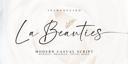 La Beauties is an original, casual and modern handwritten font that comes with a distinctive chic character that adds unique value to the font, perfect for branding, wedding invites cards, and more. La Beauties includes a full set of uppercase and lowercase letters, numeral, punctuations, and ligatures. The lowercase letters completed with beautiful beginning and ending swashes Included in this set: Works on PC & Mac Simple installations Accessible in Adobe Illustrator, Adobe Photoshop, Adobe InDesign, even work on Microsoft Word. PUA Encoded Characters – Fully accessible without additional design software
 - Black Star by Zaki Creative,
$12.00 Black Strar is a modern calligraphy design, including Regular. This font is casual and beautiful with swash. Can be used for various purposes. such as logos, product packaging, wedding invitations, branding, headlines, signage, labels, signatures, book covers, posters, quotes, and more. Black Strar includes a change of the OpenType language style, binding and international support for most Western languages. To activate the OpenType Stylistic alternative, you need a program that supports OpenType features such as Adobe Illustrator CS, Adobe Indesign & CorelDraw X6-X7, Microsoft Word 2010 or newer versions.
 - Chemistry by MJB Letters,
$15.00 Chemistry is a stylish monoline script with a natural flow and beautiful and elegant characters, you can use this font to design wedding invitations, labels, logos, branding, craft project, quotes, and more. In order to use the beautiful swashes, you need a program that supports OpenType features such as Adobe Illustrator CS, Adobe Photoshop CC, Adobe Indesign, and Corel Draw. but if your software doesn't have Glyphs panel, you can install additional swash font files: if you have questions about the latest fonts, please provide a short message to us Thank You! MJB Letters
 - Renneal by Nathatype,
$29.00 The better your font, the better the result of your design will be. That’s a fact. Renneal is an uppercase font that comes in duo (serif and display) version. The unique strokes/curves at the particular part of the character give the serif style artistic vibes. On the other hand, the display version expresses more simple and clean looks than the serif. Overall, Renneal designed to be easy to read and works best in header/title text. Features: Alternates Swashes Multilingual Supports Numerals and Punctuations It is suitable for branding, logos, social media quotes, stickers, posters, vintage designs, wall art, merchandise, social media, and many more. Get more inspiration by seeing the preview. Thank you for purchasing our premium fonts! Happy Designing!
 - Glance Slab by Identity Letters,
$29.00 Dynamic and sportive. A well-balanced experiment for sparkling headlines. Glance Slab is an experimental design that plays on the tension between connection and detachment. In this typeface, serifs may be detached and some strokes may not connect to their stems. This creates a dynamic impression of balance and movement. The elegance of an ice skater and the determination of a quarterback: Glance Sans has it all. Where a curve meets a stem and where serifs seem to “hover” near their respective letters, the nonjoining elements create an impression similar to a stencil typeface. But here, the function of the gaps differs from strictly stencil designs: while the gaps provide a “sparkling” effect in Glance Slab that’s clearly visible in large sizes, they take on the role of ink traps when set smaller, making for surprisingly legible body copy. With its strong visual character, this font family is quickly recognizable, making it perfectly suitable for branding and any large-scale application, such as posters, billboards, and event signage. Glance Slab consists of seven weights from Thin to Black. Each style has a character set of about 570 glyphs, which includes circled numbers and arrows (positive and negative versions), ligatures, extended language support, and many other features.
 - Frequen by Trim Studio,
$13.00 Frequen is a futuristic font, inspired by sci-fi and technology, so we designed the font with modern feel to achieve the theme. It is also well suited for branding, magazine, marketing design, technology, sci-fi design, bag, any much more.
 - Sachsenwald by Monotype,
$50.99 Toshi Omagari’s revived Sachsenwald design can be the perfect choice for distinctive headlines and brand identities for music, movies, video games and more. The revised design includes a regular and light weight – maintaining its distinctive design traits and adding more versatility.
 - Planet Express by Estudio Calderon,
$29.99 Family type designed by Felipe Calderón. This type is a display with a modern style and a different and innovative concept. The development of this type was a challenge because it was set out from the begining as a script font with ornaments and complements, where the round shapes do not have prominence in the result. Planet Express is an interesting job from the aesthetic point of view, it works for big scale texts and contains little shadow-cuts in each character to give it more personality and stand out among other fonts from this gender. I hope this new project works to solve issues in design. Planet Express is composed of Regular & Italics, it has 250 intelligent ligatures to produce the best signs in big scale, it is perfect for branding and works very well with the geometric complements. It is designed with programming in opentype: Ligatures, Discretionary ligatures, Stylistic Alternates, Stylistic set 01, Stylistic set 02, Stylistic set 03, Stylistic set 04, Stylistic set 05, Stylistic set 06, Stylistic set 07, Stylistic set 08 & Stylistic set 09, multiple language support and a complete set of extras like arrows, catchwords, flags, emblems, hands, fleurons & crossed elements. Planet Express can be used in different ways, each character pretends to cover the needs in any circumstance where it is used. It is funny to write words and play with the complements. It also works with current concepts in graphic design like sports, cars, hip hop, music, social network, skateboarding and more. Everybody can use this font, it works with different languages like italian, french, portuguese, danish, german and so forth. See specimen and samples here. Enjoy it!
 - Hypercreepos by Bisou,
$15.00 Hypercreepos is a sweet and creepy hyper-bold font inspired by the horror comic books of the 60s. Handmade in La Chaux-de-Fonds (Switzerland) on lined A4 papers, the letter's shape is conscientiously designed to give a punchos impact on the reader. The unique and vibrant contours are drawn on an improvised backlit table inherited from Bisou's mother. Definitely contemporary, the overall feeling given off by Hypercreepos is profound and human, evoking the graphite smell of the comic's workshops. Exclusively made for titles, this impactos font will suite with delight the text of posters, signs of comics bookstore, gaming bar, horror movie theater or film festival. That said, the designer is not responsible for the use of Hypercreepos and wish it will serve beyond all expectation.
 - Rotis Semi Serif Paneuropean by Monotype,
$92.99Rotis¿ is a comprehensive family group with Sans Serif, Semi Sans, Serif, and Semi Serif styles, for a total of 17 weights including italics. The four families have similar weights, heights and proportions; though the Sans is primarily monotone, the Semi Sans has swelling strokes, the Semi Serif has just a few serifs, and the Serif has serifs and strokes with mostly vertical axes. Designed by Otl Aicher for Agfa in 1989, Rotis has become something of a European zeitgeist. This highly rationalized yet intriguing type is seen everywhere, from book text to billboards. The blending of sans with serif was almost revolutionary when Aicher first started working on the idea. Traditionalists felt that discarding serifs from some forms and giving unusual curves and edges to others might be something new, but not something better. But Rotis was based on those principles, and has proven itself not only highly legible, but also remarkably successful on a wide scale. Rotis is easily identifiable in all its styles by the cap C and lowercase c and e: note the hooked tops, serifless bottoms, and underslung body curves. Aicher is a long-time teacher of design and has many years of practical experience as a graphic designer. He named Rotis after the small village in southern German where he lives. Rotis¿ is suitable for just about any use: book text, documentation, business reports, business correspondence, magazines, newspapers, posters, advertisements, multimedia, and corporate design. Today Rotis ia also available with paneuropean caracter set. - Rotis Semi Serif by Monotype,
$40.99 Rotis¿ is a comprehensive family group with Sans Serif, Semi Sans, Serif, and Semi Serif styles, for a total of 17 weights including italics. The four families have similar weights, heights and proportions; though the Sans is primarily monotone, the Semi Sans has swelling strokes, the Semi Serif has just a few serifs, and the Serif has serifs and strokes with mostly vertical axes. Designed by Otl Aicher for Agfa in 1989, Rotis has become something of a European zeitgeist. This highly rationalized yet intriguing type is seen everywhere, from book text to billboards. The blending of sans with serif was almost revolutionary when Aicher first started working on the idea. Traditionalists felt that discarding serifs from some forms and giving unusual curves and edges to others might be something new, but not something better. But Rotis was based on those principles, and has proven itself not only highly legible, but also remarkably successful on a wide scale. Rotis is easily identifiable in all its styles by the cap C and lowercase c and e: note the hooked tops, serifless bottoms, and underslung body curves. Aicher is a long-time teacher of design and has many years of practical experience as a graphic designer. He named Rotis after the small village in southern German where he lives. Rotis¿ is suitable for just about any use: book text, documentation, business reports, business correspondence, magazines, newspapers, posters, advertisements, multimedia, and corporate design. Today Rotis ia also available with paneuropean caracter set.
 - Lah Kagok by Differentialtype,
$12.00 Lah Kagok is an elegant and luxurious serif font family. This font comes with 8 weights accompanied by italics. The lowercase is inspired by an italic serif, which this time is also used for the upright style. Whatever design you make, this font is perfect to complement it. This font is also equipped with alternate calligraphy on the uppercase, don't forget to activate it to add an elegant and luxurious impression to each of your projects.
 - Tip Me Cheapy - Unknown license

- Blackheat by Almarkha Type,
$19.00 Blackheat is a bold, condensed sans with 4 styles inspired by the title of the sports poster. We designed it to look very energetic, taking into account the thickness and density of each glyph. Extra ligatures give you even more possibilities. This family is suitable for the titles, clothes, posters, magazines, brochures, packaging, websites and much more.
 - Falfurrias NF by Nick's Fonts,
$10.00Another in the Whiz-Bang Woodtype series, based on authentic xylographic designs from the late nineteenth century. Named after (surprise!) a small town in Texas. The net effect is a typeface which can add style and warmth to any project. Both versions of this font include the complete Unicode 1252 Latin and Unicode 1250 Central European character sets. - Gafata by Underground,
$24.00 Gafata is a font designed for small sizes in medium-long text, mixing elegance and readability causing it to have great applicability in books, magazines and web pages. In the process of finding the finest legibility, particular features emerged making this whimsical sans serif different from the rest, creating an original mark to the text its applied to.
 - Fairy Tail by Gatype,
$8.00 Fairy Tail is a bold and friendly typeface designed specifically for headlines. All of the letters are chunky and rounded,which is probably the reason why they are visible from afar. The overall feel of the typeface is meant to be very casual and affable, so it is great for businesses that are fun, outgoing and sincere.
 - Poniard by Hackberry Font Foundry,
$24.95 Cutlass was just for fun. Poniard is the working version. Sleek, slender, sharp, to the point! A bit of decorative fun. This is the first font used in teaching Fontographer in my new Practical Font Design Book. I thought I better release it for those who enjoyed the journey. It's just an 8-bit font for fun. Enjoy!
 - Vinnie Culture NF by Nick's Fonts,
$10.00Vincent Pacella designed the inspiration for this typeface, which was called Carousel and was issued by Photolettering in the 70s. Fresh and bouncy, its retro charm will perk up any project it graces. The PC PostScript, TrueType and OpenType versions contain the complete Latin language character set (Unicode 1252) plus support for Central European (Unicode 1250) languages as well. - Now Showing JNL by Jeff Levine,
$29.00 Inside the pages of the April, 1937 issue of the fan magazine “Hollywood Now” is an unusual bit of hand lettering used for the titles in a number of featured articles. A narrow thick-and-thin Art Deco alphabet with many stylized characters, this type design is now available as Now Showing JNL in both regular and oblique versions.
 - Take Trails by Pratama Yudha,
$8.00 Take Trails is a handcrafted script vintage font. The font uses rounded rough edges, inked style and has texture, so this script typeface gives a feel of vintage, classic, old, handmade looked-like. The process of the font design went through scanning and digitally carving, and the texture is well crafted and was carefully added in each character.
 - Startup by Serebryakov,
$30.00Startup is a nine style type famaly. It combines the aesthetics of gothic sans and Neo-grotesques. Created specifically for the creation of startup identity. When you need something that doesn't scream, but has personality. This type family can be used in the design of the logo, as well as apply it to headlines and secondary texts. - Maybrook JNL by Jeff Levine,
$29.00 One of the type examples found within the pages of “Lettering” by Harry B. Wright (1950) is a bold hand lettered serif typeface with a unique twist – the slab serifs had rounded corners, looking very much like show card lettering of the early 1900s. This design is now available digitally as Maybrook JNL, in both regular and oblique versions.
 - Roncial by Fontron,
$35.00Roncial is an Ultra Bold font with a hint of serif. This is one of the fonts originally designed before the advent of digital and started out being a bolder, slightly serifed version of Folio Extra Bold which was one of the boldest fonts at the time (old metal set). It is available as Roman and Italic. - ITC Syndor by ITC,
$29.99ITC Syndor is the work of Swiss designer Hans Eduard Meier, a font which is almost, but not quite, a sans serif. The beginnings and endings of strokes display a hint of the calligrapher's hand and these tiny serifs optimize legibility. This legibility and the typeface's simple forms make ITC Syndor an excellent choice for business and presentation graphics. - Hermes by ParaType,
$30.00 The typeface was designed at ParaType (ParaGraph) in 1993 by Tagir Safayev. Based on Placard typeface (Hermes Grotesk) of the Lange type foundry (St.-Petersburg), an adaptation of Hermes Grotesk, of the Woellmer type foundry (Berlin, middle of the 19th century). This sans serif with its old-fashion stability looks well in advertising and display typography.
