10,000 search results
(0.075 seconds)
- Strasua - Unknown license
- Lost Forever - Unknown license
- rhino dino - Unknown license
- TeamSpirit - 100% free
- StandingRoomOnly - Unknown license
- Liquidy Bulbous - Unknown license
- Fatboy Slim BLTC 2 BRK - 100% free
- Kimberley - Unknown license
- Kicking Limos - Unknown license
- Nixon - Unknown license
- Nicotine Stains - Unknown license
- Pupcat - Unknown license
- Linear Curve Fatty - Unknown license
- Shazbot - Unknown license
- DS Thompson - Unknown license
- Black Eye Nue - Unknown license
- Bandwidth BRK - Unknown license
- LED - Unknown license
- GiantTigers - Unknown license
- Lounge Bait - Personal use only
- Chibaraki Now - Unknown license
- Eight Track program 4 - Personal use only
- Family Guy - Unknown license
- LetterOMatic! - Personal use only
- Sergeant SixPack - Personal use only
- Kremlin Kourier II - Unknown license
- Sunlight JNL by Jeff Levine,
$29.00 - Blocksta by AVP,
$30.00 - Bookish by Hackberry Font Foundry,
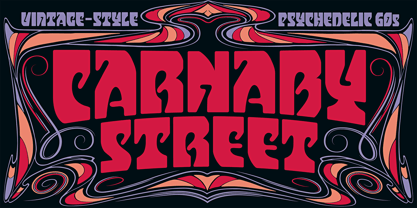
$24.95 - Carnaby Street by Mysterylab,
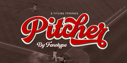
$19.00 - Pitcher by Fenotype,
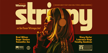
$35.00 - Strippy by Just Font You,
$18.00 - Keymer Radius by Talbot Type,
$19.50 - Ornatique - 100% free
- Fontenay Fancy - Personal use only
- MADFONT Regular - Unknown license
- Rothenburg Decorative - Personal use only
- Dirt2 SoulStalker - Personal use only
- Ithornët - Personal use only
- WW2 BlackltrAlt - Unknown license


