3,482 search results
(0.012 seconds)
- AT Move Quipo by André Toet Design,
$39.95 QUIPO is a typeface based on my recent survey (Freeflow) on hand drawn logotypes used by American and English pop groups in the 60-70s. We thought it an interesting project and a free flow exercise to design this particular font just in capitals and well... yes it’s rather ‘bulky’. Needless to say it comes with numbers and the normal punctuations ! Concept/Art Direction/Design: André Toet © 2017
 - AT Move Billiard by André Toet Design,
$39.95 BILLIARD was born from the numerous sketches André Toet did for the design of a series of postage stamps in 2011. It’s a capital monospaced and ‘fun’ alphabet, based on the classic billiard play with two white and one red ball. Actually snooker and pool were derived from this rather old sport! In Europe it used to be a sport played by elderly people, practiced in traditional bars, including the smell of beer and the at that time prevalent smell of cigarettes and cigars. These days billiard, snooker and pool are quite popular once again with young people. Hopefully our new font will get the same attention the ‘old sport’ deserves and who knows it might even be used in a sportive way. Concept/Art Direction/Design: André Toet © 2017
 - AT Move Strano by André Toet Design,
$39.95 STRANO Like the name indicates it’s a strange typeface. Just capitals (including punctuation marks and numbers), composed from early sketches for a corporate identity in 2005 by André Toet. The complete font was restyled and translated to a Monospaced version. It’s a quite versatile font: it can be used in a lot of different cases, not only in print but also in architecture and street furniture. Think about lettering on benches, bridges, buildings. Concept/Art Direction/Design: André Toet © 2017
 - AT Move Artu by André Toet Design,
$39.95 Artù ! Strano ma vero, strange but true. A beautiful, intelligent and lively Italian dog and a great friend, unfortunately no longer among us ... but his memory lingers. A typeface designed in Rosennano (Tuscany), its Italian, but executed in Amsterdam. This monospace typeface might prove to be extremely useful for household products like washing powder or any anything like that. Just use it in your designs, let it live! Concept/Art Direction/Design: André Toet © 2017
 - AT Move Tremelo by André Toet Design,
$39.95 TREMELO a typeface based on a logotype (Microtel). We designed it as a complete capital alphabet. The original idea for the logotype font came from the products the firm produced. They provided the parts that go into hearing-aids. We thought the type should have some visual tremor in it. Concept/Art Direction/Design: André Toet © 2017
 - Tipo Movin CDMX by Ixipcalli,
$- La versión propuesta por la SEMOVI (Secretaria de Movilidad) es un estilo más angosto y ortográfico, creadó con la finalidad de aligerar las aplicaciones tipográficas del sistema. Se emplea oficialmente en todas las aplicaciones del sistema de Movilidad Integrada de la Ciudad de México. El creador de la tipografía es Lance Wyman. En esta edición, los tipos minúsculas son una adaptación “no oficial” para el Tipo Movin CDMX, enriqueciendo la tipografía a un estilo visual de altas y bajas, por lo que se prescinde del diseño base como trabajo propio para enfatizar los tipos minúsculas exclusivamente, además de que se han añadido algunos caracteres de acentuación extendiendo su uso a otros lenguajes. Los tipos son una nueva propuesta por Ixipcalli en el presente año 2023. The version proposed by SEMOVI (Secretary of Mobility) is a narrower and more orthographic style, created with the purpose of lightening the typographic applications of the system. It is officially used in all the applications of the Integrated Mobility system of Mexico City. The creator of the typeface is Lance Wyman. In this edition, the lowercase types are an “unofficial” adaptation for the Tipo Movin CDMX, enriching the typography to a visual style of highs and lows, so the base design is dispensed with as my own work to emphasize the lowercase types exclusively, In addition, some accentuation characters have been added, extending their use to other languages. The types are a new proposal by Ixipcalli in the current year 2023.
 - Moving Van JNL by Jeff Levine,
$29.00Moving Van JNL is a classic sign painter's block Roman with angled [instead of rounded] corners and slab serifs. This style of lettering was most popular in the 1920s and 1930s. - AT Move Bloggy by André Toet Design,
$39.95 BLOGGY designed in 2010 by André Toet. In the series of typefaces that were created by our team, BLOGGY stands out as a rough typeface based on a grid. Within this square grid the typeface is enlarged and reduced in size in order to create a dazzling font. A complete ‘extra alphabet’ was added to the font by cutting the letters diagonally. To us typedesign doesn't only mean designing fonts for books but also advertising, posters, film or digital use. We hope that BLOGGY will do the trick ! Concept/Art Direction/Design: André Toet © 2017
 - AT Move Herengracht by André Toet Design,
$39.95 HERENGRACHT (Patricians' Canal or Lord’s Canal) is the first of the three major canals in the city centre of Amsterdam. The canal is named after the heren regeerders who governed the city in the 16th and 17th century. The most fashionable part is called the Golden Bend, with many double wide mansions, inner gardens and coach houses on Keizersgracht. Former bureau of André Toet (SO)Design was situated there for over 32 years, it was about time to name one of our fonts to: HERENGRACHT. Concept/Art Direction/Design: André Toet © 2017
 - Rock Show Whiplash - Unknown license

- Chinese Rocks Free - Unknown license

- Retro Rock Poster - Unknown license

- Rock ‘n Roller - Unknown license

- KG ROCK CONCERT - Unknown license

- Rock-A-Billy - Unknown license

- Glam Rock MF by Masterfont,
$59.00 Either Futuristic or Space ship logo - it will sure fit to a mysterious poster.
 - Rock Concert JNL by Jeff Levine,
$29.00 Rock Concert JNL is a playful free form type design inspired by the opening title and credits for the 1964 motion picture comedy “Send Me No Flowers” starring Rock Hudson, Doris Day, and Tony Randall. Strongly resembling hippie movement poster lettering of the mid-1960s, this fonts fits well with any retro project emulating the “Peace and Love” movement or (as its name implies) re-creating period piece rock concert posters.
 - MC Scar Rock by Maulana Creative,
$16.00 Scar Rock Scary Display Font. Scar Rock scary display font. Heavy stroke, fun character with a bit of ligatures. To give you an extra creative work. Scar Rock scary display font support multilingual more than 100+ language. This font is good for logo design, Social media, Movie Titles, Books Titles, a short text even a long text letter and good for your secondary text font with script or serif. Make a stunning work with Scar Rock scary display font. Cheers, Maulana Creative
 - Rock And Cola by Corradine Fonts,
$49.95 Rock and Cola's design is clearly inspired by the sinuous shapes of the world's most famous drink's logo. It however does not pretend to copy it faithfully or to serve as a platform to generate the logo itself. Rock and Cola is a very elegant Script font with great weight and contrast. Its OpenType features include ligatures, swashes, alternative characters, ornaments and accents in order to support many foreign languages. It has huge possibilities for application in logos, titles and short texts by generating in them great impact and recalling. Use Rock and Cola in your projects and enjoy it!
 - MC Rock Ice by Maulana Creative,
$17.00 Rock Ice Funny Display Typeface Rock Ice funny display typeface. Heavy stroke, fun character with a bit of ligatures. To give you an extra creative work. Rock Ice funny display typeface support multilingual more than 100+ language. This font is good for logo design, Social media, Movie Titles, Books Titles, a short text even a long text letter and good for your secondary text font with script or serif. Make a stunning work with Rock Ice funny display typeface. Cheers, Maulana Creative
 - Round Rock NF by Nick's Fonts,
$10.00Woodtype wizard Rob Roy Kelly identified the inspiration for this typeface in his 100 Wood Type Alphabets simply as "No. 154". Funky, chunky, round and robust, it’s clearly a barrel of fun. Named after a small town in Central Texas, which just happens to be the home of Dell Computer. Both versions of the font include 1252 Latin, 1250 CE (with localization for Romanian and Moldovan). - Jaded Rock Stars by Throndsen,
$10.00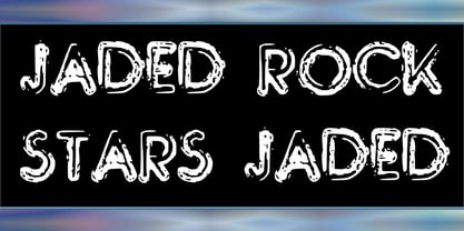
- CA Cape Rock by Cape Arcona Type Foundry,
$39.00 CA Cape Rock, first released in 2007 and now reissued and expanded, is an impressive display typeface. Designed with a fat Clarendon and wood type in mind, the typeface’s bold and distinctive forms add spice and personality to any design that requires a strong display aesthetic. CA Cape Rock is particularly enjoyable for use in headlines and ideal for highlighted text. With already two dozen existing ligatures and many OpenType swashes, the new edition also received letters for use in the Central European and South Eastern European area. Cleaned and harmonized paths, a completely new kerning as well as a newly added Italic (Slanted) style are also among the new features.
 - LD Rock Hero by Illustration Ink,
$3.00 - Trekbats - Unknown license

- LHF Retro Ricky Doohickies by Letterhead Fonts,
$29.00 LHF Retro Ricky transports you right into the groovy retro past. These 60’s-era Doohickies set includes over 85 panels and dingbats to enhance your designs. Save time recreating vintage logos and designs. Goes perfect with the LHF Retro Ricky Fonts, only available at Letterhead Fonts.
 - Moi Non Plus by Hanoded,
$15.00 Moi Non Plus is a wonderful, handwritten font. It has a somewhat chaotic look, but is stylish nonetheless. The name was taken from a famous Serge Gainsbourg song called 'Je t'aime - moi non plus', which caused a bit of a scandal when it was released in the '60's, due to its overtly sexual content.
 - HU Mois KR by Heummdesign,
$25.00 HU Mois KR is a calligraphy typeface with a sense of speed and a naturally slanted feel as if writing. It also gave a sense of free rhythm of handwriting. Includes Korean from the existing 'HU Mois' font.
 - AT Move Specx Stncl by André Toet Design,
$39.95 SPECX Stencil This is my #11/12 Font a slabserif typeface. In fact it’s a very, very basic and extreme strong typeface! We gave this new Font a special touch by adding an extra family-member: a stencil-version of the SPECX. My inspiration for the SPECX is based on the cover of a 1955 French School-Notebook. Concept/Art Direction/Design: André Toet © 2017
 - Lazy Rock - Personal Use - Personal use only

- punk rock rummage sale - Unknown license

- Rocking the Kasbah NF by Nick's Fonts,
$10.00This lively script is based on a handlettered offering from The Hunt Brothers, which they called simply "Ornamental Italic". Ornamental, yes, but there’s also a lot of action and attitude in this typeface. Please note that, due to the extreme slant of the characters, spacing in the font has been optimized for upper- and lowercase use. Both versions of this font contain complete Unicode 1252 (Latin) and Unicode 1250 (Central European) character sets, with localization for Romanian and Moldovan. - Hand Scribble Sketch Rock by TypoGraphicDesign,
$19.00 U-P-D-A-T-E (more glyphs, bug fixed, MAC (Desktop) + WIN (Office) Version) CHARACTERISTICS An own interpretation of a classic egyptienne/slab serif typeface with modern and fancy handmade haptics/hatching. The 3 styles/weights fits perfectly in each font size. From light till bold. All 3 styles are handemade sketched for diverse display size. APPLICATION AREA This heavy, sketched, scribbled, handmade slab serif font “Hand Scribble Sketch Rock” with many language support would look good in headlines. Magazines or websites, party flyer, movie posters, music Poster, music covers or webbanner. TECHNICAL SPECIFICATIONS ■ Font Name: Hand Scribble Sketch Rock ■ Font Weights: Regular, Bold, Light ■ Fonts Category: Display for Headline Size ■ Font Format: OpenType OTF + Windows TrueType TTF ■ Glyph Set: 361 glyphs ■ Language Support: Basic Latin/English letters, Central Europe, Baltic, Romanian ■ Specials: alternative letters and ligatures (with accents & €) ■ Design Date: 2013 ■ Type Designer: Manuel Viergutz ■ Font License: Desktop license, Web license, App license, eBook license, Server license
 - VU Rock N Roll by VisualizeUnited Fonts,
$65.00 VU Rock nRoll is a block display typeface, that comes in English and Greek characters, numerals and a very basic set of marks. It was inspired by graffiti and custom made wooden type. Having a rough look, it feels appropriate for short messaging and titles since its design is dynamic. Posters, labels and tees would host beautiful designs, that can stand out! Choose your text and rock n roll!
 - Mini Pics Red Rock by NicePrice Font Collection,
$4.99 - the Incredibles - Unknown license

- Bornholm Allinge by Trine Rask,
$25.00 Bornholm Allinge is named after a village "Allinge" on the only rocky island in Denmark "Bornholm" It is the third face in a series of rough stone cut typefaces, that shares proportions, but differs in any other aspect like different pieces of rock. It is a powerful face, but still very friendly. Good for very big sizes, but can be used for small texts, movie titles, cartoons …
 - Bornholm Sandvig by Trine Rask,
$25.00 Bornholm Sandvig is named after the village, "Sandvig", on the only rocky island in Denmark, Bornholm. It is the second face in a series of rough stone cut typefaces, that shares proportions, but differs in any other aspect like different pieces of rock. It is a powerful face, but still very friendly. Good for very big sizes, but can be used for small texts, movie titles, cartoons, etc.
 - Bornholm Tejn by Trine Rask,
$25.00 Bornholm Tejn is named after the Tejn village on the only rocky island in Denmark, Bornholm. It is the first face in a series of rough stone cut typefaces, that shares proportions, but differs in any other aspect like different pieces of rock. It is powerful face, but still very friendly. Good for very big sizes, but can be used for small texts, movie titles, cartoons and more.
 - BonJovi - Unknown license


