3,482 search results
(0.012 seconds)
- Glam Rock by Sylvestre Studios,
$25.00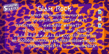 Glam Rock isn't for just anyone.
 - Konga Rock by RodrigoTypo,
$35.00 It is a new style of Konga Pro, now more rough and ornaments.
 - River Rocks by Maulana Creative,
$10.00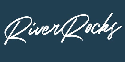 Give your designs an authentic handcrafted feel. "River Rocks Brush" is perfectly suited to signature, stationery, logo, typography quotes, magazine or book cover, website header, clothing, branding, packaging design and more. Thanks for use this font ~ Maulana
 - Rock Star by AlfaBravo,
$25.00 Rock Star is a original sans serif family with a distinct personality. The family has 36 font styles, ranging from ExtraLight to UltraBlack in normal and narrow styles (including italics). A wide range of weights and widths offering tremendous typographic flexibility. Rock Star is a contemporary typeface with roots in the past. It based on the sans-serifs of the late 19th and early 20th century. It would look great for corporate branding, in books and magazines.
 - Cyber Rock by WAP Type,
$15.00 Cyber rock Brush Script bold, cool, cursive, design, editorial, grunge, handpaint, handwritten, ink, letter, logo, logotype, magazine, marker, modern, paint, ragged, ROUGH BRUSH, script, sign, style, stylish, swash, tag tagging, textured, trend, trendy, urban, vintage, written handwritten brush script dry brush cursive font with rough and dynamic look. Ideal for quotes, posters, branding, packaging, illustration, social media.
 - Rock Corn by Baqoos,
$18.00 Rock Corn is a chipper intrepid handwritten typeface apt for headline, editorial, branding, packaging, printed materials and typographic applications. 200+ glyphs including punctuation and numerical.
 - Rock Road by Putracetol,
$22.00 Rock Road is a racing theme font with sharp and consistent angles combined with a hard and strong style. So it looks very fast and powerful. So I made it a display font. Rock Road has an uppercase and lowercase version that doesn’t have a recing feel, so you can be more creative. In addition, Rock Road has a sans ligature feature that makes the great look. Rock Road would be perfect for Logo, title, logotype, cover, headline, apparel, comic, cover books, cards, posters, or anything that requires a horror or scarylook! Rock Road is also support multi language. To access the alternate glyphs, you need a program that supports OpenType features such as Adobe Illustrator CS, Adobe Photoshop CC, Adobe Indesign and Corel Draw.
 - Rugged Rock by Comicraft,
$19.00 Around the rugged rock the ragged rascal ran, Foregoing fancy fonts, the Fontographer fawned and fell! Alliteratively allowing for assonant aspects as well, He spoke of several sentences that some should never spell! This classic title font will deliver tall tales that tell!
 - Mawns Rock by Mans Greback,
$59.00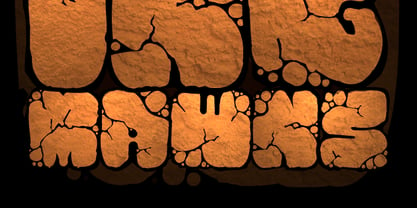
- Beach Rock by Stripes Studio,
$20.00 Hi, Introducing the latest styles Beach Rock with the kind of modern hand scratches, I hope you are interested in this font, if you want to use for your work this font can be used easily and simply because there are a lot of features in it to contain a complete set of letters lower and uppercase letters, assorted punctuation, numbers, and multilingual support. font also contains several ligatures and alternate style Stylistic.
 - Casper - Unknown license

- Blade Runner Movie Font - Unknown license

- SF Movie Poster Condensed - Unknown license

- SF Movie Poster Condensed - Unknown license

- SF Movie Poster Condensed - Unknown license

- SF Movie Poster Condensed - Unknown license

- Movie Ad Deco JNL by Jeff Levine,
$29.00 An extra-bold, hand lettered type design with a casual feel was used for the 1942 movie poster “Tortilla Flat”. This served as the inspirational model for Movie Ad Deco JNL, and is available in both regular and oblique versions.
 - OL Movie Title Gothic by Dennis Ortiz-Lopez,
$30.00Inspired by Hamilton Gothic. - Pre Code Movies JNL by Jeff Levine,
$29.00 The hand lettered credits from the 1931 melodrama “Safe in Hell” inspired the typeface Pre Code Movies JNL, which is available in both regular and oblique versions. The design is strongly influenced by the popular Art Deco style of thick-and-thin characters and also features rounded corners. The font’s name comes from the early era of talking pictures and the short period before the establishment of the Hays Office in 1934 when Hollywood did not self-censor itself. Many then-taboo topics were exploited on film until Will Hays cracked down on such productions. To read more about Pre-Code Hollywood, visit the Wikipedia link: https://en.wikipedia.org/wiki/Pre-Code_Hollywood
 - Movie Star Deco JNL by Jeff Levine,
$29.00 Here’s a jaunty little Art Deco sans serif type design inspired by the headline of a feature article on Carole Lombard found in the August, 1937 issue of Hollywood magazine. This served as the inspirational model for Movie Star Deco JNL, and is available in both regular and oblique versions.
 - Rocky Mountain Spotted Fever - Unknown license

- HU Mois by Heummdesign,
$15.00 English It is a font made based on the handwriting written by a designer who said it was HUMois, and it is a font with a speedy and natural tilt as if taking notes. Cyrillic Это шрифт, сделанный на основе почерка, написанного дизайнером, который сказал, что это HUMOIS, и это шрифт с быстрым и естественным наклоном, как если бы принимал заметки. Greek Είναι μια γραμματοσειρά φτιαγμένη με βάση το χειρόγραφο που έγραψε ένας σχεδιαστής που είπε ότι ήταν HUMois, και είναι μια γραμματοσειρά με γρήγορη και φυσική κλίση σαν να κρατά σημειώσεις.
 - Rockin Roman NF by Nick's Fonts,
$10.00Here's another gem from Blandford Press' Pen & Brush Lettering and Practical Alphabets. Pleasant, playful and packed with personality, this typeface rocks. - MoDi Khilari 1 - Unknown license

- KR Moving Day - Unknown license

- AT Move Altera by André Toet Design,
$39.95 ALTERA a typeface based on a logotype André Toet made for a dutch broadcast company. This typeface is in fact carries a transformation in itself: it’s composed of three different weights and shapes. In our humble opinion the possibilities are endless ! So be a sport and use this typeface for logo’s and headings. Kick the can ! Concept/Art Direction/Design: André Toet © 2017
 - AT Move Wyggle by André Toet Design,
$39.95 WYGGLE is a dynamic (capital) font taken from my Alphatool project. It’s an interesting typeface which can be used for interior and/or exterior (3D projects). Concept/Art Direction/Design: André Toet © 2017
 - Moving Message JNL by Jeff Levine,
$29.00 A vintage printer's cut for the masthead of the "Fed-O-Gram" (a monthly publication of the Farm Bureau Federation, Inc.) had its title set in letters that emulated a moving message board. This design formed the basis for what is Moving Message JNL.
 - AT Move Powerplay by André Toet Design,
$39.95 POWERPLAY a monospace lowercase alphabet with a 3D twist. Designed by André Toet in 1976 (during his study at Central School of Art & Design, London, UK) and he redesigned this in 2011. The name Powerplay is based on the Battersea Power Station, London. The remarkable architecture of the building is also used as a decor for films and for one of the covers by Pink Floyd (Animals, the flying pig). Concept/Art Direction/ Design: André Toet © 2017
 - AT Move Nath! by André Toet Design,
$75.00 NATH !* Is a peculiar typeface. It’s design came by the fascination of Optical Illusions and 3D on a flat surface, like with Holborn and Powerplay. The typeface is named after a girlfriend of André Toet. *Made in the UK, 1974, London (Central School of Art & Design). (Redesigned 2013 by André Toet / Jasper Terra). Concept/Art Direction/Design: André Toet © 2017
 - AT Move Decoupe by André Toet Design,
$39.95 Découpé Based on a French children’s play from 1906. In a car boot sale André Toet found a funny looking box containing a lot of cut out cardboard figures, in fact it looked a bit like a geometric puzzle! He played around a bit and succeeded to create a workable typeface with it ! The interesting thing about this particular font is, that in fact it’s organized chaos. The 26 letters of the alphabet are a mix between caps and lowercases, so within one word caps and lowercases will be used next to each other. It’s a very useful font for different projects. Concept/Art Direction/Design: André Toet © 2017
 - AT Move Specx by André Toet Design,
$39.95 SPECX This is my #11/12 Font a slabserif typeface. In fact it’s a very, very basic and extreme strong typeface! We gave this new Font a special touch by adding an extra family-member: a stencil-version of the SPECX. My inspiration for the SPECX is based on the cover of a 1955 French School-Notebook. Concept/Art Direction/Design: André Toet © 2017
 - AT Move Frutta by André Toet Design,
$39.95 FRUTTA (Fruit) is a new typeface made with the ever expanding food industry in mind. But don’t let that deter you from using our font on the cover of the forthcoming cd of the Black Keys or Beady Eye or Damon Albarn or Paul Weller or Daft Punk or Whatever... Concept/Art Direction/Design: André Toet © 2017
 - AT Move Straw by André Toet Design,
$39.95 STRAW The inspiration for this capital alphabet came from those beautiful haystacks you see in summer and the old fashioned Mikado game! We wanted to create a light, fragile and airy typeface with an optical effect. And here it is ... it’s just STRAW ! Concept/Art Direction/Design: André Toet © 2017
 - AT Move Wolfszn by André Toet Design,
$39.95 WOLFSZN Anniversary! WOLFSZN is the tenth Font of André Toet. The inspiration for this capital alphabet came from the trails of an agricultural machine (think tractor) leaves in the soil after working the land. But it’s not meant to be ‘like a heavy workload’, in fact to us it seems like a very useful Font for headings, logotypes, advertising or films. We hope WOLFSZN will be happily and wisely used by my dear colleagues. Concept/Art Direction/Design: André Toet © 2017
 - AT Move Bulky by André Toet Design,
$39.95 BULKY is the 19th Font of André Toet. It’s Unusual, it’s Heavy, it’s Irregular, it’s Rough, it’s Stripy, it’s Angular, it’s BULKY. But it has character and extremely useful for headings, posters and even logotypes. Just-Use-It! Concept/Art Direction/Design: André Toet © 2017
 - AT Move PiPi by André Toet Design,
$39.95 PiPi is named after a happy Italian cat with a remarkable pattern, color and attitude. Designed by Andre Toet in 2011. Every letter is a different expression in itself although it has an identical base. It gives a joyful feeling to use this font in all your designs whether they be graphic or digital. M E O O O W ! Concept/Art Direction/Design: André Toet © 2017
 - Moving Headlines JNL by Jeff Levine,
$29.00 For decades, visitors to Times Square could look up and read the up-to-the-minute news flashes that moved across a giant electric sign on the face of the old New York Times Building (now known simply as One Times Square). According to Wikipedia's article on OneTimes Square: "On November 6, 1928, an electronic news ticker known as the Motograph News Bulletin (colloquially known as the "zipper") was introduced near the base of the building. The zipper originally consisted of 14,800 light bulbs and a chain conveyor system; individual letter elements (a form of movable type) were loaded into frames to spell out news headlines. As the frames moved along the conveyor, the letters themselves triggered electrical contacts which lit the external bulbs (the zipper has since been upgraded to use modern LED technology)." An example of this was seen in the 1933 Warner Bothers film "Picture Snatcher" starring James Cagney. This example inspired Moving Headlines JNL.
 - AT Move Holborn by André Toet Design,
$39.95 HOLBORN Aptly named after ‘High Holborn’, a high-street in London where the Central School of Art & Design was based. A font, just in capitals, based on the original design and the earlier sketches (1976) by André Toet. The strong optical illusion in this alphabet makes it an outstanding typeface. Concept/Art Direction/Design: André Toet © 2017
 - AT Move MMM by André Toet Design,
$75.00 MMM is a sturdy Typeface, the design is based on a old Soap-Powder advertisement. MMM is very useful for headings and/or logotypes. André Toet his 17th Font Caps, Lowercase. With Numbers, Glyphs and the normal Punctuation. Use this Font well, it’s made with the greatest care. Concept/Art Direction: André Toet © 2017 - Design: André Toet / Jasper Terra


