10,000 search results (0.027 seconds)
  1. Hendrix Demo - Unknown license
  2. Kleptocracy - Unknown license
  3. Outta Control Caps - Unknown license
  4. VTCSuperMarketSaleSC - Unknown license
  5. Wanax Demo - Unknown license
  6. Kremlin Emperor - Unknown license
  7. Marsh Gas - Unknown license
  8. Mage 1999 - Unknown license
  9. Mainframe BB - Personal use only
  10. Strasua - Unknown license
  11. Lost Forever - Unknown license
  12. rhino dino - Unknown license
  13. TeamSpirit - 100% free
  14. StandingRoomOnly - Unknown license
  15. Liquidy Bulbous - Unknown license
  16. Kimberley - Unknown license
  17. Kicking Limos - Unknown license
  18. Nixon - Unknown license
  19. Nicotine Stains - Unknown license
  20. Pupcat - Unknown license
  21. Linear Curve Fatty - Unknown license
  22. Shazbot - Unknown license
  23. DS Thompson - Unknown license
  24. Black Eye Nue - Unknown license
  25. Bandwidth BRK - Unknown license
  26. LED - Unknown license
  27. GiantTigers - Unknown license
  28. Lounge Bait - Personal use only
  29. Chibaraki Now - Unknown license
  30. Eight Track program 4 - Personal use only
  31. Family Guy - Unknown license
  32. LetterOMatic! - Personal use only
  33. Sergeant SixPack - Personal use only
  34. Kremlin Kourier II - Unknown license
  35. Technical Stencil VP by VP Type, $24.00
    Technical Stencil VP is the stenciled version of Technical Standard VP and the two typefaces can be used either on their own or together seamlessly. The initial inspiration for their design came from examining the various types of precisely machined labels on tools from cameras to cars, which need to be perfectly legible at all sizes. The unique streamlined look such processes achieve was carefully reinterpreted and the resulting fonts are at the same time robust and stylish, both universal and unique. Technical Stencil VP includes ten distinct styles, offering great versatility. All styles in this family include an extensive Latin character set, the Greek alphabet, multiple sets of numerals, a large set of punctuation marks, and other symbols. With 1120 glyphs in each style, it guarantees full support for all Latin languages. To make the family even more powerful, twenty OpenType features are included, such as multiple vertical positions, diagonal fractional forms, optional slashed zeros, separate old-style and lining figures, small capitals, and contextual alternates.
  36. Bum Steer JNL by Jeff Levine, $29.00
    In older American slang, a "bum steer" is a bad tip, some bad advice or being sent in the wrong direction (to name a few examples). Bum Steer JNL was modeled from some playful hand lettering found on a piece of early 20th Century sheet music entitled "When Uncle Joe Plays a Rag on His Old Banjo". It's very possible that "Hobo" (a popular type design of the time) was a strong influence on the sheet music's style of title lettering. It seems that songwriters in those bygone days were prone to cramming as many words from a line of their song into the title itself. Another such example of a wordy song title which coincidently is in keeping with the theme of a "bum steer" (pun intended) is a novelty number from 1915: "Cows May Come and Cows May Go but the Bull Goes on Forever" (words by Vincent Bryan, music by Harry Von Tilzer). [It's kind of self-descriptive, don't you think?]
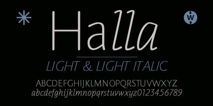
  37. Halla by Wilton Foundry, $19.00
    Creating Halla was a bit unusual for me since I started out creating the italic version first and that inspired the name Halla, meaning to tilt in Icelandic. It is also a fairly common female name in Iceland. “Halla” is derived from old Norse word “hallr” = 'flat stone, rock' or 'sloping, leaning to one side' Halla is a true italic inspired by handwriting and mechanical type. The combination of Light and Italic makes Halla ideal for advertising, branding, signage, packaging and editorial design.
  38. Quadrat Grotesk New by ParaType, $30.00
    Designed for ParaType in 2004 by Vladimir Pavlikov. It is a new version of popular type Quadrat Grotesk by the same author. Letters of the new version in contradistinction to the old one are clean and have no traces of exploitation. Quardat Grotesk New due to its rectangular proportions is extremely readable in small sizes and can be successfully used in Web pages and in documents with long lists where critical aspect is a number of lines rather then length of a line.
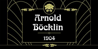
  39. Arnold Boecklin by Linotype, $36.99
    The font, Arnold Boecklin, appeared in 1904 with the font foundry Otto Weisert. Traces of the floral forms of the Jugendstil can still be seen in this typeface. Alphabets of this type were mainly meant for larger point sizes, as on posters. A decorative feel was much more important than legibility, and Arnold Boecklin was of particular importance to the book design of the Jugendstil movement. Today the font is often used to remind people of “the good old days”.
Looking for more fonts? Check out our New, Sans, Script, Handwriting fonts or Categories
abstract fontscontact usprivacy policyweb font generator
Processing