10,000 search results
(0.028 seconds)
- Coyuhqui by Ixipcalli,
$24.00 Coyuhqui is a semi-geometric technical typeface, ideal for posters and flyers. It provides two weights: regular and medium. In addition to three styles: condensed, regular and extended; without leaving out the italic forms of each one. Thus, the Coyuhqui typeface family provides twelve typefaces. If you need a typeface for your project, this is the ideal one.
 - AT Nezue by Amera Type,
$10.00 Nezue is our first font family consisting of neat and elegant lowercase and uppercase letters, comes with 9 styles (Thin, Extra Light, Light, Regular, Medium, Semi Bold, Bold, Extra Bold, and Black) Formed in a modern style that can help your visual branding look younger, detailed letterforms for optical contrast can make this font even more attractive
 - Adlery Pro by Zetafonts,
$39.00 Adlery is a brush typeface designed by Cosimo Lorenzo Pancini for display use. It has a handmade feel and it’s optimized for maximum readability at medium sizes. The typeface comes in three styles: Basic, Swash and Blockletter Uppercase and has a double set of lowercase alphabets that alternate in writing, so that no double letters are the same.
 - Mixoma by Something and Nothing,
$12.00 Introducing Mixoma, a combination of Serif and Sans strokes gives Mixoma a stylish look. The available stylistic alternates are designed to make your typography look more unique and help bring out your inner Mixologist. Mixoma is available in 9 weights, Thin, Extra Light, Light, Regular, Medium, Semi Bold, Bold, Extra Bold and Black each having an italic version. Enjoy!
 - Malvie by Eko Bimantara,
$17.00 Malvie is casual, groovy and friendly font. Made for titling and products, branding, packaging, display, signage and other fit-for-bold medium. Each glyphs shown dynamic curves, especially with the stems which is personalized by heavy swinging stroke. Its contain 270 glyphs with latin standard character set and two opentype features; Stylistic Alternates and standard Ligatures also extra swashes.
 - Peragat by ArimaType,
$19.00 Peragat is the perfect embodiment of the harmony between classical elegance and a modern touch. Designed to meet the diverse needs of design, this serif font offers a combination of sophistication and contemporary flair, creating a captivating and professional atmosphere. Key Features: Classic Beauty: With a set of gentle serifs and balanced proportions, Peragat creates classical beauty that enriches your designs with an elegant touch. Optimal Readability: Each letter is meticulously crafted to ensure optimal readability, even at small sizes, making it the perfect choice for various graphic design and print projects. Global Flexibility: Peragat is designed with diversity and inclusivity in mind. With full support for multiple languages worldwide, this font seamlessly integrates into international projects. Design Applications: This font is suitable for various design purposes, including but not limited to: Brand identity design Marketing and promotional materials Print and digital publications Web design Business presentations
 - Mailuna Pro AOE by Astigmatic,
$24.00 Mailuna Pro is a family of gothic typefaces of weight and oblique stature, finding themselves on a line between modern and historical gothic styles. Originating as a revival and elaboration of a limited lettering specimen from a series of old loose spanish specimen book pages, it finds itself in the visual company of vintage transportation roll signs, wood type gig posters, financial publications, etc. What began as just Capitals, Lowercase and Numerals was expanded to a rich pro glyphset including small caps, unlimited fractionals, superiors & inferiors, ordinals, tabular & proportional figures, a Caps to small caps feature and an expanded language glyph set. From modern letterpress back to historical adverts, book covers, headlines, or anything else you want to give a dash of vintage authenticity to, the Mailuna Pro Family is here to fill your needs. Be sure to download and take Mailuna Pro AOE - Book weight for a spin for free.
 - Safe Font by Galapagos,
$39.00Some typefaces are more deserving of the reference "original typeface design" than are others. Such a typeface is Steve's Safefont GD. It is indeed safe to say that this design has caused some controversy. However, the management of Galapagos Design Group believes that the message of the typeface, even before its characters are used to form words in print, is important enough-and the design itself compelling enough-to warrant the risk of any unintended offense it might cause. Safefont GD is made up of condoms, in various shapes and sizes. The design originated as a lampoon of contemporary-punk- and -garagefont- designs of the nineties. It soon evolved into the quintessence of socially conscious design. Steve suggests this typeface could be "useful as a public service font aimed at important health and social issues." In addition, Safefont GD lends itself to a wide range of fun uses. - HWT Artz by Hamilton Wood Type Collection,
$24.95 HWT Artz is the newest wood type to be cut at Hamilton Wood Type and Printing Museum. It was designed by venerable type designer Erik Spiekermann exclusively for his own print studio (P98a in Berlin), specifically to be cut into large size wood type. The digital version is being offered to the general public with proceeds of sales to benefit the museum's ongoing operations. HWT Artz evokes bold early 20th century European poster lettering. The design itself is intended to minimize hand-finishing and thus production time with rounded corners rather than sharp interior corners that would normally have to be hand-finished. In keeping with the tradition of naming new Hamilton designs after key figures from the living history of Hamilton (and following Spiekermann's tradition of four letter font names), Artz is named after Dave Artz- Hamilton Manufacturing retiree and master type trimmer.
 - Ardoise Std by Typofonderie,
$59.00 A straightforward sanserif in 20 fonts, 4 widths Ardoise met the needs of publications. By extension, it met the needs of a newpapers typeface featuring a low contrast, straightforward forms, as Franklin Gothic. The verticals metrics and proportions of Ardoise are calibrated to match perfectly others Typofonderie families. Four widths to answer all situations Ardoise, inspired by the needs of today’s fine newspapers offers simple and tense shapes designed to renew and revitalize. Ardoise could be considered as an homage to Antique Olive, but quite indirectly and as an organic result of the designer’s longstanding admiration of the work of Roger Excoffon. Ardoise shares a purity and dynamics with Excoffon’s designs giving it a unique elegance and excellent readability. Its sturdiness means it is virtually immune it to distortion. In addition, a few alternates glyphs (a, c, g) can be used to alter the overall tone of a text setting.
 - PF Bulletin Sans Pro by Parachute,
$79.00 This is a grotesque typeface which was derived from an older more simple version designed back in 2000. Bulletin Sans Pro is distinguished by its selective deep cuts which give this typeface a robust and contemporary look. These cuts become more apparent at larger sizes while they create a more subtle effect at smaller sizes. For intense titles try the black version. When space and legibility for long texts are critical, use the lighter versions. The family consists of 10 fonts—from black to light—including true italics. It supports 20 special OpenType features like small caps, fractions, ordinals, etc. and offers multilingual support for all European languages including Greek and Cyrillic. Finally, every font in this family has been completed with 270 copyright-free symbols, some of which have been proposed by several international organizations for packaging, public areas, environment, transportation, computers, fabric care and urban lifestyle.
 - CA Saygon by Cape Arcona Type Foundry,
$40.00 CA Saygon was originally conceived for a large corporate design project, but as this was never implemented, the way was free to make a public font. As a striking corporate typeface, it transports the fractions of a society after the post-modernist phase. After hundreds of sketches a bunch full of letters were selected, some of them quite twisted, others rather conventional. The combination of these letters reflects a rebellion of individuality but also leads to a coherent typeface. Additionally there are alternative letterforms in the Stylistic Sets or in the glyphs palette, which keeps the font always exciting to the designer. Thanks to the Cyrillic and Latin Extended character sets, a huge language area is covered that even extends to Vietnam! Numerous OpenType features make life easier for the professional typographer: There are fractions, superscript and subscript numbers, as well as proportional and tabular numbers.
 - Onomatopedia by Comicraft,
$29.00 Fans of Comicraft have made a lot of noise (HELP!) about the availability of ready-to-wear, factory surplus sound effects, not unlike those made available over a decade ago in our extremely popular and raucous ZAP PACK. It may sound impossible (WHA--?!), but Comicraft's Sonic Specialist, John JG Roshell, locked himself away (CLIK) in our top-secret SFX lab forming Onomatopoeia at high speeds (FWOOSH) and extreme temperatures (BBRRR), and sounded out over One Hundred (GASP) of the loudest (BTOOM), most intense (UNNGHH), squawkiest (KRAKK), discordant (SPLANGG), dissonant (SQUTCH) -- as well as dulcet and restrained (THWIPP) -- sound effects ever conceived (WOO HOO!) Helpfully arranged in alphabetical order (YIPPEE!), this Library of Onomatopeia -- the ONOMATOPEDIA, if you will (DING) -- is now available for use by the general public. WARNING: Comicraft Sound Effects may explode on contact with skin (AAAH!); please use protective clothing and eyewear when handling the Onomatopedia.
 - Arabic Scratch by Si47ash Fonts,
$19.00 And now Arabic Scratch font is here! Based on the old Naskh based typeface, this font along with the other Si47ash dirty font Persian Grunge, is introducing new possibilities to use Arabic letters for some of your exciting graphic projects, including book covers, posters, banners, brochures, catalogs, logotypes, and more! Every glyph is unique and all the patterns and textures are distinctively designed and make the font an artwork itself! It's so convenient, you do even have to do anything! Just type the words and the magic happens spontaneously! Shahab Siavash, the designer has done more than 30 fonts and got featured on Behance, Microsoft, McGill University research website, Hackernoon, Fontself, FontsInUse,... Astaneh text and headline font which is one of his latest designs, already got professional typographers, lay-out and book designers' attention as well as some of the most recognizable publications in Arabic/Persian communities.
 - Okaytext by Okaycat,
$24.50The inspiration for the Okaytext family came from seeing so many fun, highly individualized special-use fonts. Alongside this massive selection, the choice of simple, plain & readable typefaces is relatively spartan. As a newly established foundry, we feel it a "must" to contribute our very best work to this important but oft-neglected genre of fonts. So the construction of the Okaytext family began. We feel that a rounded, sans serif font should be easily read, and very clean looking. It does not need to tire the eyes with any needless twists or silly quirks. So is Okaytext, it exists simply to be read, and hopes that it is a pleasant read. Okaytext is perhaps our most versatile font yet, its ultra-simplicity makes it adaptable to the demands of almost any typeset environment. Okaytext is extended, containing the complete West European diacritics & ligatures, making it suitable for multilingual environments & publications. - Carouge Pro by André Simard,
$14.00 Carouge Pro is a contemporary typeface with a classical twist. This duality gives Carouge an energetic and vivid sensibility. Its subtle shapes are highly suitable for all types of documents, including corporate collateral and publicity literature. The fineness of the types provides a pure and elegant style that is highly valued in the fashion and design industry. While extremely legible in small body sizes, its personality comes into full bloom when used in large type sizes. Carouge comprises a wide range of bold fonts, from Ultra Thin to Ultra. The italic companion of the roman type has a split-line allure with a rounded personality. Carouge Pro is available in eight weights from the UltraThin to an Ultra Black. Each weight is also supported by a strong personality cursive italic. “When I designed Carouge, I wanted to create a typeface with a sober appearance and a dash of audacity. Carouge provides a fine balance between two different worlds.” — André Simard Carouge Pro is a contemporary typeface with a classical twist. This duality gives Carouge an energetic and vivid sensibility. Its subtle shapes are highly suitable for all types of documents, including corporate collateral and publicity literature. The fineness of the types provides a pure and elegant style that is highly valued in the fashion and design industry. While extremely legible in small body sizes, its personality comes into full bloom when used in large type sizes. Carouge comprises a wide range of bold fonts, from Ultra Thin to Ultra. The italic companion of the roman type has a split-line allure with a rounded personality. Carouge Pro is available in eight weights from the UltraThin to an Ultra Black. Each weight is also supported by a strong personality cursive italic. “When I designed Carouge, I wanted to create a typeface with a sober appearance and a dash of audacity. Carouge provides a fine balance between two different worlds.” — André Simard
 - Tiresias by Bitstream,
$29.99Tiresias was designed for subtitling by Dr. John Gill from the Royal National Institute for the Blind (RNIB), in the United Kingdom. The Tiresias font is designed to have characters that are easy to distinguish from each other, especially important for the visually impaired. The following key factors were considered during the design process: character shapes, relative weight of character stokes, intercharacter spacing, and aspect ratios that affect the maximum size at which the type could be used. The benefits of the Tiresias font are greatest on lower resolution displays, such as televisions, train and airline information terminals, and low resolution displays on wireless communication and handheld devices. InfoFont is for printed instructions on public terminals where legibility is the primary consideration; these instructions are often read at a distance of 30 to 70 cm. Infofont is not designed for large quantities of text. The Tiresias LPfont is a large print typeface specifically designed for people with low vision. Large print publications should be designed to specifically help with reading problems, and should not just be an enlarged version of the ordinary print. The Tiresias LPfont family, made up of roman, italic, and bold weights, was designed to address and solve these issues. The RNIB developed PCfont for people with low vision to use on computer screens. It is designed for use at larger sizes only. PCfont includes delta hinting technology in the font to ensure pixel-perfect display at key sizes. Signfont is for fixed (not internally illuminated) signage. The recommended usage is white or yellow characters on a matt dark background. Note that the “Z” versions have slashed zeroes, and are identical in all other respects. These faces were developed together with Dr. John Gill of the National Institute of the Blind, Dr. Janet Silver; optometrist of Moorfields Eye Hospital, Chris Sharville of Laker Sharville Design Associates, and Peter O'Donnell; type consultant. Tiresias himself is a figure from Greek mythology, a blind prophet from Thebes. - Linotype Puritas by Linotype,
$29.99The German designers Gerd Sebastian Jakob and Jörg Ewald Meißner developed the Linotype Puritas family in 1999. The family, which has six text styles as well as a ornament set, displays a very geometric design, which harks back to the German modernist experiments with typography and lettering from the 1920s. The letters in Linotype Puritas Light, Linotype Puritas Medium, and Linotype Puritas Bold all have a slight slant to them. Not to be confused with an italic-grade slant, which may be found in the Light, Medium, and Bold Italic styles, these acute slants add a dynamic quality to text. The Linotype Puritas Ornaments font contains several dingbats and border elements, all drawn in the same line style as the companion letters. The entire Linotype Puritas family is included in the Take Type 4 collection from Linotype GmbH." - Zest by Scholtz Fonts,
$22.00 Zest is an informal brush script drawn with quick, thick brush strokes. While it is based on everyday handwriting, the expansive and easy flow of the script hides the care that has been given to the crafting of each character. In style it harks back to the hey-day of American lettering and calligraphy, yet it has a looseness that is thoroughly modern. Zest comes in three styles: -- Zest-Medium, which is medium-weighted and appropriate to a wide range of applications; -- Zest-Drama, in which the contrast between the the thicker and thinner parts of a brushstroke has been dramatically enhanced; and -- Zest Bezel, in which the brush strokes have been given a contemporary, square-cut appearance. Zest is ideal for invitations to stylish but relaxed events, for advertisements that are intended to create a special ambiance, for posters and for announcements.
 - Arabella by profonts,
$51.99 Ralph M. Unger, (Arno Drescher), 2006, (1936) Originally, Arabella Pro was designed by Arnold Drescher around 1936/1939. Drescher created this wonderful script for former Germany type foundry Joh. Wagner. The typeface has been redesigned, digitized, completed and expanded as OpenType Pro in the profonts studio.Arabella Pro comes in two versions, light and medium, each with a large selection of manually designed ligatures and alternates, i.e. swashed upper case to make this naturally flowing script design a perfect font for OTF-savvy applications like e.g. InDesign or Quark Xpress 7.Arabella Pro light and medium are perfect partners for any sans serif, especially for Futura. It is perfectly suited for anything in the area of headlines, posters, invitations etc. However, since it is very well legible, it can also be used individually for small text blocks.
 - Alimentary by Missy Meyer,
$12.00 Alimentary (adjective): relating to nourishment or sustenance. If you've seen my other fonts, you know I tend to lean into food-based names. This name has to do with food and science combined, so it's double nerdy in the ways I like to be nerdy! I started with Alimentary Medium, which was inspired by my shorter, wider font MacGuffin - I wanted something taller, narrower, with a hip and retro feel. When I finished the Medium weight, I felt like I wanted a Light weight. Then a Heavy weight. Then I figured, "what the heck," and made an outline version of the Medium weight too. In the end, I wound up with four members of the Alimentary family, each with over 700 glyphs! Not only do they all have the basics (A-Z, a-z, 0-9, and tons of punctuation), but they also each have 330 characters for European language support, and a limited selection of Greek, Coptic, and Cyrillic characters. Plus a double handful of alternates and ligatures to add a little variety to your designs! And of course, all of the Alimentary fonts are super-smoothed, with reduced nodes and clean curves, so whether you're cutting them out, printing them, engraving them, or using them in a way I haven't even thought of, these fonts will be sharp and crisp!
 - TM Beguiled - Unknown license

- Valiety by Din Studio,
$25.00 Valiety is a serif font family to better charm your designing experiences. It consists of eight different levels to add elegant, modern touches to your designs. Valiety has a continuity aspect produced from each small stroke in order to help the eyes smoothly move from one letter to another. Besides, the thickness differences are unnoticeable so that it leaves stable, legible impressions. With such flexibility, you can use it in either bigger- or smaller-sized texts. Include 8 different weight fonts : Valiety Hairline Valiety Thin Valiety Extra Light Valiety Light Valiety Regular Valiety Medium Valiety Semi Bold Valiety Bold Features: Multilingual Supports PUA Encoded Numerals and Punctuation Valiety is best for any design projects, such as posters, banners, logos, book covers, invitations, quotes, headings, printed products, merchandise, social media, etc. Find out more ways to use this font by taking a look at the font preview. Thank you for purchasing our font and happy designing.
 - FF Justlefthand by FontFont,
$65.99 Dutch type designer Just van Rossum created this script FontFont in 1990. The font is ideally suited for advertising and packaging, festive occasions, editorial and publishing as well as poster and billboards. FF Justlefthand provides advanced typographical support with features such as ligatures, small capitals, alternate characters, case-sensitive forms, fractions, and super- and subscript characters. It comes with tabular oldstyle and proportional oldstyle figures.
 - Kathleen Serif by ActiveSphere,
$30.00 Kathleen Serif is a geometric serif display font and works best in text and display applications, such as posters, headline, magazine, logos, titles, product branding, corporate branding and publishing. Kathleen Serif font has three weights: Light, Regular, and Bold, each available in italic, making a total of six styles. Each style has a full upper and lower-case, accents, punctuation and a selection of monetary symbols.
 - Roman Ionic by Jawher Matmati,
$25.00 Roman Ionic is a unique revival of a typeface that was once popular and used in many late 19th century and early 20th century music publishing houses, such as Durand et fils. It displays a happy marriage between the beautiful features of the Clarendon type and the legibility of the Scotch roman class and is thus aimed to work for titling and body text.
 - Poynter Old Style by Font Bureau,
$40.00 In the 1670s, Christopher Plantin was the largest publisher of his day. Hendrik van den Keere cut for him an astounding series of romans. As Stanley Morison once observed, such types adopted features of Flemish blackletter to strengthen elegant French romans. Large on the body, strong in color, economical in fit, widely (if anonymously) distributed, they established effective standards for all that followed; FB 1997–2000
 - Candida by Bitstream,
$29.99German designer Erbar drew the Candida typeface for the Ludwig & Mayer foundry shortly before his death in 1935. The typeface was released posthumously in 1936. An italic designed by Walter Höhnisch was published the following year and a reworked version was produced in 1945. Bold weights followed in 1951. Thanks to its clarity and readability in small sizes, the Candida family remained popular in the digital age. - Decour by Latinotype,
$26.00 Decour is a Slab Serif typeface that features low contrast between thick and thin strokes and whose proportions were based on those of Art Deco design. A big height difference between lower case and upper case letters makes Decour a very expressive font and well-suited for headings and subheadings. Its versatility also allows it to be used in other ways, such as publishing and retailing.
 - FF FontSoup by FontFont,
$41.99 Spanish type designers Andreu Balius and Joan Carles Pérez Casasín created this display FontFont in 1997. The family has 6 weights, ranging from Regular to Extra Bold and is ideally suited for festive occasions, editorial and publishing as well as poster and billboards. FF FontSoup provides advanced typographical support with features such as ligatures, alternate characters, and case-sensitive forms. It comes with proportional lining figures.
 - Angry Brush by Joy Studio,
$13.00 Introducing ANGRY BRUSH - a very bitter display brush font made for all your resentful ramblings. Available only in upper case (shout mode) and with 17 different unique variations of every single character so it always looks fresh, with no duplicated letters in sight. You can either manually choose your preferred character, or let the contextual alternates rotate through each stylistic set whilst you type.
 - FF Karton by FontFont,
$62.99 Dutch type designer Just van Rossum created this display FontFont in 1992. The font is ideally suited for advertising and packaging, festive occasions, editorial and publishing as well as poster and billboards. FF Karton provides advanced typographical support with features such as ligatures. It comes with proportional lining figures. As well as Latin-based languages, the typeface family also supports the Greek writing system.
 - Ademo by astype,
$48.00 Ademo is a classic, shaded and perspective looking display font. The design is based on two typefaces designed by Carl Albert Fahrenwaldt and published between 1931– 1932 by the German Schriftguss AG type foundry. pdf specimen Ademos special Fill fonts can be used for building multi colored text or for special finishing needs like blind imaging, embossing, stamping, partial UV coating and laser cutting.
 - FF Clair by FontFont,
$41.99 German type designer Ingrid Liche created this script FontFont in 1995. The family has 5 weights, ranging from Light to Black and is ideally suited for advertising and packaging, editorial and publishing as well as logo, branding and creative industries. FF Clair provides advanced typographical support with features such as ligatures, alternate characters, and case-sensitive forms. It comes with proportional oldstyle and proportional lining figures.
 - Economica by TipoType,
$19.90 Typography created in Montevideo, Uruguay. The project's development typography Economica covered much of 2007 and received assistance of colleagues from all over Latin America. Economica has four basic versions: normal, bold, italic and bold italic. It was inspired by saving space for publishing texts without loss of height. Includes a comprehensive set of characters that lets you deal with diverse languages in its four variants.
 - Fitzgerald by Greater Albion Typefounders,
$18.00 Fitzgerald was inspired by the carved and gilded lettering seen over the entrance of a bar in Dublin. The result is a lovely piece of neo-Victorian fun that brings back the joy of 19th century shop-signs and flamboyant design ethos. Fitzgerald is ideal for poster work and signage, or anywhere that you want to bring back the joy of high Victorian design ethos.
 - FF Scribble by FontFont,
$41.99 German type designer Ole Schäfer created this display FontFont in 1995. The family has 6 weights, ranging from Regular to Bold and is ideally suited for film and tv, editorial and publishing as well as poster and billboards. FF Scribble provides advanced typographical support with features such as ligatures, small capitals, and case-sensitive forms. It comes with proportional oldstyle and proportional lining figures.
 - FF Erikrighthand by FontFont,
$65.99 Dutch type designer Erik van Blokland created this script FontFont in 1990. The font is ideally suited for advertising and packaging, festive occasions, editorial and publishing as well as poster and billboards. FF Erikrighthand provides advanced typographical support with features such as ligatures, small capitals, alternate characters, case-sensitive forms, fractions, and super- and subscript characters. It comes with proportional oldstyle and tabular oldstyle figures.
 - Minimalist Stylish by Java Pep,
$15.00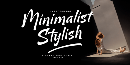 Proudly present the newest product Minimalist Stylish font. That font is inspired by brush script and modern sans, Minimalist Stylish font already has a feature in alternate, ligature, swash, and multilingual support. Minimalist Stylish font is perfect for headlines, logotypes, taglines, quotes, publishing, apparel, etc. Package includes Minimalist Stylish Minimalist Swash Uppercase, lowercase, punctuation, and numeral PUA encoded Multilingual Support in more than 25 languages
 - Gawain's Hand by Just My Type,
$25.00 Gawain Douglas was my co-worker and eventually my boss when I worked for the Tucson Citizen. He’s director of production and design for a children’s book publisher now, a very talented and creative guy and Gawain’s Hand is what his writing looks like. A shame, isn’t it? Just kidding, Gawain; I wouldn’t have featured it, if I hadn’t liked it. Really. No, really. :-)
