10,000 search results
(0.04 seconds)
- Sallyna Cattalya by Essentials Studio,
$16.00 Sallyna Cattalya Is a A Monoline Signature Font Sallyna Cattalya is perfect for product packaging, branding project, megazine, social media, wedding, or just used to express words above the background. Enjoy the font, feel free to comment or feedback, send me PM or email.
 - Valencia Nature by Timurtype,
$14.00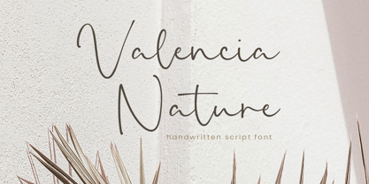 Introducing by Timur type Proudly Present, Valencia Nature Valencia Nature A Handwritten Font Valencia Nature is perfect for product packaging, branding project, megazine, social media, wedding, or just used to express words above the background. Valencia Nature also multilingual support. Enjoy the font.Thank you!
 - Admire Camelia by Timurtype,
$14.00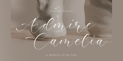 Introducing by Timur type Proudly Present, Admire Camelia Admire Camelia A Handwritten Font Admire Camelia is perfect for product packaging, branding project, megazine, social media, wedding, or just used to express words above the background. Admire Camelia also multilingual support. Enjoy the font.Thank you!
 - Creamy Baked by Timurtype,
$14.00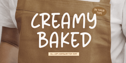 Introducing by Timur type Proudly Present, Creamy Baked Creamy Baked A Handwritten Font Creamy Baked is perfect for product packaging, branding project, megazine, social media, wedding, or just used to express words above the background. Creamy Baked also multilingual support. Enjoy the font.Thank you!
 - Simptown Boutique by Timurtype,
$14.00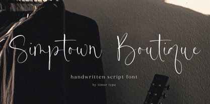 Introducing by Timur type Proudly Present, Simptown Boutique Simptown Boutique A Handwritten Font Simptown Boutique is perfect for product packaging, branding project, megazine, social media, wedding, or just used to express words above the background. Simptown Boutique also multilingual support. Enjoy the font.Thank you!
 - Crumble Bakery by Timurtype,
$14.00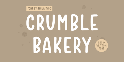 Introducing by Timur type Proudly Present, Crumble Bakery Crumble Bakery A Handwritten Font Crumble Bakery is perfect for product packaging, branding project, megazine, social media, wedding, or just used to express words above the background. Crumble Bakery also multilingual support. Enjoy the font.Thank you!
 - Simple Games by Timurtype,
$14.00 Introducing by Timur type Proudly Present, Simple Games Simple Games A Handwritten Script Font Simple Games is perfect for product packaging, branding project, megazine, social media, wedding, or just used to express words above the background. Aesthetica also multilingual support. Enjoy the font.Thank you!
 - Almond Hunter by Timurtype,
$14.00 Introducing by Timur type Proudly Present, Almond Hunter Almond Hunter A Handwritten Font Almond Hunter is perfect for product packaging, branding project, megazine, social media, wedding, or just used to express words above the background. Almond Hunter also multilingual support. Enjoy the font.Thank you!
 - Ampersorts JNL by Jeff Levine,
$29.00 Ampersorts JNL is a collection of many wood type ampersands along with a smattering of question marks, exclamation points, dollar signs and cent signs. A vintage wood type embellishment is also included on the keystroke for the number 6.
 - Mr Richmond Caps by Intellecta Design,
$11.90 a classic decoative caps from wood types era
 - Tharagaverung by Intellecta Design,
$20.90a vintage font, based in wood type samples - French Clarendon N2 by Intellecta Design,
$22.90 a revival of a classic wood type font...
 - Egiptian Ornamented by Intellecta Design,
$13.90inspired in the classical wood tye egiptian fonts - Play Day - Personal Use - Personal use only

- Rare Bird Specimen II by Rare Bird Font Foundry,
$100.00 RARE BIRD SPECIMEN II Specimen II is an elegant hand by Karla Lim of Written Word Calligraphy. It floats across the page on gossamer wings. Specimen II pairs well with classic typefaces like Baskerville, Garamond and Bodoni. OBSERVATIONS Specimen II is exquisitely delicate but not fragile. Best suited for unforgettable affairs. DEFINING CHARACTERISTICS Opentype programming, formal title & preposition wordart, 7 alternate ëandí options, Roman numerals, in and out-stroked letterforms at beginning and end of words, multiple alternate lowercase t cross-strokes, realistic double-letter ligatures, seamlessly connecting calligraphic letters, alternate capital letters, old style numerals, basic Latin encoding. POTENTIAL SIGHTINGS Wedding stationery suites, logo design, luxury product packaging, fragrance, wine labels.
 - 1968 GLC Graffiti by GLC,
$38.00 This font was inspired by the paint brushed letters in use in the 60 - 70s for protest slogans tagged on the cities walls. In those days, we didn't commonly use aerosols like today, so we used paint brushes, with paint or tar cans, drew the letters, and ran away quickly ! Capitals and lower case have the same size, and a lot of alternates characters or ligatures allows the user to vary each letter (until tree alternates for single letters) in each word of a text . Likewise, the words may be easily underscored or intersected by a few stains looking like paint spots, substituted to the following standards characters: [greater], [less], [dagger], [backslash], [bullet], and [underscore].
 - Sagarana by Eller Type,
$35.00 Sagarana is an elegant display typeface rooted in the style of romantic or didones letterforms; however, it is a sans serif with a cleaner appearance. The contrast and the vertical stress maintain the modern style, while the terminals, the finials, the proportions and the narrow look enhance its stylish personality. It could be suitable for editorial projects such as magazines, books or even for sophisticated environments, let’s say, fashion, department store, perfumes, cosmetics and so on. Sagarana was initially inspired by a Brazilian book cover from 50’s. The name itself combines the words “saga” (as in the English sense of “story”) and “rana,” a Tupi word (Indigenous language) that roughly means “showing similarities”.
 - Tall Skinny Condensed by Outside the Line,
$19.00 This is the tallest, skinniest, most condensed, non serif font I know of. I designed this because I felt a serious need for that one big, thin word to fit in a narrow space. It is great for ‘SALE!’ in a one column ad. Also is a life saver for several long words in a narrow space like Merry Christmas... If you need a full character set take a look at the new Ultra Condensed 3 font family. Ultra Condensed was based on Tall Skinny Condensed with some changes and a full character set. Ultra Condensed Lettered is a hand lettered version and Ultra Condensed Line is a lighter hand drawn version
 - ViabellaT H Pro by Elsner+Flake,
$40.00 The script version of the typeface Viabella introduces us to the calligraphic side of the Berlin type designer and typographer Karl-Heinz Lange. The sketches for this script typeface, which resulted from the close cooperation with Veronika Elsner and Günther Flake, found their roots in sketch drawings which Karl-Heinz Lange had already drawn in the 1980’s. For the Viabella design, Karl-Heinz Lange drew the basic letterforms of the Black and Regular cuts with a brush. He then re-worked the drawings and transferred them on to tracing paper. The design studio Elsner+Flake in Hamburg cut these typeface extensions and later digitized them manually with the help of the IKARUS Sustem. With the Regular cut as a basis, Elsner+Flake extended the family with the Light version and interpolated and re-worked the Medium weight. The completion of the family was taken over by the type designer Björn Gogalla who had done the same kind of work on Rotola, a design which Karl-Heinz Lange had also created for Elsner+Flake. While Viabella was originally conceived as a headline typeface, its lighter weights can certainly be used for shorter text applications. The Black version creates powerful headlines with highly effective accents. With the help of swashes, which are available for all weights, the user can lighten up longer texts and add special character to titles. In contrast to pure headline fonts, Viabella has been enriched by an extensive complement of special characters. In addition to the Europa-Plus character set which allows setting type in over 70 latin-based languages, the user will find multiple versions of numerals as well as oldstyle figures, tabular and proportional lining figures, diagonal fractions, and a complete set of superior and inferior figures and fractions (60%). With such a rich character set, Viabella is not only ideal for many different uses in the areas of newspaper, magazine and advertising but it will surely be chosen for the design of greeting cards, invitations and other design projects within the privat sphere.
 - September Spirit by Set Sail Studios,
$14.00 Introducing the September Spirit Font Duo! A hyper-realistic handwritten font duo, which utilises a large range of ligatures (uniquely designed letter combinations), and alternate characters—all taken from real handwritten words—to achieve an incredibly natural handwritten style. As well as the fast-flowing handwriting font, September Spirit also include an all-caps version, great for combining with the regular font for adding emphasis to words, or even as it's own standalone font. Not only that, a bonus font of extra circles, underlines & arrows is included to add even more emphasis and an additional hand-crafted aesthetic. The September Spirit family includes; September Spirit • A fast-flowing handwritten font containing upper & lowercase characters, numerals, and a large range of punctuation. September Spirit Alt • This is a second version of September Spirit, with a completely new set of both upper and lowercase characters. If you wanted to avoid letters looking the same each time to recreate a custom-made style, or try a different word shape, simply switch to this font for an additional layout option. September Spirit All Caps • An uppercase-only font, perfect for pairing with the regular September Spirit fonts to add emphasis to words or phrases. September Spirit Extras • A bonus font containing 19 hand-drawn arrows, cirlces and underlines. Ideal for adding to your September Spirit text for extra emphasis. Language Support • September Spirit supports the following languages; English, French, Italian, Spanish, Portuguese, German, Swedish, Norwegian, Danish, Dutch, Finnish, Indonesian, Malay, Hungarian, Polish, Croatian, Turkish, Romanian, Czech, Latvian, Lithuanian, Slovak, Slovenian
 - Perdido by Scriptorium,
$12.00Perdido is a classic western-style font, with the added twist of the addition of a degenerated wood grain, so that the characters naturally look like aged and cracking wood. With the addition of an appropriate texture it's very convincing. - Happy arila script by Sulthan Studio,
$10.00 Happy arila Hello, I made two handwritten fonts, one with thickness and can be used for whatever you are working on clarifying what you want to display, and a smooth script font is also here to make your work be sweeter
 - Mamut by Totem,
$29.00 Mamut is a display type family of three weights. It has elegant and distinctive letterforms with lots of character. Mamut is your chunky friend, perfect for designing headlines, logos, labels, lettering works, posters and lots of eye-pleasing typographic works.
 - Plaza by ITC,
$29.99Plaza is the work of British designer Alan Meeks, an Art Deco sans serif style. It includes many alternative characters which offer endless possibilities. Plaza is ideal for work in which a feel of the 1920s or 30s is desired. - Emirose by Ergibi Studio,
$16.00 Emirose consists of 4 weights: Thin, Light, Regular and Bold, all equipped with many ligatures and alternative letters that look cute and classy. They work very well for your work such as logos, brands, packaging, posters, invitations, headlines, posters, and more.
 - Stempel Garamond LT by Linotype,
$29.99 Opinion varies regarding the role of Claude Garamond (ca. 1480–1561) in the development of the Old Face font Garamond. What is accepted is the influence this font had on other typeface developments from the time of its creation to the present. Garamond, or Garamont, is related to the alphabet of Claude Garamond (1480–1561) as well as to the work of Jean Jannon (1580–1635 or 1658), much of which was attributed to Garamond. In comparison to the earlier Italian font forms, Garamond has finer serif and a generally more elegant image. The Garamond of Jean Jannon was introduced at the Paris World’s Fair in 1900 as Original Garamond, whereafter many font foundries began to cast similar types. The famous Stempel Garamond interpretation of the 1920s remains true to the original Garamond font with its typical Old Face characteristics. The bold italic was a modern addition at the end of the 1920s and the small caps provided an alternative to the standard capital letters. In the mid 1980s, a light version was added to Stempel Garamond. Since its appearance, Stempel Garamond has been one of the most frequently used text fonts.
 - Boxy by Hackberry Font Foundry,
$24.95 In my on-going quest for display fonts to be used with my books and on my book covers, I decided I need a squared sans serif. I started the build off of Fiscal, a font I designed back in 2006. I never liked the font, plus my tastes have changed. So, I opened it, made it narrower, increased the x-height, and various stuff like that. I made it much heavier—an ended up with Boxy. Then my brain slapped me and said, "Why don't you make a sorta modern version?" So, I did and decided to call that style Chic. But then I wanted a thin version also. Fiscal was always too heavy and ponderous for me. So, I made the Thin style. Finally, I felt I needed an italic of Chic. OpenType features didn't seem to work well with the family, so all I added was oldstyle figures. So, I ended up with another of my unique families—with two unmodulated fonts: Thin and Medium, and two modulated fonts: Chic and Chic Italic. But, I'm pleased with it. My hope is that you will like it also.
 - Haunted Brick by LetterStock,
$20.00 Introducing “Haunted Brick” – The Spooky Halloween Decorative Font Dive into the eerie world of “Haunted Brick,” a spellbinding decorative Halloween font that will send shivers down your spine. Perfect for crafting captivating Halloween posters, invitations, and chilling social media posts, this font boasts a unique hand-drawn style adorned with intricate spider webs in every glyph. Key Features: Spine-Chilling Elegance: “Haunted Brick” strikes the perfect balance between elegance and the macabre, adding a spine-chilling touch to your Halloween designs. Creepy Creativity: Whether you’re conjuring up posters, eerie invitations, or haunting social media content, “Haunted Brick” lends an air of mystery and excitement to your projects. Intricate Spider Webs: Every character in “Haunted Brick” is intricately adorned with spider webs, ensuring that your text is truly one-of-a-kind and perfect for all things Halloween. Why Choose “Haunted Brick”: – Elevate your Halloween designs with a font that’s both spooky and stylish. – Craft invitations that send shivers down the spines of your guests. – Create captivating posters that will haunt the memories of those who see them. – Perfect for adding a dose of horror to your social media posts. Embrace the Spookiness – Download “Haunted Brick” Now!
 - Muisca by JVB Fonts,
$25.00 Muisca, that in its early edition was named as «Muisca Sans», was developed in mid-1997 and based on the graphic concept of pre-Columbian characteristics figures within some of the very few visual elements recovered from the Muisca culture. This ancient pre-Columbian tribe disappeared since the arrival of the Spanish 500 years ago, in what is now the center of Colombia. In fact, the name of the capital Bogotá goes back to Bacatá as primary or village downtown of what was once the imperial capital of the Muisca tribe. This typographic project was submitted as my work for the degree in Graphic Design, obtained in September of that year (at the Universidad Nacional de Colombia), under the creative concept of vindicating the ancient culture and identity through a functional typeface, into a fact without precedent in the country. Muisca was recently edited, arranged and completed, including multilingual diacritic glyphs to be versatile in several languages. Related and inspired by Latin America, Ethnic, Native, Tribal, Mysthical, Handmade, Aboriginal, Pre-Hispanic, Pre-Columbian, Textured, Fantasy. Ideal to be used in logos, display text & titles, games and other design applications that reminds of the Pre-Hispanic art.
 - Bartosh by jpFonts,
$19.90 Bartosh is the American short form for Bartholomew. Although I chose this font name because of its sound and its short conciseness, I also liked the fact that Bartholomew had been one of the 12 apostles who had worked in India and Iran and the idea that his spirit could be the inspiration for my work.Bartosh was designed for display on the screen: the large x-height and the clear, open shapes facilitate readability. As a result, it develops a strong expression of character and makes it ideal for headings or highlighting individual text passages – it is ideal for captions of any kind. In each of the six weights, it unfolds its own and special charm. The extra-bold version is particularly noteworthy because fonts in this stroke width are rare and it is precisely these extreme bolds that give them a special graphic appeal.For all fonts there are matching italics in a well-developed set of 677 characters. In addition, it is possible to change the digits and currency characters from proportional to tabular or OldStyle via the OpenType feature, and small caps are also available in all fonts.
 - Orelia Display by Orenari,
$20.00 Introducing our latest retro font design: Orelia Display font, a modern take on classic mid-century typography. Our simple retro font is designed to be humble yet eye-catching, with clean lines and simple shapes that evoke a sense of nostalgia while remaining relevant and contemporary. This font is perfect for projects that require a touch of retro charm without overwhelming the design. Its understated appearance makes it ideal for minimalist designs, logos, and branding, while the bold letterforms ensure that it still catches the eye. Crafted with care and attention to detail, our simple retro font is available in a variety of weights and styles, allowing you to customize your design and make it truly unique. Whether you're creating a retro-themed website, designing a product with a vintage twist, or simply want to add a touch of nostalgia to your work, our simple retro font is the perfect choice. With its timeless appeal and modern design, our simple retro font is sure to become a go-to choice for designers and creatives who appreciate the beauty of simplicity. Purchase now and add a touch of retro charm to your next project!
 - Priori Serif by Emigre,
$59.00 After the popular successes of Exocet and Mason, Emigre has once again teamed up with Jonathan Barnbrook to bring you his latest venture into type land. Priori is a logical progression from Mason, a typeface he designed around ten years ago. Where Mason was designed purely for display purposes and featured only caps, Priori includes lower case, companion serif and sans serif versions, alternates and, according to its creator, is shooting for text face status - a bold claim from a designer who loves to wear his influences on his sleeve and who has little use for typography that aspires to be "neutral" or "transparent." Like many of Barnbrook's typeface designs, Priori is based on his interest in British typography of the early 20th century. It is inspired by the work of famous British typographers, such as Eric Gill and Edward Johnston. But it also embraces all of the signage and lettering that Barnbrook observes in the streets, cathedrals, and public buildings of his London neighborhood. This mixing of native influences with a contemporary pop culture intent is what gives Barnbrook's types a distinct and unique flavor. Like its creator, Priori is a one of a kind.
 - Pawl by The Ampersand Forest,
$20.00 Meet Pawl, an affordable 48-font squarish sans family with a little grotesque in him! Oh, you may think you’ve got him pegged at first glance, but he’ll surprise you with his versatility. AND he's just been totally refurbished from top to bottom and boy, did he need it! Pawl lives in the same visual landscape as fantastic modular superfamilies like Eurostile, Agency, Geogrotesque, Barlow, and even the great American Gothics. Unlike those faces, though, he's nimble enough to switch between looks effortlessly. Pawl is energetic, aggressive, strident, and structural. Depending on how you use him, his voice can be retro, futuristic, industrial, or sleek. He can be sober or splashy, techy or oldschool. Use his alternate characters and stylistic sets to create looks ranging from Streamline Moderne to Futurism to Brutalism to Swiss. He works from small paragraphs all the way up to monumental signage. This guy is smart and useful, with a lotta looks! How many times have you needed multiple weights, styles, and widths for your hierarchy, but standard type families were either shockingly expensive or couldn't deliver? Pawl delivers. Give him a shot!
 - Mariachi by FontMesa,
$25.00 Mariachi is a new condensed version of our Maison Luxe font which is a revival of an old 1800's classic ornate French font. This new 2021 condensed version takes this old classic to an all new level by adding small caps, italics and a new solid black version. Mariachi is perfect for headlines and logos from advertising to product labels, t-shirt lettering and restaurant menus. Fill fonts are also part of this family, new to this font style is the half fill font for creating a two color effect on the letters, you'll need an application that works in layers to use the fill fonts in Mariachi. The regular fill font for Mariachi isn't meant to be used as a stand alone font so we've created a solid black version with thicker serifs on top and adjusted outlines throughout for a better appearance as a solo font. The difference between Mariachi and our Mi Casa font is that Mariachi has a squared off shadow on the top half of the letters. We hope you enjoy Mariachi as much as we did making it. Mariachi is a trademark of FontMesa LLC
 - Hickory by FontMesa,
$25.00Hickory is the revival of an old unnamed font dating back to 1852 and was sold through a few different type foundries including Bruce, MacKellar Smiths & Jordan and James Conner's Sons. By the year 1900 this font disappeared from the major type foundries, now with the digital age of type we're proud to revive this old classic font that hasn't been used in over one hundred years. The original font was only available as an uppercase with punctuation and an ampersand. Today the character set has been updated to include a new lowercase, numbers and accented characters for Eastern, Central and Western European countries. Three fill fonts have been created for the Hickory font making it easier for you to add different colors, textures and patterns to the letters. You will need an application that works in layers such as Adobe Photoshop or Illustrator in order to use the fill fonts, some fill fonts may look good as a stand alone font, the Hickory fill fonts however do not look good used apart from the Hickory main font. I hope you enjoy this old font as much as I did making it. - Ornery Polecat JNL by Jeff Levine,
$29.00 In January of 2006, Jeff Levine fonts debuted with ten releases. Many of those first fonts were based on vintage lettering stencils, which were the "school years" catalyst for Jeff's interest in lettering and type design. Eight years later, his collection of fonts has become a giant catalog of display type ranging from Wood Type revivals to Art Nouveau, Art Deco to stencil, reinterpretations of old favorites, experimental fonts, dingbat fonts and typefaces reflecting a particular decade's styles of cultural popularity. Designs from old lettering books, type catalogs and advertising have also been fodder for many alphabets not previously available in a digital format. Along the way, many unusual lettering sources were also mined for type ideas. Vintage packaging, hand-lettered signage, sign making kits, rubber stamp type, water applied decals and at times just a singular letter example inspired many of the releases within this collection. It was a source of pride for Jeff Levine Fonts to reach 500 releases and a determined goal to grow the type library as far as possible. With this in mind, February 2014 brings forth many new releases. This one in particular, Ornery Polecat JNL, is the 800th typeface release from Jeff.
 - Hand Shop Pack by Fontscafe,
$29.00 We’re really excited to unveil our all-new line of ‘HAND SHOP FONTS’. As the name suggests, these are fonts that have a hand-made or hand-typography feel reminiscent of shop signboards from the past with an attentive focus by the shop owners, always looking to discover exciting and unique ways to promote their products or services. While for decades typography has strived hard for perfection, one of the routes taken by the typography world as a whole has been to eliminate any form of ‘human imperfection’ in the typesets, but what about the times when you DO want to send across emotions of a personal human touch through your fonts? We did a step back...these fonts will give your shop-signs a personal touch, telling your buyers that they will get personalized attention, be it through an online or an offline business…We hope you love them as much as we do. The “Hand Shop EXTENDED Pack” containing a total of 14 fonts from the “Hand Shop Banners & Elements Pack” (3 fonts) , the “Hand Shop Typography Pack 01” (8 fonts) and the “Hand Shop Typography Pack 02” (3 fonts)
 - Ardentia by Asritype,
$19.00 Ardentia is a serif typeface, supporting a wide range of Latin based languages and Greek (see TechSpecs). Ardentia was created inspired by most serif text font used in book printing. Smooth curves help the flow for long text reading. Ardentia is designed with medium contrast in order to have all parts of the letter’s shape well printable in book size printing, for high or low resolution printers, high or low paper quality. Other than book printing, the medium contrast also gives good visibility in display thanks to its clearness. Thus, Ardentia will work well for both printing and display, webpage or electronic/digital display. Ardentia consist of 4 weights: Light, Regular, Semi-bold and Bold, plus matching italics. The thickness of the lowercases (vertical stem) of the regular font is drawn at about the middle of the thickness of similar kind (serif) and similar size fonts. So Ardentia is the right choice for both textbook and display altogether. Being a normal serif typeface, Ardentia is applicable to a wide range of usage. From book typing, news, magazines notes, cards, sticker texts, banners, to logos and the others design mean. Enjoy using Ardentia for your projects.
 - Lattolatoo by Zamjump,
$17.00 Lattolatoo is a unique modern display font with a fun and trendy kind of street style twist. From poster designs to t-shirts and packaging, Lattolatoo will give your designs an alternative to the minimal look and supercharge your creative work. Lattolatoo is hand-drawn, having an almost handwritten appearance; the characters skip the baseline giving it a charming yet modern look and feel. Alternative All characters A to Z one alternative. To make your text look less repetitive, you can substitute the letters for something else—this makes your design look more like handwriting. Ligature Lattolatoo has standard ligatures, 7 of them in total. You can activate it through the glyph panel in Adobe applications. The binder makes a huge difference in the look of Beautiful Freak. It switches the order of two popular letters making your design look more individual. opentype Please note: Alternatives and Binders use OpenType features. Therefore, you'll need a design application to access these options—an application such as Adobe Photoshop, Illustrator, or InDesign. Included : - Uppercase glyphs only (This font is unicase) - Punctuation, Symbols, and Numbers - Alternate A-Z characters (1 character) - 7 Ligatures - Support for Central, Western, and Southeast European characters
 - Priori Sans by Emigre,
$59.00 After the popular successes of Exocet and Mason, Emigre has once again teamed up with Jonathan Barnbrook to bring you his latest venture into type land. Priori is a logical progression from Mason, a typeface he designed around ten years ago. Where Mason was designed purely for display purposes and featured only caps, Priori includes lower case, companion serif and sans serif versions, alternates and, according to its creator, is shooting for text face status - a bold claim from a designer who loves to wear his influences on his sleeve and who has little use for typography that aspires to be "neutral" or "transparent." Like many of Barnbrook's typeface designs, Priori is based on his interest in British typography of the early 20th century. It is inspired by the work of famous British typographers, such as Eric Gill and Edward Johnston. But it also embraces all of the signage and lettering that Barnbrook observes in the streets, cathedrals, and public buildings of his London neighborhood. This mixing of native influences with a contemporary pop culture intent is what gives Barnbrook's types a distinct and unique flavor. Like its creator, Priori is a one of a kind.
