5,633 search results
(0.072 seconds)
- Idealist Sans - 100% free

- Fairy Strange - Personal use only

- Rumpelstiltskin - Personal use only

- Futurex SCOSF - Unknown license

- Futurex Transmaat - Unknown license

- KR For Baby B - Unknown license

- Kuenstler 480 by ParaType,
$30.00 The Bitstream version of Trump Mediaeval of Linotype, 1954-60, by Georg Trump, a prolific German type designer. It seems to be his best typeface. It has a vigorous and assumed oldstyle roman and italic that is the sloped roman, except for the letters a, e, f. With its crisp angularity and wedge-shapes serifs, Trump Mediaeval appears carved in stone. It is a strong text typeface that is highly legible and especially useful for low-resolution output. It is useful in display work too. Cyrillic version developed for ParaType by Vladimir Yefimov and Isabella Chaeva and released in 2010. Cyrillic italics maintain the main feature of Trump Mediaeval to be the sloped roman, except for the letters г, д, и, й, n, т. There are old style figures, additional ligatures and fractions available at all styles and small caps at the Roman 55. Black style was added in 2011 by Vladimir Yefimov.
 - AW Conqueror Std Slab by Typofonderie,
$59.00 Slab serif with a 70’s aesthetic A version of AW Conqueror Sans, AW Conqueror Slab draws inspiration from geometrical slab serifs of the 1930s, of which Rockwell is a perfect example. Lubalin Graph, a reworking of the genre, came out in the wake of the Avant Garde wave of the early 70s. In recent years, ‘slabs’ have made a comeback in the graphic design world. AW Conqueror Slab advances the cause quite happily. AW Conqueror superfamily AW Conqueror Didot is part of a larger family, who include 4 others subfamilies with great potential: They’re but based on same structure, with some connection between them (width for example), to offer a great & easy titling toolbox to any designers, from skillful to beginner. Each of the members try their best to be different from the others because of their features. They should work harmoniously in contrast. Club des directeurs artistiques Prix 2010 European Design Awards 2011
 - AW Conqueror Std Didot by Typofonderie,
$59.00 Homage to 70s phototype typography in 3 styles The AW Conqueror typeface family is a nod to the spirit of phototype typefaces and transfer lettering from the early 70’s. Founded by Ed Rondthaler, Photo-lettering catalogs swarmed with more daring typefaces than the others. Both transfer letter and phototitling have liberated the principle of letter-to-letter spacing, previously impossible with metal type. Phototype allowed operators to position millimeters, on the fly, letter after letter: words, sentences according to the specifications of the art director. AW Conqueror superfamily AW Conqueror Didot is part of a larger family, who include 4 others subfamilies with great potential: They’re but based on same structure, with some connection between them (width for example), to offer a great & easy titling toolbox to any designers, from skilful to beginner. Each of the members try their best to be different from the others because of their features. They should work harmoniously in contrast. Club des directeurs artistiques Prix 2010 European Design Awards 2011
 - Sanchez by Latinotype,
$- CHECK OUT Sánchez Niu (new, nova, neue, next) Sánchez, designed by Daniel Hernández, is a serif typeface belonging to the classification slab serif, or Egyptian, that bears a strong resemblance to the iconic Rockwell, but with rounded edges— offering contrast and balance to the square structure. Sánchez & Sánchez Condensed comprises 12 variants, ranging from extra light to black, each of the same x-height. Regular and Italic variants are available for free. Download specimen pdf
 - ITC Arid by ITC,
$29.99ITC Arid was designed by Rob Leuschke in 1997 as a lively calligraphy typeface which looks as though it was put to paper with a piece of charcoal. Generous capitals mix harmoniously with the more reserved lower case characters and the forward slant of both create a dynamic impression. Arid should be used in point sizes of 12 and larger and is well-suited for headlines and short to middle-length texts. - Linotype Boundaround by Linotype,
$29.99Linotype Boundaround is part of the Take Type Library, selected from the contestants of Linotype’s International Digital Type Design Contests from 1994 and 1997. German artist Christina Sachse gave her font a mystical feel. The vertical strokes meet the base line at a point and the strokes vary in their width. The lively Linotype Boundaround is suitable for shorter texts in point sizes 12 or larger and for headlines in larger point sizes. - Regnante by BustanType,
$19.00 Regnante was created with all of my heart. It has a luxury style, is stylish and lovely, and has a strong personality, so it will catch your attention. This font is ideal for a wide range of tasks including branding, logos, packaging, and more. Regnante includes 12 fonts, including 4 weight variations and Italic style. Regular and Alternate are come separately. You can make your selection based on your personal preferences and requirements.
 - Mestiza by Antonio Lechuga,
$30.00 Mestiza is a type family with a living past, which combines its ancient roots with the handmade and the contemporary in a spirited mix that evokes elegance and strength. Thanks to its sharp terminals and high contrast, Mestiza acquires a unique personality. It is ideal for headlines and branding projects. Mestiza has 12 variants, six Roman plus Italics including Small Caps, Old-Style numbers, Superiors, Inferiors, Contextual and Discretionary ligatures, Symbols, and some Alternates.
 - Woodstock by Linotype,
$29.99Woodstock is a round, heavy, lovable serif display typeface. Just as music brought many together in the spirit of love during the 1960s and the Woodstock music festival, this face brings a smile to the eye of the beholder. Many traces of the hand can be seen in the curves and the joins of Woodstock's forms. Try using Woodstock in headlines, logos, or greeting cards, in point sizes from 12 on upward. - Wedding Text by Monotype,
$40.99Wedding Text was designed by Morris Fuller Benton in 1901 for American Type Founders (ATF). The face was so popular that its forms soon began appearing with other font foundries under different names, Elite Kanzlei with D. Stempel AG, Comtesse with C.F. Rühl, Linotext with Linotype, etc. Its ornamental forms are not considered very legible by today's standards; therefore it should be used for headlines and short texts in point sizes 12 or larger. - Grand by North Type,
$- Inspired by old school sign painting techniques, Grand is a display condensed sans serif that isn't shy to put its foot down. Its verticality and bulky curves combined with its sharp angular connections between the bowls and stems give Grand a distinctive look and feel. It comes in 12 styles (6 weights and accompanying italics), and supports over 200 languages. Grand Regular and Grand Italic are both available for free (personal and commercial use).
 - Slabic by Tour De Force,
$30.00 Slabic is modern slab serif font family available in 12 styles. It’s main characteristics are gently rounded edges, unique serifs and ink traps. Looks and feels compact, harmonized and visually balanced, so readers flow don’t get interrupted during reading. Slabic recommends itself for editorial use or main body webfont, for logos, package design and posters. Slabic contains Small Caps, Fractions, Tabular and Old Style Numerals as Open Type features. Supports extended Latin character map.
 - EXPATRIATE by UICreative,
$23.00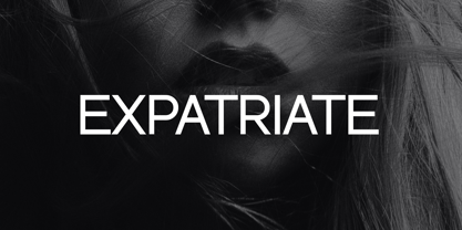 Introducing our new product the name Expatriate Sans Serif Font Family comes with 12 different weights. Modern Sans Serif font that beautiful classy, elegant, and modern. This font is perfectly suited for a wide variety of projects, such as signature, stationery, logo, wedding, typography quotes, magazine or book covers, website headers, clothing, branding, packaging design, and more. Also for fashion-related branding or editorial design and displays both masculine and feminine qualities.
 - Old Harbour by DimitriAna,
$12.00 Old Harbour is a font collection of 12 hand drawn fonts inspired by the vintage hand lettered signage, the old bottles’ labels and the aesthetic of my favourite old school tattoos. The fonts can work together in endless combinations, to create beautiful vintage designs for apparel, logos, labels, posters or any merchandise product you can imagine. All the fonts support Western European languages based on Latin script and delivered in OpenType and True Type format.
 - ITC Bailey Quad by ITC,
$29.99 ITC Bailey Quad Bold was designed by Kevin Bailey in 1994. It is a semiserif typeface in the style of slab serif faces. The unusual placement of some serifs and unconventional forms of some characters give the font a modern feel. The overall look of Baily Quad Bold is robust and strong and the font is best used in headlines and short to middle length texts in point sizes of 12 and larger.
 - Praho Pro Stencil by Picador,
$29.00 Praho Pro is a part of Warsaw Types – a project based on Warsaw’s local typographic heritage. The project, presented at the Museum of Praga, is a collaboration of 12 young Polish typographers. Praho Pro Stencil is a multilingual family inspired by the unique, historical character of Praga district of Poland's capital - Warsaw. High contrast, thin serifs, sharp terminals and large x-height are key features for distinctive headlines. Now available as a stencil version!
 - Castle by Linotype,
$29.99This family, which includes faces in light, book, bold, and ultra weights, more stroke contrast than is typical of sans serifs, making it very legible in text. Because of its large x-height, it is recommended for used in point sizes ranging from 12 point upward. Of course, it functions well in display sizes, too. The contrast between the four weights makes this family optimal for use in hierarchical advertising systems, and corporate identity uses. - ITC Static by ITC,
$29.99Static looks almost like it was stamped on paper: the black color is not evenly distributed and the background comes through the letters and consciously irregular forms reinforce the effect. The characters do not all have the same height, nor do they stand straight and regularly on the base line. Static is a robust font with bold, rounded serifs and is best used for headlines and short texts in point sizes of 12 and larger. - Afterglow by Vintage Voyage Design Supply,
$18.00 Elegant and so stylish serif typeface full of contrast lines, a lot of Stylistic Alternates with thin swashes. Some letters has up to 12 of them. Use only capitals for headers or quotes, it looks strong and refined, or use Caps with lowercase for block texts, or subheaders. Design your art- or beauty blogs, t-shirts or websites, posters, magazines or cards, and logo's of course. You will return to this font again and again.
 - Playful Runway by UICreative,
$23.00 Introducing our new product the name Playful Runway Sans Serif Font Family comes with 12 different weights. Modern Sans Serif font that beautiful classy, elegant, and modern. This font is perfectly suited for a wide variety of projects, such as signature, stationery, logo, wedding, typography quotes, magazine or book covers, website headers, clothing, branding, packaging design, and more. Also for fashion-related branding or editorial design and displays both masculine and feminine qualities.
 - Brannboll Fet - Personal use only

- Shipped Goods 1 (Personal Use) - Personal use only

- Respective - Personal use only

- The World Is Yours - Personal use only

- Milkmoustachio - 100% free

- Psychoscout by Absoluut Designers,
$30.00 Psychoscout is an initial cap font, originally developed for the Psychoscout record by Flat Earth Society (2006). In 2011 the font was updated for commercial use. It's highly recommended for headlines or posters. It can also be used as a stencil for decorating walls etc.
 - Clocko by upirTYPO,
$7.00 Clocko automatically turns the time stamp text into an analog clocks using the OpenType ligatures. Even when the ligatures are turned off, the time is still visible and readable, and it does not change or ruin the layout. Perfect for web usage and even for small sizes. For a crisp look, please use sizes divisible by 30, for example 30pt or 60pt. To make a custom analog clock, type any uppercase or lowercase letter to have a border (see previews for examples), and then type the time in 12 hour or 24 hour format with or without seconds. Use colon, comma, semicolon, hyphen, period or plus as a separator. Few examples: 12:45 9:25:46 10.50 13:30.10 The borders can be mixed together for more interesting look, please see the screenshots above. An additional background shape can be added to the clocks by typing a symbol (! # $ % & ( ) < = > ) as a first character, for example %A12:40:55. Please note that in order to keep the clocks visible, the background shape and the clocks need to have a different colors.
 - Jatina Script - Personal use only

- CONFLICT DRIPS PERSONAL USE - Personal use only

- Manics - The Holy Bible - Unknown license

- Futurex Distro - Protection - Unknown license

- Futurex Distro - Survival - Unknown license

- Futurex Distro - Numb - Unknown license

- Flying Peace PERSONAL USE - Personal use only


