10,000 search results
(0.061 seconds)
- Fairy Strange - Personal use only
- Mutlu - Unknown license
- Nadejda - Unknown license
- Nyctophobia - Personal use only
- Cookies - Unknown license
- Shortbrush - Personal use only
- Radio 187.5 - Personal use only
- Jack Fancy - Unknown license
- Insecurity - Unknown license
- Shower Flower - Unknown license
- Holtzschue - Unknown license
- Komika Text - Unknown license
- Bionic Comic - Personal use only
- Tom-Bombadill - Personal use only
- Crosspatchers delight - Unknown license
- Chantelli Antiqua - Unknown license
- Sappy Mugs - Unknown license
- Tin Doghouse - Unknown license
- bobTag - Unknown license
- Meet John Henry - Unknown license
- Kitsu XD - Unknown license
- Toppo Giggio - Personal use only
- Florimel™ - Unknown license
- Gordon Heights - Personal use only
- Jailbox1 - Personal use only
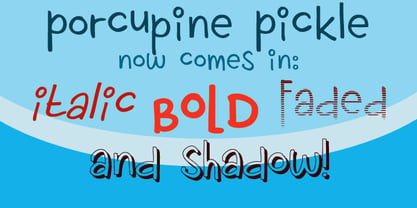
- Porcupine Pickle by Hanoded,
$20.00 - Sans Original by Thaddeus Typographic Center,
$25.00 - Ultimate Ornaments by Gerald Gallo,
$20.00 - Digby by Atlantic Fonts,
$26.00 - Flower Doodles by Outside the Line,
$19.00 - remakeoffabulous3 - Unknown license
- Rikkia by Matt Chansky,
$21.00 - Intramural JL - 100% free
- Frutiger Capitalis by Linotype,
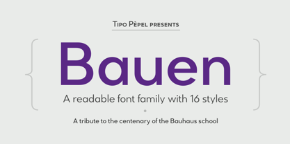
$29.00 - Bauen by Tipo Pèpel,
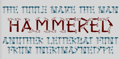
$22.00 - Hammered by Ingrimayne Type,
$14.95 - Pricing Labels JNL by Jeff Levine,
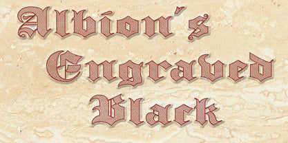
$29.00 - Albion's Engraved Black by Greater Albion Typefounders,
$15.00 - Nexgen SLD by Alphabet Agency,
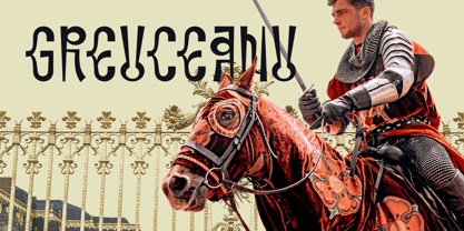
$20.00 - Greuceanu by DePlictis Types,
$36.00


