10,000 search results (0.037 seconds)
  1. Dream of me - Unknown license
  2. Squeeze Me Baby! - 100% free
  3. Close to Me - Unknown license
  4. colour me purple - Personal use only
  5. KR Bite Me - Unknown license
  6. you found me - Personal use only
  7. So Sue Me - Unknown license
  8. Tip Me Cheapy - Unknown license
  9. KR Call Me - Unknown license
  10. Let Me Ride by Mans Greback, $59.00
  11. Kiss Me Dead by PizzaDude.dk, $20.00
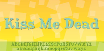
  12. Stand By Me by Natural Ink, $12.00
    Stand By Me Display is a modern calligraphy design, including Regular. This font is casual and beautiful with swash. Can be used for various purposes. such as logos, product packaging, wedding invitations, branding, headlines, signage, labels, signatures, book covers, posters, quotes, and more.
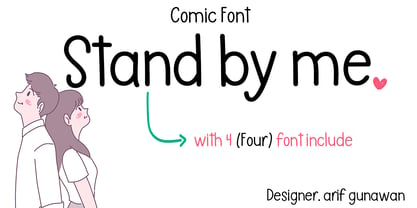
  13. Believe In Me by PizzaDude.dk, $20.00
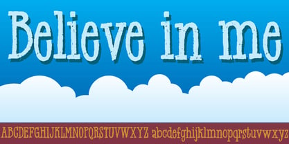
  14. Talk To Me by PizzaDude.dk, $20.00
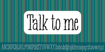
  15. Stay With Me by PizzaDude.dk, $20.00
    Slightly grungy and blurred-edged combined with a thick stroke and a fat drop shadow. This font is eye catching in many ways!
  16. FS Me Paneuropean by Fontsmith, $90.00
    Mencap When most of us go about everyday tasks, we take for granted the reading that’s involved, on instructions, labels and so on. For people with learning disabilities, reading is made much harder by certain fonts. FS Me is designed specifically to improve legibility for people with learning disabilities. The font was researched and developed with – and endorsed by – Mencap, the UK’s leading charity and voice for those with learning disabilities. Mencap receive a donation for each font license purchased. Every letter of FS Me was tested for its appeal and readability with a range of learning disability groups across the UK. Inclusive Fontsmith were determined to design a font that was accessible to those with learning disabilities without standing out as such – one that was inclusive of all readers. It should comply with accessibility guidelines and work best at 12pt, but still have a character of its own that was warm and approachable. “So much accessible design is done separately to the main body of brand work,” says Jason Smith. “We wanted to make a typeface that covered both brand tone and neutrality, and that could be used legitimately as a brand font as well as in accessible design.” Me, you, everyone FS Me is about design that doesn’t patronise. People with learning disabilities are often treated as inferior by childlike design. FS Me is designed for adults, not children – a beautifully-designed font for everyone. Its features include very subtle distinguishing elements of each letter to aid the reading and comprehension of texts, and tails, ascenders and descenders that have been extended for extra clarity. What the people said... Here is a sample of comments from the extensive research groups that helped to shape the letterforms of FS Me: “I want something round, clear and friendly.” “We like movement in the letters but don’t want anything childish.” “The ‘b’ and ‘d’ need to be different as they can be confused.” “I prefer the handwriting-style ‘a’.” “It’s important to have an accessible ‘a’ and ‘g’. Teachers sometimes complain that learners cannot read or understand the inaccessible ‘a’ and ‘g’.”
  17. Pardon Me Boy! by Greater Albion Typefounders, $8.00
    Pardon me boy, is that the Chattanooga Choo-choo? Well, not quite, but "Pardon Me Boy!" is a set of silhouette based ornaments capturing railway locomotives and rolling stock from around the world. Use it to form up trains to make suitable themed rules and borders, or just for fun anywhere a bit of locomotive power will add life and movement!
  18. Schnebel Sans ME by URW Type Foundry, $35.99
    It took me 12 years to bring this extensive font family to completion. A lot has been changed, transformed, peeled and developed in all those years. For many of my projects I used it as my quarry and so it might have become something like a synthesis of all my imaginations and experiences. To me »Schnebel Sans« represents the optimal design of a contemporary grotesque that perfectly unites dynamics with statics. For copy text the typefaces are very legible, neutrally and remain in the background, but despite this generate the necessary tension when set as headlines. »Schnebel Sans« is available in 48 different styles. It is available as a Pro Font, containing West, East Greek, and Cyrillic or as the Schnebel Sans ME, also containing Arabic and Hebrew. The scripts include small caps and various figure sets.This big range of styles from Thin to Black and from Compressed to Expanded offer many possibilities for design and fulfill all requirements for a professional use. Because of the supplement of several non-Latin character sets, the »Schnebel Sans« is perfectly suitable for global services too. Volker Schnebel, 2016
  19. Millrich Reading NF by Nick's Fonts, $10.00
    The 1918 specimen book of the Miller and Richard Type Foundry of London and Edinburgh featured this endearing typeface. Both versions of this font include the complete Latin 1252 and Central European 1250 character sets, as well as a very tasty f_f_i ligature.
  20. Joy Of Reading by Typephases, $25.00
    The theme in these illustrations is the pleasure of books and reading wherever you are, at any time. This series collects illustrations of people enjoying the pleasure of reading in the most diverse places and situations, some of them frankly absurd and funny, ranging from children reading tales to a witch with her magic brewing manual. A fraction of the contained images comes from other Whimbats, but most of them are exclusive. We hope you will feel like reading and start reading a good book! These illustrations are ready to use at any size and in any application (their vectorial format ensures they can be scaled to any size with no loss of sharpness). They can be used out of the box, or easily customized in any graphics program, adding colour or texture, resizing, combining... the variety of suggested uses is huge, from small spot illustrations to full-page layouts. Use them to great effect in magazine spreads, advertisements, stationery, packaging, bulletins or poster creative designs.
  21. GR Read Family by Garisman Studio, $20.00
    GR Read is a very cool font for headline designs with a bold and bold theme. With a strong display and clean nodes make text in the design become more character and great. Inspired by headline trends in a poster or magazine today. So that with a firm and a very modern style makes your design better! This font is formed from the headline display font of a very careful title. GR Read has about 350 flying machines. Suitable for all graphic design projects, prints, logos, posters, t-shirts, packaging, website, ticket and applies to several types of graphic design. Especially for the use of a title! Very suitable! GR Read is compatible with any software without pain, especially in headlines with GR Read pairing
  22. The Reading Display by Great Studio, $19.00
    The Reading Display is a new editorial serif with all clean and soft lines, tight curves, and a trendy elegant look. The Reading Display has two versions of the font, namely Regular Serif & Condensed Serif which are equipped with an italic version style, very suitable for your design needs such as very suitable for creating nostalgic designs but still clean and elegant such as headlines, magazines, logos, packaging, editorial, and so on. much more. Cheers, Great Studio
  23. KG Dancing on the Rooftop - Personal use only
  24. VTC-Bad Tattoo Hand One - Personal use only
  25. KG Party on the Rooftop - Personal use only
  26. As seen on TV Skew - Unknown license
  27. For The One Hundreth Time - Unknown license
  28. KR Back On The Farm - Unknown license
  29. KG Party On The Rooftop by Kimberly Geswein, $5.00
    In both chunky and tilted/3D versions, this font gives a dose of fun!
  30. PictiFont’s newest symbol set, intended to be used within any of the PictiFont™ typefaces, features a sampling of the seashore. From seashells to sailboats, surfboards to sunshine, here are the symbols you need to make all things summer a breeze! Sunscreen anyone?
  31. M HG Hagoromo T HK by Monotype HK, $523.99
    HK series fonts are in Unicode encoding and consists of BIG 5 character set and HKSCS characters. The character glyphs are based on the regular Traditional Chinese writing form and style. It is generally used in Taiwan ROC, Hong Kong and Macau.
  32. M HG Kyokashotai T HK by Monotype HK, $523.99
    HK series fonts are in Unicode encoding and consists of BIG 5 character set and HKSCS characters. The character glyphs are based on the regular Traditional Chinese writing form and style. It is generally used in Taiwan ROC, Hong Kong and Macau.
  33. M HG Reithic T HK by Monotype HK, $523.99
    HK series fonts are in Unicode encoding and consists of BIG 5 character set and HKSCS characters. The character glyphs are based on the regular Traditional Chinese writing form and style. It is generally used in Taiwan ROC, Hong Kong and Macau.
  34. Jon - Unknown license
  35. ion - Unknown license
  36. dob - Unknown license
  37. Dong - Unknown license
  38. Dogs - Unknown license
  39. Dom by ParaType, $30.00
    Dom was designed by Peter Dombrezian for American Type Founders in 1951–52. It is an informal unjoined script typeface that looks brushwritten. Its letters are almost monotone, freely or casually drawn. Vertical strokes of them have irregular ending at different heights, and oval axis have slightly different slopes. This typeface is to create a friendly, informal look in signs, advertising, and invitations. The Cyrillic version of the Bitstream digital font was developed by Dmitry Kirsanov for ParaType in 2008.
  40. Dione by DSType, $19.00
Looking for more fonts? Check out our New, Sans, Script, Handwriting fonts or Categories
abstract fontscontact usprivacy policyweb font generator
Processing