10,000 search results
(0.037 seconds)
- Yankee Ghosts BB by Blambot,
$20.00 - Care Bear Family - Unknown license
- Rickles - Personal use only
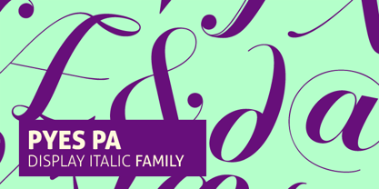
- Pyes Pa by Tim Donaldson,
$65.00 - Cuisine by Sudtipos,
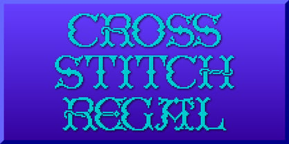
$45.00 - Cross Stitch Regal by Gerald Gallo,
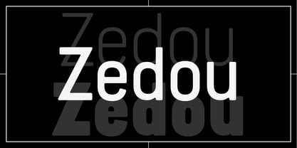
$20.00 - Zedou by Kvant,
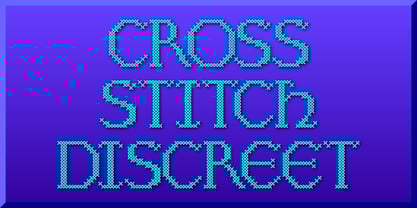
$59.00 - Cross Stitch Discreet by Gerald Gallo,
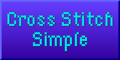
$20.00 - Cross Stitch Simple by Gerald Gallo,
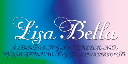
$20.00 - Lisa Bella by Wiescher Design,
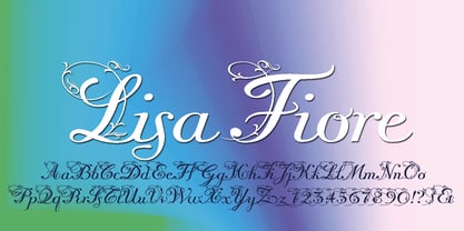
$39.50 - Lisa Fiore by Wiescher Design,
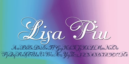
$39.50 - Lisa Piu by Wiescher Design,
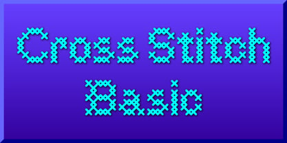
$39.50 - Cross Stitch Basic by Gerald Gallo,
$20.00 - Creampuff - 100% free
- Hawaii Lover - Personal use only
- Botanink - Personal use only
- Bastardilla - Personal use only
- peach sundress ~ - Unknown license
- Milkmoustachio - 100% free
- Creation - Unknown license
- Iloveyou - Unknown license
- Gaitera Ball - Personal use only
- RhumbaScript - 100% free
- CAC Lasko Condensed - Unknown license
- 6th Aniversario - Personal use only
- Shredder - Unknown license
- GERALDINE PERSONAL USE - Personal use only
- Pondicherry by Hanoded,
$15.00 - Maternellecolor creuse - Unknown license
- Lalibela by CyberGraphics,
$43.00 - Tenderness - 100% free
- Vegur - 100% free
- Patzcuaro by Storm Type Foundry,
$28.00 - ColorTube - 100% free
- Medio - 100% free
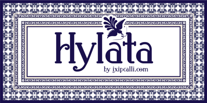
- Hylata by Ixipcalli,
$65.00 - Ferrum - 100% free
- MC Twinkle Star - Unknown license
- Retro Signature - Personal use only
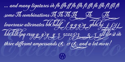
- Excelsia Pro by Wiescher Design,
$69.50


