10,000 search results
(0.466 seconds)
- JY Shapa by JY&A,
$45.00 Designed by Jure Stojan, JY Shapa—his first serif family for JY&A Fonts—has a wide-pen, calligraphic feel, with the upper half of the letters reasonably conservative to aid recognition, but the lower half more decorative and dynamic to achieve a specific rhythm. The italics are more dynamic, with the upper halves more flowing, with Stojan taking greater liberties with the design. Ligatures such as ct and st are included, as well as small caps for all weights. The JY Shapa fonts come with over 5,000 kerning pairs each.
 - Bismuth Stencil by Setup,
$20.00 Bismuth is a simple versatile multi-purpose stencil display typeface with nine weights. Both the upper and the lower case are capitals -- the paired letters (e.g. Aa, Bb) differ in construction but keep the same width. The width is also consistent across all weights, making the fonts easily interchangeable. The nine styles are accompanied with a free font Bismuth Stencil Symbols which contains more than one hundred various arrows, symbols and patterns for even more striking display typography. Learn more about the typeface and its OpenType features at Urtd.net.
 - Flowery Drop Caps by Celebrity Fontz,
$15.99The Flowery Drop Caps font is a set of highly ornate block letters with rich embedded flowery designs, perfect for Spring and holiday themes and publications or any text where you want to add some texture, pizzazz, and depth to make your message stand out. This one-of-a-kind font has the feel of a homemade embroidered or quilted design and comes with both upper and lower case letters to give you more design flexibility. (Numbers, special characters, and punctuation are a neutral sans serif typeface and are included for convenience only.) - Milmay Brush by ijemrockart,
$10.00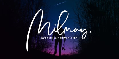 Milmay Brush is handmade script font with stunning characters. Ideal for logos, name tag, handwritten quotes, product packaging, merchandise, social media & greeting cards. It contains a full set of lower & uppercase letters, a large range of punctuation, numerals, and multilingual support. The font also contains several alternatives for lowercase characters, accessible in the Adobe Illustrator Glyphs panel, or under Stylistic Alternates in the Adobe Photoshop OpenType menu. But If you don't have any opentype specific software, you can still use Collatin as is with its standard lowercase and uppercase letters. Thank You.
 - Straight Angles by Celebrity Fontz,
$24.99Straight Angles is a precisely designed three-dimensional font with a clean and futuristic look. The predominant angles are 90 degrees and 180 degrees with parallel and perpendicular lines. Each character is surrounded by a crisp black border of even thickness throughout the font. Upper- and lower-case letters are the same, providing a constant maximum top height while the stems extending below are allowed to show off their distinct personalities in order to spice things up. The 3D extrusion effect makes text appear to stand out from the page. - Kettering 105 by Talbot Type,
$12.99 Kettering 105 is inspired by the classic, geometric slab-serifs such as Lubalin, but has shallower ascenders and descenders for a more compact look. It's a versatile, modern slab-serif, highly legible as a text font and with a clean, elegant look as a display font at larger sizes. It includes old style non-aligning (lower case) numbers, both proportional and tabular, as well as accented characters for Central European languages. The Kettering 105 family comprises of six weights and is closely related to Kettering 205, its more intensely Deco flavoured cousin.
 - Sleepy Time by Hanoded,
$15.00 Sleepy time… Ah, if only your kids would go to bed, close their eyes and drift off to sleep. This font was created when my son had some problems falling asleep: he'd cry, he wanted to sleep in a different bed, he wanted a different animal friend (he has Tij - a tiger, Meh - a sheep, Rafi - a giraffe, Moo - a cow, Woofy - a dog, Kikker - a frog). Sleepy Time font is an all caps typeface with uneven letters and a very different upper and lower case. It comes with all languages, including Cyrillic!
 - Eurostile Round by URW Type Foundry,
$89.99 Eurostile, created in 1962 by Aldo Novarese for the Nebbiolo type foundry, is one of the most popular sans serif fonts of all, and has been for about 50 years. Originally designed as a screen font it was very popular from the beginning, even though it is only a slightly modified version of the 10-year-older Microgramma, but completed with lower case characters. On public demand, URW++ has expanded its range of Eurostile with Eurostile Round with 19 additional styles. Quite like Futura Round by URW++, Eurostile Round works perfectly well as webfont.
 - Royal Loudes by Letterhend,
$14.00 Bold and powerful, Royal Loudes is a top-of-the-line display font that commands attention. Its impeccable quality is evident in its flawless execution, with each letter carefully crafted to perfection. Available in three unique styles - regular, rough, and stamp - this font offers a dynamic range of options to suit any design need. Features : Uppercase & lowercase Numbers and punctuation Alternates & Ligatures Multilingual PUA encoded We highly recommend using a program that supports OpenType features and Glyphs panels like many of Adobe apps and Corel Draw, so you can see and access all Glyph variations.
 - Italian Gothic by Celebrity Fontz,
$24.99The Italian Gothic font is a full set of decorative initials inspired by 16th-century Italian Calligrapher Giovanni Battista Palatino, containing beautiful loops, flourshes, and parallel calligraphic strokes. This lovely calligraphic font includes one set of A-Z ornamental initials conveniently assigned to both the upper- and lower-case alphabet characters, as well as many foreign language accented characters. It is ideal for starting off the beginning of paragraphs in artistic publications, storybooks, fairy tales, religious publications, and any written work conveying the calligraphic style of the 1500s. - Andaman by Pen Culture,
$17.00 Andaman is carefully crafted modern calligraphy font, this font comes with ligature and artificial swash which will be very suitable for branding, logos, fashion projects, posters, magazines and many more. What inside and will you get: Fully uppercase and lower case Number and punctuation Ligature Ending Swash PUA Encoded I really hope you enjoy it – please do let me know what you think, comments & likes are always hugely welcomed and appreciated. More importantly, please don’t hesitate to drop me a message if you have any issues or queries. Thank you
 - Racetrack by Type Innovations,
$39.00 Racetrack is the work of American type designer, Alex Kaczun, and was conceived as a result of developing a logo for a client. Alex was experimenting with a uniform grid pattern, outline and inline, connecting the dots which lead to this interesting typeface effect. Racetrack is a bold display font, which also works well at many point sizes. It has a futuristic appeal with straight lines and sharp corners. The uniform strokes, inline treatment and symmetry make for a powerful headline. The applications for this font design are endless.
 - Thaknus by Sealoung,
$25.00 Thaknus is a beautiful, elegant, and unique font that has many flowing style alternates and also uses binders to seamlessly connect letters. Perfect for branding, logos, invitations, mastheads, and more. Thaknus has 32 ligatures, 73 alternates for an upper and lower case as well as numbers and punctuation making it very versatile for your beautiful designs. Thaknus also includes the full set: Uppercase and lowercase Number punctuation ligatures Alternates multilingual Support Hope you enjoy our fonts and if you have any questions feel free to message me & I'm happy to help :)
 - Linotype Constitution by Linotype,
$29.99Frank Marciuliano designed the basic forms of Linotype Constitution around those of the swash alphabets of the 18th century. While the capitals are generously designed, the lower case letters have more reserved forms and are narrower. The characters of Constitution seem to have been set to paper with a feather and ink. The marked stroke contrast and elegant forms makes it a dynamic and sentimental font. The capitals can be used as initials mixed with other fonts, but Constitution is also good for texts which should give a feeling of nostalgia. - Mattire by Ahmad Jamaludin,
$15.00 I'm present to you for new serif, Mattire! Mattire is a stylish font that is both classic and minimal. A bold, high contrast font that is perfect for header magazine, web, feminine logo marks & editorial design. It's a mix between a classic serif and a futuristic sans serif. Mattire fits perfectly into those modern moodboards. It come with a unique lower and uppercase plus numbers, punctuation & multilingual letters. Features : OTF Letters, numbers, punctuation, multilingual support, accent Ligature If there is a problem feel free to message or contact at : dharmasahestya@gmail.com Thank you and enjoy!
 - South Island by Rook Supply,
$14.00 The goal with South Island was to make a font that looked authentically handwritten. Each character had to perfectly flow into the next and maintain a nice balance between variation and legibility. The typeface retains all the texture and grit of the original handwritten characters, making it especially powerful when used for large headers. South Island comes in a regular version, and a second version which contains alternate versions of each letter A-Z (both upper and lowercase). Try pairing it up with a more traditional serif or sans serif font for endless possibilities.
 - Toadstool by Hanoded,
$15.00 My kids love toadstools, especially the red capped ones with the white spots (they’re called Amanita muscaria, a.k.a. fly agaric - in case you’re wondering). A couple of months ago you could find loads of them in the forest, but now they’ve all disappeared. Toadstool font will not disappear, however. It is a very legible, clean and neat text font with an uneven baseline, slightly bouncy glyphs and more diacritics than a forest has mushrooms. Use if for packaging, kids’ book covers and posters. This toadstool is the non-toxic variety, so go nuts.
 - Little Dolly by Shape Studio,
$12.00 Little Dolly is a fun handwritten font filled with handwritten charm and personality! It is the perfect choice for crafters with lawn mowers, as it is extremely smooth for optimal cutting performance. Little Dolly is a fun font that's bold and smooth enough to cut with the Cricut & Silhouette crafting machine, for Titles for children's books, scrapbooks, logos, icons, phrasesor quotes for winter greeting cards (Halloween or New Year holidays), photo overlays, short phrases, children's books, gift shop tags, presentations on social media Pinterest, Instagram, Facebook, or others. Thank you!
 - Sean Henrich ATF by ActiveSphere,
$30.00 Sean Henrich ATF is a sharp, rounded geometric display font and works best in text and display applications, such as headline, posters, signage, magazine, product branding, corporate branding, logos and titles. Several alternate characters are included in this typeface. Sean Henrich ATF font has six weights; ultra light, extra light, light, regular, bold and extra bold, each available in italic, making a total of twelve styles. Each style has a full upper and lower-case, accents, punctuation and a selection of monetary symbols. Currently Available for PC, in Open Type, PostScript or TrueType.
 - Snowflake Drop Caps by Celebrity Fontz,
$15.99The Snowflake Drop Caps font is a set of highly ornate block letters with rich embedded snowflake designs, perfect for winter and holiday themes and publications or any text where you want to add some texture, pizzazz, and depth to make your message stand out. This one-of-a-kind font has the feel of a homemade embroidered or quilted design and comes with both upper and lower case letters to give you more design flexibility. (Numbers, special characters, and punctuation are a neutral sans serif typeface and are included for convenience only.) - Vegetability by Hanoded,
$15.00 Vegetability: “The quality or state of being vegetable”. Yes, I know: it’s kinda weird, but I quite like the name of this font! I am trying to become a vegetarian (I am a ‘flexitarian’ right now) and I was trying to find a good veggie recipe for dinner, when this name crossed my mind. Vegetability is a handwritten font with a dash of roughness, a splash of attitude and a pinch of class. Comes with a whole bunch of diacritics and double letter ligatures for the lower case letters.
 - Savoye by ITC,
$29.99 Savoye was created by Alan Meeks in 1992. The spirit of the Jugendstil lies behind the design of this font. Graceful upright letters combine to create delicate, flowing word figures. The light stroke contrast and slant to the right emphasize the liveliness of Savoye. Generous capitals contrast with small, demure lower case letters whose distinguishing characteristic is their high ascenders. This contrasts beautifully with the relatively reserved descenders. The capitals can also be used as initials combined with other alphabets. Savoye is the perfect font for invitations, greeting cards and other personal correspondence.
 - 36 Dope by Power Type,
$- 36Dope is a display typeface with an experimental serif design. It draws from the event ’36DaysOfType’ held in 2023. Created as part of the ’36DaysOfPower’ theme, this font showcases unique and unconventional serifs, reflecting the creative and powerful spirit of the event. With its bold and experimental look, 36dope is well-suited for attention-grabbing headlines, titles, or graphic design projects that aim to convey a sense of strength and artistic innovation. This font is intended for eye-catching headlines, titles, or other graphic design projects that require a bold and experimental look.
 - Smashing by PintassilgoPrints,
$26.00 Smashing is a stout typeface, with a twist. It’s a massive all-caps font with bouncing glyphs, positively bold yet quite good-humored. Its upper and lower case slots stores different lettershapes, providing handy options to choose from. When working with OpenType savvy applications you can turn on the contextual alternates feature to instantly get alternating glyphs, which add spontaneity to your artwork and prevent neighbor double letters from using the same glyph. Also try the discretionary ligatures feature to get some cool interlocking pairs. A smashing font for truly smashing designs!
 - Rebus Script by Ascender,
$29.99 Rebus Script is a fun, lively font that lets you create rebus puzzles by automatically replacing certain words or syllables with pictures. This font is an advanced OpenType font that requires an application that supports Contextual Alternates. The font was created by Terrance Weinzierl and is based on the Louisville Script handwriting font designed by Steve Matteson. To use the font you simply type a word like 'sun' or 'son' and those letters will automatically be replaced by a picture of the sun. There are over 70 pictorial symbols in Rebus Script that make up the 'vocabulary' for automatic substitution based on over 300 different syllable/word combinations in various cases (lower, upper, titling) in the English language.
 - Enigmatica by Artisticandunique,
$10.00 Enigmatica - Serif font family - 18 Styles - Multilingual supports Enigmatica is a stylistic and powerful serif font family with different alternative type designs. You will have the opportunity to enrich the content of your projects with alternative characters. This font comes with multilingual support and 18 styles. It has an elegant structure that can be effective in the development of your projects. Especially for editorials, magazines, books, branding, logo design, web design, headlines, movie titles etc. If you are looking for a font with stylistic alternatives, Enigmatica serif font might meet your needs. With this font you can create your unique designs. If you have a question, please contact me. Have a good time.
 - Qualion Text by ROHH,
$39.00 Qualion Text™ is a modern geometric sans serif typeface with humanist and calligraphic inspirations. It is a text family designed for excellent legibility. Qualion Text™ is a sibling of Qualion™ & Qualion Round™, geometric family with lots of swashes and ornaments. Letter shapes and proportions has been adjusted to fit paragraph text and small sizes: - typeface is narrower now in order to fit more text in the design space - larger stroke contrast - pronounced ink traps and tapering - elegant true italics made even more calligraphic - adjusted spacing and kerning - adjusted font weights The main purpose of the family is clean and legible paragraph text, however it is very attractive choice for branding, headlines and display use, too. The italic styles as well as thin, bold and black upright styles have very strong character and look great in display sizes. Italics are very fluent, calligraphic, subtle and elegant, from the other side bold and black uprigths are very modern, powerful and unique thanks to the pronounced ink traps. Qualion Text™ family consists of 20 styles - 10 weights with corresponding true italics. Both have extended language support, as well as broad number of OpenType features, such as small caps, case sensitive forms, standard and discretionary ligatures, swashes, stylistic sets, contextual alternates, lining, oldstyle, tabular and small cap figures, slashed zero, fractions, superscript and subscript, ordinals, currencies and symbols.
 - Farfa by Eurotypo,
$44.00 The Farfa fonts were designed for institutional use, commissioned by the City of Fara in Sabina, Italy. This project started from the study of the manuscripts found in the Abbey of Farfa, penned in a variant of the lower case of “Carolingian” typical style of that area. The Capital, ligatures and Small Caps, however, are based on the uncial writing that often appears in those codes and manuscripts. Farfa Abbey is a territorial abbey in northern Lazio, central Italy. It is one of the most famous abbeys of Europe. It belongs to the Benedictine Order and is located about 60 km from Rome, in the commune of Fara Sabina The origin of the Abbey is still unknown. Archaeological discoveries seem to prove that the first monastic establishment was built on the ruins of a pagan temple. The Vandals destroyed the first monastery in the fifth century. Only a few documents from the sixth-century prove the early presence of the monastic community. It had the heritage of Charlemagne (S VIII), the Lombard chiefs, and later the Carolingians, succeeded in withdrawing Farfa from obedience to the Bishops of Rieti, and in securing many immunities and privileges for the monastery. Farfa was at this period the most important monastery in Italy both from the point of view of worldly possession and ecclesiastical dignity.
 - Aeroko Variable by Monotype,
$279.99 Meet Aeroko, a slick variable typeface that evokes grit and speed, a dynamic play, a future–present competitive edge that evokes motorsport and all progressive brand design. This is a robust type system that creates memorable brand headlines. Powered by four display weights and three widths. Turbo-charged by a two-axes variable font. High performance brands can expect Aeroko to out-pace in every graphic condition. Aeroko is bold and assertive, it moves fast in headlines, it flexes when and where you need it. The forms are boxed and solid from Condensed to Wide, and they provide a distinct contrast when paired with rounder text fonts. Aeroko’s secondary power unit is harnessed from the ever adaptable variable font format. Variable font technology enables vast levels of typographic scale and expression, furthermore it allows Aeroko to react instantly in any digital space to maximize results. Aeroko evokes confidence, this is a typeface that actively encourages you to be courageous and daring with type in your own way. Brands demand distinct and robust typography, much in the same way that drivers demand pace. Aeroko meets these demands with ease, delivering assurance and weight across a valiant aesthetic. Aeroko is designed by Krista Radoeva and the Monotype Studio.
 - Aeroko by Monotype,
$49.99 Meet Aeroko, a slick variable typeface that evokes grit and speed, a dynamic play, a future–present competitive edge that evokes motorsport and all progressive brand design. This is a robust type system that creates memorable brand headlines. Powered by four display weights and three widths. Turbo-charged by a two-axes variable font. High performance brands can expect Aeroko to out-pace in every graphic condition. Aeroko is bold and assertive, it moves fast in headlines, it flexes when and where you need it. The forms are boxed and solid from Condensed to Wide, and they provide a distinct contrast when paired with rounder text fonts. Aeroko’s secondary power unit is harnessed from the ever adaptable variable font format. Variable font technology enables vast levels of typographic scale and expression, furthermore it allows Aeroko to react instantly in any digital space to maximize results. Aeroko evokes confidence, this is a typeface that actively encourages you to be courageous and daring with type in your own way. Brands demand distinct and robust typography, much in the same way that drivers demand pace. Aeroko meets these demands with ease, delivering assurance and weight across a valiant aesthetic. Aeroko is designed by Krista Radoeva and the Monotype Studio.
 - Hello Agatha by Zeenesia Studio,
$12.00 "Hello Agatha" - a delightful font pair with a handy set of illustrations This font duo consists of a beautiful script and a playful caps serif font. Together or separate they are perfect for tshirt design, quotes, mug, bag canvas, greeting cards, branding, stationery design, social media, packaging, prints and many more! If you combine them with the illustrations - you can create even more typographic designs, logos, labels and seasonal cards Hello Agatha script comes with tons of alternates for each lower case letter and a selection of standard ligatures so the possibilities are endless. It supports multiple languages and offers PUA encoding. The doodles make this font so perfect.
 - Hanseat by profonts,
$41.99 Hanseat is a profonts typeface family by Ralph M. Unger, heavily inspired by Germany’s official DIN 1451 Engschrift. Originally, the German DIN (Deutsches Institut für Normung / German Committee for Industrial Standardization) typefaces were taken as the standard traffic fonts for street signs and house numbers. During the 1980s, the DIN fonts became digitally available for sign making systems, initially again primarily for traffic sign purposes. However, later on, the DIN fonts became also popular in the world of designers and art directors. Hanseat is a modern, contemporary interpretation of the DIN fonts, responding to the ever growing demand for such typeface designs reflecting the spirit of the industrial area.
 - Canberra Script by Romie Creative,
$19.00 Canberra is a classy handwritten font with distinctive curves, inside with some eye-catching features that are perfect for feminine-style projects. Canberra features start and end engraved in upper and lower case, very beautiful ligatures and this font is perfectly qualified when you use it for wedding design projects, fashion, greetings, invitations, social media and more. This font includes alternative glyphs. You can access alternative glyphs via Font Book (Mac users) or Windows Character Map (Windows users), I've put the tutorial link inside the zip file. WHAT'S INCLUDED: Basic Characters (Capital and Lowercase, Numbers, Symbols and Punctuation) fastener Washed PUA encoded Multilingual Support
 - LHF Centennial Panels 1 by Letterhead Fonts,
$46.00 One of four fonts consisting of the best old fashioned panels from Golden Era Studios. Each font contains 36 expertly drawn panels. Each letter generates a different design. Special Note: Due to the large file size of these fonts, they will not convert for use in Gerber Omega. Instead, Omega users may wish to use an alternate program to type the characters and import them into Omega as .eps files. CorelDraw users should use the "Weld" command rather than "Convert to Curves" command to convert these fonts to vector outlines. Otherwise, the program may crash due to the sheer number of points in each panel.
 - Toy Story by Shape Studio,
$10.00 We are proud to present our new font. Name of the font is TOY STORY. Toy Story is a fun handwritten font filled with handwritten charm and personality! It is the perfect choice for crafters with lawn mowers, as it is extremely smooth for optimal cutting performance. Toy Story is a fun font that's bold and smooth enough to cut with the Cricut & Silhouette crafting machine, for Titles for children's books, scrapbooks, logos, icons, phrasesor quotes for winter greeting cards (Halloween or New Year holidays), photo overlays, short phrases, children's books, gift shop tags, presentations on social media Pinterest, Instagram, Facebook, or others. Thank you!
 - Bottle Party by PizzaDude.dk,
$20.00 A bottle party is a party where you are supposed to bring whatever you wish you drink. When using my Bottle Party font, you need not bring anything at all! The font does all the partying itself - all you need to do is type, and the contextual alternates makes sure that your text doesn’t repeat the same letters over and over again! How is that? As I said, it happens automatically as you type, because the font cycles through the 4 different versions of each lower-case letter! The font is handmade with a brush feeling to it, legible at even very small sizes and it’s quite full of international characters!
 - Yom Tov by Jonahfonts,
$42.00 YomTov is a whimsical hebrew font. Traditional in design with a free spirit and slightly bounced. Hebrew alphabets contain 22 Hebrew letters along with five final letters which are automatically activated when used in Applications such as Apple Pages® and MicroSoft Word®. The Hebrew Letters do not contain cantillation marks very much used in everyday modern Hebrew. Designed with acomplete latin font that mirror the Hebrew letterforms. Latin lower-case letters have been replaced with smaller caps. You may also be interested in my other Hebrew fonts, NEWMARK Hebrew, HEBRON Hebrew, PAGEANTRY Hebrew and a Hebrew Script font KOMUNIDAD Script. YomTov requires OpenType-aware software.
 - X Ruffian by ThoroughBR&,
$9.00 X RUFFIAN Ruffian was a champion thoroughbred horse who won 10 consecutive races. A feat worth mentioning & repeating. Her tenacity & steadfast approach established the basis for this variable based font. The X represents both the Roman numeral 10, but also the X-factor for creating bespoke works of art. It is quite befitting that this font be named after a legendary champion. Which begs the question...Do you champion variety? X Ruffian's design motif uses a broad tipped chiseled marker that was set at an angle for that extra bit of vigor. Identical letter forms defeat that truly "hand rendered" look that we ultimately strive for. Each uppercase letter offers 10 (X) or more stylistic alternatives, the lowercase and number sets have 3+ options and an over under for those special characters that yield a long bottom or top (see images). Ligatures & bonus characters can add that unique offering to your already individual style & can easily be found via the glyphs panel in any open type program. With a gigantic glyph count of 688, you'll never run out of options. As a right of passage, we felt obliged to include a roman numeral set as the name beckons, which differs from the standard letter form in which you would use to create. This is a variable winner. See you at the races!
 - Roller Poster by HiH,
$12.00 Roller Poster is named after Alfred Roller. In 1902, Roller created a poster to advertise the 16th exhibit of Austrian Artists and Sculptures Association, representing the Vienna Secession movement. The exhibit was to take place in Vienna during January & February 1903. The location is not mentioned because everyone in Vienna knew it would be held at the exhibit hall in the Secession Building at Friedrichstraþe 12, a few blocks south of the Opernring, near the Naschmarkt. Designed by Joseph Maria Olbrich in 1897, the buiilding has been restored and stands today as one finest of the many fine examples of Art Nouveau architecture in Vienna (see vienna_secession_bldg.jpg). Because of its dome, it is called “the golden cabbage.” The poster itself is unique. The word “secession” is in one type style and takes up two-thirds of the elongated poster. At the bottom of the poster are the details in a different lettering style. It is this second style at the bottom that is the basis for the font Roller Poster. In keeping with our regular naming conventions, we were going to call it Roller Gezeichnete (hand-drawn), but the wonderful play on both words and the shape of the three S’s in secession was too compelling. In November 1965 there was an exhibit of Jugendstil and Expressionist art at the University of California. Alfred Roller’s Secession Poster was part of that exhibit. Wes Wilson was designing promotional material at Contact Printing in San Francisco. Among their clients was a rock promoter named Bill Graham, staging dance-concerts at Fillmore Auditorium. Wilson saw the catalog from the UC exhibit and Roller’s lettering. Wilson adapted Roller’s letter forms to his own fluid style. The result was the poster for the August 12-13, 1966 Jefferson Airplane/Grateful Dead concert at Fillmore put on by Graham (BG23-1). Wilson continued to use Roller’s letter forms on most of the posters he did for Graham through May 1967, when he stopped working for Graham. The posters were extremely successful and the lettering style along with Roller’s letter forms were picked up by other artists, including Bonnie MacLean, Clifford Charles Seeley, James Gardner, and others. The Secession poster and the Fillmore posters have inspired a number of fonts in addition to ours. Among them are JONAH BLACK (& WHITE) by Rececca Alaccari, LOVE SOLID by Leslie Carbarga and MOJO by Jim Parkinson. Each is different and yet each clearly shows its bloodlines. Our font differs in two ways: 1) the general differences in the interpretation of the letter forms and 2) the modification of the basic letter form to incorporate the diacriticals within the implied frame of the letter, after the manner of the original design by Roller. We borrowed Carbarga’s solution to the slashed O and used it, in a modified form, for other characters as well to accomplish the same purpose. We recommend that you buy ours and at least one of the other three. According to Alaccari, a version called URBAN was released by Franklin Lettering in the 70’s (and is shown on page 51 of The Solotype Catalog). For comparison of our font to original design, see image files roller_poster_2s.jpg of original poster and roller_poster_2sx.jpg showing reconstruction using our font for the lower portion (recontructed area indicated by blue bar). Please note the consistency of character width. In the lower case, 23 of the basic 26 letters are 1/2 EM Square wide. The ‘i’ is an eighth narrower, while the ‘m’& ‘w’ are one quarter wider. All the Upper Case letters are 1/8 EM wider than the lower case. This is to make it easier to fill a geometrical shape like a rectangle, allowing you to capture a little of the flavor of Wes Wilson’s Fillmore West poster using only a word processor. We have also included a number of shapes for use as spacers and endcaps. If you have a drawing program that allows you to edit an ‘envelope’ around the letters to distort their shape, you can really get creative. I used Corel Draw for the gallary images, but there are other programs that can accomplish the same thing. The image file “roller_poster_keys.jpg” shows the complete character set with the keystrokes required for each character (see “HiH_Font_readme.txt” for instruction on inserting the non-keyboard characters). The file “roller_poster_widths.jpg” shows the exact width of each character in EM units (based on 1000 units per EM square). You will notice that the font is set wide for readability. However, most programs will allow you to tighten up on the character spacing after the manner of Roller & Wilson. In MS Word, for example, go to the FORMAT menu > FONT > CHARACTER SPACING. Go to the second Drop-Down Menu, labeled ‘Spacing’ and select "condensed' and then set the amount that you want to condense ‘by’ (key on the little arrows); two points (2.0) is a godd place to start. Let your motto be EXPLORE & EXPERIMENT. Art Nouveau has always been one of my favorite movements in art -- I grew up in a home with a couple of Mucha prints hanging on the living room wall. Perhaps because of that and because I lived through the sixties, I have enjoyed researching and designing this font more than any other I have worked on. Let’s face it (pardon the pun), Roller Poster is a FUN font. You owe it to yourself to have fun using it.
 - Veronika by Linotype,
$29.99Veronika is a semi-serif text face, available in three styles: Regular, Italic, and Bold. All three faces are available in OpenType format, with both lining and old-style figures. Grüger, a German artist and designer, first began the design of her typeface by writing out its letterforms with a wooden stylus. She wanted to create a new semi serif face that had uniform stroke widths, but still maintained some aspects of calligraphy. Veronika achieves this; the terminals that begin the first strokes of most letters are round and bulbous, as if the writing instrument added extra emphasis on that spot. This adds a dynamic, movement-like quality to texts designed with Veronika. Aside from some sans serif-ness, Veronika appears similar to old style typefaces from the renaissance: classical inscriptions inspired the proportions of the capital letters, and the lower case letters stem from Carolinian minuscule. These proportions allow Veronika to function very well in text and at small sizes. However, only when you design larger headlines, logos, or other elements with Veronika, will you notice all of its special qualities, like its weight distribution and stroke characteristics.