10,000 search results
(0.053 seconds)
- Kiwi by Atlantic Fonts,
$26.00 Kiwi gives natural energy to every project with its sweet and spirited forms and a variety of tasty options. Be bold using it as all-caps including its fun set of discretionary double-letter ligatures, or be distinctly playful, combining upper-lower, with bushels of loosely interlocking ligatures. Kiwi font family also includes delicious Kiwi Fruits, a striking and juicy collection of graphic fruit illustrations by illustrator, Amy Dietrich. For inviting packaging, magazine, and books, or say, a cool-looking apple for your cider pressing party invite, Kiwi is a great pick. Shown here with Quince font, also by Atlantic Fonts.
 - Double Frames by Putracetol,
$22.00 Introducing Double Frames - Display Font, a font with unique shape. there are two styles – standard and decorative. The modern and powerful display font you've been looking for. Each character is carefully crafted until the result is perfect. A lot of detail is preserved when characters are digitized, so uppercase looks fantastic up close Come with open type feature with a lot of alternates, its help you to make great lettering. best uses for wedding invitation, invitations, signature, typography lettering, branding, label, poster, logos, quotes, product packaging, header, merchandise, social media & greeting cards and many more. Double Frames is also support multi language.
 - Metalsmith by Burntilldead,
$13.00 Say hi to “Metalsmith” font family, a stylish custom culture typeface. Started from the enthusiasm of custom motorcycles, artsy looks of hand made typefaces & illustrations, along with the freedom vibes that came with it, become the first motivation in making this Metalsmith typeface. Packed up with three styles font; regular Clean, Ink Paint & Vintage textured. Italic version on each styles are included. There are 655 glyphs on each styles font including Stylistic sets, Discretionary Ligatures, Standard Ligatures, Contextual Alternates etc. Powered with OpenType features that allows you to mix and match pairs of letters to fit into your design.
 - Thunderspeed by Tigade Std,
$15.00 Thunderspeed is a futuristic and sporty look font. It is sharp yet easy on eyes of readability. It is perfect for your branding and logo, mainly in design theme related to sports, futuristic, space, etc. Thunderspeed features complete set of upper case and lower case with standard International characters. Of course come with the numbers and punctuations. The font come in format: OTF TTF WOFF/WOFF2 That's a wrap! I do really hope you like this font, and please don't hesitate to contact me if you have any questions. Also, drop by to our instagram! Tigadestd | Doli Harahap
 - Dear Penpal Script by Giaimefontz,
$6.00 This is a fully connected script font, not calligraphic, but entirely designed to follow handwritten cursive ligatures rules as teached in schools. In order to correctly visualize it, you have to enable OpenType features (Contextual Alternates, Discretionary Ligatures, Standard Ligatues and Kerning). Trying to write All Capitals will generate Block Letters writings, since cursive style doesn't allow more than the first uppercase per word, however this font is not meant to be a Block Letters font. Using specific type combinations will generate special glyphs. All of these features are intended to reproduce a classic schoolboy or schoolgirl notebook.
 - Wade Sans Light by ITC,
$29.99Wade Sans Light was designed by Paul Hickson and Key Characters and appeared in the ITC library in 1990. The basic forms of the font are those of a constructed sans serif, as seen in the circular O and triangular A. The low x-height of the lower case letters make this font particularly reserved and graceful and the high ascenders give it a certain elegance. The high, wide capitals need a lot of space and dominate the overall look of this font. Wade Sans Light is reminiscent of the elegant cabarets of the 1920s and 30s. - Duc de Berry by Linotype,
$29.99Duc de Berry is a part of the 1990 program Type before Gutenberg, which included the work of twelve contemporary font designers and represented styles from across the ages. Linotype offers a package including all these fonts on its web page, www.fonts.de. The design of Duc de Berry was influenced by those of typefaces created between the 13th and 16th centuries. The font was named after Duc de Berry, whose beautiful missals inspired typefaces of the 15th century. The capital letters are especially elegant and can be used either as initials or as contrast to the much more reserved lower case letters. - Hype Runner by Invasi Studio,
$17.00 Hype Runner is a bold and stylish brush font that is perfect for sports and anything that requires strength and power. With its unique style and edgy look, Hype Runner is ideal for a wide range of design projects, including headings, flyers, greeting cards, product packaging, book covers, printed quotes, logotypes, and album covers. This font features alternate glyphs, ligatures, and support for Latin Multilingual, giving you plenty of design options to create unique and eye-catching designs. Whether you're creating designs for sports or simply want a strong and impactful font, Hype Runner is a great choice.
 - Grunge Standard by Scholtz Fonts,
$9.50 Grunge Standard is to grunge fonts what Jazz standards are to the world of Jazz – timeless, easy to use, great for every occasion. The font is easily recognized, clear and legible, just like the tune that everyone knows. Use Grunge Standard for contemporary display work, for fashion items, for event posters, movie posters, music posters, videos, DVD covers, in fact, anywhere that grunge fonts could possibly appear. Grunge Standard contains over 250 characters - (upper and lower case characters, punctuation, numerals, symbols and accented characters are present). It has all the accented characters used in the major European languages.
 - Tavern by FontMesa,
$25.00 Tavern is a super font family based on our Algerian Mesa design, with Tavern we've greatly expanded the usability by creating light and bold weights plus all new for 2020 with the introduction of extra bold and black weights Tavern is now a five weight family. The addition of the bold weight made it possible to go further with the design by adding open faced shadowed, outline and fill versions. Please note, the fill fonts are aligned to go with the open faced versions, they may work with the outline versions, however you will have to apply them one letter at a time. The Tavern Fill fonts may also be used a stand alone font, however, the spacing is much wider than the regular solid black weights of Tavern. In the old days of printing, fill fonts rarely lined up perfect with the open or outline font, this created a misprinted look that's much in style today. To create that misprinted look using two different colors, try layering the outline fonts offset over the top of the solid black versions. Next we come to the small caps and X versions, for a font that's mostly seen used in all caps we felt a small caps would come in handy. The X in Tavern X stands for higher X-height, we've taken our standard lowercase and raised it for greater visibility in small text and for signage where you want the look of a lowercase but it needs to be readable from the street. In August of 2016 I started the project of expanding this font into more weights after seeing the font in use where someone tried creating a bold version by adding a stroke fill around the letters. The result didn't look very good, the stroke fill also caused the shadow line to merge with the serifs on some letters. This lead me to experiment to see if a new bold weight was possible for this font and I'm pleased to say that it was. After the bold weight was finished I decided to type the regular and bold weights together in a first word thin second word bold combination, however the weight difference between the two wasn't enough contrast. This lead me to wonder if a lighter weight was possible for this font, as you can see yes it was, so now for the first time in the history of this old 1908 type design you can type a first word thin second word bold combination. So why the name change from Algerian to Tavern? Since the original font was designed in England by the Stephenson Blake type foundry I decided to give this font a name that reminded you of the country it came from, however, there were other more technical reasons. During the creation of the bold weight the engraved shadow line was sticking out too far horizontally on the bottom right of the serifs dramatically throwing the whole font off balance. The original font encountered this problem on the uppercase E, L and Z, their solution was a diagonal cut corner which was now needed across any glyph in the new bold weight with a serif on the bottom right side. In order to make the light and regular weights blend well with the bold weight diagonal cut offs were needed and added as well. This changed the look of the font from the original and why I decided to change the name, additional concerns were, if you're designing a period piece where the font needs to be authentic then this font would be too new. Regular vs. Alt version? The alternate version came about after seeing the regular version used as a logo and secondary text on a major product label. I felt that some of the features of the regular version didn't look good as smaller secondary text, this gave me the idea to create an alternate version that would work well for secondary text in an advertising layout. But don't stop there, the alternate version can be used as a logo too and feel free to exchange letters between both regular and alternate versions. Where are the original alternates from Algerian? Original alternates from Algerian are built into the regular versions of Tavern plus new alternates have been created. We're excited to introduce, for the first time, all new swash capitals for this classic font, you're going to love the way they look in your ad layout, sign or logo. The best way to access alternate letters in Tavern is with the glyph map in Adobe Illustrator and Adobe InDesign products, from Adobe Illustrator you can copy and paste into Photoshop as a smart object and take advantage of all the text layer style features Photoshop has to offer. There may be third party character maps available for accessing alternate glyphs but we can't advise you in that area. I know what you're thinking, will there be a Tavern Condensed? It takes a lot of hours to produce a large font family such as this, a future condensed version will depend on how popular this standard version is. If you love Tavern we're happy to introduce the first weathered edge version of this font called Bay Tavern available in February 2020.
 - Trumania EEN - 100% free

- Analogue Pro by Ingo,
$42.00 very traditional forms strongly slanted italic consistant proportions extraordinary ligatures swashes alternate letters alternate figures lower case l with a hooked “foot” Believe it or not, there are hardly any sans serif fonts in which the lower case letter l also has the hooked form of an l. Instead, we readers have to constantly distinguish whether we are seeing an uppercase I or a lower case l — just take a look at the word “Illinois”... The ingoFont Analogue was developed for exactly this reason. The intent: To create a pretty much »ordinary«, even classical font with its most striking characteristic being the inclusion of the “crooked l.” As a model, I used the »mother of all sans serifs«, Akzidenz Grotesk from Berthold, with its beginnings going back to the 19th century. Analogue is so to say a new interpretation of Akzidenz Grotesk from ingoFonts. All characters — following the model — have been newly designed. And if you want to emphasize the shape of the hooked foot even more, you can also activate the alternate styles for d, h, m, n (Style Set 1). Conversely, the alternate a somewhat softens the “hooked” impression (Style Set 2). The slanted versions — it isn’t truly a real cursive font — are noticeably stronger with 13° than the italics in comparable fonts, and were given a round e with a mind of its own which distinguishes itself considerably compared to the upright characters in the overall appearance of the font. More modern and formal solutions in detail were chosen for some of the characters, for example the M was given lightly slanted sides; the a reflects the curves of the s; the “feet” of a, l and t match; the flared legs of K and R became a “foot”, too. General proportions were carried over almost completely with no changes from Akzidenz Grotesk as well as the slanted trimming on the open forms of a, c, e, s; in comparison, C, G and S were given straight endings. Analogue contains many ligatures, even discretional ligatures, plus proportional, old style as well as tabular figures. All in all, at first sight Analogue brings back memories of the charm of its well-known predecessor; and yet, many small differences give Analogue an unmistakable certain something...
 - P22 Kirkwall by IHOF,
$24.95 P22 Kirkwall is an unusual and elegant design. The upper case letters have a slightly curved stem that ends in a small serif and wedge crossbars. The lower case letters have a fluid and easy design with end-hooks and long leading serifs. Kirkwall Trim and Bold Trim styles contain an alternate set of lower case characters without the long leading serifs and end-hooks. P22 Kirkwall is appealing for display work and appropriate for short texts and headlines. According to the designer: "The type design is inspired by my meeting with the people of Orkney Island and their culture, and it's my tribute to the St. Magnus Cathedral in Kirkwall."
 - Sommet Slab by insigne,
$24.99 The Sommet family of typefaces has been updated with a new slab serif variant. Expanding on Sommet's successful design principals, Sommet Slab is there when you need more impact and power. Sommet Slab is available with six weights and complementary italics and plenty of OpenType features. Sommet Slab features a tall x-height, and its letterforms are compact, perfect for when layout space is at a premium. Over twenty OpenType alternate characters are available, including friendlier upright italic forms, and a unique simplified lowercase. Sommet Slab also includes oldstyle figures and small caps. Use Sommet Slab whenever you need a powerful and contemporary slab-serif.
 - English Grotesque by Device,
$39.00 English Grotesque is based on the proportions of an early 20th century signwriter’s sans, emphasising the characteristic idiosyncrasies of type of the period. Sharing a similar Roman circle-and-square construction as Gill Sans or Johnston Railway, it has a wide T and W, a narrow S, and a long-tailed R. The Roman alphabet did not include a lower-case, and therefore early sans-serifs tended to base theirs on handwritten or cursive models, resulting in more even character widths. English Grotesque, by contrast, carries the more characterful proportions of the capitals through to the lower case. Available in six weights, with optional alternative versions for the Q, &, £ and J.
 - Kaligane by ArimaType,
$18.00 Kaligane is a type family designed with passion. A geometric typeface, first designed in a muscular black weight with a high-powered dynamic typographic aesthetic used in various communications, and later developed in a lighter weight where the shape exhibits some vintage-inspired proportions. With these diverse influences, typefaces allow for the use of impressive displays and effective logo designs as well as the use of more subtle editorials in body text - with a natural inclination for effective and powerful advertising. Sports typography typically uses italics for added dynamism and impact, and Kaligane complies by offering a choice of three alternative italic shapes with different slants.
 - Bouncer by Ingrimayne Type,
$6.95 The letters in Bouncer are round because they all begin as a ball and then have parts of the ball cut away. Bouncer was one of the earliest typefaces from Ingrimayne Type. Lower-case letters are smaller versions of the upper-case letters. BouncerTwo, designed twenty years after the original Bouncer, continues playing with the idea of making letters by cutting out parts of a circle, but in this case the circles are interlocking. All letters are upper-case but some of those on the lower-case keys differ from those on the upper-case keys. BouncerTwo is eye-catching but not highly legible.
 - Aviano by insigne,
$24.99 Aviano is an extended titling face with influence from the power and timeless beauty of classical letterforms. Aviano features extended characters for a formal feel, sharp, powerful looking serifs and geometric and consistent letterforms. Use Aviano as an alternative to Trajan. Aviano includes a number of advanced OpenType features including alternates, 40 unique ligatures and old style figures. The Aviano family was updated in 2008 to include a light and black weight. Be sure to check out the rest of the Aviano series, including Aviano Serif, Aviano Sans and Aviano Slab. Aviano is named for a small town at the base of the Alps in northern Italy.
 - Samo Sans by CarnokyType,
$- Samo Sans is a modern sans-serif typeface with low contrast strokes and is balanced between technical shapes and dynamic feeling. The primary type family is consisted of complete set of Latin glyphs for lower and upper case. It also supports diacritics of all European languages including lining numerals, standard ligatures and other characters sufficient for regular typesetting. Characteristic features are lower spurs (a, b, d, u), and upper spurs (m, n, p, q, r) with distinctive wedge-shaped cuts. These parts are complemented by homogeneously designed diacritics, which is not disturbing and harmonizing with the whole unit. Another very strong feature of the type drawing are lower terminals of the round glyphs, which are finished by moderate narrowing. The type has got decreased caps height, also decreased numerals and optimal x-height, which makes it suitable for more extensive text typesetting. It can be effectively applied in corporate identities or in display typesetting. The narrowness of the basic set of Samo Sans typeface is supplemented by extended type family Samo Sans Pro .
 - Rockwell by Monotype,
$40.99 Whether you call them slab serif, square serif, or Egyptian, you know them when you see them – sturdy, nearly monoweight designs with blunt, straight-edged serifs and a no-nonsense attitude. The Rockwell® Nova family is a fine example of this appealing and eminently usable type style. This is a design that is both robust and adaptable. Marked by the flat top-serifs on the cap A, unusual Q tail and high-legibility two-storied lowercase a, Rockwell has a bit of handmade charm that distinguishes it from the cool, more modern interpretations of the slab serif style. The family is excellent for branding, headlines and other display uses. The simple shapes and hearty serifs also make it a good choice for short blocks of textual content in both print and on-screen environments. The light and bold weights are perfect for setting blocks of text copy, while the extra bold and condensed designs bring authority to display copy. Throw in a little color, and you amp up Rockwell’s messaging power. The regular and italic designs perform handsomely, in the most modest of screen resolutions. With four weights of normal proportions, each with a complementary italic, and three condensed designs, two with italics, the family is a commanding and versatile graphic communicator. Rockwell’s large x-height, simple character shapes and open counters, make for an exceptionally legible design. It should not, however, be set so tight that its serifs touch, as this will erode legibility and impair readability. A benefit to Rockwell’s slab serifs, however, is that the design combines beautifully with both sans serif typefaces and a variety of serif designs. Rockwell OpenType® Pro fonts have an extended character set supporting Greek, Cyrillic, most Central European and many Eastern European languages, in addition to providing for the automatic insertion of ligatures and fractions. Looking for its perfect pairing? Look no further than ITC Berkeley Old Style, Between™, ITC Franklin Gothic®, Harmonia Sans™, Metro® Nova or Frutiger® Serif.
 - Rushtard Brush by ijemrockart,
$10.00 Rushtard Brush is handmade signature style font with stunning characters. Ideal for logos, name tag, handwritten quotes, product packaging, merchandise, social media & greeting cards. It contains a full set of lower & uppercase letters, a large range of punctuation, numerals, and multilingual support. The font also contains several alternatives for lowercase characters, accessible in the Adobe Illustrator Glyphs panel, or under Stylistic Alternates in the Adobe Photoshop OpenType menu. But If you don't have any opentype specific software, you can still use Collatin as is with its standard lowercase and uppercase letters.
 - Pain de Mie by PintassilgoPrints,
$24.00 Pain de Mie is a soft font, friendly and sweet, kinda creamy, kinda bubbly. It's an all caps font with 2 different glyphs for each letter: easily access these through the keyboard upper or lower cases keys. Make them cycle with OpenType Contextual Alternates. There's also a handful of drawings to add an extra charm here and there. Reach these via OpenType Ornaments or pick your choices through a glyphs palette. Like a fresh loaf of bread, Pain de Mie goes well in so many ways. Give it a try!
 - New American Vintage by Lucky Type,
$18.00 New American Vintage is the latest vintage serif font packaged in a modern and classy style, New American Vintage is also equipped with access to the OpenType feature to access many alternative choices for upper and lower case variations to get a luxurious and luxurious appearance. elegant appearance. New American Vintage has a very unique and versatile serif style with several unique ligatures and 260 alternatives to make your designs really pretty. This font is perfect for branding projects, Clothing Branding, Logo designs, magazine titles, advertisements, packaging, T-shirts, postcards, wedding invitations and many more.
 - Midnight Asylum by Kitchen Table Type Foundry,
$15.00 I have no fantastic story on how I came up the name to share with you. I am currently not in an asylum, nor will I be in the near future. I also finished this font way before midnight, so it is just a crazy name for a scary looking font! Midnight Asylum was made with a pencil and Chinese ink. It comes with a full set of alternates for the lower case letters, extensive language support and a cute .notdef character, which is also the alternate asterisk glyph.
 - Dirrrty by Hanoded,
$20.00 The Three Degrees had a song called 'Dirty Ol' Man'; Christina Aguilera danced around to the tune of 'Dirrrty' and my three kids leave everything that way after they have finished their meals, so I guess I really had no other option than to call this font: Dirrrty. Dirrrty is a brush font I painted in one go. It is quite dynamic, with some serious grunge in it. Dirrrty is all caps, but upper and lower case differ and can be interchanged. Comes with with a truly disgusting amount of diacritics.
 - Still Shine by Joelmaker,
$18.00 Still Shine is a script font, smooth, modern and classic, wavy, which was created to meet the needs of your next design project. Still Shine can used for various purposes. such as titles, signatures, logos, correspondence, wedding invitations, letterhead, signages, labels, newsletters, posters, badges, etc. Still Shine Script contains a full set of lower- and uppercase, a large range of punctuation, numerals, and multilingual support. The font also contains several ligatures, Discretionary Ligatures, stylistic alternates, Swash, and Stylistic Set, for you who have opentype capable software (e.g. Photoshop/Illustrator, Corel Draw).
 - Stelashild by Skinny Type,
$16.00 Stelashild Duo is a majestic, luxurious and impactful handwritten script font, serif font with clean ligatures and alternates making for a harmonious pair. Handwritten scripts come with a large number of ligatures giving you several options for your designs. Stelashild Duo supports western, southern, southern, and southeastern America. Stelashild Duo is perfect for branding, web titles, logos, quotes, movie titles and more... Promote your next project today with this powerful duo and differentiate your message from the rest. I'm so excited and excited to see what you can do with the Stelashild Duo!
 - Winter Beast by Figuree Studio,
$18.00 Winter Beast is a captivating winter brush font that unleashes the untamed spirit of the season. With its bold, brisk strokes, this font encapsulates the raw beauty and power of winter, making it the perfect choice for projects that demand a rugged, cold, and untamed aesthetic. Whether used in winter-themed designs, holiday graphics, or any project that seeks to embody the frosty allure of the season, Winter Beast adds a chilly and visually striking element to your typography, making your text stand out like fresh snow on a moonlit night.
 - Fuggles by TypeSETit,
$59.95 Take a little Inspiration, mix in some Sassy Frass and a splash of Waterfall; add hundreds of alternate forms and you have the recipe for a versatile hand writing font. This fun, scribbly little font can fool you. At first glance it looks crude and simple. But, with over 1600 glyphs, combine the right character pairs and suddenly Fuggles is a powerful script that can be used for sophisticated commercial design. Some characters are quirky, some are swashy, some are scribbly and others are elegant. So take a look at the world of Fuggles.
 - Dranskof by PintassilgoPrints,
$29.00 Dranskof is a light-hearted, cheery font. It is inspired by a page from an extraordinary serbian publication for children by the writer, poet and journalist Duško Radović. Dranskof whimsical letterforms are full of joie de vivre, consisting of different glyphs on upper and lower case slots for added flexibility.The contextual alternates feature will instantly alternate glyphs. To literally add a twist here and there, Dranskof is equipped with a spirited set of stylistic alternates, easily accessible through stylistic alternates feature or by the glyphs palette. This is definitely a 'make feel good' font. Enjoy!
 - Dublishines Signature by ijemrockart,
$10.00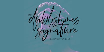 Dublishines Signature is handmade script font with stunning characters. Ideal for logos, name tag, handwritten quotes, product packaging, merchandise, social media & greeting cards. It contains a full set of lower & uppercase letters, a large range of punctuation, numerals, and multilingual support. The font also contains several alternatives for lowercase characters, accessible in the Adobe Illustrator Glyphs panel, or under Stylistic Alternates in the Adobe Photoshop OpenType menu. But If you don't have any opentype specific software, you can still use Collatin as is with its standard lowercase and uppercase letters.
 - Arrow Callouts JNL by Jeff Levine,
$29.00 Here’s a set of arrow shaped callouts in two varieties within one font. The black-on-white letters are on the upper case keys, and the white-on-black characters are on the lower case keys. The numerals 1 thru 10 in black-on-white are in the standard key positions, while the white-on-black numbers are on the same keys when engaging the “shift” key. The 'zero' key houses the number '10'. For a more dynamic look, the font is also available in an oblique version.
 - EB Base Mono by Fenotype,
$19.95 Not your average monospaced typeface, Base Mono flourishes with several handsome OT features mostly found exclusively in text fonts. Despite the geometric and techno feel of the initial roman version, the cursive version is heavily influenced by traditional Finnish weaving and folk art! The contradiction is taken further by inclusion of such classical features as small capitals and lower case figures, usually found in slightly more traditional fonts. Base Mono family suits many editorial, corporate identity and logotype tasks. It can even be used for setting text such as captions and headlines.
 - Multipa by Hurufatfont,
$22.00 Multipa takes inspiration from old-style grotesque fonts and reinterprets them for the present. Its contrast structure distinguishes it from other sans serif fonts. Thanks to style sets, letters like t, b, d, k, l are synchronized with capitalization height. It allows you to create powerful typographic designs with body text and heading styles. It is equipped with rich opentype features, style sets and ligatures for professional typography designs. Ideal for packaging, labels, routing designs, mobile applications, brand designs, logos, all kinds of presentation and editorial designs, indoor and outdoor printing works.
 - Lemony Crumpet by Kitchen Table Type Foundry,
$10.00 A crumpet is a small griddle bread, mostly enjoyed in the UK, North America, Australia and New Zealand. I have never had one, but I have heard of them and I like the name - which is probably Welsh in origin. Lemony Crumpet is a whimsical, handmade font. It is tall & thin, shaky and jumpy and I wouldn’t use it as a poster font because of its delicate properties, but it would look fantastic on book covers, product packaging and websites. Comes with extensive language support and a set of alternates for the lower case letters.
 - Elyaris by Sealoung,
$25.00 Elyaris is a classic, elegant and unique font that has lots of flowing stylish alternates and also uses ligatures to connect letters smoothly. Perfect for branding, logos, invitations, mastheads, and more. The Elyaris has 15 ligatures, 89 alternates for an upper and lower case as well as numbers and punctuation making it very versatile. The Elyaris also includes the full set: - Uppercase and Lowercase - Multilingual Symbol - Number - Punctuation - Ligature - Alternative - multilingual Hope you enjoy our fonts and if you have any questions feel free to message & I'm happy to help :)
 - 1350 Primitive Russian by GLC,
$44.00 This rough font was inspired by a Russian Cyrillic hand of the 1350s “Russkaja Pravda” (a Russian text of common Laws). As a Pro font, it supports Western and Northern European, Icelandic, Baltic, Eastern, Central European and Turkish specific characters, as well as Old Russian glyphs, including many which fell out of use in the 1700s, except in religious texts — in all over 136 Russian glyphs. The upper and lower case have the same form and almost same size, like in the original texts, which had only one size and style.
 - Xanthine by Hanoded,
$15.00 Xanthine… is a purine base found in most human body tissues. Yes, you can forget that. I don’t even know what it means, but I suddenly realised that I was running low on fonts with an ‘x’ in the name. Xanthine font is a messy brush: it is all caps, but upper and lower case mingle freely. It comes with a whole bunch of diacritics and some interesting ligatures as well. I have included a very handy shapez pack and a truckload of arrows - anything to make you happy…
 - ITC Cherie by ITC,
$29.99Some words from the designer... Like long legs walking a runway in stiletto heels, ITC Cherie is both sophisticated and feminine. West coast designer Teri Kahan developed this art nouveau-style font into two distinct all capital alphabets – one with a “high waist”, placed in the capital position, and the other a “low-waist,” placed in the lower case position. They work separately or together, and this dual nature gives a designer the ability to make subtle changes in a logo or line of text. Additional flourished letters round out this versatile headline font. - RM Whiteletter by Ray Meadows,
$19.00 It is reasonable to assume that a majority of people interested in typography will attempt some variation on the blackletter theme at some time or another. However, there seems to be a paucity of open-faced designs in this style and, having played around with a few thoughts, eventually I came up with RM Whiteletter. Light in appearance but classical in design, this clean looking open-face font provides a good counterpoint to more traditional blackletter designs. This font includes both the full Latin-1 Supplement & Latin Extended-A sets.
