10,000 search results
(0.07 seconds)
- Comic Opera JNL by Jeff Levine,
$29.00 Comic Opera JNL (and its oblique version) is a wide, bold sans serif type design with an Art Deco influence based on a 1930s namesake poster from the WPA (Works Progress Administration) advertising a performance put on by the Federal Music Project.
 - Steclo by Pepper Type,
$30.00 Steclo is a semi-closed narrowed display sans-serif typeface with pronounced technical character. It comes in 9 weights from Thin to Black accompanied by corresponding oblique italics. Steclo features rich language support including pan-European Latin and basic Cyrillic glyph sets.
 - Town Meeting JNL by Jeff Levine,
$29.00 Town Meeting JNL (available in both regular and oblique versions) is a modified version of Mud Creek JNL (which was based on Tuscan Egyptian – a classic wood type). The side spurs were removed and the split serifs were replaced by slab serifs.
 - River Terrace JNL by Jeff Levine,
$29.00 “Corbitt” is one of the many designs found within the pages of the 1907 Inland Type Foundry specimen book. A bold spurred serif with Art Nouveau influences, it is now available digitally as River Terrace JNL in both regular and oblique versions.
 - Disruptor's Script by Piñata,
$15.00 Disruptor's Script is the alter ego of our previous project Gentlemen's Script. Unlike the Gentlemen's Script, the new font is an elegant rebel and defies traditions. The font is painted with a brush pen, which is especially noticeable in the characteristic shabbiness and different thicknesses of the strokes. While the Gentlemen's Script is an embodiment of a classic costume, dress shoes and an expensive watch, Disruptor's Script is a fashionable suit, sneakers, an iWatch and a tattoo that peeks from under the shirt. The font retained the incline, speed and overall sense of dynamics inherent in Gentlemen's Script, but got a bit more chaotic and unpredictable. This is especially noticeable in the newly added shabbiness, elongated extenders, a large number of contextual alternates and different ligatures. For some high-frequency letters (10 for the Latin alphabet and 10 for the Cyrillic alphabet), we painted alternative versions that are substituted in the word instead of the standard characters when following our preceding certain groups of letters. In addition, in the Disruptor's Script you can find functional ligatures, including some of the frequently occurring two- and three-letter combinations. All these solutions dilute the monotonous line of the set, add a bit of unpredictability to the font and a touch of chaos to inscriptions. To fully enjoy usage of the font, we recommend that you always keep the features contextual alternates (calt) and standard ligatures (liga) turned on. If you do not have access to applications that support OpenType features, it does not matter—even without these features you can use and enjoy our font!
 - Sargento Gorila - Personal use only

- Broisther by Hanzel Space,
$25.00 Say hello Broisther, a handwritten script font inspired by handwriting with an aesthetic touch. Broisther is versatile enough for both web and print and can be used in a variety of projects such as stationery, packaging, apparel, wedding stationery, prints, quotes, social media graphics, planners, greeting cards, logos, branding, and much much more. The script includes a set of uppercase characters, numerals, symbols, two lowercase letter sets, and a total of 28 ligature. Full Set of standard alphabet and punctuation Extra set of ending swashed lowercase Handwritten ligatures Thanks so much for checking out my shop! Happy creating! Cheers!
 - Rogliano by TipoType,
$25.00 Rogliano is an affable Slab Serif. On one hand it responds to the classic tenet of strong and direct alphabets of the Industrial Revolution period. While nourishing the text of a warm environment, it takes the freedom to flirt with lettering and lithographic posters of the Victorian era: due to its multiple stylistic alternatives, borders and decorative ornaments. This wide range of voices makes Rogliano a versatile typeface that can move from the mechanical to humanistic with absolute ease, and perform efficiently from branding to editorial design. Rogliano offers 14 weights with support for more than 200 latin languages.
 - Anlinear by Linotype,
$29.99Anlinear is part of a series of constructed typographic experiments from the young Swiss designer Michael Parson. In the Anlinear family, which contains three separate weights, Parson has successfully created a fabulous display of alphabets out of the sole arrangement of lines at right angles to each other. The letters in this face virtually groove with the beat as you set them in text. Like a musical score, they provide a fantastic look just right for your next flyer. This family of fonts looks best when set in larger point sizes, in headlines or other display settings. - Mrs White by Hipopotam Studio,
$40.00 We designed Mrs White for our next book for children. We needed a clean script that would give a feeling of a primary school handwriting. Mrs White is filled with ligatures and contextual alternates which gives her very smooth line of text. Scripts shouldn't be used without lowercase letters so we added a small caps for headlines and acronyms. Check out the manual for more information on how to use Mrs White. Polish language use latin characters but we would like our Eastern neighbors to be able to enjoy Mrs White so we added cyrillic alphabet (script and caps).
 - Aliya Script by madjack.font,
$15.00 Aliya Script, a handwritten script font inspired by handwriting with an aesthetic touch. Aliya Script is flexible enough for web and print and can be used in a variety of projects such as stationery, packaging, apparel, wedding stationery, prints, quotes, social media graphics, planners, greeting cards, logos, branding and much more. The script includes a set of uppercase characters, numbers, symbols, two sets of lowercase letters, and ligatures. Complete Set of standard alphabet and punctuation marks Additional set of brushed lowercase endings Handwritten ligature. Thank you so much for checking out my shop! Happy creative! Cheers!
 - Cooked by Sudtipos,
$79.00 Koziupa and Paul are just as good in the kitchen as they are on the drawing board. Cooked is their choice offering of stir-fried and juicy alphabet ready to complement any visual stew you can put together. This meaty course, with even meatier OpenType programming, was designed to crank up the volume on the viewer's senses of smell and taste, and induce drooling at a mere glance. Cooked is just as suitable in packaging as it is on posters, books or music stressing the wild, adventurous and extremely pleasurable side of life. Lot of alternates of each letter are included. Enjoy!
 - Novaturient by DimitriAna,
$18.00 Novaturient is a modern, brush calligraphy font, designed to give an elegant hand-drawn style at your work. It is suitable for a variety of applications such as stationery design, invitations, logos, labels, packaging design, merchandise products, etc. It supports Central, Eastern, Western European, Baltic, Turkish and Greek languages. The font contains a variety of opentype features in Latin and Greek alphabet: Both, uppercase and lowercase character sets have their stylistic alternates. Standard ligatures, 2 sets of terminals (te01 & te02) and a set of initial letters (in01), will also give your text a custom personal look.
 - Marydale by Three Islands Press,
$29.00 While helping produce a trade magazine years ago, I admired the hand-lettering of the art director -- a woman named Marydale -- and suggested she let me model a font after her penmanship. She agreed and drew out the alphabet, and I launched an old copy of Fontographer and (to shorten a long story) ended up developing my very first digital typeface. Which has since, astonishingly, become famous worldwide. So now the real Marydale gets the mixed blessing of seeing her handwriting (and name) plastered all over the planet. Full release has regular, bold, and black weights.
 - HU Handserif KR by Heummdesign,
$25.00 HU Handserif KR contains KOREAN words and Latin alphabets. HU Handserif KR expresses the heart written down by hand in a font. Since there are no curved serifs, it is a handwritten typeface that is easy for children to follow correctly. It was produced using the order of strokes so that Hangeul can be written in the correct order, and the shape and size of the initial consonants, middle consonants, and final consonants were produced correctly. It also has an honest and correct form based on the basic principles of letters and the structure according to the form.
 - Jack Pirate by Mans Greback,
$59.00 Jack Pirate is a hand-drawn blackletter typeface, created by Måns Grebäck during 2019. It is a genuine medieval font with fraktur-inspired letter forms, Gothic decorations and a mysterious undertone. Use it for projects relating to the Middle Ages, or in modern contexts such as tattoo or storefront graphics. It contains an alternate alphabet, to be used as a stand-alone font or to give decoration and variation to the regular style. The font is multilingual and has an extensive range of glyphs; it supports all Latin-based European languages, contains numbers as well as all symbols and characters you'll ever need.
 - Amber Lemon by Supfonts,
$18.00 Amber Lemon is a cute handwritten signature font with heart and regular swashes. Perfect for greeting cards, wedding stationery, photographer watermarks logos, modern websites, apparel design and more. Amber Lemon features handwritten ligatures, beginning and end swashes for lowercase letters and heart connections Thanks so much for checking out my shop, and please get in touch if you have any questions! Amber Lemon Font Features: Full Set of standard alphabet and punctuation Extra set of beginning and ending swashed lowercase Extra set of heart connections handwritten ligatures PUA Encoded - no special software needed to access extra characters Multilingual Characters AÁĂÂÄÀĀĄÅÃÆBCĆČÇĊDÐĎĐEÉĚÊËĖÈĒĘẼFGĞĢĠḠHĦIIJÍÎÏİÌĪĮĨJKĶLĹĽĻŁMNŃŇŅÑ OÓÔÖÒŐŌØÕŒPÞQRŔŘŖSŚŠŞȘẞTŤŢȚUÚÛÜÙŰŪŲŮŨVWẂŴẄẀXYÝŶŸỲỸZŹŽŻ aáăâäàāąåãæbcćčçċdðďđeéěêëėèēęẽfgğģġḡhħiıíîïìijīįĩjȷkķlĺľļłmnńňņñoóôöòőōøõœpþ qrŕřŗsśšşșßtťţțuúûüùűūųůũvwẃŵẅẁxyýŷÿỳỹzźžż
 - Mocombo JNL by Jeff Levine,
$29.00Mocombo JNL is a slightly modified version of one of the numerous alphabets created by the late Alf R. Becker for Signs of the Times Magazine during the period of the 1930s through the 1950s. Tod Swormstedt of ST Media—who is also the curator of the American Sign Museum in Cincinnati, Ohio—supplied Jeff Levine a wealth of source material from which this font is derived. The angular style of this typeface was originally referred to as “German Poster Lettering” by Becker, but it can represent many styles from 1940s night clubs to African safaris and just about anything in-between. - ITC Airstream by ITC,
$29.00Timothy Donaldson creates letterforms anywhere using anything: he is just as happy making letters with pens and brushes, many of which he makes himself. Applying his personal commitment to the beauty of hand-drawn letterforms to modern type design methods has ensured that his fonts frequently reveal the presence of a joyful creativity behind the design. Airstreams alphabet is composed of consciously irregular handwriting characters and the overall tone is set by the emphasized vertical strokes. The erratic Airstream with its cheerful, unconventional character is intended for shorter texts and headlines and should be used in point sizes 10 and larger. - Linotype Killer by Linotype,
$29.99Linotype Killer is part of the Take Type Library, selected from the contestants of Linotype’s International Digital Type Design Contests from 1994 and 1997. Designed by German artist Andre Nossek, the font seems to describe the Technosound of the 1990s with its electronically produced sights and sounds. It represents repetition, mass production and conformity. The alphabet consists exclusively of capital letters, all based on a rectangular form, all of the same height, and, with the exception of the I’, all of the same width. The cool and distant Linotype Killer is best suited to short headlines. - Victorixel by Quatype,
$35.00 Victorixel is a pixel font that incorporates the Victorian wood-type style. In order to organically combine these two styles, I abandon the exaggerated and ornate shape, yet the essence of the wood type was retained, such as the forked serif at the beginning and end of the letter stem. Victorixel family has over 800 glyphs (including emojis) and it supports lots of Latin-alphabet-based languages. It is suitable for the title, poster, etc. *EASTER EGG* Turn on the ligature OpenType features and input MBTI+emoji will output the MBTI emojis. For instance: ENTPemoji Enjoy!
 - Sondela by Scholtz Fonts,
$19.00Sondela is a gently rounded, informal font, whose name means "welcome" or "come closer". It echoes the openhearted tradition of the Zulu people, where all who come are welcome. The font is available in regular and display (Pizazz) versions. Sondela Pizazz incorporates the zig-zag pattern that has been used in traditional Zulu beadwork for generations. It is highly effective when used in conjunction with the unadorned Sondela regular. The numerals are mono-spaced so that they will line up correctly in columns of figures. The letters of the alphabet are correctly kerned so that they appear correctly in text. - AT Move Bloggy by André Toet Design,
$39.95 BLOGGY designed in 2010 by André Toet. In the series of typefaces that were created by our team, BLOGGY stands out as a rough typeface based on a grid. Within this square grid the typeface is enlarged and reduced in size in order to create a dazzling font. A complete ‘extra alphabet’ was added to the font by cutting the letters diagonally. To us typedesign doesn't only mean designing fonts for books but also advertising, posters, film or digital use. We hope that BLOGGY will do the trick ! Concept/Art Direction/Design: André Toet © 2017
 - Display Squares Two by Gerald Gallo,
$20.00 Display Squares Two is a display font not intended for text use. It was designed specifically for display, headline, logotype, branding, and similar applications. Display Squares Two has upper and lowercase alphabets, numbers, and punctuation.
 - Display Dots One by Gerald Gallo,
$20.00 Display Dots One is a display font not intended for text use. It was designed specifically for display, headline, logotype, branding, and similar applications. Display Dots One has upper and lowercase alphabets, numbers, and punctuation.
 - Candy Lovely by Good Java Studio,
$25.00 Candy Lovely - Cute Handwritten Font make from handlettering ideas in typeface. This font includes full of Alphabetical glyphs, Numerals, and punctuation. This is so perfect for invitations, monograms, wedding, fashion, branding, label, handlettering or logotype.
 - Display Dots Seven by Gerald Gallo,
$20.00 Display Dots Seven is a display font not intended for text use. It was designed specifically for display, headline, logotype, branding, and similar applications. Display Dots Seven has upper and lowercase alphabets, numbers, and punctuation.
 - October Quirky by Good Java Studio,
$20.00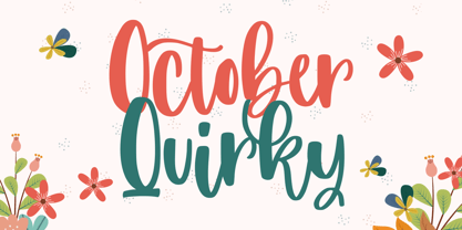 October Quirky - Cute Quirky font make from handlettering ideas in typeface. This font includes full of Alphabetical glyphs, Numerals, and punctuation. This is so perfect for invitations, monograms, wedding, fashion, branding, label, handlettering or logotype.
 - Display Squares One by Gerald Gallo,
$20.00 Display Squares One is a display font not intended for text use. It was designed specifically for display, headline, logotype, branding, and similar applications. Display Squares One has upper and lowercase alphabets, numbers, and punctuation.
 - ATC Oneshot by Avondale Type Co.,
$20.00 ATC Oneshot, is a handwritten script font based on neighborhood bodega signage. Contains 160+ glyphs, full alphabet, ligatures, numberals, accents and punctuation. File type included in download is .otf. ATC Oneshot was released in 2019.
 - Unikled by Ingrimayne Type,
$12.95 Unikled a decorative calligraphic family inspired by the uncial style. The upper and lower cases are largely different and can be treated as two separate alphabets. It is available in two weights, plain and bold.
 - Waterloo Bold by ITC,
$29.99The slab serif Waterloo Bold was designed by Alan Meeks. He chose unique and individual forms to give this alphabet its unmistakable character. The cross strokes of the capitals are not in the optical center, the serifs have light furrows, and the figures have a slight slant tot he right, giving this font a dynamic, flowing look. Waterloo Bold is reminiscent of cigars, whiskey and the 1930s and should be used only in headlines in large point sizes. - Photo Developer JNL by Jeff Levine,
$29.00 An image found online of a vintage storefront sign for the Kraus Photo Shop was the inspiration for Photo Developer JNL, which is available in both regular and oblique versions. The sign featured a thick and thin Art Deco style lettering with an inline cutting through the thicker strokes. Before the advent of digital photography, and way before chain stores offered in-house processing, neighborhood photo labs were the only place for getting prints from your roll film (unless you wanted to send the film into Kodak for developing and printing). Customers of these stores could also purchase additional film, cameras and photographic accessories from the same location.
 - Vaudevillian JNL by Jeff Levine,
$29.00 The place for a family to be entertained by comedians, dancers, acrobats, animal acts, singers and just about any other acts that fit the bill at the time was the vaudeville theater. Prior to radio becoming the major source of entertainment for the American public, popular songs were introduced on the stages of these entertainment venues. One such song from 1916 with a World War I patriotic sentiment was "A Yankee Doodle Boy Is Good Enough for Me". The sheet music featured the title hand lettered in Art Nouveau style. This became the design source for Vaudevillian JNL, available in both regular and oblique versions.
 - Yankee Doodle Boy JNL by Jeff Levine,
$29.00 In the early years of the 20th Century, singer-dancer-actor-composer-playwright George M. Cohan was known as "The Man Who Owned Broadway". In 1904, Cohan was enjoying success with his latest creation, "Little Johnny Jones". Cohan gave America what would become a number of iconic songs, and both he and his compositions were immortalized in the 1942 biographical film "Yankee Doodle Dandy" starring James Cagney. The Art Nouveau-influenced hand lettering of the title on the cover of the sheet music for "The Yankee Doodle Boy" was the model for its namesake digital typeface design and is available in both regular and oblique versions.
 - Winter Garden JNL by Jeff Levine,
$29.00 Winter Garden JNL was modeled from the eccentric sans serif hand lettering with varying line widths found on the sheet music of 1917's "When the Girl You'd Give the World to Win Gives Her Heart to You". (It seems that sheet music from the early 1900s often had song titles that were more than just a few choice words. This particular ditty's title took up fourteen words to make its point.) The font is available in regular and oblique versions and gets its name from both the famed theater in New York and the city located 14 miles West of downtown Orlando, Florida.
 - Trade Convention JNL by Jeff Levine,
$29.00 An ad for the annual Variety Club Convention appeared in the March 18, 1940 issue of "The Film Daily. The main headline was hand lettered in a classic Art Deco "solid" style of sans serif - ultra bold and with no counters - but had one additional feature: 'engraved' lines to the left of each character. This has now been expanded into the digital typeface Trade Convention JNL, which is available in both regular and oblique versions. Variety Clubs (now know as Variety - The Children's Charity) was founded in Pittsburgh, Pennsylvania in 1928 by entertainers specifically to aid children. Their history can be found at https://variety.org/who-we-are/history
 - Maintenance Stencil JNL by Jeff Levine,
$29.00 In the opening scenes of the 1938 Three Stooges comedy “Tassels in the Air” the Stooges are working as maintenance men inside an office building. Their immediate job requirement is to paint the tenants’ business names on the corresponding office doors with pre-cut stencils. Of course, they get it all wrong. Nonetheless, the stencils appear to be a hand cut sans serif design in a squared or ‘block’ style with rounded corners, and some of the applied lettering made for an interesting challenge to recreate as a typeface. The end result is Maintenance Stencil JNL, which is available in both regular and oblique versions.
 - News Copy JNL by Jeff Levine,
$29.00 Found within the pages of the 1934 edition of the American Type Foundry’s “Book of American Type” is a sans serif design with rounded terminals that emulates a typewriter face. “Jumbo Typewriter” is reminiscent of the type of lettering formerly found on teletype news copy. “Teletype” was a division of Western Electric (part of AT&T), and the machines utilized telephone lines to electronically type and send (as well as receive) messages worldwide. Many folks will remember the sound of teletype machines in the background when radio stations had their news breaks. Now available digitally as News Copy JNL, it is available in both regular and oblique versions.
 - Pre Code Movies JNL by Jeff Levine,
$29.00 The hand lettered credits from the 1931 melodrama “Safe in Hell” inspired the typeface Pre Code Movies JNL, which is available in both regular and oblique versions. The design is strongly influenced by the popular Art Deco style of thick-and-thin characters and also features rounded corners. The font’s name comes from the early era of talking pictures and the short period before the establishment of the Hays Office in 1934 when Hollywood did not self-censor itself. Many then-taboo topics were exploited on film until Will Hays cracked down on such productions. To read more about Pre-Code Hollywood, visit the Wikipedia link: https://en.wikipedia.org/wiki/Pre-Code_Hollywood
