CRAY AN? by Skydog is an intriguing and visually captivating font that manages to transport users back to their childhood days, evoking memories of carefree doodles on the edges of notebooks. This fo...
Cheri Liney is a distinctive and playful font that captures the essence of lighthearted whimsy. This typeface, created by the talented team at Fontalicious, showcases a unique blend of creativity and...

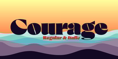
High-contrast? High impact? Have Courage? Eye-catching and (extra, extra) bold, Courage balances ultra-high stroke weight, delicate details, and unique letterforms with a self-indulgent passion that will make you feel a little guilty using it. Honestly, use it large and don’t try to force it into a small space, because these fearless letterforms need room to move. Flavored with both upright and italic styles, each font includes an indulgent level of alternates, swashes and titling options, visual elements and more. A backstory with a different name Years ago, I was commissioned to take my Lust typeface and produce something unique to use for large format graphics for an event…cool. It needed to be hyper-contrast with a lot of over-the-top details. With a tight turnaround, I looked for primers within my development catalogue to help me, and settled on some early work on a typeface I had drawn called Hedonist. I used those sketches and its conventions to retrofit and build out Lust Hedonist (only to see the project go bust on the client’s end). I intended to go back shortly after the Lust Hedonist release to finalize a retail version of the OG Hedonist, but I never could settle on the look of the 'g' or the numerals, got distracted with other projects, and never picked it back up… until last year. After randomly doodling a fat, flat ‘g’ with an extremely tilted counter axis, I knew immediately how it could be used and that (re)set things in motion. Only problem was, in the process of refining the letterforms I began truly dissecting the pieces, rediscovering all of the recklessness within Hedonist, and decided on fundamentally rewriting the approach to the typeface… literally flaying it to the bone. I’m much, much happier with this finished typeface now, but the name no longer fit the moniker given to the first, adolescent approach—there’s far more audacity and cleverness in these letterforms, tenacious in their resolution now. As a result, the name Courage fit the mettle of this typeface so much more, so I kept it.
As if plucked from the whimsical mind of a doodling wizard, the font Szorakatenusz by Bumbayo Font Fabrik is nothing short of a typographic enchantment. Picture letters that decided to throw a costum...
The font named Skratch, crafted by the talented typographer David Kerkhoff, is a true embodiment of creativity and unleashed artistic expression. It dives into the realm of casual and spontaneous des...
Ah, "AddShade" – the mysterious, yet seemingly playful character in the grand narrative of typography. Picture this: Imagine you're walking down the street on a sunny afternoon. The sun is high, cast...
The font Orange Juice is like the wild, energetic friend that brings the party to any design. Crafted by the talented Brittney Murphy, it's as if she dipped her brush in pure sunshine and zest, captu...
Chris MacGregor's ThreadFun font embodies playfulness and creativity in every stroke, making it a delightful addition to any project seeking a touch of whimsy and handcrafted charm. As the name sugge...
The font "KG The Last Time Bubble" by Kimberly Geswein is a delightful and expressive display font that captures the whimsical essence of handwritten notes and bubble letters. This font is part of Ki...
The KR Strawberry font, designed by the talented Kat Rakos, exudes a delightful whimsy that captures the essence of childlike wonder and playfulness. At its core, it is a font that stands out for its...
"Sunspots AOE" is a distinctive font created by Astigmatic One Eye, a type foundry known for its wide and eclectic array of fonts, ranging from the practical to the whimsical. Sunspots AOE encapsulat...
The ChickenScratch AOE font, designed by the prolific Astigmatic One Eye Typographic Institute, carries with it a distinct personality and playfulness that sets it apart from more traditional typefac...
The font named "BLUSH BEAR" by SpideRaY is a charming and playful typeface that captures the essence of fun, creativity, and warmth. Designed with a gentle nod to whimsical storytelling and the light...
Alright! Picture this: the font Funny Face. It's like stumbling into a party where every letter invites you to dance with its unique rhythm. At first glance, Funny Face might remind you of doodles in...
The font "Give You Glory" by Kimberly Geswein is a captivating embodiment of casual and spirited handcrafted artistry. With its engaging hand-lettered charm, this typeface exudes an air of warm, frie...
LC Chalk, although a fictional creation for the sake of this description, embodies the essence of nostalgia and creativity, merging the simplicity of handwritten notes with the rustic charm of chalkb...
As of my last update in April 2023, the font "Jon Handwriting" specifically might be less well-known or perhaps even a custom or personal creation, rather than one of the widely recognized typefaces ...
The Flim-Flam font, crafted by the talented Tom Ledin, exudes a playful and whimsical quality that instantly grabs the attention of the viewer. This typeface, much akin to its name, embodies a cheerf...
The Arggh @$*# Lite font, crafted by GemFonts and the talented Graham Meade, stands out distinctly in the realm of typography for its imaginative and playful design. This font encapsulates the essenc...
CoffeeMilkCrazy by Flop Design encapsulates a whimsical and playful energy that seems to dance upon the page, inviting readers into a world where font becomes more than just text - it becomes an expe...
KR A Fishing We Go is a whimsical and playful font created by the talented Kat Rakos. True to its name, the font draws significant inspiration from the leisurely and often adventurous activity of fis...
Ah, Tucker Handwritten! Imagine a script so carefree and whimsical, it's like each letter rolled out of bed, stretched, and decided to dance its way onto the page. If fonts were people, Tucker Handwr...
The "Little Miss" font, a creation by SpideRaY, carries a distinctive charm that sets it apart in the vast sea of typography. This font is inspired by the whimsical world of children's literature and...
Ah, the jovial and whimsical world of fonts, where each typeface has its own distinct personality and charm. Nestled within this realm of typographic delights, you'll find a gem named joeHand 3, craf...
Instant Soup Mix by Utopiafonts is a font that captures the essence of casual creativity and quirky charm. Envisioned and designed to bring a playful and somewhat whimsical touch to various types of ...
Ah, Clementine Sketch by TheBlueJoker - imagine if a lemonade stand in mid-July decided it wanted a career change and became a font. This is that font. It's as if each letter, in its whimsical noncha...
Alright, folks, let’s dive into the whimsical world of the font named LAZYTOWN, crafted by none other than the font wizard, SpideRaY. Picture this: a font so playfully quirky, it decided to ditch the...
The MoneyGoRound font by Imagex is a distinctive and lively typeface that embodies a sense of fun and creativity. This font stands out with its playful character shapes and the somewhat whimsical fee...
The Brewsky font, designed by the talented Tup Wanders, is a unique and charismatic typeface that embodies a perfect blend of playfulness and artistic flair. This font manages to capture the essence ...
Pea Nicole is a font that possesses a charming, handcrafted aesthetic, making it a delightful choice for a variety of design projects that aim to evoke a personal and intimate feel. Its whimsical nat...
Alison, if it were a person, would be the charming friend who can walk into any room and instantly make everyone feel more cheerful and at ease. Picture a font that balances the line between casual a...
Scrawl, designed by Nikolay Dubina, is a distinctive and expressive font that captures the energy and spontaneity of handwriting. Unlike the precision and uniformity found in most typefaces, Scrawl e...
The Janda Scrapgirl Dots font, designed by Kimberly Geswein, is a delightfully whimsical and charming typeface that captures the essence of creativity and playfulness. Kimberly Geswein, known for her...
The "Huggable Hedgehogs Demo" font by Brittney Murphy is a delightful and charming typeface that seems to capture the essence of whimsy and playfulness, much like the endearing qualities of hedgehogs...
"GoodDog Plain" is a font that exudes a playful charm and an unpretentious simplicity, much like the delight one might find in watching the joyful antics of a beloved pet. Its design is rooted in a c...
Imagine a font that decided to throw on a tuxedo, sip a glass of exquisite wine, and then, mid-sip, dash off to join a carnival. That, my friend, is Reprise Script by Avid Technology. It's like the h...

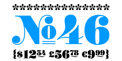
PUBLIC SERVICE ANNOUNCEMENT: Price Didone has inspired a full alphabetic font - Mastadoni, so if you're after more than numerals, head over there! Price Didone is a font with a singular purpose: The setting of elegant, stylish price tags. As such it is non-alphabetic, featuring instead numerals, a large array of currency symbols, and a smattering of typographic niceties such as quotes, brackets, pilcrow, daggers and a very curvaceous ampersand. Certain currency symbols that are not independent glyphs (Q, Ft, kr etc.) are included as their constituent letters, some of which also have automatic ligatures for that little something extra. There are currency symbols included which have not (yet) been accepted to unicode, such as the Russian Ruble and Bitcoin symbols. For ease of access, these can be typed using the standard ligatures feature. See features below for the full list. Features: Automatic Fractions - with fractions feature engaged, arbitrary fractions are a doddle. Stylistic Sets: SS01 - an alternate look for 4 SS02 - a double stroked dollar symbol SS03- the # sign becomes a stylish numero Stylistic Alternates - for software that doesn't support stylistic sets, the above three features are grouped into the one SALT feature. Standard Ligatures - certain typed combinations automatically change to different glyphs: B|| = Bitcoin symbol P- = Russian Ruble RM = Malaysian Rimgit symbol Rp = Indonesian Rupiah Rs = Rupees Ft = Hungarian Forint kr = Kroner symbol % off;%off;%ff = Special percent off ligature Discretionary Ligatures - this feature sets decimal prices like $5.95 with the numerals after the period smaller and raised from the baseline, underlined by a nice swoosh. It also shrinks the dollar, sterling, and Euro symbols for a more authentic look. While intended for one sole purpose, Price Didone could nevertheless be quite versatile. Quote marks and typographic symbols can be used for decoration. Everybody loves a nice ampersand and this is one I'm really proud of. Or you might just want some pretty numbers for your house, or sports jersey, or just to stand out a little from the rest of your text. Whatever use you may have in mind, go for it. And do let me know if your currency symbol isn't included, and I'll quickly add it to the glyph set in future versions.
Ah, the Confinental FREE font by Inspiratype – a name that evokes the elegance of a continental breakfast in Paris but with the 'FREE' tag dangling like a cherry on top that says, "Bonjour, mon ami! ...

The famous roman type cut in Venice by Nicolas Jenson, and used in 1470 for his printing of the tract, De Evangelica Praeparatione, Eusebius, has usually been declared the seminal and definitive representative of a class of types known as Venetian Old Style. The Jenson type is thought to have been the primary model for types that immediately followed. Subsequent 15th-century Venetian Old Style types, cut by other punchcutters in Venice and elsewhere in Italy, are also worthy of study, but have been largely neglected by 20th-century type designers. There were many versions of Venetian Old Style types produced in the final quarter of the quattrocento. The exact number is unknown, but numerous printed examples survive, though the actual types, matrices, and punches are long gone. All these types are not, however, conspicuously Jensonian in character. Each shows a liberal amount of individuality, inconsistency, and eccentricity. My fascination with these historical types began in the 1970s and eventually led to the production of my first text typeface, Iowan Old Style (Bitstream, 1991). Sometime in the early 1990s, I started doodling letters for another Venetian typeface. The letters were pieced together from sections of circles and squares. The n, a standard lowercase control character in a text typeface, came first. Its most unusual feature was its head serif, a bisected quadrant of a circle. My aim was to see if its sharp beak would work with blunt, rectangular, foot serifs. Next, I wanted to see if I could construct a set of capital letters by following a similar design system. Rectangular serifs, or what we today call "slab serifs," were common in early roman printing types, particularly text types cut in Italy before 1500. Slab serifs are evident on both lowercase and uppercase characters in roman types of the Incunabula period, but they are seen mainly at the feet of the lowercase letters. The head serifs on lowercase letters of early roman types were usually angled. They were not arched, like mine. Oddly, there seems to be no actual historical precedent for my approach. Another characteristic of my arched serif is that the side opposite the arch is flat, not concave. Arched, concave serifs were used extensively in early italic types, a genre which first appeared more than a quarter century after roman types. Their forms followed humanistic cursive writing, common in Italy since before movable type was used there. Initially, italic characters were all lowercase, set with upright capitals (a practice I much admire and would like to see revived). Sloped italic capitals were not introduced until the middle of the sixteenth century, and they have very little to do with the evolution of humanist scripts. In contrast to the cursive writing on which italic types were based, formal book hands used by humanist scholars to transcribe classical texts served as a source of inspiration for the lowercase letters of the first roman types cut in Italy. While book hands were not as informal as cursive scripts, they still had features which could be said to be more calligraphic than geometric in detail. Over time, though, the copied vestiges of calligraphy virtually disappeared from roman fonts, and type became more rational. This profound change in the way type developed was also due in part to popular interest in the classical inscriptions of Roman antiquity. Imperial Roman letters, or majuscules, became models for the capital letters in nearly all early roman printing types. So it was, that the first letters in my typeface arose from pondering how shapes of lowercase letters and capital letters relate to one another in terms of classical ideals and geometric proportions, two pinnacles in a range of artistic notions which emerged during the Italian Renaissance. Indeed, such ideas are interesting to explore, but in the field of type design they often lead to dead ends. It is generally acknowledged, for instance, that pure geometry, as a strict approach to type design, has limitations. No roman alphabet, based solely on the circle and square, has ever been ideal for continuous reading. This much, I knew from the start. In the course of developing my typeface for text, innumerable compromises were made. Even though the finished letterforms retain a measure of geometric structure, they were modified again and again to improve their performance en masse. Each modification caused further deviation from my original scheme, and gave every font a slightly different direction. In the lower case letters especially, I made countless variations, and diverged significantly from my original plan. For example, not all the arcs remained radial, and they were designed to vary from font to font. Such variety added to the individuality of each style. The counters of many letters are described by intersecting arcs or angled facets, and the bowls are not round. In the capitals, angular bracketing was used practically everywhere stems and serifs meet, accentuating the terseness of the characters. As a result of all my tinkering, the entire family took on a kind of rich, familiar, coarseness - akin to roman types of the late 1400s. In his book, Printing Types D. B. Updike wrote: "Almost all Italian roman fonts in the last half of the fifteenth century had an air of "security" and generous ease extremely agreeable to the eye. Indeed, there is nothing better than fine Italian roman type in the whole history of typography." It does seem a shame that only in the 20th century have revivals of these beautiful types found acceptance in the English language. For four centuries (circa 1500 - circa 1900) Venetian Old Style faces were definitely not in favor in any living language. Recently, though, reinterpretations of early Italian printing types have been returning with a vengeance. The name Vendetta, which as an Italian sound I like, struck me as being a word that could be taken to signifiy a comeback of types designed in the Venetian style. In closing, I should add that a large measure of Vendetta's overall character comes from a synthesis of ideas, old and new. Hallmarks of roman type design from the Incunabula period are blended with contemporary concerns for the optimal display of letterforms on computer screens. Vendetta is thus not a historical revival. It is instead an indirect but personal digital homage to the roman types of punchcutters whose work was influenced by the example Jenson set in 1470. John Downer.


