10,000 search results
(0.128 seconds)
- BAQ Metal by Thinkdust,
$10.00 Another font for the BAQ family, BAQ metal brings back the classically solid, sturdy form of its predecessors with a rough and ready finish. The roundness of this font doesn’t take away from its impact, but does keep it from being too harsh, while the texture creates extra legibility at smaller sizes. Really though, BAQ metal works better when it’s bigger, standing out with its coarse appearance and rotund fullness. Use it to create outstanding headlines and catch people’s attention without being aggressive, even in a variety of different languages.
 - Loftype by Gleb Guralnyk,
$15.00 Hello! Presenting a design set named "Loftype". It includes a font files with various OpenType features - lots of ligatures and alternate characters with swashes (you can access them trough "OpenType" tab, or manually insert them from "Glyphs" tab).
 - Museo Slab Rounded by exljbris,
$16.50 One of the most friendly Slab Serifs just got even more friendly. Museo Slab Rounded is the latest addition to the Museo font family. It has updated letterforms, spacing and kerning. It can perfectly be combined with Museo Sans Rounded. It comes in six weights with italics, that are not just slanted regulars. Key characters have been changed to give the italics more flow.
 - Bandshell JNL by Jeff Levine,
$29.00 Anyone old enough to remember either the radio or television version of “The Adventures of Ozzie and Harriet” pictures Ozzie Nelson as the easygoing father figure who never seemed to have a real job – he was always hanging around the house. In truth, the handsome young Ozzie was a bandleader in the 1930s and 1940s and ended up marrying his ‘girl singer’, Harriet Hilliard. A piece of sheet music from 1933 for “You Have Taken My Heart” was one of the songs Nelson featured with his Columbia Broadcasting System Orchestra. The title was hand lettered in what can only be described as a slightly eccentric Art Deco Sans serif. Redrawn and cleaned up to reflect more uniform stroke weights, Bandshell JNL is now available in both regular and oblique versions.
 - KG Turning Tables by Kimberly Geswein,
$5.00 A neater version of my font Complete in Him, a hand-drawn marker font. Hand drawn with a brush marker, this font is neat but still has enough twists to make it fun. Perfect for painted or brushed looks.
 - CrappyJoe by JOEBOB graphics,
$- CrappyJoe got its name because I wrote all characters with a felt-pen with a broken tip. It's still very readable though.
 - Rhythm by Positype,
$42.00 I hate the idea of revivals. I have publicly said I choose not to do revivals because they make me uncomfortable. This is as close as I have been to crossing my own line. To be direct, Rhythm is based on the ATF typeface, Ratio (I just recently learned the foundry of origin). I came across this typeface from a printed specimen years ago when I was in school and held onto it. It was unique and I loved how well integrated the inline worked within both the flourish and serif of the glyphs—it was old, but not, reminiscent, but fresh. My specimen was limited in the glyph offering (it was c. 1930ish) and I realized a lot would need to be done to ‘finish’ it and bring it to contemporary expectations. I didn't want to do ‘retro’ and tried to avoid the visual trappings associated with it. What I did want to do is interpret what I had in the specimen and reinterpret it digitally, refining its construction and extending its typographic equity along the way. The ‘One’ and ‘Two’ (and their matching ‘Solids’) styles diverge providing various elaborations that coordinate well between rigid bracketed serifs and compact tails. I further expanded the glyph offering to include a full diacritic set, old style numerals, fractions, stylistic alternates, swashes, titling alternates and controlled flourishes that adhere to the efficient framework of the script. And yes, I refer to it as a ‘script’ because calling it a ‘cutesy serif’ seems wrong :) I hope this is seen less as a slavish revival and more as a championing of a really unique typeface. The Original Typeface was Adastra, designed by Herbert Thannhaeuser for the Foundry D. Stempel AG in Frankfurt, Germany.
 - Dimensions by Dharma Type,
$19.99 Dimensions is redesigned font family based on Blackout font released as free font in 2005. The original blackout has been used especially for company or brand logo of fashion and music label in the world. In 2011, Blackout had evolved into this Dimensions font family of seven weights with roman and italics. They are one of the most condensed, black and skinny font in the world. All weights and italics have upper and lower cases, accented characters and small capital glyphs that can be used with OpenType smcp feature. There is high contrast version called Speedometer.
 - Cigar Label by Solotype,
$19.95This font was inspired by the embossed lettering on cigar boxes. The letters, or entire words, are often surrounded by raised dots, and that was our idea here. We drew this about 1997, and have been refining it ever since. All letters are on the lowercase keyboard; the end pieces and spaces are on the caps. - Solpera by Storm Type Foundry,
$32.00This type face fills one of the gaps between the world of Roman alphabets and that of linear alphabets. The first to be designed was the set of upper-case letters. The expression of these characters cannot conceal that they were originally intended only for the sculptor's use, as a type face for three-dimensional inscriptions. Their width proportions reflect a dialogue between the contemporary feeling and the legacy of classical Roman inscriptions. The type face was later complemented with a set of lower-case letters and elaborated into further designs. Its clear, concise letter forms end with small serifs which not only make the type face more refined, but above all anchor the individual letter signs visually to the horizontal of the text line. The austere construction of the majority of the letters is balanced by the more exuberant, humanizing forms of the most frequently used letters "a"; "e". (The three variants of the lower-case "e" enable to create rhythmically differentiated texts.) The letters in which a straight stroke is connected with an arch are designed in two ways. That means that the letters "n", "h","m" and the group of letters "b","d","p","q" are conceived in a different way. Thus an interesting tension is created in the structure of the text, which, however, does not endanger legibility. The economizing, slightly narrowed design of this type face predetermines its use for the setting of usual texts. In larger sizes, however, it produces a rather serious, even solemn, impression. - Pink Broccoli PB by Pink Broccoli,
$14.00 A soft-edged shortcaps typeface with enough funk to lighten any mood.
 - Manufactory JNL by Jeff Levine,
$29.00 Manufactory JNL and its oblique counterpart were re-drawn from examples of a now-antique typeface used within many advertisements found throughout the pages of The American Stationer magazine, circa 1879. The term ‘manufactory’ was popular during this era; the word being a more archaic form of ‘factory’. There is a bit of Western flavor to this type design, as the spurred serifs and the top and bottom strokes are heavier than the vertical and mid-point stroke weights.
 - Steel Grrrder by ULGA Type,
$9.00 Steel Grrrder is a robust, industrial-style stencil typeface family consisting of six weights, from light to black, with corresponding italics. Suitable for all kinds of display purposes including posters, film titles, book covers, magazines, advertising, logos, packaging, signage and games design, Steel Grrrder is especially useful where the message needs some serious geometric bite behind it. Steel Grrrder is best categorised as a constructivist sans family. The character shapes are sharp, angular and slightly condensed - it’s a rigid, no-frills, no-curves, mega-metallic design. Legible? Not really. Readable? I think not. In your faceable? Absolutely! This is a tough display typeface, designed to work in the most demanding typographic situations. It won’t buckle under pressure or wilt when the heat’s turned up. Forged from carbon steel and wrapped in a layer of Graphene, Steel Grrrder is unashamedly rugged, a rock-hard pound-for-pound boxer specialising in thumping knockouts. The Steel Grrrrder extended family also includes a six-weight joining script and two display fonts, Groove & Nutjob - all designed to work with each other.
 - Kiyosace by Olivetype,
$23.00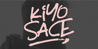 Kiyosace is an authentic brush font with very cool textures and a natural feel. It's perfect for posters, headlines, and logotypes. Its rough and tough style gives it a unique authenticity that sets it apart from the rest. Kiyosace font includes : Standard Latin Uppercase and Lowercase Numbers, symbols, and punctuations Swashes Multilingual Support. PUA Encoded and fully accessible without additional design software Simple Installations Works on PC & Mac Thank You.
 - Tall Skinny Condensed by Outside the Line,
$19.00 This is the tallest, skinniest, most condensed, non serif font I know of. I designed this because I felt a serious need for that one big, thin word to fit in a narrow space. It is great for ‘SALE!’ in a one column ad. Also is a life saver for several long words in a narrow space like Merry Christmas... If you need a full character set take a look at the new Ultra Condensed 3 font family. Ultra Condensed was based on Tall Skinny Condensed with some changes and a full character set. Ultra Condensed Lettered is a hand lettered version and Ultra Condensed Line is a lighter hand drawn version
 - Bessemer by Sivioco,
$10.00 Bessemer is an all-caps sans-serif display font inspired by industrial lettering from the 20th century. On its own, it has a predominantly factory-made feel, but is versatile enough to work well in a variety of settings. In other words, it feels just at home on a series of technical guides as it does on a range of hair styling products. Bessemer comes in 5 weights ranging from Light to Bold and has been designed with chamfered edges. This makes it really easy to customize and create your own custom type. It also includes the following OpenType features: • Proportional Lining Figures • Tabular Lining Figures • Superior & Inferior Figures • Numerators & Denominators • Ordinals • Fractions Perfect for logos, posters, t-shirts, packaging and use in video. Delivered in TTF and OTF format. Supports all Western, Central and South Eastern European languages.
 - Tihlsand by Hart Foundry,
$20.00 Introducing a new font from Hart Foundry, Tihlsand. This rounded and rough font are made with carefully, so it look good in pair, this font are also good for Logotype, Branding or even a quotes. With this neutral font are also good for you to make a modern or vintage design, With a bunch of an alternate and ligature you can make a good combination for your design. What's Included: -Character set A-Z -Uppercase & Lowercase -Numerals & Punctuation -Multilingual -Some Ligature & Stylistic alternates -Works on PC & Mac There is the details about the font, if there any other question about this font. Do not hesitate to let me know... Thanks
 - Imperfection by LIGHTDESIGNS,
$9.00 IMPERFECTION Is a hand-written san-serif font inspired by human imperfections (mistakes). This is the first font created by LIGHTDESIGNS. It has no consistency in it's design which made the font looks like a lot of mistakes has been made. But this is done with purpose. With these characteristics, the font is given the name "IMPERFECTION', With surprising font and glyph designs, the intent of this font design is to pass a message that says, "SUCCESS IS NOT THE ACHIEVEMENT OF PERFECTION, BUT THE ACCOMMODATION OF IMPERFECTION™ This font design will be a fit in every design project it is utilised like logos, posters, flyers, magazine, card designs e.t.c. This font can be nicely pairs with script fonts & San serif font.
 - Silver Shark by Epiclinez,
$18.00 Silver Shark is a cool and authentic brush display font. It has a bold, rough texture and as a result, it makes each of your creative designs stand out. Carefully handcrafted to grab the attention of the viewers, this font is ideal for logos, posters, headlines, branding, apparel and so much more. Silver Shark contains 199 glyphs. Supporting more than 66 languages, from English to Zulu. Accessible in Adobe Illustrator, Adobe Photoshop, Adobe InDesign, even works on Microsoft Word PUA Encoded and fully accessible without additional design software,
 - Quijote Sauvage by Lián Types,
$45.00 It was in the beginning of 2008 when I designed a font named Quijote, its predecessor. In the middle of 2009, I looked at it again and thought it could be a good idea to make an update of it. Variables and Features: Quijote Sauvage Pro is the most complete variable. It includes all the ligatures, alternates and swashes. It has the OpenType function in order to alternate glyphs easily when running applications which support this. The font is also offered separately. Quijote Sauvage Standard has the right glyphs to get an equilibrium between wildness and softness. It includes standard and discretionary ligatures. Quijote Sauvage Stylistic has the sharpest glyphs. Its decorative traces are discreet in order not to have problems as regards legibility. Its upper case are less wild than the other variables. Quijote Sauvage Text is the most discreet of its partners. This one was thought in order to improve legibility. Its ascenders and descenders are shorter, so the words are easier to read in small sizes. Quijote Sauvage Contextual, Swash and Titling, are the ones with wonderful terminals. They decorate words, adding a wonderful look of wildness or passion.
 - Dez Squeeze Pro by Dezcom,
$32.00 Dez Squeeze Pro is a display family in seven bold widths. Choose the width that fits the space available for your headline. Dez Squeeze Pro is a very bold display face with multiple language support, nearly 600 glyphs, stylistic sets, Unicase, and many alternates. Dez Squeeze Pro is Bold enough for knock-out photographs, so go ahead, knock yourself out.
 - Comforter by TypeSETit,
$49.95 Comforter promises to be a favorite among professional designers and people who love quality hand lettered forms. It’s a bouncy, upright brush style script. It’s look is appealing for many various usages. It’s contemporary, and non- traditional. It’s sophisticated, yet fun and funky. The Brush style of Comforter adds another touch to its “brushy” look. Comforter Pro versions come complete with multiple language options including Rob’s interpretation of a script style of Cyrillic. Unlike a “cursive” style, the script Cyrillic uses both traditional and cursive forms. In addition, the PRO versions are programmed with numerous OpenType features plus a few ornamental and word art glyphs not found in the Regular flavors. The regular versions are properly kerned, but contain none of the OpenType features found in the PRO versions. The Alternate flavors contain a few of the alternate forms found in the PRO versions of the typeface, including Cyrillic.
 - 112 Hours by Device,
$9.00 Rian Hughes’ 15th collection of fonts, “112 Hours”, is entirely dedicated to numbers. Culled from a myriad of sources – clock faces, tickets, watches house numbers – it is an eclectic and wide-ranging set. Each font contains only numerals and related punctuation – no letters. A new book has been designed by Hughes to show the collection, and includes sample settings, complete character sets, source material and an introduction. This is available print-to-order on Blurb in paperback and hardback: http://www.blurb.com/b/5539073-112-hours-hardback http://www.blurb.com/b/5539045-112-hours-paperback From the introduction: The idea for this, the fifteenth Device Fonts collection, began when I came across an online auction site dedicated to antique clocks. I was mesmerized by the inventive and bizarre numerals on their faces. Shorn of the need to extend the internal logic of a typeface through the entire alphabet, the designers of these treasures were free to explore interesting forms and shapes that would otherwise be denied them. Given this horological starting point, I decided to produce 12 fonts, each featuring just the numbers from 1 to 12 and, where appropriate, a small set of supporting characters — in most cases, the international currency symbols, a colon, full stop, hyphen, slash and the number sign. 10, 11 and 12 I opted to place in the capital A, B and C slots. Each font is shown in its entirety here. I soon passed 12, so the next logical finish line was 24. Like a typographic Jack Bauer, I soon passed that too -— the more I researched, the more I came across interesting and unique examples that insisted on digitization, or that inspired me to explore some new design direction. The sources broadened to include tickets, numbering machines, ecclesiastical brass plates and more. Though not derived from clock faces, I opted to keep the 1-12 conceit for consistency, which allowed me to design what are effectively numerical ligatures. I finally concluded one hundred fonts over my original estimate at 112. Even though it’s not strictly divisible by 12, the number has a certain symmetry, I reasoned, and was as good a place as any to round off the project. An overview reveals a broad range that nonetheless fall into several loose categories. There are fairly faithful revivals, only diverging from their source material to even out inconsistencies and regularize weighting or shape to make them more functional in a modern context; designs taken directly from the source material, preserving all the inky grit and character of the original; designs that are loosely based on a couple of numbers from the source material but diverge dramatically for reasons of improved aesthetics or mere whim; and entirely new designs with no historical precedent. As projects like this evolve (and, to be frank, get out of hand), they can take you in directions and to places you didn’t envisage when you first set out. Along the way, I corresponded with experts in railway livery, and now know about the history of cab side and smokebox plates; I travelled to the Musée de l’imprimerie in Nantes, France, to examine their numbering machines; I photographed house numbers in Paris, Florence, Venice, Amsterdam and here in the UK; I delved into my collection of tickets, passes and printed ephemera; I visited the Science Museum in London, the Royal Signals Museum in Dorset, and the Museum of London to source early adding machines, war-time telegraphs and post-war ration books. I photographed watches at Worthing Museum, weighing scales large enough to stand on in a Brick Lane pub, and digital station clocks at Baker Street tube station. I went to the London Under-ground archive at Acton Depot, where you can see all manner of vintage enamel signs and woodblock type; I photographed grocer’s stalls in East End street markets; I dug out old clocks I recalled from childhood at my parents’ place, examined old manual typewriters and cash tills, and crouched down with a torch to look at my electricity meter. I found out that Jane Fonda kicked a policeman, and unusually for someone with a lifelong aversion to sport, picked up some horse-racing jargon. I share some of that research here. In many cases I have not been slavish about staying close to the source material if I didn’t think it warranted it, so a close comparison will reveal differences. These changes could be made for aesthetic reasons, functional reasons (the originals didn’t need to be set in any combination, for example), or just reasons of personal taste. Where reference for the additional characters were not available — which was always the case with fonts derived from clock faces — I have endeavored to design them in a sympathetic style. I may even extend some of these to the full alphabet in the future. If I do, these number-only fonts could be considered as experimental design exercises: forays into form to probe interesting new graphic possibilities.
 - Butter - Unknown license

- Stormtrooper by Comicraft,
$19.00 We've gathered the old characters together, and added a bunch of young new hotshots, to create the long-anticipated sequel to our STORMTROOPER font! The digitally remastered Special Edition STORMTROOPER is now a trilogy, with two new weights -- outlined ARMOR and inlined BLASTER -- each containing more than 100 autoconnecting letter combos*. Yes, you'd have to be crazy to attempt a font like this; our man JG certainly has courage... * Hutts, dewbacks and point blank misfired laser shots not included
 - Kurri Island by Mans Greback,
$29.00 Kurri Island is a positive sans-serif typeface. It was drawn and created by Måns Grebäck between 2017 and 2020. With its slightly irregular strokes and bends the font has a characteristic fun and comical and look. The sans is easy-going and relaxed while being serious enough to be used professionally. Kurri Island is an extensive multi-style font family, composed of 24 high quality fonts. The weights are Thin, Light, Regular, Medium, Bold and Black. Being favorably used as a block letter sans-serif, it has an additional Caps style to maximize the impression, and each font are provided as Italic. Its range of styles gives the typeface great flexibility, while also giving the ability to emphasize phrases or words. Kurri Island contains all characters you'll ever need, including all punctuation and numbers. It has an extensive lingual support, covering all European Latin-based scripts.
 - Grand Slam SG by Spiece Graphics,
$39.00 Grand Slam is based on an old cardwriting style known as Poster Gothic. This dynamic letterstyle was used in the heyday of the Hollywood movie poster because of its powerful and snappy appeal. The face is of uniform thickness and made as wide as possible without interfering with legibility. Its vertical strokes seem to be thickened slightly where normal serifs would be. It is interesting to note that another group of tiny little serifs populate the entire design. Grand Slam comes with a complete set of alternates including small caps and small figures. A lowercase has been added for greater versatility. Grand Slam is now available in the OpenType format. In addition to small caps, lining figures, oldstyle figures, petite lining figures, and swashes, this expanded OpenType version contains some new stylistic alternates. These advanced features work in current versions of Adobe Creative Suite InDesign, Creative Suite Illustrator, and Quark XPress. Check for OpenType advanced feature support in other applications as it gradually becomes available with upgrades.
 - Flimsy by Bogstav,
$17.00 Flimsy is 100% handmade, but digitally remastered. I removed some blobs here and there, but kept enough of the original handmade line in order to make the Flimsy stand out as an organic and powerful ALL CAPS font! I've also added 5 slightly different versions of each letter, along with multilingual support!
 - TETARIA - Unknown license

- dearJoe 1 by JOEBOB graphics,
$19.00 DearJoe 1 is the first of four handwritten scripts by JOEBOB graphics. It is not the same as the free font. It includes a complete character set with numbers and most (but not all) special signs.
 - Old Labels JNL by Jeff Levine,
$29.00 Old Labels JNL was inspired by the red and white gummed labels that were used for shipping parcels long before self-adhesive materials and desktop publishing rendered the older labels obsolete. The fifty-two glyphs include a generous supply of phrases such as ‘Air Mail’, ‘Do Not Bend’, ‘Rush’, etc. along with a number of blank label backgrounds and decorative frames. NOTE: Commercial replication of the images within this font for any resale purposes (including, but not limited to labels, t-shirts, stock designs, et al) requires a separate license which may be obtained by contacting the designer via the email address found within the End User License Agreement.
 - Edits And Credits JNL by Jeff Levine,
$29.00Edits and Credits JNL is a cheerful sans serif typeface modeled from ceramic letters in a movie titling set from the late 40s or early 1950s. In the original kit, letters would be lined up accordingly against a contrasting background and photographed for home or professional movie and slide titles. Note: The cap height is slightly smaller than normal for the respective point size. This will give the effect of wider line spacing - similar to that of home movie titles. - Brody by Linotype,
$40.99Not to be confused with the prolific, 1980s British super-star graphic and type designer Neville Brody, this brush script typeface was designed in 1953 by the American type designer Harold Broderson. Broderson worked for ATF (the American Type Founders), who were the original publishers of this design. Body is a brush script face that mimics the show card style of lettering, which was very popular throughout the United States during the first half of the 20th Century. The letters appear as if they were drawn quickly and spontaneously with a wide, flat lettering brush. The lowercase letters connect to each other, cursive script style. Brody is the perfect display face to provoke a nostalgic feeling for the 1950s. Anything having to do with apple pie, home cooking, or last minute sales would look great in this face. You could outfit a whole supermarket signage system in a snap with Brody. If you need the original version with more lettered characters then Brophy Script is a good alternate, - Blog Script by Sudtipos,
$39.00 Technology is making it so that we’re all connected without the need for the physical-presence kind of being connected. That is strange, fascinating, and has a certain magnetism that is very difficult to resist. What’s at stake is no less than the transformation of centuries of human behaviour, and that’s part of the fascination. But while our existence morphs and we rush headlong into our socially minimalist future, we use our present culture to helplessly signal our nostalgia about our past. We know what our future will be missing, and we’re already full of nostalgia about it, but we know that what little we can do about isn’t going to affect the outcome that much. So, almost in full hindsight now, the DIY implosion of the past few years must have really been a reaction to our technological dis/connection. In typography, the minimalist future is already here, with something as austere as the sans serif having become the preferred expression of progress and fortune, both part of the connected isolation we are undergoing. But when physical interaction must take place, like coffee shops and gin joints, our organic alphabets ride high and mighty. That sense of human heritage — elegance and exuberance in our writing, the use of flaws to charmingly brand our own individualism — keeps turning up in all kinds of places, most unexpected of which is the digital world. The overall message seems to be that we’re still creative, imaginative, and unique. In the digital world, on blogs where we write about our puny music and fashion preferences, we’re just articulating this individualism of ours, this third domain of existence our future seems eager to dismiss. These were the thoughts behind Blog Script, the second collaboration between Carolina Marando and Alejandro Paul, after their successful stint with the Distillery set of fonts. This typeface comes in two weights, alternates for most letters, and a strong aesthetic rooted in individuality and freedom of spirit. Use it to be alone together, to tell the world that we’re still human, for now.
 - MFC Zulu Monogram by Monogram Fonts Co.,
$69.00 The inspiration source for Zulu Monogram is a vintage publication called “Bibliotheque D.M.C: Alphabets et Monogrammes 2nd Series”. This wonderful design is an alternative to the diamond shape monogram that dominated monogram at the time. A Zulu shield-like form, this monogram style is now digitally recreated and revived for modern use in Zulu Monogram, with two letter monograms and a selection of additional frame styles for a final classy touch! Download and view the MFC Zulu Monogram Guidebook if you would like to learn a little more.
 - Avenir Next by Linotype,
$97.99 Avenir Next Pro is a new take on a classic face—it’s the result of a project whose goal was to take a beautifully designed sans and update it so that its technical standards surpass the status quo, leaving us with a truly superior sans family. This family is not only an update though, in fact it is the expansion of the original concept that takes the Avenir Next design to the next level. In addition to the standard styles ranging from UltraLight to Heavy, this 32-font collection offers condensed faces that rival any other sans on the market in on and off—screen readability at any size alongside heavy weights that would make excellent display faces in their own right and have the ability to pair well with so many contemporary serif body types. Overall, the family’s design is clean, straightforward and works brilliantly for blocks of copy and headlines alike. Akira Kobayashi worked alongside Avenir’s esteemed creator Adrian Frutiger to bring Avenir Next Pro to life. It was Akira’s ability to bring his own finesse and ideas for expansion into the project while remaining true to Frutiger’s original intent, that makes this not just a modern typeface, but one ahead of its time. Complete your designs with these perfect pairings: Dante™, Joanna® Nova, Kairos™, Menhart™, Soho® and ITC New Veljovic®. Avenir Next Variables are font files which are featuring two axis, weight and width. They have a preset instance from UltraLight to Heavy and Condensed to Roman width. The preset instances are: Condensed UltraLight, Condensed UltraLight Italic, Condensed Thin, Condensed Thin Italic, Condensed Light, Condensed Light Italic, Condensed, Condensed Italic, Condensed Demi, Condensed Demi Italic, Condensed Medium, Condensed Medium Italic, Condensed Bold, Condensed Bold Italic, Condensed Heavy, Condensed Heavy Italic, UltraLight, UltraLight Italic, Thin, Thin Italic, Light, Light Italic, Regular, Italic, Demi, Demi Italic, Medium, Medium Italic, Bold, Bold Italic, Heavy, Heavy Italic. Featured in: Best Fonts for PowerPoints
 - Puggu by Aah Yes,
$9.95Puggu is ideal for headlines or posters where slightly unusual or unrefined type is required, though paragraphs of text are quite readable. The font includes 57 ligatures of fairly common letter combinations (such as at, ee, ss, tt, Ar, RD,) with alternative letter-shapes used, to give some random variations and avoid having too many repeat letters looking identical. (The full list is included with the zip-file.) And there's a wide range of accented characters giving compatability with many European languages. The zip contains OTF and TTF versions - only install one version of a font on the same machine, either the OTF or TTF, but not both as that could cause various conflicts and erratic behaviour. - Monarque by The Paper Town,
$27.00 Monarque is an elegant typeface. It is crafted with fine details that would make your typography stand out. Large x-height, high stroke contrast, rounded curves & long sharp serifs create together a dramatic look that would succeed in delivering a strong message with elegance. The true italic’s are designed to work harmoniously with the roman for a striking contrast within a line. Originally created to be an all-caps only, the font includes a lot of uppercase ligatures that are thought to flow in naturally and achieve a legible composition. OpenType features include a stylistic set of alternates, contextual alternates, discretionary and standard ligatures, old style figures, small caps and case-sensitive forms. The type family is available in 5 weights for a total of 10 fonts and supports over 200 Latin-based languages, making Monarque a solid powerful typeface ready for any kind of project from editorial design, branding, magazines, logos and more. As Monarque is only available as a display (for now) its full potential operates at its best with headlines or short to medium-length texts.
 - Hulahoy Typeface by Alit Design,
$19.00 Introducing Hulahoy Typeface. This font is inspired by the design styles of the 70s. The style is funny, groovy, classic, not serious but has aesthetic and unique value, besides that the Hulahoy font is very easy to remember and becomes the image of a design. Hulahoy is very good for being your font collection because this font is very unique and easy to apply to any media that has a design concept that is not so serious, groovy, classic, funny and unique.
 - Zubilo by ParaType,
$25.00 An informal decorative sans serif was designed by Gennady Fridman and released by ParaType in 2004. Based on informal lettering. In Russian 'Zubilo' means 'Cold cutter' or 'Chisel'. Colorful letterforms seems to be cut by an amateurish but strong hand used to operate with rough metal tools, not with pen or pencil. The face is good for use in advertisements, posters and headlines, especally for comic editions and youth press. Decorative styles were added in 2011 by the same author.

