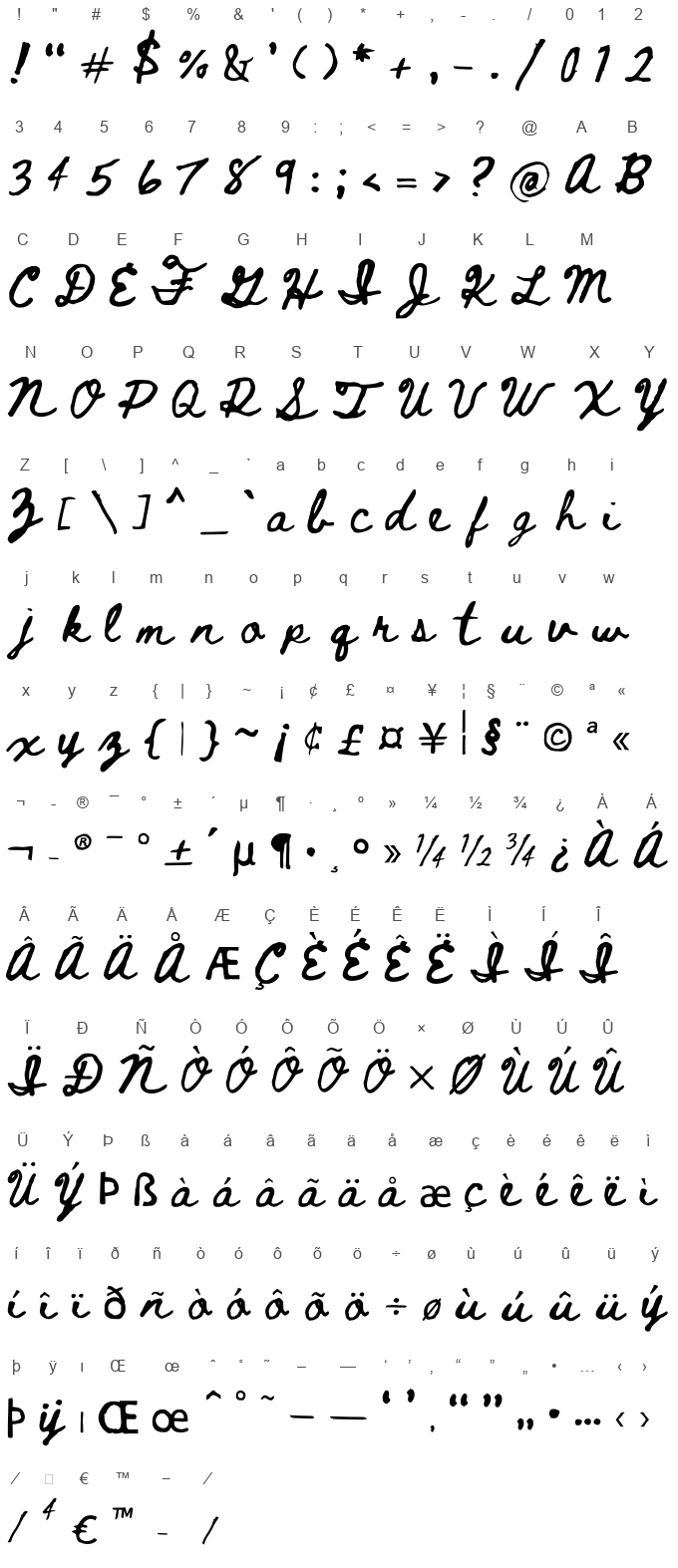

Beth Ellen is a unique font that harnesses the essence of heartfelt, handwritten correspondence. Designed by Rob Jelinski, this font captures the intimate and personal touch often found in handwritten notes and letters. Its creation stems from a place of genuine emotion and connection, aiming to bridge the gap between digital communication and the warmth of traditional pen-and-paper messages.
The font features a cursive style that mirrors natural handwriting, with varied stroke weights and a sense of fluidity that suggests each letter is penned with care and personal attention. The characters in Beth Ellen are distinctive, with a mix of looped and slightly irregular letterforms that enhance its personal, handwritten appeal. This irregularity adds a level of authenticity and charm, making it ideal for projects that require a touch of warmth and personality.
Beth Ellen is versatile enough to be used in a variety of contexts, from personal invitations and greetings cards to branding and packaging that aim to evoke a sense of nostalgia and authenticity. Its ability to convey genuine emotions makes it a popular choice for projects that require a personal touch. The font’s legibility, despite its handwritten nature, ensures that it is practical for both digital and print media, offering designers a tool to add a human element to their work.
Overall, Beth Ellen by Rob Jelinski is more than just a font; it's a means of adding soul and character to digital designs, providing a bridge to the personal and handmade in an increasingly digital world. Its ability to evoke emotions and create a sense of personal connection makes it a valuable asset for any project that aims to stand out with its authenticity and heartfelt communication.
Character map

Characters
! " # $ % & ' ( ) * + , - . / 0 1 2 3 4 5 6 7 8 9 : ; < = > ? @ A B C D E F G H I J K L M N O P Q R S T U V W X Y Z [ \ ] ^ _ ` a b c d e f g h i j k l m n o p q r s t u v w x y z { | } ~ ¡ ¢ £ ¤ ¥ ¦ § ¨ © ª « ¬ ® ¯ ° ± ´ µ ¶ · ¸ º » ¼ ½ ¾ ¿ À Á Â Ã Ä Å Æ Ç È É Ê Ë Ì Í Î Ï Ð Ñ Ò Ó Ô Õ Ö × Ø Ù Ú Û Ü Ý Þ ß à á â ã ä å æ ç è é ê ë ì í î ï ð ñ ò ó ô õ ö ÷ ø ù ú û ü ý þ ÿ ı Œ œ ˆ ˚ ˜ – — ‘ ’ ‚ “ ” „ • … ‹ › ⁄ ⁴ € ™ − ∕
Languages
CommentsFollow
No comments. Be the first one!


