6,980 search results
(0.03 seconds)
- Zapf Renaissance Antiqua by Linotype,
$29.99The Zapf Renaissance Antiqua type family was designed by Hermann Zapf for the German Scangraphic Dr. Böger GmbH in Hamburg, from 1984–1986. The typefaces were engineered for use in digital CRT phototypesetting. This version was based on Scangraphic SH version (For Display use) and not on the SB version (for text use). - Zapf Renaissance Antiqua SH by Scangraphic Digital Type Collection,
$26.00 Since the release of these fonts most typefaces in the Scangraphic Type Collection appear in two versions. One is designed specifically for headline typesetting (SH: Scangraphic Headline Types) and one specifically for text typesetting (SB Scangraphic Bodytypes). The most obvious differentiation can be found in the spacing. That of the Bodytypes is adjusted for readability. That of the Headline Types is decidedly more narrow in order to do justice to the requirements of headline typesetting. The kerning tables, as well, have been individualized for each of these type varieties. In addition to the adjustment of spacing, there are also adjustments in the design. For the Bodytypes, fine spaces were created which prevented the smear effect on acute angles in small typesizes. For a number of Bodytypes, hairlines and serifs were thickened or the whole typeface was adjusted to meet the optical requirements for setting type in small sizes. For the German lower-case diacritical marks, all Headline Types complements contain alternative integrated accents which allow the compact setting of lower-case headlines.
 - Zapf Renaissance Antiqua SB by Scangraphic Digital Type Collection,
$26.00 Since the release of these fonts most typefaces in the Scangraphic Type Collection appear in two versions. One is designed specifically for headline typesetting (SH: Scangraphic Headline Types) and one specifically for text typesetting (SB Scangraphic Bodytypes). The most obvious differentiation can be found in the spacing. That of the Bodytypes is adjusted for readability. That of the Headline Types is decidedly more narrow in order to do justice to the requirements of headline typesetting. The kerning tables, as well, have been individualized for each of these type varieties. In addition to the adjustment of spacing, there are also adjustments in the design. For the Bodytypes, fine spaces were created which prevented the smear effect on acute angles in small typesizes. For a number of Bodytypes, hairlines and serifs were thickened or the whole typeface was adjusted to meet the optical requirements for setting type in small sizes. For the German lower-case diacritical marks, all Headline Types complements contain alternative integrated accents which allow the compact setting of lower-case headlines.
 - Zapf Renaissance Antiqua EF by Elsner+Flake,
$35.00 - Swash by Paul O'Connell,
$9.95 This innovative styled swash font was created to suit various design applications within the typeface market and is aimed at people looking for a sharp styled brush script typeface that doesn't fit in with the regular trends of hand written fonts. Designed and produced by Paul O'Connell of POCT, it is a strong pointed styled typeface with sharp edges and curves, but still manages to retain a subtle hand drawn feel.
 - Renaissance - Unknown license

- Zapf Essentials by Linotype,
$29.99Linotype Zapf Essentials is the modernized version of Zapf Dingbats and was also designed by Hermann Zapf himself. Over 372 characters and symbols are included within six fonts and make life a little more communicative, a little more informative, and a lot more interesting. The fonts contain symbols for both professional and everyday uses. With their markers, ornaments and arrows they are informative as well as versatile, timeless and lively. An interesting note to the story of Zapf Essentials: in 1977, Hermann Zapf created about 1000 sketches of signs and symbols. ITC chose those which became known around the world as Zapf Dingbats. For a typesetter, dingbats are the characters in the corner of the type box which can be used for just about anything. The last decade has seen the appearance of new symbols for e-mail, fax, mobile phones and other developments. These are now part of Linotype Zapf Essentials, just as they are now a part of everyday life. For a quick overview of the different Linotype Essentials variations, see the keyboard layout PDF in the Gallery section. It shows the keyboard layout of each font. A helpful hint from Hermann Zapf: Linotype Zapf Essentials should be used sparingly so that the characters retain their emphasis. - Swish - 100% free

- Smash - Unknown license

- Swish by TypeFaith Fonts,
$10.00 Swish is a contemporary geometric font with two 3D orientations that create an alienating effect. The direction is shifted around the center of the horizontal axis. The font is inspired by the change of perspective that the artist Escher used in his drawings. It is a complete Latin font in which all the accents are present. The unique thing about this font is that it is also a stencil letter. The Swish font is designed to work in any printed and on-screen contexts, including logo design, brand identities, websites, packaging, posters and headlines. Optimized for latin based languages. Leon Hulst for TypeFaith Fonts.
 - Smash by Cool Fonts,
$24.00 Smash is nicely distressed and has cracks, chunks and blobs. Some people think it looks like a crappy FAX or broken typewriter. It is compatible with Overexposed, so you can mix and match letters so you don't have two of the same messed up letters in a row.(Pretty cool huh?)
 - Slash by Superfried,
$32.50
- Stash by J Foundry,
$30.00 Your Stash of fonts for that custom hand-lettered look. Stash comes in two styles; a clean modern and a worn vintage look, each in five weights. Stash features hundreds of alternates to make every setting look crafted and unique. The fonts are programmed with a smart set of contextual alternates that handle initial and final forms, as well as a few connecting pairs, making each word look polished. Tails and underlines round out the character set. With Stash you can craft solid logotypes with a unique look, set posters and ads, and even run longer lines of copy on packaging. Pick it up for your next craft beer label, chocolate pack, café logo, or good old social media posts!
 - Smash by Comicraft,
$19.00 Comicraft just want Puny Humans to leave Comicraft alone... Why soldiers shoot at Comicraft? PAH! Bullets do not hurt Comicraft... Bullets only make Comicraft Angry... and when Comicraft angry... COMICRAFT SMASH!
 - Smashing by PintassilgoPrints,
$26.00 Smashing is a stout typeface, with a twist. It’s a massive all-caps font with bouncing glyphs, positively bold yet quite good-humored. Its upper and lower case slots stores different lettershapes, providing handy options to choose from. When working with OpenType savvy applications you can turn on the contextual alternates feature to instantly get alternating glyphs, which add spontaneity to your artwork and prevent neighbor double letters from using the same glyph. Also try the discretionary ligatures feature to get some cool interlocking pairs. A smashing font for truly smashing designs!
 - Zape by Corradine Fonts,
$14.95 Based in Manuel Corradine's handwriting, Zape is a very spontaneous font. It could be used in almost any informal project.
 - Puritan Swash - Personal use only

- KR Swash - Unknown license

- Swash Monogram by StuArt,
$12.95 Swash Monogram is a font with swashes both in the beginning and ending of a single character. It is perfect for branding, logos, business cards, invitations, stationery, posters, or any gift item you may wish to personalize.
 - Lisboa Swash by Vanarchiv,
$45.00 Lisboa Swash is a display humanist sans-serif typeface and it was designed for big sizes purposes. The uppercase letterforms are much more decorative than the lowercase, but both contain hook-head terminals and few contrast. This typeface family contain stylish alternates characters which are more calligraphic than the main version. This typeface family has different encoding languages (Latin, Central Europe and Baltic).
 - Winter Swash by Illushvara,
$14.00 Hello, Introducing a new font Winter Swash inspired by graffiti style. It's bold, dramatic, urban styled display font. Add this font to your favorite creative ideas and notice how it makes them come alive like a poster, kids flyer, merchandise, quotes, branding, cartoon, comic and more. If you have any question, don’t hesitate to contact me. Happy Designing !!! Thank You, Bayu Suwirya
 - Goudy Swash by URW Type Foundry,
$35.00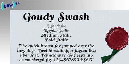
- Natalya Swashes by insigne,
$21.99 Natalya Swashes provides a diverse set of flowing swashes and ornaments originally designed to complement the popular insigne script Natalya. The basis point for Natalya's ornate swirls is the golden ratio, and this makes for especially harmonious swashes with timeless appeal. These poised and graceful flourishes can be easily adapted to many design situations, even in situations that don't call for Natalya Swashes' script companion. Natalya swashes can be resized and rotated easily without any loss of quality and converted to outlines and modified. Combine them to form unique compositions or insert them into your copy to create interest. Please see the sample .pdf to see all 56 ornaments in action. The Natalya Swash package comes with an inDesign sample file to quickly reference ornaments and copy and paste them into your layouts.
 - Ela Swashes by Wiescher Design,
$39.50 Ela Swashes are not meant to and cannot be used as a standalone typeface. Swashes are a set of many different embellished letters to be used together with Ela Demiserif fonts of corresponding weights.
 - Adriane Swash by Typefolio,
$59.00 The Swash version of Adriane Text features the best characteristics of this lineage, without losing the strong personality and elegant design featuring in your text styles, Adriane Swash brings a fancy look to this classic style. The family comes with a complete character set in Uppercase, Lowercase and Small Caps, and the Swash option can be activated through the OpenType features panel, including glyphs initial, intermediate and final, plus a wide range of stylistic ligatures, alternate glyphs, ornaments and languages.
 - Best Swashed by Gold Type,
$15.00 Best Swashed is a beautiful, versatile serif font. This font is characterized by a serif style with a luxurious style in a modern form, but also a friendly and playful style in bold, Best Swashed has glyphs to give crafters more options in designing. This modern style will make a design appear more classy, elegant, unique and edgy. Best Swashed is a font suitable for many projects, for modern or even retro vintage designs, branding, logos, crafts, stickers, sublimation, wedding invitations, and more. This font is suitable for a variety of projects such as logos, branding, magazines, signage, fashion, and many more. -Uppercase and lowercase letters, Numbers and punctuation, Multilingual support, PUA encoded fonts, Alternative styles and ligatures Language Support: Afrikaans, Albanian, Basque, Bemba, Bena, Bosnian, Catalan, Chiga, Congo Swahili, Cornish, Croatian, Czech, Danish, Dutch, English, Estonian, Faroese, Filipino, Finnish, French, Galician, Ganda, German, Gusii, Hungarian, Icelandic, Indonesian, Irish, Italian, Kabuverdianu, Kalenjin, Makonde, Malagasy, Malay, Manx, Morisyen, North Ndebele, Norwegian Bokmål, Norwegian Nynorsk, Nyankole, Oromo, Polish, Portuguese, Romanian, Romansh, Sena, Shambala, Shona, Slovak, Slovenian, Soga, Somali, Spanish, Swahili, Language Support: Breton, Catalan, Czech, Danish, Estonian, English, Finnish, French, German, Hungarian, Icelandic, Italian, Latvian, Lithuanian, Norwegian, Polish, Portuguese, Romanian, Scottish Gaelic, Slovak, Slovenian, Spanish, Swedish. Thank You
 - BD Renaissance - Unknown license

- Renaiss-Italic - 100% free

- FS Renaissance by Monotype,
$52.99 FS Renaissance is a display stencil typeface by the Monotype Studio. A collaboration between lettering artist and designer Craig Back and Creative Type Director Pedro Arilla, the single style font explores the intersection between art and design. With artist and designer working hand in hand, each letter was crafted as a standalone piece of art, while working harmoniously together as a functioning typeface. The typeface is inspired by the Renaissance period symbolised by flourishing progress in the arts, sciences, learning, and philosophy. The typeface is not a traditional stencil design: the cuts are not rigid but interactions that are hand crafted between each element, emphasising the idea of a typeface as a piece of art or sculpture. Pedro Arilla’s aim was to take the core DNA of Craig's lettering and apply it to a typographic base with a solid internal consistency, balanced with an external elegance. Pedro and Craig worked closely together to make sure the original concept was not compromised and this is reflected in the finished design which strikes the perfect balance between functionality and art.
 - Renaissance Initial by Kaer,
$19.00 This is a new classic Renaissance Initial font. Renaissance Initial font is perfect for premium design labels, medieval print, antique posters, etc. The fonts are presented in usual and color versions. Only uppercase letters from A to Z and numbers set (36 characters)
 - Florid Renaissance by Celebrity Fontz,
$24.99 Florid Renaissance is digital revival of a classic and ornate historical alphabet. The font face is dressed in a repeating diamond-pattern faÁade, and the edges are adorned with grape leaves, flowing scrolls, and flourishes, evoking the apex of Italian Renaissance design. The font includes a full set of accented characters.
 - New Renaissance by Type Innovations,
$39.00 New Renaissance is a modernized old style design based on generous proportions and clean, crisp lines. A 'New Renaissance' for the 21st century, New Renaissance makes for easy reading and looks good in both text and display.
 - 1565 Renaissance by GLC,
$20.00 This set of initial letters was inspired from French renaissance decorated letters. It is a typical pattern, one among dozen quite similar, but this one was in use in Paris, unchanged, for centuries, and was still in use in the beginning of 1900s. This explains the difference between I and J, U and V. These characters were engraved years after the original set. Our font was inspired from a late 1800s publication. It can be used as well with Humane fonts (like our 1543 Humane Janson or 1592 GLC Garamond) as with modern fonts like our 1820 Modern or 1906 French News.
 - Renaissant NF by Nick's Fonts,
$10.00 A classic late nineteenth-century face from the Dickinson Type Foundry of Boston. Both versions of this font support the Latin 1262, Central European 1250, Turkish 1254 and Baltic 1257 codepages.
 - Renaissance Ornaments by Intellecta Design,
$23.90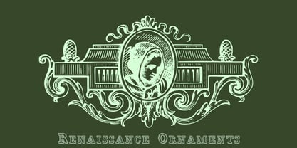
- Washed by FSD,
$40.00Deconstructed script designed to be used in Climax magazine and Fontology catalogue. An absolute protagonist in the layout. - Zapped - Unknown license

- Zapped by Cool Fonts,
$24.00 Zapped is a grungy font with a sort of extruded look. I was working on a poster for the punk band MAXILLA (they are hot check'm out). It looks like it came out of a war zone. Abuse it!
 - ZAP by Wannatype,
$9.90 ZAP is an all-caps monospaced and (almost) monolined typeface family. ZAP comes along in square and round shape, 2 widths (ZAP 360 and ZAP 500), and 8 weights. ZAP also offers Slant and BAckslant styles. ZAP covers multiple languages with Extended Latin. Even complete Greek alphabets are part of the ZAP keymap.
 - Zapf Elliptical 711 by ParaType,
$30.00 The Bitstream version of Melior, a twentieth century modern face commissioned by Stempel and designed by Hermann Zapf in 1952. It is based on Zapf’s thoughts about the squared-off circle known as a super-ellipse. The type was originally intended as a newspaper text face by Linotype. Hermann Zapf’s Melior exhibits a robust character through classic and objective forms. Versatile and extremely legible, it can be used for a variety of texts and point sizes. Cyrillic version was developed by Natalya Vasilyeva and licensed by ParaType in 2002.


Page 1 of 175Next page