10,000 search results
(0.045 seconds)
- FS Maja by Fontsmith,
$50.00Youthful Fontsmith received a brief to develop a font that would form part of the broadcast identity for the UK’s first digital Freeview channel – E4. It needed to work seamlessly in text and display, both in print and on-screen, and please the eye of the target audience, 18-34-year-olds. So, young, fresh and informal. No problem. Except for one thing: the timing. Daughter As he worked on FS Maja, Jason Smith was occupied by another imminent deadline: the birth of his third child. The pressure was mounting, but rather than let it get to him, Jason embraced the challenge and made light of the tension, fashioning a bright, bubbly, entertaining type with a personality made for memorable headlines. Beautifully random FS Maja’s soft, rounded shapes and assured, fluent lines encompass lots of notable features that contribute to its warm, fun-loving personality, including: a very large x-height; a short, rounded serif to allow for close spacing and give texture to body text; a slight convexity, or bulge, in the stroke terminals; a calligraphic fluidity in the entry to the down-stroke of most lowercase letters; open, generous curves, especially in the “B”, “P” and “R”; and a “w” made of two “u”s. - Oktah by Groteskly Yours,
$15.00Oktah is a geometric grotesk that comes both as a variable font and 22 static fonts: 11 uprights and 11 matching italics, which make it a great tool for those seeking a versatile font with a strong character and high legibility. Throw in a very pleasing look, elegant curves and a wide range of weights, and you'd get what Oktah aspires to be: a perfect typographic tool for every need.In Oktah, elegant geometric curves meet bold strokes and wide apertures. Round letters are nearly circular, but, to boost readability, slight changes were introduced for optical compensation. Oktah is also equipped with amazing OpenType features: case sensitive punctuation, ligatures, fractions, superscript and subscript figures, two kinds of circular figures, stylistic & contextual alternatives and much more! Oktah supports all major European languages, as well as Vietnamese and some dozens of foreign languages that you may encounter in your designs. We've got all that covered. The glyph count for each of the styles is 800+ characters. Two styles (Extra Light and Bold Italic) are free to try and experiment with. If you need wide language support and more extensive OpenType features, consider taking a look at Oktah Neue, a bigger version of the classic Oktah. - Calypso E by Typolar,
$72.00Founded on a rigid structure of modernist type, Calypso E has a determined tone without an authoritative tang. It is an updated interpretation of a Neo-grotesque model Egyptian with a hint of Humanist lightness in its forms. Seriously big x-height, square basic form and sturdy serifs create firm text regardless of the weight. This makes Calypso E well suited for various media, from sharp plotter images to low-res television screens. Calypso E includes four suitable body copy styles. Book, Regular, Normal and Medium can be applied according to, for example, the size of text and quality of paper. All styles in the family are equipped with an expanded character set, small caps, case sensitive forms, discretionary ligatures and much more to make even the most elaborate typographic detailing possible. - Varisse Variable by AVP,
$79.00Varisse spans over two centuries of type design and draws its inspiration from well-loved classics that are as fresh today as they were when they were created. The range stretches from a quintessential 18th century transitional serif to an uncompromising 20th century sans. Think Baskerville, think Gill. The idea was to create a family that shared similar forms and the same vertical metrics, allowing them to be mixed to provide impact and readability as required. With a generous x-height and a host of options, Varisse Variable is ideally suited to branding, packaging, magazines and editorial. It also provides a wealth of opportunity in website presentation. The variable axes of weight and serif allow selection of styles from sans light to serif heavy with all the options in between. - Graphie by Dharma Type,
$24.99Graphie is a modern geometric sans-serif family designed by Ryoichi Tsunekawa and the whole family consists of 16 style: eight weights from Thin to ExtraBold and their matching Italics. The range of styles provides flexibility for title, headline and body text. And the clear-cut-corner, vibrant straight lines and large x-heights give them legibility, readability and keenness. The basic skeleton of their letterform was designed geometrically and optically corrected. The sophisticated geometric design gives them universality, neutrality and sense of unity and make it possible to be used across a wide range of applications in all medias, all purposes. Graphie supports almost all European languages: Western, Central, South Eastern Europeans and afrikaans. And superior figures, inferior figures, denominators, numerators and fraction can be accessed by using OpenType features. - Forjada by Latinotype,
$26.00Forjada—designed by Raúl Israel—is a monolinear, rounded and condensed typeface, belonging to the slab serif classification, inspired by wrought iron window and door grills on facades of historic buildings in America and Europe. Forjada is a rigid yet softly curved font with exquisite ornaments and optimized for great legibility. Forjada Family comes in 3 weights—Light, Regular and Bold—with matching italics and includes alternate swash caps and ligatures plus Ornaments and Catchwords sets that provide a wide range of choices for creating the most beautiful designs. The font character set supports 212 languages. Forjada is well-suited for branding, packaging, food & drinks menus, wedding invitations, party invitations, guidebooks to old cities or any glamorous design you want to add a fresh and modern touch to! - Zin Serif by CarnokyType,
$46.00Zin Serif is a contemporary typeface designed for various situations of typographic usage. Characteristic feature is a large x-height and balance between neutral construction of letters (strictly vertical axis) and dynamic open forms (opened terminals). Another typical feature is a visually narrower connection between stems and strokes. The complete font family consist of three width proportions (Normal, Condensed and Extended). Every sub-family has 5 weights, ranging from Light to Black with matching Italics. Zin Serif can be effectively used for both text and display typesetting. It can be used especialy in magazine layouts and editorial design, as well in advertising typography, orientation systems, corporate identities and many other situations. Zin Serif is a member of the Zin super family, which also includes Zin Sans, Zin Slab and Zin Display fonts. - Black Ridge by ZP Fonts,
$16.00Black Ridge is a strong and rugged typeface, supplemented by its tall x-height, angled cuts, and quirky curves—all giving it a unique touch of character. It was inspired by the bold, modern, and condensed sans-serif typefaces created by typographic pioneers such as El Lissitszky, Herbert Bayer, and Jan Tschichold of the early twentieth century. This typeface is intended for display headlines and comes with a customary set of Latin characters, including diacritics, accents, symbols, mathematical glyphs, and more. Black Ridge comes in five styles—thin, light, regular, bold, and black—and supports over 80 different languages. Each weight contains a set of alternate glyphs and discretionary ligatures specially designed for better spacing and aesthetic enhancements for the more awkward character pairs such as fi, fl, rv, TY, FT, and more. - HU Mobydick by Heummdesign,
$15.00 - Mollis Gothic by Quatype,
$25.00Mollis Gothic is inspired by medieval gothic calligraphy. The gothic calligraphy is classical and traditional, I want to add something modern to it. So the letters are simplified as lines and without the handwriting feel, just like a sans font. Meanwhile, the gothic calligraphy visual look remained. It expands the usage area because of the modern feel of this font, such as the package, titles, logo, poster design, etc. In September 2021, we created the thin weight. Although Mollis Gothic Thin is from the font family, the kerning set and capital letters’ height are not as same as the regular weight for suiting the thin font’s usage situation. - Project Sans by TypeUnion,
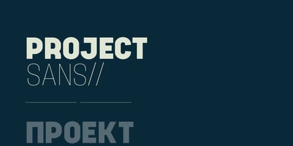
$40.00Project Sans is a structured and versatile geometric sans serif which includes 10 weights and matching, playful italics that offer a unique feel for multiple applications. The fonts versatility creates a plethora of uses from branding and advertising to digital applications such as websites and apps. Project Sans has support for Central and Eastern European languages as well as Cyrillic. The font has a slight retro poster feel mixed with a uniform structure that, mixed with its substantial weight options and warm italics, creates a suite of fonts that can be used for anything your Project requires. Have fun with it and bring life to your Project. - Memento by Linotype,
$29.99Memento is a 1993 design of the type artist Franco Luin, the creative mind behind a variety of types, for instance, Venus and Griffo Classico. Memento's high x-height allows it to be legible even in small point sizes. It is distinguished by its tiny triangular serifs, a characteristic reminiscent of the Dutch types of the 17th century. Memento is an extremely legible typeface with a classical touch. It is available in four different weights with corresponding italics and small caps. This range of weights along with its classic, neutral look makes it a versatile typeface which can be used in anything from books to corporate design to magazine typography. - P22 Mackinac by IHOF,
$39.95P22 Mackinac Pro spans four centuries of type design, bridging the Old World with the New. This family of four weights and corresponding italics is of old style construction, with a diagonal weight stress. Contrast between thick & thin is modest and proportioned the same for all fonts. The tall x-height recommends itself to a wide variety of text and display uses; including advertising, publishing, signage and packaging. P22 Mackinac Pro (pronounced Mackinaw) is a general-purpose, utilitarian design incorporating an abundance of OpenType features: small caps, ligatures, ordinals, numerous figure options plus a few bonus goodies. Mackinac supports 56 languages using extended Latin character sets. - Nata by MysticalType,
$10.00Nata is a sans serif family with fourteen weights plus matching italics. It was designed by Candi Erwanto in 2019. This sans serif family is based and influenced by geometric styles that were popular during the 1920s and 30s and have been optically corrected for better readability. Nata has a functional look with a warm touch. While thin and black weights are great players in display size, lightweights, regular, and medium are suitable for longer texts. Small x-height and curbed shape provide a distinctive elegance. Nata is equipped for complex and professional typography. This OpenType font family has extended characters to support Central and Eastern European and Western European languages. - Winsel by insigne,
$29.00You stand, poised at the brink. If you do not choose the right, the best typeface, this may be one of the greatest disasters in your history. The whole root and core and brain on which and around which your project is built seems about to perish into an ignominious end. But I do not for a moment fail to believe that Winsel shall prevail for you. This bold new face, founded from the tested mind of insigne design, will in the moment of need wield for you the full might of its ancestors. The entire strength of the British Empire’s vernacular poster lettering spanning the 1920’s to the 1950’s drives the very heart of every feature and weight this font has to offer. Winsel’s expanded design is sharp and angular, based on pointed brush strokes. Its thick, sturdy appearance will draw and direct your reader’s mind to the weight and importance of your messages and titling. Within the font’s full forces work a range of styles to achieve victory in the contest ahead: thick weights that are compact and muscular for carrying a heavier load and lighter, finer weights to lead you through your more sensitive operations. It stands equipped with OpenType features, ready to support most European Latin-based languages and providing features such as Small Caps and Titling Caps in all nine of its weights. Well-honed for the task ahead, Winsel has been crafted to ride out the storm of mediocrity and to outlive the merits of inconsequence, if necessary for years, if necessary alone. There has never been in all the world such an opportunity for you. With Winsel, you shall go on till the end. You shall write on the beaches. You shall write on the landing grounds. You shall write with growing confidence and growing strength in print or on the air. Every morn has brought forth a noble chance. Your chance this day is Winsel. - CA Spotnik by Cape Arcona Type Foundry,
$40.00The initial inspiration for CA Spotnik was the opening title of an early Andrei Tarkovsky movie. There was this very unconventional hand drawn “s” which drew my attention. Despite its strange shape, it felt totally natural in that context. So we made a few screenshots and started to sketch some more letters in order to catch the spirit that attracted us so much. The result is a grotesque typeface with a slight contrast, the proportions are rather wide with a large x-height. The bolder the weight, the wider it gets. In case you find the swirly “s” uncomfortable, there is a standard s included as well. The general atmosphere of the typeface, which could be described as “nerdy but friendly” doesn’t depend on this detail. It’s rather the sum of details derived from the original inspiration. - Yasmine Mutamathil by Arabetics,
$32.00The Yasmine Mutamathil type family follows the guidelines of the Mutamathil type style. It has only one glyph for every basic Arabic Unicode character or letter. The Yasmine Mutamathil family includes all required Lam-Alif ligatures and selected marks positioning so it does use limited glyph substitutions or forming. Yasmine Mutamathil employs four fixed x-height values, two above and two below the x-axis. Values are high to give a slight vertical overall look. Its design uses full curves with equally distributed weight. Text strings composed using types of this family are non-cursive with stand- alone isolated glyphs. The Yasmine Mutamathil family includes both Arabic and Arabic-Indic numerals, all required diacritic marks, Allah ligature, in addition to all standard English keyboard punctuations and major currency symbols. It is available in regular, italic, bold, and bold italic styles. - Kolage by Runsell Type,
$20.00Kolage was created from a sans humanist design with a modern twist. Characterized by the large x-height, inktrap and open appertures as the hallmarks of the Kolage a letterform. Kolage was inspired by the strong character of the letter without leaving the aesthetic of the letterforms. Each family member of Kolage also equipped with useful OpenType features such as Ordinals, Superscripts, Subscripts, Stylistic Alternates, Stylistic Sets, Oldstyle Figure, Proportional Lining, Standard Ligatures, Fractions, also Numerators & Denominators. Each font has 530+ glyphs which covers Western & Eastern Europe, and other Latin based languages – over 200 languages supported! Comes with 9 weights from Thin to Black with each matching Italic. Contain several OpenType features: Stylistic Alternates, Figures Variation (fraction, tabular lining, numerator, denominator), and also covered broad latin languages. Provided also variable fonts in two styles; Upright and Italic - Terfens Gothic by insigne,
$29.00Terfens Gothic is the perfect choice for your next project! With its medium contrast and approachable design, this calligraphic sans serif has a classic feel that will never go out of style. Terfens Gothic is the perfect typeface for anyone looking to add a touch of uniqueness to their designs. With its generous x-height and rounded terminals, it's perfect for creating one-of-a-kind designs that are sure to impress. Its large x-height gives it a welcoming, but not too casual vibe. With forty-eight different typefaces, it has the versatility and aesthetic options you need to make your project stand out. Choose from regular, condensed, and extended styles, each with nine different weights and italics. Terfens Gothic has the look you need to make a powerful impression. Terfens is the ideal typeface for any project that has to stand out, thanks to its towering verticality. Terfens may be utilized for a variety of purposes because of its adaptable design. Terfens is a sans unlike any other- it starts with a beautiful calligraphic chancery script and then adds movement and personality. This sans is guaranteed to make your next project more exciting! The Terfens Type System's third typeface, Terfens Gothic, is an amazing addition to any type collection. The Terfens Type System's adaptability is unrivaled, with its vast choice of styles, widths, and weights. This font family has everything you need to create unique, customized designs that will suit your individual needs. Whether you need a narrow or wide font, or a hairline or bold weight, the Terfens Type System has you covered! And, with its Opentype features, the Terfens Type System is perfect for anyone who wants to add a personal touch to their projects. - URW Geometric Condensed by URW Type Foundry,
$35.99URW Geometric Condensed is the matching complement for the URW Geometric. Including 20 additional condensed styles the URW Geometric Condensed is the space-saving alternative in the URW Geometric family. URW Geometric is a sans serif typeface inspired by the German geometric typefaces of the 1920s but designed for modern usability. The character shapes have optimized proportions and an improved balance, the x-height is increased, ascenders and descenders are decreased. Special glyphs, which are often designed afterwards for the original geometric typefaces from the 1920s, are perfectly integrated in the URW Geometric. These design characteristics increase the usability and legibility tremendously. With its 10 weights ranging from Thin to Black, plus 10 additional oblique styles, it has a great versatility in mind. The extreme light styles shine bright in large sizes, the middle weights are perfect for body copy and the bolder variants for the use of emphasis information or bring a strong impact to headlines and information. The optically balanced styles are designed to work in perfect harmony together. URW Geometric is functional, strong, simple and harmonized in form, and at a glance appears as a modern variant of its predecessors. Apart from the basic characters the design has an extra focus on the special glyphs. These are designed for today’s needs. For example: the email glyph looks modern and unique, including a perfectly balanced spacing. The number sign, in modern use called “hashtag”, is space saving and optically balanced for body text. Additionally, various extra and alternate glyphs are designed to provide a friendly usability. Including a wide Latin language support and character sets, URW Geometric is perfectly designed for today’s requirements. Please have a look at the URW Geometric Type Specimen (PDF) for further information. - Nuovo Deco by Ben Burford Fonts,
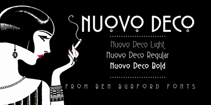
$20.00Following from the continued popularity of the original MB Deco, here is Nuovo Deco, its new and improved big brother. Nuovo Deco comes in three weights, Light, Regular and Bold. A full character set of Caps and lower case letters, alternate characters, plus some very nice Ligatures to give some added art deco style and a much wider scope. - Badona by gravitart,
$29.95Badona is a custom typeface which is applicable for web, print especially for magazines, brochures, posters, flyers and motion graphics. Both weights are perfect for logos (light size has an elegant look and the regular one gives a unique feel). Regular size is also applicable for text. Badona has 232 glyphs and supports Turkish and West European languages. - Wafterby by Paramajan,
$8.00Wafterby is a handsome sans serif typeface family. It comes in eight weights which have a minimal and clean feel. Its design is based on circle and line geometric shapes. It can be used as a cute minimal-style header display or as a stylish text for magazine, blog, corporate branding, packaging, wedding invitation project, etc. - Kica by iframe,
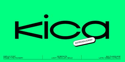
$32.003 weights (Light, Regular, Bold) 613 glyphs Character set A-Z Uppercase & Lowercase Numerals & Punctuation Multilingual Language support: Latin, Greek, Cyrillic Works on PC & Mac Kica is a modern display typeface that is characterized by its clean lines, bold strokes, and geometric shapes. This typeface was designed with the intention of creating a strong visual impact and capturing attention. - Krays by Pesotsky Victor,
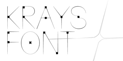
$10.00«KRAYS» is an ultra-thin font display. Simple structure and fine uniform strokes contrast with bold squares in the structural units. The combination of gravity and lightness. Krays supports Basic Latin and Extended Latin, Cyrillic — in total about 90 languages are supported. The font has one Regular weight. All uppercase. Krays font was designed by Viktor Pesotsky. - Neue Metana by Dirtyline Studio,
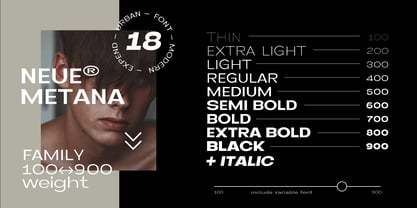
$20.00Neue Metana is a modern minimalist design typeface with geometric type and more feature alternative character. there include some ligature. It is inspired by hype and urban design - a font suited for lifestyle with trend design. It was designed to be versatile, to blend in your design with light through bold weights add touch a lot of personality. - Planca by Vertigo,
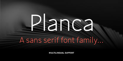
$18.00Planca is a sans serif typeface with medium contrast and distorted rhythm of the line. Spaced and mastered for optimal readability. All lines are of equal thickness. Its morphology is based on the study of traditional writing with a wide tip stick. It comes in 4 different weights (Light, Regular, Bold and Black) and provide multilingual support. - Layla pro Arabic by Zaza type,
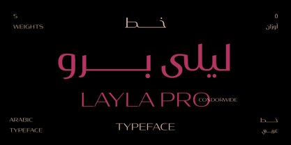
$29.00Layla pro Arabic typeface is a modern Arabic typeface designed by Ahmed Zaza. the design is inspired by the Kufi calligraphic style and influenced by the Naskh style. The result is a hybrid that combines modern proportions with Classic Arabic scripts it’s suitable for branding, editorial, packaging, and advertising. Layla pro Arabic Features five weights from Light to Bold, - Fun Line by FunFont,
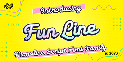
$19.00FunLine is a modern script font, crafted with monoline strokes characterized by curved lines and seamless connections, presenting a classic font with a modern touch. The font family comprises three weights; Light, Regular, and Bold. Suitable for your design needs. The Arabic version will be released, accompanied by the addition of Arabic, Urdu, Pegon, Persian, and Kurdish languages. - FF Irregular by FontFont,
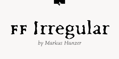
$41.99Austrian type designer Markus Hanzer created this display FontFont in 1994. The family has 6 weights, ranging from Light to Black (including italics) and is ideally suited for editorial and publishing and poster and billboards. FF Irregular provides advanced typographical support with features such as ligatures and case-sensitive forms. It comes with proportional lining figures. - Arcuata by Eko Bimantara,
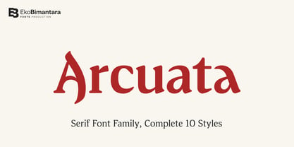
$29.00Arcuata is a serif font family inspired by 1400 classic roman typeface with soft characteristics. It's featured with some uncial letterforms as alternates, for example in 'a' and 'd' letter, it also has a set of decorative capital letters alternates and ligatures. Arcuata complete family contains 10 styles, consisting of 5 weights from Light to ExtraBold with matching italics. - Tourette by Barnbrook Fonts,
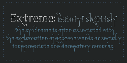
$30.00Tourette draws inspiration from 19th century French light slab serifs. This area of typography is relatively unexplored in contemporary design. Tourette includes two versions, Normal and Extreme. Normal is simple, delicate and legible, whereas Extreme is full of little flourishes that grant an exquisite, slightly frivolous, feel to the weight. Tourette is a progression of the Expletive Script family. - MGN Burro by Morgana Studio,
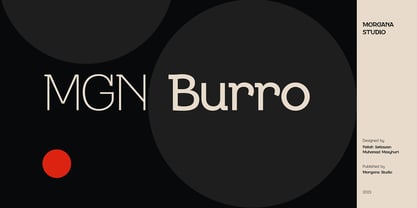
$17.50MGN Burro by Morgana Studio is a slab serif font offering 7 styles: Thin, Light, Regular, Medium, Semibold, Bold, and Extra Bold. Combining classic and modern elements, it caters to diverse designs, ensuring readability and impact. From delicate Thin to bold Extra Bold, each weight caters to various preferences, making MGN Burro a versatile toolkit for designers. - Hlad by Tour De Force,
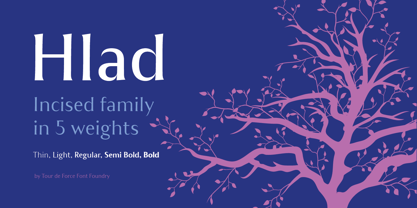
$25.00Hlad is incised sans serif family inspired by carved Roman letters. Hlad comes in 5 weights – Thin, Light, Regular, Semi Bold and Bold. It is a low contrast typeface, with asymmetric flare serifs and sharp bowl and shoulder endings. Hlad combines elegance of calligraphic endings with stable, solid constructional stems from sans serif group of typefaces. - Tinta by NamelaType,
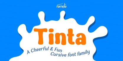
$19.00Tinta is A Cheerfull font Family. Inspired by handwritten lettering touch. Tinta means ‘ink’, The terminal of each character is formed like flowing ink, Comes with 6 weight variants from Light to ExtraBold, each has Oblique version. Tinta can be use for Headline, branding, packaging, advertising, quotes and where ever you need fun and playful design - Blop11 by osialus,
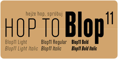
$15.00Blop11 is a geometric sans-serif type family, consisting of 3 weights. Blop11 Bold is inspired by 1800s-style wood, poster typeface. Owing to its rounded terminals, Blop preserves natural organic quality of wood typeface. The Regular and Light versions are contemporary original projects. Blop11 is well-suited to headlines and short text. See also Blop77 - Cajito by Rosario Nocera,
$19.99Cajito is a font family with a medium contrast, developed for numerous uses, ranging from app to website and catalogue to corporate design especially for logo design, Cajito has ten alternative capitals and his terminal looks like the fins of a fish. Cajito font family consists of five weights from extra light to extra bold with matching italics. - Fun Line Arabic by FunFont,
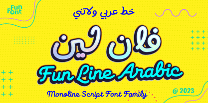
$29.00FunLine is a modern script font, crafted with monoline strokes characterized by curved lines and seamless connections, presenting a classic font with a modern touch. The font family comprises three weights; Light, Regular, and Bold. Suitable for your design needs. The Arabic version will be released, accompanied by the addition of Arabic, Urdu, Pegon, Persian, and Kurdish languages. - Bonega by Locomotype,
$16.00Bonega is a display font inspired by classic typography on ancient stone inscriptions. Consist of 4 weight (light, regular, bold, black) with each matching italics. With sharp and manly characteristics, Bonega family is suitable for powerful headlines, logotypes, beautiful signs, posters and more. Contains more than 400 glyphs including stylistic sets that make your typographic design more attractive. - Caronta by Ixipcalli,
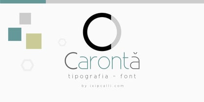
$22.00The Caronta typeface is a modern, clean and easy-to-read sans serif typeface. It has been used for texts and documents where you want to show a minimalist appearance. The contrast between the light and bold fonts makes for a visual game that is pleasing to the eye. It has ten styles, and five weights.


