10,000 search results
(0.037 seconds)
- GaoYah Display by Stones Design Lab,
$20.00 GaoYah Display Thin is a type in very thin line, GaoYah means Elegance in Mandarin, some characters build in unique shapes can make a good memory. This font is suitable for huge titles display, in which way the line and detail shows elegance. It will make good performance in dark background as well. Including Basic English and Western Europe languages.
 - Elephunky NF by Nick's Fonts,
$10.00This hefty little number is an amalgam of two typefaces from the Flower Power era, Dave West’s Elephant Gothic and Wayne Stettler’s Neil Bold. It’s an extrabold, sassy headline face that will get your message across, loud and clear. Both versions include the complete Latin 1252, Central European 1250 and Turkish 1254 character sets, as well as localization for Moldovan and Romanian. - Ghylde by Krismagraph,
$17.00 Ghylde is an elegant & modern Serif Display typeface that stands out. Ghylde will be best suited for creating logotypes, branding, headlines, corporate identities, and marketing materials for the web & as well as any minimal designs. Please see the included demographics to get an idea about the capability of this typeface when used for branding and marketing material design. Thank you.
 - Mango Vintage by Zeenesia Studio,
$16.00 Introducing Vintage Mango Vintage Mango is a modern and elegant sans serif font. Vintage Mango is well-suited for advertising, branding, logotypes, packaging, titles, headlines and editorial design. I created more much alternates variant and much natural ligatures to make this font very classy and look so beauty. Vintage Mango was built with open type features make your project will be perfect.
 - Olde Megrat NF by Nick's Fonts,
$10.00This rough-hewn offering is patterned after Antikva Margaret, designed by Zoltán Nagy for VGC in the mid-60s. Its energetic and, at times, eccentric letterforms make this face a perfect choice for headlines and subheads that will be noticed. Both versions include the complete Latin 1252, Central European 1250 and Turkish 1254 character sets, as well as localization for Moldovan and Romanian. - Crowd Pleaser by Hanoded,
$15.00 Crowd Pleaser is a pleasant, handmade font. I hoped its lively looks, slightly crooked glyphs and overall happy appearance would appeal to many people - so I named it Crowd Pleaser. Well… not entirely true, as I have a list of font names and Crowd Pleaser was the next one up… ;-) I do hope, however, that you will like this font!
 - Wagerton by PizzaDude.dk,
$20.00 Wagerton is my very legible scribbled font! The fine scribbled details are very visible at large sizes, but also leaves a good impression when used in small sizes as well. Comes with ligatures for double letters and double numbers - along with alternative letters for both upper- and lowercase! You will need to use OpenType supporting applications to use the autoligatures.
 - Whisky Fudge by Braw Type,
$16.00 Whisky fudge is a tasty handmade font! With its smooth edges and fun style Whisky Fudge will make your creative projects look simply delicious! Giving your design ideas a more personal touch, it’s a great choice for gift tags, greeting cards and invitations. The font comes with a set of standard ligatures (including double letters) and 5 final form characters to add extra flavour to your words. Uppercase letters also look great on their own for added creativity. Enjoy!
 - Osnova Pro by AndrijType,
$55.00 The common Slavic word Osnova means basis in English and βάση in Greek. This universal but still distinctive typeface can make a good ground for any design project. Osnova has six weights from Thin to Heavy with Italic, Small Caps, Old Style & Tabular Figures, some ligatures, alternatives and letter variations. It supports Central European, Greek and Cyrillic codepages, and will be suited for both display and text use. Look how people use it: http://use.type.org.ua/tagged/osnova
 - Belarisha by Bosstypestudio,
$12.00 Belarisha is a beautiful script font with perfectly perfect alternates. This font will exude a romantic and elegant feeling of your design. Belarisha can be used for various applications, such as wedding designs, logos, invitations, posters, social media posts, and others. Feature: - Lots of Flying Machines - Additional characters encoded by PUA with a love accent - Can be used in any software, such as Adobe Photoshop, Illustrator, even Microsoft Word, PowerPoint, and others. - multilingual glyphs. Thank you
 - PTT by TYDTYP,
$20.00 PTT typeface has very rounded outlines. They are extremely overlapping each other like packed potatoes. The face will be very strong and give your design extraordinary spice! Basically, main characters are consist of two different shapes, one is initial form which is only used at the beginning of a word, the other is medial form which is used for the rest. To use this function, I highly recommend to use appropriate layout application (e.g. Adobe illustrator, InDesign, QuarkXpress).
 - South Paris by Allouse Studio,
$16.00 South Paris a Signature Font that will bring an luxury impression for you. South Paris is perfect for product packaging, branding project, megazine, social media, wedding, or just used to express words above the background. South Paris come with many underline styles, also come with Multi-Lingual Support. We highly recommend using a program that supports OpenType features and Glyphs panels like many of Adobe apps and Corel Draw, so you can see and access all Glyph variations.
 - Alehna by Afkari Studio,
$13.00 Alehna is A Whimsical Display Playful Font. This typeface is have a playful and casual look, suitable to use for headline, title, logo, book or magazine cover title, or anything related with fun themed or casual design project. Features: - Alternate + Ligatures - Works on PC & Mac - Simple installations - Accessible in the Adobe Illustrator, Adobe Photoshop, Adobe InDesign, even work on Microsoft Word - PUA Encoded Characters - Fully accessible without additional design software. - Multilingual Support
 - Olivade by Grezline Studio,
$10.00 Olivade is a fresh and organic script font crafted very carefully. Olivade is perfect use for a logo for branding, typography design, christmas card, product packaging, invitation, quotes, t-shirt design, label poster, special events and anything that need handwriting taste. Feature : - Ton of glyphs ( include Uppercase, Lowercase, Numerals, Punctuations & Ligatures ) - Multilingual Language - Works on PC & Mac - Simple installations - Accessible in the Adobe Illustrator, Adobe Photoshop, Adobe InDesign, even works on Microsoft Word.
 - Speed Rush by Pixesia Studio,
$10.00 Speed Rush - A Race Display Font Speed Rush is an assertive and modern display font that oozes strength and toughness. It suits perfectly any racing theme or online game. Have fun with this beautiful font and explore its endless variations. FEATURES - Uppercase and Lowercase letters - Numbering and Punctuations - Multilingual Support - Works on PC or Mac - Simple Installation - Support Adobe Illustrator, Adobe Photoshop, Adobe InDesign, also works on Microsoft Word Hope you Like it. Thanks.
 - Funny Society by NonaNova,
$20.00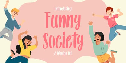 Funny society is a unique handwritten font that has a beautiful touch. This font is perfect for kids designs, branding, invitations, svg designs, logos, birthdays, parties and much more. What's Included : Ligature Uppercase, Lowercase, Numeral and Punctuation, Symbol International Language Works on PC & Mac Simple installations Accessible in the Adobe Illustrator, Adobe Photoshop, Adobe InDesign, even works on Microsoft Word. Thank you for your purchase! Hope you enjoy with our fonts! "NonaNova"
 - Dynamic Wave by EKNOJI,
$15.00 DYNAMIC WAVE - Display Retro Font It is perfect Bold Display Font for branding, logo, every other design which needs a Dsiplay. What you get? Character set A-Z Character set a-z Support multi-language glyphs Works on PC & Mac Simple installations Accessible in the Adobe Illustrator, Adobe Photoshop, Adobe InDesign, even work on Microsoft Word. Please kindly message us for any question or issue about our product. Hope you love it!!
 - Buttershine Serif by Typestory,
$25.00 Buttershine is a bold, beautiful and versatile duo font (serif and script). It looks beautiful on a variety of designs requiring a personalized style, such as wedding invitations, thank you cards, weddings, greeting cards, logos and so on. What’s Included : Ligature, Alternate & Swashes Works on PC & Mac Simple installations Accessible in the Adobe Illustrator, Adobe Photoshop, Adobe InDesign, even work on Microsoft Word. PUA Encoded Characters – Fully accessible without additional design software.
 - Articulat CF by Connary Fagen,
$25.00 Articulat® CF is a streamlined, updated take on midcentury type design. Strong, sharp, and well-spoken, Articulat was built from scratch to be bold, clean, and clear. Articulat® CF pairs well with itself, as it has many weights to choose from. It also works well with fonts that contrast strongly, such as Wayfinder® CF and Olivette CF. All typefaces from Connary Fagen include free updates, including new features, and free technical support.
 - Ekaliptus by Yinon Ezra,
$9.90 Ekaliptus, Display Condensed and Humane Typeface, Containing 4 Weights + 4 Matched Italics, Can be used for Headlines and Logos. Two Styles that work well together to form a better tool for you.
 - Firefly by Canada Type,
$24.95 Firefly was designed by Miranda Hopper during her time in Patrick Griffin's type design class of 2010 at Humber. It is a light, narrow alphabet that works well in casual, leisurely design.
 - Beauty Festival by Rockboys Studio,
$15.00 The Beauty Festival Font Duo is a handwritten script that is combined with a slick yet playful looking sans. The duo works very well for a lot of different types of projects.
 - Pemberton by Aboutype,
$24.99Decorative hand drawn display font with drop shadow. Originally designed for embroidery application. Works well with layers, colors, gradients and filters at large point size. Pemberton requires subjective display kerning and compensation. - Cattle Drive JNL by Jeff Levine,
$29.00 Cattle Drive JNL is based on some examples of a classic condensed wood type. Lettering of this period lends itself well to themes of Western life, carnivals, circuses or classic broadside posters.
 - Baby Boss by Nirmalagraphics,
$14.00 Baby Boss was inspired by the writing style of my brother who focused on learning to write and read. This font works well for children themed uses and has multi-lingual support.
 - Garden by Los Andes,
$18.00 Last year, we visited Brazil and we were totally captivated by its cheerful and warm people. Its wild nature is absolutely amazing and very noticeable in textile printing as well as in floral design. That was precisely what inspired us to create some ornaments and dingbats, which we then turned into a single typographic work. The resulting typeface was called Garden , a serif display handmade font with a playful and spontaneous feel. The Garden family offers a font with a set of original “catchwords” (‘Garden Catchwords’, based on brush calligraphy), floral dingbats and botanical ornaments. Please be aware, “Garden Catchwords” is a ‘Catchwords’ font, and does not offer standard AlphaNumeric characters. The OpenType version provides a wide range of creative options. Garden is well-suited for text composition, posters, headlines, label design and handmade-style items. Garden is inspiration, nature and joy!
 - Dahlia Darling by Sulthan Studio,
$12.00 This beautiful handwritten font we made very attractive with a natural touch we worked back to clean smudges and into smooth lettering it's easy when you cut as well as print stickers and other cool work you're working on this font has 3 front swashes and 3 back swashes for lowercase and one alternative for uppercase, 98 ligature Fonts include uppercase and lowercase letters, punctuation numbers, and language support
 - BOT by fontkingz,
$19.00The BOT font package includes two character sets, BOT-Regular and -Stencil. The futuristic looking characters are designed to work in both large scale and small sizes; it works very well as a comfortable, readable lettering on machines of any kind as much as in print and screen publications. In addition, the BOT-Stencil letters can easily be cut out and work as a template for painting type on any surface. - BORCHA by Top Type,
$9.00 Hello there.. I introduce to you a new work by the name of BORCHA. This font has an attractive style as well as elegant. In addition, this font is also equipped with several ligature features, stylistic alternate and stylistic set so that it can be the best work in each of your work. This font can be used to create letters, advertisements, logos, banners, web, and everything else. Thank you, glad to be able to contribute to your best work.
 - Corsair PE by Rosetta,
$70.00 Corsair is a rugged font with a handcrafted touch. Familiar and easy to work with, it has a worn-in feel that slots right into your typographic toolkit like you’ve known it all along. Originally commissioned by Best Made Co., its functional beauty was shaped to mimic the idiosyncrasies of handwriting. Naturally randomised letterforms lend it authenticity, while weathered edges and subtle variations add a hospitable charm. The effect is an honest, approachable, and organic look that’s careful, but that doesn’t overthink it. Goes well with packaging, branding, and product lookbooks alike. Like a writer’s favorite pen, it gets even better with age.
 - Cyan Sans by Wilton Foundry,
$29.00The design of Cyan was inspired by features found in classic Roman and styles like Trajan and Bodebeck. The characters stay true to the same features as the capitals, resulting in an unusually distinctive style. The Capitals version contains Roman numerals. Cyan's weight is similar to Trajan's but the horizontal strokes are slightly bolder resulting in better legibility for small sizes, especially for lowercase characters. Cyan Sans evolved out of the hugely successful Cyan Serif family. Cyan Sans retains the same geometric Roman proportions with open centers in B,P,R b, d, p . This helps create a thick and thin stroke illusion since the actual strokes don't vary much. There are many subtle details in Cyan Sans that become more interesting in larger sizes. The beauty of Cyan Sans is that it has no features that "jar" the eye. The result is a very pleasing and distinctive sans that scales well. Cyan Sans is a robust font that will exceed expectations in areas never explored before. The name is inspired by the Greek word cyan, meaning "blue". Blue as a primary color that has many hues and uses. Cyan the font, we hope will be seen in a similar light. Obviously Cyan Sans is a perfect companion to the Cyan Serif family. - Rocket Pop by astroluxtype,
$20.00 Rocket Pop and Rocket Pop Outline are influenced by product packaging and cereal box art from the 1960's and 1970's. The fonts will work as companions or separate. Best used over 36pt as a headline display face, these fonts will bring a bold playfulness to any project where a vintage or retro style is in the concept. The style reflects the era when things were indeed, mad, where men (and some women) did crazy art for vinyl records, food packaging and kiddie products. Sugar frosted blue donut cereal is yummy for your tummy like... Rocket Pop and Rocket Pop Outline. Buy both and get the discount! Watch for the Cerealboxx Set coming soon that will include the astroluxtype fonts, Sugarbang! Koo Koo Puff and Rocket Pop together in one box.
 - Bromolek by Almarkha Type,
$35.00 Hello Introducing, Bromolek - Luxury & Elegant Ligatures Serif is unique font that uses 27 Alternate 9 ligatures to smoothly link letters. inspired by the famous minimalist logo, perfect for the purposes of designing templates, brochures, videos, advertising branding, logos and more. Perfect for adding a unique twist to word-mark logos, monograms or pull quotes. What's Included : + Standard glyphs + Ligatures glyphs + Alternate glyphs + Web Font + International Accent + Works on PC & Mac + Simple installations Accessible in the Adobe Illustrator, Adobe Photoshop, Adobe InDesign, even work on Microsoft Word. PUA Encoded Characters - Fully accessible without additional design software. Fonts include multilingual support + Image used : All photographs/pictures/vector used in the preview are not included, they are intended for illustration purpose only. Thank You
 - Cavas by Authentype,
$20.00 Cavas modern & elegant font with discretionary ligatures that give each word a different shape. Also contains a swash with an elegant, contrasting, and clean, perfect for logo designs, posters, and various types of promotional media. – Standard glyphs uppercase and lowercase letters – Numerals, a large range of punctuation and ligatures. – Swashes. – Multilingual – Works on PC & Mac. Simple installations, accessible in Adobe Illustrator, Adobe Photoshop, Adobe InDesign, even work on Microsoft Word. PUA Encoded Characters – Fully accessible without additional design software. Fonts include multilingual support for; ä ö ü Ä Ö Ü ß ¿¡ _________________________________________________________________________________________________________________________________ Image used: All photographs/pictures/logo/vectors used in the preview are not included, they are intended for illustration purposes only. Thank you for your purchase! Hope you enjoy our font! Designers: Authentype | Ekayasa.
 - Steampipe by Just My Type,
$25.00 Jules Verne. Wild, Wild West. Tomorrowland. The Past’s extrapolation of the Future. So it was wrong, it’s still romantic. Steampipe is a font constructed of bits and pieces, reminiscent of the ironwork construction of the Crystal Palace or the inner workings of The Time Machine. Although it works fine as is, it comes alive with some Photoshop Layer Styles. Steampipe has the most extensive kerning of any font I've designed, just so (most) letters fit together as if they were constructed as a unit; use them in a program that supports special kerning.
 - Kurdis by That That Creative,
$32.00 Kurdis Varibel Font Family is a modern sans serif family with six widths and five Weights Making 30 Set Styles and of course 10,000 more combinations when considering the Variable options. This Typeface is a real work horse for titles. At its condensed Width it is sophisticated and professional with well considered ink traps that help it really stand out at Large Sizes. the Regular width works well for longer bodies of text on websites or posters and the Wide Styles give an elevated look to your average wide sans serif.
 - Kinstag by Alphabet Agency,
$15.00 Kinstag is a all caps serif display font. The typography was originally developed during work on a country rock music project. The initial characters were then evolved into a workable font for use in rural, rustic, vintage, outdoor and adult beverage related themes. The thick serif with an angled edge is a key characteristic of the font; pairing fantastically well with the thick stems and spurs protruding from them. These elements all work together to give the font a strong bold expression as well as a unique look.
 - Comenia Sans by Suitcase Type Foundry,
$75.00Comenia Sans was designed in the framework of a unique typographic project for all types of schools. It is a complementary face for Comenia Serif, released by our friends at Storm Type Foundry. Comenia Sans has a lot in common with its serif sister: the height of both upper and lower case, the length of ascenders and descenders, and the general weight. This makes the two perfect partners which work well even when set side by side in a single line of text. Comenia Sans does, however, lack all serifs, ornamental elements and stroke stress variation. All these elements freshen up the feel of long texts, but for shorter texts use, they are not necessary. Despite that, Comenia Sans retains the soft, friendly character of its big sister, as well as a few tiny details which lend it its unique character without compromising legibility or utility. Open counters give all letters an airy feel and permit enough variation in construction. This is why the face works well even in multiple-page texts. All its letters are easily distinguished from each other, so the reader's eyes are not strained. Diacritics and punctuation harmonize with both upper and lower case. As usually, all diacritical marks fully respect conventional shapes of accents and they are perfectly suitable for Czech, Slovak, Polish and other Central European languages, where a lot of diacritics abounds. Similarly to the renaissance italics which refers to the cursive forms, Comenia Sans introduces novel shapes of some characters drawing from the hand-written heritage. This is most apparent in the single-bellied a, the simplified g, and the stem of f which crosses the baseline and ends with a distinct terminal. In the text, emphasized words are thus distinguished not only by the slant of letters, but also by the shapes of the letters themselves. All twelve styles contain set of small caps, suitable for the names, in the indexes or the headlines in longer texts. Legibility in small sizes under 10 points was at the center of designers' attention, too. This is why the counters of a, e and g are large enough to prevent ink spread in small sizes, both on-screen and in print. After all, the font was specifically optimized for screen use: its sober, simple forms are perfectly fit to be displayed on the computer screen and in other low-resolution devices. When used in the context of architecture, the smoothness of all contours stands out, permitting to enlarge the letters almost without limit. A standard at the Suitcase Type Foundry, each style of Comenia Sans boasts a number of ligatures, an automatic replacement of small caps and caps punctuation, a collection of mathematical symbols, and several types of numerals which make it easy to set academic and other texts in an organised, well-arranged way. For the same purpose, fractions may come in handy, too. Apart from the standard emphasis styles, the family also contains six condensed cuts (each set has the same number of characters), designated for situations where space is limited or the need for striking, poster-like effect arises. Comenia Sans is the ideal choice for the setting of magazines, picture books, and navigation systems alike. Its excellent legibility and soft, fine details will be appreciated both in micro-typography and in poster sizes. Although it was designed as a member of a compact system, it will work equally well on its own or in combination with other high-quality typefaces. - Aphrodite Slim by Typesenses,
$57.00 Aphrodite Slim Pro is not just a lighter version of its sister Aphrodite Pro. Aphrodite Slim Pro has duplicated the quantity of characters of its partner, and that means more than 500 new glyphs, reaching a total of more than 1000. More delicate and meticulous, Aphrodite Slim Pro is once more a new typography with deep calligraphic ideals: We immersed ourselves into the world of each calligraphy ductus and each calligraphy masters by studying from decoration to lettering books. This was the key for the logic of Aphrodite Slim’s behavior. The new concept of Aphrodite Slim Pro was to join diverse styles of calligraphy in one in order to achieve an autonomous expressiveness, in fact, this is what calligraphy aims to, and we agreed to bring those ideals to the world of typography: It is justifiable to be inspired in hundred-year-old calligraphies, but it is even better if the results you obtain have a plus. A personal plus. During the creation process we were wondering whether it was possible to mix certain strokes of such rigid styles as uncial, (Li·n’s favourite style), with strokes of the copperplate, (Sav’s favourite style), and also to take and mix cualities of cancelleresca cursiva, formata and moderna; finally giving our creation a roman-transition italic look. So Aphrodite Slim takes ideals and aspects from those formal styles, following its own logic though, and emphasizing the fact of being a decorative typography. Calligraphy masters of our past are who we are in debt with. They are the cause we have lovely letters now. They have been spontaneous at the moment of creation, what differs from the type-designers of nowadays, whose spontaneity is more limited. Digital faces that we are used to see these days are a result of long hours of optical adjustments, grids, macros and inspirations of other existing typography, but without personal contributions. Aphrodite Slim wants to refute this. Its mission is to rescue de spontaneity of the artesanal lettering in order to obtain unique words; those which only calligraphy masters of our past or lettering artists of our present could give us. We have worked hard to achieve this, making Aphrodite the most universal font we could: It was necessary to study the most common words, focalizing more in the ones referring to “sensitivity”, of four of the most spoken languages in the world. Aphrodite Slim has an enormous quantity of decorative characters and special ligatures for phrases and words in English, French, Spanish and German. (See English, Français, Español, Deutsch PDF in the gallery section). We promise there is no existing type that decorates/ligates glyphs and words like Aphrodite Slim does: It is the first time a font like this really considers its purpose. -The way glyphs are ligated is insane- : Aphrodite Slim rescues some ideals of persons like Jan van den Velde (Italian cancilleresca writing of XVI Century) who understands ascenders and descenders as possibilities to beautify the lines of writing with curved strokes that seem to be dancing above and below of the words. This master also creates ascenders and descenders even where they are not necessary, on letters that do not actually need them: Aphrodite Slim takes this ideal. The font counts with a wide range of glyphs that seem not to be satisfied with its more primitive form and prefer to extreme their parts to be decorative. It also existed masters of calligraphy like José de Casanova of XVII Century, who, with a magnificant skill and a really personal mark, had the particularity of ligating words that were actually separated with spaces. This is another innovative feature in Aphrodite Slim. An investigation of the most common beginnings and endings words of the English language was done. Having that feature activated (discretionary ligatures), common words will start to ligate or to be decorated even when they are separated by spaces. Impossible to forget Francesco Periccioli of XVII Century and our experience us designers to face with works of him: His letters, that today are included in the group of cancellerescas modernas, have been a direct inspiration to the oldstyle figures and historical forms variables in Aphrodite Slim. Giovanni Antonio Tagliente (XVI Century) and his particular way of making tails and diagonals longer than usual, qualities that our creation reflects too. Finally, our adventures in Biblioteca Nacional and Barrio San Telmo, Buenos Aires, were essential for us to make Aphrodite Slim more complete and interesting: Sav did an excellent work when studying how the decorative miscellanea and swirls of early XX century were. She also investigated what particularities made those roman titling characters look antique so she could rescue some ideals for the oldstyle figures and historical forms variables. This also leaded her to create the ornaments variable in Aphrodite Slim. We are really proud of presenting Aphrodite Slim Pro, a typography that was the result of days and nights of working hard, because we do love what we do; and we are glad we are living in a present that gives us the possibility to spread this kind of art, because that is the way we consider our job: Aphrodite Slim Pro is Art. Hope you can appreciate the enormous work this type has. Features. Aphrodite Slim Pro is the most complete variable. It includes more than 1000 glyphs. Thanks to the Open-Type programming, it counts with a easy way to change/alternate glyphs if the application in which the font is used supports this. The variables contained in Aphrodite Slim Pro are also offered separately. Aphrodite Slim Text: It is the variable for lines and paragraphs. Thus it is the least ornamental and the most accurate to achieve a satisfying legibility. It has the Standard Ligatures feature in order to improve the possible conflicts some glyphs could have by others. Aphrodite Slim Contextual: It is the one that makes emphasis in decorating. It has the particularity of ligating/decorating words of common use in English, French, Spanish and German. It also has the quality of ligating common beginnings and endings of the common words in English. Aphrodite Slim Stylistic: With similar features of Slim Contextual. It includes a set of decorative numbers for a display use. Aphrodite Slim Swash: This one has special beginnings and endings to decorate words. Aphrodite Slim Endings: It makes words look as a signature. Aphrodite Slim Historical: It adds an antique look to the written word. It also has the special historical ligature function. Aphrodite Slim Titling: This one is the most decorative. Its copperplate inspired ornaments give words a special color, in order to handle the quantity of decoration, it comes with the standard ligature feature, which has the most common ligatures plus others that make decorative swirls not to be conflictive. Aphrodite Slim Ornaments: A set of 52 ornaments. Aphrodite Slim Pro includes all this features plus the Stylistic Set 1; Stylistic Set 2 and the possibility of Slashed Zero. We recommend you to check out the gallery in order to see all these features in action.
 - Hotel District JNL by Jeff Levine,
$29.00 The sans serif type style for the specialty font Nameplate JNL was given a serif treatment and is now Hotel District JNL complete with a full character set. Originally inspired by two Art Deco-era metal door signs saying "Men" and "Ladies", the thin lettering lends itself well to period pieces as well as contemporary design work.