10,000 search results
(0.074 seconds)
- Moresign by Invasi Studio,
$19.00 Inspired by Urban Lifestyle, Moresign Font is bold, readable, and tailored to your street art designs. With alternate glyphs and multilingual Latin accents, Moresign Font adds dynamically to titles, logos, packaging, branding, and magazines. It adds impact to words above the background with precision: Moresign Font – the perfect font for making a statement.
 - Amorfatti by Allouse Studio,
$16.00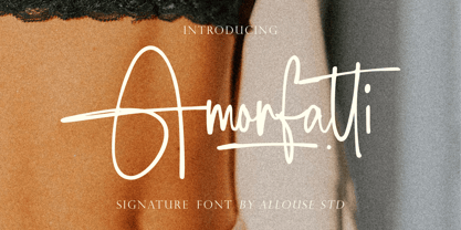 Proudly Presenting, Amorfatti A Signature Font. Amorfatti is perfect for any titles, logo, product packaging, branding project, megazine, social media, wedding, or just used to express words above the background. Amorfatti also come with Multi-Lingual Support. Enjoy the font, feel free to comment or feedback, send me PM or email. Thank You!
 - Deathridge by Allouse Studio,
$16.00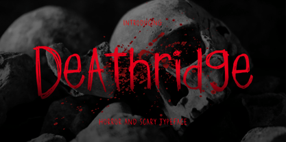 Proudly Presenting, Deathridge a Horror and Scary Typeface. Deathridge is perfect for product packaging, branding project, megazine, social media, wedding, or just used to express words above the background. Deathridge also come with Multi-Lingual Support. Enjoy the font, feel free to comment or feedback, send me PM or email. Thank You!
 - Somuch Fabrica by Allouse Studio,
$16.00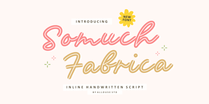 A Inline Handwritten Script. Somuch Fabrica is perfect for any titles, logo, product packaging, branding project, megazine, social media, wedding, or just used to express words above the background. Somuch Fabrica also come with Multi-Lingual Support. Enjoy the font, feel free to comment or feedback, send me PM or email. Thank You!
 - Joynoted by Allouse Studio,
$16.00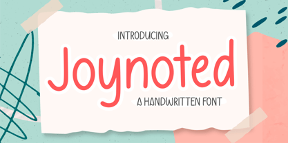 Proudly Presenting, Joynoted a Handwritten Font Joynoted is perfect for any titles, logo, product packaging, branding project, megazine, social media, wedding, or just used to express words above the background. Joynoted also come with Multi-Lingual Support. Enjoy the font, feel free to comment or feedback, send me PM or email. Thank You!
 - Moonlily by Allouse Studio,
$16.00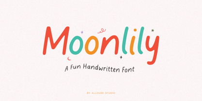 Moonlily a Fun Handwritten Font. Moonlily is perfect for any titles, logo, product packaging, branding project, megazine, social media, wedding, or just used to express words above the background. Moonlily also come with Multi-Lingual Support. Enjoy the font, feel free to comment or feedback, send me PM or email. Thank You!
 - Laricio by Présence Typo,
$36.00Laricio is the italian name of the larch tree. This typeface has naturalist and renaissance connotations. The design of the stems is organic. The general feeling is slightly prickling like the foliage of conifers. In french, the word "fût" qualifies the "stem" (of a letter) and also the "bole" (of a tree). - Giantboat by Timurtype,
$14.00 Proudly presenting: Giantboat, introduced by Timur Type Giantboat is a handwritten script font. Giantboat is perfect for product packaging, branding projects, magazines, social media, wedding invitations, or just used to express words above the background. Giantboat also has multilingual support. Embellish your designs with our original fonts. Enjoy the font, thank you!
 - Gold Standard by FontMesa,
$30.00 Gold Standard got its start from a few letters found on an old Gold Certificate from 1882. From those few letters spelling out the word GOLD, the rest of the alphabet was designed to match. The lowercase design was based on lettering found on an old silver certificate from approximately the same year.
 - Summer Fling by Comicraft,
$19.00 Summer Fling is a breezy brush script lettering font in the style of classic sign painting, complete with custom letter pairs and word ends to create authentic hand-painted feel. Consider this the perfect headline font for the Summer Blockbuster Romance you’re sure to pen in the warm, wine-soaked evenings ahead.
 - Shortline by Qwrtype Foundry,
$14.00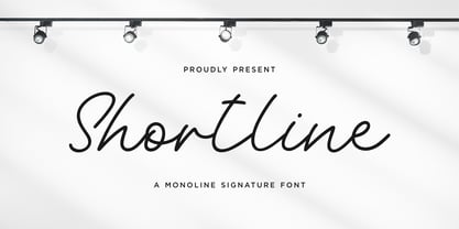 Proudly Present, Shortline Shortline is a Monoline Signature Font Shortline is perfect for product packaging, branding project, megazine, social media, wedding, or just used to express words above the background. Shortline also come with Multi-Lingual support. Enjoy the font, feel free to comment or feedback, send me PM or email. Thank you!
 - Winterlady by Balpirick,
$15.00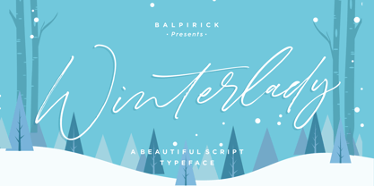 Proudly Present, Winterlady Font. Winterlady is a Beautiful Script Font. Winterlady is perfect for product packaging, branding project, business card, megazine, social media, wedding, or just used to express words above the background. Winterlady also multilingual support. Enjoy the font, feel free to comment or feedback, send me PM or email. Thank you!
 - Westbum by Allouse Studio,
$16.00 Proudly Presenting, Westbum A Bold Handbrush Font. Westbum is perfect for any titles, logo, product packaging, branding project, megazine, social media, wedding, or just used to express words above the background. Westbum also come with Multi-Lingual Support. Enjoy the font, feel free to comment or feedback, send me PM or email.
 - Timegoing by Allouse Studio,
$16.00 Proudly Presenting, Timegoing a Graffiti Street Font. Timegoing is perfect for any titles, logo, product packaging, branding project, megazine, social media, wedding, or just used to express words above the background. Timegoing come with Multi-Lingual Support. Enjoy the font, feel free to comment or feedback, send me PM or email. Thank You!
 - Mothenary by Adante Creative,
$23.00 Introducing by Adante Creative Proudly Present, Mothenary Mothenary is A Beautiful Calligraphy Font Mothenary is perfect for product packaging, branding project, magazine, social media, wedding, or just used to express words above the background. Mothenary also multilingual support. Enjoy the font, feel free to comment or feedback, send me PM or email.
 - Landa by Sudtipos,
$39.00 As good as Nylon is, there’s nothing better than a nice woolly blanket. The smell and coarse, uneven texture are relaxing and feel reassuring. More comfortable. In a world where technology can reach millimetric precision, sometimes it’s good to connect with the imperfect and controlled impurity that is nature. Font design in particular has matured through software that can generate the most perfect letters in the world. But most of them don’t have soul. Landa is a glimpse from the cutting edge into the past. Inspired by Venetian lettering from the 15th century, whilst giving them new meaning, its letters become expressionist and have a modern touch. A rendez-vous between Nicolas Jenson, Oldřich Menhart, and nature itself. In Landa you can feel the texture of trunks and branches, from full fertile splendour to dried-out frailty. It takes the reader for a stroll through the woods on a late autumn evening, or on an adventure through the Amazonian rainforest, depending on the weight chosen. In the lighter and italic options, Landa text is organic and rustic, and very comfortable to read. What’s more, while it’s discreet on smaller screens, when enlarged it reveals brittle and expressive calligraphic shapes. This also makes it ideal for packaging or display elements. Landa provides advanced typographical support in several languages and OpenType features including case-sensitive forms, small caps, contextual alternatives, stylistic alternates, fractions, proportional and tabular figures. In this case it is technology that serves lettering, not the latter being technology dependent. Let’s not forget, as Erik Spiekermann said “we are still analogical beings. Our brains and eyes are analogical.” Perhaps that’s why to disconnect we always need to go back to forests, rivers, nature. Perhaps that’s why we still prefer wood to steel or wool to nylon.
 - YrBkMess - Unknown license

- Sqsville - Unknown license

- Westkreep by Pedro Teixeira,
$25.00 Westkreep is based on wood type with characters extremely wide relative to their height.
 - Fuller Sans DT by DTP Types,
$49.00An original design by Malcolm Wooden inspired by the works of Morris Fuller Benton. - American Advertise 016 by Intellecta Design,
$15.95a classic decorative caps font digitized from the wood type classics heritage from America's - Summer Nights by BA Graphics,
$45.00 A very readable script, simple yet elegant. Works great in a multitude of applications.
 - Phanitalian by Intellecta Design,
$9.00Phanitalian in an exercise whith many styles from a classic victorian wood type font. - Montada by BRtype,
$18.00 The design of Montada was inspired by the manual printing of mixed wood types.
 - Payson JNL by Jeff Levine,
$29.00Payson JNL is based on a vintage sans serif wood type from the 1800s. - Birac DT by DTP Types,
$49.00This design is based on custom design work by DTP Types Limited in 1990. - Zing Sans Rust by Fontfabric,
$29.00 Zing Sans Rust is a textured handmade typeface with wide and calm proportions perfect for short text in small sizes, but also pleasant enough to use as an isolated display headline. It has a distinctive geometric spirit, smoothed with handmade details such as a slightly slanted axis visible in the terminals. The combination of Zing Script TM and Zing Sans TM brings a balanced completeness. Zing Goodies As a dessert, we serve you Zing GoodiesTM that tops off the whole package, making it an extraordinary delicacy! It has 4 basic forms — Bakery, BBQ, Banners, and Words — with two styles each, which contain plenty of adorable icons for any food and taste, elaborate banners, ribbons, and ornaments, and even a beautiful selection of useful words to accentuate your design.
 - Once upon a whimsical time in the bustling town of Typeface Village, there lived a jovial and somewhat rotund font named Balloon. Oh, Balloon! With curves as bouncy and spirit as buoyant as its names...
- RAN by URW Type Foundry,
$35.99 RAN Reformed Typeface for Beginners by Georg Salden - a headstrong and courageous approach to an improved handling of handwriting. Diverse and sometimes irreconcilable theories exist about how beginners are supposed to learn writing and reading. This has led to fierce discussions among experts already. We don’t want to pour more oil on the fire, but hope to create a new awareness for this topic, which is important to everyone of us. For beginners the combination of single characters (sounds) to whole words is essential during the acquirement of reading and writing. In this process they develop the skill to recall entire terms from memory. Therefore, after current practice, every word shall be written in a single stroke without lifting the pen in between. Georg Salden contradicts this postulate and warns, that coercively holding the pen down within a word can easily lead to exaggerated loop formations and a general meandering of the written text. The intellectual process in connecting single sounds to words while writing would happen anyway and the prohibition to lift the pen would often lead to tensions. To still support the necessary connections in general and to simplify the connecting, he teaches to write all round letters like a, e, g, o with inclusion of the connecting stroke, so that the spacing and combining with the next character arise by themselves. By settling the stroke at certain points and with a clear and logical writing method, a conscious and careful contact with the various strokes arises. All this automatically leads, together with a certain deceleration, to an increase of beauty and readability in the handwriting. The repeatedly discussed topic »connected or unconnected« appears to be solved in the most comfortable way as, depending on the particular character combination, both solutions are possible.
 - ChefScript by Andinistas,
$79.95 Chef Script is an experimental font designed by Carlos Fabian Camargo G. Its fantasy design contains 1463 glyphs to compose words, phrases and short messages on small and large sizes. The idea was born in a sketchbook that was perfected again by hand and achieving "non-neutral drawings" on tracing paper. With bezier digitization the empty and full parts of letters appeared with soft and eloquent curves as calligraphic result produces optimal readability. Chef Script combines warmth and good humor running in countless design applications such as labels and base plates, covers, posters, movie titles, seals and any printed design that needs an unusual typographic tool. In that sense, Chef Script is influenced by Speedball lettering manual (1957), Ross F. George. The illustrative nature of "ChefScript-complete" does not look anything like the traditional type design hierarchies. Therefore offers 7 hierarchical resource groups to design comfortable contexts flavored with illustration and typography: • ChefScript-Basic: Letters with horizontal and vertical thrifty proportions mimic an uninterrupted calligraphy brush made with flat tip. Thus its letters have ascenders and descenders strokes perpendicular to its base line and equal to the height of the lowercase. • ChefScript-Swashes: Letters expressive and unique flourishes to design highlighted words or phrases. • ChefScript-Caps: Uppercase with lowercase height give the impression of interrupted uppercase italics writing within what is written with uninterrupted lowercase letters producing strong contrast within a paragraph fragment. • ChefScript-Containers: Container drawings designed to exchange with infinite possibilities each order so that its inferior serve to store information written or drawn. • ChefScript-Dingbats: Pictograms that communicate: kitchen, chef, restaurant, food, etc. • ChefScript-Numbers: Bulky and useful numbers to highlight prices or figures containing points or dollar signs. • Chef Script-Words: Predesigned words with uninterrupted letters diagonally leveled highlighting various thoughts in writing.
 - PB Capitalis Rustica IVc by Paweł Burgiel,
$32.00 PB Capitalis Rustica IVc is a font face designed for imitate latin writing style found in manuscripts from 1st to 9th century. All characters are handwritten by use ink and reed pen (calamus), scanned, digitized and optimized for best quality without lost its handwritten visual appearance. Character set support codepages: 1250 Central (Eastern) European, 1252 Western (ANSI), 1254 Turkish, 1257 Baltic. Include also additional characters for Cornish, Danish, Dutch and Welsh language, spaces (M/1, M/2, M/3, M/4, M/6, thin, hair, zero width space etc.) and historical characters (overlined Roman numerals, I-longa, historical ligatures for "nomina sacra" and "notae communes"). OpenType TrueType TTF (.ttf) font file include installed OpenType features: Access All Alternates, Localized Forms, Fractions, Ordinals, Superscript, Tabular Figures, Proportional Figures, Stylistic Alternates, Stylistic Set 1, Historical Forms, Historical Ligatures. Include also kerning as single 'kern' table for maximum possible backwards compatibility with older software. Historical ligatures for "nomina sacra" and "notae communes" are mapped to Private Use Area codepoints. Use of OpenType features to get historical characters: ïTo get "I-longa" use Stylistic Alternates for: "I"(U+0049), "i"(U+0069), "dotless i"(U+0131). ïTo get "nomina sacra" use Historical Ligatures and write uppercase letters: DS for: "Deus", DMS or DNS for: "Dominus" EPS for: "Episcopus", IHS for: "Iesus", PBR for: "Presbiter", SCS for: "Sanctus", SPS for: "Spiritus", XPS for: "Christus". ïTo get "notae communes" use Historical Ligatures and write: B(U+0042) + "middle dot"(U+00B7) for: "-BUS", Q(U+0051) + "middle dot"(U+00B7) for: "-QUE". ïTo get "scriptio continua" (writing without words separation) use Historical Forms (regular spaces are replaced by zero width spaces between words). ïTo get "middle dot" for separate words use Stylistic Set 1 (regular spaces are replaced by middle dot between words).
 - Reina Neue by Lián Types,
$29.00 Hey! See Reina Neue in action here! INTRODUCTION When I designed the first Reina¹ circa 2010, I was at the dawn of my career as a type designer. The S{o}TA, short for the Society of Typographic Aficionados, described it as complex display typeface incorporating hairline flourishes to a nicely heavy romantic letterform². And it was like that; that’s what I was pursuing at that time since I was very passionate about ornaments and accolades of Calligraphy. Why? I felt that Typography, in general, needed more of them. These subtle flourishes could breathe life into letters. Maybe, I thought it was the only way I could propose something new into the field of type. However, after some years, I came across a very interesting quote: –Beautiful things don’t ask for attention– Wow! What did this mean? How could something be attractive if it’s not actually showing it. Could this be applied to my work? Sure. I think every type-designer goes through this process (aka crisis) regarding his or her career. At the beginning we love everything. We are kind of blind, we only see the big picture of a project. And that’s not because we are lazy. We actually can’t see the small mistakes nor the subtleties that make something simpler beautiful. We are not able. But, the small subtleties… They are actually everything: With experience, one puts more attention into the details and learns that every single decision in type has to be first meticulously planned. Here I am now, introducing a new Reina, because I felt there was a lot of it that could be improved, also the novelty of Variable Fonts caught my attention and I had to take that to my type library. THE FONT A thing of beauty is a joy forever Now, a decade later, I’m presenting Reina Neue. This font is not just an update of its predecessor: –A thing of beauty is a joy forever– is the first line of the poem ‘Endymion’ by John Keats, and despite the meaning of “beauty” may vary from person to person, and even from time to time (as read in the last paragraph), with Reina I always wanted to bring joy to the eye. In 2010, and now, in 2020. I believe the font is today much better in every aspect. It was entirely re-designed: Its shapes and morphology in general are much more clean and pure. The range of uses for it is now wider: While the old Reina consisted in just one weight, Reina Neue was converted into a big family of many weights, even with italics, smallcaps and layered styles. The idea behind the font, this kind of enveloping atmosphere made out of flourishes, is still here in the new Reina. This time easier to get amazing results due to the big amount of available alternates per glyph and also more loyal from a systemic point of view. However, and as read in the introduction -Beautiful things don’t ask for attention-, if none of the flourishes are activated the font will look very attractive anyway. Reina Neue is ready to be used in book covers, magazines, wedding cards, dazzling posters, storefronts, clothing, perfumes, wine labels and logos of all kind. Like it happened with the previous Reina, I hope this new font satisfies every design project around the world if used, and can be a joy forever. SOME INSTRUCTIONS Before choosing the right style for your project, hear my advice: -Reina Neue Display was meant to be used at big sizes. If you plan to print the font smaller than 72pt, I suggest using Reina Neue, not Display. Otherwise, if the font will be BIG or used on a digital platform, Reina Neue Display should be your choice. For even smaller sizes, use Reina Neue Small. This style was tested and printed in 12pt with nice results. (Note for variable fonts: Print them in outlines) -Reina Italic is not a slanted version of the roman, and this means some flourishes are different between each other. The Italic version has other kind of swirls. More conservative, in general. -All the styles of Reina Capitals have Small Capitals inside. -Reina Capitals Shine should be used/paired ONLY with Reina Capitals Black. The engraved feeling can be achieved if Reina Capitals Black and Reina Capitals Shine are used as layers, with the same word. Variable fonts instructions: -For more playful versions, choose Reina Neue VF, Reina Neue Italic VF or Reina Neue Capitals VF: With them you can adjust between 3 axes: Weight (will change the weight of the font) – Optic Size (will thicken/lighten the thin strokes and open/close the tracking) – Accolades (will modify the weight of the active flourishes). SOME VIDEOS OF REINA NEUE VF https://youtu.be/8cImmT5bpQM https://youtu.be/1icWfPmKAkg https://youtu.be/YC9GkJDL1a8 NOTES 1. The original Reina, from a decade ago: https://www.myfonts.com/fonts/argentina-lian-types/reina/ 2. In 2011, Reina received an honourable mention by S{o}TA. “Great skill is shown in the detailing, and an excellent feel for the correct flow of curves and displacement of stroke weight.” https://www.typesociety.org/catalyst/2011/ Reina was featured in the “Most Popular Fonts of the year” in MyFonts in 2011 https://www.myfonts.com/newsletters/sp/201201.html In 2012, the font was also selected in Tipos Latinos, the most prestigious competition of type in Latinoamerica. https://www.tiposlatinos.com/bienales/quinta-bienal-tl2012/resultados Also, chose as a “Favorite font of the year” in Typographica. https://typographica.org/typeface-reviews/reina/
 - Sangli by insigne,
$- It started in 2007 with Chennai, the first of a three-part series of sans that I envisioned with slab serif counterparts. Each font would differ from the others in how the stem terminals were expressed. The initial font was extremely well received, and a revitalized and remastered Chennai made its appearance two years later, complete with new weights and new, novel OpenType features. Then came Madurai, a variation of Chennai based on the same core, only without the rounded stems. Chennai’s rounded stems made it distinctive and great for headlines but left it lacking appeal as copy--a problem that Madurai easily solved. And now comes Sangli, the final iteration of my original 2007 vision. Sangli is a happy medium. Like Chennai, it’s great for headlines--but not too distinct for copy. Sangli keeps the same core structure as the other two, but new less sharp forms give this latest font a friendlier look that’s more versatile than the original Chennai and less formal than Madurai. The font includes a whole range of six weights from light to black, along with condensed and extended options as well for a total of 54 fonts. There are plenty of OpenType features, including small caps. Alternates include normalized capitals and lowercase letters that include stems for when you want a more traditional look or when you’re writing copy. Sangli also supports over 70 languages that use the extended Latin script. Use Chennai, Madurai, and their slab serif variants interchangeably with Sangli, too, for even more options in your work. All three complement one another well. So when you need a balanced font that stands boldly on the page and commands your reader’s attention, look within and find your Sangli.
 - Woodmark JNL by Jeff Levine,
$29.00 Woodmark JNL is a rough and somewhat irregular in letter form wood type based on some examples of William H. Page's "New Process No. 507". The eccentricity of the letters is reminiscent of many of the 1800's wood type designs, and is perfect for a rustic look within any retro project.
 - Lullaby by Ania Szerszen,
$20.00 Lullaby is a display font that works great for headlines, posters or logotypes. With its regular rhythm, soft lines, some non-standard ligatures and two versions of each character (caps as alternatives), it gives many possibilities for any kind of typographic artworks. It works best with auto kerning in OpenType savvy applications.
 - Pablo by ITC,
$29.99 Pablo is the work of British designer Trevor Pettit, who based this dramatic typeface on the signature of Pablo Picasso. The chunky lowercase reflects the very essence of Picasso's influence and the initial capitals can also be used on their own. Pablo is excellent for work requiring a vivid, cutting edge appearance.
 - Choc by ITC,
$29.99 Choc font is the work of French designer Roger Excoffon, based on the traditions of Japanese brush calligraphy, thick yet graceful. Choc light font was designed by Phil Grimshaw, who had to redraw many times in different weights before finding one that worked as a text face and remained true to the original.
 - Oblique Rain by NREY,
$19.00 Introducing a cool monoline script font family - Oblique Rain. Typeface is based on handwriting text, like school work or retro letters. Works great applied to logos, prints, quotes, magazine headers, clothing, and many others! Features: Uppercase Lowercase Numeral & Punctuation Standart Ligatures Stylistic Alternates PUA Encoded Multilingual Support I hope you enjoy it! Thanks!
 - Doohickey by Comicraft,
$19.00So your widget’s stuck between the framistat and the whatchamacallit, there’s a spanner in the works and your avengers just won't assemble. Hey, if you want to get any more work done, you know you're gonna have to hook the hoojamajigger up to the doohickey! See the families related to Doohickey: Doohickey Lower. - Frank Reaction by Will Stewart,
$40.00 A high quality hand rendered pencil script that includes a variety of contextual alternates to ensure the best handwritten look. Frank Reaction works brilliantly when used for both display and body copy and it is available for both print and web application. Use Frank Reaction to give your work personality and life.

