7,520 search results
(0.025 seconds)
- Alleghieri by Scriptorium,
$18.00Alleghieri was developed from several different examples of late Renaissance lettering. While it is based on a style which is clearly intended for quick, easy writing, we've preserved many of the unusual character forms and elaborations to give it a lot of personality. The result is stylish and unique, with a real feel of the Renaissance, but great readability as well. The full version includes a large selection of variant character forms and special characters. - Vild Scapes by Typesketchbook,
$49.00 With the intention to create a family of modern calligraphy, Vild Scapes offers different feels in different effects. The Normal option cuts back the imperfections created from freehand writing, while Inkless keeps those details. There’s also the Rust option, which imitates letterpress printing effects. In addition, the family comes in three designs: Brush (big paint brush style), Script (small paint brush style), and Marker (brush tip maker style), offering you more possibilities for creativity.
 - Muffin by ParaType,
$30.00 Muffin is a soft and rounded humanistic low-contrast sans serif based on broad nib writing. It comes in five weights ranging from Regular to Black. The friendly character of the font becomes even more pronounced in the darkest styles. Muffin is well suited for food packaging, menus, children's products, while Regular may be easily used for long runs of text. The font was designed by Natalia Vasilyeva and released by Paratype in 2017.
 - MVB Emmascript by MVB,
$39.00Kanna Aoki drew the letters for MVB Emmascript while on a picnic near the Conservatory of Flowers in San Francisco’s Golden Gate Park. Mark van Bronkhorst adapted the writing as a font that maintains a very natural scrawl. Later a bold weight was added. MVB Emmascript has been used to add a lighthearted, human touch to everything from fiction paperbacks to potato chip packaging. The typeface is named for Aoki's 1968 Volkswagen, Emma. - PeterPierre by Ingrimayne Type,
$6.95 PeterPierre is a stiff, awkward sans serif face. It has little variation in stroke width and the vertical and horizontal elements are connected with short, sharp curves. The condensed style was developed first and then, in a quest for legibility, it was widened into the regular style.
 - Auberge Script by Sudtipos,
$79.00 It took me a long time, but I think I now understand why people of my generation and older feel the need to frame current events in an historical context or precedents, while most of the young couldn't care less about what happened ten years ago, let alone centuries back. After living for a few decades, you get to a point when time seems to be moving quite fast, and it’s humbling to see that your entire existence so far can be summed up in a paragraph or two which may or may not be useful to whoever ends up reading the stuff anyhow. I suppose one way to cope with the serenity of aging is trying to convince yourself that your life and work are really an extension of millenia of a species striving to accept, adapt to, and improve the human condition through advancing the many facets of civilization -- basically making things more understandable and comfortable for ourselves and each other while we go about doing whatever it is we are trying to do. And when you do finally convince yourself of that, history becomes a source of much solace and even a little premonition, so you end up spending more time there. Going far back into the history of what I do, one can easily see that for the most part it was ruled by the quill. Western civilization’s writing was done with quill pens for more than thirteen centuries and with newer instruments for about two. By the mid-18th century, the height of the quill experience, various calligraphy techniques could be discerned and writing styles were arranged in distinct categories. There are many old books that showcase the history of it all. I recommend looking at some whenever the urge comes calling and you have to get away from backlit worlds. Multiple sources usually help me get a better perspective on the range of a specific script genre, so many books served as reference to this quill font of mine. Late 17th century French and Spanish professional calligraphy guides were great aides in understanding the ornamental scope of what the scribes were doing back then. The French books, with their showings of the Ronde, Bâtarde and Coulée alphabets, were the ones I referenced the most. So I decided to name the font Auberge, a French word for hotel or inn, because I really felt like a guest in different French locales (and times) when I going through all that stuff. Because it is multi-sourced, Auberge does not strictly fit in a distinct quill pen category. Instead, it shows strong hints of both Bâtarde and Coulée alphabets. And like most of my fonts, it is an exercise in going overboard with alternates, swashes, and ornamental devices. Having worked with it for a while, I find it most suitable for display calligraphic setting in general, but it works especially well for things like wine labels and event invitations. It also shines in the original quill pen application purpose, which of course was stationery. Also, as it just occurred to me, if you find yourself in a situation where you have to describe your entire life in 50 words or less, you may as well make it look good and swashy, so Auberge would probably be a good fit there as well. This is one quill script that no large bird had to die for. A few technical notes The Auberge Script Pro version includes 1800 glyphs, everything is included there. Also latin language support. We recommend you to use the latest design application to have full access to alternates, swashes, small caps, ornaments, etc. The images from the gallery uses this version. For better results use the fonts with “liga” feature on. Awards During 2014 the early develop of Auberge Script was chosen to be part of Tipos Latinos, the most important type exhibition in South America.
 - Snowky Brush by Letterara,
$10.00 Snowky Brush is a simple layered font inspired by the uniqueness of the snow. It includes 2 fonts. Snowky Brush is great in any branding, posters designs, and your upcoming winter stuff. Get inspired by its snow look & feel! Features : - Uppercase - Numerals - Punctuations (OpenType Standard) - Accents (Multilingual characters) - Works on PC & Mac - Simple installations - Accessible in the Adobe Illustrator, Adobe Photoshop, Adobe InDesign, even works on Microsoft Word. don't wait anymore, put it in your shopping basket :) and follow me, because there will be many promos!
 - Albus by Gustav & Brun,
$20.00 Albus is bold and friendly. It is your wizard when you're lost in communication. Perfect for the not so serious statements, or maybe for the very serious ones? Maybe it fits on your next children’s book, or maybe on your webshop? The Albus Friends (ornaments) includes speech bubbles, clouds and other fluffy stuff. You can also buy the whole family for an extra friendly price. Let Albus be your wand and let it help you create the kind of message you want. Let’s create some magic!
 - Burgery by Arterfak Project,
$18.00 Say hello, to Burgery! A playful display font. Inspired by kids' games and snacks typography. Burgery designed in monoline concept and adjusted well to keep the legibility. Burgery is a flexible typeface that you can use for many kinds of stuff and themes. Burgery is an all-caps font, equipped with stylistic alternates, ligatures, Burgery is perfect for kids' merchandise, quotes, t-shirts, posters, social media, pillow, packaging, storybook, food menu, cafe decoration, logos, and much more! Mix and play your words with Burgery!
 - Soft Garden by Intellecta Design,
$17.90 Soft Garden is a collection of ornaments, available in font format. Good to use in arts and crafts works, books of arts, stationery, publishing stuff and many other applications. Another delicate collection by Iza W from Intellecta Design. Besides the font itself, buying SoftGarden you get FREE a special set of eps: 49 intrincated and feminine colored versions of SoftGarden by Iza W (see the banners at the gallery section with some samples of this collection). The EPS are ready to use and Royalty-Free licensed.
 - Killuminati by IKIIKOWRK,
$17.00 Introducing Killuminati - Gothic Type, created by ikiiko. Killuminati is a simple english old type with modern blackletter style. This typeface is inspired by gothic & classic rock band logo. killuminati has a bold font with a combination of sharp and curved corners. This font is perfect for an poster event, stencil, logotype, magazine layout, fashion stuff, quotes, and so much more. What's included? Uppercase & Lowercase Number & Punctuation Alternates Multilingual Support Enjoy our font and if you have any questions, you can contact us by email : ikiikowrk@gmail.com
 - Kooltura by IKIIKOWRK,
$17.00 Introducing Kooltura Psychadelic Type, created by ikiiko. Is a trippy typeface with unique stylistic in 70s era. This typeface is perfect for an poster, cover album, cult product, hipster stuff, fashion, quotes, or simply as a stylish text overlay to any background image. What's included? Lowercase & Uppercase Number & Punctuation Multilingual Support Format File : TTF & OTF Works on PC & Mac Get also a good offer & FREEBIE at our site : www.ikiiko.com Enjoy our font and if you have any questions, you can contact us by email : ikiikowrk@gmail.com
 - Wolfgang Krauss by IKIIKOWRK,
$17.00 Introducing Wolfgang Krauss - Modern Fraktur Typeface, created by ikiiko. A simple blackletter type with mood of modern fraktur style. This typeface is perfect for an poster event, stencil, hipster magazine, fashion stuff, T-shirt design, tote bag design, quotes, and so much more. What's included? Uppercase & Lowercase Number & Punctuation Multilingual Support Format File : TTF & OTF Works on PC & Mac Get also a good offer & FREEBIE at our site : www.ikiiko.com Enjoy our font and if you have any questions, you can contact us by email : ikiikowrk@gmail.com
 - Bouncy Color by Mans Greback,
$59.00 Bouncy Color is a funny cartoon font with pre-set coloring, outline and shine effects! Drawn and created by Mans Greback in 2021, this comic-style lettering has a happy, quirky personality and optimistic humour. It has a colorful graffiti and street art look, while being a childish and cute sans-serif – a typeface for boys and girls alike. Bouncy Color is provided in five styles: White, Blue, Pink, Highlight and Outlined. Use it in Photoshop, Illustrator, InDesign or any other modern software that supports color fonts, and you'll give any project a fun and happy appearance.
 - Mr Jones by Miller Type Foundry,
$25.99 Mr Jones was originally conceived as a family for print design consisting of a sans and a headline. The lowercase are wide for legibility at small sizes while the caps are narrower to save space and keep an even balance of negative space when used in body copy. The overall widths of certain characters have been adjusted to almost extremes to keep an even balance of white space around each letter. He works well in body copy, but will need decreased tracking for larger settings. He comes with small caps; proportional, oldstyle, and tabular figures and discretionary ligatures.
 - Monotype Bodoni by Monotype,
$40.99 Bodoni expresses the beginning of the Industrial Revolution; its serifs are flat, think and unbracketed, while the stress is always on the mathematically vertical strokes. Bodoni believed in plenty of white space and therefore descenders are long. The M is rather narrow; in the Q the tail at first descends vertically and the R has a curled tail. The italic, like most continental modern faces, has roman serifs. Monotype Bodoni provides a clear-cut effect due to its simplicity. It reproduces well, particularly in sizes over 12pt. This font is slightly darker than Bauer Bodoni. The contrast makes Monotype Bodoni appear more condensed.
 - Goudy Text by Monotype,
$29.99The word Text" in Goudy Text™ is short for Textura, and textura is the style of blackletter or gothic writing developed in Northern Europe in the middle ages. The use of space in blackletter is quite different from what we know about Roman letterforms. Lowercase forms in blackletter writing and typefaces must be evenly textured with black and white elements, like the texture of weaving or fabric. Capital letters can provide either an integration of the even texture (by the use of decoration in their construction) or, if they are wide and open and filled with white, they provide bright spots of visual emphasis. Goudy, despite being an American in the twentieth century, understood well the fundamental texture of medieval blackletter and the importance of both density and light. He designed Goudy Text in 1928 for Lanston Monotype after studying the type in Gutenberg's 42-line bible; still one of the best models for designers of blackletter typefaces. The lowercase of Goudy Text has impact and medieval authenticity. The standard caps have some Victorian eccentricities but are mostly well drawn. The alternate, or "Lombardic" caps are spectacular - they set beautifully with the lowercase letters, providing the proverbial shafts of light through the Gothic cathedral's stained glass windows. Use this potent font in sizes 14 point or larger, for Christmas greetings, certificates, wedding invitations, advertising, or music collateral pieces." - Nat Pictures by ParaType,
$25.00 Two sets of signs and pictures designed by Natalia Vasilyeva. The first one includes figures, arrows, geometric shapes and other signs of abstract nature. The second set — pictures of flora and fauna (animals, fishes, birds, insects, plants,...) and pictures of common staff (houseware, instruments,…). Released by ParaType in 2009.
 - ITC Leawood by ITC,
$29.99 ITC Leawood was begun by designer Les Usherwood and finished by his talented staff at Typsettra in Toronto, Canada, after his untimely death. A similar calligraphic series to ITC Usherwood, following alternative options, the typeface features small, well-defined serifs which aid legibility and allow for close spacing.
 - Charons Obol by Hanoded,
$20.00 Charon's Obol is a scary, brushed typeface. It was created using cheap paint and stiff brushes - hence the rough texture of the glyphs. Using this font will ensure you a safe passage across the river styx - just don't pay the ferryman until he gets you to the other side…
 - Ma Braille by Echopraxium,
$5.00 The "Ma" in "Ma Braille" is used as a minimalist way to say "Negative Space". "Ma" in japanese arts is an "esthetical usage of emptiness". Thus this font explicits the negative space around visible braille dots in each glyph. A. Font user guide a.1. Lowercase glyphs { A..Z } In these glyphs, dots are represented as "black squares" while the negative space is displayed as 1 or 2 white filled polygons. a.2. Uppercase glyphs { a..z } In these glyphs, dots are represented as "white squares" while the negative space is displayed as 1 or 2 black filled polygons. a.3. Digits: they are just the same than a..j, but the "North US version" is also provided in ascii codes 0xE0..0xE4 (1..5) and 0xE7..0xEB (6..0). a.5. "Dashed Border": a.5.1. "Black dashed" border glyphs; { £, ¥, µ, Â, Ä, Ê, Ë, Î, Ï, Ô } a.5.2. "White dashed" border glyphs; { Ö, Õ, °, ô, ö, î, ï, û, u, õ } B. Posters Poster 1: "Font Logo" version 1, it displays "Ma Braille" text surrounded by the "black dashed border" glyphs. Poster 2: "Font Logo" version 2, it displays "MA" glyphs in big size and smaller "Braille" glyphs within "M" and within "A" as well. Poster 3: the classical pangram to test a font "The Quick Brown Fox jumps over the Lazy dog". Poster 4: Article 1 of the Human Rights: All human beings are born free and equal in dignity and rights. They are endowed with reason and conscience and should act towards one another in a spirit of brotherhood. Poster 5: the "Glyph set" (Border glyphs not included) with A..Z, a..z, digits and special characters.
 - Budskab by Bogstav,
$17.00 This is the kind of font which is up to trouble. Not trouble in a bad way, but trouble like when you are in no way prepared what is going to happen. The font is handmade and playful - and to help that playfullness come to live, the 5 different versions of each letter helps! Watch your words change while you write with Budskab! And, by the way..."budskab" is message in danish...just thought you should know!
 - Neonoir by phospho,
$25.00 Neonoir is an homage to neon lettering craftsmanship of the mid 20th century. The beautiful futuristic grace of wall-sized bent-glass hand-writing is distilled into a three-weight connected script that’s on the button for headlines, logotype and branding designs. Its Slim and Bold weights are formal monoline scripts, while the medium weight mimics the rough edges of ink on paper. Neonoir is available as an Open Type font that features alternate endings and lots of ligatures.
 - Bicyclette by Kostic,
$40.00 The name “Bicyclette” was chosen because this typeface is all about balance and elegance. The idea was to create a highly contrasted sans-serif family carefully balanced between gentle curves and sharp angles, with large capitals opposing uncommonly short lower case, through six distinctive weights. The letters are wide, and the capitals pop up in headlines while the lower case leaves a lot of white space between the text lines because of its small x-height. The edges are rounded (but not so much for the family to be called rounded), just enough to make the text feel slightly softer, gentler, while retaining some of that technical sans sharpness. The Bicyclette character set supports Western and Central European languages, and includes an extended set of monetary symbols. Each weight includes small caps, ligatures, proportional lining and oldstyle numbers, tabular figures, fractions and scientific superior/inferior figures.
 - Rataczak by Ingrimayne Type,
$9.00 Rataczak is a stiff, awkward serifed font that was inspired by similar fonts from the 19th century. It is legible as a text font but not graceful. In addition to plain, italic, bold, bolditalic, extrabold, condensed, and condenseditalic styles, there is a striped style and a font of swash capitals.
 - Kalidony by Arterfak Project,
$26.00 Kalidony is a wonderful wedding typeface. Inspired by the upscale wedding design and the luxury woman stuffs. Kalidony represents a classy impression with beautiful thick & thin strokes. Kalidony is perfect for elegant design which requires natural handwriting or signature style. Equipped with many alternate characters that give your design a floral touch and look calmer. You can use this typeface for wedding purposes, greeting cards, invitations, logotype, books, packaging, and more! Kalidony features: Complete standard character set, symbols & punctuations Stylistic alternates set: ss01 - ss09 PUA Encoded Multilingual support: ÀÁÂÃÄÅÆÇÈÉÊËÌÍÎÏÐÑÒÓÔÕÖ×ØÙÚÛÜÝÞßàáâãäåæçèéêëìíîïñòóôõöøùúûüýþÿĀāĂ㥹ĆćĈĉĊċČčĎ ďĐđĒēĔĕĖėĘęĚěĜĝĞğĠġĢģĤĥĦħĨĩĪīĮįİıIJijĴĵĶķĹĺĻļĽľĿŀŁłŃńŅņŇňʼnŌōŎŏŐőŒœŔŕŖŗŘřŚśŜŝŞşŠšŢţŤťŦŧŨ ũŪūŬŭŮůŰűŲųŴŵŶŷŸŹźŻżŽžȘșȚțẀẁẂẃẄẅ Thank you, bestie!
 - Neugen by Minor Praxis,
$20.00 Inspired by retro movies and theatre display design. A very condensed font made by Minor Praxis. Perfect for headlines, tall-format prints, posters, and displays which can utilize space of a medium. Neugen is a condensed type of font with a very dense kern. Give a strong impression which can be matched with basic sans serif fonts as a body copy that can make it more casual and modern looks. Available in medium and medium-rounded style with multi languages support. Ligatures, alternates, and stuff like icons and symbols.
 - Madness Attitude by IKIIKOWRK,
$19.00 Proudly present Madness Attitude - Street Brush Type, created by ikiiko. Inspired by the brush strokes on the street, where the raw, rough lines show a strong character of freedom expression. The font has a sloppy & dirty stroked texture, so it fits perfectly for making a poster, magazine layout, youth stuff, sleeve cover, party flyer, quotes, or simply as a stylish text overlay to any background image. What's Included? Uppercase & Lowercase Numbers & Punctuation Multilingual Support Works on PC & Mac Enjoy our font and if you have any questions, you can contact us by email : ikiikowrk@gmail.com
 - Huben by Minor Praxis,
$20.00 Inspired by a dark techno typography design style which tends to utilize space of a module. Designed for headlines, titling, large-format prints and posters. Huben is a wide extended width based, dense kern, a strong of a structures and heavy looks, make it more loud and on-point type of impression. Matched with basic sans serif typefaces as a body copy. Available regular and italic in standard and outlined version of styles with multi languages support. Ligatures, stylistic alternates, and some stuff like icons and symbols are added.
 - Djaman Doeloe by IKIIKOWRK,
$17.00 Introducing Djaman Doeloe - Old Type, created by ikiiko. Djaman Doeloe is a classic serif typeface with unique decorative element. Is an extension of the word taken from the indonesian language term "jadoel" which means antiquity. This typeface is perfect for an elegant logo, classy branding, vintage stuff, wedding, invitation, magazine layout, quotes, or simply as a stylish text overlay to any background image. What's included? Uppercase & Lowercase Number & Punctuation Multilingual Support Works on PC & Mac Enjoy our font and if you have any questions, you can contact us by email : ikiikowrk@gmail.com
 - Creative Signature by Scratch Design,
$9.00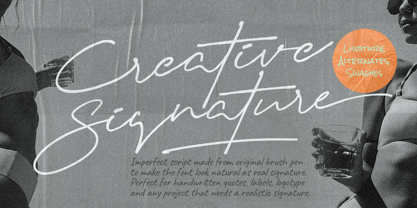 Introducing Creative Signature! It's a modern script font with a signature-style look. It's highly recommended for you who want to make some designs with a realistic signature style. This font will work for invitation design, wedding design, fashion design, advertising design, posters, packaging, book cover title, quote, social media post, etc. Open your Opentype features using the script font to use the ligatures, alternates, and swashes. As you type, your text will look like a natural signature or handwriting. So, enjoy the Creative Signature and make some cool stuff!
 - Vow by Thinkdust,
$15.00 Vow is an incredibly stylised font, strutting its stuff on the typography catwalk. Vow does everything to excess, even when cutting down: where it’s curvy, it’s very curvy, but where it’s thin, it’s thin. Vow’s regular weight has a certain boldness at text size, but its ultra-thin alternative is much better used at larger sizes, managing to take up very little space even when scaled up. Using a mix of the two creates a subtle emphasis, especially when coloured, which helps to create stunning messages in elegant ways.
 - Space Odyssey by IKIIKOWRK,
$17.00 Introducing Space Odyssey - Modern Sans, created by ikiiko. Space Odyssey is a display type with a character of semi-condensed sans serif combined with stretched font characters. This letter has a choice of stretch shapes to play with that. This typeface is perfect for an logo, branding, layout magazine, fashion stuff, quotes, or simply as a stylish text overlay to any background image. What's included? Uppercase & Lowercase Number & Punctuation Alternates Multilingual Support Enjoy our font and if you have any questions, you can contact us by email : ikiikowrk@gmail.com
 - Artificial Flavour by Kitchen Table Type Foundry,
$15.00 I do groceries a couple of times a week. When I am shopping for food, I always read the ingredients list; I don’t want too much sugar, nor palm oil, trans fats or a lot of E numbers. It used to be quite hard finding products that didn’t contain artificial flavours or colouring, but it is getting better. Artificial Flavour is an anti-ode to the time we couldn’t get enough of the stuff - it is a handmade, all caps font which comes with extensive language support and a sweet set of alternates.
 - FairyTale by Comicraft,
$29.00 In its beauty, Comicraft's Fairytale font is without rival in the heavens, the earth, or the stuff of men's dreams! A wee thing it may be, but 'tis like a star pulled from the sky. Luminescent. Radiant. Perfect. Yes! PARADISE can be yours...from the pages of "Captain Stoneheart and the Truth Fairy," comes a font that might very well change your life forever... it's a dream, a myth, a neverending story, it's a FairyTale! Words by Joe Kelly & art by Chris Bachalo from Captain Stoneheart and the Truth Fairy
 - Charlonka by PleasureFonts,
$22.00 I‘d like to introduce “Charlonka“ to you. When my daughter finished high school, she wanted to get rid of her entire school stuff. So I saved a few sheets of her beautiful handwriting and promised her to create a typeface out of it. That‘s how the idea of Charlonka was born, a typeface family out of Charlotte‘s handwriting (by the way: that‘s her name). Some characters of Charlonka have extended crossbars, like in upper case A or H, and reduced descenders, like in lower case g or y.
 - Tequendama by JVB Fonts,
$30.00 A display fontface for titles inspired on Latin America, Ethnic, Native, Tribal, Mysthical, Handmade, Aboriginal, Pre-Hispanic, Pre-Columbian, Textured. By mid-1997 I was developed the early type edition was called «Muisca Sans» as my work for the degree in Graphic Design (Universidad Nacional de Colombia), based on the concept of pre-Columbian figures characteristics within some of the very few visual elements recovered from the Muisca culture, ancient pre-Columbian tribe disappeared before the arrival of the Spaniards in what is now central Colombia. In fact, the name of the capital Bogotá (the capital of Colombia) goes back to Bacatá as primary or village downtown of what was once the imperial capital of tribe Muisca. Although this unfinished early typographic project has not yet been published, Tequendama is the evolution of the first one. Tequendama reminds the myth of Muisca culture and religion of this tribe. The god Bochica, a wise old man with a white beard heard the cries of his tribe suffered against flooding of their land losing harvests before the divine punishment resulted by the offended god Chibchacun. However Bochica appeared wearing a white robe sitting on a huge rainbow and he broken the mountain towards the southwest wise old man with a golden staff broke the mountain to drain the flooded savanna. This emblematic and iconic place would later be called as «Salto de Tequendama». Tequendama name also been adopted to a nearby province to Bogotá.
 - JulesLove - Unknown license

- Carolus - Unknown license

- Reepika by Khoir,
$15.00 Reepika is a thick serif font inspired by 70-90s design styles, A mix of groovy styles combined with streetwear styles but still looks not stiff. Perfect fit for logo design. posters, branding, album covers, fashion, apparel, merchandise, and more. What's included? Uppercase Characters Lowercase Characters Alternates & Ligature Support 75+ Language FEATURES Reepika

