10,000 search results
(0.013 seconds)
- Rome Ionic by 38-lineart,
$17.00 Rome Ionic is a serif display font inspired by architectural features in ancient Roman building columns. The Ionic columns are taller and slender compared to 'Doric and Corinthian' columns. On the Ionic Capitol column, there is a geometric spiral like a paper roll. We used those elements in this roman style font. The base of this font is serif shaped, more slender and towering, and equipped with 8-18 stylistic set alternates. This is the development of the basic shape on which we added spiral ornaments to the left and right. This serif font's characteristic is soft and simple, not sharp and complicated like Doric and Corinthian. The composition of the softness of the basic and alternate fonts does not reduce the splendor of this font. We complemented this font with support for the Latin extend as an analogy to the Roman region. Rome Ionic is perfect for 'impressive luxury and power' designs. With this font, your branding will show the robustness and refute the splendor of other products.
 - You Are Loved Pro by CheapProFonts,
$10.00 Rough. Torn. Shredded. Worn. Weary. Gritty. Uneven. Irregular. Ripped. Scraped. Cracked. Eroded. Deteriorated. And now ready to present your powerful message in 65 languages! ALL fonts from CheapProFonts have very extensive language support: They contain some unusual diacritic letters (some of which are contained in the Latin Extended-B Unicode block) supporting: Cornish, Filipino (Tagalog), Guarani, Luxembourgian, Malagasy, Romanian, Ulithian and Welsh. They also contain all glyphs in the Latin Extended-A Unicode block (which among others cover the Central European and Baltic areas) supporting: Afrikaans, Belarusian (Lacinka), Bosnian, Catalan, Chichewa, Croatian, Czech, Dutch, Esperanto, Greenlandic, Hungarian, Kashubian, Kurdish (Kurmanji), Latvian, Lithuanian, Maltese, Maori, Polish, Saami (Inari), Saami (North), Serbian (latin), Slovak(ian), Slovene, Sorbian (Lower), Sorbian (Upper), Turkish and Turkmen. And they of course contain all the usual "western" glyphs supporting: Albanian, Basque, Breton, Chamorro, Danish, Estonian, Faroese, Finnish, French, Frisian, Galican, German, Icelandic, Indonesian, Irish (Gaelic), Italian, Northern Sotho, Norwegian, Occitan, Portuguese, Rhaeto-Romance, Sami (Lule), Sami (South), Scots (Gaelic), Spanish, Swedish, Tswana, Walloon and Yapese.
 - Soft2911 by Ivan Kostynyk,
$15.00 This font was a product of self-initiated project I started a while back. It started and finished as a project that I was working on while procrastinating at school, for fun; however, I spent enough time to not give it out for free.
 - CA Play by Cape Arcona Type Foundry,
$29.00 This font invites you to play with it. The Real version has longer tails, while the Roman version cuts them up to make the font more suitable for text. The Script version connects the letters, while the Dynamic version is just an italic style.
 - Portiere by Cititype,
$14.00 "Portiere" is a natural handwritten font, we created this font using a marker pen, the natural emphasis of the pen makes the round size random. We write one by one on the paper and then we select each glyph to be the font. This is how we get a natural impression. To sharpen the natural impression we made several ligatures because in natural writing you will not find the same composition. Activate the ligature and feel a natural writing sensation. This font is very suitable for writing quotes and short sentences. Even more so for text animations such as on YouTube and other social media. Its unique shape also allows it to be used for logos.
 - Charpentier Renaissance Pro by Ingo,
$42.00 A very legible Renaissance Antiqua This typeface is based on the desire to create an Antiqua like those which might have existed at the beginning of the »printing age« — the basic form oriented on the classical Roman and early Middle Ages models, the ductus defined completely by writing with a wide pen and much individual expression in detail. In the spring of 2005 I had the opportunity to closely examine a few pages in the famous book »Hypnerotomachia Poliphili« from 1499. The script used here from Aldus Manutius is exemplary. Most of the book, however, is not very carefully printed. The characters do not stay on the line; the print is at times too strong and at times much too weak. And on these imperfect pages the true character of the letters is recognizable; that is, that they are cut with lively detail which is a result of the patterns provided by full-time writers. After all, around 1499 script was written as a rule and the printed type was oriented on this pattern. I prefer the typeface on the lightly printed pages. The characters are not placed neatly on the line, but the distinct and emerging lively ductus of the individual characters automatically presents harmonious word formations in the eye of the beholder, with the non-perfect line stepping into the background. Also in Charpentier Renaissance, the strokes of the wide pen are still noticeable. The font has very defined softly bent serifs. The forms are powerful and stand solidly on the baseline. Charpentier Renaissance is very legible and yields a solid and yet still lively line formation. The accompanying italic, like its historical models, has almost no inclination. The lower case characters of Charpentier Renaissance Oblique have such idiosyncratic figures that they can also form a font of their own. Please visit www.ingofonts.com
 - El Fonte Angelia by Gilar Studio,
$16.00 Hello Everyone.. Introducing a new Font " El Fonte Angelia " Beautiful Serif Type Family is inspired by the serif typefaces used in editorial media in the 70s and 80s.such as the soft and gentle shapes found in Cooper or the fluid, angled strokes in Windsor— mixed into one single design that features familiar, fresh, modern flavors. Designed to reflect nature, it creates a sense of natural softness and expressiveness. We pushed the concept into a usability focused direction, to work as a bold tool and beautiful communicator. El Fonte Angelia variable allows fluid design across 5 weights The font broadens its use by supplying weights all the way from Light to Bold. The natural curves, swells and sloping trunks, grow in character as the font gains weight. Whilst the thinner weights have lowered contrast and optical corrections to create a warm and gentle appearance. El Fonte Angelia character set incorporates additional symbols, stylistic alternates, unique ligatures and case sensitive punctuation - producing a stable workhorse family ready to tackle projects of any size.The type family melds organic curves and gentle repetition into powerful and harmonious type. At large point sizes you can appreciate the letter shapes, whilst the same restraint and focus creates an even texture for small point sizes and long reading. Its variety of weights provide a range of choices that will help you find the best typographic color for your project. Lighter weights are well-suited for body text while heavier ones are ideal for high impact headlines. The available stylistic alternates offer a number of different characters that give your logo or business card a unique look. Check my other Font here : https://gilarstudio.com/ Thank you Regards, Gilar Studio
 - Love Cake by Rixdesigns,
$14.00 Use this font for your beautiful awesome projects. You will get: Lower Case and Uppercase Letters, Numbers, & Extended Punctuation
 - Rubens by Wooden Type Fonts,
$15.00 A sans serif with splayed ends, descenders of the lower case dropping below the baseline, very tall x-height.
 - Rejoicingly by Get Studio,
$15.00 Rejoicingly is a sweet marker handwritten font. It comes with unique lower and uppercase plus numbers, punctuation & multilingual letters.
 - Oita by insigne,
$- Oita might be a carefully crafted typeface family, created by a meat-bag human. Or, it might have been made by a supremely clever sentient robot. Found in the dark recesses of a top secret spy agency’s quantum computer, this font came with this somewhat unusual description, which is presented without comment. "To conquer, we cannot simply overcome. Success is found in supremacy--in the dominance of Oita. While looking for the right tool for this success, our research has led us to the finely executed forms found of military domination throughout history. In our labs, we've used our specialized machines to harness these forms' power and refined their impact through elements of contemporary and computer design. The structure proves to be robotic and squared on its edges. However, the chutzpah of this technical face still allows it to pass as if created by human hands. Our resulting payload, Oita, is modern and sturdy. While based on a practical, octagonal structure, make no mistake; this new instrument will drive forward the energy you want to push through your projects. Oita has 42 cuts certain to encompass your designs on world domination. Each font contains the glyphs to support over 52 languages. The font also includes tabular and lining figures, numerous ligatures, and selected advanced Opentype options, including stencil and experimental options to bring out the dynamic characteristics that have already been crafted into Oita. Early tests have found that the new instrument is easily scalable to smaller dimensions without reducing its impact. The font remains highly readable across a variety of applications. We speculate from our findings that it will be successful for sporting and technical applications. So for you who venture to use Oita, use it boldly. Don't just overcome. Dominate. Go and conquer mightily with Oita. We'll be watching." We may never know whether Oita hails from mind or mechanism. What we do know is that, should you choose to take on Oita, you'll be acquiring a dynamic poster and packaging face, a minigun-toting bad robot of a font that exudes pace and power.
 - Stud by Typodermic,
$11.95 Listen up, partner! If you want to give your message some real grit, you need to saddle up with Stud. This ain’t no wimpy, delicate typeface that’ll have you tip-toeing around your message like a city slicker. No way, pal. Stud is a cowboy typeface with brawny serifs that’ll have you shouting your message from the rooftops. With wide characters and robust letterforms, Stud is the epitome of solid confidence. It’s the kind of typeface that’ll have your audience sitting up straight, paying attention, and hanging on your every word. And let me tell you, there ain’t no other typeface out there that can do that. But that’s not all, folks. Stud comes equipped with some serious firepower. Some character combinations are automatically swapped for custom pairs in OpenType-aware apps. That means your message is going to be more powerful than a bull at a rodeo. So if you want to make a real impact, make sure to turn off your application’s “standard ligatures” function to disable the effect. It’s time to get tough with Stud. Saddle up and let your message ride into the sunset with confidence, power, and a powerful style that’ll leave your competition eatin’ dust. Most Latin-based European writing systems are supported, including the following languages. Afaan Oromo, Afar, Afrikaans, Albanian, Alsatian, Aromanian, Aymara, Bashkir (Latin), Basque, Belarusian (Latin), Bemba, Bikol, Bosnian, Breton, Cape Verdean, Creole, Catalan, Cebuano, Chamorro, Chavacano, Chichewa, Crimean Tatar (Latin), Croatian, Czech, Danish, Dawan, Dholuo, Dutch, English, Estonian, Faroese, Fijian, Filipino, Finnish, French, Frisian, Friulian, Gagauz (Latin), Galician, Ganda, Genoese, German, Greenlandic, Guadeloupean Creole, Haitian Creole, Hawaiian, Hiligaynon, Hungarian, Icelandic, Ilocano, Indonesian, Irish, Italian, Jamaican, Kaqchikel, Karakalpak (Latin), Kashubian, Kikongo, Kinyarwanda, Kirundi, Kurdish (Latin), Latvian, Lithuanian, Lombard, Low Saxon, Luxembourgish, Maasai, Makhuwa, Malay, Maltese, Māori, Moldovan, Montenegrin, Ndebele, Neapolitan, Norwegian, Novial, Occitan, Ossetian (Latin), Papiamento, Piedmontese, Polish, Portuguese, Quechua, Rarotongan, Romanian, Romansh, Sami, Sango, Saramaccan, Sardinian, Scottish Gaelic, Serbian (Latin), Shona, Sicilian, Silesian, Slovak, Slovenian, Somali, Sorbian, Sotho, Spanish, Swahili, Swazi, Swedish, Tagalog, Tahitian, Tetum, Tongan, Tshiluba, Tsonga, Tswana, Tumbuka, Turkish, Turkmen (Latin), Tuvaluan, Uzbek (Latin), Venetian, Vepsian, Võro, Walloon, Waray-Waray, Wayuu, Welsh, Wolof, Xhosa, Yapese, Zapotec Zulu and Zuni.
 - Neuer Weltschmerz by Hanoded,
$15.00 About 7 years ago, I released a beautiful (imho) Art Deco inspired font called Weltschmerz. Weltschmerz was an all-caps font and I always wanted to do a lower case version as well. But as things so often go in life, I never found the time and forgot about it. Some time ago, I ‘rediscovered’ my good old Weltschmerz font and remembered that I wanted to create a lower case version. Without further ado: here is Neuer Weltschmerz (‘New Weltschmerz’). I redid the whole font, better kerning, better spacing, better looks… and with a proper lower case! I did keep the original handwritten look intact - because, well, it IS hand made!
 - Kessel 205 by Talbot Type,
$19.50 Kessel 205 is inspired by the classic, geometric sans-serifs such as Futura, but has shallower ascenders and descenders for a more compact look, and features an art deco influence with sharp points at the apex of many characters, lowered crossbars and an oblique crossbar on the lower case e. It's a versatile, modern sans, highly legible as a text font and with a distinctive, elegant look as a display font at larger sizes. It includes old style non-aligning (lower case) numbers, both proportional and tabular as well as accented characters for Central European languages. The Kessel 205 family comprises of six weights and is closely related to Kessel 105.
 - FG Tonya by YOFF,
$13.95 Here you have FG Tonya who's a social, charmingly writing female.
 - Amebo & Oboni by Volcano Type,
$19.00 Oboni, how are you. I am fine, thank you! This little song is what you will hear in Ghana and Togo. The white people are called Oboni and the black people are the Amebo. We'll bring both cultures together!
 - Irish Stout BB by Blambot,
$20.00 Created by Blambot’s Nate Piekos for a party invitation, IRISH STOUT has a deep, dark aroma and a creamy, white head. Serve ice cold with a heaping plate of Shepherd's Pie! Comes with a six-pack of European characters.
 - Cocogoose Pro by Zetafonts,
$39.00 Discover Cocogoose Pro Narrow Weights! Designed by Cosimo Lorenzo Pancini in 2013, Cocogoose was first expanded in 2015 with the help of Francesco Canovaro who co-designed the decorative display weights and Andrea Tartarelli who developed the condensed widths. In 2020 a full redesign of the typeface has been published: Cocogoose Pro now includes new widths, weights, open type features and characters, thanks to the help of Mario De Libero. Influenced by vernacular sign-painting and modernist ideals, Cocogoose is drawn on a classic geometric sans skeleton, softened by rounded corners and slight visual corrections. Its very low contrast, dark color and tall x-height make it a solid choice for all designers looking for a powerful display typeface for logos, headings and vintage-inspired branding. The tall x-height makes texts set in Cocogoose very readable even at small sizes, while the bold regular weight allows for maximum impact when used as a branding, signage or decorative typeface. Cocogoose Pro was designed as a highly reliable tool for design problem solving, and given all the features a graphic designer needs, starting from its wide range of widths and weights. Its 2000+ latin, cyrillic and greek characters make sure it covers over 200 languages worldwide, while its comprehensive set of open type features allows faultless typesetting thanks to small capitals, positional numbers & case sensitive forms. A wide range of alternate letterforms, developed along nine different stylistic sets, gives you an extra level of design fine-tuning. The layerable and color-ready display variants include inline, outline, shadow and a letterpress version that can simulate the effect of old print, also thanks to programmed randomization of its letters. Cocogoose Pro has been completely re-engineered in 2020 to include extra features and technologies. A variable font version allows you to fine tune precisely the appearance of the text while minimizing download size on the web. A darkmode weight range has been added to the whole family, to keep consistency of effect when the typeface is used in reverse on the web and in dark mode interfaces. Also, a new text subfamily has been developed for body text usage, to keep the look and feel of Cocogoose while maximizing readability on screen and on the printed page.
 - Mainstream by Mans Greback,
$59.00 Mainstream is a graffiti handwriting font, designed created by Måns Grebäck. It is vivid, artistic and contains a wide range of characters. Write underscores after any word to make an underline. Example: Mainstream_ Write * after any letter to put a crown on it. Example: Mainstre*am
 - Nostagila by Forberas Club,
$16.00 This font is made based on memories from the past. Where is writing in a diary that tells about everyday stories. Are you ready to write a story with this font? or did you want to make a crafty item, this font will do it too.
 - Paula Fluiton by Raditya Type,
$12.00 Paula Fluiton is a font in an elegant signature style. This typeface is suitable when used for writing a brand name, as a logo or naming a product. When used for an invitation or greeting card, it will make the greeting you write more beautiful and luxurious.
 - The Kallman by Sabrcreative,
$25.00 Introducing The Kallman Font, a captivating display brush typeface that effortlessly commands attention. With its bold and dynamic strokes, this font adds a striking impact to your design projects. Perfect for eye-catching headlines, posters, logos, and more, The Kallman Font infuses your creations with a powerful and contemporary vibe.
 - Valgan by Patria Ari,
$15.00 Valgan is a bold, slanted, all-capital display font designed to energize sport-themed apparel and related content. Its dynamic style exudes power and motion, making it perfect for team logos, jerseys, posters, and event branding. Versatile and contemporary, Valgan ensures your designs command attention and convey the spirit of competition.
 - Gorus by Smartfont,
$19.00 Gorus is a variable width sans serif type family that's been created to give a powerful but flexible tool to create strong headlines, posters, logos, and display text with tight spacing and maximum space coverage. A contemporary geometric family in 15 styles brings a modern and strong impression to your design.
 - Snakehead Graffiti by Sipanji21,
$18.00 Snake head is a script font with a graffiti look. cool to be use in various types of designs, with several choices of characters and various kinds of swashes, so that your design looks powerful, this font is sutable for branding, clothing, logotype, packaging, advertising, crafting, and various other designs.
 - Sportfield Varsity by Rvandtype,
$9.00 Sportfield Varsity is a Sport Font Family. It’s perfect for all your athletic and sports-related designs. With its strong and angular letters, this font conveys a sense of power and motion, making it the ideal choice for logos, headlines, and other graphic elements that need to make a big impact.
 - Tufan by Samir Chajia,
$12.00 Tufan is a dynamic Arabic typeface abstracted from Kufi Arabic typescript, manifest a strong contrast between bold and thinner strokes, giving it a stylistic overview suitable for title and retro posters. Tufan is an Arabic word meaning flood or typhoon, it represents the boldness and the power of the font.
 - Panama by Din Studio,
$29.00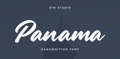 Panama is a modern handwritten font. It will make your design project more powerful and beautiful. The font is suitable for any project such as logos, branding and quotes.. Enjoy the Font! Features: Accents (Multilingual characters) PUA encoded Numerals and Punctuation (OpenType Standard) Thanks for visiting and purchasing my font!
 - Nerve Brush by Create Big Supply,
$15.00 Invention is a sans serif brush font that has bold, strong, bold characters. This will add a very unique and powerful touch to your design. This font is PUA encoded which means you can access all the glyphs and sweeps easily Features: All Uppercase Numbers and punctuation Multilingual PUA Encoding
 - Bla Bla by S6 Foundry,
$25.00 Bla Bla is a contemporary serif typeface inspired by brutalist forms, featuring large open counters, curved, round forms, creating a modern & elegant glyph set. The organic curves with gentle repetitions create powerful and harmonious forms. Designed to be a stylish modern family it is perfect for communication and branding projects.
 - Troglodyte NF by Nick's Fonts,
$10.00Here is a faithful rendering of Albert Auspurg's a 1927 expressionistic masterpiece, Messe Grotesk Licht. Its raw power and compact letterforms make for commanding and engaging headlines. Both versions of the font include complete Latin 1252, Central European 1250 and Turkish 1524 character sets, with localization for Moldovan, Romanian and Turkish. - Edgewise NF by Nick's Fonts,
$10.00Considerable heft and clean lines—with a few whimsical grace notes—characterize this font, based on a typeface originally named "Ryter Night". Powerful yet playful, this gentle giant is the perfect choice for engaging headlines. Both versions of the font include 1252 Latin, 1250 CE (with localization for Romanian and Moldovan). - Teknik by ITC,
$29.99Teknik font is the work of British designer David Quay and was inspired by the powerful geometric styles of the 1920s Soviet Constructivist movement. It is typographically categorized as an Egyptian style due to its slab serifs. Teknik is a strong, precise font suitable for a wide variety of headline applications. - Montage by House Industries,
$33.00 Montage has played a weighty role in some of the most influential and enduring typography of the past few decades, from book jackets and album covers, to posters and logos…you name it. Exhibiting an uncommon ability to wield immense power while demonstrating extraordinary finesse, Montage’s commanding profile packs a hefty punch which is softened only by its lithe yet durable serifs. Originally designed for Photo-Lettering in the mid-1960s by type legend, Ed Benguiat, the fonts were given a jump start by Jess Collins before ultimately being shaped into five compatible widths by longtime House co-conspirator, Mitja Miklavčič. Under the guidance of Ben Kiel, along with some additional chin-stroking by Ken Barber, Montage has been fully developed into a robust family ready to tackle any challenge you can throw at it. FEATURES LIGATURES: In order to ensure that Montage maintains its bold presence in tricky text settings, we’ve added a handy set of pre-drawn letter combinations. When enabled, the Ligature feature identifies problem pairs like—fl, fi, ff, ffl, and of course, fyi—and substitutes them with glyphs optimized to enhance font performance. ALTERNATES: For fickle typographers, we’ve also added a handful of alternate characters to allow Montage to suit any number of mood Like all good subversives, House Industries hides in plain sight while amplifying the look, feel and style of the world’s most interesting brands, products and people. Based in Delaware, visually influencing the world.
 - Wolfhagen Blackletter by Mofr24,
$13.00 Introducing Wolfhagen Blackletter, an extraordinary font that embodies the perfect blend of medieval-modern elegance. With its strikingly bold and stylish appearance, this typeface effortlessly merges timeless aesthetics with contemporary flair. What sets Wolfhagen Blackletter apart is its ability to seamlessly transcend borders, thanks to its extensive multilingual support, empowering your creative endeavors on a global scale. This font is a true embodiment of sophistication, making it ideal for headlines, art crafts, logotypes, and beyond. Its unique charm and exquisite design concept bring an unparalleled allure to any project it graces. The intricate details and intricate strokes of Wolfhagen Blackletter capture the essence of medieval craftsmanship while infusing it with a modern twist, resulting in a truly captivating and versatile typeface. We created Wolfhagen Blackletter with a vision to offer designers a font that would stand out from the crowd and leave a lasting impression. The marriage of medieval inspiration with contemporary design was a deliberate choice, as we sought to evoke a sense of timeless elegance while meeting the demands of the modern creative landscape. Unleash the power of Wolfhagen Blackletter, and witness the transformation of your projects into works of art. This font embodies the harmonious convergence of past and present, enabling you to communicate your ideas with a touch of history and a dash of contemporary sophistication. Discover the uniqueness of Wolfhagen Blackletter and embark on a creative journey that is both captivating and unforgettable.
 - Science Noire by Fonts of Chaos,
$10.00 Science Noire is a special font with more than 154 glyphes, upper and lower case, punctuation, number and special characters.
 - Ghost Train by Aerotype,
$29.00 Ghost Train features slightly alternate glyphs A-Z in the lower case that can be used to differentiate consecutive characters
 - La Pica Bonus by RodrigoTypo,
$29.00 La Picá bonus is a new version with lower case letters, styles and dingbats that represents the popular lettering style.
 - Varese Gradient by Tarallo Design,
$18.99 Varese Gradient is a color font for display, headlines, or large body text. Use it for bold graphic statements or a vintage mood. Its geometric style is inspired by Art Deco and early 1900s European travel posters. This typeface will set a friendly and light tone while giving messages a unique and memorable feeling. The gradients transition vertically and come in these sets; color with white, color with black, two colors, chromatic grays, grayscales, and concepts like summer or cappuccino. The font name will indicate its color. The full family includes one regular font. Here is a list of all the fonts in color. The lowercase letterforms are similar to the uppercase, but the lowercase have counterforms. It comes with OpenType features such as alternate glyphs, half-height letters, standard ligatures, and stylistic sets. The fonts are OpenType SVG format and fully scalable. Contact Tarallo Design if you need custom colors. Varese Gradient has siblings, Varese Soft (rounded) and Varese Outlined (color/shadow/outline).
 - Kane by Device,
$29.00 Based on the Batman logo, this font (and a medium weight which is unreleased) were designed especially for Rian Hughes' "Batman: Black and White" comic book. It retains the signature reversed-stress weight distribution, seen to best effect on the A.