10,000 search results
(0.016 seconds)
- Austina Capitton by HansCo,
$15.00 Austina Capitton is our new modern, clean, and stylish monoline signature font and was created to look as a naturally handwritten as possible. Built with unique style in OpenType features, this script comes to life as if you are writing it yourself. This font is very suitable to be used to brand a product because if you write a brand name it will look like your company signature. Austina Capitton is perfect for photographers, bloggers, trademarks, magazines, fashion, logos, business cards and much more. There are two styles in this font package, they are Alt and Regular. You can use Regular style if you like the curve of the font or you can use Alt style if you like simple and minimal ones. It's highly recommended to use it in OpenType capable software - like a Coreldraw, Photoshop, Illustrator and Indesign. This font come with Uppercase, Lowercase, Numbers, Punctuation and swash. It offers Multilingual Support, works on Mac and Windows OS and is easy to install. Enjoy!
 - Interind Diary by Aminmario Studio,
$20.00 Introducing The new "Interind Diary" script font. A fashionable and super-chilled new handwriting font script with sexy stylish. Interind Diary font was created to look as close to a natural handwritten script as possible by including over 134 ligatures, and lowercase alternates.Comes with two styles of Regular and Italic. Mix and match lowercase regular with several lowercase alternatives to get your new ligature. Perfect for any awesome projects that need hand writing taste. With built in Opentype features, this script comes to life as if you were writing it yourself. It's highly recommended to use it in opentype capable software - there are plenty out there nowadays as technology catches up with design ... Other than Photoshop, Illustrator and Indesign, many standard simple programs now come with Opentype capabilities - even the most basic ones such as Apple's Text Edit, Pages, Keynote, iBooks Author, etc. Even Word has found ways to incorporate it. Thanks for checking out this font. I hope you enjoy it! AminMario
 - Rostrum by Canada Type,
$24.95The Rostrum fonts are a revival and expansion of a type called Oleander, designed in 1938 by Julius Kirn for the Genzsch & Heyse foundry in Hamburg. Many of the original uppercase letters had some blackletter remnants tacked onto them, so in this digital version they were relegated to the Rostrum Two font, while more contemporary forms were designed for the Rostrum One font. Characters from both fonts are interchangeable via software programs' font menus and glyph palettes in the Postscript and True Type versions, while the OpenType version takes advantage of the Ligatures, Contextual Alternates and Stylistic Alternates features to perform character substitutions. Rostrum finds the middle ground between italic and brush script, which makes it quite usable in all-caps settings. Its majuscules have a very distinct curl that makes the typeface effect-ready and very appealing in packaging design. Plenty of alternates and ligatures are sprinkled throughout the character set. - SG Larchett by Studio Gulden,
$20.00 SG Larchett is a stunning new sans serif font perfect for display. It features clean, elegant lines and a modern, minimalist design that is stylish and versatile. The font is characterized by its balanced proportions, uniform stroke width, and subtle variations in letterform, giving it a distinctive and sophisticated appearance. The unique features of SG Larchett make it ideal for use in a wide range of design applications, including branding, advertising, packaging, and web design. The font's clean, uncluttered lines and legibility make it easy to read even at small sizes, while its bold, striking appearance ensures that it stands out in any design. SG Larchett is a font that commands attention, yet remains understated and refined. It is the perfect choice for designers looking to make a bold statement with their typography while maintaining a sense of elegance and sophistication. Whether used in headlines, logos, or body copy, SG Larchett is a font that will impress.
 - ArTarumianBehrensInitialen by Tarumian,
$100.00 Behrens Initialen is based on the type graphics of the German architect and type designer Peter Behrens (1868-1940). The drawing of the original typeface is in tune with the Art Nouveau (Jugendstil) style in which Behrens worked. This is a light, delicate, somewhat theatrical typeface, the forms of which bear at the same time a certain shade of Gothic and modernity, and can be used, in particular, when there is a need to make a reference to medieval graphics while maintaining the modern style of composition. In the proposed version, the original initial graphics are used not only for uppercase letters, but also for Arabic figures, while for lowercase letters and for the base of other characters are used the letters themselves - without decorative framing. This feature can be useful for obtaining various effects when using both lower and upper cases in parallel, including when they are overlaid. The font includes the Latin, Cyrillic and Armenian ranges. Created by Ruben Tarumian in 2020.
 - Brave Brothers by Strong,
$20.00 Brave Brothers is a stylish modern font that's perfect for use in fashion-related design projects. Its elegant thin font makes it ideal for branding and logo design, while low legibility height makes it perfect for use in websites, advertising, and other types of communications. Brave Brothers Modern Font is perfect for adding a touch of luxury and elegance to your designs. This stylish font was created with care to be perfect for use in modern fashion logos, websites, and marketing materials. Brave Brothers is a stylish modern font that's perfect for use in fashion-related design projects. Its elegant thin font makes it ideal for branding and logo design, while low legibility height makes it perfect for use in websites, advertising, and other types of communications. Brave Brothers Modern Font is perfect for adding a touch of luxury and elegance to your designs. This stylish font was created with care to be perfect for use in modern fashion logos, websites, and marketing materials.
 - Beatrix Antiqua by Zetafonts,
$39.00 Beatrix Antiqua is a humanist sans-serif typeface designed by Francesco Canovaro. Beatrix Antiqua is part of the Beatrix Family that takes its inspiration from the classic Roman monumental capital model: its capitals are directly derived from the stone carvings in Florence Santa Croce Cathedral - where the serifs are often removed while keeping the variable width strokes. So, even if it’s basically a sans-serif, Beatrix keeps a subtle swelling at the terminals suggesting a glyphic serif - in the same vein as Herman Zapf classic Optima typeface. In the lowercase design, Beatrix references early humanist typefaces, keeping small calligraphic details (as the prolongation of the e nose) that are especially visible in the italics. While Beatrix Antiqua, the companion typeface to Florentia , slightly exaggerates its antique stylistical features, Florentia tries to mix those influence with a more robust & digital age ready design, featuring bigger X-height and an extended character set that covers over forty languages using the latin alphabet, as well as Greek and Russian Cyrillic.
 - Moena by RagamKata,
$16.00 Moena | Stylish Modern Serif Font Moena is a unique serif font that showcases distinctive characters in each letter, while maintaining a high level of readability. With its slight thinness, this font remains versatile for all design purposes, especially for logo designs. Moena's uniqueness lies in its meticulously crafted letterforms, where each character carries its own distinct personality. The font exudes an air of creativity and elegance, making it ideal for adding a touch of sophistication to your designs. Whether you're working on logos, branding, or other design projects, Moena's versatility shines through. Its delicate yet readable appearance adds a sense of refinement, allowing your designs to stand out effortlessly. Crafted with precision and a keen eye for detail, Moena ensures that every curve and stroke is thoughtfully designed to maintain legibility while showcasing its individualistic charm. With Moena, you have a powerful tool to create captivating and memorable designs that leave a lasting impression. Unleash your creativity and elevate your designs with the unique character of Moena!
 - Gridiot by Peter Bain,
$10.00 Gridiot is a constructed, semi-serif, two-weight stencil family that expands an approach taken by Josef Albers. Intended for display or headline setting, it features chamfered or bevel-cut corners, used instead of curves. The individual letter components sometimes vary in depth, avoiding a strictly modular approach, while the widths are kept consistent. The lining figures provide a standard set of numbers, and the oldstyle figures align with the lowercase, encouraging lowercase-only setting. Currency and other useful numerical symbols are provided in both versions. The zero is intentionally lighter, following early Renaissance types; there are filled versions as stylistic alternates. While horizontal scaling distorts the relationship between verticals and horizontals in a typeface, since every chamfer in Gridiot is at 45°, changing the horizontal scaling of the type will affect all diagonals equally. When used at a large size, or for a just few words, Gridiot can be very tightly spaced. Remember, any idiot can design a typeface on a grid: Gridiot.
 - Struck Base by Mans Greback,
$59.00 Struck Base is a cool logotype script font. Drawn and created by Mans Greback in 2021, this lettering has a sporty style and a bold, colorful personality. It can be used in tough and feminine contexts, by peasants and royals alike, for tattoos or for weddings. Constructed with retro inspired brush strokes, anything written in this calligraphy appears to be a truly custom typographic design. Create swashes by writing underscore _ after any word. Example: Striker_ Write several underscores to make swashes of different lengths. Example: Baseball________ (Download required) The font is built with advanced OpenType functionality and has a guaranteed top-notch quality, containing stylistic and contextual alternates, ligatures and more features; all to give you full control and customizability. It has extensive lingual support, covering all Latin-based languages, from North Europa to South Africa, from America to South-East Asia. It contains all characters and symbols you'll ever need, including all punctuation and numbers.
 - Serat by Wahyu and Sani Co.,
$24.00 Serat is a medium contrast flared serif with mixed up styles of classic typefaces which is highly influenced by early stages of Latin based hand writing. The lowercase are modernized versions of Carolingian minuscules, vertical stems which touch the baseline have been modified to have horizontal cut for simpler look and keep the calligraphic style for terminals & stroke ends. Then the uppercase are flared serif which were influenced by Roman inscriptional capitals. The font name was taken from the Javanese word "serat" which means writing (noun). It comes with some unique features, such as: - Carolingian style alternate for some letters (a,e,f,g,t), also comes with separated stylistic set for long 's', and long left leg 'x' and alternative ampersand. - Discretionary ligatures for all caps titling. - Standard Ligatures. - Tabular and Proportional for both Lining and Old-style figure. - Fraction with Nominator and Denominator. - Superscript and Subscript for numbers, etc. Serat would be suitable for "classic" themed work; poster, book cover, branding, videography, etc.
 - Handsome by Shinntype,
$50.00 Handsome was the first digital typeface to resemble nice, ordinary, fully cursive handwriting. Or neon. In 2005, Handsome Pro was one of the first script typefaces to utilize the OpenType format to simulate the natural quality of writing, by automatically substituting alternate contextual glyphs. The effect follows the conventional “joining rules” of calligraphy, which are a formalization of the way in which letter forms are modified in cursive handwriting for the sake of speed and efficiency—and also perhaps to make life more interesting. For the look of real handwriting, Handsome is most convincing at around 15 pts. At much smaller or larger sizes it works differently. At display size, the feel of the non-nib styles is very slick, more like a speedball Kauffman, owing to the smoothness of the finish. As script fonts go, Handsome has a relatively large x-height, which can be useful if you don't want the “writing” to look too small.
 - Infusion by Andinistas,
$39.00 Infusion is a type family designed by CFCG & Fabio Godoy for andinistas.net. The creative process of Infusion evolved throughout a myriad of experiments supported by my font gluten This is why its expressivity comes from the addition and subtraction of its parts by mixing and combining, resulting in a great variety and new versatility of uppercase, lowercase, multiple and different numbers to be applied at the beginning, middle or end of the word. Infusion is used to write sentences in craft contexts that require organic graphic design, with meticulous imperfect look. Infusion offers typographic solutions out of the limits, or out of borders that divide the mechanics of the drawn by hand. Infusion has 6 decorative and legible fonts to write casual messages with organic, friendly and natural personality. Infusion “Script, Mix, Roman, Shadow, Extras, Dingbats” contain unconventional visually appealing ideas to work independently or in group in the design of logos, packaging, presentations, headlines or editorials.
 - HiH Firmin Didot by HiH,
$10.00 Before Bodoni, there was Didot. With the publication by Francois Ambroise Didot of Paris in 1784 of his prospectus for Tasso’s La Gerusalemme Liberata, the rococo typographical style of Fournier de Jeune was replaced with a spartan, neo-classical style that John Baskerville pioneered. The typeface Didot used for this work was of Didot’s own creation and is considered by both G. Dowding and P. Meggs to be the first modern face. Three years later, Bodoni of Parma is using a very similar face. Just as Bodoni’s typeface evolved over time, so did that of the Didot family. The eldest son of Francois Ambroise Didot, Pierre, ran the printing office; and Firmin ran the typefoundry. Pierre used the flattened, wove paper, again pioneered by Baskerville, to permit a more accurate impression and allow the use of more delicate letterforms. Firmin took full advantage of the improved paper by further refining the typeface introduced by his father. The printing of Racine’s Oeuvres in 1801 (seen in our gallery image #2) shows the symbiotic results of their efforts, especially in the marked increase in the sharpness of the serifs when compared to their owns works of only six years earlier. It has been suggested that one reason Bodoni achieved greater popularity than Didot is the thinner hairlines of Didot were more fragile when cast in metal type and thus more expensive for printers to use than Bodoni. This ceased to be a problem with the advent of phototypesetting, opening the door for a renewed interest in the work of the Didot family and especially that of Firmin Didot. Although further refinements in the Didot typeface were to come (notably the lower case ‘g’ shown in 1819), we have chosen 1801 as the nominal basis for our presentation of HiH Firmin Didot. We like the thick-thin circumflex that replaced the evenly-stroked version of 1795, possible only with the flatter wove paper. We like the unusual coat-hanger cedilla. We like the organic, leaf-like tail of the ‘Q.’ We like the strange, little number ‘2’ and the wonderfully assertive ‘4.’ And we like the distinctive and delightful awkwardness of the double-v (w). Please note that we have provided alternative versions of the upper and lower case w that are slightly more conventional than the original designs. Personally, I find the moderns (often called Didones) hard on the eyes in extended blocks of text. That does not stop me from enjoying their cold, crisp clarity. They represent the Age of Reason and the power of man’s intellect, while reflecting also its limitations. In the title pages set by Bodoni, Bulmer and Didot, I see the spare beauty of a winter landscape. That appeals to a New Englander like myself. Another aspect that appeals to me is setting a page in HiH Firmin Didot and watching people try to figure out what typeface it is. It looks a lot like Bodoni, but it isn't!
 - Fleur by Lián Types,
$39.00 La vie est une fleur dont l'amour est le miel Fleur is the French for flower and I've chosen this language for a good reason. Over the past 5 years, I've had the opportunity to travel a lot to Paris and I've always tried to catch every moment and detail of this delightful city through the eyes of the designer inside me. Paris is full of surprises, mainly for us, artists. In fact, I believe the city is a museum itself. Every corner of any street has something inspiring. But, there’s something I particularly love and I want to address here: The Palais Garnier. Built between 1861 and 1875, this opera house is a dream made true for many of us, who love somptuosité. Garnier, the architect of this magnificent building, said that the style he proposed was not Grecian nor Roman/baroque, he created something new and called it Napoleonic: Luxurious at its best. Fleur is inspired in this palace which, in fact, has some similar letters inside. Garnier put his name at the ceiling of the Rotonde des Abonnés: Letters are interlacing each other with nicely done art nouveau curves. I thought I could take this idea and achieve something very delicate and imposing at the same time if the font consisted entirely of caps with the logic of a didone and a bit of art-nouveau. This mix of elegance and flamboyance gave birth to Fleur which has a wide range of uses but was mainly intended for perfumes, fashion magazines, storefronts, book covers or logos. Not only you'll find many decorative glyphs, but also a vast amount of unique ligatures will make you really adore this font. Get Fleur and profite de la vie TECHNICAL As suggested above, the font has many open-type coded alternates and a vast amount of unique ligatures. Install the font in applications that support them, like Adobe Illustrator or Photoshop.
 - Sublime by Coniglio Type,
$19.95 Sublime45-Regular Sublime Revised for 2021. One font in Opentype format as Sublime45. Families and all TT Truetype versions eliminated in this wonderful stand alone. The Spring 1997 original release of Sublime —borne an organic creature of black water soluble ink & digitized by Coniglio Type. Sublime is a fun font to use in commercial layouts. It is soft and fluid as ink. Like the wrinkles of time, it is imperfect. That in itself makes it incredibly attractive, warm and “human factor”. Sublime offers legibility so sorely missed in the current recreational font market. Sublime was inspired by World War II US fighter pilot Donald Alling. He flew missions over Nazi Germany. His squadron also dropped food, medicine and relief supplies over the Netherlands. Known as “the Colonel” to his friends. Don as a civic engineer ruled literally miles of ink letter callout’s with a template device called a LeRoy in peacetime on vellum and mylar across his career as a technical illustrator. You didn't want to screw up inking into a template with wet black permanent ink. You really had to have a steady hand and it was all done by hand. You can say Don worked “unplugged”. And that is cool! He was part of the broad stroke of postwar industrial expansion that helped keep America strong, rendering exploded views on top secret projects. Many of us were not even born yet when all this was going on. Today at over 80 years young Don is like a national treasure, savvy and bright—and the ladies love him! The Colonel remains a dedicated master airbrush man, stand–up man, caricature artist and letterman all without use of a computer! He was lucky enough to retire before a desktop cathode tube was put in his face. Today the Colonel enjoys restoring VW’s, flying and freelance consulting when not being called to supper by his lovely wife Rea.
 - Typrighter V1 by Jadugar Design Studio,
$75.00 Here is a revolution in typewriter fonts.......typrighter.......yes! typrighter V1 and typrighter V2.....We applied Contextual Substitutions feature in Fontlab with 6 different alternative of each letter (standard English alphabets). No more repeating same contours of letters which a typical typewriter fonts does......a next same letter replaces itself automatically to 6 variations to give you real typewriter text flowing out of your computer keyboard...... Please watch a short demo and enjoy the open type features in word, illustrator and Photoshop.... https://www.youtube.com/watch?v=HMM98Wmb_sg The basic version is bold version but does not have Contextual Substitutions option.
 - Elfabet - Unknown license

- Balietta by Almarkha Type,
$33.00 Balietta - Lovely Script font with a natural handwritten feel. This handmade font will make your design has a beautiful natural touch for each details. It is perfect for any design project as Invitation,logo, book cover, craft or any design purposes. This font is PUA encoded which means you can access all of ligatures.
 - Rachert by ahweproject,
$9.00 Rachert is a retro bold font that will bring you back to the 70s. Fall in love with its unique character and use it to create gorgeous wedding invitations, beautiful stationery art, eye-catching social media posts, and much more! Rachert is PUA encoded which means you can access all glyphs and swashes with ease!
 - Renitha by Allouse Studio,
$16.00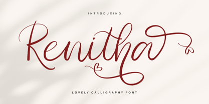 Proudly Presenting, Renitha a Lovely Calligraphy Font Renitha is perfect for any titles, logo, product packaging, branding project, megazine, social media, wedding, or just used to express words above the background. Renitha also come with Multi-Lingual Support. Enjoy the font, feel free to comment or feedback, send me PM or email. Thank You!
 - Asterism Clean by Great Lakes Lettering,
$30.00 Asterism Clean is the smooth lined version of Asterism. It is a calligraphy style font with a moving baseline and lots of shining personality. Also contains a bold and a monoline version. This hand written style font is based on one of Molly’s signature calligraphy styles and pairs beautifully with Frosted, Icing, Saint Agnes.
 - Movie Drama JNL by Jeff Levine,
$29.00 The Nov. 26, 1921 issue of “The Moving Picture World” carried an ad for the dramatic film “For Your Daughter’s Sake” (originally tilted “The Common Sin” and produced in 1920). Hand lettered in an Art Nouveau sans serif style, the ad copy inspired Movie Drama JNL, which is available in both regular and oblique versions.
 - Playful Koala by Reyrey Blue Std,
$12.00 Playful Koala is a cute and fun typeface. It's hand-lettered with lots of love and made for the young at heart. Playful Koala will be perfect for books, greeting cards, logos, posters or anything that requires a fun and happiness look! Features : · All Uppercase and Lowercase · Number & Symbol · Supported Languages · Swash · PUA Encoded
 - Perfect Island by Balpirick,
$15.00 Perfect Island is a Modern Handwritten Font. Perfect Island is a lovely script font featuring charming, playful characters that seem to dance along the baseline. Add this font to your most creative ideas, and notice how it makes them stand out! Perfect Island also multilingual support. Enjoy the font, feel free to email. Thank you!
 - Malibu Waves by Epiclinez,
$18.00 Sometimes you just need a little bit of that old-fashioned charm. That's why we created Malibu Waves. With a beautiful, handwritten style, this font is perfect for those who love the classic look with a modern twist. It’s timeless, perfect for adding some natural flair to your designs, and works great with any project.
 - Butterskotch by Great Lakes Lettering,
$30.00 Butterskotch is a whimsical 'semi script' from the fine folks Great Lakes Lettering which features some of that 'golden never olden' Molly Jacques lettering that we've come to know and love. Be sure to try it out in your opentype aware design programs and activate the contextual alternates feature for some innovative contextual interplay!
 - Summer of 76 by Darumo,
$15.00 Introducing Summer of '76, a nostalgic multi-line font inspired by the 70's aesthetic. Perfect for big eye-catching headers. Сan be used for text blocks also. Includes two styles: solid and multi-line (regular). This font could be the perfect solution if you want to give a lovely retro touch to your designs.
 - Sewing Patterns by Lauren Ashpole,
$15.00 When I created my first website, I loved using vintage sewing pattern illustrations in my designs. Thinking back on it, I wanted to create a dingbat inspired by those images and Sewing Patterns is the result. The font features ladies-fashions in silhouette form for uppercase and lowercase letters and childrens- styles for the numbers.
 - Wiggly Wavy by Mvmet,
$14.00 Wiggly Wavy is a whimsical display font that took inspiration from french fries shapes. You can use it for anything ranging from t-shirts, kids’ book designs, restaurant menu, greeting cards, stickers, and posters, or anything that needs a casual touch. Try it to create lovely designs and feel the good vibes with it!
 - Berlinsa by FadeLine Studio,
$15.00 Berlinsa is a modern script font. It has smooth strokes to give character of a simple, sweet and realistic handwritten style. Berlinsa is perfect for logos, branding projects, homeware designs, product packaging, mugs, quotes, posters, shopping bags, logo's, t-shirts, book covers, name card, invitation cards, greeting cards, and all your other lovely projects.
 - Scribbler by Hanoded,
$15.00 Scribbler, like Double Quick (another one of my fonts), is a handwritten typeface, designed to look like a quick grocery list, a hasty 'I Love You' note penned down on a Post-it or a home improvement to-do list. Scribbler is a little messier than Double Quick, but this may be just your style!
 - Totally Deco JNL by Jeff Levine,
$29.00 The hand lettered title found on the sheet music for 1938’s "So Help Me (If I Don't Love You)" was the basis for Totally Deco JNL, which is available in both regular and oblique versions. A classic mix of widely rounded letters and condensed letters typifies the design style of the Art Deco era.
 - Wardrobe JNL by Jeff Levine,
$29.00 A 1938 issue of the Spanish language movie fan magazine Cine-Mundial (Movie World) had an article entitled "Lo Que Visten Las Estrellas" ("What Stars Wear"). The headline of the article was hand lettered in a lovely Art Deco monoline sans serif, which is now available as Wardrobe JNL in both regular and oblique versions.
 - Baked Almond by Balpirick,
$15.00 Baked Almond Font. Baked Almond is a Modern Bold Handbrushed Font. Baked Almond is a bold and flowing handwritten font. Fall in love with its incredibly versatile style and use it to create spectacular designs! Baked Almond also multilingual support. Enjoy the font, feel free to comment or feedback, send me PM or email.
 - Amourette by Lunas Type,
$19.00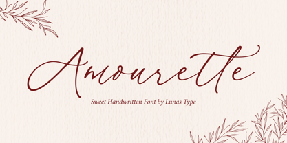 Amourette is a sweet and modern handwritten font. This sweet handwritten font invokes a feeling of nostalgia and warmth. Amourette comes with begining swashes, ending swashes and also love swashes connection. Amourette is perfect for many design needs such as merch, T-shirts, titles, wedding, book covers, social media posts, websites, events, and many more.
 - Dubrovnik Hill by Wildan Type,
$10.00 "Dubrovnik Hill" is a handwritten calligraphy font with a subtle, cute, minimalist and modern touch. It's perfect for branding, event invitations, beautiful Instagram posts. You will love them! :) "Dubrovnik Hill" includes a full set of charming international uppercase and lowercase letters, numbers, multiple punctuation marks and ligatures. all of which provide a realistic handwritten style.
 - Stage Direction JNL by Jeff Levine,
$29.00 On the cover of the 1932 sheet music for "Without Your Love", the credits for the stage play "The Dubarry" are listed under the name of the star and the play's title. These hand lettered credits served as the work model for Stage Direction JNL, which is available in both regular and oblique versions.
 - Komix Eighties by Figuree Studio,
$18.00 Say hello to Komix Eighties font. Made with love and joy. Comic look, so it will make your design more beautiful, cute, fun, and colorful. It comes With three awesome styles. Features: - Character Set A-Z (All-caps) - Numerals and Punctuation (OpenType Standard) - Accents (Multilingual characters) - PUA Encode I hope you can enjoy the font :)
 - Big Deal by Daily Studio,
$13.00 Big Deal is a display San serif font with a strong character. A beautifully handcrafted modern typeface that helps you to create remarkable logos, headings, advertisements, and more. With 235 glyphs and files in OTF format. If you want to make your project to a whole new level, you are going to love this font.
