10,000 search results
(0.034 seconds)
- ITC Stranger by ITC,
$29.99ITC Stranger is the work of California designer Jill Bell, a slashing, almost menacing calligraphic typeface in a narrow, upright style. In small sizes, the strokes themselves draw more attention than the letterforms. In larger sizes, the effect is a little rougher and more diffuse, as the bristled ends of some strokes become apparent. - ITC Buckeroo by ITC,
$29.99ITC Buckeroo was designed by Rick Mueller in 1997, and as the name suggests, it is reminiscent of the Wild West in the US. It is a small caps alphabet with extremely heavy characters, which makes it particularly good for headlines. This ornamental font should be used in point sizes of 12 or larger. - Anzeigen Grotesk by Linotype,
$40.99Anzeigen Grotesk is a heavy, condensed sans serif face drawn in the style of typefaces popular during the early 20th Century. It was originally intended for use in advertising design, a field for which it is still well suited. Anzeigen Grotesk (which means “advertising sans serif” in German) is best used in larger point sizes. - Date Book JNL by Jeff Levine,
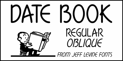
$29.00The pen lettered opening credits for the 1937 film “The Awful Truth” inspired Date Book JNL, which is available in both regular and oblique versions. A hybrid of both Art Nouveau and Art Deco influences, this casual type design is perfect for any project that wants to convey its message in a pleasant, informal manner. - KrazyKool - Unknown license
- Souttia by Sakha Design,
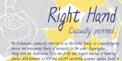
$10.00 - Right Hand by Okaycat,
$19.50 - Bluegrass by Scrowleyfonts,
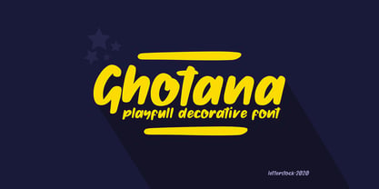
$14.00 - Ghotana by LetterStock,
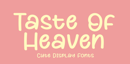
$12.00 - Taste Of Heaven by Crumphand,
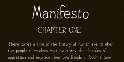
$16.00 - Personal Manifesto by Thomas Käding,
$15.00 - Bipolar Poster by VersusTwin,
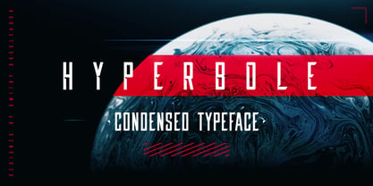
$39.00 - Hyperbole by Dmitry Bogolyubov,
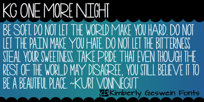
$10.00 - KG One More Night by Kimberly Geswein,
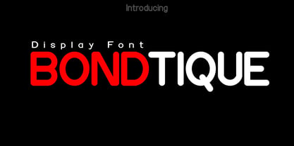
$5.00 - Bondtique by PojolType,
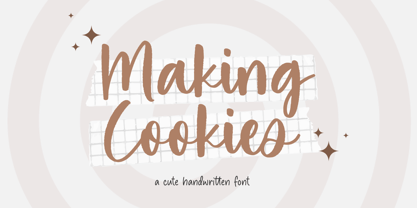
$12.00 - Making Cookies by Timurtype,
$14.00Introducing by Timur type Proudly Present, Making Cookies Making Cookies A Handwritten Font Making Cookies is perfect for product packaging, branding project, megazine, social media, wedding, or just used to express words above the background. This White Buttert font includes: -Full Set of standard alphabet and punctuation & symbol -Extra set Alternate ending lowercase -multilingual support. Embelish your designs with our original fonts.Enjoy the font, Thank you! - Chwast Buffalo by Linotype,
$29.99Seymour Chwast designed the fun font Chwast Buffalo in 1981 and gave it his name. Its extremely robust figures are rendered in regular, even strokes, significantly reducing the inner white spaces. The typeface should therefore only be used in large and very large point sizes. A distinguishing characteristic of Chwast Buffalo is its half-circle serifs, which give the forms a technical, constructed appearance. - Planny by Kaer,
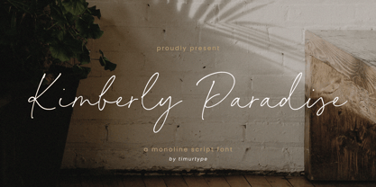
$19.00Planny is a blueprint font created for the reproduction of a technical drawing or engineering drawing. All characters were designed with construction lines. The blueprint process was characterized by white lines on a blue background, a negative of the original. What you will get: Regular style Uppercase and lowercase glyphs Multilingual support Numbers and symbols Please feel free to request to add characters you need: kaer.pro@gmail.com - Kimberly Paradise by Timurtype,
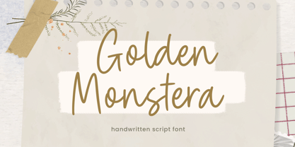
$14.00Introducing by Timur type Proudly Present, White Butter Kimberly Paradise A Handwritten Font Kimberly Paradise is perfect for product packaging, branding project, megazine, social media, wedding, or just used to express words above the background. This Kimberly Paradise font includes: -Full Set of standard alphabet and punctuation & symbol -Extra set Alternate ending lowercase -multilingual support. Embelish your designs with our original fonts.Enjoy the font, Thank you! - Golden Monstera by Timurtype,
$14.00Introducing by Timur type Proudly Present, Golden Monstera Golden Monstera A Handwritten Font Golden Monstera is perfect for product packaging, branding project, megazine, social media, wedding, or just used to express words above the background. This White Buttert font includes: -Full Set of standard alphabet and punctuation & symbol -Extra set Alternate ending lowercase -multilingual support. Embelish your designs with our original fonts.Enjoy the font, Thank you! - Cut Along by Hanoded,
$15.00I made Cut Along by stealing some red cardboard from my kids (red, because they didn’t have any black…) and cutting out the glyphs one by one with a pair of scissors. I then pasted the shapes onto white paper, scanned them and turned them into a font. Cut Along is a very nice font for ads, book covers, packaging and children’s books. Enjoy! - Salsiccia by Bech Type,
$19.00Inspired by bold and rounded typefaces on signs from the 1970s, Salsiccia can promote both your hot dog stand and your international toy store enterprise. Its boldness and roundness is combined with classical proportions, with wide letters — like the O — next to little nubby ones — like the T. This not only looks nice, but helps us even out the white spaces across words and sentences. - Colombard by Kitchen Table Type Foundry,
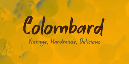
$15.00The other day I drank a glass of white wine, which was partly made with Colombard grapes. When I created this font, I needed a bit of a ‘posh’ name, so I settled on Colombard. Colombard is a nice, handwritten font. Quite elegant, but cheeky at the same time. It comes with extensive language support and a full set of Discretionary Ligatures for double letter combinations. - VLNL TpLlum by VetteLetters,
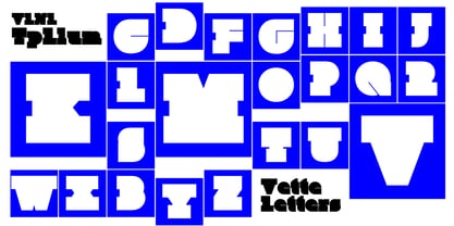
$35.00TpLlum is a typeface designed by TwoPoints for a festival in Barcelona called ‘Montjuïc de Nit’. Llum means light in Catalan. In the Montjuïc de Nit project the font was used in white over a dark grey background, letting the light of a backlit poster shine through. For this purpose the typeface had to be very bright, which was made possible by its heavy cut. - Algoria by Sealoung,
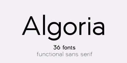
$15.00Algoria is a functional sans serif that includes open character openings, a uniform distribution of white and black, and excellent readability. The general neutrality of the font patterns is not without elegance, and all the details of the typeface are crafted with mathematical precision and love. Typographic designs are developed for the widest possible range of tasks that any quality corporate font must accomplish. - Yukas by Alex Camacho Studio,
$25.00Yukas is a funky and sexy typeface where the proportions are based on the optical balance between black strokes and white shapes. Ideal to enjoy on a large scale. It takes its references from the psychedelic movement, old-school western movie posters, and mid-19th century American wood type with those big, heavy capital letters. Includes several Open Type alternatives to customize your design however you want. - Anglaise by Ladyfingers,
$39.00Anglaise was designed for display and it likes to be big and present, filling the width of a whole spread. The repetition of vertical black and white space holds the typeface together and the contrasting straight and round shapes add the personality... for even more... use the OpenType features, and Anglaise will start merging and building new characters for you to play around with... Enjoy! - IL Palamede by Notope,
$25.00IL Palamede is a typeface with just one style, referring by its name to the French chess magazine Le Palamède. Connects with chess here not only the name. Each symbol is built on a 5x5 grid with 3x3 priority. At the same time, the logic here is higher than optical compensation, so you can observe here quite dense, for example "b". Thanks to this solution, the typed text is balanced in width, and it also creates the feeling of a chess cell, where black and white cells alternate. Connects with chess here not only the name. Each symbol is built on a 5x5 grid with 3x3 priority. At the same time, the logic here is higher than optical compensation, so you can observe here quite dense, for example, "s". Thanks to this solution, the typed text is balanced in width, and it also creates the feeling of a chess cell, where black and white cells alternate. Use this font for any purpose that includes winning or enjoying. - TE Modern by Tharwat Emara,
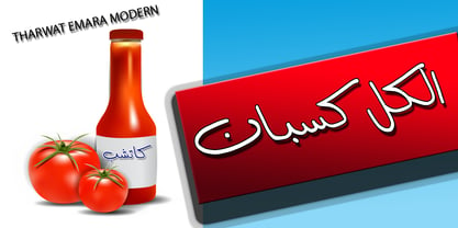
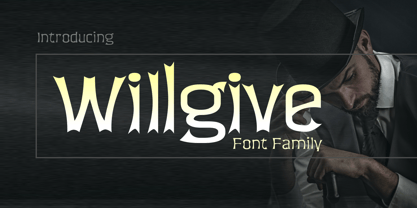
$7.00 - Willgive by ZetDesign,
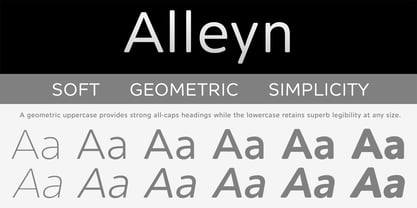
$15.00 - Alleyn by AVP,
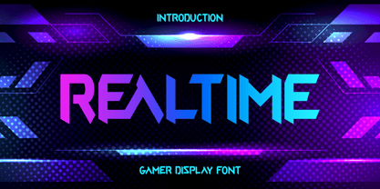
$19.00 - Realtime Gamer by Creaditive Design,
$12.00 - Lordela by Rubén Prol,
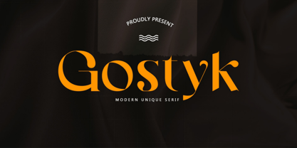
$28.00 - Gostyk by Saxofont,
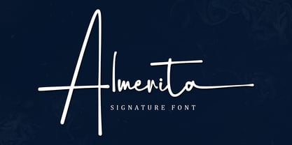
$18.00 - Almerita by Sakha Design,
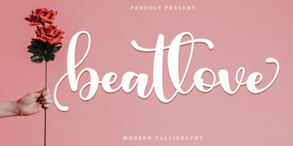
$12.00 - Beatlove by Sakha Design,
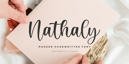
$14.00 - Nathaly by Aestherica Studio,
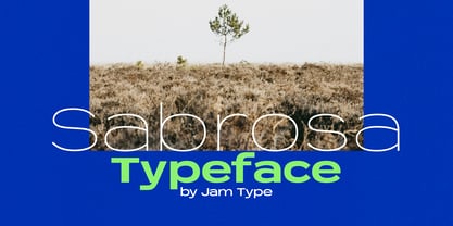
$12.00 - Sabrosa by JAM Type Design,
$16.00 - Kickshaw by PizzaDude.dk,
$17.00Kickshaw is definately a hardcore tagfont. Its rough edges and hard lines makes it perfect for imitating writing on the walls! Switch between caps and lowercase to keep the original bad look! - Pigeon Wing by PizzaDude.dk,
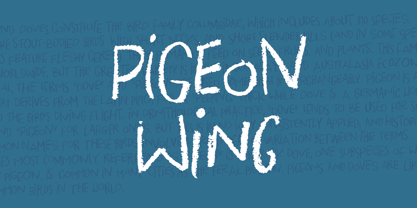
$20.00Crayon fonts are fantastic! I've always thought it looked so cool with fonts that simulate writing with crayons...but the fonts has always been limited in letters! But that’s where my Pigeon Wing font stands out! Using the smart techniques of the OpenType thing called “Stylistic alternates”, you get 8 different versions of each letter! Yes EIGHT different versions that cycle as you write! That means words with the same letter appearing several times, cycles through the different versions! Besides that, the font is loaded with multi language support! What’s not to like! :)
