10,000 search results
(0.055 seconds)
- Carlista Buttery - Personal use only
- Ricardo by Bureau Roffa,
$19.00Rather than confining itself to a single style, Ricardo combines the best of two worlds: the conceptual clarity of a geometric design with the legibility and warmth of a humanist design. Its open counters, crisp joints, and even texture allow for effective use in long-form text settings, while its simple geometric shapes combined with some unexpected details make it highly suitable for display settings such as branding and marketing. Ricardo contains seven carefully chosen weights, ranging from ExtraLight to ExtraBold. The Medium weight functions as a slightly darker alternative to the Regular. Ricardo’s 812 glyphs per style support over a hundred languages, and also include arrows and case-sensitive punctuation. The Ricardo family consists of three subfamilies: Ricardo, Ricardo ALT, and Ricardo ITA. Ricardo contains the most conventional forms, and is the most suitable option for long-form text. Ricardo ALT contains simplified shapes for the a, j, u, and t, which are also accessible through Stylistic Set 2 within Ricardo (in opentype-savvy applications). The cursive-like italics of Ricardo ITA provide a slightly more eccentric alternative to the standard italics. Furthermore, all styles contain stylistic alternates that swap the blunt apexes in A, M, N, V, W, v, w, y, and 1 for pointier ones. These are also accessible through Stylistic Set 1. Other opentype goodness includes: (discretionary) ligatures, smallcaps, case-sensitive forms, fractions, nine sets of numerals, and more. David Ricardo (1772-1823) is considered the first of the classical economists, and combined ground-breaking mathematical abstractions with an understandable down-to-earth way of explaining his ideas. - ALS Direct by Art. Lebedev Studio,
$63.00ALS Direct is an open and dynamic typeface with clear-cut letterforms that make it instantly readable. It lends text a neutral, yet agreeable and modern feel. Direct has nine font styles convenient for the purposes of navigation signage. Regular-style letterforms are rather wide, because direction signs are likely to appear before readers at an angle, so the type needs to withstand perspective distortions. And as signs and boards may vary in size, Direct was developed to include several width variations. Condensed fonts can be used where horizontal space is limited, allowing you to keep proper height and readability of the characters. A signage typeface must be easily readable from some distance away and have simple letterfoms with clear-cut features to quickly identify characters. Designing a type for a potentially wide range of purposes calls for a universal approach. If not destined to be used for navigation in a particular building, it shouldn’t incorporate any peculiar elements to agree with certain design or architecture. All of the above determined our choice of a sans serif with large apertures and definite features allowing readers to instantly recognize letters. Descenders are made compact not to interfere with the line below. And the low contrast between thick and thin strokes renders all elements equally perceptible. The x-height is significant, close to the cap height, which inhances readability of the lowercase type. There are two reasons why directions must not be set in all caps. Firstly, lowercase letters are more diverse and include ascenders and descenders identifying some of the letters in the line. And secondly, having learned to read, people recognize word shapes rather than individual letters, which makes lowercase text more readable. With Direct being a signage typeface, first to be developed were its width variations, and different weight styles and italics were added later. Another thing to be kept in mind was that signs often use dark background colors, and black type on a white background appears smaller than white type on a black background. Direct is the first Cyrillic typeface created for navigation purposes. Before that, designers could use the Cyrillic version of Frutiger (Freeset) developed by Adrian Frutiger for the Paris Charles de Gaulle International Airport, and a number of other, mostly body copy, neutral sans serif types. However, signs and boards were dominated by Arial, which Direct would be glad to replace offering elegance and lucidity of form instead of type bluntess. Direct was designed as a signage typeface, but its neutral style and clear-cut letterforms suggest various other ways of application. - Skippy Sharp by Chank,
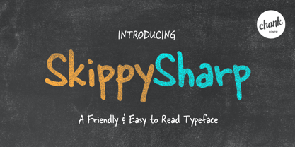
$99.00Skippy Sharp was drawn by Skippy McFadden in 1995 and faxed to Mister Chank Diesel. Chank completed the character set, added extensive kerning and created a very friendly, informal marker handwriting font. The font is also enhanced for OpenType use with Contextual Alternates for a more natural and organic handwriting style, and true Small Caps, too. - Bunbury by Monotype,
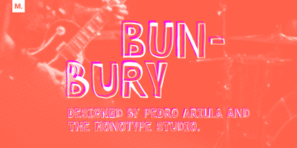
$15.99For playfulness and something a little less ordinary, Bunbury is a wonderful script that’s packed with personality. Created using a felt marker and available as an all capitals display font, SC Bunbury’s style is sort of awkward and a lot of fun, with defined outlines and uneven line thicknesses that make for letters packed with hand drawn quirks. - Battle Bingo by Zeenesia Studio,
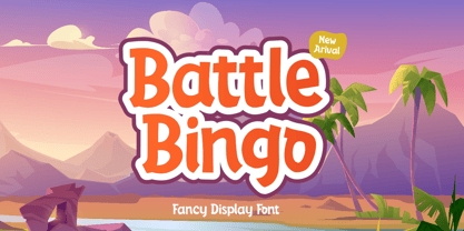
$15.00Battle Bingo is Playful and Fancy font. It was created with freehand handwriting style using a marker. It look classy and happiness to all your designs. You can use this font for a logo, kids clothing, invitation, poster, friendly design, fun design, book cover, adventure poster, outbound poster, and any cute and funny typeface needs and more. - Fat Ink by High Peak,
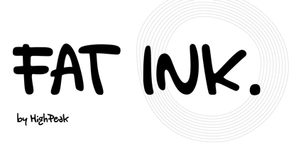
$20.00This handwritten font is as juicy as the strokes from a fat marker! Unpredictable but harmonious, the lines and shapes give this font a fun, funky vibe. Perfect for creating logos, charts, pricing, and more. Full uppercase and lowercase, it supports several languages, lots of discretionary ligatures, and alternatives that combine with each other. Have fun! High Peak - Dreamy Doodles by Typebae,
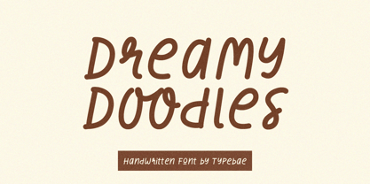
$12.00Dreamy Doodles is a stylish and joyful that captures the essence of a modern handwritten marker. It exudes a delightful and lively vibe, perfect for those seeking a refreshing and vibrant aesthetic. This font effortlessly conveys a cool and fashionable impression, making it an excellent choice for those looking to create eye-catching and trendy designs. - Sticky Notes by Hendra Pratama,
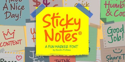
$19.00Sticky Notes is a handmade font, made from a marker pen. It's fun yet playful font for variety design graphics project. From Logotype, Poster, Quotes design, Comics book or illustration, T-shirt design, Magazine titles and many more. Sticky Notes is Good used in small or large size. Please check out all the preview images. Best! - Grimnotes by Allouse Studio,
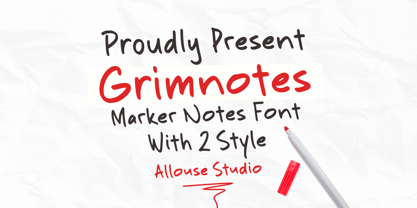
$16.00Proudly Presenting, Grimnotes a Marker Notes Font with 2 styles Grimnotes is perfect for any titles, logo, product packaging, branding project, megazine, social media, wedding, or just used to express words above the background. Grimnotes also come with Multi-Lingual Support. Enjoy the font, feel free to comment or feedback, send me PM or email. Thank You! - IA Airship Captain by Invisible Art Studio,
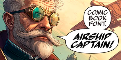
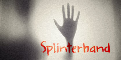
$14.99IA Airship Captain is a good readable comic book dialogue font made with a marker with wavy lines, giving it uniqueness and recognition. The family includes Regular, Italic, Bold, and Bold Italic. And contains a large number of kerning pairs. Added extended Latin, extended Cyrillic and contextual autoreplacing crossbar "I" in words like I, I'm, etc. - Splinterhand by Hanoded,
$12.00 - Cyber Rock by WAP Type,
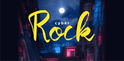
$15.00Cyber rock Brush Script bold, cool, cursive, design, editorial, grunge, handpaint, handwritten, ink, letter, logo, logotype, magazine, marker, modern, paint, ragged, ROUGH BRUSH, script, sign, style, stylish, swash, tag tagging, textured, trend, trendy, urban, vintage, written handwritten brush script dry brush cursive font with rough and dynamic look. Ideal for quotes, posters, branding, packaging, illustration, social media. - Notes by Resistenza,
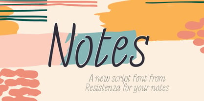
$39.00Notes Is a handwritten-Italic font style, casual and fresh. Our recipe for this project is a perfect blend of typography and handwriting. Works well in small sizes and has several ligatures. Notes Family has many cuts, Pen, Pencil, Marker and Felt Tip. This font family can be used for many purposes like publishing, quick notes, adding captions, signage. - Jackloft by Mofr24,
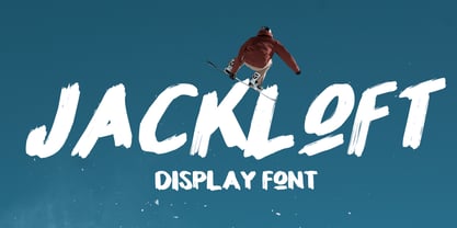
$11.00Introducing Jackloft, the ultimate display font for all your design needs! With its energetic and bold brush textured style, Jackloft is perfect for advertising, headlines, posters, thumbnails, and much more. What makes Jackloft unique is its ability to stand out in any design while still maintaining legibility. This font includes a full set of uppercase and lowercase letters, numbers, and punctuation marks. It pairs well with sans-serif fonts for a modern look or can be paired with other brush script fonts for a cohesive design. The design concept behind Jackloft was to create a font that could convey a sense of energy and excitement while still being readable. The brush textured style gives the font a handcrafted feel, making it perfect for designs that require a personal touch. Jackloft is not a revival or based on a historical design. Instead, it was created to fill a gap in the market for a display font that was both bold and legible. So, whether you're designing a poster or creating a social media graphic, Jackloft has got you covered! - LaRuja by SilverStag,
$19.00Embrace the captivating elegance of LaRuja, a modern serif font that seamlessly blends feminine grace with unwavering strength. Its distinctively high contrast between horizontal and vertical lines creates a dynamic interplay of elegance and structure, making it a versatile choice for a wide range of applications. LaRuja's gracefully tapered terminals and subtly curved arches exude a sense of refined femininity, while its sturdy serifs and well-defined letterforms project an unyielding strength. This unique balance of characteristics makes LaRuja the ideal choice for projects that demand both beauty and substance. LaRuja's extensive language support, encompassing over 90 languages, makes it a global font that can be effortlessly adapted to diverse cultural contexts. From fashion magazines and branding materials to websites and marketing campaigns, LaRuja seamlessly conveys your message across borders. LaRuja's comprehensive weight system, ranging from Thin to Black, enables you to tailor the font's appearance to suit the specific needs of your project. The lighter weights, such as Thin and Light, exude elegance and sophistication, while the heavier weights, such as Semibold and Black, project authority and impact. Happy creating everyone! - Wilko by Device,
$39.00 - Silk Remington Pro by Jadugar Design Studio,
$19.00 - Century Oldstyle by Bitstream,
$29.99Century Oldstyle is Linn Boyd Benton’s and Morris Fuller Benton’s renovation of Phemister’s Miller & Richard Old Style for ATF forty-five years later, using the Century name for marketing purposes. - Cute - Personal use only
- Midnightman - Personal use only
- Networkand Family by yasireknc,
$14.00Description This is Networkand Family. World's best graffiti and non-graffiti marker-styled font ever. Networkand marker font family, carefully selected from hundreds of letters. Signature-styled Networkand Script perfectly fits next to the Networkand Font. Besides all this, the Networkand Swashes Font is designed to customize your designs to another level. You can read Medium article here. FEATURES: Original: Networkand Fonts and swashes created for your special designs. You can turn your dreams into reality and customize them. Unique Creation: An unprecedented experience a creation that no one has ever had before and will uncover your awareness. Create your Brand: Unlike a standard font to create a new brand concept. Be different. Be different in life. Your own. Create your own mark: That’s the most special part of this font. A brand new identity for your personal signatures. - Diehl Deco - Alts - Unknown license
- Sabiya by MrLetters,
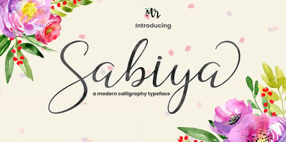
$18.00Dogma Script font is a kind of handwriting calligraphy with new and modern hand scratches. This typeface has been added with various alternative characters up to 439 glyphs. This type of writing is perfect for logos, fashion, stationery, magazines, menus, books, invitations, greeting cards, packaging, labels, apparel, marketing, business cards, etc. Features: Basic Latin A-Z and a-z Numbers Symbols Stylistic Sets Stylistic Alternates Ligatures Swash/Swirls PUA Encode If you don't have a program that supports OpenType features such as Adobe Illustrator and CorelDraw X Versions, you can access all the alternate glyphs using Font Book (Mac) or Character Map (Windows). If you have any question, don't hesitate to contact me by email hello.mrletters@gmail.com Thanks and happy designing :-) Thank You for purchase! - Raw potato by Agnieszka Ewa Olszewska,
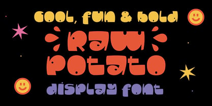
$25.00Introducing "Raw Potato" - a font that beautifully balances the raw and the captivating. Its bold, middle, and very thin weights within each letter create an intriguing, almost unfinished aesthetic that's still undeniably cool and eye-catching. "Raw Potato" is the perfect choice for products aimed at kids, as it brings a sense of playfulness and curiosity to any design. Its unconventional charm adds a touch of whimsy while maintaining a modern and edgy appeal. So, if you're in the market for a font that's raw yet fascinating, "Raw Potato" is your ticket to making designs that resonate with creativity and youthful energy. Let your imagination run wild with "Raw Potato" and watch your projects come alive! it contains Europenian diarcritics. - Baline by Xelo,
$12.00Baline is a modern and dynamic sans-serif typeface that is perfect for branding, marketing materials, and personal projects. With 20 font styles ranging from heavy to light, and variable weights, Baline is a versatile typeface that can adapt to any design project. Its sleek and clean design makes it easy to read, while its contemporary style gives your text a unique and sophisticated look. Baline is perfect for anyone looking to make a statement with their typography. Whether you're a designer, marketer, or just someone who appreciates beautiful typefaces, Baline is the perfect font for you. Try it out today and see how it can elevate your designs to the next level. Versatility: With 20 font styles ranging from heavy to light and variable weights, Baline is a versatile typeface that can adapt to any design project. This makes it a great investment for designers who need a font that can work across multiple mediums and projects. Modern and dynamic: Baline's sleek and clean design makes it easy to read, while its contemporary style gives your text a unique and sophisticated look. This makes it perfect for branding, marketing materials, and personal projects that need a modern and dynamic touch. Professional quality: Baline is a professionally designed font that has been created to the highest standards of typography. This means that you can be confident that your designs will look polished and professional, whether they are used for print or digital projects. Multilingual support: Baline supports multiple languages, making it a great choice for designers who need a font that can handle multilingual projects. Easy to use: Baline is easy to use and install, so you can start using it right away without any hassle. It also comes with a complete set of characters and symbols, so you can use it for a wide range of design projects. Great value: With its range of font styles and professional quality, Baline offers great value for money. It's a smart investment for any designer who wants to elevate their typography game without breaking the bank. Baline font is a great choice for anyone looking for a versatile, modern, and professional-quality typeface that can handle a wide range of design projects. - Wooden Log - Personal use only
- Retro Signature - Personal use only
- Electric Newspaper JNL by Jeff Levine,
$29.00Around 1931, the Los Angeles Times (in partnership with the Richfield Oil Company) installed on its building a moving message board similar to the one at the New York Times in New York City which they dubbed an “electric newspaper”. The style of characters used on this electronic sign were the basis for the namesake font Electric Newspaper JNL, which is available in both regular and oblique versions. A blank space to place between words is available on both the solid bar and broken bar keystrokes. - Avion by Fenotype,
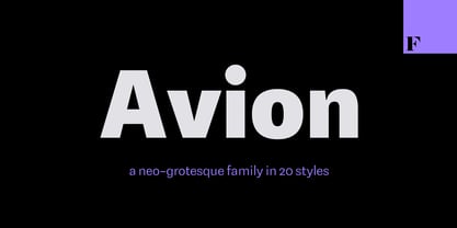
$25.00Despite what some might say, you can’t just always go for that most ubiquitous font in the world, can you? Avion font family channels those cool modernist vibes yet brings something new to the table. With a slightly more rectangular approach and some clever detailing, Avion has a distinct look of its own, yet provokes a calming familiarity of neutrality and objectiveness. As goes without saying, it’s also equipped with a sensible amount of features that make it a true, versatile workhorse. Get on board. - Tilson by Marc Lohner,
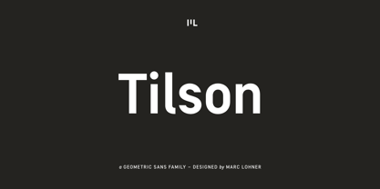
$28.00Meet Tilson, a versatile workhorse family for both texts and headlines based on a geometric and straight-lined design. It will give your apps, websites, logos, posters and so much more a techy and masculine look and feel. However, some friendly rounded details, such as the i-dot, add a rather pleasant personality to this family. With more than 200 languages covered, many opentype features on board, obliques, and weights ranging from Thin to Black, Tilson is a truly versatile companion for your next design project. - Tendencies by HIRO.std,
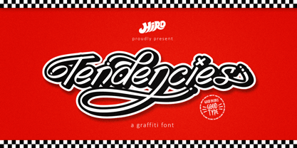
$22.00Tendencies – Graffiti Font This font describes culture, hip-hop, gravity, style, spray, road, travel, is easy to use and will bring good harmony when the letters are connected with alternate styles and paired with each other Tendencies has more than 489 Glyphs FEATURES - Ligatures - Stylistic Alternates - Uppercase - Lowercase - Numbering and Punctuations - Multilingual Support - Works on PC or Mac - Simple Installation USE Tendencies works great in any branding, board, logos, apparel, produk pagaking, magazines, label, films, stationary, poster, etc. and any projects that need street art taste. - Alota by Burntilldead,
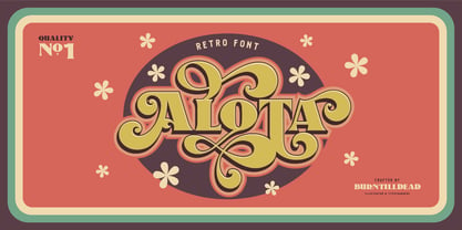
$14.00Say hi to “Alota” retro typeface. Inspired by 70’s design styles, a good decade where we saw many calm colors with groovy, bold, 3D and round shape. This font is very easy to use with hundreds of stylistic alternate (ss01-ss12) & powered with opentype feature. The font really bring a good statement for your logo design and can be the image of a design. Alota is very unique and easy to apply to any media; t-shirts, posters, sign boards, and social media needs. - Carolus - Unknown license
- Gianis by Obelisk Gestalt,
$34.00OBL Gianis is a family of compact geometric sans-serif typefaces designed with a strong focus on headline utility while infusing a touch of subtle naivety. We drew inspiration from the rigid yet rhythmic construction principles found in late 20th-century geometric classics like Avant-Garde, Futura, and Kabel. OBL Gianis seeks to salvage and build upon the legacy of geometric typefaces as they continue to evolve in the 21st century. We've considered various real-world scenarios and use cases, adapting to the ever-changing visual culture. This evolution has given OBL Gianis its unique quirks, including a larger x-height to accommodate bold usage in tighter typesetting, a compact double contour to balance the larger x-height, and shorter descenders and ascenders in lowercase characters. With extensive Latin character support (over 1000 glyphs) and 18 different weights and accompanying italics, OBL Gianis is well-equipped to meet the ever-changing demands and trends in headline typesetting. - Sequel Sans by OGJ Type Design,
$35.00Sequel Sans is a new chapter in the book of neogrotesque typefaces. Its core idea and its name were conceived in collaboration with the max bill georges vantongerloo foundation. The main inspiration for its design were the sans-serif typefaces used by Max Bill, the larger-than-life Swiss architect, artist, and designer. Honoring these roots, I designed Sequel Sans to be a clean and adaptable font family that is built upon a comprehensive system of styles. 8 weights, each with a corresponding italic, and a matching set of Variable Fonts are available in 4 optical sizes. These range from standard (for text sizes) to Subhead to Headline to Display—larger optical sizes come with tighter spacing and a number of gently adjusted glyph shapes. Like the great neogrotesques found in mid-century Swiss Style designs, Sequel Sans is a vessel that you can fill with any kind of content. It will amplify your message while retaining its own modernist character. - Davison Spencerian by House Industries,
$33.00As one of the most distinguished lettering artists of the 20th century, Meyer “Dave” Davison’s greatest contribution to the American visual landscape is arguably Davison Spencerian. The alphabet made its first appearance in Photo-Lettering’s 1946 catalog and remains a benchmark of the ornamental script genre. Thanks to the skillful hands of Mitja Miklavčič and the tireless eyes of House Industries designers Ben Barber and Ken Kiel, we have preserved the poise and precision of Davison’s masterwork in this faithfully-rendered digital incarnation. From automotive exhaust accessories and pirate-themed wedding invites to New Orleans sissy bounce hip-hop CD covers and upmarket bivalve ambrosia packaging, Davison Spencerian offers sober sophistication and unparalleled flexibility. DAVISON SPENCERIAN CREDITS: Typeface Design: Meyer “Dave” Davison Typeface Digitization: Mitja Miklavčič Typeface Direction: Ben Kiel and Ken Barber Like all good subversives, House Industries hides in plain sight while amplifying the look, feel and style of the world’s most interesting brands, products and people. Based in Delaware, visually influencing the world. - Riviera by Solotype,
$19.95This is derived from the Marder, Luce foundry's face called Rivet. A nip and a tuck here and there plus the addition of a lowercase make this into a potentially useful font. - Tsuki by ReivNick,
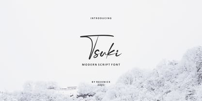
$12.00 - Neo Strada by Differentialtype,
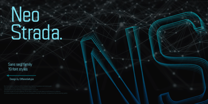
$10.00


