10,000 search results
(0.037 seconds)
- She is Mine by Olivetype,
$18.00 She's Mine is a fun and girly handwritten font. Its skinny and smooth style makes this font incredibly versatile, fitting a wide variety of creative ideas such as: kids, school projects, crafting and DIY projects. So what’s included: She's Mine (OTF) Basic Latin A-Z, a-z, numbers, symbols, and punctuations International Characters. Thank you
 - Audrena by Putracetol,
$19.00 Audrena is a new elegant modern script font. A lovely, elegant and sweet script font. Audrena is perfect for styling logos, stationery, wedding event, invitation, quote, social media, websites and so much more! Come with Opentype feature with a lot of alternates, its help you to make great lettering.This font is also support multi language.
 - Caterina by Calligraphics,
$30.00Caterina, was selected personally by Francis Ford Coppola for the film he produced called The Legend of Suriyothai. It's not the credits, but text placed in the center of the screen to introduce information about the setting, the characters, and so on. Something like chapter headings in a book, or the text in silent movies. - Lucky Night by Epiclinez,
$18.00 Lucky Night is a cute, quirky, and childish handwritten font. Whimsical and relaxed, this font will brighten up each of your designs. So what’s included: Basic Latin A-Z, a-z, numbers, symbols, and punctuations Multi-Languages support: from Afrikaans Albanian Catalan Danish to Dutch English Spanish Swedish Zulu. Accented Characters : ÀÁÂÃÄÅÆÇÈÉÊËÌÍÎÏÑÒÓÔÕÖØŒŠÙÚÛÜŸÝŽàáâãäåæçèéêëìíîïñòóôõöøœšùúûüýÿžß Thank you
 - Suspiria Vampira by Konstantine Studio,
$10.00 Halloween is coming. Get prepared earlier with our Suspiria Vampira. A bold and bouncy fonts with 2 styles, Clean and rough. Very good for a halloween concept, but the versatility level are high in this font. It can be placed into any fun and cheerful branding or event concept. So many possibilities coming up!
 - Grayphene by ErlosDesign,
$19.00 Grayphene is a romantic and sweet calligraphy typeface with characters that dance along the baseline. It has a casual, yet elegant touch. This font is PUA encoded which means you can access all of the glyphs and swashes with ease! The font has a smooth texture, so it would be perfect for your design.
 - Glamure by Fauzistudio,
$10.00 Glamure was inspired by the Myriad font which has been frequently used by technology companies and governments since the 1990s. Glamure is a clean, sleek and versatile font, by applying geomattric shapes to create a fantastic, modern and humanistic font. Glamure can function as a title, logo, body copy, subtitle, headline and so on.
 - Display Patrol by Hanoded,
$15.00 I have always liked handmade display fonts - maybe that’s why I have so many of them! Display Patrol is a rather fat, in your face font. It is completely handmade and comes in two distinct styles: regular and dots. Use it for your posters, books and product packaging. I am sure it will stand out!
 - Quickstep Sans by Holland Fonts,
$30.00A 'quick' font, originally made for the 25th anniversary of SSP Printing Co. in Amsterdam. First used for an intro spread in Wired Magazine (#3.05, May 1995): "The problem with computers is that they don't have enough Africa in them. What's pissing me off is that they use so little of my body" (Brian Eno). - After Brush Graffiti by Sipanji21,
$16.00 Hello, this is After Brush - Realistic Awesome Monoline Display Font! This font designed so that users can use it more easily and make Monoline designs easier. After Brush is very suitable for use in various media such as; packaging, logos, labels, posters, shirt designs, bulletins, typography, and many other media, especially with Monoline look.
 - Dark Sider by Sipanji21,
$18.00 Hello, this is Dark Sider- Natural Handwritten Graffiti Tag Font! This font designed so that users can use it more easily and make graffiti designs easier. Dark Sider is very suitable for use in various media such as; packaging, logos, labels, posters, shirt designs, bulletins, typography, and many other media, especially with graffiti look.
 - Ludwig Sans by Hyber Type,
$40.00 Ludwig Sans is a modern Sans Serif Font Family inspired by american Gothics. It also contains many Alternates that are inspired by Ludwig Sütterlin’s Latin Script from 1911. All those Alternates can be combined seamlessly within the neutral Sans Serif Typeface, so you get both: a bread-and-butter type and a display font.
 - Bervina by Balevgraph Studio,
$12.00 Bervina is an elegant and delicate serif font. It looks beautiful on a variety of designs requiring a personalized style, such as wedding invitations, thank you cards, weddings, greeting cards, logos and so on. Bring your projects to the highest levels! Features: Multilingual Ligatures Alternates PUA encoded Files Included: Bervina Regular ttf Bervina Italic ttf
 - The Shoreman by Hustle Supply Co,
$18.00 The Shoreman This typeface is a vintage Sans Serif Display Typeface. The Shoreman comes packed with over 450 glyphs containing many alternates and decorative characters. With so many options of characters, you can give any of your projects it's own unique character. What's Included? Over 450 Glyphs with tons of alternates Western European characters Thanks!
 - Chellinda by Portograph Studio,
$20.00 Chellinda Bold Script is a stylish and refined Script font. It looks beautiful on a variety of designs requiring a personalized style, such as wedding invitations, thank you cards, weddings, greeting cards, logos and so much more. This font is PUA encoded which means you can access all of the glyphs and swashes with ease!
 - John Brown by Hanoded,
$15.00 I realized I didn't have that many serif fonts, so I started sketching and came up with John Brown. John Brown is named after the sheriff in the Bob Marley song 'I Shot The Sheriff'. It is an all caps font, but upper and lower case can be freely interchanged for that great 'natural' look.
 - FS Untitled Variable by Fontsmith,
$319.99Developer-friendly The studio has developed a wide array of weights for FS Untitled – 12 in all, in roman and italic – with the intention of meeting every on-screen need. All recognisably part of a family, each weight brings a different edge or personality to headline or body copy. There’s more. Type on screen has a tendency to fill in or blow so for each weight, there’s the choice of two marginally different versions, allowing designers and developers to go up or down a touch in weight. They’re free to use the font at any size on any background colour without fear of causing optical obstacles. And to make life even easier for developers, the 12 weight pairs have each been designated with a number from 100 (Thin) to 750 (Bold), corresponding to the system used to denote font weight in CSS code. Selecting a weight is always light work. Easy on the pixels ‘It’s a digital-first world,’ says Jason Smith, ‘and I wanted to make something that was really functional for digital brands’. FS Untitled was made for modern screens. Its shapes and proportions, x-height and cap height were modelled around the pixel grids of even low-resolution displays. So there are no angles in the A, V and W, just gently curving strokes that fit, not fight, with the pixels, and reduce the dependency on font hinting. Forms are simplified and modular – there are no spurs on the r or d, for example – and the space between the dot of the i and its stem is larger than usual. The result is a clearer, more legible typeface – functional but with bags of character. Screen beginnings FS Untitled got its start on the box. Its roots lie in Fontsmith’s creation of the typeface for Channel 4’s rebrand in 2005: the classic, quirky, edgy C4 headline font, with its rounded square shapes (inspired by the classic cartoon TV shape of a squidgy rectangle), and a toned-down version for use in text, captions and content graphics. The studio has built on the characteristics that made the original face so pixel-friendly: its blend of almost-flat horizontals and verticals with just enough openness and curve at the corners to keep the font looking friendly. The curves of the o, c and e are classic Fontsmith – typical of the dedication its designers puts into sculpting letterforms. Look out for… FS Untitled wouldn’t be a Fontsmith typeface if it didn’t have its quirks, some warranted, some wanton. There’s the rounded junction at the base of the E, for example, and the strong, solid contours of the punctuation marks and numerals. Notice, too, the distinctive, open shape of the A, V, W, X and Y, created by strokes that start off straight before curving into their diagonal path. Some would call the look bow-legged; we’d call it big-hearted. - FS Untitled by Fontsmith,
$80.00 Developer-friendly The studio has developed a wide array of weights for FS Untitled – 12 in all, in roman and italic – with the intention of meeting every on-screen need. All recognisably part of a family, each weight brings a different edge or personality to headline or body copy. There’s more. Type on screen has a tendency to fill in or blow so for each weight, there’s the choice of two marginally different versions, allowing designers and developers to go up or down a touch in weight. They’re free to use the font at any size on any background colour without fear of causing optical obstacles. And to make life even easier for developers, the 12 weight pairs have each been designated with a number from 100 (Thin) to 750 (Bold), corresponding to the system used to denote font weight in CSS code. Selecting a weight is always light work. Easy on the pixels ‘It’s a digital-first world,’ says Jason Smith, ‘and I wanted to make something that was really functional for digital brands’. FS Untitled was made for modern screens. Its shapes and proportions, x-height and cap height were modelled around the pixel grids of even low-resolution displays. So there are no angles in the A, V and W, just gently curving strokes that fit, not fight, with the pixels, and reduce the dependency on font hinting. Forms are simplified and modular – there are no spurs on the r or d, for example – and the space between the dot of the i and its stem is larger than usual. The result is a clearer, more legible typeface – functional but with bags of character. Screen beginnings FS Untitled got its start on the box. Its roots lie in Fontsmith’s creation of the typeface for Channel 4’s rebrand in 2005: the classic, quirky, edgy C4 headline font, with its rounded square shapes (inspired by the classic cartoon TV shape of a squidgy rectangle), and a toned-down version for use in text, captions and content graphics. The studio has built on the characteristics that made the original face so pixel-friendly: its blend of almost-flat horizontals and verticals with just enough openness and curve at the corners to keep the font looking friendly. The curves of the o, c and e are classic Fontsmith – typical of the dedication its designers puts into sculpting letterforms. Look out for… FS Untitled wouldn’t be a Fontsmith typeface if it didn’t have its quirks, some warranted, some wanton. There’s the rounded junction at the base of the E, for example, and the strong, solid contours of the punctuation marks and numerals. Notice, too, the distinctive, open shape of the A, V, W, X and Y, created by strokes that start off straight before curving into their diagonal path. Some would call the look bow-legged; we’d call it big-hearted.
 - Vendetta by Emigre,
$69.00 The famous roman type cut in Venice by Nicolas Jenson, and used in 1470 for his printing of the tract, De Evangelica Praeparatione, Eusebius, has usually been declared the seminal and definitive representative of a class of types known as Venetian Old Style. The Jenson type is thought to have been the primary model for types that immediately followed. Subsequent 15th-century Venetian Old Style types, cut by other punchcutters in Venice and elsewhere in Italy, are also worthy of study, but have been largely neglected by 20th-century type designers. There were many versions of Venetian Old Style types produced in the final quarter of the quattrocento. The exact number is unknown, but numerous printed examples survive, though the actual types, matrices, and punches are long gone. All these types are not, however, conspicuously Jensonian in character. Each shows a liberal amount of individuality, inconsistency, and eccentricity. My fascination with these historical types began in the 1970s and eventually led to the production of my first text typeface, Iowan Old Style (Bitstream, 1991). Sometime in the early 1990s, I started doodling letters for another Venetian typeface. The letters were pieced together from sections of circles and squares. The n, a standard lowercase control character in a text typeface, came first. Its most unusual feature was its head serif, a bisected quadrant of a circle. My aim was to see if its sharp beak would work with blunt, rectangular, foot serifs. Next, I wanted to see if I could construct a set of capital letters by following a similar design system. Rectangular serifs, or what we today call "slab serifs," were common in early roman printing types, particularly text types cut in Italy before 1500. Slab serifs are evident on both lowercase and uppercase characters in roman types of the Incunabula period, but they are seen mainly at the feet of the lowercase letters. The head serifs on lowercase letters of early roman types were usually angled. They were not arched, like mine. Oddly, there seems to be no actual historical precedent for my approach. Another characteristic of my arched serif is that the side opposite the arch is flat, not concave. Arched, concave serifs were used extensively in early italic types, a genre which first appeared more than a quarter century after roman types. Their forms followed humanistic cursive writing, common in Italy since before movable type was used there. Initially, italic characters were all lowercase, set with upright capitals (a practice I much admire and would like to see revived). Sloped italic capitals were not introduced until the middle of the sixteenth century, and they have very little to do with the evolution of humanist scripts. In contrast to the cursive writing on which italic types were based, formal book hands used by humanist scholars to transcribe classical texts served as a source of inspiration for the lowercase letters of the first roman types cut in Italy. While book hands were not as informal as cursive scripts, they still had features which could be said to be more calligraphic than geometric in detail. Over time, though, the copied vestiges of calligraphy virtually disappeared from roman fonts, and type became more rational. This profound change in the way type developed was also due in part to popular interest in the classical inscriptions of Roman antiquity. Imperial Roman letters, or majuscules, became models for the capital letters in nearly all early roman printing types. So it was, that the first letters in my typeface arose from pondering how shapes of lowercase letters and capital letters relate to one another in terms of classical ideals and geometric proportions, two pinnacles in a range of artistic notions which emerged during the Italian Renaissance. Indeed, such ideas are interesting to explore, but in the field of type design they often lead to dead ends. It is generally acknowledged, for instance, that pure geometry, as a strict approach to type design, has limitations. No roman alphabet, based solely on the circle and square, has ever been ideal for continuous reading. This much, I knew from the start. In the course of developing my typeface for text, innumerable compromises were made. Even though the finished letterforms retain a measure of geometric structure, they were modified again and again to improve their performance en masse. Each modification caused further deviation from my original scheme, and gave every font a slightly different direction. In the lower case letters especially, I made countless variations, and diverged significantly from my original plan. For example, not all the arcs remained radial, and they were designed to vary from font to font. Such variety added to the individuality of each style. The counters of many letters are described by intersecting arcs or angled facets, and the bowls are not round. In the capitals, angular bracketing was used practically everywhere stems and serifs meet, accentuating the terseness of the characters. As a result of all my tinkering, the entire family took on a kind of rich, familiar, coarseness - akin to roman types of the late 1400s. In his book, Printing Types D. B. Updike wrote: "Almost all Italian roman fonts in the last half of the fifteenth century had an air of "security" and generous ease extremely agreeable to the eye. Indeed, there is nothing better than fine Italian roman type in the whole history of typography." It does seem a shame that only in the 20th century have revivals of these beautiful types found acceptance in the English language. For four centuries (circa 1500 - circa 1900) Venetian Old Style faces were definitely not in favor in any living language. Recently, though, reinterpretations of early Italian printing types have been returning with a vengeance. The name Vendetta, which as an Italian sound I like, struck me as being a word that could be taken to signifiy a comeback of types designed in the Venetian style. In closing, I should add that a large measure of Vendetta's overall character comes from a synthesis of ideas, old and new. Hallmarks of roman type design from the Incunabula period are blended with contemporary concerns for the optimal display of letterforms on computer screens. Vendetta is thus not a historical revival. It is instead an indirect but personal digital homage to the roman types of punchcutters whose work was influenced by the example Jenson set in 1470. John Downer.
 - Actium by Type Mafia,
$45.00 Actium is a contemporary multilingual sans serif typeface developed to help perfect typography automatically. Type Mafia has focussed on words with odd combinations of capital letters and numbers, such as product names and postal codes such as WD40 and H1N5, jump out of the text. They sit awkwardly together as the numerals have been designed to work with the lowercase, not the uppercase letters – affecting readability.To fix this Type Mafia invented Smart Capo™. Smart Capo™ Smart Capo is a feature that automatically activates once you type an uppercase letter together with a number. When a capital letter is sat next to a numeral, Smart Capo converts the letter to a mid-cap — a contemporary alternative to small caps — and the default old-style numeral to a lining numeral. Actium’s mid-caps and lining numerals have been designed with the same height (between cap and x-height) so they sit comfortably next to each other and fit more harmoniously into text. Smart Capo applies equal attention to capitalised words without any numbers, such as NAVO and USA, and are also automatically set into mid-capitals. Working on its own, Smart Capo saves time and money for the typographer — taking the pain out of text formatting — and makes it a more pleasurable experience for the reader. This feature is made possible by the use of ‘contextual alternates’, an OpenType feature used in modern font software, working with a set of characters specially designed at mid-cap height. By default these changes automatically take place so it doesn't need to be switched on, it will just work. Actium Actium’s design has an unusual diagonal contrast — much more common in a serifed face than in a sans serif — giving it more bite. The typeface looks elegant when set in large sizes and remains very legible when shown in small sizes. The family consists of six weights in two styles, making a dozen fonts. Weights range from light to black in roman and true italic. All fonts are fully loaded with functional elements. Actium boasts an extended Latin character set and with Greek. This means a wide range of Western languages are supported: perfect for use in bilingual publications and packaging. For numerals, each font includes old-style and lining figures in both proportional and tabular widths, with superiors and inferiors. These allow you to select the right set of numbers for the right task.
 - Belgato by Molly Suber Thorpe,
$9.00 Belgato is a vintage-inspired typeface with delicate details. It comes in six weights – plus italics! – for a total of 12 fonts, making it a highly versatile display face. The variable font version allows for ultimateweight and slant customization in print and web. Belgato has Latin, Greek, and Cyrillic alphabets, and supports dozens of languages, making it ideal for multilingual branding, publications, ads, social media, and more! I had so much fun designing this typeface, playing with classic serif letterforms to create an elegant, mid-century modern vibe. Belgato Light is fresh, airy, and delicate – perfect for feminine branding. By contrast, Belgato Black boasts fat curves with thin details, perfectly-suited to bold layouts and retro branding projects. Each Belgato font has 665 glyphs, encompassing: - the Latin alphabet (including hundreds of accented characters) - the Modern Greek alphabet - the Cyrillic alphabet (for Russian, Ukrainian, Bulgarian, and Serbo-Croatian) - discretionary ligatures - stylistic and alternate glyphs - numerals (lining and old style), small figures, and fractions - extensive punctuation, symbols, and diacritical markings Software: No special software is required to use Belgato fonts. You can even use these fonts with Canva! To access Belgato’s variable font features, ligatures, and stylistic alternates, it is best to use software that supports these functions (Adobe programs, Corel Draw, Sketch, etc). Languages: Belgato supports dozens of languages which use the Latin, Greek, and Cyrillic alphabets. Among the most common languages it supports are: English, Bulgarian, Catalan, Croatian, Czech, Danish, Dutch, Filipino, Finnish, Flemish, French, German, Modern Greek, Hungarian, Icelandic, Indonesian, Italian, Luxembourgish, Maltese, Norwegian, Polish, Portuguese, Russian, Serbo-Croatian, Spanish, Swedish, Swiss German, Turkish, and Ukrainian.
 - Weigela by Colllab Studio,
$15.00 Presenting Weigela! A Beauty Script Font 6 alternates and extra. This font made with the perfect combination of each character. You can combine with Alternates and Extra to get a unique combination. It looks original and can be used for all your project needs. Each glyph has its own uniqueness and when meeting with others will provide dynamic and pleasing proximity. This font can be used at any time and in any project. You can see in the presentation picture above, Weigela looks beautiful and versatile on design projects. So, Weigela Font can't wait to give its touch to all your design projects such as quotes, wedding invitations, wedding theme designs, poster design, personal branding, promotional materials, website, logotype, product packaging, etc. WHAT'S INCLUDED? Weigela Regular • It comes with uppercase, lowercase, ligatures, numeral, punctuation, symbols, Many Ligatures, Alternates, and Standard Latin Multilingual Support (Afrikaans, Albanian, Catalan, Danish, Dutch, English, French, German, Icelandic, Indonesian, Italian, Malay, Norwegian, Portuguese, Spanisch, Swedish, Zulu, and More). Weigela Stylish Alternate • It comes with the lowercase of ending swash. Weigela Alternate One • It comes with the lowercase of beginning swash. Weigela Alternate Two • It comes with the lowercase of ending swash Weigela Alternate Three • It comes with the lowercase of love connecting swash. Weigela Alternate Four • It comes with the lowercase of love connecting swash. Weigela Alternate Five • It comes with the lowercase of love connecting swash. Weigela Alternate Six • It comes with some lowercase; b, d, f, k, and l. Extra Swashes • Included 15 Underline Swashes. You can feature all with typing c_1 until c_15 (Opentype Feature) or using Characters Map Tool. A Million Thanks Colllab Studio
 - Exquisite Corpse - 100% free

- Janda Everyday Casual - Personal use only

- Aeroboost by Mevstory Studio,
$30.00 Aeroboost is a sporty look with a strong and sporty feel, perfect for your titles, logos, typography, flyers and various design needs, making your designs more modern and professional. Aeroboost comes with these all caps making them look strong and bold, giving them a bold and modern feel, so enjoy creating any project that will showcase your main idea!
 - Bounties by Balpirick,
$15.00 BOUNTIES is a Fun & Rounded Handbrushed Font. Bounties is a fun, round, hand-brushed, and handwritten font that has an innocent and clean style. It is perfect for product packaging, branding project, magazine, social media, wedding invitations and so much more! BOUNTIES also multilingual support. Enjoy the font, feel free to comment or feedback, send me PM or email.
 - Ventoux by Wiescher Design,
$39.50 The highest and windiest mountain of Provençe is the Mont Ventoux. That is where I saw a pretty windy signpost in a very windy typeface that inspired me to design Ventoux. I recently added a Small-Caps style to it and overhauled the font a little bit without destroying its shaky appearance. Your not so windy Gert Wiescher
 - Anthemis by Blankids,
$17.00 Introducing Anthemis, the bold script font inspired by Bold hand lettering style. Anthemis is good for branding logotype, Packaging, poster, headline, book cover, Flyer, t-shirt design and any more. Anthemis has many alternative character and have opentype features like a stylistic alternatives, stylistic set, ligature and swash so you can mix and match like a you want.
 - Horrifal by Khoir,
$15.00 Displays the appearance of a serif font that has a spooky impression but with elegant characteristics that make this horror-themed font different from other horror fonts, with the addition of sharp alternative letters that make the impression even more gripping so it is perfect for movie titles, posters, logotypes and many others. Thank you for seeing
 - Big Bag NF by Nick's Fonts,
$10.00This industrial-strength titling face takes its design cues from Hans Eduard Meier's Syntax Antigua. This version is bolder and beefier, so your headlines will grab and hold attention in a refined and genteel manner. Both versions include complete Latin 1252, Central European 1250 and Turkish 1524 character sets, with localization for Moldovan, Romanian and Turkish. - My Lovely by Good Java Studio,
$20.00 My Lovely is a beautiful script font made with many swashes in start and ending character, offering beautiful love swashes. This font includes a full set of swash heart lowercase letters, numerals, and punctuation. It also includes opentype Ligatures and Stylistic Setuntil 10 option. This is so perfect for invitations, monograms, wedding, fashion, branding, labels or logotype.
 - London Handlettering by Axara Creative,
$39.00 The London Signature is an amazing Ellegant Signature font. It was made with perfect precision for every single curve that was build with a horizontal, vertical path & smooth. London signature script font which stylish natural handwritten font with beautiful curve in every single corner. This font is so fashionable & elegant and perfect for photography, branding, signature and logo .
 - Lamenta by Dawnland,
$13.00 All that remains from this once so proud and glorious antiqua are steel skeletons. Destroyed. Distorted. Ruins. The main focus and usage of LamentaX are headlines, posters for event graphics and music/media/game packaging. Lamenta X was revised 2012 and now hold a full character set of basic english/latin letters and west european diacritics!
 - Fillippo by Stefani Letter,
$12.00 Fillippo is a stunning monoline style script font with authentic and casual vibes. It looks beautiful on a variety of designs requiring a personalized style, such as wedding invitations, thank you cards, advertising, poster, greeting cards, logos and so on. Fillippo is PUA encoded which means you can access all of the glyphs and swashes with ease!
 - Taka Sans by FSodic.com,
$15.00 Taka is a font that can be used in all situations, be it Articles, News, Titles and so on. We will be adding variants of the font in the coming weeks which will make this font even more complete. This font is only sold by Monotype and its subsidiaries, make sure you get the original only here!
 - Hypercrack by Invasi Studio,
$19.00 Introduction of our new collection of playful doodle font styles. The Hypercrack Handwritten all-caps Font with scribbles styles font. Also, Hypercrack has a unique stylistic alternates character. So you can create a combination of whatever you want! This font is perfect for your display project for headlines, quotes, editorial design, print posters, and much more.
 - Christmas letter by Stefani Letter,
$12.00 Christmas letter is a stunning monoline style script font with authentic and casual vibes. It looks beautiful on a variety of designs requiring a personalized style, such as wedding invitations, thank you cards, weddings, greeting cards, logos and so on. Christmas letter is PUA encoded which means you can access all of the glyphs and swashes with ease!
 - Creative Thinking by Java Pep,
$17.00 Proudly present a new font that fresh from the oven Creative Thinking font, an elegant font family that has 4 weight styles regular, italic, bold, and bold-italic. It's so perfect to combining and mixing the weight styles to make outstanding and beautiful design project. Don't worry this font already with multilingual support more than 30 languages.
 - Blossom Riviera by Olivetype,
$18.00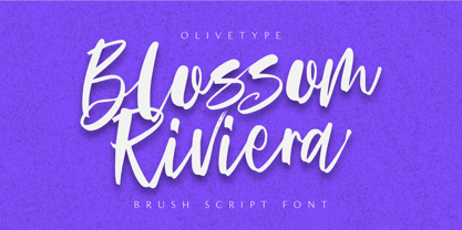 Blossom Riviera is the perfect brush script font for giving your projects a natural, handmade feel. With its cool, awesome texture, it's perfect for creating beautiful, unique logos and headlines. So what’s included : Standard Latin Numbers, symbols, punctuations and ligatures Multilingual Support. PUA Encoded and fully accessible without additional design software Simple Installations Works on PC & Mac Thank You!
 - Brotherly by Creativework Studio,
$14.00 Brotherly is a modern san serif font that is very different from the standard san serief form in general, this font is more artistic so it is very flexible to use for various design project needs, both formal and non-formal, but this font is based on the basic san serief font. easy to read and clear.

