10,000 search results
(0.032 seconds)
- Shine of Love by Namara Creative Studio,
$9.00 Cute and Playful display fonts crafted with heart, especially for you. It is perfect for children-themed designs, Such as t-shirt designs, story books, packaging, children’s activity or school projects, posters, greeting cards, valentine’s crafts, and more! Come in 03 variants : Regular, Shadow and Fun. So add it to your creative ideas and notice how it makes them stand out!
 - CRM American Horror by CRMFontCo,
$35.00 The Classic Charles Rennie Mackintosh Font has been a massive seller over the years. Its use in the Hollywood motion picture "Spider Man 2", has now been emulated by the branding of the the new Fox TV series "American Horror Story". Very unusual for the horror genre, this slightly tweaked version of the classic original mirrors how the show's producers have used it.
 - Heidar by Craft Supply Co,
$17.00 Unveil the Bold Elegance Serif Font – Where letters stand strong, strokes exude confidence, and design speaks with authority. Elevate your creations with this typographic powerhouse that turns words into captivating stories. This typeface is ideal for greeting card, packaging, brand identity, poster, or any purpose to make your art/design project look eye catching and trendy. Feel free to play with this typeface!
 - Oakes Grotesk by Studio Few,
$12.00 Oakes Grotesk is a more corporate take on the Oakes typeface. It explores a set of brand new metrics that allow it to be more legible in body text as well as headings. The letter 'g' has been tweaked to become double-story as well as the refinement of other characters. This is all whilst maintaining the subtle curves of the Oakes typeface.
 - Foreign Film JNL by Jeff Levine,
$29.00 The Art Deco hand lettered opening credits for the 1936 French drama “La Belle Équipe” [English title: “They Were Five”] provided the inspiration for Foreign Film JNL, which is available in both regular and oblique versions. According to Wikipedia, the film “…tells the story of five unemployed workers who win the jackpot in the national lottery but their solidarity then proves fragile.”
 - Missy Voya by Creativemedialab,
$20.00 Introducing Missy Voya. The unique and fashionable font with tons of alternative characters and ligatures. This Versatile family consists of 8 weights, multilingual support, numbers, and currency symbols. The straight lines combined with a slight curve make Missy Voya look minimalist and elegant. Try uppercase for a simple look. Missy Voya is perfect for website header, logo, Instagram story, or fashion-related branding.
 - Helomade by Scratch Design,
$9.00 Helomade font named from Indonesia - Balinese language, this font is an authentic font with a suitable form like handwriting. This font was created to complement some designs such as quotes, invitations, texts, novels, story books and everything that requires some touch of handwriting. This font is also supported multi languages. Please try using this font, feel the sensation of Helomade's handwritten.
 - Window Sign JNL by Jeff Levine,
$29.00 Window Sign JNL is a solidified re-working of Sign Stencil JNL; originally modeled from some vintage lettering stencils that were part of a store sign making kit.
 - Cowgirl by By Meg Burk,
$25.00 An uppercase font that has versatile character. Got a story to tell? Cowgirl can help you tell it. Includes western-themed vector illustrations handmade by Meg Burk. I grew up spending almost every family vacation as a road trip across the southwestern US. In these adventures, I fell in love with learning about the nature around us; deserts, mountains, plains, piñon trees, rainbow trout, black bears, eagles, and more. I fell into freezing cold white water rapids, explored long-abandoned cliff dwellings, camped under the Milky Way, saw old cave markings, stone markings, preserved art, and read many a many old map legends. These memories are visceral and the inspiration that I get from them permeates my every day. Take a piece of these stories with you and use them in your designs, too. Handmade, meant to last a lifetime and inspire others for decades to come.
 - ST Gaidar by ShimanovTypes,
$9.00 The font "Gaidar" named in the honour of Arkady Gaidar. He was a Soviet writer, whose stories were very popular among Soviet children, and a Red Army commander. He died in combat fighting with German nazis in 1941. Few generations of Soviet kids are raised on his books and a number of films were made based on his stories. This font inspired by posters, movie titles and book covers of this writer. The letterforms are bold and gnarly and comes in 2 styles: uppercase and small caps. It has LATIN and Extended Eastern Europe CYRILLIC letters. "ST-Gaidar" created for titles, poster design, web design, branding and packaging works, illustrations, badges and other typography works. Pls, don't use it for for typing large arrays of text. ST Gaidar supports 15+ languages: Belarusian, Bosnian, Bulgarian, Croatian, Dutch, English, German, Macedonian, Norwegian, Russian, Serbian, Swedish, Spanish, Slovenian, Ukrainian and probably others
 - Atipla ND by Nicolas Deslé,
$20.00 Atipla ND is a contemporary sans serif typeface. It works best at large sizes, with softened ink traps pair legibility with aesthetic, while its strict horizontal and vertical terminals give it a rigid yet friendly appearance. The typeface contains a stylistic set, case sensitive forms, symbols and arrows, and the font covers all Latin Extended-A languages.
 - Gafata by Underground,
$24.00 Gafata is a font designed for small sizes in medium-long text, mixing elegance and readability causing it to have great applicability in books, magazines and web pages. In the process of finding the finest legibility, particular features emerged making this whimsical sans serif different from the rest, creating an original mark to the text its applied to.
 - Tracker by Device,
$39.00 Tracker is a geometric twin-line font reminiscent of space-age disco designs of the 60s and 70s, but entirely reexamined, rationalised, redesigned and updated for contemporary use. Best seen in shorter, punchier settings and at larger sizes. The font includes connecting ligatures that can be toggled an and off in the Opentype palette to further customise your text.
 - Vanhille Quaver by Viswell,
$18.00 Venhille Quaver is inspired by classic typography and brings its own unique style to any design project. This fantastic handwritten font is best suited for headlines of all sizes, as well as for blocks of text that have both maximum and minimum variations. Whether it’s for web, print, moving images or anything else – Venhille Quaver will look spectacular.
 - Sticky Notes by Hendra Pratama,
$19.00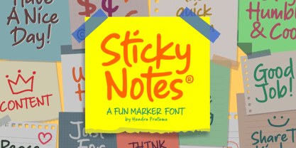 Sticky Notes is a handmade font, made from a marker pen. It's fun yet playful font for variety design graphics project. From Logotype, Poster, Quotes design, Comics book or illustration, T-shirt design, Magazine titles and many more. Sticky Notes is Good used in small or large size. Please check out all the preview images. Best!
 - Ninth Century MF by Masterfont,
$59.00 OpenType Pro Excellent support for Niqqud (Vowels). All marks are programmed to fit each glyph's shape and width. OpenType Pro includes new advanced features like Dagesh Hazak, ShevaNa, Qamatz Katan, Holam Haser and wide letters. Best used with Adobe InDesign CC that support complex Hebrew text. Please check these advanced features in this link: tinyurl.com/2fbkuy95
 - Sawah by Din Studio,
$29.00 Sawah is a modern and elegant display font. It celebrates abstract shapes in all their eclectic beauty. This font will look truly outstanding in a wide range of contexts. It is the best for logos, branding and quotes. Featured : Accents (Multilingual characters) PUA encoded Numerals and Punctuation (OpenType Standard) Thank you for downloading premium font from Din Studio.
 - Sayonachi by ActiveSphere,
$30.00 Sayonachi is a fun, curly font to use in a wide range of documents, and works best in display applications, such as posters, greeting cards, awards, invitations, logos and titles. Sayonachi font has a full upper and lower-case, accents, punctuation and a selection of monetary symbols. Currently Available for Mac and PC, in Open Type, PostScript or TrueType.
 - HWT Antique Tuscan 9 by Hamilton Wood Type Collection,
$24.95 A very condensed 19th century Tuscan style wood type design with a full character set with ligatures. This design was first shown by Wm H Page Co in 1859 and this is the first digital version of this font to include a lowercase and extended European character set. This is a font best used at large sizes.
 - Laurel by Fenotype,
$25.00 Often in typography, a standout appeal is required – but preferably without compromising on clarity and legibility. Laurel font family by Fenotype is where the best of both worlds meet – an edgy display letter yet easily legible and appropriate for a wide range of use cases. Brand identities, packaging, posters or editorial – choose Laurel for a touch of unique flair.
 - Blue Goblet Serif by insigne,
$6.99 Blue Goblet is a series of fonts and ornaments by Cory Godbey and Jeremy Dooley. This best selling series has now been extended to include a new member, Blue Goblet Serif. Blue Goblet Serif comes with a variety of weights and also an outline version. Blue Goblet is hand-lettered by the artist, Cory Godbey, and is organic, spontaneous and exuberant. Characters bounce and dance above and below the baseline and x-height, making this a whimsical and fun script. Not only is Blue Goblet Serif a excellent choice, it also is a member of a wide family of different fonts. You can use it side by side with the original Blue Goblet, and there are a wide range of ornaments available, totaling over 350 illustrations! These illustrations include frames, florals and other text ornaments that can be inserted into your text and resized at will. This makes the Blue Goblet series a great pick when you want a type system that works very well together for a very unique and consistent look. The Blue Goblet series continues to grow and be expanded, making it a valuable investment. Blue Goblet Serif also includes auto replacing ligatures that make it appear that the script was drawn by the artists own hand, just for you! Blue Goblet Serif also includes a wide variety of alternates that can be accessed in any OpenType enabled application. Blue Goblet includes over 150 OpenType glyphs, and is loaded with features including an even more unique alternate alphabet. Included are swash alternates, style sets, old style figures and small caps. Please see the informative PDF brochure to see these features in action. OpenType enabled applications such as the Adobe suite or Quark can take full advantage of the automatic replacing ligatures and alternates. This family also includes the glyphs to support a wide range of languages. Blue Goblet Serif is great choice for display and short blocks of display text, children's books, packaging, or other unique applications. Fill in the counter spaces with color for a unique look, or alternate the different weights. Use Blue Goblet whenever you want to inject a sense of fun and whimsy to your designs. Give the Blue Goblet series a try today!
 - Phonk by Slava Antipov,
$39.00 Phonk is a bold and wide sans serif. It's great for logos, packaging, posters, advertising and other tasks requiring strong and bold typography. The font family contains the following 4 styles: Regular, Regular Italic, Contrast, Contrast Italic. Contrast styles are characterized by increased readability in small font sizes. Phonk has very wide language support (80+ languages). The font includes Latin and Cyrillic scripts. I recommend you check out the new and improved version of this font! Phonk Sans
 - HU Discopangpang KR by Heummdesign,
$25.00 "Disco Pang Pang" is the Korean name for Tagada rides. It is a characteristic typeface that is good to use when you want to make use of a unique and bouncy feeling. Light and Extrabold are made with the thickness of normal typefaces, but Left and Right have strange shapes with stroke thicknesses that are biased to one side. Its unique shape can make a strong impression on people. This font contains Korean.
 - Whittington by George Tulloch,
$21.00 Whittington is a revival of a congenial ‘modern’ typeface of the mid nineteenth century, unassuming and businesslike with an even colour that reads comfortably over long stretches. It is intended primarily for use in running text. Whittington provides wide support for west, central, and east European languages that use the roman alphabet. Among its OpenType features are ligatures, small caps, several sets of numerals, contextual alternates, intelligent implementation of long ‘s’, and fractions. For more detail, please see the pdf available in the Gallery.
 - Lumberjacky by Tour De Force,
$25.00 In winter when cold time comes, when animals with thin fur play drums, there’s one guy who keeps you warm, his name is Lumberjacky and he’s stronger then storm!
 - Urban Tour by Roland Hüse Design,
$10.00 -This font has been basically designed for poster display in black weight and big size (mostly for capital letters). The rest of the family is a derivative work of it. I can’t guarantee if it works well on small size print. -Future updates may follow in the near future or on request. Please feel free to contact me via rolandhuse@aol.com about the following: -This family does not contain all the language extensions, but I am willing to create any extensions (including Cyrillic) on request; - Discovering kerning problems while using; Or any other question.
 - Harpo by Elemeno,
$25.00Harpo is a naturally condensed font, better at large sizes. Harpo Wide is a more versatile version of the same font. Part of The Algonquin Collection, Harpo was named for occasional Round Table member, Harpo Marx. Light, narrow and discreet this font brought to mind the silent Marx brother. - Freundschafts-Antiqua AR by ARTypes,
$35.00Freundschafts-Antiqua AR is based on a 20th-century German type design. Freundschafts-Antiqua (which was also called Chinesische Antiqua) was designed by the Chinese calligrapher Yü Bing-nan when he was a student at the Hochschule für Grafik und Buchkunst at Leipzig in 1960. It was cast in 1964 by VEB Typoart, Dresden, in 9-pt and 28-pt (Didot). The design combines the best German traditions with the Chinese bamboo pen. It is a unique, wholly modern, yet quiet and dignified typeface which is well suited for text-setting in many sizes. The original design was carefully crafted with all non-kerning letters (none of the letters overhangs its side-bearings); the lower-case f was designed so that no ligatures were needed. The AR fonts include the type's ch and ck logotypes, monetary signs and all the standard accents. The letterfit of the original design is retained and, as can be seen in the attached printable .pdf, text composed at normal sizes is very agreeable indeed. Freundschafts-Kursiv AR A features old-style (non-lining) figures and 'kerning' letters; Freundschafts-Kursiv AR B contains lining (cap-height) figures and all non-kerning letters following the original design of the face. - Leo by Canada Type,
$29.95 Leo is an economic magazine and book face meant for use in sizes suitable for immersive reading, with different cuts optimized for different body copy size ranges, like footnotes and legal text. Designed with the explicit intent of relaying information without calling attention to itself, this typeface places itself squarely on the "function" side of the eternal debate about form versus content. The roman Leo fonts were built with as little ornamentation as possible, with wedge serifs, a high x-height and a skeleton somehwat rooted in the designers' reflections on the modern, post-war Dutch archetype. Rather than follow traditional models with entirely different forms, contracted widths and steep slants, the Leo italics deliver naturally subtle emphasis in reading by closely relating to the forms, stance and rhythm of their roman counterparts. The 12 Leo fonts contain over 700 glyphs each, and include support for the vast majority of Latin languages. Included OpenType features are built-in small caps, lining and oldstyle figures in both proportional and tabular sets, superiors, numerators, denominators inferiors, ordinals, automatic fractions, ligatures, and optional long descenders for optimal counterspace management in book and magazine text layout. For more information on Leo's character set, features and some print tests, please consult the PDF in the gallery section of this page.
 - RadioTime by John Moore Type Foundry,
$24.95 A funny look with the spirit of the radio’s golden age, RadioTime is a typeface based on the handwritten alphabets of the ’30, ’40 and ’50. RadioTime comes with two styles: Regular and Tooled, in standards connected letters to imitated continuos handwritting and it’s provided with specials characters like swash, terminals, lower case numbers as well as an unlinked set of characters. RadioTime comes also with a wide kind of icons and ornaments. All this features provides the Word with the fun spirit and speed of those times of bustle. Radio Time was a winner in "Tipos Latinos 2010", The Fourth Biennial of Latin-American Typography. RadioTime Icons offers a thorough and well drawn vintage collection of 63 icons that tells the story of the glory days of radio, charts, dials, automobiles, airplanes and people who set the mood of those days.
 - Midwinter Fire by Wing's Art Studio,
$24.00 Widwinter Fire: A Gothic Fantasy Font A decorative serif font inspired by tales of gothic fantasy and horror. Inspired by gothic cathedrals, ancient myths and campfire horror stories, Midwinter Fire is a font for the coming of Autumn when our days become shorter, darkness closes in and the snow begins to fall. It's for those chilling tales of terror and fairy tales that caution us not to go into the woods. Midwinter Fire is a versatile serif font, classical in style that can be applied to book covers, movie titles, rock albums, arcade games or even a vintage ale! It's the perfect choice for a decorative gothic look that remains readable at smaller sizes. Midwinter Fire is an all-caps serif font that includes lots of alternative characters and underlines along with numerals, punctuation and language support.
 - Lontara by Triden Works,
$21.00 PREFACE Lontara typeface shape is originally created by freehand technique, without modify other exist digital typeface. It purely inspired by traditional Lontara manuscript, South Sulawesi. Lontara typeface is dedicated for originality of Indonesian Cultural. ORIGINS The La Galigo that written in traditional Lontara script is widely believed by people Buginese as a bible of sacred and should not be read without a certain ritual preceded.It tells the story of hundreds of descendants of the gods who live at a time for 6 (six), hereditary generation, the various kingdoms in South Sulawesi and the surrounding islands. The Lontara script is an Brahmic script traditionally used for the Bugis language, Makassarese language, and Mandar languages of Sulawesi in modern Indonesia. It is also known as the Buginese script. It was largely replaced by the Latin alphabet during the period of Dutch colonization.
 - Monarda by Monotype,
$29.99 Monarda™ is Terrance Weinzierl’s take on the loud and splashy brush scripts of the 1950s. It’s energetic, playful, and equally at home in hardcopy headlines as it is in interactive banners. In addition to the basic alphabet, OpenType® fonts of Monarda are also awash in super-sized swash caps, contextual alternate characters and ligatures. Pair Monarda with a mid-century structural sans like Trade Gothic® or a sturdy slab serif like Egyptian Slate™ to create typographic counterpoint that’s confident, compelling and memorable! Named for a riotous bright red flower that attracts butterflies and humming birds, Monarda is a rare combination of flamboyance and effortless beauty. Weinzierl describes it as “casual yet precise: a stiff denim jacket or perfectly white sneakers at a formal event.” Monarda clearly stands out – and always fits in. Well, almost always. Drawn for print, the design’s robust x-height, open counters and wide apertures also make Monarda screen-friendly. Monarda can be perfect for a wide variety of food and lifestyle applications as well as travel, stationery and packaging projects. Advertising campaigns and product branding are also well within its reach. Monarda works best when used large – but economically. Two or three words are its sweet spot. Think: product name, print headline or the lettering on the side of a truck. It could easily become your go-to design for projects that call for a script with a bright personality and fearless demeanor. The excellence of Weinzierl’s work has been recognized by the Type Directors Club and Print Magazine. When not working on creating new typefaces, he augments his professional practice through calligraphy, lettering, and letterpress printing. Monarda is another winner from Weinzierl’s creative mind and talented hand.
 - Henry VII by Greater Albion Typefounders,
$15.00 Henry VII draws it's inspiration from an inscription in Westminster Abbey dedicated to the memory of His Late Majesty of the same appellation. However, it is also in large part in the best tradition of 19th and 20th century Tudor revival. The inscription consisted wholly and completely of Capital Letter forms and we have 'imagined' all the rest in similar style, so Henry VII is very much a Mock Tudor work. Never the less, we feel it is great fun and ideal for lending an aire of 'Olde England' to any piece of design. Best used with 'Greensleeves' playing ever so softly in the background!
 - Bouwsma Script by Canada Type,
$24.95Bouwsma Script, based on Philip Bouwsma's own handwriting, was originally released in 1994 and settled for nothing less than being an instant classic. One of Bouwsma's widely used works in the 1990s, Bouwsma Script finds its home now at Canada Type, where it was updated with the Euro symbol and complete support for Turkish, Baltic, and Central and Eastern European languages. It now also comes in all popular font formats, including OpenType. Real, casual, friendly, and loaded with the designer's artistic touch, Bouwsma Script can be seen around the globe on plenty of store signs, book covers, product packaging, promotional posters and a variety of other paraphernalia. - Sherbrooke by Eyad Al-Samman,
$- Sherbrooke is a simple and sans serif font. I have chosen the name of this typeface after the "Sherbrooke" Street in Montreal, Canada, that I daily walked in for several months in the late 2005 while I was studying in Montreal, Quebec, Canada. I do adore this street and also I adore the whole city of Montreal. This font comes in two different weights. "Sherbrooke" can be used in wide fields of publications such as the titles of novels, literary texts, short stories, dictionaries, books, newspapers, websites, and magazines. It is suitable for T-shirts, mugs, advertisement light boards in malls, subtitles of movies, logos, cans of foods, and medicines' names. The font is more attractive when it is printed in calendars and for displaying the contents and paragraphs of electronic encyclopedias and different online websites. "Sherbrooke" is specifically designed for educational, journalistic, literary, and social purposes. The main characteristics of "Sherbrooke" Typeface are in its sans serif new designed letters and also in its lowercase special numerals. I think that these characteristics have made "Sherbrooke" exceptionally unique with its alphanumeric combinations. You can enjoy this typeface and use it anywhere at any product or service. It is simply gratuitous for all. The word "Sherbrooke" is a person's name. Sherbrooke Street - officially Rue Sherbrooke - is a major east-west artery at 31.3 kilometers in length and it is the second longest street on the Island of Montreal in Canada. The street is named for John Coape Sherbrooke, the Governor General of British North America from 1816 to 1818.
 - Franzi Variable by Wannatype,
$211.00 The new sans-serif Franzi typeface family – as neutral as can be, but at the same time individual and striking. Its unmistakable character lies in the detail, with no effect pushing itself to the fore. As a wide-running typeface with a relatively large x-height, the typeface family is perfectly suited to small text sizes but, with its elegant details, it leaves nothing to be desired in display applications either. Originally designed with constructed, often rectangular elements, Franzi has gradually been rounded during the development process and is now less hard in order to guarantee optimal legibility. Franzi Variable is designed alongside the italic and the weight axes. The italics are softly and elegantly drawn, while the upright characters appear much more severe. The design appeal reveals itself in the two-storey ‘a’ – a tribute to legibility in body copy; however, for those who prefer the geometric in applications, an alternative single-storey ‘a’ is also available. All styles have small caps, superscript and subscript lowercase letters, lining, non-lining and small caps figures, fractions as well as several ligatures, alternative fonts, symbols and arrows. The Latin uppercase letters are also available as discreet swash variants. In addition to the extended Latin alphabet, the typeface family also includes the complete Greek, Cyrillic and International Phonetic Alphabet IPA. Franzi was created as a further development of an order to produce a sign for a therapy practice in Vienna’s Franz-Hochedlinger-Gasse – hence the name, which is more common as an abbreviation for Franziska than as a diminutive for the male name Franz: Franzi is therefore a hybrid typeface name which has female tendencies.
 - Stationery Department JNL by Jeff Levine,
$29.00 A 1940s-era package of "Herald Square" carbon paper sold by the F.W. Woolworth 5 & 10 cent stores offered up the hand lettered Art Deco design of Stationery Department JNL.
 - Quick Response JNL by Jeff Levine,
$29.00 Quick Response JNL is a technology-inspired set of novelty letters (A to Z only) emulating the digital "quick response codes" used for storing data retrievable by today's smart phones.
 - TA Father 60 by Tural Alisoy,
$15.00 Since 2017, I have been improving my font creating skills. In the same year, I went through my father's notes and decided to make a font with his handwriting style. I completed the initial version with a lower number of glyphs in 2018. It supported only basic Latin, Turkish, and Azerbaijani alphabets. On the 15th of January 2021, my dad will turn 60. I am planning to finalize the updated version of the Father font by then. 584 glyph, 100+ Languages Set. Multilingual support: Latin basic, Latin Extended, Cyrillic, Central Europe, Turkish, Romanian, Euro, West European diacritics