10,000 search results
(0.033 seconds)
- WILD1 Toxia by The Fontry,
$7.00 Toxia is a creepy—yes, eerie face, like something wet and poisonous clambering out of the swamp. It’s spooky too—yes, but it’s also frighteningly easy to read. Just don't let it drip on you! Toxia is just one font in a package of five known as Wild Bunch Pak #1.
 - Fresh Squeezed by LetterBalm,
$19.99 A Splashy font inspired by all things liquid and wet, the goal was to create a fun and realistic representation of water in the form of a letter. Water parks, Juice bars, your backyard pool party or your box of fresh squeezed orange juice, any time you need a good splash.
 - Kendrick by Monotype,
$15.99 A heavy-set but lively font, Kendrick’s dense strokes were hand-painted using a thick wet brush. This all-caps set of letters is bold but brushy, textured and expressive; fun but very much meaning business. Kendrick is streetwise and no-nonsense, but with a big cheesy grin to boot.
 - Rationell by PeGGO Fonts,
$29.00 Download PDF Instructions from https://peggofonts.com/download/Rationell-Instructions_4.59.pdf Behance presentation https://www.behance.net/gallery/88695175/Rationell Rationell is a functional multipurpose corporate typeface, based on classic 1950's swiss rationalism, subtle tuned on a XIX century didonesque modernist structure, a contemporary interpretation with the eyes of the Latin idiosyncrasy. Designed in 12 upright weight with 12 matching Italic, from Hairline to ExtraBlack, average weights (Light to Bold) are easily read on text sizes, printed and digital media, while Hairline to ExtraLight and ExtraBold to ExtraBlack are especially suitable for big contexts like headlines, poster and higher sizes as big as storefronts, monumental billboards or building size printed mesh covers. 40 OpenType features: Standard and Discretionary Ligatures, Lining, Old Style and tabular numerals, scientific and fractional forms, slashed zero, stylistic and contextual alternates (rounded dots, "Il" readability, auto roman numbers, auto group enclosed numbers, slashed zero on alphanumeric contexts), sensitive case, localized forms, glyphs composition/decomposition, access to all alternates. Rationell has a serious but kind timeless look, an ideal voice for corporate publishing, branding, wayfinding and complex technical information systems. It Supports 222 Latin based languages, with +2200 glyphs Rationell is capable to solve the most advanced nowadays global design needs.
 - Kickbox by Ahmad Jamaludin,
$19.00 Introducing KICKBOX Fonts - Unleash the Power of Nostalgia and Captivate Pop Culture, Lifestyle, and Music and Film Branding Looking to infuse your brand with a burst of retro charm and a dash of pop culture? Say hello to our KICKBOX Fonts! Designed with 3 styles: Narrow, Regular, Wide to make your brand stand out in the realms of pop culture, lifestyle, music, and film branding. These fonts are an absolute game-changer. KICKBOX transports you to the golden era of the past, evoking a sense of nostalgia that resonates with pop culture enthusiasts. Seamlessly blending boldness and authenticity, they captivate the hearts of your audience, adding a unique and irresistible touch to your brand identity. KICKBOX has 3 widths on each type: Narrow - Regular - Wide so can be perfect for any retro project like logotype, branding, title, packaging, and many more Features: Kickbox Main File Has 3 Variable: Narrow - Regular - Wide Instructions (Access special characters, even in Cricut Design) Unique Letterforms Works on PC & Mac Simple Installations Accessible in Adobe Illustrator, Adobe Photoshop, Microsoft Word even work on Canva! PUA Encoded Characters Fully accessible without additional design software. Embrace the captivating allure of our KICKBOX today and unleash a world of endless possibilities! Enjoy Designing! Dharmas Studio
 - Oktah by Groteskly Yours,
$15.00 Oktah is a geometric grotesk that comes both as a variable font and 22 static fonts: 11 uprights and 11 matching italics, which make it a great tool for those seeking a versatile font with a strong character and high legibility. Throw in a very pleasing look, elegant curves and a wide range of weights, and you'd get what Oktah aspires to be: a perfect typographic tool for every need.In Oktah, elegant geometric curves meet bold strokes and wide apertures. Round letters are nearly circular, but, to boost readability, slight changes were introduced for optical compensation. Oktah is also equipped with amazing OpenType features: case sensitive punctuation, ligatures, fractions, superscript and subscript figures, two kinds of circular figures, stylistic & contextual alternatives and much more! Oktah supports all major European languages, as well as Vietnamese and some dozens of foreign languages that you may encounter in your designs. We've got all that covered. The glyph count for each of the styles is 800+ characters. Two styles (Extra Light and Bold Italic) are free to try and experiment with. If you need wide language support and more extensive OpenType features, consider taking a look at Oktah Neue, a bigger version of the classic Oktah.
 - Neacademia by Rosetta,
$70.00 Neacademia is a Latin and Cyrillic type family inspired by the types cut by 15th century punchcutter Francesco Griffo for Venetian printer Aldus Manutius. Beyond the letterforms themselves, however, the digital fonts themselves are based on the techniques and methods Griffo employed. The family comprises four distinct variants optimised for specific point sizes, as was traditional in metal type. While the display sizes maintain a visual link to calligraphic roots, text sizes exhibit more typographic qualities, following the hand of the carver. Likewise, Neacademia maintains its even colour on the page by carefully employing alternative letterforms, rather than leaning on a multitude of kerning pairs. A geeky little detail you’ll likely need to point out with a magnifying glass to your type friends, but creating a neat texture that works in readers favour nonetheless. Neacademia’s historically sensitive eye is put to work for modern typographers’ needs. It incorporates Griffo’s italic capitals and harmonizes them with the lowercase and the romans — where the original Aldine italics had no capitals of their own and simply re-used the uprights. It was designed with specific allowances for letterpress photopolymer printing. Printed digitally, it can tolerate – and even benefit from – low resolution, rough paper, and low-grade presswork. In many ways, it feels like using metal type again!
 - Quirky Quill by Mix Fonts,
$13.00 MIX QUIRKY QUILL is not your average font. Inspired by the old archival books and documents from the days of yore, MIX QUIRKY QUILL brings a touch of history and tradition to your designs. With its clean, slightly italicized letters, this font is the perfect choice for projects that aim to evoke a sense of timelessness. Think of the old record books in church archives, the documents from Ellis Island, and pre-technology paperwork. MIX QUIRKY QUILL is reminiscent of these timeless pieces, making it ideal for art events, classic artwork, theatre posters, and anything that demands an air of tradition and classic sophistication. But don’t let its historical roots fool you. MIX QUIRKY QUILL is a perfectly imperfect digitized handwriting font, with a playful and fun flair that makes it stand out. Its clean lines and slightly italicized letterforms provide a touch of sophistication, while its charming imperfections add a touch of personality. This font is perfect for use in earthy, classic palettes such as browns, creams, and ink greens. Whether you’re looking to create a vintage-inspired design or a modern, quirky take on tradition, MIX QUIRKY QUILL is the font for you. Add Quirky Quill to your design arsenal today and see what story you can tell! MIX QUIRKY QUILL comes with the following glyphs: ABCDEFGHIJKLMNOPQRSTUVWXYZ abcdefghijklmnopqrstuvwxyz 0123456789 !@#$%^&*()`~♥✿•· ÷×+−±≈=≠≥≤[]<>:;'”,.\|/ {}“”‘’-–—_…‚„©®™‹›«»°¹²³¡¿₱¢€£¥¶§№† ÁÀÂÄȦÃÅĂĀĄÆĆĈČĊÇÐĐÉÈÊËĖĒĘḞǴĜǦḠĠĤȞḦḢIÍÌÎÏĪĮĴḰǨŁḾṀŃÑŇ ÓÒÔÖÕŌŐØŒṔṖŔŘṘŚŜŠŞȘŤṪȚÚÙÛÜŨŮŬŪŰŲẂẀŴẄẆÝŶŸŹẐŽŻƵ áàâäȧãåăāąæćĉčċçðđéèêëėēęḟǵĝǧḡġĥȟḧḣıíìîïīįĵḱǩłḿṁńñň óòôöõōőøœṕṗŕřṙśŝšşșťṫțúùûüũůŭūűųẃẁŵẅẇýŷÿźẑžżƶ Alternates/Ligatures: & j gg kk ll lt mm nn oo th tt
 - Snare by In-House International,
$5.00 A typeface that celebrates marching to the beat of your own drum. Snare is a jazzy little display type that presents like a stencil but behaves in its own way.Featuring angled section breaks and variable heights, Snare keeps each character’s footprint steady as as its heights change, revealing unique crossbars, periscoping capitals and deep-sinking descenders. Because each character follows its own rules, the more each word grows, the more it shows the beautiful rhythm of variety. Or stretch individual characters to shape the contours of your words. Beyond just being playful, fun to dress in colors, and delightfully useful for tight spaces,Snare’s lanky verticals and nervous energy reflect the time it was created. In this second pandemic spring, Snare brings up the drumroll-expectant heartbeat of our uncertainty, and the wish that when we can all meet again, our newfound weirdnesses will find a home in the world. The Snare font family includes one uppercase alphabet with two lowercase variants and comes in ten standard weights-which-are-just-really-heights (.otf) and as a variable type(.ttf) for designers using compatible platforms. Snare was designed by Alexander Wright and In-House International and developed byRodrigo Fuenzalida at FragType. In-House International’s foundry was launched in the summer of 2020 to offer bold, experimental, display typefaces that tell a story. Our previous releases have been featured on Design Milk, DesignBoom, Slanted and all sorts of exciting places.
 - Able by T-26,
$39.00The history of Able’s connection with the Harry Potter phenomenon is really up in the air. It’s a catch-22 in this business - you either promote your own work and negotiate expensive exclusive licenses, or you work with a promoter and sell your designs to anyone and everyone. It could have been an in-house designer at Rowling’s publisher, Scholastic, or a freelancer who proposed Able for the headings and such. The responsible party licensed it from T26, and JK Rowling’s storytelling made it a star. (I suppose it’s ironic that there’s a whole lot of unwritten history in the typography business.) Able’s rise to fame really is a classic love story between reading and type design. If the books weren’t so popular, Able might still be waiting for some Mexican fast food chain to pick it up for packaging design. The movie deal certainly made the font all the more recognizable, what with its merchandising campaign. Popularity can also cripple a great decorative face. It’s always being recognized as “The Harry Potter Font.” It might just have to wait a few decades for the Potter phenomenon to subside to be freed from the “Chamber of Pigeonholed Fonts.” In the meantime, I’m sure that a lot of fledgling graphic design apprentices are reading their new Potter books, being charmed by the idea of type design when they’re not turning the pages too fast to notice. - Hello January Cyrillic by Ira Dvilyuk,
$19.00 The slope and clear rhythm of the Hello January Cyrillic cursive script font will harmoniously blend in with the laconic design of your projects. Also, elements from the Hello January symbols font will be a good addition to it when creating logos. The font pair Hello January script font will look gorgeous on wedding stationery, love stories, branding materials, monoline logos, business cards, Insta quotes, elegant fashion sketches, and much more. Hello January script font contains the Cyrillic glyphs too. Hello January script is pretty monoline cursive font, plus a Symbols font with 36 lovely hand-drawn swashes and illustrations. Hello January script font contains a full set of uppercase and lowercase letters. Hello January Symbols is a font with over 36 hand-drawn elements, illustrations, and swashes that can help you to make your design unique and matchless. Combine and merge swashes and illustrations to create your own designs and make borders, frames, dividers, logos, and more (just use A-Z or a-z and 0-9 keys in the included Hello January Symbols font). A different symbol is assigned to each uppercase or lowercase standard character, so you do not need graphics software, just type the letter you need. Multilingual Support for 31 languages: Latin glyphs for Afrikaans, Albanian, Basque, Bosnian, Catalan, Danish, Dutch, English, Estonian, Faroese, Filipino, Finnish, French, Galician, Indonesian, Irish, Italian, Malay, Norwegian Bokmål, Portuguese, Slovenian, Spanish, Swahili, Swedish, Turkish, Welsh, Zulu. Cyrillic glyphs support Russian, Belorussian, Bulgarian, and Ukrainian languages.
 - Zira by Artcity,
$10.00 Zira is a playful hand-drawn font family designed by Daniel Bak (Artcity). It is available in three handy weights: regular, bold and screaming. It contains international language accent marks and diacriticals, including Greek and Cyrillic. Zira can be considered as smoothed serif version of Cornelius font. Zira as Cornelius as well is a chimpanzee character in the novel and movie series Planet of the Apes. Dr. Zira is a chimpanzee psychologist and veterinarian, who specializes in the study of humans, in the novel and subsequent movie series Planet of the Apes. Zira was played in the first three Apes movies by actress Kim Hunter. Unique among the Apes characters, Zira has blue eyes. Zira is the fiancée (later wife) of Cornelius, and both are ultimately responsible to the Minister of Science, Dr. Zaius. Zira's character and role are essentially the same in both the novel and the movies, though some story details differ. Her work in each involves both working with humans under laboratory conditions (e.g. learning and behavioural experiments), and working on them physically (lobotomy and other brain surgeries, vivisection, physical endurance and tolerance experiments, and subsequent autopsies). Zira is an outspoken liberal by nature, deploring war and militancy (and despising the gorillas, who seem to make both a way of life), and eager to seek and develop intelligence anywhere it can be found. Zira literally stands for her principles - or refuses to stand, as the case may be.
 - Gravesend Sans by Device,
$39.00 Smart, legible and elegant, Gravesend Sans is a based on the unique typeface used for the iconic grass-green signage for the Southern Railway. In existence from 1923 to 1948, when the network was nationalised, the Southern Railway linked London with the Channel ports, South West England, the South coast resorts and Kent. The same design was also used for the ‘hawkeye’ signs on the London, Midland and Scottish Railway, differentiated by black letters on a yellow background. Reference for each letter was taken from vintage ‘target’ station nameplates and other platform signage. The rarest letters were the Q, seen in Queens Road Battersea, the X, seen in East Brixton, and the Z, used in Maze Hill, site of an infamous train crash in 1958. Being hand-made, the letters often differ in width and thickness. There was no lower case. The Bluebell Railway, a heritage steam line, runs over part of the old Southern Railway network and uses a very similar type. The design of the numbers differed considerably, but here have been taken from the Device 112 Hours font Smokebox. As well identifying platforms, they were used on the front of the steam engine’s smokebox, hence the name, and stylistically are more in keeping with the letters than some of the squarer versions that can be seen in old photographs. William Caslon IV is credited with the first Latin sans-serif type, shown in a 1816 Caslon specimen book. ‘Two Lines English Egyptian’, as it was called, was caps-only, and there are several other correlations between that type design and this one. Includes a selection of authentic arrows and manicules, plus abbreviated ligatures such as ‘St.’ (Saint or Street) ‘Rd.’ (Road) and ‘Jn.’ (Junction). The Cameo version includes many graphic banner elements that can be freely combined.
 - Beton by Linotype,
$29.99The Bauer Typefoundry first released the Beton family of types in 1936. Created by the German type designer Heinrich Jost, the present digital version of the Beton family consists of six slab serif typefaces. First developed during the early 1800s, by the 1930s slab serif faces had become one of many stock styles of type developed by foundries all over the world. Because of their distance from pen-drawn forms and their industrial appearance, they were seen as “modern” typefaces. (Their serifs kept them from being too modern.) The first slab serif typefaces were outgrowths of didone style text faces (e.g., Walbaum). As newspapers and advertising grew in importance in the western world (especially in “Wild West” America), type founders and printers began to create bigger, bolder typefaces, which would set large headlines apart from text, and each other. Through display tactics, businesses and industry could begin to visually differentiate their products from one another. This craze eventually led to the development of monster sized wood type, among other things. By the 20th Century, the typographic establishment had begun to tame, categorize, and codify 19th Century type styles. It was in the wake of this environment that Jost developed Beton. The Beton family is a type “family” in a pre-1950s sense of the word. Although six styles of type are available, only four of them fit in logical progression with each other (Beton Light, Beton Demi Bold, Beton Bold, and Beton Extra Bold). The other two members of the family, Beton Bold Condensed and Beton Bold Compressed, are more like distant cousins. They function better as single headlines to text set in Beton Light or Beton Demi Bold, of as companions to totally separate typefaces. - BD Gitalona by Balibilly Design,
$22.00 We introduce our high-complex typeface. A wide range of serifs for text and display titles are divided into one prominent sub-family and four display sub-families. Comes shifted from serif to sans serif to fulfilling the completeness of this font family that we named BD Gitalona. In addition to these massive things, this font family is filled with an explorative and experimental decorative version that we present separately. Figure out the decorative version BD Gitalona Moxa to make the aesthetic appeal of this whole typeface! Inspiration The world of entertainment moves non-stop. One by one, figures appeared and left. We expect to create something to entertain previous trends with packaging more relevant to the present. More specifically, we admire and are inspired by some of the world's leading and top singers with a segmented nature. We imagine so many figures that can affect every viewer. However, each artist or singer has a segment because almost all of them have characteristics. The Design The basic design of this typeface begins with a transitional serif shape with sharp, shapeless corners. Then in the middle of the invention, there was an opportunity to explore it further from the readability side by adding an optical variable that can adjust the serif thickness when used together between large, medium to paragraph text sizes for editorials. The shift from serif to sans-serif with the contrast initiated by the shift of the serif family form as a different variable also makes this font richer in terms of the features it contains. Parts are expected to add to the user satisfaction with the complexity of this font. The Features BD Gitalona consists of one sub-family intended for body text with nine weights from Thin(100) to Black(900) and four other display sub-families such as Display serif, Flick, Harmony Sans and Contrast Sans. Each consists of four weights Thin(100), Regular Weight(400), Bold(700), and Black(900). And again, there are also retailed separately; the BD Gitalona Variable font, which is designed to accommodate all Subfamily in 1 font file, and BD Gitalona Moxa, an experimental typeface. A total of 700+ glyphs in each style. Advanced OpenType features functionally and aesthetically, such as Case-sensitive forms, small caps, standard and discretionary ligatures, stylistic alternates, ordinals, fractions, numerator, denominator, superscript, subscript, circled number, slashed zero, old-style figure, tabular and lining figure. Supports multi-languages including Western Europe, Central Europe, Southeast Europe, South America, and Oceania.
 - ITC Bodoni Seventytwo by ITC,
$29.99Giambattista Bodoni (1740-1813) was called the King of Printers; he was a prolific type designer, a masterful engraver of punches and the most widely admired printer of his time. His books and typefaces were created during the 45 years he was the director of the fine press and publishing house of the Duke of Parma in Italy. He produced the best of what are known as modern" style types, basing them on the finest writing of his time. Modern types represented the ultimate typographic development of the late eighteenth and early nineteenth centuries. They have characteristics quite different from the types that preceded them; such as extreme vertical stress, fine hairlines contrasted by bold main strokes, and very subtle, almost non-existent bracketing of sharply defined hairline serifs. Bodoni saw this style as beautiful and harmonious-the natural result of writing done with a well-cut pen, and the look was fashionable and admired. Other punchcutters, such as the Didot family (1689-1853) in France, and J. E. Walbaum (1768-1839) in Germany made their own versions of the modern faces. Even though some nineteenth century critics turned up their noses and called such types shattering and chilly, today the Bodoni moderns are seen in much the same light as they were in his own time. When used with care, the Bodoni types are both romantic and elegant, with a presence that adds tasteful sparkle to headlines and advertising. ITC Bodoni™ was designed by a team of four Americans, after studying Bodoni's steel punches at the Museo Bodoniana in Parma, Italy. They also referred to specimens from the "Manuale Tipografico," a monumental collection of Bodoni's work published by his widow in 1818. The designers sought to do a revival that reflected the subtleties of Bodoni's actual work. They produced three size-specific versions; ITC Bodoni Six for captions and footnotes, ITC Bodoni Twelve for text settings, and ITC Bodoni Seventytwo - a display design modeled on Bodoni's 72-point Papale design. ITC Bodoni includes regular, bold, italics, Old style Figures, small caps, and italic swash fonts. Sumner Stone created the ornaments based on those found in the "Manuale Tipografico." These lovely dingbats can be used as Bodoni did, to separate sections of text or simply accent a page layout or graphic design." - ITC Bodoni Twelve by ITC,
$29.99Giambattista Bodoni (1740-1813) was called the King of Printers; he was a prolific type designer, a masterful engraver of punches and the most widely admired printer of his time. His books and typefaces were created during the 45 years he was the director of the fine press and publishing house of the Duke of Parma in Italy. He produced the best of what are known as modern" style types, basing them on the finest writing of his time. Modern types represented the ultimate typographic development of the late eighteenth and early nineteenth centuries. They have characteristics quite different from the types that preceded them; such as extreme vertical stress, fine hairlines contrasted by bold main strokes, and very subtle, almost non-existent bracketing of sharply defined hairline serifs. Bodoni saw this style as beautiful and harmonious-the natural result of writing done with a well-cut pen, and the look was fashionable and admired. Other punchcutters, such as the Didot family (1689-1853) in France, and J. E. Walbaum (1768-1839) in Germany made their own versions of the modern faces. Even though some nineteenth century critics turned up their noses and called such types shattering and chilly, today the Bodoni moderns are seen in much the same light as they were in his own time. When used with care, the Bodoni types are both romantic and elegant, with a presence that adds tasteful sparkle to headlines and advertising. ITC Bodoni™ was designed by a team of four Americans, after studying Bodoni's steel punches at the Museo Bodoniana in Parma, Italy. They also referred to specimens from the "Manuale Tipografico," a monumental collection of Bodoni's work published by his widow in 1818. The designers sought to do a revival that reflected the subtleties of Bodoni's actual work. They produced three size-specific versions; ITC Bodoni Six for captions and footnotes, ITC Bodoni Twelve for text settings, and ITC Bodoni Seventytwo - a display design modeled on Bodoni's 72-point Papale design. ITC Bodoni includes regular, bold, italics, Old style Figures, small caps, and italic swash fonts. Sumner Stone created the ornaments based on those found in the "Manuale Tipografico." These lovely dingbats can be used as Bodoni did, to separate sections of text or simply accent a page layout or graphic design." - ITC Bodoni Ornaments by ITC,
$29.99Giambattista Bodoni (1740-1813) was called the King of Printers; he was a prolific type designer, a masterful engraver of punches and the most widely admired printer of his time. His books and typefaces were created during the 45 years he was the director of the fine press and publishing house of the Duke of Parma in Italy. He produced the best of what are known as modern" style types, basing them on the finest writing of his time. Modern types represented the ultimate typographic development of the late eighteenth and early nineteenth centuries. They have characteristics quite different from the types that preceded them; such as extreme vertical stress, fine hairlines contrasted by bold main strokes, and very subtle, almost non-existent bracketing of sharply defined hairline serifs. Bodoni saw this style as beautiful and harmonious-the natural result of writing done with a well-cut pen, and the look was fashionable and admired. Other punchcutters, such as the Didot family (1689-1853) in France, and J. E. Walbaum (1768-1839) in Germany made their own versions of the modern faces. Even though some nineteenth century critics turned up their noses and called such types shattering and chilly, today the Bodoni moderns are seen in much the same light as they were in his own time. When used with care, the Bodoni types are both romantic and elegant, with a presence that adds tasteful sparkle to headlines and advertising. ITC Bodoni™ was designed by a team of four Americans, after studying Bodoni's steel punches at the Museo Bodoniana in Parma, Italy. They also referred to specimens from the "Manuale Tipografico," a monumental collection of Bodoni's work published by his widow in 1818. The designers sought to do a revival that reflected the subtleties of Bodoni's actual work. They produced three size-specific versions; ITC Bodoni Six for captions and footnotes, ITC Bodoni Twelve for text settings, and ITC Bodoni Seventytwo - a display design modeled on Bodoni's 72-point Papale design. ITC Bodoni includes regular, bold, italics, Old style Figures, small caps, and italic swash fonts. Sumner Stone created the ornaments based on those found in the "Manuale Tipografico." These lovely dingbats can be used as Bodoni did, to separate sections of text or simply accent a page layout or graphic design." - ITC Bodoni Brush by ITC,
$29.99Giambattista Bodoni (1740-1813) was called the King of Printers; he was a prolific type designer, a masterful engraver of punches and the most widely admired printer of his time. His books and typefaces were created during the 45 years he was the director of the fine press and publishing house of the Duke of Parma in Italy. He produced the best of what are known as modern" style types, basing them on the finest writing of his time. Modern types represented the ultimate typographic development of the late eighteenth and early nineteenth centuries. They have characteristics quite different from the types that preceded them; such as extreme vertical stress, fine hairlines contrasted by bold main strokes, and very subtle, almost non-existent bracketing of sharply defined hairline serifs. Bodoni saw this style as beautiful and harmonious-the natural result of writing done with a well-cut pen, and the look was fashionable and admired. Other punchcutters, such as the Didot family (1689-1853) in France, and J. E. Walbaum (1768-1839) in Germany made their own versions of the modern faces. Even though some nineteenth century critics turned up their noses and called such types shattering and chilly, today the Bodoni moderns are seen in much the same light as they were in his own time. When used with care, the Bodoni types are both romantic and elegant, with a presence that adds tasteful sparkle to headlines and advertising. ITC Bodoni™ was designed by a team of four Americans, after studying Bodoni's steel punches at the Museo Bodoniana in Parma, Italy. They also referred to specimens from the "Manuale Tipografico," a monumental collection of Bodoni's work published by his widow in 1818. The designers sought to do a revival that reflected the subtleties of Bodoni's actual work. They produced three size-specific versions; ITC Bodoni Six for captions and footnotes, ITC Bodoni Twelve for text settings, and ITC Bodoni Seventytwo - a display design modeled on Bodoni's 72-point Papale design. ITC Bodoni includes regular, bold, italics, Old style Figures, small caps, and italic swash fonts. Sumner Stone created the ornaments based on those found in the "Manuale Tipografico." These lovely dingbats can be used as Bodoni did, to separate sections of text or simply accent a page layout or graphic design." - ITC Bodoni Six by ITC,
$40.99Giambattista Bodoni (1740-1813) was called the King of Printers; he was a prolific type designer, a masterful engraver of punches and the most widely admired printer of his time. His books and typefaces were created during the 45 years he was the director of the fine press and publishing house of the Duke of Parma in Italy. He produced the best of what are known as modern" style types, basing them on the finest writing of his time. Modern types represented the ultimate typographic development of the late eighteenth and early nineteenth centuries. They have characteristics quite different from the types that preceded them; such as extreme vertical stress, fine hairlines contrasted by bold main strokes, and very subtle, almost non-existent bracketing of sharply defined hairline serifs. Bodoni saw this style as beautiful and harmonious-the natural result of writing done with a well-cut pen, and the look was fashionable and admired. Other punchcutters, such as the Didot family (1689-1853) in France, and J. E. Walbaum (1768-1839) in Germany made their own versions of the modern faces. Even though some nineteenth century critics turned up their noses and called such types shattering and chilly, today the Bodoni moderns are seen in much the same light as they were in his own time. When used with care, the Bodoni types are both romantic and elegant, with a presence that adds tasteful sparkle to headlines and advertising. ITC Bodoni™ was designed by a team of four Americans, after studying Bodoni's steel punches at the Museo Bodoniana in Parma, Italy. They also referred to specimens from the "Manuale Tipografico," a monumental collection of Bodoni's work published by his widow in 1818. The designers sought to do a revival that reflected the subtleties of Bodoni's actual work. They produced three size-specific versions; ITC Bodoni Six for captions and footnotes, ITC Bodoni Twelve for text settings, and ITC Bodoni Seventytwo - a display design modeled on Bodoni's 72-point Papale design. ITC Bodoni includes regular, bold, italics, Old style Figures, small caps, and italic swash fonts. Sumner Stone created the ornaments based on those found in the "Manuale Tipografico." These lovely dingbats can be used as Bodoni did, to separate sections of text or simply accent a page layout or graphic design." - Ameyasi by Fype Co,
$16.00 Thanks for checking out Ameyasi! Ameyasi is a modern script Typeface with Multilingual Support, it has style striking display font full of energy allowing you to create beautiful hand-made typography. Covering a wide range of project types such as perfect for logos, printed quotes, invitations, cards, product packaging, headers, and photography.
 - Alothea by Stefani Letter,
$14.00 Alothea is a friendly and modern script font with a quirky style. Masterfully designed to become a true favorite. Beautiful and versatile, this font will become your top choice for a wide spectrum of creative ideas in no time! This font is PUA encoded which means you can access all of the glyphs.
 - Summer Joy by AEN Creative Studio,
$15.00 Summer Joy is a cute groovy font that will help you enjoy and have fun with your designs. You can design it to match Summer’s holiday theme. Perfect for creating a wide variety of new designs to match products such as T-shirts, pillows, banner, mugs, cards, stationery, social media posts, and more!
 - Ostbahnhof by Sylvain Mazas,
$14.99 Ostbahnhof is a headline font inspired by both german blackletter and hand-painted signs. The 4 weights can be combined together to achieve a fancy letterpress effect, where slightly rounded corners are not proportional to the font size. Not sure what I'm talking about? Have a look at the examples. youtube video
 - Urban Dope 3d Graffiti by Sipanji21,
$15.00 "Urban Dope" is a graffiti font characterized by its bold letterforms and rounded corners. This font is ideal for a wide range of design projects, including headlines and various other creative endeavors. With its edgy and dynamic style, "Urban Dope" adds an urban flair to your typography, capturing the essence of street culture.
 - Stina by profonts,
$41.99 profonts Stina is an cursive font based on cross stitch pattern. It can be used in (very) tall letters but it also keeps legible in smaller sizes. Because of its joined letter pairs and ligatures it keeps the flow of a "handwritten" cursive font. So, you ever felt like stitching? - Start today.
 - FM Bebel by FontMeister,
$29.95 Bebel is a straight forward font. A modern geometric typeface influenced by architectural reproduction drawings such as blueprints and dyelines. It's medium weight makes it very legible, even in small sizes. You can use this font to create posters, greeting cards, scrapbooks, CD labels, T-shirts, coffee mugs, digital videos websites and banners.
 - Dragon Scribble by Sipanji21,
$10.00 Dragon Scribble Graffiti is a display font with Curved graffiti style. It will elevate a wide range of design projects to the highest level, be it branding, headings, wedding designs, tittle, signatures, logos, labels, movie, video, magazine, logotype, crafting, packaging, advertising and much more! thank you very much, and have a nice day.
 - Bishops Stinger by Folding Type,
$9.00 Ouch! Bishops Stinger is a unique isometric display typeface, perfect for bold headlines and logotypes. The blunt serifs and terminals that appear on select letters help ground the faced-paced look. When used for a block of text at smaller sizes the style resembles old script writing but with a retro futuristic twist.
 - Fastbrag by Konstantine Studio,
$17.00 Fastbrag was inspired by the vintage sign painting culture in the early 1900s. We talk about visuals from the building-sized messages, billboards, storefronts, windows, doors, and menus. A shot to deliver the heritage and historical vibes of storytelling, and branding. To give a strong persona and character to your graphic design projects.
 - Curwen Initials by ARTypes,
$30.00Transcribed from letters designed by Jan van Krimpen for The Curwen Press at Plaistow, London, in 1925; printed on pages 49, 51 & 53 of A Specimen Book of Types and Ornaments in Use at The Curwen Press (1928). A setting at 120 pt is recommended to match the size of the original. - Bolyvina by Almarkha Type,
$33.00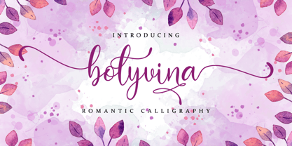 Bolyvina is a beautiful script that feels classy, elegant, and modern. It is perfectly suited for a wide variety of projects! This font is PUA encoded which means you can access all of the magical glyphs and swashes with ease! It also features a wealth of special features including alternate glyphs and ligatures.
 - The Bafger by Muksal Creatives,
$12.00 The Bafger is modern vintage serif font, and The Bafger features unique and modern serif look and feel.is a fancy and modern serif font will elevate a wide variety of projects, from logos and stationery to magazine covers and social media posts. This typeface will take your designs to the next level!
 - Zepto by d[esign],
$- Zepto is about as small as you can get with pixel fonts without sub-pixel rendering. Featured on Make: A tiny screen font you can actually download and use, free. For optimal use, please turn font anti-aliasing off and set at a size of 8px with image resolution set to 72ppi.
 - Prizma2012 by Stereo Type Haus,
$25.00 A futuristic grid-based interpretation of the classic Prisma by Rudolf Koch (1927-29). Prizma2012 breaks away from typical rounded characteristics of most Multiline designs and embraces 45 degree angles, a rigid grid system and open ended terminals. Intended for use at large sizes, the family comes with four weights for optimal impact.
 - Nuff Said by Comicraft,
$19.00Comicraft's President and Tiger Rank-and-File (recently demoted from First Tiger for kissing a girl) stayed up all night with a big box of crayons and created a unique series of illustrations which, we confidently predict, will be widely known as the last word in comic book lettering fonts... 'NUFF SAID! - Futura ND Display by Neufville Digital,
$45.25 Futura Display was designed by Paul Renner in 1932. Its original German name was Futura Schlagzeile, which means “headline”, alluding to its suitability for display use. Its forcefulness and robustness have made it a widely used typeface in film posters, advertising, logos, and music covers. Futura is a Trademark of BauerTypes SL
 - Growling by Alexandr Galuzin,
$26.00 The font is well suited for stencils. Can be successfully used in outdoor advertising, a poster and any large inscription. In small size, font details may be lost. The characteristic stylization of the font makes it possible to use it in a variety of works. There is a regular and oblique outline.
 - Aligarh by NamelaType,
$23.00 Aligarh is a semi-slab serif font formed with a smooth rounded bracket whose edges end with unique shapes, an exploration of combining unique styles in a typefaces. Designed to be used in a variety of media both print and digital media. 18 fonts built from 9 sizes and supported by open types.
 - Ventralie by Din Studio,
$29.00 Ventralie is authentic and modern blackletter font. The font is suitable for any branding project like logo, t-shirt printing and many more. Outstanding in a wide range of contexts. Featured : Alternates Accents (Multilingual characters) PUA encoded Numerals and Punctuation (OpenType Standard) Extra Ornaments Thanks for downloading premium font from Din Studio