10,000 search results
(0.031 seconds)
- Pico by d[esign],
$8.46 Pico is the pixel font that works small and large—from web buttons to LED boards. The native font size is 16px, however you can work within any size that’s a multiple of 2. Pico is featured in the gorgeous mobile game Space Age: A Game of Cosmic Adventure by Big Bucket! The latest version of Pico (1.300) includes a staggering 454 new characters (from 235 to 689)! This update includes support for south eastern European and all new Cyrillic, Hebrew, Greek and math characters. Latin characters and kerning have also been updated and improved for legibility.
 - Good Song by Ocha Puyaber,
$10.00 Good Song is a cursive font based on the USA's teaching script. It can be written in Carolinian, Sioux, Oʼodham, Southern Athabaskan, Hawaiian, and Samoan from USA. It can also be written in Dutch, Maltese, Aymara, Mapuche, Rapa Nui, and other languages. This font family is cute. The style is wide and rounded. It has wide and open loops. The strokes are drawn with a round cap tool, with no contrast. It is cursive and connected. The form is upright. It is easy to read in the USA. Part H has capitals with High starts. Part L has capitals with low starts.
 - Grimmig by Schriftlabor,
$40.00 Grimmig draws inspiration from solid and angular blackletter shapes and the idea of cutting letters out of paper. The interaction between curves, sharp edges, and partially unconventional serif placement makes it an excellent typeface for impactful headlines. The vivid details fade into the background in smaller sizes and provide an enjoyable reading experience for continuous text. Open counters and a large x-height contribute to Grimmig’s legibility in text sizes. It was developed as part of the MA Typeface Design in the University of Reading but had started before as a graduation project for Tamara Pilz.
 - Vivala Marbod by Johannes Hoffmann,
$29.00 Vivala-Marbod is a versatile serif font that boasts a wide range of features and styles. With ten styles and 545 glyphs, the Marbod enables a wide range of applications. Whether subtle headings or easy-to-read body text, Marbod offers the necessary versatility. A set of symbols with fractional numerals, scientific numerals, and matching arrows makes them particularly suitable for informative design. Advanced language support makes it ideal for international projects. In addition to the upright font, Marbod contains a well-developed italic. This is great for making posters, brochures, and corporate designs that need to be precise and stylish.
 - Iwan Zaza Arabic by Zaza type,
$29.00 Iwan Zaza is a high-contrast modern Arabic typeface designed by Ahmed Zaza. The design is inspired by the Kufi calligraphic style and influenced by the Naskh style. Iwan balances classic and contemporary tastes with wide open counters and short ascenders and descenders that minimize the hight. And has a high - contrast between the vertical and the horizontal to line up in harmony with Latin. And openType alternates and ligatures set. This makes it suitable for branding, editorial, packaging and advertising. Iwan features five weights from Light to Black, and supports OpenType features for Arabic, and has a wide glyph set.
 - Proza by Bureau Roffa,
$- Proza is a humanist sans serif typefamily, consisting of 12 styles (6 weights + italics), with roots in serif designs from the Renaissance, such as Garamond and Jenson. Proza was made to function well at a large range of sizes, from the smallest of text sizes, to gigantic posters, making it a highly versatile type family. Its large character set (support for 100+ languages) and opentype features do all the heavy lifting for you, while its elegance and refined details ensure to deliver a punch of class to your designs. A detailed article about the development and design of Proza on ilovetypography.com.
 - Fd Forever Young by Fortunes Co,
$12.00 Forever Young is A disco 70s retro font is a typeface that captures the bold, flashy, and vibrant style of the disco era, which was popular in the 1970s. These fonts are characterized by their unique design elements that reflect the disco culture. with funky shapes Disco fonts often feature unconventional and geometric shapes, such as curves, swirls, and exaggerated serifs. Retro fonts are widely used in various design projects, branding, posters, and packaging to create a sense of nostalgia or capture the essence of a particular era. They are versatile and can be customized to fit a wide range of creative applications.
 - Roadway by K-Type,
$20.00 Roadway is based on U.S. highway lettering observed on New York street signs. Two weights of capitals would often be used on the same sign, condensed for the main name, and a half-size regular superscript for ‘road’ or ’street’. Roadway is a Small Caps font. The upper case consists of condensed capitals, the lower case consists of regular width small caps, sized at 50% and superscript. A small superscript comma and period, aligned with the lowercase, are at keystrokes < and > respectively. A small hyphen lining with the superscript lowercase is at the en dash position (Mac: option hyphen, Windows: alt-0150).
 - Keyboard by Red Rooster Collection,
$45.00 Keyboard is a condensed and elongated Egyptian font family with thin serifs and a large x-height. Its original design was created in 1951 by Stephenson Blake. International TypeFounders, Inc. gained exclusive licensing rights to the Stephenson Blake Collection, and then Paul Hickson (P&P Hickson) and Steve Jackaman (ITF) created its digital form in 1994. Keyboard excels in display and subhead sizes, and brings a formal feel to any project. Its condensed nature gives it great visual density in the bolder weights, and the lighter weights allow it to retain legibility at both small and massive sizes.
 - Monoicono by astroluxtype,
$40.00 Monoicono is a graphics font which contains various iconography related to environmental, health, weather, emergency, quality control, and synergy. There are a total of sixty-six items which includes a light version in the lowercase letters and a bold version in the uppercase letters as well as various numbers that have additional icons. See the poster examples provided for all the dingbats/icons in the font. Recommended size usage would be approximately 62 points or above in size, although some icons will read fine much smaller. Note parenright and left, braceright and left have additional icons.
 - Queen Michelly by Zamjump,
$17.00 Introducing "Queen Michelly" - a Serif font family that's "two-faced" with modern and vintage. If you're using Vintage Retro : Access your OpenType features to access a large selection of alternative fonts and ligatures, pick the font you like from a wide variety of variations to get the vintage look you're looking for. Vary between a light and heavy vintage look based on the number of letters you change. Due to its dual personality, Queen Michelly is a very versatile font, covering a wide variety of projects, from bold magazine images, to wedding invitations, to branding, poster design, and more. Inclouded : - Multilanguage
 - Niveau Grotesk by HVD Fonts,
$40.00 Niveau Grotesk—the companion of Niveau Serif —is a type family of six weights plus matching italics and small caps. It was designed by Hannes von Döhren in 2013. Influenced by classical nineteenth-century faces, the fonts are based on geometric forms. Because of its straight architecture, Niveau Grotesk has a “punch” in big sizes but is very legible in smaller sizes and longer texts—in print or on screen. Niveau Grotesk is equipped for complex, professional typography with alternate letters, arrows, fractions and an extended character set to support Central and Eastern European as well as Western European Languages.
 - JWX Memo by Janworx,
$15.00 Memo, designed by Janet Valdez of Janworx, is a digital version of her own personal penmanship, currently displayed in abundance on sticky notes all over her desk and monitor. Although its basis is in actual handwriting, it's perfectly legible, offering a casual alternative typeface for everyday correspondence or simple things, ranging from event flyers to children's birthday party invitations. Memo performs well at regularly used correspondence sizes, but at a larger size can also be manipulated in graphics software for interesting effects. The letters can be moved randomly from the baseline, overlapped, and then contoured with good results for a casual look.
 - Classic XtraRound by Durotype,
$49.00 Classic XtraRound is a companion typeface to Classic Round, designed by Ben Blom. Although Classic Round has a lot of roundness, Classic XtraRound has more. Classic XtraRound has maximum roundness — no sharp corners, anywhere. Classic XtraRound has maximum roundness — and is still legible. It can be used as an interesting workhorse in small text sizes. It makes eye-catching headlines in big display sizes. Classic XtraRound can be combined in any way with Classic Round, to create an interesting variation and sameness within the same document, brochure, catalog, advertisement, etc. For more information about Classic XtraRound, download the PDF Specimen Manual.
 - Grimmig Variable by Schriftlabor,
$200.00 Grimmig draws inspiration from solid and angular blackletter shapes and the idea of cutting letters out of paper. The interaction between curves, sharp edges, and partially unconventional serif placement makes it an excellent typeface for impactful headlines. The vivid details fade into the background in smaller sizes and provide an enjoyable reading experience for continuous text. Open counters and a large x-height contribute to Grimmig’s legibility in text sizes. It was developed as part of the MA Typeface Design in the University of Reading but had started before as a graduation project for Tamara Pilz.
 - CAL Bodoni Ferrara by California Type Foundry,
$47.00 Bodoni Ferrara™ Fashionable, Luxury Heritage: The Original Bodoni Ferrara Sculpted from hi-res photos and scans of Bodoni's original Ferrara Font—his 1818 Manuale Tipografico and 1768 specimens. It has never before been available. This cut of Bodoni specially selected by Dave Lawrence from rare book specimens. Part of the California Type Foundry Origin Series. 3 Display Fonts in One!! And 6+ style mixes. Bodoni's 1st Draft - Transitional Serif Bodoni was often inspired by French type designs. His first draft of Ferrara was inspired by Pierre Simon Fournier. But Bodoni added his own Italian sensibilities. Bododni’s first, transitional style can pair with humanist sans, and transitional fonts. Bodoni's Rework - Modern Serif Later, Bodoni reworked Ferrara to match the later neo-classic style or modern serif of Firmin Didot¹. Bodoni’s modern style can pair with geometric sans, grotesque sans, neo-grotesque sans, gothic sans, copperplate script, . Informal On™ - Informal Mode by CAL Type Foundry This can pair with “infant” fonts. Geometric sans, and other sans or serifs with one-storied a’s. + Bodoni’s Tivoli a for another option! Works great with Fournier¹ fonts and grotesques, since the terminals will match. Font Pairing Guide This font includes a 78 page Ferrara Pairing Guide. This book shows you 131 pairings with text fonts. 47 pairings with subheader fonts! We want to help you get more out of your font collection. Design Features • Subtle forward angle (0.5-1.5°) makes Ferrara more lively and engaging than most Bodoni or Didot fonts. • Round curves make this font feel letter-pressed. • Bodoni's original tall x-height and slightly condensed proportions: great for headlines, where space is at a premium. • Better uppercase. Uppercase punctuation for design apps. • Proportional oldstyle and lining figures, both modern style and transitional numbers. Every pair of numbers is kerned for display sizes: no unsightly gaps! • Multiple special symbols for whenever you need a design to pop, including 3 of Bodoni’s amazing ampersands. Language Features Latin standard for western European and other languages. +Advanced support for: German, French, Spanish, Portuguese, Italian, and French. Special, uppercase umlauts for titles! Compare to metal Bauer¹ Bodoni! Special context kerning for French, Spanish, Portuguese, Italian, and French, to allow better better words like L'Angelique & “¿Nosotros?”. This kerning gets rid of unsightly gaps between “¿ and other combinations. Can’t Find the Pairing Guide? Can't find the pairing guide? Google “California Type Foundry” and grab the pairing guide. Get another free pro font while you’re there! Ferrara: many sizes, styles, moods and situations. It's a classic, fashionable font for display, headlines, and titles. Grab Ferrara today! ----------- ¹Trademarks of their respective owners. Ferrara™ is a trademark of the California Type Foundry.
 - A10 STAR Black by Mogtahid,
$90.00 As a former typographer / lino and calligrapher, Abdallah NASRI had recourse to the nature of the idea of an "INTERCHANGEABLE" collection for types who in reality offer a police collar parallel to the complex typeface of the variable. Our fashion is outlined by a simple calculation defined by superimposed geometric circles where we used only its ¼ to fill the need for the angles of each of our letters. Always with the idea of having in the same allocated space, the same letter nested as many times as fat example from Hairline to Ultrabold. It was in this way that I was able to obtain a large number of styles, with a very interesting kerning which prompted me to extend the font to other languages with +1000 characters and +600 glyphs. I have always been treasured by the all in "1". I assure you that I sought to obtain the maximum of Visibility for a use S / Titling TV, WEB Pages and Typography Typo; once the difficult thing was done, I was rewarded by a font that has countless typographic openings for the world of graphics with 10 styles of weights in hand, and again I am happy to have personalized the charm of each letter by new details; I do not regret the time spent on thinking about it so that it is useful and at the same time pleasant as a working tool, finally profitable in all sectors and more multilingual, without forgetting that it is a family of inter change c ' is to say: All the types occupy the same height of the body and it is their fats which differs in the same space width of each of the letters, therefore no interference in spacing. Here, an additional alternative, a participation of a septuagenarian in the service of the love of modern digital typography. • TEST: At 50% screen in a body of 12 pixels, the A10 STAR Alphabet subjected to a test, has a clear Readability / Visibility. • P.S: A10 STAR integrates Diacriticism in all its forms. Texte d'origine : Abdallah NASRI a eu recours en étant ancien typographe/lino et calligraphe à la nature de l'idée d'une collection "INTERCHANGEABLE" pour les types qui en réalité offre un collier de police parallèle à la fonte complexe du variable. Notre mode est esquissé par un calcul simple défini par des ronds géométrique superposés où on a utilisé seulement son ¼ pour garnir le besoin des angles de chacune de nos lettres. Toujours dans l’idée à avoir dans le même espacement alloué, la même lettre imbriquée autant de fois de graisse exemple du Hairline à Ultrabold. C’est de cette manière que j’ai pu obtenir un grand nombre de styles, avec un crénage très intéressant ce qui m’a incité à étendre la police à d’autres langues avec +1000 caractères et +600 glyphes. J’ai toujours été prisé par le tout en « 1 ». Je vous assure que j’ai cherché à obtenir le maximum de Visibilité pour une utilisation S/Titrage TV, Pages WEB et Maquette typo ; une fois le difficile fait, j’ai été récompensé par une police qui possède d’innombrable ouverture typographique pour le monde du Graphisme avec comme atout en main 10 styles de graisses, et encore je suis content pour avoir personnalisé le charme de chaque lettre par des détails nouveaux ; je ne regrette pas le temps passé dessus à réfléchir pour qu’il soit utile et à la fois agréable comme outil de travail, enfin profitable tous secteurs confondus et en plus multilingue, sans oublié que c’est une famille d’inter change c’est-à-dire : Tous les types occupent la même hauteur du corps et c'est leurs graisses qui diffère dans un même espace largeur de chacune des lettres, donc aucune interférence dans l’espacement. Voilà, une alternative supplémentaire, une participation d’un septuagénaire au service de l’amour de la typographie numérique moderne. • TEST : A 50% d'écran dans un corps de 12 pixels, l'Alphabet A10 STAR soumise a un test, présente une nette Lisibilité / Visibilité. • P.S : A10 STAR intégre la Diacritique dans toutes ses formes.
 - Blacker Pro by Zetafonts,
$39.00 Blacker Pro is the revised and extended version of the original wedge serif type family designed by Cosimo Lorenzo Pancini and Andrea Tartarelli in 2017. Blacker was developed as a take on the style that Jeremiah Shoaf has defined as the "evil serif" genre: typefaces with high contrast, oldstyle or modern serif proportions and sharp, blade-like triangular serifs. Due to the high contrast in the design - slightly reminescent of didone typefaces - Blacker has been developed in two optical subfamilies. The display version offers tighter tracking, higher contrast and sharper corners for maximum effect at big sizes, while the text variant offers better readability and screen rendering at smaller sizes, with lower contrast and looser spacing. In the pro version, two additional condensed variant families have been added (condensed display and condensed text) allowing for more freedom and versatility in typesetting where space constraints are present. Also, three titling uppercase-only variants have been added, with a slightly extended feel, and two decorative subfamilies (inline and diamond). Each of these seven variants has been developed in six weights from light to heavy, with matching italics, for a total of 69 styles covering a wide range of editorial and advertising uses. All Blacker Pro feature a revised and extended character set covering over two hundred languages using the latin, cyrillic and greek alphabets. Open type features include small caps, positional numerals, fractions, superior & inferior figures, alternate forms, and an extended set of standard and discretionary ligatures. With its bold personality, Blacker aims to be a modern classic used for bold statements and self-conscious brands, making your text look great both on paper and on the screens.
 - ITC Tactile by ITC,
$29.99ITC Tactile is a puzzle of subtle typographic contradictions. Capitals have traditional epigraphic proportions, but the lowercase has a uniform optical width. Light weights are stately and elegant, but bold designs are almost jolly. This paradoxical alphabet even combines two distinctively different serif designs. Designer Joe Stitzlein says, “I wanted to create a modern and dynamic serif face that draws its forms from antiquity. I also wanted to have as much fun as possible with the drawing and architecture of each letter. Hopefully I've created a very legible typeface that grabs the reader's eye in a nice, 'tactile' way.” The apparent inconsistencies of the design are the result of careful consideration. Of the seemingly odd serif design, Stitzlein explains, “The transitional serif is an entry point for the eye into the letterform, and the long slab is an exit, leading to the next letter.” The result is a typeface that's easy to read at text sizes but offers surprising details when enlarged to display sizes, setting ITC Tactile apart from more traditional designs. While this is his first commercial typeface design, Stitzlein has ample experience creating custom typefaces for corporate branding, including companies such as Silicon Graphics and Sempra Energy. His graphic design business has served a wide range of clients, including Apple Computer and the 2002 Salt Lake City Olympics. The ITC Tactile family is available in three weights, with complementary italic designs and a suite of small caps for each of the roman designs. Stitzlein drew the small caps to match the height of the lowercase x-height, which enables “bi-form” or “unicase” setting in display copy. - Barokah by Alifinart Studio,
$14.00 Do you want to create a design with a luxurious and casual style? Barokah Serif Font is the best choice. This is a modern display font has a lot of ligature for uppercase and lowercase. This serif font are perfect for luxury projects and will keep your creativity flowing. Typeface Story In 2021, we released Barokah Script and at that time a lot of people loved it. However, we feel that Barokah Script should be combined with a serif font with a luxurious and casual style, so that it will become a popular for everyone. That's why, today—after 1 year—we are releasing Barokah Serif, as the best match for Barokah Script. Why Barokah Serif Font? Barokah Serif is a font with a myriad of ligatures, both uppercase and lowercase. In this font, there are Stylistic Alternates for each capital letter with an authentic and elegant design. In the lowercase letters you will find an amazing variety of ligatures and in a luxurious style. This will make each of your designs look elegant and classy. For ease of use, we divide it into two; Standard and Discretionary Ligatures. Features: - Uppercase and lowercase letters - Numbers and punctuation - Lots of ligatures for uppercase and lowercase - Stylistic Alternates for each capital letter - True type hinting - Multilingual Standard and Discretionary Ligatures Standard and Discretionary Ligatures are available for the following letter combinations: LA LI LU LE LO LL RA RI RU RE RO KA KI KU KE KO XA XI XU XE XO ZA ZI ZU ZE ZO RS AS MS KS HS EV EW DO OC OG DG OO OQ TT NN WWW SS Th fi ff ffi fj ffj ft fl ffl fb ffb fh ffh fk ffk ſi ſſ ſſi ſl ſſl ſt ct st tt an ah am ap ar ab en eh em ep er eb cn ch cm cp cr cb un uh um up u rub gi gj ti tti tj ss ri rj www Language Supports Afrikaans, Albanian, Asu, Basque, Bemba, Bena, Breton, Catalan, Chiga, Colognian, Cornish, Croatian, Czech, Danish, Dutch, Embu, English, Esperanto, Estonian, Faroese, Filipino, Finnish, French, Friulian, Galician, German, Gusii, Hungarian, Indonesian, Irish, Italian, Kabuverdianu, Kalaallisut, Kalenjin, Kamba, Kikuyu, Kinyarwanda, Latvian, Lithuanian, Lower Sorbian, Luo, Luxembourgish, Luyia, Machame, Makhuwa-Meetto, Makonde, Malagasy, Maltese, Manx, Meru, Morisyen, North Ndebele, Norwegian Bokmål, Norwegian Nynorsk, Nyankole, Oromo, Polish, Portuguese, Quechua, Romanian, Romansh, Rombo, Rundi, Rwa, Samburu, Sango, Sangu, Scottish Gaelic, Sena, Serbian, Shambala, Shona, Slovak, Soga, Somali, Spanish, Swahili, Swedish, Swiss German, Taita, Teso, Turkish, Upper Sorbian, Uzbek (Latin), Volapük, Vunjo, Walser, Zulu Suggested Uses Perfect for branding projects, logo or logotype, promotion, book cover, invitation, letterhead, website, and more. Conclusion Barokah Serif is a luxurious authentic font and a must-have in your font collection. Get the Barokah Serif Font now… ----------------------------------- Alifinart Studio alifinart@gmail.com Instagram | Behance
 - Mon Nicolette by Sudtipos,
$49.00 This is a digital revival by Cristóbal Henestrosa based on an experimental typeface named Charter, designed – yet never fully accomplished – by the prominent William Addison Dwiggins. It is an upright italic, unconnected script typeface, whose main features are a pronounced contrast, condensed forms and exaggerated ascenders. While Dwiggins worked on this project from 1937 to 1955, he only completed the lowercase and a few other characters. However, it was used to set a specimen in 1942 and a short novel in 1946. The sources that Cristóbal used for Mon Nicolette were the original sketches by WAD as well as printing trails kept at the Boston Public Library, and a copy of the 1946 edition of The Song-Story of Aucassin and Nicolette. This gorgeous typeface can be used successfully in headlines, subheads and short passages of text from 12 points onwards, in applications such as fashion magazines, soft news, advertising, poetry, albums, and book covers. This project started ten years ago, while Cristóbal was studying the Type@Cooper Extended Program at New York City. A previous version was selected to be part of the Biennial Tipos Latinos 2018, and now Mon Nicolette is finally ready for commercial distribution with Sudtipos… and we are very proud of it! Festina lente.
 - Frutiger Capitalis by Linotype,
$29.00Frutiger Capitalis Regular and Outline belong to the group of typefaces for the Linotype’s Type Before Gutenberg project. However, they are not based on direct historical sources. At first glance, they may seem related to the roman type Capitalis Monumentalis, but upon closer examination, the fonts reveal a vitality unknown to the characters the Romans etched in stone. Frutiger confesses that creating Capitalis was “a liberation”. After working on so many sophisticated and meticulously designed typefaces, Frutiger Capitalis was a breath of fresh air. Stylistically, Frutiger Capitalis Outline forms a bridge to Frutiger Capitalis Signs, a whole universe of its own. Frutiger Capitalis Signs is a personal cosmos of symbols, many are immediately “legible”, others leave room for interpretation. Some of the symbols are the product of Frutiger’s imagination, such as his “Life Signs” — soft, hand drawn figures whose lines have no apparent beginning or end, creating both interior and exterior spaces, new forms emerging at each glance. These contoured drawings have accompanied Frutiger throughout his professional life, a fantasy garden which has provided an important balance to his many years of disciplined typeface design. Yet he does not consider himself an artist. Frutiger says he simply “wants to tell stories, to draw thin lines, create contours of signs; that is my style”. - Zapf Essentials by Linotype,
$29.99Linotype Zapf Essentials is the modernized version of Zapf Dingbats and was also designed by Hermann Zapf himself. Over 372 characters and symbols are included within six fonts and make life a little more communicative, a little more informative, and a lot more interesting. The fonts contain symbols for both professional and everyday uses. With their markers, ornaments and arrows they are informative as well as versatile, timeless and lively. An interesting note to the story of Zapf Essentials: in 1977, Hermann Zapf created about 1000 sketches of signs and symbols. ITC chose those which became known around the world as Zapf Dingbats. For a typesetter, dingbats are the characters in the corner of the type box which can be used for just about anything. The last decade has seen the appearance of new symbols for e-mail, fax, mobile phones and other developments. These are now part of Linotype Zapf Essentials, just as they are now a part of everyday life. For a quick overview of the different Linotype Essentials variations, see the keyboard layout PDF in the Gallery section. It shows the keyboard layout of each font. A helpful hint from Hermann Zapf: Linotype Zapf Essentials should be used sparingly so that the characters retain their emphasis. - Gyllene Elgen by Mans Greback,
$69.00 Gyllene Elgen, created by Mans Greback, is a delicate and captivating handwriting font that exudes romance and charm. With its thin, beautiful lines, and loopy, decorative swirls, this typeface brings a touch of elegance and sophistication to your design projects. Perfect for invitations, personal notes, and other heartfelt communications, Gyllene Elgen captures the essence of delicate, handcrafted beauty. The font was inspired by the golden hues of the Swedish landscape during autumn, as well as the mythical golden elk that roams the forests. Mans Greback sought to bring this enchanting story to life through the graceful curves and fine details of Gyllene Elgen. The font is built with advanced OpenType functionality and has a guaranteed top-notch quality, containing stylistic and contextual alternates, ligatures, and more features; all to give you full control and customizability. It has extensive lingual support, covering all Latin-based languages, from Northern Europe to South Africa, from America to South-East Asia. It contains all characters and symbols you'll ever need, including all punctuation and numbers. Mans Greback is a Swedish typeface designer, celebrated for his innovative and diverse portfolio. With a keen eye for detail and innovative designs, Mans has earned a reputation for creating fonts that resonate with people across the globe, inspiring creativity and capturing the imagination.
 - Thalweg Poetica by Ani Dimitrova,
$29.00 Thalweg Poetica is a revival font that comes with a story created in 1993 by the Bulgarian artist Ivan Kyosev. It is a sequel to the Thalweg font family completed in 2020. The construction of characters combines the upright character of the Thalweg font and the handwritten character of Thalweg Italic. The font partners perfectly with the Talweg font family and gives designers a new opportunity for expression. Thalweg Poetica contains 4 widths / Normal, Semi Condensed, Condensed & Extra Condensed / and 8 weights ranging from Thin to Black with small caps versions, each style containing more than 1100 glyphs. The font comes with extended coverage of the Latin, Cyrillic, and Greek Scripts. All of the weights are specifically equipped for complex, professional typography with Open Type Features. These features include Small Caps, Ligatures, Discretionary Ligatures, Superscript, Subscript, Tabular Figures, Old-Style Figures, Circled Figures, Arrows, Matching currency symbols, and fraction. The Thalweg Poetica family is ideally suited for small text, books and magazines, branding, posters, as well as web and screen design, headlines, and more. The Regular and Medium weights are perfect for body text and they give an interesting texture to the text. The range of styles gives good flexibility to this family.
 - AtomBomb - Unknown license

- Caster by Mans Greback,
$59.00 Caster is a thick poster script, created by Måns Grebäck during 2019. It is a high quality typeface and has energetic, drama-filled letter forms. It contains all necessary symbols and supports a wide range of languages.
 - Be Kind by Seemly Fonts,
$12.00 Be Kind is a sweet and simple handwritten font. Its friendly feel makes this font incredibly versatile, fitting a wide range of contexts. Add it to your creative ideas and notice how it makes them stand out!
 - Glorita by Gerald Gallo,
$20.00 Glorita is an original, clean and crisp, sans serif condensed font, excellent for text and at large sizes an effective display font. The font includes upper and lowercase alphabets, numbers, punctuation, accented characters, symbols, and miscellaneous characters.
 - Display Magazine by Letterena Studios,
$10.00 Display Magazine is a bold, distinct and assertive serif font. This font is imposing and features uniquely shaped letters, and as a result, it will easily match a wide range of creations that require a distinct touch.
 - Forestland by Brithos Type,
$11.00 Forestland simplifies elegance into one truly outstanding handwritten font. It maintains its classy calligraphic influences while feeling contemporary and fresh. This versatility will appeal to a wide range of crafty ideas, from letterheads and titles, to stationery.
 - Cute Lime by Sipanji21,
$10.00 Cute Lime is a bold and colorful display font. Its friendly feel makes this font incredibly versatile, fitting a wide range of contexts. Add it to your creative ideas and notice how it makes them stand out!
 - Allamanda by Illushvara,
$15.00 Allamanda simplifies elegance into one truly outstanding handwritten font. It maintains its classy calligraphic influences while feeling contemporary and fresh. This versatility will appeal to a wide range of crafty ideas, from letterheads and titles, to stationery.
 - Refracta by ITC,
$29.00Refracta is the work of British designer Martin Wait, a simple, condensed italic sans serif capital alphabet. The letterforms were designed with a shadow effect for extra impact. Refracta is ideal for a wide variety of applications. - Super Kids by Stringlabs Creative Studio,
$29.00 Super Kids is a playful, and quirky display font. Its friendly feel makes this font incredibly versatile, fitting a wide range of contexts. Add it to your creative ideas and notice how it makes them stand out!
 - The Hungary by Skiiller Studio,
$20.00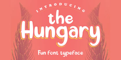 The Hungary is a playful display font with a friendly style. It is perfectly suited for a wide variety of projects! What's include: Ligature PUA Encoded Characters - Fully accessible without additional design software.\ Basic Latin Language Support
 - Scholastica by Balpirick,
$15.00 Scholastica simplifies elegance into one truly outstanding handwritten font. It maintains its classy calligraphic influences while feeling contemporary and fresh. This versatility will appeal to a wide range of crafty ideas, from letterheads and titles, to stationery.
 - Banyu langits by Stringlabs Creative Studio,
$29.00 Banyu Langits is a cute and quirky display font. Its friendly feel makes this font incredibly versatile, fitting a wide range of contexts. Add it to your creative ideas and notice how it makes them stand out!
 - Chicken Salad by PizzaDude.dk,
$20.00 Chicken Salad is a playful and easy going sans serif font. A closer look reveals influences from both graffiti and comics. This font works very well in small and large sizes and in both lower and uppercase!
 - Toley Hand by Mans Greback,
$59.00 Toley Hand is a bold handwritten typeface, created by Måns Grebäck in 2019. The comic-style script is light-hearted while being quick and energetic. It contains all necessary symbols and supports a wide range of languages.
