570 search results
(0.008 seconds)
- Pixel - Personal use only
- Deadspace by Tension Type,
$15.00 - Interlace by Holland Fonts,
$30.00 - FF Bauer Grotesk by FontFont,
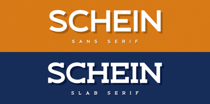
$50.99 - Schein by Almarkha Type,
$29.00 - Pretendo - Personal use only
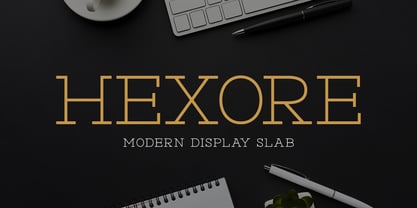
- Hexore by Almarkha Type,
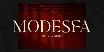
$29.00 - Modesfa by Almarkha Type,
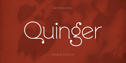
$33.00 - Quinger by Almarkha Type,
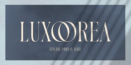
$33.00 - Luxoorea by Almarkha Type,
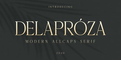
$25.00 - Delaproza by Almarkha Type,
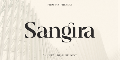
$29.00 - Sangira by Almarkha Type,
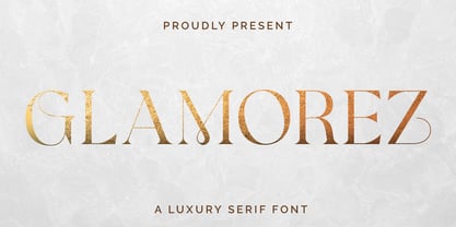
$29.00 - Glamorez by Almarkha Type,
$35.00 - GodOfWar - Unknown license
- SF Intellivised - Unknown license
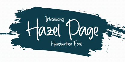
- Hazel Page by Fromletterel,
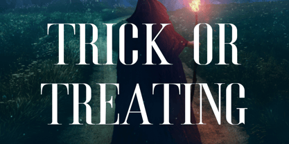
$14.00 - Trick Or Treating by Graphicxell,
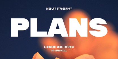
$19.00 - Plans by Graphicxell,
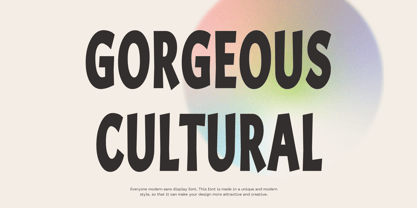
$19.00 - Gorgeous Cultural by Graphicxell,
$19.00 - 1up by Fly Fonts,
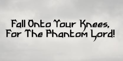
$15.00 - Phantom Lord by Subversive Type,
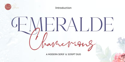
$13.00 - Emeralde Chamerions by Almarkha Type,
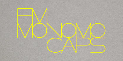
$29.00 - FM Monomo by FontMeister,
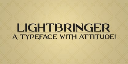
$19.95 - Lightbringer by Subversive Type,
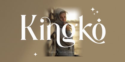
$13.00 - Kingko by Graphicxell,
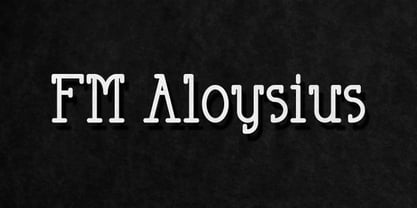
$20.00 - FM Aloysius by FontMeister,
$24.95 - Bloop by Robert Petrick,
$19.95 - Aloha - Unknown license
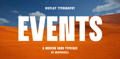
- Events by Graphicxell,
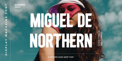
$20.00 - Miguel De Northern by Graphicxell,
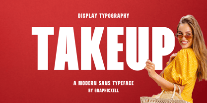
$20.00 - Takeup by Graphicxell,
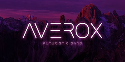
$20.00 - Averox by Almarkha Type,
$29.00 - KoreanJeju by Beewest Studio,
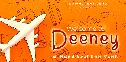
$10.00 - Deeney by DawnCreative.Id,
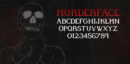
$13.00 - Murder Face by Subversive Type,
$13.00 - DM PopCap by DM Founts,
$20.00 - Dismedia by Lee Mounsey,
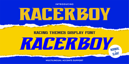
$13.95 - Racerboy by Gassstype,
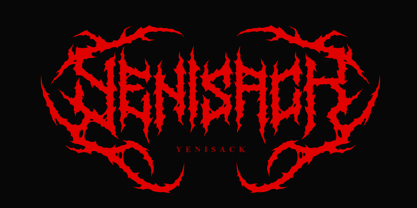
$27.00 - Yenisack by Madhaline Studio,
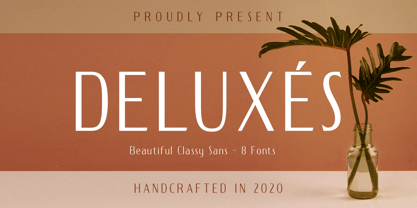
$29.00 - Deluxes by Almarkha Type,
$29.00

