10,000 search results
(0.013 seconds)
- Antipol VF by phospho,
$75.00 - Megaverse VF by jpFonts,
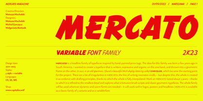
$249.00 - Mercato VF by Borutta Group,
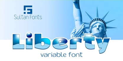
$79.00 - SF Liberty VF by Sultan Fonts,
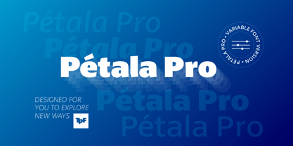
$180.00 - Petala Pro VF by Typefolio,
$129.50 - Sana Sans by Latinotype,
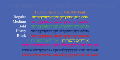
$29.00 - Hebrew Esther Tanach VF by Samtype,
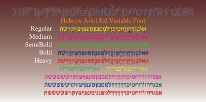
$495.00 - Hebrew Moses Std VF by Samtype,
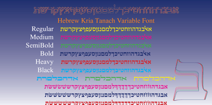
$120.00 - Hebrew Kria Tanach VF by Samtype,
$360.00 - Jacinto Sans - Unknown license
- Cocaine Sans - Unknown license
- Idealist Sans - 100% free
- Mobile Sans - Personal use only
- Reactor Sans - 100% free
- Obti Sans - 100% free
- Droid Sans - 100% free
- Obcecada Sans - Personal use only
- Azoft Sans - 100% free
- Happy Sans - Personal use only
- DejaVu Sans - Unknown license
- Seattle Sans - Unknown license
- Averia Sans - Unknown license
- Saiyan Sans - Unknown license
- Liberation Sans - 100% free
- Casa Sans - 100% free
- San Remo - Personal use only
- Aurulent Sans - Unknown license
- gridbreak sans - Unknown license
- Fil Sans - Unknown license
- Sans Culottes - Unknown license
- Grill Sans - Unknown license
- Philly Sans - Unknown license
- Stewart Sans - Unknown license
- Amerika Sans - Unknown license
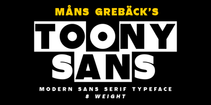
- Toony Sans by Mans Greback,
$59.00 - Hiragino Sans by SCREEN Graphic Solutions,
$210.00 - Prima Sans by Bitstream,
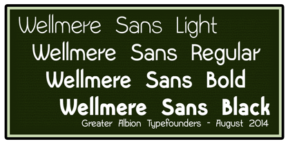
$29.99 - Wellmere Sans by Greater Albion Typefounders,
$16.00 - Decary Sans by Mans Greback,
$49.00 - San Jose by Graffiti Fonts,
$19.99
Page 1 of 250Next page


