3,678 search results
(0.043 seconds)
- UCT Found Receipt by uppercaseTYPE,
$12.99 - Reporter-Two - Unknown license
- TeamSpirit - 100% free
- Hornswoggled - 100% free
- Alpine 7558S - Unknown license
- Underground - Unknown license
- Poseidon - Unknown license
- HerzogVonGraf - 100% free
- MND Pinballer Fill - Unknown license
- DSJapanCyr - Unknown license
- SolsticeOfSuffering - Unknown license
- Aleia - Unknown license
- Fat Lefty - Unknown license
- Ruffian bold - Unknown license
- Alpine 7558M - Unknown license
- Nora - Unknown license
- Ruffian Outline - Unknown license
- SpiceGrrl - Unknown license
- Al Seg33 by Nihar Mazumdar,
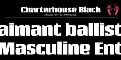
$1.00 - Charterhouse by Device,
$29.00 - Richfont BT by Bitstream,
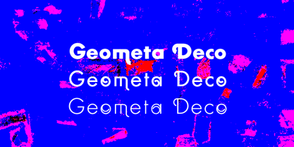
$50.99 - Geometa Deco by Wiescher Design,
$39.50 - Black Shirt Slime Trail - Unknown license
- Fish in the bathroom - Unknown license
- Elliot's Bad Day - Unknown license
- Wet Paint - Unknown license
- FL Peekababy! - Unknown license
- Jerkoff - Unknown license
- Starberry Swirl Whipped Delight - Unknown license
- punk rock rummage sale - Unknown license
- Blob - Unknown license
- Scrawl Of The Chief - Unknown license
- Wavy - Unknown license
- Gara Gara by Daylight Fonts,
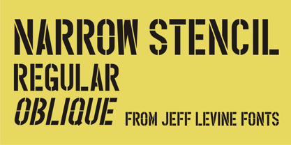
$50.00 - Narrow Stencil JNL by Jeff Levine,
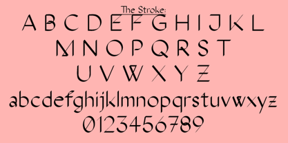
$29.00 - The Stroke Sans by ABSTRKT,
$35.00 - Penny by Wooden Type Fonts,
$20.00 - Shopkeeper JNL by Jeff Levine,
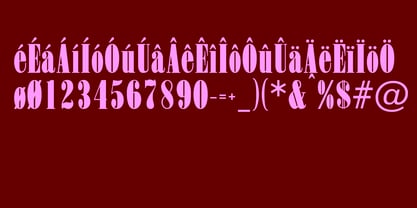
$29.00 - Olympian by Linotype,
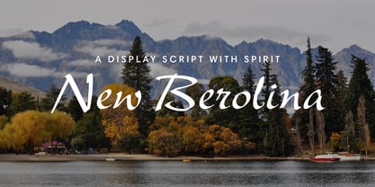
$29.99 - New Berolina MT by Monotype,
$29.99


