10,000 search results
(0.033 seconds)
- Gradl Highstep by HiH,
$8.00 Gradl Highstep is an archetypical Art Nouveau face by the prolific and mysterious Max Joseph Gradl. It epitomizes the visual language of elegance and sophistication. It seems strange that so little information is available today about Max Gradl: He seems to have been well known in his day. In addition to his jewelry design, he did advertising work for customers in Naples, London and New York in addition to customers in cities all over Germany. Gradl Highstep is an all-cap font with a wide range of ligatures: 094=SA, 123=CH, 125=CK, 126=TS, 167=FA, 172=PA, 177=TA, 188=WA and 190=YA. In addtion, 137=Gradl’s dated monogram “MJG 1903,” 175=LLC abbreviation, 181=alternate S. This is a subtle font with thin, variable strokes. It is best used at 28 points and larger to give it the presence it needs to be be appreciated. Gradl Highstep Initials is a companion font, incorporating a deft line drawing of a fashionable woman of the period who is every bit as elegant as the underlying font.
 - 1456 Gutenberg B42 Pro by GLC,
$42.00 Is it necessary to tell the Gutenberg story? 1456 Gutenberg Pro is the second Gutenberg typeface produced by GLC foundry (look at our 1456 Gutenberg). This font was created from the so called "B42" character set used for the two Gutenberg Latin Bibles (42 and 36 lines), but with a better and finer design than in our first version, more faithful to the finest original printed books appearance. We offer also now a larger choice of the original ligatures and Latin abbreviations, as complete as possible to be usable with OTF specifications. The complete basic alphabet (with "long s" naturally)is strictly looking like the real one (including the curious twisted "X"). We have only recreated the capitals W and J, who was not existing in the time. The numerals, no more existing in the original type set, were inspired from those in use a few years later by early following printers, but matching with the Gutenberg font's pattern. The font includes West (including Celtic), East, Central European, Baltic and Turkish glyphs.
 - Vega VW SB by Scangraphic Digital Type Collection,
$26.00 Since the release of these fonts most typefaces in the Scangraphic Type Collection appear in two versions. One is designed specifically for headline typesetting (SH: Scangraphic Headline Types) and one specifically for text typesetting (SB Scangraphic Bodytypes). The most obvious differentiation can be found in the spacing. That of the Bodytypes is adjusted for readability. That of the Headline Types is decidedly more narrow in order to do justice to the requirements of headline typesetting. The kerning tables, as well, have been individualized for each of these type varieties. In addition to the adjustment of spacing, there are also adjustments in the design. For the Bodytypes, fine spaces were created which prevented the smear effect on acute angles in small typesizes. For a number of Bodytypes, hairlines and serifs were thickened or the whole typeface was adjusted to meet the optical requirements for setting type in small sizes. For the German lower-case diacritical marks, all Headline Types complements contain alternative integrated accents which allow the compact setting of lower-case headlines.
 - Century Old Style SB by Scangraphic Digital Type Collection,
$26.00Since the release of these fonts most typefaces in the Scangraphic Type Collection appear in two versions. One is designed specifically for headline typesetting (SH: Scangraphic Headline Types) and one specifically for text typesetting (SB Scangraphic Bodytypes). The most obvious differentiation can be found in the spacing. That of the Bodytypes is adjusted for readability. That of the Headline Types is decidedly more narrow in order to do justice to the requirements of headline typesetting. The kerning tables, as well, have been individualized for each of these type varieties. In addition to the adjustment of spacing, there are also adjustments in the design. For the Bodytypes, fine spaces were created which prevented the smear effect on acute angles in small typesizes. For a number of Bodytypes, hairlines and serifs were thickened or the whole typeface was adjusted to meet the optical requirements for setting type in small sizes. For the German lower-case diacritical marks, all Headline Types complements contain alternative integrated accents which allow the compact setting of lower-case headlines. - Molandika Script by Great Studio,
$16.00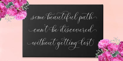 Molandika Script is elegant calligraphy font, designed to convey elegance and style. It is slender, feminine and friendly, This font is casual and pretty with swashes. Can used for various purposes. such as logos, product packaging, wedding invitations, branding, headlines, signage, labels, signatures, book covers, posters, quotes and more. Molandika Script features OpenType stylistic alternates, ligatures and International support for most Western Languages is included. To enable the OpenType Stylistic alternates, you need a program that supports OpenType features such as Adobe Illustrator CS, Adobe Indesign & CorelDraw X6-X7, Microsoft Word 2010 or later versions. How to access all alternative characters using Adobe Illustrator : https://www.youtube.com/watch?v=XzwjMkbB-wQ Molandika Script is coded with PUA Unicode, which allows full access to all the extra characters without having special designing software. Mac users can use Font Book , and Windows users can use Character Map to view and copy any of the extra characters to paste into your favourite text editor/app. How to access all alternative characters, using Windows Character Map with Photoshop : https://www.youtube.com/watch?v=Go9vacoYmBw
 - Pacific Clipper SG by Spiece Graphics,
$39.00 Pacific Clipper has its roots in an old 1930s showcard lettering style. An extra bold version of this sign painter’s relic is shown in Carl Holmes' wonderful book on lettering. It may be described as what happens when Rudolf Koch's Kabel Heavy meets ATF's Novel Gothic. Also known as Sam’s Tune, Pacific Clipper’s noteworthy features include wedged crossbars in the capital A, E, F, and H. Overcurving is present in the capital B, D, P, and R while vertical strokes in the lowercase b, d, h, k, l, and t are chopped off obliquely. Figures in Pacific Clipper are also refreshingly different, particularly the number 4. This lettering favorite turned retro typeface has been extended to include a variety of weights. Pacific Clipper is now available in the OpenType format. Some new characters have been added to this OpenType version as Stylistic Alternates and Historical Forms. These advanced features work in current versions of Adobe Creative Suite InDesign, Creative Suite Illustrator, and Quark XPress. Check for OpenType advanced feature support in other applications as it gradually becomes available with upgrades.
 - Trieste SB by Scangraphic Digital Type Collection,
$26.00 Since the release of these fonts most typefaces in the Scangraphic Type Collection appear in two versions. One is designed specifically for headline typesetting (SH: Scangraphic Headline Types) and one specifically for text typesetting (SB Scangraphic Bodytypes). The most obvious differentiation can be found in the spacing. That of the Bodytypes is adjusted for readability. That of the Headline Types is decidedly more narrow in order to do justice to the requirements of headline typesetting. The kerning tables, as well, have been individualized for each of these type varieties. In addition to the adjustment of spacing, there are also adjustments in the design. For the Bodytypes, fine spaces were created which prevented the smear effect on acute angles in small typesizes. For a number of Bodytypes, hairlines and serifs were thickened or the whole typeface was adjusted to meet the optical requirements for setting type in small sizes. For the German lower-case diacritical marks, all Headline Types complements contain alternative integrated accents which allow the compact setting of lower-case headlines.
 - Infantometric Pro by CheapProFonts,
$10.00 The unicase height, condensed forms and playful mix of geometric construction and childish letterforms gives these fonts a naïve and charming expression. Part infantile, part geometric - it's Infantometric! ALL fonts from CheapProFonts have very extensive language support: They contain some unusual diacritic letters (some of which are contained in the Latin Extended-B Unicode block) supporting: Cornish, Filipino (Tagalog), Guarani, Luxembourgian, Malagasy, Romanian, Ulithian and Welsh. They also contain all glyphs in the Latin Extended-A Unicode block (which among others cover the Central European and Baltic areas) supporting: Afrikaans, Belarusian (Lacinka), Bosnian, Catalan, Chichewa, Croatian, Czech, Dutch, Esperanto, Greenlandic, Hungarian, Kashubian, Kurdish (Kurmanji), Latvian, Lithuanian, Maltese, Maori, Polish, Saami (Inari), Saami (North), Serbian (latin), Slovak(ian), Slovene, Sorbian (Lower), Sorbian (Upper), Turkish and Turkmen. And they of course contain all the usual "western" glyphs supporting: Albanian, Basque, Breton, Chamorro, Danish, Estonian, Faroese, Finnish, French, Frisian, Galican, German, Icelandic, Indonesian, Irish (Gaelic), Italian, Northern Sotho, Norwegian, Occitan, Portuguese, Rhaeto-Romance, Sami (Lule), Sami (South), Scots (Gaelic), Spanish, Swedish, Tswana, Walloon and Yapese.
 - OCR B SB by Scangraphic Digital Type Collection,
$26.00Since the release of these fonts most typefaces in the Scangraphic Type Collection appear in two versions. One is designed specifically for headline typesetting (SH: Scangraphic Headline Types) and one specifically for text typesetting (SB Scangraphic Bodytypes). The most obvious differentiation can be found in the spacing. That of the Bodytypes is adjusted for readability. That of the Headline Types is decidedly more narrow in order to do justice to the requirements of headline typesetting. The kerning tables, as well, have been individualized for each of these type varieties. In addition to the adjustment of spacing, there are also adjustments in the design. For the Bodytypes, fine spaces were created which prevented the smear effect on acute angles in small typesizes. For a number of Bodytypes, hairlines and serifs were thickened or the whole typeface was adjusted to meet the optical requirements for setting type in small sizes. For the German lower-case diacritical marks, all Headline Types complements contain alternative integrated accents which allow the compact setting of lower-case headlines. - Walbaum Fraktur SB by Scangraphic Digital Type Collection,
$26.00 Since the release of these fonts most typefaces in the Scangraphic Type Collection appear in two versions. One is designed specifically for headline typesetting (SH: Scangraphic Headline Types) and one specifically for text typesetting (SB Scangraphic Bodytypes). The most obvious differentiation can be found in the spacing. That of the Bodytypes is adjusted for readability. That of the Headline Types is decidedly more narrow in order to do justice to the requirements of headline typesetting. The kerning tables, as well, have been individualized for each of these type varieties. In addition to the adjustment of spacing, there are also adjustments in the design. For the Bodytypes, fine spaces were created which prevented the smear effect on acute angles in small typesizes. For a number of Bodytypes, hairlines and serifs were thickened or the whole typeface was adjusted to meet the optical requirements for setting type in small sizes. For the German lower-case diacritical marks, all Headline Types complements contain alternative integrated accents which allow the compact setting of lower-case headlines.
 - Century Nova SB by Scangraphic Digital Type Collection,
$26.00 Since the release of these fonts most typefaces in the Scangraphic Type Collection appear in two versions. One is designed specifically for headline typesetting (SH: Scangraphic Headline Types) and one specifically for text typesetting (SB Scangraphic Bodytypes). The most obvious differentiation can be found in the spacing. That of the Bodytypes is adjusted for readability. That of the Headline Types is decidedly more narrow in order to do justice to the requirements of headline typesetting. The kerning tables, as well, have been individualized for each of these type varieties. In addition to the adjustment of spacing, there are also adjustments in the design. For the Bodytypes, fine spaces were created which prevented the smear effect on acute angles in small typesizes. For a number of Bodytypes, hairlines and serifs were thickened or the whole typeface was adjusted to meet the optical requirements for setting type in small sizes. For the German lower-case diacritical marks, all Headline Types complements contain alternative integrated accents which allow the compact setting of lower-case headlines.
 - Commercial Script SB by Scangraphic Digital Type Collection,
$26.00Since the release of these fonts most typefaces in the Scangraphic Type Collection appear in two versions. One is designed specifically for headline typesetting (SH: Scangraphic Headline Types) and one specifically for text typesetting (SB Scangraphic Bodytypes). The most obvious differentiation can be found in the spacing. That of the Bodytypes is adjusted for readability. That of the Headline Types is decidedly more narrow in order to do justice to the requirements of headline typesetting. The kerning tables, as well, have been individualized for each of these type varieties. In addition to the adjustment of spacing, there are also adjustments in the design. For the Bodytypes, fine spaces were created which prevented the smear effect on acute angles in small typesizes. For a number of Bodytypes, hairlines and serifs were thickened or the whole typeface was adjusted to meet the optical requirements for setting type in small sizes. For the German lower-case diacritical marks, all Headline Types complements contain alternative integrated accents which allow the compact setting of lower-case headlines. - Europa Grotesk No. 2 SH by Scangraphic Digital Type Collection,
$26.00 Since the release of these fonts most typefaces in the Scangraphic Type Collection appear in two versions. One is designed specifically for headline typesetting (SH: Scangraphic Headline Types) and one specifically for text typesetting (SB Scangraphic Bodytypes). The most obvious differentiation can be found in the spacing. That of the Bodytypes is adjusted for readability. That of the Headline Types is decidedly more narrow in order to do justice to the requirements of headline typesetting. The kerning tables, as well, have been individualized for each of these type varieties. In addition to the adjustment of spacing, there are also adjustments in the design. For the Bodytypes, fine spaces were created which prevented the smear effect on acute angles in small typesizes. For a number of Bodytypes, hairlines and serifs were thickened or the whole typeface was adjusted to meet the optical requirements for setting type in small sizes. For the German lower-case diacritical marks, all Headline Types complements contain alternative integrated accents which allow the compact setting of lower-case headlines.
 - Marsya Script by Areatype,
$13.00 Marsya script is a lovely, modern calligraphic script. It features dynamic and pretty swashes and can be used for many purpose, such as titles, signatures, logos, wedding invitations, letterhead, signage, labels, newsletters, posters, badges, etc. Marsya features OpenType, including the initial and terminal letters, ligatures and International support for most Western languages included. To activate OpenType Stylistic alternative, you need a program that supports OpenType features such as Adobe Illustrator CS, Adobe Indesign and CorelDraw X6-X7, Microsoft Word 2010 or later. How to access all of the alternate characters, using the Windows Character Map to Photoshop: https://www.youtube.com/watch?v=Go9vacoYmBw How to access all of the alternate character using Adobe Illustrator: http://youtu.be/iptSFA7feQ0nn How to use stylistic sets font in Microsoft Word 2010 or later versions: https://youtu.be/x1A_ilsBsGs Marsya PUA encoded with Unicode, which allows full access to all the extra characters without having to design special software. Mac users can use Font Book, and Windows users can use the Character Map to view and copy one additional character to paste into your text editor / favorite applications. Enjoy using
 - Data 70 SH by Scangraphic Digital Type Collection,
$26.00 Since the release of these fonts most typefaces in the Scangraphic Type Collection appear in two versions. One is designed specifically for headline typesetting (SH: Scangraphic Headline Types) and one specifically for text typesetting (SB Scangraphic Bodytypes). The most obvious differentiation can be found in the spacing. That of the Bodytypes is adjusted for readability. That of the Headline Types is decidedly more narrow in order to do justice to the requirements of headline typesetting. The kerning tables, as well, have been individualized for each of these type varieties. In addition to the adjustment of spacing, there are also adjustments in the design. For the Bodytypes, fine spaces were created which prevented the smear effect on acute angles in small typesizes. For a number of Bodytypes, hairlines and serifs were thickened or the whole typeface was adjusted to meet the optical requirements for setting type in small sizes. For the German lower-case diacritical marks, all Headline Types complements contain alternative integrated accents which allow the compact setting of lower-case headlines.
 - Garamond Simoncini SB by Scangraphic Digital Type Collection,
$26.00Since the release of these fonts most typefaces in the Scangraphic Type Collection appear in two versions. One is designed specifically for headline typesetting (SH: Scangraphic Headline Types) and one specifically for text typesetting (SB Scangraphic Bodytypes). The most obvious differentiation can be found in the spacing. That of the Bodytypes is adjusted for readability. That of the Headline Types is decidedly more narrow in order to do justice to the requirements of headline typesetting. The kerning tables, as well, have been individualized for each of these type varieties. In addition to the adjustment of spacing, there are also adjustments in the design. For the Bodytypes, fine spaces were created which prevented the smear effect on acute angles in small typesizes. For a number of Bodytypes, hairlines and serifs were thickened or the whole typeface was adjusted to meet the optical requirements for setting type in small sizes. For the German lower-case diacritical marks, all Headline Types complements contain alternative integrated accents which allow the compact setting of lower-case headlines. - Bustor Rhikan by Kulokale,
$22.00 Bustor Rhikan is a stylish, clean, and linear slab serif font, with style that is very different from the others. This font comes in two styles, Regular and Oblique Version. Bustor Rhikan is well-suited for posters, social media, headlines, magazine titles, clothing, large print formats - and wherever you want to be seen. Inspired by the style of design that is currently popular, and this is the answer to all the needs of every idea that you will pour in this modern era. We highly recommend using a program that supports OpenType features and Glyphs panels such as Adobe Illustrator, Adobe Photoshop CC, Adobe InDesign, or CorelDraw, so you can see and access all Glyph variations. This font is encoded with Unicode PUA, which allows full access to all additional characters without having special design software. Mac users can use Font Book, and Windows users can use Character Map to view and copy one of the extra characters to paste into your favorite text editor / application. Thank You.
 - Caxton SH by Scangraphic Digital Type Collection,
$26.00Since the release of these fonts most typefaces in the Scangraphic Type Collection appear in two versions. One is designed specifically for headline typesetting (SH: Scangraphic Headline Types) and one specifically for text typesetting (SB Scangraphic Bodytypes). The most obvious differentiation can be found in the spacing. That of the Bodytypes is adjusted for readability. That of the Headline Types is decidedly more narrow in order to do justice to the requirements of headline typesetting. The kerning tables, as well, have been individualized for each of these type varieties. In addition to the adjustment of spacing, there are also adjustments in the design. For the Bodytypes, fine spaces were created which prevented the smear effect on acute angles in small typesizes. For a number of Bodytypes, hairlines and serifs were thickened or the whole typeface was adjusted to meet the optical requirements for setting type in small sizes. For the German lower-case diacritical marks, all Headline Types complements contain alternative integrated accents which allow the compact setting of lower-case headlines. - Xenophone Pro by CheapProFonts,
$10.00 The letters in Xenophone were created from hand-drawn figures in which coins were traced around to create curves and circles. Some capital letters resembles symbols from the greek and International Phonetic Alphabet. ALL fonts from CheapProFonts have very extensive language support: They contain some unusual diacritic letters (some of which are contained in the Latin Extended-B Unicode block) supporting: Cornish, Filipino (Tagalog), Guarani, Luxembourgian, Malagasy, Romanian, Ulithian and Welsh. They also contain all glyphs in the Latin Extended-A Unicode block (which among others cover the Central European and Baltic areas) supporting: Afrikaans, Belarusian (Lacinka), Bosnian, Catalan, Chichewa, Croatian, Czech, Dutch, Esperanto, Greenlandic, Hungarian, Kashubian, Kurdish (Kurmanji), Latvian, Lithuanian, Maltese, Maori, Polish, Saami (Inari), Saami (North), Serbian (latin), Slovak(ian), Slovene, Sorbian (Lower), Sorbian (Upper), Turkish and Turkmen. And they of course contain all the usual "western" glyphs supporting: Albanian, Basque, Breton, Chamorro, Danish, Estonian, Faroese, Finnish, French, Frisian, Galican, German, Icelandic, Indonesian, Irish (Gaelic), Italian, Northern Sotho, Norwegian, Occitan, Portuguese, Rhaeto-Romance, Sami (Lule), Sami (South), Scots (Gaelic), Spanish, Swedish, Tswana, Walloon and Yapese.
 - Trovoada Mono by SullivanStudio,
$25.00 Trovoada Mono is a monospaced font for use in print (but also looks great on display). Hand-drawing glyph by glyph, my intention was to get that old manual typewriter look, with uneven inks, but with a totally up-to-date, emotional and admittedly humorous attitude. Trovoada Mono borrows from classics like Courier and Letter Gothic, reinventing serifs here and there. The result is a font that is both familiar and unusual. As I love Greek typography, I made sure to include a full polytonic alphabet, in the same vintage spirit: the text looks very legible and matches the Latin characters. The font has no kerning, obviously, and no ligatures (this is a typewriter, my friend!), but it has important OpenType features: fractions, subscripts/superscripts, slashed zero and stylistic alternatives for some characters. The italics are 11 degrees, which brings a strong personality. Some characters have true italics, giving the text an overall texture different from the upright type. All that is missing is that nervous typewriter noise. Enjoy!
 - Ronnia by TypeTogether,
$45.00 One of the most remarkable characteristic of this humanistic sans serif is its versatility. Ronnia’s personality performs admirably in headlines, but is diffident enough for continuous text and small text alike. The heavier weights deliver very cohesive shapes, and they have been successfully used for branding and newspaper headlines. Its ten styles grant the designer a broad range of coherent color and texture variations in text blocks, necessary tools to solve complex information and editorial design problems. Ronnia has been mainly engineered for newspaper and magazine applications manifested in its properties: economic in use, highly legible, and approaching the reader with some friendliness and charm. Ronnia features about 800 characters per weight, including small caps, fractions, old style and lining numbers, scientific superior/inferior figures, and a set of symbols and arrows. It supports over 40 languages that use the Latin extended alphabet. Ronnia Basic is a reduced version of Ronnia. It is still an OT-font but without any particular features except of a set of ligatures, class-kerning and language support including CE and Baltic.
 - Nevison Casual SB by Scangraphic Digital Type Collection,
$26.00Since the release of these fonts most typefaces in the Scangraphic Type Collection appear in two versions. One is designed specifically for headline typesetting (SH: Scangraphic Headline Types) and one specifically for text typesetting (SB Scangraphic Bodytypes). The most obvious differentiation can be found in the spacing. That of the Bodytypes is adjusted for readability. That of the Headline Types is decidedly more narrow in order to do justice to the requirements of headline typesetting. The kerning tables, as well, have been individualized for each of these type varieties. In addition to the adjustment of spacing, there are also adjustments in the design. For the Bodytypes, fine spaces were created which prevented the smear effect on acute angles in small typesizes. For a number of Bodytypes, hairlines and serifs were thickened or the whole typeface was adjusted to meet the optical requirements for setting type in small sizes. For the German lower-case diacritical marks, all Headline Types complements contain alternative integrated accents which allow the compact setting of lower-case headlines. - Scribonius GTSLB by Intellecta Design,
$30.00 Blackletter typefaces, also known as Gothic, Fraktur, or Old English, have been used in the headings and initial chapters of books. This style of typeface is recognizable by its dramatic thin and thick strokes, and in some fonts, the elaborate swirls on the serifs. Blackletter typefaces are based on early manuscript lettering and evolved in Western Europe from the mid twelfth century. They are best used for headings, logos, posters, and signs, as they are not easy to read in body texts. Blackletter was type that emulated the most common handwritten scripts of the era and was used for books of hours and initial chapters of books Brazilian type designer Paulo W created this font ideally suited for advertising and packaging, festive occasions, editorial and publishing, logo, branding and creative industries as well as poster and billboards. An elegant and clean typeface, with two harmonic blackletters styles, the bold lowercases with beaufitul ornamented initials. A classic decorative design around an antique theme: The headings of gothic texts, this font works great in display purposes. ENJOY
 - Janson SB by Scangraphic Digital Type Collection,
$26.00Since the release of these fonts most typefaces in the Scangraphic Type Collection appear in two versions. One is designed specifically for headline typesetting (SH: Scangraphic Headline Types) and one specifically for text typesetting (SB Scangraphic Bodytypes). The most obvious differentiation can be found in the spacing. That of the Bodytypes is adjusted for readability. That of the Headline Types is decidedly more narrow in order to do justice to the requirements of headline typesetting. The kerning tables, as well, have been individualized for each of these type varieties. In addition to the adjustment of spacing, there are also adjustments in the design. For the Bodytypes, fine spaces were created which prevented the smear effect on acute angles in small typesizes. For a number of Bodytypes, hairlines and serifs were thickened or the whole typeface was adjusted to meet the optical requirements for setting type in small sizes. For the German lower-case diacritical marks, all Headline Types complements contain alternative integrated accents which allow the compact setting of lower-case headlines. - Caslon Black SH by Scangraphic Digital Type Collection,
$26.00 Since the release of these fonts most typefaces in the Scangraphic Type Collection appear in two versions. One is designed specifically for headline typesetting (SH: Scangraphic Headline Types) and one specifically for text typesetting (SB Scangraphic Bodytypes). The most obvious differentiation can be found in the spacing. That of the Bodytypes is adjusted for readability. That of the Headline Types is decidedly more narrow in order to do justice to the requirements of headline typesetting. The kerning tables, as well, have been individualized for each of these type varieties. In addition to the adjustment of spacing, there are also adjustments in the design. For the Bodytypes, fine spaces were created which prevented the smear effect on acute angles in small typesizes. For a number of Bodytypes, hairlines and serifs were thickened or the whole typeface was adjusted to meet the optical requirements for setting type in small sizes. For the German lower-case diacritical marks, all Headline Types complements contain alternative integrated accents which allow the compact setting of lower-case headlines.
 - Hafidz by Redy Studio,
$19.00 Hafidz – Luxury Signature Font If you are looking for high-quality, cool, and luxury signature fonts, Hafidz is one of your best choices. Start your digital signature with this brand-new font, Hafidz. Hafidz will help you create stunning signature logos for you, your company, and your projects. With sharp diagonal lines and ink splatters in the background. Alternate letters appear in the beginning, middle, and ending positions of a word – optimal for signature typography. The added swash will give you an even more personal touch to your greeting cards or lettering. Hafidz will bring a sense of sophistication and elegance to your digital signatures. Made with love from us to you. Create wonderful signature typography with Hafidz today! Hafidz features: A full set of upper & lowercase characters Numbers & punctuation 48 Gorgeous ligatures Lowercase alternates characters Lowercase beginning swashes Lowercase ending swashes Multilingual symbols PUA Encoded Characters – Fully accessible without additional design software. Feel free to give me a message if you have a problem or question. Thank you so much for taking the time to look at one of our products.
 - Harlow SB by Scangraphic Digital Type Collection,
$26.00Since the release of these fonts most typefaces in the Scangraphic Type Collection appear in two versions. One is designed specifically for headline typesetting (SH: Scangraphic Headline Types) and one specifically for text typesetting (SB Scangraphic Bodytypes). The most obvious differentiation can be found in the spacing. That of the Bodytypes is adjusted for readability. That of the Headline Types is decidedly more narrow in order to do justice to the requirements of headline typesetting. The kerning tables, as well, have been individualized for each of these type varieties. In addition to the adjustment of spacing, there are also adjustments in the design. For the Bodytypes, fine spaces were created which prevented the smear effect on acute angles in small typesizes. For a number of Bodytypes, hairlines and serifs were thickened or the whole typeface was adjusted to meet the optical requirements for setting type in small sizes. For the German lower-case diacritical marks, all Headline Types complements contain alternative integrated accents which allow the compact setting of lower-case headlines. - Candida SB by Scangraphic Digital Type Collection,
$26.00Since the release of these fonts most typefaces in the Scangraphic Type Collection appear in two versions. One is designed specifically for headline typesetting (SH: Scangraphic Headline Types) and one specifically for text typesetting (SB Scangraphic Bodytypes). The most obvious differentiation can be found in the spacing. That of the Bodytypes is adjusted for readability. That of the Headline Types is decidedly more narrow in order to do justice to the requirements of headline typesetting. The kerning tables, as well, have been individualized for each of these type varieties. In addition to the adjustment of spacing, there are also adjustments in the design. For the Bodytypes, fine spaces were created which prevented the smear effect on acute angles in small typesizes. For a number of Bodytypes, hairlines and serifs were thickened or the whole typeface was adjusted to meet the optical requirements for setting type in small sizes. For the German lower-case diacritical marks, all Headline Types complements contain alternative integrated accents which allow the compact setting of lower-case headlines. - HD Anomie by HyperDeluxe,
$40.00 HD Anomie is a modern geometric sans built in 18 styles with variable support and is brought to you by HyperDeluxe®. Its subtle forms and nuanced curves create a simple structure that could be perceived as mundane, but our goal was to create a typeface that is both mechanical and organic in its forms so it seamlessly fits within the environment it is placed. It's clean, minimal approach gives it a wide array of offline uses such as branding, editorial & print, but its modern design and detailed build makes it perfect for UI & digital applications. The clean visual structure of the letter forms give it great readability at smaller sizes, while also being happy to be shown off at larger sizes. Built to be robust and as versatile as possible we have around 1150 Glyphs per weight including extended Latin & Cyrillic support as well as basic Greek. Anomie also features extras such as 2 arrow sets, circled numbers as well as stylistic alternates and case sensitive forms. Find beauty in the Mundane. Meet HD Anomie.
 - NewTel SB by Scangraphic Digital Type Collection,
$26.00Since the release of these fonts most typefaces in the Scangraphic Type Collection appear in two versions. One is designed specifically for headline typesetting (SH: Scangraphic Headline Types) and one specifically for text typesetting (SB Scangraphic Bodytypes). The most obvious differentiation can be found in the spacing. That of the Bodytypes is adjusted for readability. That of the Headline Types is decidedly more narrow in order to do justice to the requirements of headline typesetting. The kerning tables, as well, have been individualized for each of these type varieties. In addition to the adjustment of spacing, there are also adjustments in the design. For the Bodytypes, fine spaces were created which prevented the smear effect on acute angles in small typesizes. For a number of Bodytypes, hairlines and serifs were thickened or the whole typeface was adjusted to meet the optical requirements for setting type in small sizes. For the German lower-case diacritical marks, all Headline Types complements contain alternative integrated accents which allow the compact setting of lower-case headlines. - Angelonia by Bal Studio,
$12.00 Angelonia is a modern handwritten script with decorative characters wich makes it very suitable to use in blog headers, branding, t-shirts, wedding, social media, product design, stationery, advertising, clothing, book covers, business cards, greeting cards, branding, merchandise, invitations, handmade quotes and more. Angelonia features OpenType stylistic alternates and ligatures. Language Support for most Western Languages is included. To enable the OpenType Stylistic alternates, you need a program that supports OpenType features such as Adobe Illustrator CS, Adobe Indesign & CorelDraw X6-X7, Microsoft Word 2010 or later versions. How to access all alternative characters using Adobe Illustrator: https://www.youtube.com/watch?v=XzwjMkbB-wQ Angelonia is coded with PUA Unicode, which allows full access to all the extra characters without needing special designing software. Mac users can use Font Book , and Windows users can use Character Map to view and copy any of the extra characters to paste into your favorite text editor/app. How to access all alternative characters, using Windows Character Map with Photoshop: https://www.youtube.com/watch?v=Go9vacoYmBw If you have any question, please don't hesitate to contact me by email.
 - Moontok by Ardyanatypes,
$15.00 Hello, Let's play with Moontok! a handmade font with a fun, sweet, also playful type character that gave extra cuteness and perky at once. Like how it named, the cheerful shape bring imaginations to fluffiness, sweetness, cuties, cookies, coffee latte smells, cheesecake, happy kids, even refresh summer trip Moontok has an OpenType feature that will automatically change each character into stunning ligatures, easy! The alternates tail bring cheerful accent to your wondrous display composition, both make more flexible exploring your needs and also including sexy punctuations Even the font shape has a fun impression, the clear bold line still fit to represent something cool and fresh also making it very easy to read and applied in various design styles such as crunchy poster designs, snacks packaging, logos, promotional artworks, storybooks, business cards, website header, and many more design projects. Moontook has its own charm of cheerfulness itself moreover combined with sharp and funny color. It will so easy to remember, catchy and flawless. wanna play more? jump up to try your words Happy summer times!
 - Magneton by Melvastype,
$32.00 Magneton is a brush script typeface that contains three weights and two slant angles. Three weights simulates the pressure of the brush pen; light is written with a gentle pressure and the bold one with more pressure. Two slant angles gives Magneton two natures; the more casual one and the more dynamic one. So with this script you have lots of options to choose from. You can adjust the look and feel just like when writing with a real brush pen! Magneton has lots of alternates and swash characters. It has two sets (and more) of upper case letters. The more basic one and the more flamboyant one. It also has lots and lots of lower case alternates: two styles of end swashes, underlines, a few different ascender and descer swashes and much more. Please explore the images and glyhp set to get the idea. I hope you like what you see and use Magneton in logos, lettering compositions, t-shirts etc. there are lots of opportunities with this one. Thank you and please enjoy!
 - Generous Hospitality by Dear Alison,
$19.00 While there can be similar handwriting styles out there, no two handwritings are exactly the same. I like to think that I have the same handwriting style as my father, but I had never seen him write with lowercase letters, only in all capitals, except when signing his name on something in cursive. I recently came across a letter my father had written long ago to a friend. It was returned to sender, yet he kept it intact. The letter primarily thanked his friend for his hospitality when my father unexpectedly dropped in for a visit while traveling. I was so taken by the handwriting, that I decided to make it into a font, not only to remember my father, but also to forever preserve his handwriting. Generous Hospitality not only taps into the character of the person the letter was written to, it also reflects the personality of my father. If you are looking for a masculine handwriting type style for your designs, I think this font could be a nice fit.
 - Vontgod by Alit Design,
$19.00 Introducing Vontgod Elegant script typeface Vontgod Typeface is inspired by the classic era typeface in the 1800 era but is combined with today's era and produces elegant script and charming typeface. The details of the “Vontgod Typeface” shape are very subtle and flow creating unique and gorgeous curves. Elegant script typefaces like “Vontgod Typeface” are very easy to apply to any design, especially those with an elegant and smooth concept, apart from that this font is very easy to use in both design and non-design programs because all alternates and glyphs are supported by Unicode (PUA). Vontgod Typeface contains 744 glyphs with many unique and interesting alternate swash options. In addition. In the poster preview all the letters are in Vontgod Typeface. Language Support : Latin, Basic, Western European, Central European, South European,Vietnamese, In order to use the beautiful swashes, you need a program that supports OpenType features such as Adobe Illustrator CS, Adobe Photoshop CC, Adobe Indesign and Corel Draw. but if your software doesn't have Glyphs panel, you can install additional swashes font files.
 - Tweed SG by Spiece Graphics,
$39.00 Tweed is a journey into the 1930s world of hand-lettering. The design looks very much like the personal scribblings of an old-fashioned cartoon animator. It’s the sort of sketch-style you might find describing a goofy caterpillar or laughing willyworm. Tweed is fun and light-hearted with open and rounded letters of a somewhat musical quality. Derived from old letterforms popularized by Carl Holmes in his wonderful book on the subject, Tweed is basically friendly in nature. This typeface is great for personal greeting cards and stationery - any kind of casual correspondence. It works well in display situations, too. And yes, there is an alternate to the funny-looking “w” character. Just press option l (el) on Mac. Or Alt 0172 on Windows. Tweed is now available in the OpenType Std format. Some new stylistic alternates have been added to this OpenType version. Advanced features work in current versions of Adobe Creative Suite InDesign, Creative Suite Illustrator, and Quark XPress. Check for OpenType advanced feature support in other applications as it gradually becomes available with upgrades.
 - Futura SB by Scangraphic Digital Type Collection,
$26.00Since the release of these fonts most typefaces in the Scangraphic Type Collection appear in two versions. One is designed specifically for headline typesetting (SH: Scangraphic Headline Types) and one specifically for text typesetting (SB Scangraphic Bodytypes). The most obvious differentiation can be found in the spacing. That of the Bodytypes is adjusted for readability. That of the Headline Types is decidedly more narrow in order to do justice to the requirements of headline typesetting. The kerning tables, as well, have been individualized for each of these type varieties. In addition to the adjustment of spacing, there are also adjustments in the design. For the Bodytypes, fine spaces were created which prevented the smear effect on acute angles in small typesizes. For a number of Bodytypes, hairlines and serifs were thickened or the whole typeface was adjusted to meet the optical requirements for setting type in small sizes. For the German lower-case diacritical marks, all Headline Types complements contain alternative integrated accents which allow the compact setting of lower-case headlines. - Crillee SB by Scangraphic Digital Type Collection,
$26.00Since the release of these fonts most typefaces in the Scangraphic Type Collection appear in two versions. One is designed specifically for headline typesetting (SH: Scangraphic Headline Types) and one specifically for text typesetting (SB Scangraphic Bodytypes). The most obvious differentiation can be found in the spacing. That of the Bodytypes is adjusted for readability. That of the Headline Types is decidedly more narrow in order to do justice to the requirements of headline typesetting. The kerning tables, as well, have been individualized for each of these type varieties. In addition to the adjustment of spacing, there are also adjustments in the design. For the Bodytypes, fine spaces were created which prevented the smear effect on acute angles in small typesizes. For a number of Bodytypes, hairlines and serifs were thickened or the whole typeface was adjusted to meet the optical requirements for setting type in small sizes. For the German lower-case diacritical marks, all Headline Types complements contain alternative integrated accents which allow the compact setting of lower-case headlines. - Garamont Amsterdam SH by Scangraphic Digital Type Collection,
$26.00Since the release of these fonts most typefaces in the Scangraphic Type Collection appear in two versions. One is designed specifically for headline typesetting (SH: Scangraphic Headline Types) and one specifically for text typesetting (SB Scangraphic Bodytypes). The most obvious differentiation can be found in the spacing. That of the Bodytypes is adjusted for readability. That of the Headline Types is decidedly more narrow in order to do justice to the requirements of headline typesetting. The kerning tables, as well, have been individualized for each of these type varieties. In addition to the adjustment of spacing, there are also adjustments in the design. For the Bodytypes, fine spaces were created which prevented the smear effect on acute angles in small typesizes. For a number of Bodytypes, hairlines and serifs were thickened or the whole typeface was adjusted to meet the optical requirements for setting type in small sizes. For the German lower-case diacritical marks, all Headline Types complements contain alternative integrated accents which allow the compact setting of lower-case headlines. - Brody by Linotype,
$40.99Not to be confused with the prolific, 1980s British super-star graphic and type designer Neville Brody, this brush script typeface was designed in 1953 by the American type designer Harold Broderson. Broderson worked for ATF (the American Type Founders), who were the original publishers of this design. Body is a brush script face that mimics the show card style of lettering, which was very popular throughout the United States during the first half of the 20th Century. The letters appear as if they were drawn quickly and spontaneously with a wide, flat lettering brush. The lowercase letters connect to each other, cursive script style. Brody is the perfect display face to provoke a nostalgic feeling for the 1950s. Anything having to do with apple pie, home cooking, or last minute sales would look great in this face. You could outfit a whole supermarket signage system in a snap with Brody. If you need the original version with more lettered characters then Brophy Script is a good alternate,