10,000 search results
(0.036 seconds)
- Crash Waves Lead To Skinny Font - 100% free
- You Can Make Your Own Font - 100% free
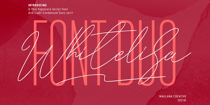
- Whitelisa Script And Sans Font Duo by Maulana Creative,
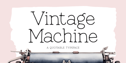
$16.00 - Vintage Machine by Balpirick,
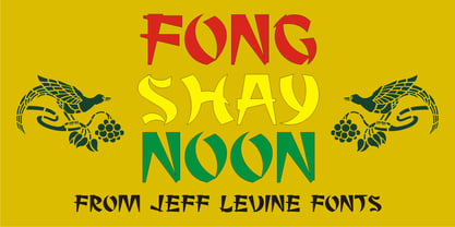
$15.00 - Fong Shay Noon JNL by Jeff Levine,
$29.00 - Monte Carlo Script NF by Nick's Fonts,
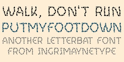
$10.00 - Put My Foot Down by Ingrimayne Type,
$14.95 - Dont Bug Me JNL by Jeff Levine,
$29.00 - Octin Vintage Free - 100% free
- My Underwood - 100% free
- All your font are belong to us - 100% free
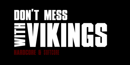
- XXII DONT-MESS-WITH-VIKINGS - Unknown license
- 101! Your FontZ Are Served - Unknown license
- XXII DONT MESS WITH VIKINGS by Doubletwo Studios,
$- - Easy Rider - Personal use only
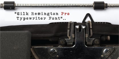
- Silk Remington Pro by Jadugar Design Studio,
$19.00 - KG Primary Penmanship 2 - Personal use only
- Silent Reaction - Personal use only
- Admiration Pains - Personal use only
- Vtc-NueTattooScript - Personal use only
- Problematic Piercer - Personal use only
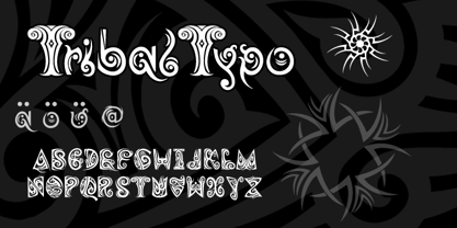
- Tribaltypo by Otto Maurer,
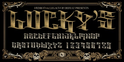
$22.00 - H74 Lucky's Flash by Hydro74,
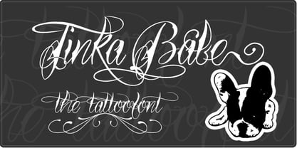
$20.00 - Tinka Babe by Otto Maurer,
$19.00 - TypeWritersSubstitute-Black - 100% free
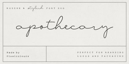
- Apothecary by Pixel Colours,
$26.00 - LD Remington Portable by Illustration Ink,
$3.00 - Linotype Typo American by Linotype,
$29.99 - SmallTypeWriting - 100% free
- TypewriterScribbled - 100% free
- Click Clack by Fonthead Design,
$15.00 - Dias Irregulares by Jrmuitos,
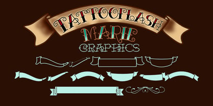
$20.00 - Tattooflash Marie by Otto Maurer,
$14.00 - Crippy MF by Masterfont,
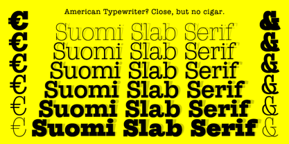
$59.00 - Suomi Slab Serif by Suomi,
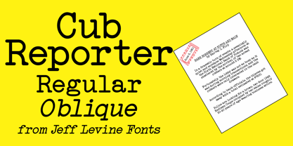
$19.00 - Cub Reporter JNL by Jeff Levine,
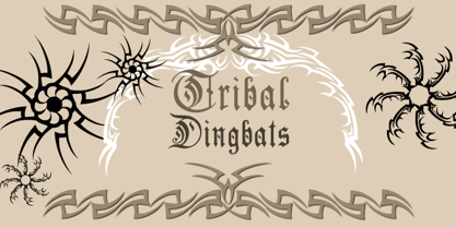
$29.00 - Tribal Dingbats by Otto Maurer,
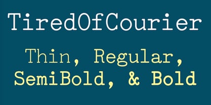
$15.00 - TiredOfCourier by Ingrimayne Type,
$14.95 - KG Already Home by Kimberly Geswein,
$5.00


