10,000 search results
(0.037 seconds)
- Xaloc by Vanarchiv,
$20.50 Xaloc was designed for editorial use in books, magazines and newspapers. This typeface family contains different font versions for different optical sizes; Caption, Text, Subhead and Display, all of them with different x-height proportions and contrast. Its serifs are asymmetrical and its letterforms have geometric modulated strokes that emulate the calligraphic variations. Its design approach enhances text flow and continuous reading. Xaloc was based on Ricado Santos’ Tramuntana, which has the same skeleton, proportions and serifs with a more mechanical design. Xaloc is the Catalonian name from the Mediterranean wind that comes from the Sahara and reaches hurricane speeds in North Africa and Southern Europe.
 - Aurelia by Linotype,
$29.99The design for Aurelia is based on the forms of Jenson, an Old Style typeface developed by Nicolas Jenson in 1470 which still influences type design today. Zapf gave Aurelia a bit of his own personal style and adapted it to the demands of modern technology. The family of typefaces was originally designed for use with the typesetting machines produced by the German company Dr.-Ing Rudolf Hell GmbH which was later merged with Linotype. The name Aurelia is a nod to the Roman emperor Aurelianus (214–275), who built the Via Aurelia in Italy. Aurelia is a robust and classic font, suitable for both text and headlines. - DBXLNightfever by VetteLetters,
$- DBXL Nightfever was originally designed by Donald Beekman in 2001 for the disco-techno-house record label of the same name, an imprint of United Recordings. Geometric and gridded, with a solid sci-fi techno feel, Nightfever still contains a lot of soul. Three additional wider weights were added for more design flexibility, as well as italics for all widths. After the record label was terminated the Nightfever fonts were used for many other DBXL design projects. It was put online for free download first in 2008, this year (2019) the design got more refined with additional accurate kerning and spacing. All fresh and new, ready for a new space age!
 - Olicana by G-Type,
$72.00 Olicana is a best selling script which was named as one of Typographica’s typefaces of 2007. It was also the very first G-Type release in OpenType, ideal for script faces as there are endless possibilities for the automatic replacement of certain character combinations with ligatures resulting in a much more ‘realistic’ appearance. Olicana is brimming with alternates, swashes and extra features like ink splats and crossings-out, not to mention the choice of using a modern or ornate styling within the same font! All of which makes Olicana the perfect choice for an authentic, rather than typeset appearance. Available in 3 variants: Rough, Smooth and Fine.
 - Lenox Avenue by Hanoded,
$15.00 I came across an old book called ‘Studio Handbook Letter And Design For Artists And Advertisers’ by Samuel Welo. Samuel Welo was an American advertising calligrapher, typographer and lettering artist, who was most active during the roaring twenties. Lenox Avenue is my version of a set of letters in that book. It was handmade (just like Welo had done). I only had an ABC/abc to work with, so I designed all the remaining glyphs myself. I changed some of the original (and quite quirky) letters to a more contemporary form. The font is named Lenox Avenue, once home of the famous Savoy Ballroom. Comes with all the bells & whistles.
 - Gledek by Differentialtype,
$10.00 Gledek is a lightning display font that comes in two styles. The regular and outline styles complement each other perfectly for any purpose such as logos, sports, games, club branding, posters, labels, comic books and more. Add this font to every project you create to make it brighter and stand out.
 - The Playing by Jorsecreative,
$20.00 Introducing ! The Playing are 3 Fonts made in thick norms and mono lines that cover all upper and lower case letters, also European letters. This font is very suitable to be applied to children's displays in the form of Games, T-Shirts, Books, Mugs, Mock Ups, Greeting Cards and others. Thanks
 - Lord Kiddos by Raditya Type,
$13.00 Lord Kiddos font has a unique look. This cute font is best suited for use in the children's world. Making it a book title or a children's t-shirt design, must be very fun. Get creative with child like games, and use them to brighten up kids and school projects!
 - Polar Press by Attype Studio,
$14.00 Polar Press is a vintage all caps font with 2 styles: clean and rough, and includes 22 ligatures. Polar Press is a strong font and is perfect for branding, logos, invitations, stationery, social media posts, product packaging, merchandise, blog design, game titles, retro style design, Book/Cover Titles and more.
 - Code Pro by Fontfabric,
$29.00 Code Pro is a font family inspired by the original Sans Serif fonts like Avant Garde or Futura, but with a modern twist. It is clean, elegant and straight-to-the-point. Code font is applicable for any type of graphic design—web, print, motion graphics, etc.—and perfect for t-shirts and other items like posters and logos.
 - Inka by CarnokyType,
$49.00 Inka is the name by which the closest-ones called my partner. Inka is also the name of a text typeface – in its form very friendly and welcoming. The same way as relationships develop through the life, text typefaces develop, too. I had started the work on this typeface about the same time as I met Inka, while reaching the final output has been a long and progressive process. Inka is a modern serif typeface with wide universality in functions (various editorial usages as books, magazines, annual reports…). The concept and the scope of the complete type family are based on the principle of optical sizes of the typeface designed for the particular use of the size of typesetting. Inka consists of several drawing variations for the typesetting of small sizes (Small), text typesetting (Text), larger typesetting sizes (Title), and headlines sizes (Display). Two constructive alternatives, differing in the height of the construction of the font signs, further extend the variability of the usage of the typeface. Inka A has classical proportions ideal for book typesetting. Inka B has lower ascenders and descenders, lower uppercase glyphs and numbers. Typeface with such construction allows us to use the typesetting efficiently while using tighter leading and still looking more contemporary. Each of the font set (Display, Title, Text, Small) consists of four weights (Regular, Medium, Bold, Black), each has wide character set and a lot of OpenType features. “Inka is dedicated to Inka.”
 - Jigger Statz by Poole,
$32.00During the spring of 2006, while creating this typeface, I was reading Praying For Gil Hodges, by Tom Oliphant, who grew up a Brooklyn Dodgers fan. I grew up a Los Angeles Dodgers fan. My mother worked as secretary to the president of the old Triple A LA Angels Baseball Team. In 1952 when she was pregnant with me, she left the team. They gave her an autographed baseball and a puppy named Angel. That's the dog I grew up with. Toward the end of the book the author talks about Gil Hodges' favorite ballplayer, a slugger for the LA Angels, Jigger Statz. I thought, could it be? My mother died two years ago and I got the team baseball. Sure enough, the first name after the dedication to my mother was Jigger Statz. - Inbrush by Alex Camacho Studio,
$15.00 Inbrush is a monospaced font whose letters and characters each occupy the same amount of horizontal and vertical space. All the characters, including diacritics, fits in the same space.This makes this font ideal for texts in both directions, horizontal and vertical. A fun and playful display font made by brush to make interesting compositions.
 - KillJoy by Comicraft,
$19.00 S P O I L E R A L E R T ! We don't want to be a drag, a wet blanket or a spoilsport, but we're here to tell you that everything before “but” is bulls*it! Yep, if you're a merrymaker, a carouser, a jester, a reveler or a live wire, we're here to poop your party with our latest knicker-twister, KILLJOY! Call us cynics, call us crabs, grouches, grumpy old men, sourpusses or bores, but we're the kind of Killjoys who just have to make some noise... sound effects (sic) everybody, so listen up even if you can't handle the truth... and here’s OUR truth; Keep Calm and be a Fabulous Killjoy! Yes, it’s easy to be mean -- but why should anybody else have all the fun? Or all the fonts?
 - Watchioro by IbraCreative,
$17.00 Watchioro – A Monoline Handwritten Typeface Watchioro, a monoline handwritten typeface, exudes a charming and effortless quality in its design. The seamless flow of its lines creates a consistent and graceful appearance, capturing the essence of handwritten elegance. With a single, unbroken weight throughout, Watchioro maintains a balanced and harmonious aesthetic, making it ideal for projects that require a personal touch with a modern twist. The simplicity of this monoline script ensures legibility while preserving a distinctive handcrafted feel, allowing it to add a warm and approachable character to a variety of creative endeavors, from invitations to branding. Watchioro stands out as a testament to the beauty of monolinearity in typography, offering a delightful and versatile choice for those seeking a handwritten typeface with a timeless appeal. Watchioro is perfect for branding projects, logo, wedding designs, social media posts, advertisements, product packaging, product designs, label, photography, watermark, invitation, stationery, game, fashion and any projects. Fonts include multilingual support for; Afrikaans, Albanian, Czech, Danish, Dutch, English, Estonian, Finnish, French, German, Hungarian, Italian, Latvian, Lithuanian, Norwegian, Polish, Portuguese, Slovak, Slovenian, Spanish, Swedish.
 - Vipsanie by IbraCreative,
$17.00 Vipsanie – A Unique Serif Typeface Vipsanie is an unparalleled Unique Serif typeface that breaks away from conventional design norms to offer a distinctive typographic experience. Its letterforms intertwine classic serifs with innovative twists, resulting in a harmonious blend of tradition and modernity. Each character in Vipsanie is meticulously crafted, showcasing intricate details and unconventional strokes that captivate the eye and challenge typographic conventions. This one-of-a-kind typeface exudes a sense of sophistication and individuality, making it a standout choice for projects that demand a touch of originality and creative flair. Whether employed in editorial layouts, branding endeavors, or artistic expressions, Vipsanie’s unique charm and versatility make it a compelling addition to the design landscape. Vipsanie is perfect for branding projects, logo, wedding designs, social media posts, advertisements, product packaging, product designs, label, photography, watermark, invitation, stationery, game, fashion and any projects. Fonts include multilingual support for; Afrikaans, Albanian, Czech, Danish, Dutch, English, Estonian, Finnish, French, German, Hungarian, Italian, Latvian, Lithuanian, Norwegian, Polish, Portuguese, Slovak, Slovenian, Spanish, Swedish.
 - Poetica by Adobe,
$29.00Poetica font was designed by Robert Slimbach in 1992 with particularly generous characters. The typeface family consists of 21 weights to allow for an unusual variety of design possibilities within one typeface family. Numerous swash letters, ornaments and ligatures remind one of the early Renaissance and its unforgettable masters, for example, Giambattista Palatino, who later gave his name to Hermann Zapf's creation. Slimbach used the Lettera Cancellaresca as a model for his typeface, the cultivated humanistic italic which later served as a point of departure for the development of italics of the Renaissance and thereafter. Lettera Cancellaresca is very legible, extremely harmonic and impressively beautiful. The early forms display two different compositional tendencies, namely the static of the simple vertical capitals and the italic dynamic of the slanted lower case alphabet, as shown in the weight Chancery 4. The capitals later conform to the slant of the lower case, as shown in the weights Chancery 1-3. Poetica font should be set according to the included suggestion in order to see the full benefit of its grace and beauty. - Excelsius by Comicraft,
$19.00 Once upon a midnight dreary, this Comicraftsman pondered, weak and weary, For a name synonymous with Mighty and Marvelous comics lore. Solid, Outline, Inline was the nameless font I'd crafted, I nodded, nearly napping o'er the work I'd grafted When suddenly came a tapping, As of someone gently rapping, rapping at my cubicle door. "'Tis some visitor," I muttered, "tapping at my cubicle door-- Calling out "EXCELSIOR!" Then an Amazing Vision beguiled my sad fancy into smilin', By the Spectacular decorum of the countenance it wore, "Though thy crest be shorn and shaven," he said, "thou art sure no craven, And thy font should not remain nameless here forevermore!" Eagerly I wished the morrow; vainly I had sought to borrow From comic books surcease of sorrow, letters that called out "EXCELSIOR!" Then, upon the velvet sinking, I betook myself to linking Fancy unto fancy, thinking of the nominative neuter singular thing Like Some Silvered Surfer wandering from the Nightly shore-- The Vision shrieked, upstarting--"Tell me what thy lordly name is thus!" Quoth the Craftsman: "EXCELSIUS!"
 - Calaveras by Design is Culture,
$29.00 In August of 2009, I was commissioned by Zoo York, a New York City based skateboard company, to visit Buenos Aires to study and document street typography. As soon as my taxi driver took the bustling street Entre Ríos, it was clear that the city and I were going to be good friends. Many of the independently owned businesses on Entre Ríos are adorned with handmade signage. These signs are painted in a style called Fileteado which is a century-old Argentinian type of lettering and floral ornamentation. Nowadays, Fileteado is still a prominent part of the city’s landscape, coloring the façades of restaurants, bars and coffee shops. Calaveras and Diablitos are two new typefaces that were inspired by Fileteado. Stylistically, the fonts are a return to a rhythmic and playful sensibility reminiscent of Vitrina and Cuba, two fonts that I designed in 1996. Along with dynamism and dance, these new fonts incorporate a rigor and functionality essential to labelling any font a ‘workhorse.’ The names Calaveras and Diablitos, came from the name of a song by the infamous Buenos Aires rock band, Los Fabulosos Cadillacs. —Pablo A. Medina
 - Diablitos by Design is Culture,
$29.00 In August of 2009, I was commissioned by Zoo York, a New York City based skateboard company, to visit Buenos Aires to study and document street typography. As soon as my taxi driver took the bustling street Entre Ríos, it was clear that the city and I were going to be good friends. Many of the independently owned businesses on Entre Ríos are adorned with handmade signage. These signs are painted in a style called Fileteado which is a century-old Argentinian type of lettering and floral ornamentation. Nowadays, Fileteado is still a prominent part of the city’s landscape, coloring the façades of restaurants, bars and coffee shops. Calaveras and Diablitos are two new typefaces that were inspired by Fileteado. Stylistically, the fonts are a return to a rhythmic and playful sensibility reminiscent of Vitrina and Cuba, two fonts that I designed in 1996. Along with dynamism and dance, these new fonts incorporate a rigor and functionality essential to labelling any font a ‘workhorse.’ The names Calaveras and Diablitos, came from the name of a song by the infamous Buenos Aires rock band, Los Fabulosos Cadillacs. —Pablo A. Medina
 - Zerpixl by ffeeaarr,
$11.00 Zerpixl is insipred and was made by a pixel. it's sci-fi, science also technology looks, it's perfect for games, movies, & more
 - Sabon Paneuropean by Linotype,
$45.99Jan Tschichold designed Sabon in 1964, and it was produced jointly by three foundries: D. Stempel AG, Linotype and Monotype. This was in response to a request from German master printers to make a font family that was the same design for the three metal type technologies of the time: foundry type for hand composition, linecasting, and single-type machine composition. Tschichold turned to the sixteenth century for inspiration, and the story has a complicated family thread that connects his Sabon design to the Garamond lineage. Jakob Sabon, who the type is named for, was a student of the great French punchcutter Claude Garamond. He completed a set of his teacher's punches after Garamond's death in 1561. Sabon became owner of a German foundry when he married the granddaughter of the Frankfurt printer, Christian Egenolff. Sabon died in 1580, and his widow married Konrad Berner, who took over the foundry. Tschichold loosely based his design on types from the 1592 specimen sheet issued by the Egenolff-Berner foundry: a 14-point roman attributed to Claude Garamond, and an italic attributed to Robert Granjon. Sabon was the typeface name chosen for this twentieth century revival and joint venture in production; this name avoided confusion with other fonts connected with the names of Garamond and Granjon. Classic, elegant, and extremely legible, Sabon is one of the most beautiful Garamond variations. Always a good choice for book typography, the Sabon family is also particularly good for text and headlines in magazines, advertisements, documentation, business reports, corporate design, multimedia, and correspondence. Sabon combines well with: Sans serif fonts such as Frutiger, Syntax. Slab serif fonts such as PMN Caecilia, Clairvaux. Fun fonts such as Grafilone, Animalia, Araby Rafique. See also the new revised version Sabon Next from the Platinum Collection." - LiebeRuth by LiebeFonts,
$29.90 LiebeRuth is your 100 percent hand-made organic type. She absolutely loves to be typeset in large *and* small sizes, because Legibility is her middle name. (Yes, we know it’s not a typical girl’s name.) She is friendly and polite, but she also has a few quirks. Her friends are impressed with how natural she manages to look every day. Her four weights ensure that Ruth has the right boldness for any context: birthday invitation, personal correspondence, photo album, or billboard ad. During the creation of this font, her designer ate plenty of healthy, organic foods. We think this is the reason why Ruth looks so fresh and lively. And of course Ruth has been designed with lots of Liebe (which is German for “love”—and she speaks many other languages, too). One more thing Ruth is marvelous at: showing off her curly-swirly swashed alternative letterforms that can be activated via OpenType. (Please make sure your software supports OpenType if you wish to use the advanced features.) Each style contains more than 560 gluten-free glyphs—now that is great value! If you like this font, you may want to look at LiebeRuth’s bolder sister LiebeDoni and our best-sellers LiebeErika and LiebeKlara. Or add in some LiebeOrnaments to prepare a curly-licious feast. By the way: LiebeRuth also gets along great with our wide range of illustrative fonts, including LiebeCook, LiebeFish, and LiebeTweet.
 - Header ON by Tadiar,
$14.00 Headeron is modern serif all caps font designed for header in such areas as Media & Entertainment, Food & Drinks, Clothes, Music, Games & Applications, etc. with Multilingual support (Latin Extended). It is perfect to use in Magazines & Newspapers Headers Posters Street Signs and other Outdoor Package Design.
 - BD Kickrom Mono by Typedifferent,
$25.00 BD Kickrom Mono is a retro futuristic monospaced, uppercase font with the main characters set on the small keys and variants on the capital characters. It is great for the use as headlines in magazines, logotypes on posters, game titles, movies or music packaging.
 - Cross Boxed by Namara Creative Studio,
$14.00 Bold modern sport font with rounded corners in consistent angles. A strong and unique style instantly adds power of movement to your creative projects. It's perfect for logotypes, headlines, game covers, sports events, posters, magazine covers, branding, product design, labels, and other suitable projects.
 - Chamy by Rosario Nocera,
$12.00 Chamy is a handwrite font family inspired by nature, sweets, comics and cartoons. It is available in three weighs from light to bold and two version: Solid and Sweet. Chamy is ideal for logo design, branding, titles, games, app and playful, cheerful and positive things.
 - Tattooflash Marie by Otto Maurer,
$14.00 Tattooflash Marie is made for Tattoofans, Tattoostudios and Tattoo artists. Make your own tattoo flash with your Name or the Names of your children. The Font is made for your skin but you can also make Tattooposter, Tattooequipment and more.
 - Cozy Sweater by Larry Nickname,
$9.00 It was originally inspired by my winter scarf knitting exploits. I discovered that making wool scarves was generating beautiful patterns and I wanted them to become a source of inspiration for a style. I made a few collages, and they became letters. Other characters came up with ease. It is readable, but long essays are not its main purpose. It is decorative and will look casual and very attractive on any ad as a title or a short phrase. It also demonstrates very good performance in automatic 3D generators, like Xara 3D maker, used in making examples of how this font can be utilised. It was designed to be thin, soft, with the capacity to cover empty space and to create a vibrant environment. Small characters are different from capital letters, they are stylistic alternates. Some letters are slightly ominous or dynamic, others create a soothing feeling. Using several colors make it shine, but it is complex, it looks good in monochromatic compositions as well.
 - ReRun Stencil by Wing's Art Studio,
$10.00 A hand-drawn stencil font for video games and film titles with a grungy urban design. This all-caps display font offers a simple way to replicate the look of hand-drawn or sprayed on stencil lettering. An industrial style that's used for it's quick real-world applications found on everything from roadworks, storage containers and military vehicles; with an urban visual language uniquely suited to video games, film titles and album covers. See above for more usage ideas. This font family includes uppercase-only characters, plus all punctuation, numerals and language support. Contents: ReRun includes 4 styles: - Rough - Clean - Outline - Light Recreate the textured look in these visuals using our infinite textures for Adobe Illustrator. Available to download from our website.
 - Divine Right by Comicraft,
$29.00 When the Adventures of Max Faraday began in the pages of Wildstorm Comics' DIVINE RIGHT in the mid-'90s, this chapter title font materialized, eventually reappearing on the covers of WOLVERINE. Delicately crafted by Mister Fontastic himself, John Roshell claims this font was the product of Divine Inspiration. When told he'd been looking at the work of too many French Poster Artists, he dismissed such allegations as Mucha do about nothing.
 - BC Away by Egg Fonts,
$28.00 BC Away is a display typeface. It has emerged from the idea of drawing letterforms with a single-line path. Thanks to this idea, the characters are designed out of standard and conventional forms. Character designs are a combination of sharp corners and smooth curves, at the same time keeping readability. Some parts have been left blank in accordance with the letter forms. The name 'Away' represents these blanks. Also, the word 'a way' refers to the design of letterforms using a single-way.
 - Freight Text Pro by Freight Collection,
$39.00 Fresh yet at the same time projecting a familiar feeling, Freight Text provides the stable foundation on which all other Freight serif families were built. As its name implies, it was designed to handle standard text sizes for large and small quantities of copy. Unique enough to catch the eyes but comfortable enough keep them from bleeding, Freight Text is a workhorse intended for magazines, newspapers, cookbooks, data-intensive technical documents and collateral. What more could you ask for from such a humble family?
 - Christolas Gift by Ake,
$12.00 Christolas Gift is a delightful display font that uses the magic of the winter holidays to bring joy to the ones who use it. Its playful style makes it a perfect choice for a variety of products. You can use it with confidence on greeting and holiday cards, quotes. children’s books and activities, logos, mugs, gift bags, and many more.
 - Christmas Sundaylab by ahweproject,
$14.00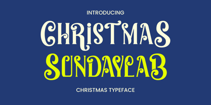 Christmas Sundaylab is a festive and very classy display font. It’s ideal for any of your winter vacation creations, so add it to your designs and bring them to life! Christmas Sundaylab is perfect for branding projects, logo, wedding designs, social media posts, advertisements, product packaging, product designs, label, photography, watermark, invitation, stationery and any projects that need handwriting taste.
 - Salzburger Plakat NF by Nick's Fonts,
$10.00A poster by Otto Baumberger for an Austrian winter sports festival in 1907 inspired this charming confluence of medieval and Art Nouveau influences. As such, its appeal is timeless, and well suited for storybook romances of all stripes. Both versions of the font include complete Latin 1252, Central European 1250 and Turkish 1524 character sets, with localization for Moldovan, Romanian and Turkish. - Hockeynight Serif Brush by XTOPH,
$25.00 "Hockeynight Serif Brush" is the handwritten version of my "Hockeynight Serif". It's a contemporary college-sports font with the little twist – that its a brush font. With its detailed brushmarks it is designed to go big and bold. "Hockeynight Serif Brush" is an uppercase font and it offers alternate glyphs as lowercases. It pairs perfect with my other "Hockeynight" Fonts – Check it out!
 - Hockeynight Sans Brush by XTOPH,
$25.00 "Hockeynight Sans Brush" is the handwritten version of my "Hockeynight Sans". It's a contemporary college-sports font with the little twist – that its a brush font. With its detailed brushmarks it is designed to go big and bold. "Hockeynight Sans Brush" is an uppercase font and it offers alternate glyphs as lowercases. It pairs perfect with my other "Hockeynight" Fonts – Check it out!
 - Redwinger by Ditatype,
$29.00 Redwinger is a captivating display font designed with a games theme, featuring different proportions of letters and sharp, uneven borders. This font showcases different proportions in its letterforms, adding a sense of variety and excitement to the font. Each uppercase letter has its own distinct width and height, creating a visually engaging composition. This design choice adds a playful and dynamic element to the font, reflecting the diversity and unpredictability of the gaming world. The sharp and uneven borders of Redwinger enhance its edgy and adventurous aesthetic. The jagged edges and irregular shapes give the font a distinctive and daring look, evoking a sense of action and intensity. This unique feature adds a touch of excitement and captures the spirit of gaming. For the best legibility you can use it in the bigger text. Enjoy the available features here. Features: Stylistic Sets Multilingual Supports PUA Encoded Numerals and Punctuations Redwinger fits in headlines, logos, posters, titles, branding materials, print media, editorial layouts, website headers, and any other projects that aim to transport players into thrilling virtual worlds. Find out more ways to use this font by taking a look at the font preview. Thanks for purchasing our fonts. Hopefully, you have a great time using our font. Feel free to contact us anytime for further information or when you have trouble with the font. Thanks a lot and happy designing.
 - Cinnabar Brush by Hanoded,
$15.00 Cinnabar Brush is a font named after a mineral - mercury sulfide to be precise. I quite like the name and the color, so naming a font after it made sense. Cinnabar Brush is a very bold, very outspoken brush font. It is all caps, but upper and lower case glyphs differ and can be mixed. It is a bit on the heavy side, so I wouldn't set a text in it. Use Cinnabar Brush for posters, book covers, T-shirts and the like. Comes with a mother lode of diacritics.