9,601 search results
(0.074 seconds)
- Nicotine by Chank,
$99.00 Need to cram a zillion words on to a single page? Nicotine is your vice. Cram it. Nicotine Jazz is a bit more musical as it trades uppercase and lowercase letters for an interesting unicase effect. Italic can be used for extra emphasis. The condensed nature of the Nicotine fonts allows for impressive use at larger, poster sizes. Another interesting tidbit? The I in Nicotine is a silhouette of a traditional filtered cigarette; that's how the font got its name.
 - Magnitudes Variable by DuoType,
$90.00 Magnitude is a font inspired by classics like Eurostyle and Bank Gothic, with geometric characteristics and dynamics style. Designed to be used in a wide variety of applications such as advertising, corporate projects, branding and retail product design. The font is well-suited for headings, display use and short text. The Magnitudes family is available in 36 weights, ranging from light to heavy, to condensed and expanded with matching italics. The font contains a character set of 401 characters supporting 206 different languages.
 - Galadali by Latinotype,
$29.00 If you are looking for an elegant typeface, with strong impact and delicate details, then Galadali is the perfect choice for you. With a complete range of resources, like small caps, old-style and lining figures, fractions, superior and inferior letters, figures, and weights from light to heavy, Galadali offers a wide variety of combinations for you to create with. Galadali's multiple alternates and swashes can add extra spice to your designs. A tall condensed typeface specially designed for beautiful titles.
 - Haymer by Greater Albion Typefounders,
$9.50 Haymer stands at the apogee of legibility and clarity. Its design embodies symmetry, even stroke widths and a subtle rounded quality to give an instinctive appeal to the reader and to the designer. Haymer is modern yet characterful and is ideal for use as a text family, online and wherever instant easy readability is required. An extensive family is offered, in four weights, regular and condensed widths, lower case and capital (small and petite) forms as well as display inline faces.
 - NorB Note by NorFonts,
$28.00 NorB Note is a handwritten text font with an angled fat marker lettering style. You can use this font with any word processing program for text and display use, print and web projects, apps and ePub, comic books, graphic identities, branding, editorial, advertising, scrapbooking, cards and invitations and any casual lettering purpose… or even just for fun! NorB Note comes with 3 weights, each with their matching Italics, Oblique and in a Light, Normal and Condensed version. (a Chalk version is also featured!)
 - Bluenote Demi by Wiescher Design,
$39.50 Bluenote is a font based on Franklin Gothic condensed. In the 60s and 70s the record label Blue Note published all those classic jazz records of my youth. Someone at their arts department cut letters to ribbons and designed wonderful record covers with those fragmented glyphs. I recently had a look at my music collection and rediscovered these letters. Being a hard-working type designer I couldn't resist the challenge, here is the result from your dilligent designer Gert Wiescher
 - Tight Spot BB by Blambot,
$12.00 Based on the feedback provided by manga letterers and translators, Blambot's new comic book dialogue font meets their specific needs for condensed type, unique manga-related glyphs like stars, wavy dashes, and hearts. In addition, Blambot has included contextual alternates to cycle through six sets of alphabets, three sets of numerals, and various punctuation for a more organic, "hand lettered" look. The set includes for fonts: Regular, Italic, Bold, and Bold Italic, each with extensive diacritical letters for multi-language support.
 - Poster Sans by K-Type,
$20.00 The Poster Sans display fonts have the enduring functionality of vintage condensed grotesques. They are loosely based on Ludlow 6-EC, and perfect for signs and posters. The Basic Package includes the Regular and Bold weights, and also a useful Outline version. Poster Sans Extreme may hold the record for the slimmest usable font available. The latest versions of the Regular, Bold and Extreme weights offer improved outlines and now include a full compliment of Latin Extended-A European accented characters.
 - Dress Rehearsal JNL by Jeff Levine,
$29.00 In a career spanning the early 1900s through 1940, George M. Cohan wrote and produced over 50 plays, 300 songs and was also an actor, singer and dancer. Many of his works honored his Irish roots, and the cover of one piece of sheet music called “The Irish American” (1905) had its title hand lettered in a condensed Art Nouveau type design with tiny spurred serifs. This is now available digitally as Dress Rehearsal JNL, in both regular and oblique versions.
 - Flowy by Typesketchbook,
$49.00 Flowy is a romantic and delicate type, made up of four sub-families. Brush, Script, and Condensed imitate freehand writing using different tools. In these families, you can choose the original version which embodies freehand styles, the Clean option which offers a clean-cut edge and is more suitable for corporate assignments, or Rust which changes the texture. Meanwhile, two options, Clean and Ink, come with the Sans type. The complete family has 29 individual typefaces that serve your projects every purpose.
 - Farloxy by Maulana Creative,
$14.00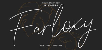 Farloxy is a Casual Signature script font. With light mono-line stroke, slant, Condensed and fun character with a bit of ligatures and lowercase alternate. To give you an extra creative work. Farloxy font support multilingual more than 100+ language. This font is good for logo design, Social media, Movie Titles, Books Titles, a short text even a long text letter and good for your secondary text font with sans or serif. Make a stunning work with Farloxy font. Cheers, MaulanaCreative
 - Mangan Nova by Hoftype,
$49.00 Mangan Nova is the semi-condensed version of Mangan. Designed for strong headlines but with slender and economical proportions, it fosters space saving text applications while permitting very pleasant reading. Mangan Nova, as does also Mangan, comprises 14 styles and is well suited for ambitious typography. It comes in OpenType format with extended language support. All weights contain small caps, ordinals, ligatures, proportional lining figures, tabular lining figures, proportional old style figures, lining old style figures, matching currency symbols, fraction- and scientific numerals.
 - Quenta by Zetafonts,
$39.00 Canovaro was inspired by the hand-lettered masthead of Queenslander, a weekly magazine published during the first half of XIX century. The condensed serif letterforms of the magazine title, with the warm, human touch gave the shapes of Quenta a lively personality and a literary charme. To let you experiment with his vintage decorative layers, it comes in 4 styles including discretionary ligatures to allow you to use script elements to enrich its expressive range for editorial and logo design.
 - Promethium by Mysterylab,
$17.00 Promethium is an elegant vintage-style condensed font with lots of ornate detailing. Ideal for western, cowboy and rodeo graphics, as well as circus & carnival themes. Additionally, Promethium can trace some of its design roots to the well established Argentine graphic style known as Fileteado, as well as to Victorian poster and book arts. The stacking & layering of the 4 different versions of the font can yield a great range of eye-catching diverse looks and color schemes that can fit many purposes.
 - Zuume by Adam Ladd,
$25.00 Zuume is a high-impact, condensed, display font family. Its weight range gives a sharp, technical feel in the lighter weights, while the bolder weights are meant to be tightly spaced and stacked for visual punch. The strong and sturdy design makes it ideal for eye-catching headlines, branding, packaging, sports, logos, and more. The Cut family takes the dynamic nature of this design further by adding sliced out elements to flat, horizontal strokes, giving it more movement, aggression, and speed.
 - Hillstown by Letterhend,
$13.00 Hillstown Font Family is a font collection that contains three different styles that will perfectly complement each other. You will get script, sans, and condensed sans in a clean and aged version for each style. The classic feel is really perfect when you need a typeface for a logotype, apparel, invitation, branding, packaging, advertising, and more. Hillstown comes in uppercase, lowercase, with punctuations, symbols and numerals, 09 stylistic set alternate, ligatures. There is multi-lingual support and Hillstown is already PUA encoded.
 - Tomkin by Typesketchbook,
$55.00 Tomkin font is an extra large super family of 54 fonts! Tomkin have such a big abundance of contrast, styles, weights, width. Typesketchbook consists of a very usable, clean and modern sans typeface with Semi-square struture. The complete Tomkin type family includes 9 weights with italic and 3 width (normal, narrow, condense) versions for each of them all in all 54 fonts for a multifunctional usage, especially for cooperative work, such as website, magazine, editorial, publishing , as well as packaging.
 - Beauty Snowy by Maulana Creative,
$14.00 Beauty Snowy is an expressive super slanted signature script font. With high contrast contrast stroke, condensed and fun character with a bit of ligatures. To give you an extra creative work. Beauty Snowy font support multilingual more than 100+ language. This font is good for logo design, Social media, Movie Titles, Books Titles, a short text even a long text letter and good for your secondary text font with sans or serif. Make a stunning work with Beauty Snowy font. Cheers, MaulanaCreative
 - Byronic by Alan Meeks,
$30.00 Byronic is soft modern sans-serif but with an antique style lower-case. The rounded end soft look gives Byronic a friendly soft look whilst still retaining a classical typographic appearance. A very clean style and slightly condensed it is excellent for text setting and headline with an unusual loser case that compliments the caps perfectly. Available in a range of 5 weights and 5 italics and a Latin Pro character set of 430 characters including ranging numerals and small caps.
 - Scriptuale by Linotype,
$29.00The Scriptuale family, which contains eight styles, is a contemporary upright calligraphic face. Designed by German designer Renate Weise in 2003, this family of typefaces speaks to the present, while at the same time reflecting on a lyrical past. The letterforms of the Scriptuale family are romanticized, they reference German calligraphic styles from the 19th and early 20th Centuries. For instance the design of Scriptuale's uppercase strays from the canon of classical proportion into romantic idealism. While the C and O are drawn according to the ancient quadratic proportions - almost twice as wide, optically, as the E or the L - the letter A is wider than would be expected, and the D narrower. These subtle differences introduce a different rhythm into text set in Scriptuale than Italic styles of calligraphy may offer. Scriptuale's Gs merit special notice: both the upper and lower case G lunge slightly forward, further enhancing the dynamic quality of the text. Also unique in Scriptuale's design is the lowercase width: the letterforms appear slightly condensed; they have large x-heights to compensate for this. In a delightful twist, the number 2's beak has been closed by drawing it full-circle, back into the stem: this references a style of letter design that was practiced, among other places, by artists from the old Klingspor foundry in Offenbach Germany. Typefaces constructed there easily captured the zeitgeist of the romantic period, but are less calligraphic than Scriptuale (e.g., Rudolf Koch's Koch Antiqua). A semi-serif face (like Prof. Hermann Zapf's Optima or Otl Aicher's Rotis Semi), some of Scriptuale's letters have serifs (D), and some do not (A). And although both the B and the E normally have the same "structure" on their left side, Weise has drawn them differently in Scriptuale. These strengthen the calligraphic-like quality of the family. Traces of the pen are easy to see in Scriptuale's design; it is a thoroughly calligraphic face. The eight typefaces in the Scriptuale family include Light, Regular, Semi Bold, and Bold weights. Each weight has a companion italic. Scriptuale is similar to one other contemporary calligraphic family in the Linotype portfolio, Anasdair , from British designer - FF Cocon by FontFont,
$65.99 FF Cocon’s designer, Evert Bloemsma (1958—2005) described it as a “serious typeface”. Despite first impressions, the description holds up well. Since its 2001 release, FF Cocon has been used in an astoundingly wide variety of design applications. At large sizes, FF Cocon works as a display face, with beautiful detailing. And at small sizes, it remains surprisingly readable. The lowercase letters a, b, d, g, h, m, n, p, q, r and u, were drawn without spurs, as Bloemsma made an attempt to erase every trace of handwriting; even “normal,” neutral sans serif typefaces still retain elements in their letterforms like this. Bloemsma wanted none of it. Although a difficult starting point for a typeface, this proved successful. Bloemsma’s design is a family of rounded yet rather asymmetrical forms with details reminiscent of brush-strokes, but that were not made with a brush in hand. In spite of its claim to seriousness, FF Cocon is a family of seductive, voluptuous styles. The original FF Cocon had two widths—normal and condensed. Later, a more compact Extra Condensed version was introduced, as well as italics.
 - Kindly Season by Ahmad Jamaludin,
$17.00 Present to you for New Modern Decorative Serif, Kindly Season! Kindly Season has a lowercase that is a unique uppercase letter, You can easily correct this by replacing the alternate letters with uppercase. It's very simple, isn't it? Comes in 3 versions: Condensed, Regular, and Expanded, with a whopping total of 60+ unique ligatures, it's easy to achieve custom typography for stunning logos, headlines, and quotes. Kindly Season has a unique 'S' that is perfect for headers in projects; it can even be used for logos. Additionally, Kindly Season features other cool, decorative-style letters that add a touch of creativity. Type in all lowercase in the type tester to try it out! What's Included? Kindly Season Main File Condensed, Regular and Expanded 60+ Ligatures Instructions (Access special characters in all apps, even in Cricut Design) Accessible in Adobe Illustrator, Adobe Photoshop, Microsoft Word even Canva! PUA Encoded Characters. Fully accessible without additional design software Language Support: Danish, English, Estonian, Filipino, Finnish, French, Friulian, Galician, German, Gusii, Indonesian, Irish, Italian, Luxembourgish, Norwegian Bokmål, Norwegian Nynorsk, Nyankole, Oromo, Portuguese, Romansh, Rombo, Spanish, Swedish, Swiss-German, Uzbek (Latin) Thank you Dharmas Studio
 - Atoverz by Twinletter,
$17.00 Introducing Atoverz, the perfect retro condensed font for your next project. This font features a classic retro design that is both stylish and functional. With 49 curved alternate characters and 32 beautiful ligatures, Atoverz allows you to easily create unique and stunning designs. Its multilingual support also ensures you can use it for projects in any language. The sleek and elegant design of Atoverz makes it perfect for a wide range of projects, from logos and branding to posters and advertisements. Its retro classic style is sure to catch the eye of your audience and leave a lasting impression. So why wait? Add Atoverz to your font collection today and take your designs to the next level. Browse our collection now to discover the versatility and charm of Atoverz retro condensed font. What’s Included : - File font - All glyphs Iso Latin 1 - Alternate, Ligature - Simple installations - We highly recommend using a program that supports OpenType features and Glyphs panels like many Adobe apps and Corel Draw so that you can see and access all Glyph variations. - PUA Encoded Characters – Fully accessible without additional design software. - Fonts include Multilingual support
 - Giraffenhals by TypoGraphicDesign,
$19.00 The kiddy and rough character and the huge capital height with the tiny x-height (plus the cute giraffe character dingbats), gives the typeface a high recognition value and uniqueness. Application Area The warm, child-like, bold and striking handmade font “Giraffenhals” would look good at logos, display size for poster, flyer, comics and graphic novel lettering, headlines in magazines or websites, packaging, music covers or webbanner etc. Technical Specifications ■ Font Name: Giraffenhals ■ Font Weights: Regular-Condensed + Bold-Condensed + DEMO (with reduced glyph-set) ■ Font Category: Display for headline size ■ Font Format:.otf (OpenType Font for Mac + Win) + .ttf (TrueType Font) ■ Glyph Set: 443 glyphs ■ Language Support: Afrikaans, Albanian, Catalan, Croatian, Czech, Danish, Dutch, English, Estonian, Finnish, French, German, Hungarian, Icelandic, Italian, Latvian, Lithuanian, Maltese, Norwegian, Polish, Portugese, Romanian, Slovak, Slovenian, Spanisch, Swedish, Turkish, Zulu ■ Specials: Alternative letters, stylistic sets, automatic contextual alternates via OpenType Feature. Euro, kerning pairs, standard & decorative ligatures, Versal Eszett (German Capital Sharp S), extras like Dingbats & Symbols, arrows, hearts, emojis/smileys, stars, further numbers, lines & shapes ■ Design Date: 2011–2017 ■ Type Designer: Manuel Viergutz ■ License: Desktop license, Web license, App license, eBook license, Server license
 - Hornsea FC by Studio Fat Cat,
$18.00 Hornsea FC is a super condensed font family that designed for display purposes. 14 styles of Hornsea FC font will let you to explore more your creativity. Related keywords: modern font, branding font, logo font, magazine font, display font, packaging font, logotype font, contemporary font, elegant font, poster font, headline font, geomatric font, corporate font, serif font, sans serif font, classic font, advertising font, fashion font, editorial font, design font, vintage font, identity font, book font, text font, legible font, grotesk font, grotesque font, technical font, clean font, swiss font, webfont, web font, wordmark font, serif font, retro font luxury font, unique font, typography font, title font, playful font, signage font, german font, workhorse font, versatile font, neutral font, condensed font, expanded font, slab serif font, college font, sports font, sport font, slab font, football font, baseball font, athletic font, varsity font, soccer font, soccer font, basketball font, american font, ligatures font, wedding font, feminine font, classy font, chic font, script font, opentype font, contemporary font, oriq font, handwriting font, handwritten font, urban font, stylish font, fashion font, bold font, handmade font, casual font, trendy font, signature font, marker font, street font, font family,
 - Dilemma by Sudtipos,
$39.00 Dilemma is a sans/sans serif type system with 42 styles; it is inspired by the anonymous Polyphème, Cyclopéen and Extra Condensé designs from the early 1900s at the Peignot Fonderie. From these initial points of reference, Sudtipos went further and reimagined these projects for an actual use by blending them into a unique and complex type system. Dilemma is defined as ‘a situation in which a difficult choice has to be made between two or more alternatives, especially ones that are equally undesirable’ and that is exactly how we designed this font. We created a workhorse system where each style functioned well alone but would be more powerful when working as a team, pairing the sans styles with the serifs. Dilemma comes in 3 different widths and 7 weights in both the sans and the serif, ranging from the more economical yet legible condensed styles, to the opulent bold and expanded weights. Dilemma also contains 2 Variable Fonts. We imagine Dilemma being used in a limitless array of graphic projects including identity systems, digital platforms, public spaces, editorial design and beyond. Now the Dilemma is yours.
 - Alter Headletter by Alter Littera,
$25.00 This is Alter Littera’s second original design. It started as an attempt at translating into roman forms the lowercase metrics of classic blackletters, in particular those of The Oldtype “Alter Gotisch” Font. Eventually, the design process led naturally to an innovative and modern re-creation of the overall forms and style of classic bold condensed letters from the early twentieth century, especially those of the “Century Bold Condensed” type from American Type Founders (ATF) Company’s American Specimen Book of Type Styles, Jersey City, 1912 (pp. 274-7) [also seen in McGrew, M. (1993), American Metal Typefaces of the Twentieth Century, New Castle: Oak Knoll Books (pp. 76-7)]. In addition to the usual standard characters for typesetting in modern Western languages, the font includes a comprehensive set of special characters, alternates, ligatures and ornaments, plus Opentype features, that can be used for creating distinctive and attractive texts with virtually unlimited variations. The glyphs are clean, smooth and definitely readable, so the font will be suitable not only for large titles and headings, but also for full text pages. Specimen, detailed character map, OpenType features, and font samples available at Alter Littera’s The Oldtype “Alter Headletter” Font Page.
 - Getoik by Twinletter,
$18.00 Introducing Getoik, the Retro Condensed Font that will take your designs to the next level. With its clean and smooth edges, this font is perfect for any design project. Getoik features multiple ligatures and alternates, giving you even more design options to choose from. Whether you’re creating a logo, branding materials, or any other design project, Getoik will add a touch of elegance and sophistication to your work. Its condensed shape allows for maximum impact while taking up minimal space, making it perfect for headlines, titles, and subheadings. With its versatility and attention to detail, Getoik is a must-have for any designer looking to elevate their work to the next level. So why settle for less when you can have the best? Get Getoik and take your designs to new heights! What’s Included : - File font - All glyphs Iso Latin 1 - Alternate, Ligature - Simple installations - We highly recommend using a program that supports OpenType features and Glyphs panels like many Adobe apps and Corel Draw so that you can see and access all Glyph variations. - PUA Encoded Characters – Fully accessible without additional design software. - Fonts include Multilingual support
 - Renois by Craft Supply Co,
$20.00 Introducing Renois – Display Sans Serif Powerful Impact, Bold and Condensed Renois – Display Sans Serif is more than just a font; it’s a meticulously designed tool for achieving a commanding presence in a variety of display applications. Command Attention Instantly Furthermore, Renois is purpose-built to command attention instantly. Its bold and condensed design ensures that your message takes center stage and captures the viewer’s gaze right away, making it perfect for headlines and displays that demand immediate attention. Clarity in Boldness Remarkably, despite its boldness, Renois prioritizes clarity. Each character is thoughtfully crafted for optimal readability, guaranteeing that your message is not only impactful but also effectively communicated, even at larger sizes. Versatile for Diverse Displays Moreover, Renois’s versatility shines in various display applications, whether it’s for posters, banners, or promotional materials. This typeface seamlessly adapts to your design needs, making a bold and impactful statement in any context. In Conclusion In summary, Renois – Display Sans Serif is the font of choice when you need to make a powerful and clear statement in your displays. Elevate your designs with Renois, ensuring your message rises above the noise, leaving an indelible and memorable impact on your audience.
 - New Horizon by Aboutype,
$24.99Inscriptional capital titling face drawn for a magazine. Suitable for a variety of media if used at 30 point and above. New Horizon requires subjective display kerning and compensation. - Everett Mill by Aboutype,
$24.99Outline brush script originally designed for embroidery application. Everett was designed for all media and works best at 24 point and above. Everett requires subjective display kerning and compensation. - Anubis by DSType,
$19.00Anubis, the first DSType font at MyFonts is back in an improved Pro version. AnubisPro, a slab serif font with a contemporary feel, with Central Europe diacritics, swashes and ligatures, available in OpenType format. - Wasabi by Positype,
$20.00 Remastered in 2019. Wasabi is the re-imagining of my very first release, Iru. Like Iru, Wasabi was heavily influenced by the monument lettering style, Vermarco. The simple, geometric forms allowed for small lettering sizes to be sandblasted cleanly and has been a monument lettering workhorse for decades… the only issue centered around the lack of a lowercase or any other letters beyond the 26 uppercase glyphs and the numerals. Wasabi solves this with the same simple, efficient line reminiscent of the old Vermarco while bringing it into the 21st century. Visual and optical incongruities of the original uppercase were replaced with new interpretations for the capital letters, a new lowercase and small caps were produced and the original single weight alphabet was replaced with six new weights. Wasabi has several ‘lighter’ weights primarily because the thin lines and simple transitions produce very elegant relationships… and I wanted to make sure those relationships could be explored regardless of the scale of letter. Stylistic Alternates show up through the upper, lowercase and small cap glyphs that attempt to simplify these shapes even more when the opportunity arises. Wasabi is as much a utilitarian typeface as it is a headline face. This realization led to the decision to produce a companion Condensed version shortly after the initial regular weights were developed and tested; so, try them all!
 - Cabrito Contrast by insigne,
$29.99 The Cabrito family is back again to make a statement. Released as a complement to the children's book, The Clothes Letters Wear, the original Cabrito is light-hearted, fun, and easy to read. Now, balancing this friendliness with a new elegance, Cabrito Contrast steps forward--a handsome typeface with an extra-sophisticated sensibility injected into the design. Still bright and playful in its Cabrito ancestry, this new Cabrito member approaches the field with a cleaner, more reductionist form, ensuring that its polished look retains the readability. Regular features and Italic forms of the 54 fonts include upright alternates, ligatures, and old figures. A range of weights include extended and condensed variants. To preview any of these interactive features, see the PDF manual. The family also includes language support for 72 Latin-based languages, and there are over 600 glyphs for further refining your work. Cabrito Contrast is best used for logos and packaging as well as flyers and websites, though its readability makes it a great option across a wide variety of works. In short, it’s well-designed just for you. Take a stroll with Cabrito Contrast, and see how much fun refinement can be. Along the way, take a look at a few other members of Cabrito, too and see how well the likes of Original, Inverto or Didone can pair with the new Contrast.
 - MMC Insignia Pro by MMC-TypEngine,
$42.50 MMC INSIGNIA PRO, is an Iconic & Emblematic Neogothic Geometric Display… Assembled by Trivial Squares and Diagonals Symbols Pattern from a puzzled grid Aftermath!! Includes Small Caps & Stylistic Alternates!! +Extra Monospaced Figures. In 22 styles, with Obliques, both for single display and layer Typesetting, plus OpenType Features & Bonus Blocks Fonts! MMC Insignia Pro, is the cursive version of MMC Insignia and the default or main lowercases in ‘SC’ feature plus cursive stylistic alternates and sets such as Monospaced figures… Its atmosphere stands by on both Corporative to Decorative, Modern & Fashion, Federalist, Bohemian, Romantic, Ludic, Treasured Look, Etc. This Display font-family is the result of the repeated applications of this unique infamous Icon or Symbol, of two counterpointed triangles, implicit as hourglasses, in order to compose an innovative and unprecedented typographic pattern and modulation concept through the letterforms, in an extremely Geometric style. The Graphic Sign used throughout this type, is a remarkable trend used already in Logos of different businesses, whose most famous case refers to a famous International Bank, which doesn’t need to be mentioned, as it is instantly associated! This characteristic innovation was the main motivation while creating this type. Usage Suggestions: Type Fancy Titling texts, Display Remarkable Logos, Branding Projects, Labels, Emblems, Fashion Patterns, or in everything Noble and designed for Excellence as a type of Insignia, or distinguished marks and attributes of Royalty and Power!! That’s also forwardly, the reason why it was named MMC Insignia… TIPS: 1-Combine styles into innumerous possibilities of Chromatic Typesetting, by ‘central pasting’ layers… You may dislocate layers for improvisations! 2-USE BLOCK “FREE-STYLES” 1 & 2 also to add default 3D! Change 3D directions by switching Block 1 to Block 2, that way you can Zig-Zag words and lines. *Also shift the block layer up to bottom limit, it makes the 3D direction turn upside down. Greetings! André, MMC-TypEngine.
 - Sebino Soft by Nine Font,
$25.00 Sebino Soft family is a rounded version of Sebino. It is a neutral sans-serif type family with 9 weights, from thin to black, with corresponding italics. Sebino Soft has a large x-height with open apertures which make texts more legible at small sizes. Each font includes OpenType Features such as Proportional Figures, Tabular Figures, Numerator, Superscript, Subscript, Case-Sensitive, Denominators, Scientific Inferiors, Ordinals, Ligatures and Fractions. Sebino Soft will make your artworks better with its clean & clear shapes.
 - Ace Sans by Factory738,
$15.00 Ace Sans is a modern and minimalist sans serif font family. The combination of minimal and geometric elements renders a modern design. Ace Sans family includes 8 fonts, clean and modern caps, thereby creating more variability. This is irreproachable sans serif to diversify your headlines, branding visual identity, poster, logo, magazines and etc. 8 Weights (Thin, Extralight, Light, Regular, Medium, Bold, Extrabold, Black) Oblique font is available Numbers & Punctuation Extensive Language Support Thanks for looking, and I hope you enjoy it.
 - Satigof by holyline design,
$19.00 Satigof by Holyline is a playful sans serif font family, This font very playful and unique comes in nine weight, thin to black . It's very unique, fancy, playful very easy to combine with multiple design style. Satigof perfect for headline, sub headline ,custom logo,packaging, quote, invitations, watermark,social media posts, label, anything for your creativity and Satigof is perfect font if you want something new with your project, and you can pairing this font with the weight, its very satisfy. Happy creating!
 - Gorodets by Alexandra Korolkova,
$25.00 Gorodets is a symbol font based on traditional wood-painting style from the town Gorodets on Volga river, Russia. The main motifs of it are decorative flowers, birds, horses and even people, drawn in special way and painted in black, red, blue and green. The Gorodets typeface consists of 60 manually traced images divided into two parts: filled and empty ones. The typeface can be suitable in greeting cards and other printed materials to make them look decorative in a traditional Russian way.
 - Quan Pro by Typesketchbook,
$60.00 Quan Pro is new redesigned version of Quan(2013) – one of the most popular font families of Typesketchbook foundry. This new family has refreshed structure, corners, and a new shape of glyphs. It is developed in 8 separate weights ranging from Thin to Black, each coming with Rounded and Slim version, which is well suited for a variety of typographic applications such as headlines and small texts. Quan Pro font family supports multiple languages and is available as both webfont and desktop font.