10,000 search results
(0.061 seconds)
- Pristine Pro Slab by AZCRTV Studio,
$23.00 Meet Pristine Pro, the epitome of elegance and precision in typography. This Slab Serif font, meticulously developed with a humanistic touch, promises unparalleled sophistication for your projects. Its 18 versatile font families, ranging from Thin to Black, offer a tailored solution for every design need. Explore the seamless blend of clean lines and firm structure that defines Pristine Pro. This font isn't just a typeface; it's a statement of modernity and style. With support for 89 international languages, including English, French, Spanish, and German, Pristine Pro caters to a global audience, ensuring your designs communicate effectively worldwide. Desire perfection in your designs? Pristine Pro delivers. Craft compelling branding, striking posters, or editorial layouts with confidence. Its immaculate precision and extensive language support empower your creativity. Your desire for flawlessness finds its match in Pristine Pro, promising visuals that captivate, leaving a lasting impression on any audience. Ready to elevate your designs? Take action now. Download Pristine Pro and witness your creativity flourish. Unleash the power of clean Slab Serif typography with international appeal. Dominate the digital space, ensuring your projects rank high and capture attention. Seize this opportunity and transform your designs into timeless masterpieces.
 - Mr Keningbeck Pro by Sudtipos,
$45.00 The Charles Bluemlein Script Collection is an intriguing reminder of the heady days of hand lettering and calligraphy in the United States. From the early 1930s through World War II, there were about 200 professional hand letterers working in New York City alone. This occupation saw its demise with the advent of photo lettering, and after digital typography, became virtually extinct. The odd way in which the Bluemlein scripts were assembled and created - by collecting different signatures and then building complete alphabets from them - is a fascinating calligraphic adventure. Because the set of constructed designs looked nothing like the original signatures, fictitious names were assigned to the new script typefaces. The typeface styles were then showcased in Higgins Ink catalogs. Alejandro Paul and Sudtipos bring the Bluemlein scripts back to life in a set of expanded digital versions, reflecting the demands of today’s designer. Extreme care has been taken to render the original scripts authentically, keeping the fictitious names originally assigned to them by Bluemlein.
 - Kris Handwriting Pro by SoftMaker,
$15.99 Digitized handwriting fonts are a perfect way to give documents the “very special touch”. Invitations look simply better when handwritten than when printed in bland Arial or Times New Roman. Short handwritten notes look authentic and appealing. There are numerous occasions where handwritten text makes a better impression. “Kris Handwriting Pro” is a beautiful typeface that mimics true handwriting closely. Use Kris Handwriting Pro to create stunningly beautiful designs easily.
 - Kyrial Sans Pro by Mostardesign,
$- Designed in 2011 by Olivier Gourvat, this font family has generous proportions with a range of weights make it a versatile family for print, text, signage, branding and web design work. Kyrial Sans Pro offers lots of OpenType goodness and broad language support.
 - Slope Sans Pro by URW Type Foundry,
$39.99 Slope Sans is an original design that combines a technological shape model borrowed from the early Macintosh system fonts with organic, open elements looking futuristic in a retrospective manner. Designed as part of a font family without different weights, Slope Sans Pro provides OpenType features for alternate letter forms in two stylistic sets. The basic version works similar to a stencil font, an alternative set has consistently closed shapes and a more rigid appearance, while the second stylistic set offers some alternative letter forms. Headlines and shorter texts set in Slope Sans provide a variable, modern appearance. Slope Slab Pro goes very well with Slope Sans Pro and can be used as style variant or display.
 - Mr Donaldson Pro by Sudtipos,
$45.00 The Charles Bluemlein Script Collection is an intriguing reminder of the heady days of hand lettering and calligraphy in the United States. From the early 1930s through World War II, there were about 200 professional hand letterers working in New York City alone. This occupation saw its demise with the advent of photo lettering, and after digital typography, became virtually extinct. The odd way in which the Bluemlein scripts were assembled and created - by collecting different signatures and then building complete alphabets from them - is a fascinating calligraphic adventure. Because the set of constructed designs looked nothing like the original signatures, fictitious names were assigned to the new script typefaces. The typeface styles were then showcased in Higgins Ink catalogs. Alejandro Paul and Sudtipos bring the Bluemlein scripts back to life in a set of expanded digital versions, reflecting the demands of today’s designer. Extreme care has been taken to render the original scripts authentically, keeping the fictitious names originally assigned to them by Bluemlein.
 - PF Benchmark Pro by Parachute,
$79.00 Benchmark Pro is a carefully structured geometric typeface which works amazingly well in body text due to its simplistic nature and large x-height. The design of Benchmark Pro started out as an attempt to convert the minimalistic structure of a technical and purely geometric design into a readable modern and friendly sans serif. This was achieved by selectively changing and turning the straight lines of the initial drawings into curves and applying legibility techniques to the transformed letterforms. These letterforms have a distinct personality which is bolstered by its angular curves and open counter terminals. The result is a contemporary text typeface that looks quite fashionable. Benchmark Pro gets away from the ultra modern and mechanical structure but keeps its display nature, it gets away from the classical but still remains legible. This robust san serif type family offers an extended character set which supports simultaneously Latin, Cyrillic and Greek. All Benchmark Pro font variants have a companion italic, rounding the total family members at 14 fonts. Each font includes more than 750 glyphs and is powered with 17 opentype features. PDF Specimen Benchmark on Behance
 - Sweet Sans Pro by Sweet,
$79.00 The engraver’s sans serif—strikingly similar to drafting alphabets of the early 1900s—has been one of the most widely used stationer’s lettering styles since about 1900. Its open, simple forms offer legibility at very small sizes. While there are digital fonts based on this style (such as Burin Sans™ and Sackers Gothic™, among others), few offer the range of styles and weights possible, with the versatility designers perhaps expect from digital type families. Sweet Sans fills that void. The family is based on antique engraver’s lettering templates called “masterplates.” Professional stationers use a pantograph to manually transfer letters from these masterplates to a piece of copper or steel that is then etched to serve as a plate or die. This demanding technique is rare today given that most engravers now use a photographic process to make plates, where just about any font will do. But the lettering styles engravers popularized during the first half of the twentieth century—especially the engraver’s sans—are still quite familiar and appealing. Referencing various masterplates—which typically offer the alphabet, figures, an ampersand, and little else—Mark van Bronkhorst has drawn a comprehensive toolkit of nine weights, each offering upper- and lowercase forms, small caps, true italics, arbitrary fractions, and various figure sets designed to harmonize with text, small caps, and all-caps. The fonts are available as basic, Standard character sets, and as Pro character sets offering a variety of typographic features and full support for Western and Central European languages. Though rich in history, Sweet Sans is made for contemporary use. It is a handsome and functional tribute to the spirit of unsung craftsmanship. Burin Sans and Sackers Gothic are trademarks of Monotype Imaging.
 - Genotype BRK Pro by CheapProFonts,
$10.00 A stylistic and square outline font suitable for headlines and logos. The original font contained no diacritics at all, so I have designed these to match. I also made the descenders on "g/j/p/q/y" a bit longer - so they would balance better with the letters with diacritics below the letter... I redesigned the "t", but have included the original "t" as an alternate, available via your programs' glyph palette or using the OpenType functions "Stylistic Alternates"/"ss01". Genotype S BRK Pro is the perfect companion for Genotype H BRK Pro (The H stands for Hollow and the S stands for Solid). Can be used as a fill for its companion (using layers), but is also quite a usable font on its own. ALL fonts from CheapProFonts have very extensive language support: They contain some unusual diacritic letters (some of which are contained in the Latin Extended-B Unicode block) supporting: Cornish, Filipino (Tagalog), Guarani, Luxembourgian, Malagasy, Romanian, Ulithian and Welsh. They also contain all glyphs in the Latin Extended-A Unicode block (which among others cover the Central European and Baltic areas) supporting: Afrikaans, Belarusian (Lacinka), Bosnian, Catalan, Chichewa, Croatian, Czech, Dutch, Esperanto, Greenlandic, Hungarian, Kashubian, Kurdish (Kurmanji), Latvian, Lithuanian, Maltese, Maori, Polish, Saami (Inari), Saami (North), Serbian (latin), Slovak(ian), Slovene, Sorbian (Lower), Sorbian (Upper), Turkish and Turkmen. And they of course contain all the usual "western" glyphs supporting: Albanian, Basque, Breton, Chamorro, Danish, Estonian, Faroese, Finnish, French, Frisian, Galican, German, Icelandic, Indonesian, Irish (Gaelic), Italian, Northern Sotho, Norwegian, Occitan, Portuguese, Rhaeto-Romance, Sami (Lule), Sami (South), Scots (Gaelic), Spanish, Swedish, Tswana, Walloon and Yapese.
 - Tramuntana 1 Pro by Vanarchiv,
$50.00 Tramuntana 1 Pro was inspired by the late Renaissance and Mannerist spirit and it was designed by Ricardo Santos during 2009 for his Master in Advanced Typography (Eina-Barcelona). This project was also inspired by Robert Granjon, Garamond and Sabon typefaces. The name tramuntana (Tramontane) is the Catalonian word for the cold wind that comes from the Pyrenees mountains and goes as far as the Balearic Islands. It was designed for editorial purposes (books and magazines). This typeface family contains different font versions for different optical sizes, caption, text, subhead and display, all of them with different x-height proportions and contrast. The serifs are asymmetrical and the letterforms have geometric modulated strokes which simulates the calligraphic variations. Its design approach gives a dynamic feeling, contributing to text flow and continuous reading. The kerning has been optimized for Baltic languages and Western, Southern, and Central European languages.
 - Elemental Sans Pro by Latinotype,
$39.00 Elemental is a font created in 1997 and launched in 2001. It is a Sans Serif of humanist type and its principal characteristic is a hybrid between different form of calligraphic outlines. In 2010 it was redesigned for Chile’s bicentenary in Opentype version and an improved italic. It is offered in eight weights: Light, Regular, Bold and Extrabold and small capitals for each one of them.
 - Schuss News Pro by typic schuss,
$42.56 I was working about 10 years exclusively for a type company. Based on my experiences, I built this superfamily. Schuss™ Sans PCG is a humanistic sans-serif with a little contrast. Small Caps, greek and cyrillic are included. Also tab, prop, lining, old style and small cap figures. It's a typeface with clear and open characters. All complicated shapes are cleaned and simplified with a bit elegance. Schuss™ Slab Pro is a slab serif, based on the Schuss™ Sans. Schuss™ News Pro is the modeled style between Schuss™ Slab Pro and Schuss™ Serif Pro. Schuss™ Serif Pro is the antiqua shape. Additionally all serifs are cleaned up. There is just one-side-serif in the "n" for example. Tab figures (except small caps), mathematical signs and currency symbols have a width system accross all styles and weights.
 - Integrity JY Pro by JY&A,
$49.00 Because of the need for a new condensed serif font family, Jack Yan created this individualistic style of typefaces complete with one of the largest collections of unusual ligatures available at the time of launch in the mid-1990s. As well as the usual selection of double-f and ct, JY&A has provided gr, gt, ty, and other ligatures for JY Integrity Roman and Italic.
 - Dada Slab Pro by Dada Studio,
$20.00 Dada Slab Pro is simple in form but an elegant font with huge language support and open-type features like ligatures, stylistic alternates, fractions, four variations of numerals and many more... It is suitable for large headlines in applications like magazines or newspapers.
 - St Croce Pro by Storm Type Foundry,
$29.00 Our eye is able to join missing parts of worn letters back into undisturbed shapes. We tend to see things better than they really are. Thanks to this ability we ignore faults of those close to us as we can’t accept the fact that every once in a while we convene with an impaired entity. Typography is merely a man’s invention, hence imperfection and transience, albeit overlooked, are its key features. This typeface is based on worn-out letterings on tombstones in the St. Croce basilica in Florence. For hundreds of years, microscopic particles of marble are being taken away on the soles of visitors: the embossed figures become fossilised white clouds, fragments of inscriptions are nearing the limits of legibility. First missing are thin joins and serifs, then the main strokes finally slowly diminish into nothingness over time. Unlike an archaeologist, for whom even completely featureless stele is valuable, the typographer must capture the proper moment of wear, when the type is not too “new” but also not too much decimated. Such typeface is usable for catalogue jackets, invitations and posters. Calligraphy is a natural human trait. To write is to create characters of reasonable beauty and content, according to the nature of the writer. A natural characteristic of architecture is to create an aesthetic message very similar to the alphabet. A doric column, the gabled roof, the circle of the well plan: these are the basic shapes from which all text typeface is derived.
 - Charpentier Sans Pro by Ingo,
$41.00 A humanistic sans serif The first version of this font was created in 1994 within the framework of the bid placed by the city of Graz to become the location for the Winter Olympics in 2006. Appropriately, its original name was ”Olympia.“ The font is intended to embody classic ideals as well as to meet modern demands. The proportions of Charpentier Sans are directly derived from Roman capitals and the humanistic book-face. The contrast between strokes and thin strokes is based on medieval uncial script. And thus, a modern serif sans was created emphasizing thick and thin strokes together. Thanks to its traditional form language, Charpentier Sans is very legible, adapts to various forms of content and expresses a kind of calmness and certainty. Details resulting from writing with the quill guarantee that the font doesn’t appear too rough and unemotional. Even the tiny, pointed mini serifs contribute to the unmistakable appearance of the font. They create an exciting contrast to the soft flowing forms of the letters and are, to a great extent, conducive to the legibility. Consequently Charpentier Sans always appears with an extremely sharp and clear outline. Charpentier Sans Italique has an even more distinct ductus derived from writing. Especially the rounded forms from a, e, f, g and y reflect the handwritten humanistic cursive. Charpentier Sans is comprised of many ligatures, including discretional ones, plus proportional medieval and capital figures for the normal type as well as disproportional tabular figures with a consistent width. Above and beyond the ”normal“ Latin typeface system, small caps are available as an especially elegant form of distinction.
 - Vin Sans Pro by Mint Type,
$35.00 Vin (translated from Ukrainian as “he”) is a superfamily consisting of three robust typefaces with pronounced vertical stems and rounded corners. All three typefaces feature very large x-height for even more expression and assertiveness. Vin Sans Pro is a quite narrow rigid sans-serif typeface with extra-large x-height and rounded corners. It is perfect for any kind of short copy with lots of attention guaranteed. Be sure to check other two typefaces of Vin superfamily: Vin Slab Pro and Vin Mono Pro .
 - HG Gothic PRO by RICOH,
$199.00 HGゴシックは、リョービの書体「ゴシック」を字母として作られたフォントです。クラシックなデザインがほどこされた正統派のゴシック体ですが、仮名は大きめに作られていて、読みやすいです。Bウェイトは、MSゴシックと同じデザインになっています。M、Bは、本文用途に向いていますが、見出しにも合います。M、Bよりも太いEは、よく目立つので、大きく使うことで魅力が発揮できるスタイルです。
 - Mr Canfields Pro by Sudtipos,
$45.00 The Charles Bluemlein Script Collection is an intriguing reminder of the heady days of hand lettering and calligraphy in the United States. From the early 1930s through World War II, there were about 200 professional hand letterers working in New York City alone. This occupation saw its demise with the advent of photo lettering, and after digital typography, became virtually extinct. The odd way in which the Bluemlein scripts were assembled and created - by collecting different signatures and then building complete alphabets from them - is a fascinating calligraphic adventure. Because the set of constructed designs looked nothing like the original signatures, fictitious names were assigned to the new script typefaces. The typeface styles were then showcased in Higgins Ink catalogs. Alejandro Paul and Sudtipos bring the Bluemlein scripts back to life in a set of expanded digital versions, reflecting the demands of today’s designer. Extreme care has been taken to render the original scripts authentically, keeping the fictitious names originally assigned to them by Bluemlein.
 - Magalith Tanach Pro by Samtype,
$124.95 This is a font to build an hebrew Bible (Tanach) or any Hebrew prayer book. Magalith Tanach Pro has all unicode hebrew marks and others like, ShevaNa, Dagesh Chazak, Qamats Katan and Cholam Chaser. You can even hide marks You don't want to use. This font has a complex and exclusive programmation of opentype features. Probably is the first hebrew font with this opentype feature programmation level in MyFonts site. Including in Tanach Pro family are 2 captions fonts to use in footnotes, explanations and small text sizes .
 - Slope Slab Pro by URW Type Foundry,
$39.99 Slope Sans is an original design that combines a technological shape model borrowed from the early Macintosh system fonts with organic, open elements looking futuristic in a retrospective manner. Designed as part of a font family without different weights, Slope Sans Pro provides OpenType features for alternate letter forms in two stylistic sets. The basic version works similar to a stencil font, an alternative set has consistently closed shapes and a more rigid appearance, while the second stylistic set offers some alternative letter forms. Headlines and shorter texts set in Slope Sans provide a variable, modern appearance. Slope Slab Pro goes very well with Slope Sans Pro and can be used as style variant or display.
 - Luckiest Guy Pro by Stiggy & Sands,
$29.00 Our Luckiest Guy Pro was inspired by hand-lettering by vintage 1950’s advertisements. The uber-bold unicase letterforms exude charm and light-heartedness, while the SmallCaps and extensive figure sets expand the range of usability and appeal. Opentype features include: - SmallCaps. - Full set of Inferiors and Superiors for limitless fractions. - Tabular, Proportional, and Oldstyle figure sets (along with SmallCaps versions of the figures). - Stylistic Alternates for Caps to SmallCaps conversion.
 - Hans Fraktur Pro by SoftMaker,
$10.99 Blackletter is the classic “German” printing type. Starting in the 16th century and lasting well into the 20th century, most works in Germany were printed using blackletter types. Today, blackletter fonts are mainly used decoratively. If you want to communicate a feeling of old-world quality or nostalgia, blackletter fonts are the preferred choice – use them on signs, in brochures or on invitation cards. “Hans Fraktur Pro” is a classic blackletter font of its epoch which inspires you to create vintage-looking designs with ease.
 - La Belman Pro by Gleb Guralnyk,
$14.00 Presenting a font family La Belman Pro. This capital vintage style typeface is perfect for label design and different headers. It has 5 weights wich makes it more usable in different sizes and usecases. Lots of ligatures can help you to create a unique lettering compositions. West european characters set is available. Thank you for your attention and have a nice day!
 - Caslon Antique Pro by SoftMaker,
$9.99 Caslon Antique Pro is one of the fonts of the SoftMaker font library.
 - Nacho Script Pro by Vástago Studio,
$19.99 Nacho Script is a classic and casual typeface ideal for give to your design a confortable touch of traditional feeling, casual style and luxury looks. Is a script system of glyphs with a subtle modulations in it strokes, because it's inspired on the classic advertising from the golden age of ads in 1950; promptly in 1957. Was so amazing design it and create it for multiple uses like ads for food, drinks, traveling, commercial products, and personal things, and thats it. Enjoy it like we enjoy it creating it. Thanks for your buy.
 - Letra Pro Headline by Stawix,
$35.00 Let's see your style with Letra Pro.
 - P22 Hoy Pro by IHOF,
$39.95 Hoy is a decorative font whose name derives from one of the Orkney Islands. Inspired by the wonderful encounter between the Celtic and Norse cultures in this specific geographic location, the font has adapted some of the features of the Insular half-uncial. It is playful and relaxed, and easily recognizable by its roundness.
 - European Sans Pro by Bülent Yüksel,
$19.00 EUROPEAN SANS PRO ABOUT FAMILY: What makes "European Sans Pro" elegant, friendly and contemporary is its very rounded curves with very open terminals. "European Sans Pro" has been designed with a higher "x-height" than other fonts in its class to make tiny readability more obvious in any use situation. It will be ideal for use in small sizes such as business cards or mobile applications. This typeface is also equipped with powerful OpenType features to satisfy the most demanding professionals. It has solid features like case sensitivity, small, true capitals, full ligatures, tabular figures for tables, old style figures to elegantly insert numbers into your sentences and more alternative characters to give personality to your projects. The extended, "European Sans Pro" supports around 85 languages in the Latin, Cyrillic and Greek scripts, and its non-Latin components were developed with native consultants. With over 1200+ glyphs per style, "European Sans Pro" cares about localised letterforms and has the OpenType features to match. FEATURE SUMMARY: - 9 weights: Thin, ExtraLight, Light, Book, Regular, Medium, Bold, ExtraBold, and Black. - 4 widths: Normal, Narrow, Condensed, and Extra Condensed. - Matching italics (12º) for all weights and widths . - Matching small caps for all weights and widths. - Lining and old style figures (proportional and tabular). - Alternate characters (A, G, M, N, R, U, a, g, l, m, n, u, y). - Unlimeted fractions. - Automatic ordinals (1st, 2nd, 3rd, etc.). - 24 Dingbats + 19 Social Media and Block Chain icons. - Extended language support: Most Latin-based scripts (including Vietnamese), Cyrillic, and Greek. - Extended currency support. You can contact me at buyuksel@hotmail.com, pre-purchase and post-purchase with questions and for technical support. You can enjoy using it.
 - Malmo Sans Pro by Martin Lexelius Core,
$33.00 Malmö Sans was born from the preconception that geometry is neutral, and neutral fonts have a wide application window. No ornaments, no quirks – just clean. Design process: establishing the main proportions, grids and library of geometric shapes. However, people are not math, people are not built from grids. We are irregular, not always logical, and, foremost, we are human. So: humanisation – define parts and areas, and make the needed adjustments to shapes and forms, although being mathematically correct. Basically, changing it into something that pleases the eye. Much effort has been made to achieve equal parts minimalism, aesthetics and legibility.
 - Ambulance Shotgun Pro by CheapProFonts,
$10.00 Another grungy masterpiece from Guillaume - this one with a woodprint touch. I have made the lowercase letters different from the uppercase by removing the cross-shaped counters and flipping where possible. Even the numbers have solid variants - available as OpenType "Stylistic Alts". Enjoy the new flexible possibilities! ALL fonts from CheapProFonts have very extensive language support: They contain some unusual diacritic letters (some of which are contained in the Latin Extended-B Unicode block) supporting: Cornish, Filipino (Tagalog), Guarani, Luxembourgian, Malagasy, Romanian, Ulithian and Welsh. They also contain all glyphs in the Latin Extended-A Unicode block (which among others cover the Central European and Baltic areas) supporting: Afrikaans, Belarusian (Lacinka), Bosnian, Catalan, Chichewa, Croatian, Czech, Dutch, Esperanto, Greenlandic, Hungarian, Kashubian, Kurdish (Kurmanji), Latvian, Lithuanian, Maltese, Maori, Polish, Saami (Inari), Saami (North), Serbian (latin), Slovak(ian), Slovene, Sorbian (Lower), Sorbian (Upper), Turkish and Turkmen. And they of course contain all the usual "western" glyphs supporting: Albanian, Basque, Breton, Chamorro, Danish, Estonian, Faroese, Finnish, French, Frisian, Galican, German, Icelandic, Indonesian, Irish (Gaelic), Italian, Northern Sotho, Norwegian, Occitan, Portuguese, Rhaeto-Romance, Sami (Lule), Sami (South), Scots (Gaelic), Spanish, Swedish, Tswana, Walloon and Yapese.
 - Garamond Antiqua Pro by RMU,
$50.00 A font classic as a RMU redesign - a small yet mighty family with a West and Central European character set plus Cyrillic. All three styles include small caps and oldstyle figures.
 - Comenia Serif Pro by Storm Type Foundry,
$69.00Comenia was developed as typographic system for use on all levels of schools and universities. It introduces new aesthetic standards aimed at improving reading and writing skills and the perception of texts for pupils, students, teachers, office and IT staff at schools. It offers a clear, intelligible and universal graphic tool for layout of primers, textbooks, educational texts and materials, for electronic typography and for the information systems. - Iwata GKyoukasho Pro by IWATA,
$199.00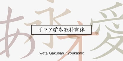 2010年に改定された常用漢字表に対応し、教科書、学習書、参考書などのあらゆる教材に使用できます。 筆やペンの入り、押さえ、ハネ、トメ、筆順などが理解しやすいようデザインしています。
 - Josefa Rounded Pro by Ingo,
$42.00 A sans serif without rough edges Josefa Rounded is a beautiful text typeface. It’s unostentatious forms and balanced narrow proportions along with the softened round edges make it to appear gentle and pleasing even in longer texts. modern very legible narrow proportions high x-height distinctive forms Dtermining for the personality of Josefa Rounded are also particular idiosyncratic letters. For instance B P and R is designed openly; the bars of E and F equal each other; lower case c and e are distinctly withdrawn in their lower zone; y is symmetrical. Short ascenders generate compact word images. Cap height is shorter than the ascenders, so capitals are only little higher than x-height. Josefa Rounded is provided in 7 weights including the corresponding italics. Tabular figures and proportional figures are available through the appropriate OpenType function as well as ligatures and discretionary ligatures.
 - TT Norms Pro by TypeType,
$39.00 Introducing TT Norms® Pro, version 3.200! The updated font now supports more languages and boasts a larger character set. These implementations have made the typeface even more advanced and convenient. TT Norms® Pro is a functional geometric sans serif for aesthetic design choices and TypeType studio's bestseller. It has been a massive success since its release, and rightfully so! This stylish, elegant, and versatile font will become the full-fledged core of your collection. TT Norms® Pro is ideally suited for products in any domain: streaming services, banking, clothing brands, or the automotive industry. It's equally convenient to use in both web and printing. Now, the TT Norms® Pro typeface includes the most extensive font package, both in terms of font styles and character sets. The base version of TT Norms® Pro consists of 22 fully redesigned font styles and 4 additional subfamilies. Besides, this font boasts the most comprehensive language support in the TypeType collection. We've added the characters of extended Cyrillic and Latin writing systems to the updated TT Norms® Pro and configured the new languages support. The character set has become more extensive—we've added currency symbols with their minuscule version and minuscule mathematical symbols. The 3.200 version of TT Norms® Pro includes: 44 roman font styles, 44 italics, and 2 variable fonts; 7 roman and 7 italic font styles in TT Norms® Pro Mono; 2 variable fonts: TT Norms® Pro Variable with three parameters of variation (weight, width, and slant) and TT Norms® Pro Mono Variable with weight and slope axes of variation; 1993 characters in each font style, including an extended set of punctuation marks, symbols, and currencies; 5 widths: TT Norms® Pro with classic proportions, monospaced TT Norms® Pro Mono, narrower-proportioned TT Norms® Pro Compact and TT Norms® Pro Condensed, and wider TT Norms® Pro Expanded; 38 OpenType features, including a large number of ligatures, fractions, numerators, and denominators; 17 stylistic sets; - 280+ languages support, counting in new symbols for French, Norwegian, Bulgarian, Uzbek, Abkhaz, and more; Flawless kerning and manual TrueType hinting. TT Norms® Pro has already become the signature font of Intercom, Inc., Sartorius AG, CSN, CBSN, Shieldex, and many other global brands. Customization is available for TT Norms® Pro upon request—we adjust the font to suit your project. Learn more about customization options in the corresponding website section. In addition to the TT Norms® Pro, we've designed the TT Norms® Pro Serif typeface. These fonts complement each other perfectly, making an ideal typeface pair.
 - Soin Sans Pro by Stawix,
$40.00
- BB Strata (Pro) by Bold Studio,
$49.00 BB Strata™ (Pro) is the first font with only octagon angles (±45°), polyspacing (same width in every weight), optical shape and monoline variants for any type of use. The ideographic system was created for an exhibition in 2015 to visualize the process and results of scientific investigations in a historical and contemporary context. ● 9 Variants (incl. SS19, SS20) ● 37 Opentype-Features/Style ● 60 Stylistic Sets (20/Variant) ● 90 Styles (incl. SS19, SS20) ● 40 OT-Features/Style ● 97 Languages Support ● 31,920 Glyphs (1064/Style)
 - Kingthings Petrock Pro by CheapProFonts,
$10.00 For these fonts I have reworked the spacing a bit, and completely redesigned the "N" as they were calligraphically very wrong. Kevin King says: "Petrock is based on letterforms found in a small city Church in Exeter - from a display case about bell ringing. A lovely simple labeling hand, I think I've done it justice... Petrock Light is a lighter form of Petrock - makes both of them more usable." ALL fonts from CheapProFonts have very extensive language support: They contain some unusual diacritic letters (some of which are contained in the Latin Extended-B Unicode block) supporting: Cornish, Filipino (Tagalog), Guarani, Luxembourgian, Malagasy, Romanian, Ulithian and Welsh. They also contain all glyphs in the Latin Extended-A Unicode block (which among others cover the Central European and Baltic areas) supporting: Afrikaans, Belarusian (Lacinka), Bosnian, Catalan, Chichewa, Croatian, Czech, Dutch, Esperanto, Greenlandic, Hungarian, Kashubian, Kurdish (Kurmanji), Latvian, Lithuanian, Maltese, Maori, Polish, Saami (Inari), Saami (North), Serbian (latin), Slovak(ian), Slovene, Sorbian (Lower), Sorbian (Upper), Turkish and Turkmen. And they of course contain all the usual "western" glyphs supporting: Albanian, Basque, Breton, Chamorro, Danish, Estonian, Faroese, Finnish, French, Frisian, Galican, German, Icelandic, Indonesian, Irish (Gaelic), Italian, Northern Sotho, Norwegian, Occitan, Portuguese, Rhaeto-Romance, Sami (Lule), Sami (South), Scots (Gaelic), Spanish, Swedish, Tswana, Walloon and Yapese.
 - Coelnische Current Pro by SoftMaker,
$10.99 Blackletter is the classic “German” printing type. Starting in the 16th century and lasting well into the 20th century, most works in Germany were printed using blackletter types. Today, blackletter fonts are mainly used decoratively. If you want to communicate a feeling of old-world quality or nostalgia, blackletter fonts are the preferred choice – use them on signs, in brochures or on invitation cards. Coelnische Current Pro is a classic blackletter font of its epoch which inspires you to create vintage-looking designs with ease.