3,401 search results
(0.036 seconds)
- Trade Gothic by Linotype,
$42.99 The first cuts of Trade Gothic were designed by Jackson Burke in 1948. He continued to work on further weights and styles until 1960 while he was director of type development for Mergenthaler-Linotype in the USA. Trade Gothic does not display as much unifying family structure as other popular sans serif font families, but this dissonance adds a bit of earthy naturalism to its appeal. Trade Gothic is often seen in advertising and multimedia in combination with roman text fonts, and the condensed versions are popular in the newspaper industry for headlines.
 - Trade Gothic Next by Linotype,
$97.99In 1948, Mergenthaler Linotype released the first weights of Trade Gothic, designed by Jackson Burke. Over the next 12 years Burke, who was the company’s Director of Typographic Development from 1948 through 1963, continued to expand the family. Trade Gothic Next is the 2008 revision of Jackson Burke’s design. Developed over a prolonged period of time, the original Trade Gothic showed many inconsistencies. Under the direction of Linotype’s Type Director Akira Kobayashi, American type designer Tom Grace, a graduate of the MA Typeface Design in Reading, redesigned, revised and expand the Trade Gothic family. Many details were improved, such as the terminals and stroke endings, symbols, and the spacing and kerning. Moreover, there are newly added compressed widths and heavy weights perfect for setting even more powerful headlines. Trade Gothic Next brings more features and better quality for today’s demanding typographers. Trade Gothic Next® font field guide including best practices, font pairings and alternatives. - Trade Gothic Inline by Linotype,
$29.00 Trade Gothic inline is a quirky display companion for Trade Gothic Next, offering five different voices, and a whole lot of personality. The lighter weights are graceful and elegant, embracing negative space to give the sense that the letters are halfway to disappearing. Designer Lynne Yun has incised the darker weights with a super thin inline that emphasises the heaviness of the letters, and creates a reassuring chunkiness. “If I kept the inlines the same, it created a lot of visual noise,” explains Yun. “I wanted each weight to be different enough, so in the end the weight and width of the letters was increasing and decreasing in size, and the inlines were too. The black is almost like an extra black, because the inline is smaller. It's about trying to have different voices for each weight.” Trade Gothic Inline is available in five weights, from light to black.
 - Trade Gothic Display by Monotype,
$42.99 It’s a colorful world. Don’t limit yourself to black and white. The Trade Gothic® Display designs take advantage of color to create lively and compelling statements, making the designs ideal for advertising, branding, poster and publication projects. Based on the powerful Trade Gothic Condensed Heavy typeface, Monotype Studio designer Lynne Yun, created the fonts necessary to set both “beveled” and “embossed” characters in any color. Trade Gothic Display 1 (embossed) generates striking highlighted type, while Trade Gothic Display 2 (bevel) produces powerful shadow and outline effects. The designs are natural additions to the Trade Gothic Next family, and stand on their own as formidable display typefaces.
 - Trade Gothic Paneuropean by Linotype,
$42.99The first cuts of Trade Gothic were designed by Jackson Burke in 1948. He continued to work on further weights and styles until 1960 while he was director of type development for Mergenthaler-Linotype in the USA. Trade Gothic does not display as much unifying family structure as other popular sans serif font families, but this dissonance adds a bit of earthy naturalism to its appeal. Trade Gothic is often seen in advertising and multimedia in combination with roman text fonts, and the condensed versions are popular in the newspaper industry for headlines. - Times Eighteen by Linotype,
$29.00In 1931, The Times of London commissioned a new text type design from Stanley Morison and the Monotype Corporation, after Morison had written an article criticizing The Times for being badly printed and typographically behind the times. The new design was supervised by Stanley Morison and drawn by Victor Lardent, an artist from the advertising department of The Times. Morison used an older typeface, Plantin, as the basis for his design, but made revisions for legibility and economy of space (always important concerns for newspapers). As the old type used by the newspaper had been called Times Old Roman," Morison's revision became "Times New Roman." The Times of London debuted the new typeface in October 1932, and after one year the design was released for commercial sale. The Linotype version, called simply "Times," was optimized for line-casting technology, though the differences in the basic design are subtle. The typeface was very successful for the Times of London, which used a higher grade of newsprint than most newspapers. The better, whiter paper enhanced the new typeface's high degree of contrast and sharp serifs, and created a sparkling, modern look. In 1972, Walter Tracy designed Times Europa for The Times of London. This was a sturdier version, and it was needed to hold up to the newest demands of newspaper printing: faster presses and cheaper paper. In the United States, the Times font family has enjoyed popularity as a magazine and book type since the 1940s. Times continues to be very popular around the world because of its versatility and readability. And because it is a standard font on most computers and digital printers, it has become universally familiar as the office workhorse. Times™, Times™ Europa, and Times New Roman™ are sure bets for proposals, annual reports, office correspondence, magazines, and newspapers. Linotype offers many versions of this font: Times™ is the universal version of Times, used formerly as the matrices for the Linotype hot metal line-casting machines. The basic four weights of roman, italic, bold and bold italic are standard fonts on most printers. There are also small caps, Old style Figures, phonetic characters, and Central European characters. Times™ Ten is the version specially designed for smaller text (12 point and below); its characters are wider and the hairlines are a little stronger. Times Ten has many weights for Latin typography, as well as several weights for Central European, Cyrillic, and Greek typesetting. Times™ Eighteen is the headline version, ideal for point sizes of 18 and larger. The characters are subtly condensed and the hairlines are finer. Times™ Europa is the Walter Tracy re-design of 1972, its sturdier characters and open counterspaces maintain readability in rougher printing conditions. Times New Roman™ is the historic font version first drawn by Victor Lardent and Stanley Morison for the Monotype hot metal caster." - Trade Gothic Next Rust by Linotype,
$29.00 Trade Gothic Next is Akira Kobayashi's 2008 revision of Jackson Burke's 1948 design. Developed over many years, the original Trade Gothic was filled with many inconsistencies. Under the direction of Akira Kobayashi, Linotype's Type Director, the american type designer Tom Grace, a graduate of the MA Typeface Design in Reading, was commissioned to redesign, revise, and expand the Trade Gothic family. Kobayashi and Grace refined many details such as the terminals and stroke endings, symbols, and the spacing and kerning. Moreover, there are newly added compressed widths and heavy weights perfect for setting even more powerful headlines. The Regular weight has been beefed up making it stronger and more robust in text settings. Trade Gothic is a staple of the advertising and newspaper industries, and now Trade Gothic Next brings more features and better quality for today's astute typographers. In addition several weights are available as soft rounded versions.
 - Trace by Linecreative,
$16.00 Introducing "Trace," a captivating display font that seamlessly marries the ancient mystique of Nordic symbols with a bold, futuristic modernity. This unique typeface transcends traditional boundaries, emerging as a striking fusion of historical symbolism and cutting-edge design. "Trace" is not merely a font; it's a visual journey that bridges the past and the future, offering a distinctive and versatile aesthetic. Inspired by Nordic symbols, "Trace" breathes new life into these ancient motifs, infusing them with a sleek and contemporary vibe. Each character carries the rich storytelling heritage of Nordic culture, interpreted through a lens of modern sophistication. The result is a font that is both timeless and forward-thinking, making it an ideal choice for those seeking a balance between tradition and innovation. As a display font, "Trace" commands attention with its bold and commanding presence. Its carefully crafted letterforms embody a sense of strength and purpose, while the subtle Nordic influences add an air of mystery and intrigue. Beyond its role as a traditional typeface, "Trace" transcends expectations by doubling as a symbol font. Unlock a treasure trove of symbolic possibilities, allowing you to weave intricate narratives or create visually stunning patterns that go beyond the constraints of traditional alphabets. Whether you're designing for futuristic branding, creating a visual language for a tech-forward project, or simply seeking a font that tells a story of cultural richness, "Trace" is your creative companion. Versatile and impactful, this font opens doors to a realm where ancient symbols and modern design converge, allowing you to explore uncharted territories in your creative endeavors. Embark on a design journey that spans centuries with "Trace. What you get, you will get: 1. Trace - Clean San serif font including Uppercase & Lowercase (ALL CAPS) characters, 2. Numbers and Punctuation 3. Support Multi language (Western Europe Latin)
 - Grades by Atom,
$15.00 Grades is a font with an amazing natural handwritten touch. Perfect for various design projects that need a touch of excitement! Is there any questions, don't hesitate to ask me :) Letteratom
 - Tralee by Tanincreate,
$12.00 Tralee Font family consist of 2 styles, regular with outline and bold filled with background colour. Originally designed for packaging typography, also would be suitable for titles, headlines, greeting cards, adverts, books and more.
 - Righten by Fikryal,
$18.00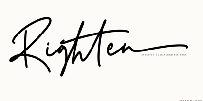 Righten – Eyecathcing Handwritten Font This font is made in a modern style, very casual, and suitable for your various design needs. It’s perfect for logo, branding, title, social media posts, advertisements, product packaging, product designs, label, photography, watermark, special event, magazine, web designs, etc. Features : Righten ( Uppercase, Lowercase ) Swashes multilingual support Ligatures If you have any questions please don’t hesitate to contact me follow my Instagram: fkryall Thank you
 - Tighten - Personal use only

- Trade Stencil by Jeff Levine,
$29.00 Spotted in an online auction was a set of brass stencils (possibly handmade) of which some of the characters were individually displayed. The interesting placement of where the letters were broken into stencil parts inspired the creation of Trade Stencil JNL, which is available in both regular and oblique versions.
 - Trade Gothic Next Soft Rounded by Linotype,
$53.99 In 1948, Mergenthaler Linotype released the first weights of Trade Gothic, designed by Jackson Burke. Over the next 12 years, Burke, who was the company’s Director of Typographic Development from 1948 through 1963, continued to expand the family. Trade Gothic Next is the 2008 revision of Jackson Burke’s design. Developed over a prolonged period of time, the original Trade Gothic showed many inconsistencies. Under the direction of Linotype’s Type Director Akira Kobayashi, American type designer Tom Grace, a graduate of the MA Typeface Design in Reading, has redesigned, revised and expanded the Trade Gothic family. Many details were improved, such as the terminals and stroke endings, symbols, and the spacing and kerning. Moreover, there are newly added compressed widths and heavy weights perfect for setting even more powerful headlines. Trade Gothic Next brings more features and better quality for today’s demanding typographers. Trade Gothic Next Soft Rounded introduces a new friendliness and warmth to the family.
 - Trad by Powerfonts,
$13.99 Trad (Träd is Swedish for tree) is inspired by viking mythology and runic alphabets. Imagine a viking warrior crudely carving a message into a tree stump with his trusty dagger, sipping on a flagon of ale and pondering a hard days slaying. Like the blade of his blood encrusted axe, Trad is ideal for projects requiring a sharp edge, such as the cover of your next thriller, zombie flick, or death metal album.
 - Covington Cond - Unknown license

- Covington Cond - Unknown license

- Covington Cond - Unknown license

- Avondale Cond - Unknown license

- Plasmatica Cond - Unknown license

- Avondale Cond - Unknown license

- Plasmatica Cond - Unknown license

- Covington Cond - Unknown license

- Bonding by Arendxstudio,
$15.00 Bonding Font that has a distinctive character that is very thick and elegant to use Bonding is a relaxed and flowing Handwritten Font. Incredibly versatile, this font fits a wide pool of designs, elevating them to the highest levels. Add this font to your favorite creative ideas and notice how it makes them come alive! Features : • Character Set A-Z • Numerals & Punctuations (OpenType Standard) • Accents (Multilingual characters) • Ligature Multilingual Support : Afrikaans, Albanian, Asu, Basque, Bemba, Bena, Catalan, Chiga, Cornish, Danish, English, Estonian, Faroese, Filipino, Finnish, French, Friulian, Galician, German, Gusii, Icelandic, Indonesian, Irish, Italian, Kabuverdianu, Kalenjin, Kinyarwanda, Low German, Luo, Luxembourgish, Luyia, Machame, Makhuwa-Meetto, Makonde, Malagasy, Malay, Manx, Morisyen, North Ndebele, Norwegian Bokmål, Norwegian Nynorsk, Nyankole, Oromo, Portuguese, Romansh, Rombo, Rundi, Rwa, Samburu, Sango, Sangu, Scottish Gaelic, Sena, Shambala, Shona, Soga, Somali, Spanish, Swahili, Swedish, Swiss German, Taita, Teso, Vunjo, Zulu There it is! I really hope you enjoy it
 - Sond by Eurotypo,
$34.00 Sond is a casual, modern and hand brushed font. I've designed Sond carefully with the intention to preserve in its glyphs the original tell-tale dry brush imperfections and a bouncy baseline for a more personalized effect even more authentic. As an exclusively Open Type release, with 519 glyphs and ornaments, it has special alternatives for all letters with lots of possibility an infinity of combinations. There are plenty of options to allow you to create something unique and special: standard ligatures, swashes and stylistics alternates for each letter, beginning and ending letters. This lovely fonts have already an extended character set to support Central and Eastern as well as Western European languages. Sond is a good choice for greeting cards, posters, labels, t-shirt design, logos, and more.
 - Mond by URW Type Foundry,
$39.99
- Cord by Roland Hüse Design,
$20.00 Cord (Zsinór in Hungarian) was originally a commissioned work for a tablecloth pattern with a thread like frame decoration that is actually consist of letters. The lettershapes were being created based on Rovas characters, which were reinterpreted without decreasing legibility. Therefore, the Rovas alphabet was designed in the first place followed by its matching Latin company. The full character set contains: Western, Central and South Eastern European Latin characters basic symbols and punctuation Rovas alphabet Rovas number symbols and punctuation Display font, best fit in larger sizes for souvenirs, folk art theme, embroidery, ribbon like decorative texts and signages. Good luck and Happy Creating! Roland
 - Bond by 4RM Font,
$10.00 Its very simple form is the hallmark of this font, the bond font is a simple styled font but still has an aesthetic value, this font is suitable for use in simple themed designs.
 - Condo by Bogusky 2,
$20.00Novelty condensed serif font - Kondes by Tour De Force,
$25.00 Kondes is our "101 Dalmatians" – it's 101th release in our catalog! And it is the 1st one that belongs to variable typefaces. Kondes (which is made up word as mixture of "condensed" and "kondezovan" on Serbian) is simple, compact, straight-in-your-face sans serif family with 9 weights and 9 Italics. It was designed with purpose to serve and to be use in any project, from editorial to website. For example, Black weight could be used effectively as poster type, in big sizes while Regular fits perfectly as main webfont. Stem joining is done with generous ink trap that divides and opens letter contours, so letter breaths in smaller sizes. Contains extended Latin character set. Enjoy!
 - Gothic Gothic by Typeco,
$29.00Gothic Gothic is a fusion of old and new that is both Gothic and Gothic. In typography Gothic can refer to German Blackletter or Old English styles. Gothic can also mean block or sans serif style lettering. By combining and balancing the elements from both of these ideas we have created a contemporary extended block letter typeface. The Gothic Gothic family contains 2 companion fonts. Gothic Gothic Text is a more minimal variation that has a more roman looking style while still retaining some Blackletter feel. Gothic Gothic Black is a bolder version designed to tend more toward the Blackletter style of Gothic with more contrast of stroke and a few of the more unusual Blackletter forms thrown in for flavor. Gothic Gothic has been honored with an award of Excellence in Type Design from Association Typographique International (ATypI) in 2001. Typeco has updated this font and has released it as an expanded family. Gothic Gothic is a crepuscular family of 3 fonts - Merchant Trade JNL by Jeff Levine,
$29.00 A precursor to Art Deco headline/display sans serif typefaces with thick and thin strokes is the Matthews Series (circa 1902). It was manufactured and sold through the Inland Type Foundry of St. Louis, MO. Digitally redrawn as Merchant Trade JNL, it’s now available in both regular and oblique versions.
 - Sign Trade JNL by Jeff Levine,
$29.00Sign Trade JNL is a reworking of Sign Crafter JNL. With a traditional M,N and W replacing the stylized versions of these letters in the previous font, Sign Trade JNL also offers an oblique version. - Trade Convention JNL by Jeff Levine,
$29.00 An ad for the annual Variety Club Convention appeared in the March 18, 1940 issue of "The Film Daily. The main headline was hand lettered in a classic Art Deco "solid" style of sans serif - ultra bold and with no counters - but had one additional feature: 'engraved' lines to the left of each character. This has now been expanded into the digital typeface Trade Convention JNL, which is available in both regular and oblique versions. Variety Clubs (now know as Variety - The Children's Charity) was founded in Pittsburgh, Pennsylvania in 1928 by entertainers specifically to aid children. Their history can be found at https://variety.org/who-we-are/history
 - Trading Hoss NF by Nick's Fonts,
$10.00 Speedball pen master Ross George presented this face as D-nib Display. Its wide stance and quaint attitude make for some unavoidable whimsy. Both versions of this font support the Latin 1262, Central European 1250, Turkish 1254 and Baltic 1257 codepages.
 - Trade Paper JNL by Jeff Levine,
$29.00 In the March 16, 1936 edition of “The Film Daily” (a trade publication for the film industry) the magazine ran an ad for its Year Book. The ad was set in a slab serif typeface similar to popular designs such as Karnak, Stymie, Beton and the like. Redrawn digitally as Trade Paper JNL, it is available in both regular and oblique versions.
 - Trade Journal JNL by Jeff Levine,
$29.00Trade Journal JNL and its oblique counterpart are derived from a classic grotesk sans face from the 1800s. Despite the 'Grotesk' style name, the font design is actually quite pleasing to the eye and a nice alternative to many of the sterile sans serif faces of today. - Trade Printer JNL by Jeff Levine,
$29.00Trade Printer JNL is another font design inspired by an old rubber stamp sign printing set. In this case, the lettering has a classic "wood type" look, reminiscent of the letterheads, billheads and fliers made by local printers of the 1880s-1920s. - OL Gotham Gothic by Dennis Ortiz-Lopez,
$40.00 - Ams Trame - 100% free


Page 1 of 86Next page