4,469 search results
(0.042 seconds)
- Vintage Varsity by Grant Beaudry,
$17.00 Vintage Varsity was inspired by that classic iron-on letterman jacket your "cool" uncle wore in high school (and lets be real, probably still wears today)... Pair with some fuzzy felt textures and you got yourself a killer duo! Strike the fill, throw a stroke on it, and design a retro-slogan t-shirt. Is this starting to sound like a cheesy infomercial? Good, I'm rolling with it. Have fun!
 - Sunshine Susie JNL by Jeff Levine,
$29.00 Sheet music for the song "Today I Feel So Happy" from the 1932 motion picture "Sunshine Susie" provided both the visual model and the name for Sunshine Susie JNL, available in both regular and oblique versions. The lettering is a bold Art Deco thick-and-thin design, and comes not from the song's title, but the hand lettered name of the movie as it appeared on the cover the song folio.
 - Maison Paris by Shakira Studio,
$19.00 "Introducing Maison Paris - Where Modern Elegance Meets Timeless Sophistication! Maison Paris is the font that defines contemporary style, making it an absolute must-have in today's design scene. This font effortlessly marries modern chic with timeless sophistication, embodying the very essence of what's trending now in the world of typography. With a versatility that knows no bounds, Maison Paris is your key to creating stunning designs that demand attention in today's competitive landscape. Whether you're crafting a high-end brand's logo, a cutting-edge editorial layout, or a minimalist wedding invitation, this font adds an element of tasteful extravagance that's currently sought after. Don't miss the chance to infuse your designs with the most sought-after modern stylish serif font of the moment. Maison Paris is your ticket to ensuring your projects are impeccably current and stylish. Embrace the future of design today with Maison Paris!" Here's what you get: Regular, Italic All Multilingual symbol Opentype features ( ligature, alternate ) Accessible in the Adobe Illustrator, Adobe Photoshop, Adobe InDesign, even work on Microsoft Word. PUA Encoded Characters - Fully accessible without additional design software. Multilingual character supports : (Afrikaans, Albanian, Catalan, Croatian, Czech, Danish, Dutch, English, Estonian, Finnish, French, German, Hungarian, Icelandic, Italian, Lithuanian, Maltese, Norwegian, Polish, Portuguese, Slovenian, Spanish, Swedish, Turkish, Zulu) Follow my shop for upcoming updates, and for more of my work, Thank you!
 - Yacarena Ultra FFP is a font that stands out for its unique and captivating design, meticulously crafted by the skilled typeface designer deFharo. This font is emblematic of deFharo's commitment to c...
- Selfie by Lián Types,
$37.00 ATTENTION CUSTOMERS :) There's a new Selfie available, have a look here; Selfie Neue is better done and more complete in every aspect. However, you can stay here if you still prefer the classic version. -But first, let me take a Selfie!- said that girl of the song and almost all of you at least once this year. While some terms and actions get trendy, some font styles do it too. It wouldn't be crazy to combine these worlds, in fact it happens often. Selfie is a connected sans serif based in vintage signage scripts seen in Galerías of Buenos Aires. These places are, in general, very small shopping centres which pedestrians sometimes use as shortcuts to get to other parts of the city. Their dark corridors take you back in time, and all of a sudden you are surrounded by cassettes, piercings, and old fashioned cloth. For some reason, all these shops use monolined geometric scripts. Surely, neon strings are easier to manipulate when letterforms have simple shapes. My very first aim with Selfie was to make a font that would serve as a company to those self-shot pictures that have become so popular nowadays. However, the font turned into something more interesting: I realised it had enough potential to stand-alone. Selfie proves that geometry itself can be really attractive. In this font, elegance is not achieved with the already-known contrast between thicks and thins of calligraphy, but with the purity of form. Its curves were based in perfectly shaped circles which made the font easy to be used at different angles (some posters show it at a 24.7º angle) without having problems/deformities. In addition to its nice performance when used over photographs, the font can be a good option for packaging and wedding invitations. TIPS Adding some lights/shadows between letters will for sure catch the eye of the viewer: Words will look as if they were made with tape/strings; so trendy nowadays. Try using Selfie at a 24.7º angle so that the slanted strokes become perfectly vertical. Having the decorative ligatures feature (dlig) activated is a good option to see letters dance. TECHNICAL It is absolutely recommended to use this font with the standard ligatures feature (liga) activated. It makes letters ligate perfectly and also improves the space between words.
 - Narrow Path by Ingrimayne Type,
$9.00 NarrowPath is a family of 18 condensed and ultra-condensed sans-serif typefaces. The family was derived from the font family NarrowWay by adding true lower-case letters. Some alternative letters forms can be reached with the OpenType feature of stylistic sets. The character spacing in most of the styles is quite loose and it can be tightened with an application's character spacing if needed. These typefaces are display faces that can be useful for squeezing tall lettering into tight spaces. Uses may include packaging, signage, and titles.
 - AB Ticena by Andres Briganti,
$20.00 Elegant and idiosyncratic, AB Ticena is a display and extended typeface inspired by the ancient forms of Lombardic capitals. The sometimes quirky and capricious letterforms take their inspiration from medieval forms found in inscriptions and manuscripts where latin Roman capitals were taken to new stylistic and even extreme expressions. The ultra-wide horizontal proportions and its modulated, humanistic strokes gives it a more refined and contemporary edge. AB Ticena works best for logotypes, short and striking headlines, and editorial purposes. A set of ligatures and stylistic alternates is also available for selected characters and pairings.
 - Altair by Zetafonts,
$39.00 Altair is a sans serif type family derived from Zetafonts's Digitalino typeface. The original bold design by Francesco Canovaro has been expanded in a seven weights family, suitable for a wide range of design uses, from body copy to display text and ranging from a thin weight to the ultra one. Altair's main originality lies in the calligraphic roots of its design, that gives it a friendly, confident look that is perfect for corporate voices, new technology startups, news blogs and any other case where a solid design must be given an emotional context.
 - Belle Sans by Park Street Studio,
$25.00 Belle Sans is a clean, straightforward sans serif typeface family, and a very large family at that! It has seven widths, from Ultra Condensed to Extra Wide, and seven weights, ranging from Light to Black, all with Oblique companions. Belle Sans offers up great legibility for on-screen usage, and the breadth of width and weight make it very usable for text applications as well. The heavier weights, especially the Black, are exceptional for creating visual impact! Each font supports Western and Central European languages, ligatures, tabular figures, unlimited fractions, superiors & inferiors, and ordinals.
 - Kimbiso by Yukita Creative,
$14.00 Kimbiso is one of the most advanced fonts on the market. Its clean lines and ultra-modern style make it perfect for high fashion branding, cinematic videos, social media posts, and more. Best of all, it's easy to read and looks sophisticated and stylish. What do you get when you get this font? - Modern Sans is one font you need - Affordable and versatile - Multilingual support and complete characters set - Designed by a Typeface Designer - Get one font for any occasion - Multilingual support in this modern sans serif font - Well known for its exceptional readability
 - Closeby by Papanapa,
$30.00 Closeby is friendly, cheerful, and extremely addictive! Closeby is a hand-drawn display font with more than 80 ligatures and a curious personality. Designed for big titles, its ultra-condensed style works as a unicase and fills the spaces with visually unique typographic compositions. Perfect for packaging, posters, food and drink menus, or book covers, its gravitational point varies between cases, and can be used in all uppercase, all lowercase, or mixing the two to obtain restless and sparkling results. Closeby has support for Western Europe and more than 65 languages.
 - Ingo by Up Up Creative,
$16.00 Introducing Ingo, a sultry display font with smooth curves and high contrast. Featuring an ultra-modern and experimental yet highly readable "deconstructed serif" style, Ingo is perfect for your next editorial, advertising, branding, book, or invitation project. Ingo includes approximately 440 glyphs. OpenType features include multilingual support (including multiple currency symbols - for kicks I even included a Bitcoin symbol in there), standard and discretionary ligatures, and two ampersand variants. The OpenType features can be very easily accessed by using OpenType-savvy programs such as Adobe Illustrator and Adobe InDesign.
 - Rock It by Fenotype,
$29.95 Rock it! is a type family that let's you create instant graphic design for any ROCK, PUNK, HARDCORE, HORROR and so on -gig, poster, logo, and whatever you need. Just type your texts and combine all the tree versions for authentic look! Rock It! includes three ultra condensed sans fonts with different eroded textures and partially different letter shapes. Different versions of Rock It! are set as "Light," "Regular," and "Bold", where Light and Regular have eroded holes in them whereas Bold has "dirty print stains" all over the characters.
 - Briller by Kostic,
$40.00 Briller is a super-wide display sans that covers 6 weights, from delicate Thin on one side to chunky Ultra on the other end. Briller tabular figures (via the OT feature) and most of figure related glyphs (such as monetary symbols) are the same width throughout the weights, leaving fun possibilities in pairing them up in contrast while retaining that sense of tabular order. Briller has a character set to support Western and Central European languages. Each weight includes ligatures, proportional lining and tabular figures, fractions and scientific superior/inferior figures.
 - Elida JNL by Jeff Levine,
$29.00 Elida JNL was modeled from an image of some wood type for sale online. Although the type design most likely has its roots in the classic Bodoni, there were a few characters in the original wood type that had a bit of a square or block shape to them. Those characters were modified in order to keep with the overall roundness of the other characters. The name Elida JNL comes from a small town in New Mexico. Available in six styles: Regular, Oblique, Extra Condensed, Extra Condensed Oblique, Ultra Condensed and Mega Condensed.
 - Force by Outras Fontes,
$24.00 Force is a contemporary sans serif ultra-black family designed by Ricardo Esteves. There are 4 font styles: Force Regular, with a upright roman structure; Force Italic, with more cursive lowercase forms; Force Shadow, that can be used alone or as a second layer to Force Regular; and Force Dingbats, containing some pictograms. Each font file has some OpenType features: discretionary ligatures, fractions, subscript and superscript. The Force family is suitable for big-size high impact situations like posters, headlines, titles, magazines, packaging and many others you may creatively think of.
 - Vow by Thinkdust,
$15.00 Vow is an incredibly stylised font, strutting its stuff on the typography catwalk. Vow does everything to excess, even when cutting down: where it’s curvy, it’s very curvy, but where it’s thin, it’s thin. Vow’s regular weight has a certain boldness at text size, but its ultra-thin alternative is much better used at larger sizes, managing to take up very little space even when scaled up. Using a mix of the two creates a subtle emphasis, especially when coloured, which helps to create stunning messages in elegant ways.
 - Magallanes Condensed by Latinotype,
$29.00 Say hello to the new Magallanes Condensed Family, a contemporary neo-humanist sans serif font designed by Daniel Hernández. Its strokes and terminals are related to the calligraphic strokes from humanist typefaces. It comes with 8 styles, from Ultra Light to Black, each with its true italics. Every weight comes with alternative glyphs for a more dynamic use. Magallanes is the perfect titling font to complement text faces in magazines, logotypes, etc. Languages supported include Basic Latin, Western European, Euro, Catalan, Baltic, Turkish, Central European, Romanian, Pan African Latin.
 - Sean Henrich ATF by ActiveSphere,
$30.00 Sean Henrich ATF is a sharp, rounded geometric display font and works best in text and display applications, such as headline, posters, signage, magazine, product branding, corporate branding, logos and titles. Several alternate characters are included in this typeface. Sean Henrich ATF font has six weights; ultra light, extra light, light, regular, bold and extra bold, each available in italic, making a total of twelve styles. Each style has a full upper and lower-case, accents, punctuation and a selection of monetary symbols. Currently Available for PC, in Open Type, PostScript or TrueType.
 - Akkordeon Slab by Emtype Foundry,
$69.00 Akkordeon Slab is the next step in a series of ultra display typefaces. The new Slab version shares the same skeleton and spirit as the original Akkordeon, putting the same concepts into a different shape. Akkordeon Slab provides a stronger voice that enriches the whole family, becoming especially suitable for sports, business, fashion or any situation that requires impact headlines. Learn more about the Akkordeon design process at the Emtype's Blog. See also the Akkordeon Slab PDF. Check out Akkordeon which is a great pair for Akkordeon Slab.
 - Gulp by Flavortype,
$18.00 GULP font is a playful and fun font inspired by pop art, hippie and comic book styles. It's groovy, funky and retro with an ultra-bold and fat appearance, making it perfect for eye-catching headers and short word texts. This font exudes modernity and fanciness, making it ideal for any purpose that requires a dominant and powerful impact. The italic style adds a touch of uniqueness, giving it a playful edge. However, GULP is not recommended for long text as it can be overpowering and may detract from the overall readability of your content.
 - Magallanes by Latinotype,
$29.00 Say hello to the new Magallanes Family, a contemporary neo-humanist sans serif font designed by Daniel Hernández. Its strokes and terminals are related to the calligraphic strokes from humanist typefaces. It comes with 8 styles, from Ultra Light to Black, each with its true italics. Every weight comes with alternative glyphs for a more dynamic use. Magallanes is the perfect titling font to complement text faces in magazines, logotypes, etc. Languages supported include Basic Latin, Western European, Euro, Catalan, Baltic, Turkish, Central European, Romanian, Pan African Latin.
 - Soul Skull by Otto Maurer,
$19.00 Soul Skull ist a special Version of my Font „Soul“ (soul ultra black). For a long Time i want to make a Font like this. Before FL6 that was impossible. I know it is a big File Size for a Font with all the Graphics but i need a Font like this for a Halloween Projekt. And so i did it myself. I hope you like it as i do! At this time i will say Thank you for FontLab 6 It is so much better than V5. I love this App :)
 - Adigiana Ultra, crafted by the talented B.O.Nelson, is a font that stands out for its boldness and creative flair. This typeface, with its ultra-thick strokes and condensed letterforms, is designed t...
- Moge by BanyumiliStudio,
$15.00 Introducing MOGE: power, retro and modern! Perpendicular and thick forms create strength in your designs. The shapes look retro, but still features modern elements. MOGE is very good if used on: Car / Motorcycle Repair Shop, Barbershop Logo, Brand Logo, and various products that require a touch of strength.
 - Velouté by Wilton Foundry,
$29.00 Velouté is named after one of the original French Mother Sauces, it is a surprisingly bold and velvety script with delicate flourishes that demand your attention. Velouté's unique mix of classic, contemporary, bold and delicate detail is ideally suited for Special Invitations, Coffee shops, Restaurants, Boutiques and Menus.
 - Coffee & Tea Doodles by Outside the Line,
$19.00 Coffee and Tea Doodles are a font of coffee and tea things-- beans, cups, drinks, tea bag, iced tea, tea sets etc. Perfect set of clip art for coffee or tea shop menus, ads, invitations, etc. Includes scripted words that include coffee, tea, coffee break and tea for 2.
 - Otis Condensed by Australian Type Foundry,
$30.00The name Otis arose from an incident in a shopping mall in which, realising my shoelace was undone while on an escalator, I bent down to tie it, became aware of the approaching end, panicked, fell over, and in the process happened to notice the escalator's brand name. - Jassime by Nian Keun Studio,
$12.00 Jassime is an elegant serif font with beautifully crafted characters following the trend so you can use them very well. You can use Jassime in graphic designs, magazines, logos, identity branding, fashion brands, clothes, and many others. Thank you for coming to my shop and enjoying other fonts.
 - Bughats by Lemonthe,
$15.00 Bughats is a relaxed and flowing script font with a modern style. This gentle font will look gorgeous on a variety of design ideas. Suitable for any projects such as logos, branding projects, product packaging, mugs, quotes, posters, shopping bags, t-shirts, book covers, labels, photography, watermark, and more.
 - Blitzplakat by FaceType,
$12.00 Unearthed by our friend Dimitris Karaiskos in an antique shop in Vienna, we digitized it and added more glyphs. Blitzplakat is the name of this pre-Letraset system, where you could make your own little advertising posters by cutting out these letters and sticking them on paper like stamps.
 - Pata Slab by In-House International,
$10.00 Pata Slab: the ultra-heavy optimism we all need in 2020 Pata Slab is the type equivalent of a catwalk stomp down a city sidewalk, a font that’s assertive, funky and more than a little sexy. Named after a colloquialism for ‘feet’, Pata features ultra-heavy slabs and contrasting hairline centers that rise from its chunky footprint. The resulting, retro-inspired vertiginous curves add instant attitude to any design. Developed in 2020, Pata is a type of its time.Pata is all upside, as it is a typeface with no descenders — one that elevates all characters to grow upward from the baseline (because, c’mon, we could all use something uplifting right now!) All uppercase characters were built to fit precisely inside a square, so they’re all the same width and height. The lowercase alphabet, eñes, cedillas, punctuation, numbers and symbols all follow the same height restrictions. Despite all that confinement, Pata sports standard-height terminals that connect seamlessly so there’s nearly endless options for modular ligatures. The upshot of all this meticulous awesomeness is that laying out, customizing and stacking text super simple. Pata Slab was created by In-House International, designed Alexander Wright in collaboration with Rodrigo Fuenzalida. It's available for Opentype format (.otf) compatible with Mac and PC.
 - Churchward Typestyle by BluHead Studio,
$25.00 Churchward Typestyle is a clean sans serif font, originally designed as a photo font by Joseph Churchward back in 2002. Under exclusive license, BluHead Studio has digitized this typeface by using his original drawings. We added any missing glyphs, being careful to maintain the aesthetic that makes this a classic Churchward design. Joseph intended this to be a six weight family, so we digitized the Light and Ultra Bold weights and interpolated the middle four. We enhanced the functionality of the family by creating a complimentary set of small caps, as well as creating a 10 degree oblique of each weight, being careful to correct the slanted curve forms of the letters. Churchward Typestyle is now an extensive 12 weight family, ranging in weights from Light to Ultra Bold, making it extremely useful in a broad range of design applications, from text and print, to display, posters and billboards. It’s sanserif design is clean and open, with a few of those characteristic Churchward goodies. Joseph loved his ink traps, so look for many of those! They especially become more apparent in the heavier weights. All of the Churchward Typestyle fonts support the major Western European languages, and have OpenType features for ligatures, smallcaps, tabular figures, superiors, inferiors, fractions, and ordinals.
 - Thorowgood Sans by HiH,
$8.00 A three-dimensional all-cap font for title use, Thorowgood Sans Shaded was released by the Fann Street Foundry of W. Thorowgood & Co. in 1839. Interestingly, it more closely resembles Figgins' Four-Line Emerald Sans-Serif Shaded of 1833 than Fann Street’s own Grotesque Shaded of 1834 (with light and shadow reversed). The idea of a shaded font is of an outline font whose letters have each been extruded through a die and then viewed from the lower right to reveal the third dimension. That third dimension has also been referred to as a shadow. Vincent Figgins' 1815-release of a shaded serif typeface was the first known of many shaded faces, as the other foundries rushed to bring out their own versions. Thorowgood Sans Shaded may be gainfully used today as a eye-catching headline font, just as it was so popularly used in the early nineteenth century. To assist with the usual all-cap letter-spacing problem, the following pre-kerned pairs are included: AT, AV, AW and AY. Be sure to download the Type Specimen showing the full character set, as well as a sample text. Live large - use it boldly.
 - Copal by Adobe,
$29.00Inspired by the carvings on meso-American monuments, David Lemon of Adobe's type staff created Copal. It is named after a resin that was burned as incense by ancient cultures and which is used today as a binding agent in printer inks and varnishes. The fonts in Copal can be used individually or combined to achieve chromatic effects. Try the decorated letters in headlines when you are in need of a burst of primitive energy. - Retro Star by Genetype,
$24.00 Introducing Retro Star Typeface: Unleash Nostalgia in Every Letter! Step into a time capsule with Retro Star, our latest vintage-themed font that oozes old-world charm. Radiating a sense of nostalgia, this typeface takes you back to the elegance pop from days gone by. Retro Star lends an air of authenticity to your designs. Embrace the past and craft designs that resonate with the soul of yesteryears – discover Retro Star today!
 - Romla by HansCo,
$12.00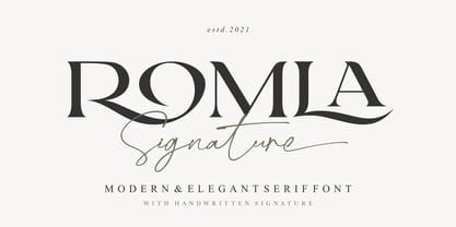 Romla is an elegant and classy font with a modern touch. This font come with signature ballpoint style that give you a sleek, elegant look for your logos, business card, wedding invitations, quotes, advertisements, and more. This typeface comes in uppercase and lowercase, with punctuation, symbols, numerals, stylistic alternates and also has multilingual support. Create something beautiful today with this font. Tutorial how to Install & use Alternate / Special Character : https://hanscostudio.com/tutorial/ Enjoy!
 - Secca Art Std by astype,
$36.00 Secca Art recovers some of the expressive forms of early art nouveau and art deco grotesques — not copying it, but carefully adapting it for today. Secca Art is based on the Secca typeface family and is full interchangeable. Both are equal in weights, widths and word spacing, so you can decide to give your layout a more expressive or serious look. If you need Italic styles just use the Italics from Secca .
 - Friedrichsfeld by Otto Maurer,
$17.00 Friedrichsfeld is a small town near there where I live. Friedrichsfeld, Voerde and Wesel was Part of the Preussen Kingdom till 1912. Friedrichsfeld was a Parade ground of the preussen troops and get the name of the King Friedrich II (the old Fritz). Today there is a Preussen Museum near Friedrichsfeld in Wesel. The Font comes in two ground Version, one in the history Letters and old Ligatures and a modern Version.
 - Kinder by 1871 Project,
$15.00 Introducing Kinder, our first serif font featuring both upper and lowercase characters! Featuring unique beautiful curves and a modern feel (look at that K!) Inspired by old records and packaging designs, with an 1871 spin. It has a beautiful range of stylistic alternates with unique characters making it a versatile powerhouse for logos, headlines, posters, shirts, you name it! Pick up Kinder today and make the world more beautiful with your creations!