10,000 search results
(0.043 seconds)
- Aberforth by Brittney Murphy Design,
$9.00 Aberforth is clean, mixed-case font family. It's mono-height, so it pairs well with other fonts. Family includes regular, rough, outline, tiles, and italic versions.
 - Origami by Monotype,
$29.99In spite of its angular appearance, Origami is composed almost exclusively of curves. Designer Carl Crossgrove derived the typeface from experiments in designing a low resolution type. The resulting face is reminiscent of Eastern European expressionist designers such as Oldrich Menhart and Vojtech Preissig. It is paired with an equally angular chancery italic. Origami works effectively for short blocks of text or at display sizes, while the capitals are especially suitable for titles. - Sageyl by Sealoung,
$25.00 Proudly present Sageyl Typeface created by Sealoung, A serif modern and classic typeface that his own unique style & modern look. It loops and swoops in a delicate dance that is never boring. Use this dainty serif as a memorable logotype or header and pair it with something contrasting and clean. This typeface is perfect for an elegant & luxury logo, book or movie title design, fashion brand, magazine, clothes, lettering, quotes, and so much more.
 - Empire by Font Bureau,
$40.00 In 1937, Morris Fuller Benton designed Empire, titling capitals that became the headline style for Vogue magazine. In 1989, David Berlow revived it for Publish magazine, adding an italic and a lowercase, both unavailable in the original. He revisited Empire in 1994 with Kelly Ehrgott Milligan, adding two heavier weights, small caps, and an elegant set of Art Deco–flavored oldstyle figures, ultimately expanding it to a seven-part series; FB 1989–94
 - Lawrence by Fenotype,
$35.00 Lawrence is an elegant OpenType powered Roman Display typeface with two weights. Lawrence is great for fashion, branding, packaging or editorial use. Lawrence is equipped with 192 OpenType alternates including Swash, Stylistic and Titling Alternates. Lawrence also has interlocking ligatures set in Discretionary Ligatures. These ligatures contain pairs in Uppercase + Uppercase, Uppercase + Lowercase and Lowercase + Lowercase. These Alternates are PUA encoded and can also be accessed from Glyph Palette or Character Map.
 - Asian Imports JNL by Jeff Levine,
$29.00 Sheet music for the 1939 Hoagy Carmichael composition "Hong Kong Blues" features the Far East-influenced hand lettered title that was the basis for Asian Imports JNL; available in both regular and oblique versions. Carmichael performed the song in the 1944 Warner Brothers film "To Have and Have Not", (which first paired Humphrey Bogart and Lauren Bacall). The sheet music was a reissue to capitalize on the song's use in the film.
 - DASEGO by Twinletter,
$15.00 DASEGO, our newest font, is now available. A display typeface with an Asia theme that we made to fulfill the needs of your project with an Asian theme that you may use for projects that can be understood by audiences all over the world. We created this typeface by paying close attention to the individuality of each letter, abstract while still prioritizing optical harmony, and your project will look stunning with it. Logotypes, food banners, branding, brochure, posters, movie titles, book titles, quotes, and more may all benefit from this font. Of course, using this font in your various design projects will make them excellent and outstanding; many viewers are drawn to the striking and unusual graphic display. Start utilizing this typeface in your projects to make them stand out.
 - MVB Celestia Antiqua by MVB,
$39.00Mark van Bronkhorst designed MVB Celestia Antiqua at a time when font choice was limited. Design was characterized by overuse of the few fonts that came with laser printers. A rustic typeface, recalling the roughness and irregularity of pre-digital printing, was a response to the cold crispness of DTP. MVB Celestia Antiqua holds its own among a large group of other “weathered” serif fonts, in part due to the size of the family: three weights, small caps, italics, and two titling styles. But it's also successful because it's simply drawn well, the contours only as rough as they need to be, enabling text at any size, large or small. - Brovile by Hanzel Space,
$25.00 Brovile, is a wedge serif font that is sure to stand out! A little bit retro and a bit modern, Brovile. is great for logos, editorial or web design. The unique sharp serifs mixed with thin strokes give off a bold mid century architectural vibe. This modern serif typeface features serifs. Perfect for gorgeous logos & titles, The Brovile. will pair beautifully with many fonts and work well with whatever project you're working on. Web font Uppercase Lowercase Numbers & Punctuation That's it! If you have any questions at all , feel free to pop me a private message , I'm always more than happy to help you along :) Happy creating! Hanzel Studio
 - GLC Ornaments One by GLC,
$20.00 This font is a collection made with the largest part of the ornaments contained in the GLC foundry medieval and renaissance period fonts. It was made for the use of customers who wish to embellish their works without buying our complete catalog! It is used to embellish and animate as variously as web-site titles, posters and fliers design or greeting cards, all various sorts of presentations, menus, certificates, letters. It was specially drawn to accompany our medieval and renaissance fonts, like 1462 Bamberg, 1509 Leyden, 1538 Schwabacher, 1543 Humane Jenson, 1557 Italique, 1589 Humane Bordeaux, 1592 GLC Garamond and others, giving them an historical additional genuine touch...
 - Quimbly by Magpie Paper Works,
$18.00 Quimbly was designed to shine! This hand-drawn font family comes in three weights (light, regular and bold) and was carefully created with coordination in mind. Warm, balanced letters pair very well with just about every modern calligraphy typeface. And unlike many other hand drawn fonts, Quimbly's thoughtful kerning means your text is easy to read at all point sizes! You'll find this versatile family is equally at home in everything from large-scale signage to wedding invitations. Rich Opentype features include decorative swashed capital letters, stylish proper titles, old-style numerals and a full set (uppercase & lowercase) of small caps. Multi-language support is also included in the font.
 - 1669 Elzevir by GLC,
$42.00 This family was inspired from the set of font faces used in Amsterdam by Daniel Elzevir to print the famous “Tractatus de corde...” the study on earth anatomy by Richard Lower, in 1669. The punch cutter was the famous Dutch Kristoffel Van Dijk. In our two styles (Normal & Italic), font faces, kernings and spaces are scrupulously the same as in the original. This Pro font covers Western, Eastern and Central European languages (including Celtic), Baltic and Turkish, with standard and “long s” ligatures in each of the two styles. The Roman (Normal) style contains a U stylistic alternate, and the Italique style A.
 - Bauer Bodoni by Bitstream,
$34.99Firmin Didot cut the first modern face about 1784 in Paris; Giambattista Bodoni followed prolifically on his heels; his punches and matrices survive in Parma. Bauer has produced the most faithful and delicate contemporary version of his types. - Rosetype by Forberas Club,
$16.00 Rosetype font create with carefully. Can be use for wedding party, invitation, memorable moment, love story and many more with special moment.
 - Tummy by Suomi,
$20.00 Tummy is part of the Game font set I made few years back; this one is for game packaging and logo design.
 - Clip Joint JNL by Jeff Levine,
$29.00 According to Wikipedia, a "clip joint" is an establishment, usually a strip club or night club (often claiming to offer adult entertainment or bottle service) in which customers are tricked into paying excessive amounts of money, for surprisingly low-grade goods or services - or sometimes, nothing - in return. These establishments were rampant during the prohibition years. However, the inspiration for Clip Joint JNL comes from a more positive source - a WPA (Works Progress Administration) poster advertising "The Lure of the National Parks". A bold, classic Art Deco design, it typifies the modern and streamlined approach to lettering in the 1930s and 1940s.
 - Zenoa by Brenners Template,
$19.00 Zenoa Display Serif Font Family - They are sharp and sensitive, but connected-oriented. That's why they're designed by incorporating hook glyphs into an elegant serif style. Somewhat high contrast between vertical and horizontal, they reveal the strong individuality of each glyph, so you can create creative layouts. The meticulous design stands out so that readability and individuality can be expressed in harmony. And, these are the special excellences of this font family: Stylish Alternates and Ligatures where calligraphic subtlety is artistically connected. These OpenType features are decorative pleasures of using this font family more functionally. Please check first if the app you are using supports these features. They are easy to use in Adobe apps such as Photoshop and Illustrator. Alternates : A, B, C, D, E, F, G, H, J, K, L, M, N, P, Q, R, S, T, U, V, W, X, Y. Standard Ligatures : ff, fi, fl Discretionary ligatures : Am, Ba, Ca, Ch, De, En, Fr, Ge, Ha, In, Lo, Mi, No, Pa, Ro, Sa, Th, Va, Wo, Yo, an, bi, ck, de, ee, gn, ha,ie, lo, mo, no, oo, pr, ro, ss, st, te, um, ve, we, yo. Supported Languages: Western Europe, Central/Eastern Europe, Baltic, Turkish, Romanian
 - moebius - 100% free

- Kodiak by Borges Lettering,
$45.00 Kodiak was designed by 40+ year sign painting veteran, Brian Grant, and is loosely based on the works of many great sign painting masters. Brian and Charles Borges de Oliveira teamed up to bring this beautiful sign painters classic to the digital age. Kodiak retains the warmth of a hand lettered font without being stiff and mechanical. Great for period style lettering to modern day logos. With over 160 alternates and 10 ornaments you are bound to find the right look for your next design!
 - Humble Craftman by Invasi Studio,
$17.00 Humble Craftman is a super versatile font that pairs script and sans typefaces. Each letter features a swashy touch, making Drippy more remarkable in the industry. This script font blends classic historical ambiance with pop modern retro vibes. Be the best version of your vision statement, and stand out from the crowd. A perfect pair for your logotype, branding project, label design, sign painting, and a very wide of advertising needs.
 - Whiplash by 38-lineart,
$16.00 Whiplash is a natural handwritten font with firm strokes as the main character. All-caps and mixed-match are the main concepts of this font, where the uppercase and lowercase can be pair according to your taste. This font has a very strong and very prominent character that will distract the eyes. This is a great choice when used as a title on banners, posters, book titles and even magazine covers. Modern lifestyle brands such as fashion, cosmetics, and outdoor sports are also a trend to use this font style. You who like travelling can also try to write a caption or quote, people are increasingly curious about the mystery of your adventure and short notes. Besides being equipped with multi-language, we also equip ligature such as ee, ll, gg, oo, ss, tt, pp, rr. Enjoy our fonts, and make sure your brand will stand out and invite people to take a closer look.
 - The Hand Wide by S&C Type,
$13.00 The Hand Wide is a handwritten font designed by Fanny Coulez and Julien Saurin in Paris. It's the extended version of The Hand, coming in 8 heights finely balanced. We wanted to create the most generic and readable handwritten font, to work well in every kind of design. We hope you will enjoy our work :) You could follow us on our Instagram: instagram.com/sc.type Merci beaucoup!
 - Nuit by Eurotypo,
$28.00 Nuit, a delightfully handwritten family font with strong character designed by Carine de Wandeleer. Its slight bounce and intentional irregularity, gives your words a wonderful flow. The fatness and thinness of their strokes give an impressive harmony. This new font family includes Regular, Italic, Bold and Bold Italic. It has OpenType features such as Stylistics alternates, Swashes, Ligatures, up to four Stylistic sets by letter, initial and terminal forms in upper and lower, ornaments that allow you to mix and match pairs of letters and a Central European language support to fit your design. This OpenType features may only be accessible via OpenType-aware applications, or the Character Map to view and copy any of the extra characters to paste into your favorite text editor/app. This will help your creativity and make it easier to make expressive and elegant your typographic work. Also with Nuit it is possible to write all in capitals. Nuit looks lovely on wedding invitations, greeting cards, logos, posters, labels, t-shirt design, logos, business-cards and is perfect for using in ink or watercolor based designs, fashion, magazines, food packaging and menus, book covers and whatever your imagination holds! Nuit was made to make your project more beautiful and attractive.
 - The Subway Types by HVD Fonts,
$30.00 The idea was to create a package containing prominent tag styles of graffiti strongholds like New York, Berlin and Paris. Shik (New York), Deon (Paris) and Etan (Berlin) came together to show the typical tag styles of their respective metropolitan areas. The fonts were digitized, spaced, kerned and programmed by Hannes von Döhren. The Subway Types are highly equipped. Each one consists of 4 alphabets (Uppercase, Lowercase, Small Caps & Swash). They also include ligatures and some specials like underlines and a huge range of accents for a wide language support. With the OpenType technology these features can be applied easily. For those who never used the OpenType features, we created the Std (Standard) and the SC (Small Caps) versions of the fonts. They contain the same basic characters like the OT versions but are split in two fonts. Hence you don’t need any OpenType knowledge to use the Std and SC fonts.
 - LaFarge by Typetanic Fonts,
$39.00 LaFarge is a typeface primarily inspired by the historic mosaic titling capitals found in the New York City Subway, designed by architect Squire J. Vickers and his staff between 1915-1927. These elegant but industrial signs are characteristic of early-20th century American architectural lettering, and show an evolution of the classical Roman capitals to lower contrast, bolder serifs, and more regular character widths. The majority of this lettering still remains in subway stations today, and though elements of the style vary from sign to sign, many carry the unique features that are reflected in LaFarge: high-waisted crossbars with angled serifs, elegantly curved “R” leg, and distinctive trapezoidal serifs. LaFarge expands this style into a lower case, taking cues from contemporary typefaces like Bookman, Cheltenham, and Della Robbia. A number of typographic features are included, such as small caps, ordinal indicators / superscript letters, arrows, and a set of borders inspired by early subway tile. The result is a fashionable, architecturally-minded typeface that is just as at home on the façade of a grand public building as it is on packaging, magazines, or the web. LaFarge works well in both text and display settings, remaining readable at small sizes but showing off its elegant details in larger uses. LaFarge has received the Communication Arts Typography Award, the ADC Annual Merit Award, is included in the 2020 STA 100, and was part of designer Greg Shutters’ winning portfolio in the 2019 Type Directors Club Ascender Awards. You can download a PDF specimen of LaFarge, and also view a video of LaFarge in action.
 - "Tour de Font" is a captivating creation by Andreas Johansson, a homage to the elegant interplay of form and function in typographic design. At first glance, this font emerges as a bold statement pie...
- Tart by Suomi,
$35.00 Headline font with extremely tight kerning with more than 1600 kerning pairs. Also with some discretionary ligatures and lining figures. That’s Tart. Sweet.
 - Qiyu by Forberas Club,
$16.00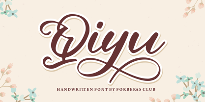 Qiyu is modern handwritten. Recommended to use this font for wedding party, invitation, memorable moment, love story and many more with special moment.
 - HU Makingfilm by Heummdesign,
$15.00 HU Makingfilm gives a solid feeling of a full module, and it is a font that adds softness by rolling the angled part.
 - Creatiny by Forberas Club,
$18.00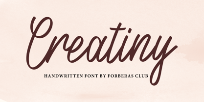 Creatiny is modern handwritten. Recommended to use this font for wedding party, invitation, memorable moment, love story and many more with special moment.
 - Rush Berry by Forberas Club,
$16.00 Rush Berry font is handwritten style. Recommended to use for wedding party, invitation, memorable moment, love story and many more with special moment.
 - Bagiles by Forberas Club,
$16.00 Bagiles is modern handwritten. Recommended to use this font for wedding party, invitation, memorable moment, love story and many more with special moment.
 - Claudya Script by Herlan Nawwi,
$16.00 Claudya is a beautiful and feminine font. This script is equipped with alternate characters, making the possibilities of design more varied and unique.
 - Macchiato by Okaycat,
$29.95 Okaycat presents "Macchiato". This playful casual font is fashion forward. Elegant simple line serifs pair well with line drawings or simple ink drawings.
 - Expectation by Linotype,
$29.99Making a Christmas card takes a lot of work! Finding the right typeface can be tough, too. Have you ever spent hours searching for the right one? Well, in 2003, instead of spending hours searching, German designer Guido Bittner made his own. Expectation was first used on the Christmas card for Bittner's Wiesbaden design studio. This delicate series of letters maintains a handwritten feel, in part because it began as a digitalization of Bittner’s own handwriting. Expectation Swash includes additional swash letters, which can be paired with regular version of Expectation to create superior effects. Perhaps it is already time for you to begin working on next year’s holiday cards. Let these fonts be the starting port for your inspiration! Expectation was a winner in the 2003 International Type Design Contest, sponsored by Linotype GmbH. - Sabor by Intellecta Design,
$59.90 Sabor is a voluptuous upright connected display font with mixed taste of script fonts. There were many inspirations for Sabor, but all started with a book from the 1950s about the battles of World War II. To that first sketches of a naive dense display typeface we, day by day, start to create a mixed style evolving some lettering concepts from 1950s, some calligraphy notions and the first display ideas. The feeling of this font is good to be used in many artworks, like logos, packaging, party invitations, layouts for t-shirts, magazine headings, and much more, since websites to and all kind of printed jobs. That font is not really a script, but, like the scripts we strongly recommends to use the caps only in the beginning of words and sentences, to contrast with the lower cases : it’s not designed for all-caps settings, so avoid that kind of use. This font has almost 700 glyphs and supports the most important Latin-based languages. We works hard in a tour-de-force kerning: over 12.000 kerning pairs soft adjusted handily. Its OpenType features include final forms, initial forms, special sets (upper and lowercase's), hundreds of contextual alternates ligatures providing letter-form variations and connections that make your designs really special, and ornaments (tails). Because of its high number of alternate letters and combination's, we suggest the use of the glyph palette to find ideal solutions to specific designs. The sample illustrations will give you an idea of the possibilities. You have full access to this amazing stuff using InDesign, Illustrator, QuarkXpress and similar software. However, we still recommend exploring what this font has to offer using the glyphs palette: principally to get all the power of the Contextual Alternates feature. You can get an idea of the power of this font looking at the “Sabor User Guide”, a pdf brochure in the Gallery section. Also available two sister fonts easy to use : SaborWords and SaborRasgosEscritura Sabor has original letters designed by Iza W and overall creative direction plus core programming by Paulo W.
 - Cabrito Sans by insigne,
$24.99 It's time to kick off your shoes and feel the "sans" between your toes. Like Cabrito Inverto , its stress-reversing cousin, the new Cabrito Sans serves up something nice and cool in the heat of the project. A quick recap: the original Cabrito is an insigne Design slab serif produced for the kid's book The Clothes Letters Wear. It's been pretty well-received--even more than I expected. I promised to grow the family with a free-standing inverted style that could pair well with Cabrito. (See Cabrito Inverto.) Now, I'm rounding out the family with this well-crafted sans. And so now, Sans is where it's at. Strip away the serifs of Cabrito, and you have a laid back, rounded sans serif alternative served up over easy. This handwriting-inspired creation--like its relatives--is definitely not uptight about its forms (though not afraid to show them off a little). Cabrito Sans' whole pack of alternates is accessible in any OpenType-enabled program. This kiddo consists of a workforce of alternates, swashes, and alternate titling caps to give the font a little extra sweetener to its flavor. Also bundled are swash alternates, old style figures, and compact caps. Check out the interactive PDF brochure to test out each these options. This font family members also consists of the glyphs for 72 various languages. Cabrito Inverto and Cabrito do pair nicely with Cabrito Sans (in case you doubted). Use Sans--or all three of these amigos--to express friendliness on just about anything: food, candy, toys, cars (if you're feeling bold). Don't wait, though. Purchase Cabrito Sans today, and bring a one-of-a-kind look to whatever your computer's next design party is.
 - Typex by Device,
$39.00 Based on the lettering used on Alan Turing’s famous code-breaking machine at Bletchley Park, the “Bombe”, and the subsequent British answer to the German Enigma machine, the Typex. Research done at Bletchley Park on their restored and antique machines provided the inspiration. The unusual shapes for the capitals have all been retained - the square O, the monospaced characters and other eccentricities that make it unique. This reference material was then extended to the numerals (which did not exist in the original) and a full international character complement. The initial design of the bombe was produced in 1939 at the UK Government Code and Cypher School (GC&CS) at Bletchley Park by Alan Turing, with an important refinement devised in 1940 by Gordon Welchman. It was based on a device that had been designed in 1938 in Poland at the Biuro Szyfrów (Cipher Bureau) by cryptologist Marian Rejewski, and known as the "cryptologic bomb" (Polish: bomba kryptologiczna). The Bombe was used to break the German Enigma code on a daily basis, and was a vital part of the Allied war effort. The British “Typex" (alternatively, Type X or TypeX) machines were an adaptation of the commercial German Enigma with a number of enhancements that greatly increased its security. It was used from 1937 until the mid-1950s, when other more modern military encryption systems came into use.
 - Spooky Friend by Mvmet,
$10.00 Spooky Friend is a cool kids friendly ghost display font for your Halloween party! You can use it for anything ranging from t-shirts and clothing, for your scary book designs, Halloween party needs, greeting cards, stickers, posters, banners, or anything that needs a spooky and fun touch. Try it to create fabulous designs and feel the fun and Halloween vibes with it!
 - Wounds by Dawnland,
$29.00 Horror/Metal/Punk upper case only font with varied double letters (open type feature). Open type Latin Pro with alternate upper case using the lower case, and varied double letters for an even more genuine handwritten look. (Open type feature.) Ink on paper, carefully and meticulously touched up digitally so that all letters will look good printed in bigger sizes.
