10,000 search results
(0.173 seconds)
- TBS Gartek Condensed by TypoBureau Studio,
$25.00 TBS GARTEK CONDENSED is a latin based condensed type of font that has a different characters from the previous TBS GARTEK BLACK font, TBS GARTEK CONDENSED has a strong yet sharp looks character, with a post modernism and semi 90's nostalgic, supported by more than 60± accent languages ranging from West, South East, Central Europe and a bit of Vietnamese. TBS GARTEK CONDENSED is able to complete your current needs who are designing something great. the single DemiBold weight is stunning in Magazine, Posters, Social Media Content, headlines, clothing, large print formats and wherever you want to see it. Inspired by the design styles of post modernism and popular style's nowadays, let's get your project elevate works with TBS GARTEK CONDENSED.
 - Lotus Arabic by Linotype,
$179.00Lotus is a traditional-style Arabic text face derived from foundry types cut earlier in the 20th Century, based on the calligraphic models in the Ottoman Naskh style (the traditional style of Arabic script for use in printing). Its graceful finials and elegant logotypes contribute to the classic look of the face making it particularly suitable for serious book and journal work. The conversion of the PostScript versions of these fonts to OpenType format has taken full advantage of the latest digital technology, allowing accurate positioning of diacriticals and kerning refinements. The Lotus typeface is available in two weights: Lotus Light and Lotus Bold. These two fonts incorporate the Arabic codepage (CP 1256), and support Arabic and Persian. They also include both tabular Arabic and Persian numerals. - Lunar Pop by Prioritype,
$19.00 Lunar Pop - Display Font. Bold and fun fonts are here to accompany your design projects. Consists of 2 styles, namely Regular & Outline which further adds to the creative value of this font. Perfect for poster design, branding, crafting, merchandise and more. Features: Uppercase, Lowercase, Numeral, Punctuation & Multilingual. Multilingual contained: Afrikaans, Albanian, Asu, Basque, Bemba, Bena, Breton, Catalan, Chiga, Cornish, Danish, Dutch, English, Estonian, Filipino, Finnish, French, Friulian, Galician, German, Gusii, Indonesian, Irish, Italian, Kabuverdianu, Kalenjin, Kinyarwanda, Luo, Luxembourgish, Luyia, Machame, Makhuwa-Meetto, Makonde, Malagasy, Manx, Morisyen, North Ndebele, Norwegian Bokmål, Norwegian Nynorsk, Nyankole, Oromo, Portuguese, Quechua, Romansh, Rombo, Rundi, Rwa, Samburu, Sango, Sangu, Scottish Gaelic, Sena, Shambala, Shona, Soga, Somali, Spanish, Swahili, Swedish, Swiss German, Taita, Teso, Uzbek (Latin), Volapük, Vunjo, Zulu. Thanks!
 - Bropella by Martype co,
$20.00 Introducing, Bropella. A bold sans with unique alternates and swashes! Comes with classic style and modern design with strong bold feels, of course this font perfect for headline, logotype, apparel, branding, packaging, editorial and etc. --- What's Include ? - Alternates - Ligatures - Swashes - And Many More! --- Support for 66 languages Afrikaans, Albanian, ,Basque, Bemba, Bena, Breton, Catalan, Chiga, Cornish, Danish, Dutch, English, Estonian, Faroese, Filipino, Finnish, French, Friulian, Galician, German, Gusii, Indonesian, Irish, Italian, Kabuverdianu, Kalenjin, Kinyarwanda, Luo, Luxembourgish, Luyia, Machame, Makhuwa, Meetto, Makonde, Malagasy, Manx, Morisyen, North, Ndebele, Norwegian, Bokmål, Norwegian, Nynorsk, Nyankole, Oromo, Portuguese, Quechua, Romansh, Rombo, Rundi, Rwa, Samburu, Sango, Sangu, Scottish, Gaelic, Sena, Shambala, Shona, Soga, Somali, Spanish, Swahili, Swedish, Swiss, ,German, Taita, Teso, Uzbek (Latin), Volapük, VunjoZulu, --- Thanks! Happy Desigining :) Umar
 - Native Stories by Prioritype,
$19.00 Native Stories - Classic Serif Font. A serif font with a stylish, classic feel is ready to work with your design projects. There are two styles, namely Regular and Italic. Perfect for applying to poster designs, branding, magazines, merchandise, logos and more. Features: Uppercase, Lowercase, Numeral, Punctuation & Multilingual. Multilingual contained: Afrikaans, Albanian, Asu, Basque, Bemba, Bena, Breton, Catalan, Chiga, Cornish, Danish, Dutch, English, Estonian, Filipino, Finnish, French, Friulian, Galician, German, Gusii, Indonesian, Irish, Italian, Kabuverdianu, Kalenjin, Kinyarwanda, Luo, Luxembourgish, Luyia, Machame, Makhuwa-Meetto, Makonde, Malagasy, Manx, Morisyen, North Ndebele, Norwegian Bokmål, Norwegian Nynorsk, Nyankole, Oromo, Portuguese, Quechua, Romansh, Rombo, Rundi, Rwa, Samburu, Sango, Sangu, Scottish Gaelic, Sena, Shambala, Shona, Soga, Somali, Spanish, Swahili, Swedish, Swiss German, Taita, Teso, Uzbek (Latin), Volapük, Vunjo, Zulu. Thanks!
 - Monsterio by Haksen,
$17.00 Monsterio is a futuristic modern slab serif style with Uppercase and Lowercase feel nice balanced. Provide alternates font in lowercase with wider style make the design letter looks incridible. Honestly it works perfectly for headlines, logos, posters, packaging, T-shirts and much more. Font Features : Regular and Italic version Character set A-Z in uppercase and lowercase Alternates in Lowercase Numerals & Punctuation Accented Characters Multiple Languages Supported Format File: OTF Recommended to use in Adobe Illustrator or Adobe Photoshop with opentype feature. How to access Alternate Characters? Open glyphs panel : In Adobe Photoshop choose tool Window glyphs In Adobe Illustrator choose tool Type glyphs If you have questions, just send me a message and I'm glad to help. Have a great day, Haksen Std
 - Sunday Cake by Arendxstudio,
$13.00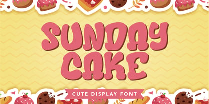 Sunday Cake - Cute Display Font is a font with distinctive handwritten characters perfect for branding projects, logos, wedding designs, media posts, advertisements, product packaging, product designs, labels, photography, watermarks, invitations, stationery, and any project who need handwritten dishes. Features : • Character Set A-Z • Numerals & Punctuations (OpenType Standard) • Accents (Multilingual characters) • Ligature Multilingual Support : Afrikaans, Albanian, Asu, Basque, Bemba, Bena, Catalan, Chiga, Cornish, Danish, English, Estonian, Faroese, Filipino, Finnish, French, Friulian, Galician, German, Gusii, Icelandic, Indonesian, Irish, Italian, Kabuverdianu, Kalenjin, Kinyarwanda, Low German, Luo, Luxembourgish, Luyia, Machame, Makhuwa-Meetto, Makonde, Malagasy, Malay, Manx, Morisyen, North Ndebele, Norwegian Bokmål, Norwegian Nynorsk, Nyankole, Oromo, Portuguese, Romansh, Rombo, Rundi, Rwa, Samburu, Sango, Sangu, Scottish Gaelic, Sena, Shambala, Shona, Soga, Somali, Spanish, Swahili, Swedish, Swiss German, Taita, Teso, Vunjo, Zulu
 - Treatment by Arendxstudio,
$13.00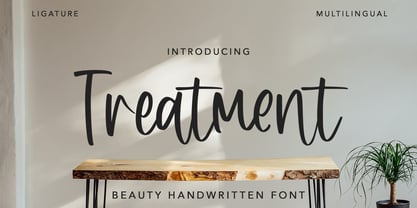 Treatment - Beauty Handwritten Font is a font with distinctive handwritten characters perfect for branding projects, logos, wedding designs, media posts, advertisements, product packaging, product designs, labels, photography, watermarks, invitations, stationery, and any project who need handwritten dishes. Features : • Character Set A-Z • Numerals & Punctuations (OpenType Standard) • Accents (Multilingual characters) • Ligature Multilingual Support : Afrikaans, Albanian, Asu, Basque, Bemba, Bena, Catalan, Chiga, Cornish, Danish, English, Estonian, Faroese, Filipino, Finnish, French, Friulian, Galician, German, Gusii, Icelandic, Indonesian, Irish, Italian, Kabuverdianu, Kalenjin, Kinyarwanda, Low German, Luo, Luxembourgish, Luyia, Machame, Makhuwa-Meetto, Makonde, Malagasy, Malay, Manx, Morisyen, North Ndebele, Norwegian Bokmål, Norwegian Nynorsk, Nyankole, Oromo, Portuguese, Romansh, Rombo, Rundi, Rwa, Samburu, Sango, Sangu, Scottish Gaelic, Sena, Shambala, Shona, Soga, Somali, Spanish, Swahili, Swedish, Swiss German, Taita, Teso, Vunjo, Zulu
 - Warkat by Wahyu and Sani Co.,
$29.00 Back in late 2019, Wahyu Wibowo designed a logotype for Wahyu and Sani Co., he decided to shorten the name to be WSCo. for the logo. Then by the end year of 2021, he got an idea to develop the typeface he did for the logo and start developing a font family which can be used for company branding. Now the typeface has come to life with the name "Warkat". The font family comes in two styles, upright and italic. It has 14 styles in total and additional two variable fonts. Each font has more than 580 glyphs including the alternates which covers Western and Eastern Europe Latin based languages and equipped with functional OpenType features like standard and discretionary ligatures, various format for numbers, ordinal, etc.
 - Meteor Fall by Arendxstudio,
$13.00 Meteor Fall - Comic Display Font is a font with distinctive handwritten characters perfect for branding projects, logos, wedding designs, media posts, advertisements, product packaging, product designs, labels, photography, watermarks, invitations, stationery, and any project who need handwritten dishes. Features : • Character Set A-Z • Numerals & Punctuations (OpenType Standard) • Accents (Multilingual characters) • Ligature Multilingual Support : Afrikaans, Albanian, Asu, Basque, Bemba, Bena, Catalan, Chiga, Cornish, Danish, English, Estonian, Faroese, Filipino, Finnish, French, Friulian, Galician, German, Gusii, Icelandic, Indonesian, Irish, Italian, Kabuverdianu, Kalenjin, Kinyarwanda, Low German, Luo, Luxembourgish, Luyia, Machame, Makhuwa-Meetto, Makonde, Malagasy, Malay, Manx, Morisyen, North Ndebele, Norwegian Bokmål, Norwegian Nynorsk, Nyankole, Oromo, Portuguese, Romansh, Rombo, Rundi, Rwa, Samburu, Sango, Sangu, Scottish Gaelic, Sena, Shambala, Shona, Soga, Somali, Spanish, Swahili, Swedish, Swiss German, Taita, Teso, Vunjo, Zulu
 - Wild Plants by Arendxstudio,
$13.00 Wild Plants - Groovy Retro Display Font is a font with distinctive handwritten characters perfect for branding projects, logos, wedding designs, media posts, advertisements, product packaging, product designs, labels, photography, watermarks, invitations, stationery, and any project who need handwritten dishes. Features : • Character Set A-Z • Numerals & Punctuations (OpenType Standard) • Accents (Multilingual characters) • Ligature Multilingual Support : Afrikaans, Albanian, Asu, Basque, Bemba, Bena, Catalan, Chiga, Cornish, Danish, English, Estonian, Faroese, Filipino, Finnish, French, Friulian, Galician, German, Gusii, Icelandic, Indonesian, Irish, Italian, Kabuverdianu, Kalenjin, Kinyarwanda, Low German, Luo, Luxembourgish, Luyia, Machame, Makhuwa-Meetto, Makonde, Malagasy, Malay, Manx, Morisyen, North Ndebele, Norwegian Bokmål, Norwegian Nynorsk, Nyankole, Oromo, Portuguese, Romansh, Rombo, Rundi, Rwa, Samburu, Sango, Sangu, Scottish Gaelic, Sena, Shambala, Shona, Soga, Somali, Spanish, Swahili, Swedish, Swiss German, Taita, Teso, Vunjo, Zulu
 - Lucifer Sans by Daniel Brokstad,
$29.00 Lucifer Sans is a modern sans serif font rooted in Scandinavian geometry and minimalism, mixed with a healthy dose of black metal and irreverent attitude. Harsh vertical cuts and angles throughout the font creates a very strict and hard look, that can either be amplified or loosened up through its stylistic sets. Lucifer Sans family contains 162 font, 9 different weights and width, plus italics. In addition there are 3 different stylistic sets. This creates substantially diverse set of characters for contrasting against another and makes it a versatile font for different formats. Style 01 takes on an almost hand drawn style, while Style 02 enhances the geometric aspects of the font further. Style 03 uses only the rounded letter 01 without the hand drawn variations.
 - Bubble Dope by Arendxstudio,
$13.00 Bubble Dope - Groovy Display Font is a font with distinctive handwritten characters perfect for branding projects, logos, wedding designs, media posts, advertisements, product packaging, product designs, labels, photography, watermarks, invitations, stationery, and any project who need handwritten dishes. Features : • Character Set A-Z • Numerals & Punctuations (OpenType Standard) • Accents (Multilingual characters) • Ligature Multilingual Support : Afrikaans, Albanian, Asu, Basque, Bemba, Bena, Catalan, Chiga, Cornish, Danish, English, Estonian, Faroese, Filipino, Finnish, French, Friulian, Galician, German, Gusii, Icelandic, Indonesian, Irish, Italian, Kabuverdianu, Kalenjin, Kinyarwanda, Low German, Luo, Luxembourgish, Luyia, Machame, Makhuwa-Meetto, Makonde, Malagasy, Malay, Manx, Morisyen, North Ndebele, Norwegian Bokmål, Norwegian Nynorsk, Nyankole, Oromo, Portuguese, Romansh, Rombo, Rundi, Rwa, Samburu, Sango, Sangu, Scottish Gaelic, Sena, Shambala, Shona, Soga, Somali, Spanish, Swahili, Swedish, Swiss German, Taita, Teso, Vunjo, Zulu
 - Peaches Blessed by Prioritype,
$19.00 Peaches blessed is a great paired font because it has organic characteristics and is luxurious to look at. With the additional characters in these two fonts, it makes your display more enjoyable. Great for branding, logos, wedding invitations, quotes and more. Features: Uppercase, Lowercase, Numeral, Punctuation, Multilingual Ligatures & Alternates. Multilingual contained: Afrikaans, Albanian, Asu, Basque, Bemba, Bena, Breton, Catalan, Chiga, Cornish, Danish, Dutch, English, Estonian, Filipino, Finnish, French, Friulian, Galician, German, Gusii, Indonesian, Irish, Italian, Kabuverdianu, Kalenjin, Kinyarwanda, Luo, Luxembourgish, Luyia, Machame, Makhuwa-Meetto, Makonde, Malagasy, Manx, Morisyen, North Ndebele, Norwegian Bokmål, Norwegian Nynorsk, Nyankole, Oromo, Portuguese, Quechua, Romansh, Rombo, Rundi, Rwa, Samburu, Sango, Sangu, Scottish Gaelic, Sena, Shambala, Shona, Soga, Somali, Spanish, Swahili, Swedish, Swiss German, Taita, Teso, Uzbek (Latin), Volapük, Vunjo, Zulu. Thanks!
 - Absolute Inky by Arendxstudio,
$13.00 Absolute Inky - Funny Comic Display Font is a font with distinctive handwritten characters perfect for branding projects, logos, wedding designs, media posts, advertisements, product packaging, product designs, labels, photography, watermarks, invitations, stationery, and any project who need handwritten dishes. Features : • Character Set A-Z • Numerals & Punctuations (OpenType Standard) • Accents (Multilingual characters) • Ligature Multilingual Support : Afrikaans, Albanian, Asu, Basque, Bemba, Bena, Catalan, Chiga, Cornish, Danish, English, Estonian, Faroese, Filipino, Finnish, French, Friulian, Galician, German, Gusii, Icelandic, Indonesian, Irish, Italian, Kabuverdianu, Kalenjin, Kinyarwanda, Low German, Luo, Luxembourgish, Luyia, Machame, Makhuwa-Meetto, Makonde, Malagasy, Malay, Manx, Morisyen, North Ndebele, Norwegian Bokmål, Norwegian Nynorsk, Nyankole, Oromo, Portuguese, Romansh, Rombo, Rundi, Rwa, Samburu, Sango, Sangu, Scottish Gaelic, Sena, Shambala, Shona, Soga, Somali, Spanish, Swahili, Swedish, Swiss German, Taita, Teso, Vunjo, Zulu
 - Joyful Berlin by Arendxstudio,
$13.00 Joyful Berlin - Comic Display Font is a font with distinctive handwritten characters perfect for branding projects, logos, wedding designs, media posts, advertisements, product packaging, product designs, labels, photography, watermarks, invitations, stationery, and any project who need handwritten dishes. Features : • Character Set A-Z • Numerals & Punctuations (OpenType Standard) • Accents (Multilingual characters) • Ligature Multilingual Support : Afrikaans, Albanian, Asu, Basque, Bemba, Bena, Catalan, Chiga, Cornish, Danish, English, Estonian, Faroese, Filipino, Finnish, French, Friulian, Galician, German, Gusii, Icelandic, Indonesian, Irish, Italian, Kabuverdianu, Kalenjin, Kinyarwanda, Low German, Luo, Luxembourgish, Luyia, Machame, Makhuwa-Meetto, Makonde, Malagasy, Malay, Manx, Morisyen, North Ndebele, Norwegian Bokmål, Norwegian Nynorsk, Nyankole, Oromo, Portuguese, Romansh, Rombo, Rundi, Rwa, Samburu, Sango, Sangu, Scottish Gaelic, Sena, Shambala, Shona, Soga, Somali, Spanish, Swahili, Swedish, Swiss German, Taita, Teso, Vunjo, Zulu
 - Geogrotesque Stencil by Emtype Foundry,
$69.00 Geogrotesque Stencil is a member of the popular Geogrotesque family, and despite being thought as a display typeface, it goes one step further and tries to solve some of the typical problems with stencils fonts. Geogrotesque Stencil comes with 3 widths of cut (A, B and C). These cuts not only allow a better performance when printing at different sizes, you can also move across versions A, B or C in accordance to the rigidity of the material used. The family consists of 42 styles, 7 weights with 3 versions each plus italics, all of them in Open Type format including ligatures, tabular figures, fractions, numerators, denominators, superiors and inferiors with support for Central and Eastern European languages. For more details see the PDF.
 - Sunny Evening by Arendxstudio,
$13.00 Sunny Evening - Groovy Trendy Font is a font with distinctive handwritten characters perfect for branding projects, logos, wedding designs, media posts, advertisements, product packaging, product designs, labels, photography, watermarks, invitations, stationery, and any project who need handwritten dishes. Features : • Character Set A-Z • Numerals & Punctuations (OpenType Standard) • Accents (Multilingual characters) • Ligature Multilingual Support : Afrikaans, Albanian, Asu, Basque, Bemba, Bena, Catalan, Chiga, Cornish, Danish, English, Estonian, Faroese, Filipino, Finnish, French, Friulian, Galician, German, Gusii, Icelandic, Indonesian, Irish, Italian, Kabuverdianu, Kalenjin, Kinyarwanda, Low German, Luo, Luxembourgish, Luyia, Machame, Makhuwa-Meetto, Makonde, Malagasy, Malay, Manx, Morisyen, North Ndebele, Norwegian Bokmål, Norwegian Nynorsk, Nyankole, Oromo, Portuguese, Romansh, Rombo, Rundi, Rwa, Samburu, Sango, Sangu, Scottish Gaelic, Sena, Shambala, Shona, Soga, Somali, Spanish, Swahili, Swedish, Swiss German, Taita, Teso, Vunjo, Zulu
 - Railroad Gothic by Linotype,
$29.99Railroad Gothic was originally designed in 1906 for ATF (American Type Founders). This uppercase-only typeface is very condensed and also heavy, giving it a distinct 19th American wood type feeling. Like those 19th Century classics, Railroad Gothic is best used when set really big. Originally designed for use in railroad signage, Railroad Gothic has since been adapted for use in many American tabloid journals, which employ it in screaming headlines. When you need to set something large and loud for the whole world to see, this old ATF classic may be right for you. Railroad Gothic is an all caps font, and is available in digital format exclusively from Linotype. The typeface is included in the Take Type 4 collection from Linotype GmbH." - Asrog Genos by Product Type,
$19.00 Welcome to the future with Asrog Genos, a futuristic technology font that designs each letter with a modern, sophisticated touch. Every character in Asrog Genos exudes a future feel, giving the appearance of cutting-edge technology. Asrog Genos brings elements of technology into your designs, creating a font that is not only eye-catching but also embraces the essence of innovation. Asrog Genos is an ideal choice for projects that require a touch of futuristic technology. Whether you are designing user interfaces, technology promotional materials, or other futuristic design elements, this font brings an unmatched modern aura. Do not miss this opportunity! Get the Asrog Genos Futuristic Technology Font now and let each character be a portal to your design future. **Uppercase
 - Tropical Vibe by Arendxstudio,
$13.00 Tropical Vibe - Groovy Retro Font is a font with distinctive handwritten characters perfect for branding projects, logos, wedding designs, media posts, advertisements, product packaging, product designs, labels, photography, watermarks, invitations, stationery, and any project who need handwritten dishes. Features : • Character Set A-Z • Numerals & Punctuations (OpenType Standard) • Accents (Multilingual characters) • Ligature Multilingual Support : Afrikaans, Albanian, Asu, Basque, Bemba, Bena, Catalan, Chiga, Cornish, Danish, English, Estonian, Faroese, Filipino, Finnish, French, Friulian, Galician, German, Gusii, Icelandic, Indonesian, Irish, Italian, Kabuverdianu, Kalenjin, Kinyarwanda, Low German, Luo, Luxembourgish, Luyia, Machame, Makhuwa-Meetto, Makonde, Malagasy, Malay, Manx, Morisyen, North Ndebele, Norwegian Bokmål, Norwegian Nynorsk, Nyankole, Oromo, Portuguese, Romansh, Rombo, Rundi, Rwa, Samburu, Sango, Sangu, Scottish Gaelic, Sena, Shambala, Shona, Soga, Somali, Spanish, Swahili, Swedish, Swiss German, Taita, Teso, Vunjo, Zulu
 - Apothicaire by Sudtipos,
$49.00 Apothicaire is a new font designed by Ale Paul and the Sudtipos team that is inspired in, but not limited to, an antique style casted by a German type foundry during the late XIX century. With the addition of a contemporary design approach, Apothicaire comes in three widths —from condensed to expanded— and five weights —from light to extra bold—, offering a wide range of combinations to explore. As a bonus the font family is also available in a single variable format. An elegant small caps set, a variety of ball terminals and delicate swashes, as well as the possibility to choose from many alternates are also included in the OpenType features. Apothicaire supports a wide range of Latin alphabet-based languages.
 - Sansterdam by NREY,
$19.00 Sansterdam is a modern condenced grotesque font family. It's great for titles, posters, logos. Condensed font allows to include more information in one line. Sansterdam has special Deco version with circle uppercase letters and oldstyle numbers for more vintage feeling. Also Sansterdam has signature script font with many ligatures and alternates for more unforgettable combinations! Font looks amazing as alone words and as full text blocks. Also it good for bright captions and logos. Language support more than 30 languages: Afrikaans, Basque, Bosnian, Catalan, Croatian, Czech, Danish, Dutch, English, Estonian, Filipino, Finnish, French, Galician, German, Indonesian, Irish, Italian, Latvian, Lithuanian, Malay, Norwegian Bokmal, Portuguese, Romanian, Russian, Slovak, Slovenian, Spanish, Swahili, Swedish, Zulu etc. Download Sansterdam for your next project today! Thank you and have a great day!
 - ITC Musclehead by ITC,
$29.99ITC Musclehead is the work of type designer Timothy Donaldson, a robust, densely packed handwriting typeface. It almost looks like brushwork but was in fact made with a ruling pen which Donaldson had bought from a company in Salem, Massachusetts. He says, The world's gone ruling-pen mad at the moment [late 1990s] and I was beginning to tire of all the skinny splashiness of the letters that most people were making with them. I wanted to do something heavy and robust with the tool, so that's what I did."" - Ballard by Proportional Lime,
$5.95 This typeface was inspired by a font used by Henrie Ballard. Ballard operated on Fleet Street at the Signe of the Bear in London, England. He was active in the industry from 1597-1608. The font is meant to capture the feel of the original typeface with the capability of reproducing the many ligatures that are part of what make that era's printing interesting. The Italic version has a dramatic feel that is almost handwritten in appearance. Every Proportional Lime font comes with a complete guide to its Unicode extended character set.
 - Dubia by Ilhamtaro,
$17.00 DUBIA is a western style font, a font that goes well with cowboy, rodeo and vintage designs. The font, which is based on a serif font, is bold and tends to carry a strong and tough character like a cowboy taming a wild horse. This font is allcaps so it is perfect for creating a title or headline on a poster or magazine cover design. To enable the OpenType Stylistic alternates, you need a program that supports OpenType features such as Adobe Illustrator CS, Adobe Indesign & CorelDraw X6-X7. Cheers!
 - Zahran by NamelaType,
$19.00 Zahran is a lovely Latin and Arabic handwritten script, Inspired by modern calligraphy style. This style is a challenge for me in designing Arabic letters, I tried joining Arabic on one side so that the baseline shape is dynamic. Come with many feature; Stylistic alternate, character variant (cv01 to cv12), ligatures, multilingual characters, begining and ending swash, and lovely connecter for lowercase, that can be accessed with opentype feature. Zahran is perfect for branding project, product packaging, tile, logo, wedding, quotes and where ever you need lovely design.
 - Florati by Proportional Lime,
$19.99 Can you imagine the delight that the printers of the Incunabula era would have had if they had such a tool as this font with a hundred and fifty glyphs of decorative capitals. The printers of that era were lucky to have more than a handful such delights. These Decorated initials and drop caps are all based on early period exemplars, dating to prior to 1525, from a wide range of printers such as Thomas de Blavis to Günther Zainer. Every Proportional Lime Font comes equipped with a complete character map.
 - Bike Decals JNL by Jeff Levine,
$29.00Bike Decals JNL captures the fun and nostalgia of the 1950s and 1960s when kids all around the country ran to their local five and dime or hobby store to purchase water applied decals. The "cool" thing would be to customize your bike, little red wagon or anything that would be fair game with various racing symbols, weird space creatures or other unusual images. In this font, Jeff Levine has put his own spin on some of the classic designs of yesteryear, drawing from scratch some of the most popular of their day. - Upton by Halbfett,
$30.00Upton is a modern and condensed sans serif. The initial inspiration for its design came from lettering Wim Crouwel created for a poster design. It also takes some cues from neutral grotesks like Helvetica and Akzidenz. Because of its narrow letterforms, Upton is best applied to headlines and poster-sized typography. Upton’s italics were designed with high-quality compensation for all circles and strokes. Upton ships in two different formats. Depending on your preference, you can install the typeface as two Variable Fonts or use the family’s 14 static OpenType font files instead. Those weights run from Extralight to Extrabold. While the static-format fonts offer a good intermediary-step selection, users who install the Variable Font have vastly greater control over their text’s stroke width. The weight axes in Upton’s Variable Fonts allow users to differentiate between almost 1,000 possible font weights. That enables you to fine-tune your text’s exact appearance on-screen or in print. In its fonts, Upton has several ligatures. That includes optional “discretionary ligatures,” which bring a unique tone to display usage. For instance, the fonts include optional ligatures for the letter combinations “E-T”, “F-l”, “L-E-T-T-E”, “L-E-T-T”, “L-E-T”, “L-E-L-O”, “L-U”, “i-j”. and “m-m”. There are also many alternate glyphs. Stylistic Set 1 substitutes in new forms for “G”, “R”, “a”, “f”, “g”, “i”, “r”, “t”, and “y”. Six more Stylistic Sets have alternates for the “æ”, “g”, “k”, “o”, “K”, “O”, and “Q”. Additional OpenType features activate other useful features, such as fractions, numbers in circles, or symbols. - Poligon by Halbfett,
$30.00 Poligon is a large family of geometric sans serif fonts. It is inspired by classic typefaces from the geometric-sans genre, like Futura and Avant Garde Gothic, whose shapes were constructed from circles and straight lines. Every character has been crafted to give it a distinct and individual feel. The family is an excellent choice for both corporate design and editorial design projects because of its range of weights, as well as its legibility in text. The typeface family ships in two different formats. Depending on your preference, you can install the typeface as two Variable Fonts or use the family’s eight static OpenType font files instead. Those weights run from Thin to Black. While the static-format fonts offer a good intermediary-step selection, users who install the Variable Fonts have vastly greater control over the stroke width in their upright and italic texts. The weight axes in Poligon’s Variable Fonts allow users to differentiate between almost 1,000 possible font weights. That enables you to fine-tune your text’s exact appearance on-screen or in print. But even the static fonts satisfy the need for flexibility, creating harmonious variations of texture and emphasis. Despite their rigid geometry, the fonts have a playful air to them. That playfulness and uniqueness can be dialed up by applying stylistic alternates via the fonts’ four Stylistic Sets. The first of these replaces “G”, “M”, and “&” with alternate, more outgoing shapes. Stylistic Set 2 has an alternate “ß”; Stylistic Set 3 has a “Q” with a longer tail and another “G”. Stylistic Set 3 has alternates for “A”, “K“, “Q”, “R”, “S”, “Y”, and “Z”.
 - TessiePuzzlePieces by Ingrimayne Type,
$9.00 After exploring tessellations for several years, I decided to see how many ways I could tessellate puzzle pieces. I began with a square template and used the same asymmetrical shape for all four edges. By flips or rotation each edge could be fitted in four ways. Eventually I discovered that, given this way of forming tiles, there were 15 distinct shapes that tessellate and these shapes can take a total of 96 orientations. (A note in the November 2016 issue of Mathematical Gazette has the proof for the 15 shapes.) This typeface contains those 15 shapes and 96 orientations. A pdf note here shows some of the tilings possible using only one shape in a pattern. An unlimited number of patterns are possible if shapes are mixed. There are two members of the family, a solid style that must have different colors when used and an outline style. They can be used separately or they can be used in layers with the outline style on top of the solid style. For rows to align properly, leading must be the same as point size. (Earlier tessellation fonts from IngrimayneType, the TessieDingies fonts, lack a black or filled version so cannot do colored patterns.)
 - Prismatic Spirals Pro by MMC-TypEngine,
$182.00 PRISMATIC SPIRALS PRO FONT! The Prismatic Spirals PRO is a Decorative Type-System and ‘Assembling Game’, itself. Settled in squared pieces modules or tiles, embedded by unprecedented Intertwined Prismatic Structures Design, or intricate interlaced bars that may seem quite “impossible” to shape. Although it originated from the ‘Penrose Square’, it may not look totally as an Impossible Figures Type of Optical Illusions. More an “improbable” Effect in its intertwined Design, that even static can seem like a source of Kinetical Sculptures, or drive eyes into a kind of hypnosis. Prismatic Spirals Pro has two related Typefaces both more basic or easier to use versions, the Default Family plus its “bold” braided version Prismatic Interlaces… PRO provides a more advanced, complex, and twisted Design, plus requires to be typed alternating caps. Instructions: Use the Map Font Reference PDF as a guide to learn the 'tiles' position on the keyboard, then easily type and compose puzzle designs with this font! All alphanumeric keys are intuitive or easy to induce, you may easily memorize it all! Plus, often also need to consult it! *Find the Prismatic Spirals Pro Font Map Reference PDF Here! (!) Is recommended Print it to have the Reference or open the PDF to also copy and paste, when consulting is required or when it may be difficult to access, depending on the keyboard script or language. The 2 glyphs sets are separated in colors for facilitating. Also use the Map Font with key captions or switch to it for ensure that the characters are alternating between both uppercase and lowercase letters as other Keys as numbers, marks, and punctuation along the strings, holding Shift one by one or actually two by two. As a Tiles Type-System, the line gap space value is 0, this means that tiles line gaps are invisibly grouted, so the user can compose designs, row by row, descending to each following row by clicking Enter, same as line break, while advances on assembling characters. Background History: The first sketches of my Prismatic Knots or Spirals Designs dates back then from 2010, while started developing hand-drawn Celtic Knots and Geometric Drawings in grid paper, while engage to Typography, Sacred Geometry and the “Impossible Figures” genre… I started doing modulation tests from 2013, until around 2018, I got to unravel it in square modules or tiles from the grid, then idealized it as fonts, along with other Type projects. This took 13 years to come out since the first sketches and 6 months in edition. During the production process some additional tiles or missing pieces were thought of and added to the basic set, which firstly had only the borders, corners, crossings, nets, Trivets connectors or T parts and ends, then added with nets and borders integrations. Usage Suggestions: This type-system enables the user to ornate and generate endless decorative patterns, borders, labyrinthine designs, Mosaics, motifs, etc. It can seem just like a puzzle, but a much greater tool instead for higher purposes as to compose Enigmas and use seriously. As like also to write Real Text by assembling the key characters or pieces, this way you can literarily reproduce any Pixel Design or font to its Prismatic Spirals correspondent form, as Kufic Arabic script and further languages and compose messages easily… This Typeface was made to be contemplated, applied, and manufactured on Infinite Decorative Designs as Pavements, Tapestry, Frames, Prints, Fabrics, Bookplates, Coloring Books, Cards, covers or architectonic frontispieces, storefronts, and Jewelry, for example. Usage Tips: Notice that the line-height must be fixed to 100% or 1,0. In some cases, as on Microsoft Word for example, the line-height default is set to 1,15. So you’ll need to change to 1,0 plus remove space after paragraph, in the same dropdown menu on Paragraph section. Considering Word files too, since the text used for mapping the Designs, won't make any literal orthographical sense, the user must select to ignore the Spellcheck underlined in red, by clicking over each misspelled error or in revision, so it can be better appreciated. Also unfolding environments as Adobe Software’s, the Designer will use the character menu to set body size and line gap to same value, as a calculator to fit a layout for example of 1,000 pts high with 9 tiles high, both body size and line gap will be 111.1111 pts. Further Tips: Whenever an architect picks this decorative system to design pavements floor or walls, a printed instruction version of the layout using the ‘map’ font may be helpful and required to the masons that will lay the tiles, to place the pieces and its directions in the right way. Regarding to export PNGs images in Software’s for layered Typesetting as Adobe Illustrator a final procedure may be required, once the designs are done and can be backup it, expanding and applying merge filter, will remove a few possible line glitches and be perfected. Technical Specifications: With 8 styles and 4 subfamilies with 2 complementary weights each (Regular and Bold) therefore, Original Contour, Filled, Decor, with reticle’s decorations and 2 Map fonts with key captions. *All fonts match perfectly when central pasted for layered typesetting. All fonts have 106 glyphs, in which 96 are different keys with 2 versions of each of both caps and shift keys, plus a few repeated for facilitating. It was settled this way in order for exchanging with its Prismatic relative fonts which has only 48 different keys repeated twice. Concerning tiles manufacturing and Printed Products as stickers or Stencils, any of its repeated pieces was measured and just rotated in different directions in each key, so when sided by other pieces in any direction will fit perfectly without mispatching errors. Copyright Disclaimer: The Font Software’s are protected by Copyright and its licenses grant the user the right to design, apply contours, plus print and manufacture in flat 2D planes only. In case of the advent of the same structures and set of pieces built in 3D Solid form, Font licenses will not be valid or authorized for casting it. © 2023 André T. A. Corrêa “Dr. Andréground” & MMC-TypEngine.
 - DIN Next Slab by Monotype,
$56.99 Now even more design possibilities with the popular DIN Next. With its technical and neutral character, DIN Next has earned a permanent place in contemporary typography. Now, DIN Next Slab expands the font family further, offering new design potential. Now comes the next step, DIN Next Slab, also produced under the direction of Akira Kobayashi. On a team with Sandra Winter and Tom Grace, Kobayashi is creating the new font variant based on the optimized shapes of DIN Next. The expansion will make the popular font all the more flexible and versatile. Apart from that, the geometric slab serifs underline the technical and formal nature of the font and emphasize a central design element of DIN Next. However, the team did have some challenges to overcome. While it is relatively easy to imagine DIN Next Light with slab serifs, the amount of available space quickly disappears when it comes to the Black styles. Winter explains that many tests and trials were necessary to find a compromise between space, letters and the serif shapes. Experiments with modified contrast in the weight or only one-sided serifs were quickly abandoned. The central, technical and powerful character of the font changed too much. Nevertheless, it was necessary to simplify slightly the shape of some letters, such as the ‘k’ or ‘x’, for example. These changes, first developed in the Black styles, were applied to all weights in order to lend the font a consistent appearance. Like DIN Next, DIN Next Slab also has seven weights, which cover the range from Ultralight to Black, each with matching italic. There are various character sets in all of the styles and the four middle weights have small capitals available. DIN Next Slab harmonizes perfectly with the styles of DIN Next: the basic letterforms and weights are identical. Both versions of the font can work together perfectly, not just in headlines and body text, but also within a text; they complement each other very well as design variations. With the new DIN Next Slab, Monotype expands the DIN Next super family consistently. With DIN Next Slab, you can underscore the technical and formal nature of the understated font not only in headlines, but in texts, as well. In this way, you have new and diverse potential for application, thanks to the way the different styles of DIN Next combine perfectly.
 - Slightly Hollow - Unknown license

- Sign Panels JNL by Jeff Levine,
$29.00Alf R. Becker was a noted sign painter, designer and the creator of hundreds of unique alphabets which were published in the trade magazine Signs of the Times during the 1930s through the 1950s. Thanks to Tod Swormstedt of ST Media [and who is also the curator of the American Sign Museum in Cincinnati], Jeff Levine received some reference material on Becker's work. Becker displayed many of his type styles within decorative panels—a popular trend in the days when signs were hand-lettered. Using the reference material as a guide, Jeff has re-drawn twenty-six sign panels for adaptation to digital print work. While the designs in themselves are not thoroughly unique to Alf Becker, he has left behind some tangible examples of how sign painters embellished their lettering work. With the use of complementary colors and tones, these panels—joined with vintage lettering - classically recreate the warm and attractive advertising of years ago. - Haboro Soft by insigne,
$- Stop trekking through the thick, wintery font forest, and step lightly into the fresh life of the Haboro hyperfamily. Though simple in nature, the Haboro hyperfamily provides you with a variety of options. Take, for instance, Haboro Soft, the latest member. Soft features a clean, geometric shape based off Haboro Sans. Unlike Sans, however, Soft’s blunted terminals give your work a more contemporary appearance. It’s a gentle touch for those times you prefer subtilty over pounding your message home. Take Haboro Soft even farther with its OpenType features. The typeface contains specially shaped small caps and old-fashioned figures--just enough to give your work a unique touch. Of course, for more options, use the entire Haboro hyperfamily to expand your abilities. Enjoy the comfort in knowing you’re choosing a font family equipped with tools for most anything: packaging, branding, web pages, iPhone apps and more. Its simplicity lends itself to achieve perfect results. And yes, your work will even thank you.
 - Trade Gothic Next by Linotype,
$97.99In 1948, Mergenthaler Linotype released the first weights of Trade Gothic, designed by Jackson Burke. Over the next 12 years Burke, who was the company’s Director of Typographic Development from 1948 through 1963, continued to expand the family. Trade Gothic Next is the 2008 revision of Jackson Burke’s design. Developed over a prolonged period of time, the original Trade Gothic showed many inconsistencies. Under the direction of Linotype’s Type Director Akira Kobayashi, American type designer Tom Grace, a graduate of the MA Typeface Design in Reading, redesigned, revised and expand the Trade Gothic family. Many details were improved, such as the terminals and stroke endings, symbols, and the spacing and kerning. Moreover, there are newly added compressed widths and heavy weights perfect for setting even more powerful headlines. Trade Gothic Next brings more features and better quality for today’s demanding typographers. Trade Gothic Next® font field guide including best practices, font pairings and alternatives. - Isento by DSType,
$40.00 We always wanted to design a gothic typeface. Our most similar typefaces are Rude and Firme, but Rude has some very delicate curves especially visible in the vertical strokes and Firme introduces a type family with reasonably big ascenders and descenders. On the other hand, Isento has a much more straightforward approach to the particular genre. Loosely inspired by Times Gothic, introduced in the American Type Founders Specimen Book and Catalogue from 1923, soon followed its very own path. Is our first typeface that clearly shows a distinct weight difference between the uppercase and the lowercase and the spacing is very open to provide a much more mechanical feeling. Isento and Isento Slab ranges from Thin to ExtraBold with perfectly matching italics. Immediately seemed very clear that a slab serif companion would follow the sans, therefore Isento Slab is the perfect companion to Isento, with very strong rectangular serifs, ideal to set short passages of text or to become the key actor in a big headline.
 - Kis Classico by Linotype,
$29.99Kis Classico™ is named after the Hungarian monk Miklós Kis who traveled to Amsterdam at the end of the seventeenth century to learn the art of printing. Amsterdam was a center of printing and punchcutting, and Kis cut his own type there in about 1685. For centuries, Kis's type was wrongly attributed to Anton Janson, a Dutch punchcutter who worked in Leipzig in the seventeenth century. Most versions of this type still go by the name Janson. In 1993, the Italian/Swedish type designer Franko Luin completed Kis Classico, his own contemporary interpretation of the Kis types. About the Kis/Janson story, Luin says: If you understand Hungarian I recommend you read the monograph, 'Tótfalusi Kis Miklós' by György Haiman, published in 1972 by Magyar Helikon. It has hundreds of reproductions from his Amsterdam period and from the time when he was an established printer in Kolozsvár (today's Cluj in Romania)." Kis Classico has five weights, and is an admirable version of this classic type.
