10,000 search results
(0.026 seconds)
- Celtic Knots by Clanbadge,
$20.00 While it is obvious that this is an ornamental style font, it is more than that: it is a Celtic Knotwork design tool! Irish, Scottish, Welsh, even Norse and Viking cultures have used knotwork designs for millenia. These ancient traditional interwoven designs are experiencing a revival as Celtic culture gains exposure in the modern world. Intricate Celtic knots are featured everywhere from jewelry to tattoos. While many enjoy them simply for their beauty and fascinating twists, they can also be used to add an air of myth, magic and mystery to any project. The interlaced lines make them perfect for wedding invitations, borders, dividers and rules, web graphics, and logos. I began using Celtic knotwork designs in my own work as part of my knifemaking and jewelry making hobbies. I read all of the books I could find about Celtic knots and at first I drew them by hand with pencil and paper. Then as I realized how nice it would be to have "undos" I switched over to using Corel Draw. Draw proved to be a natural for this type of artwork with tools like contour and the trim function. But even with these great tools, it was still tedious to create these designs. I noticed that I was able to reuse a lot of parts in repetitive sections. I developed a small library of reusable bits and chunks of Celtic designs. I found them so useful and fun to work with that I began thinking about ways to market my Celtic design kit. I thought about CDR and EPS formats, but then I thought of creating this toolset as a True Type Font. That way anyone with ANY program that uses fonts could easily create Celtic knotwork designs. Word processors, embroidery programs, engraving programs, jewelry design programs, CAD/CAM programs...almost every program can use fonts. I was also interested in CNC work and thought that this font would work well for applications such as laser etching, vinyl signs, and machining. With that in mind, I designed each character of the font with extremes of accuracy. If one character from the font is used at one inch tall, every control point will be placed to an accuracy of better than 0.0001 inch. I wanted every piece to meet exactly with the next, with no possibility for misalignment. The different styles are all very carefully created to fit accurately with each other. So the Filled Style fits exactly into the Outline Style, and the Inverse Style fits precisely around the Outline Style so as to make up the background behind the knotwork. Combining the styles allows you to have complete creative control. By assembling the nearly 200 pieces it is quite easy to produce very complex designs. It is actually a bit like playing with a puzzle and many people really enjoy putting the pieces together to make designs. In fact, I have had many customers tell me of how they love playing with this font and making knots into the wee hours of morning. If you like puzzles then you will absolutely love this font! And creating the patterns is just the beginning of the fun! If you apply your favorite Photoshop tricks on them you can make anything from dazzling chrome knotwork to carved stone. Photoshop plug-ins like SuperBladePro are great for converting knotwork text into corroded bronze or rusted iron. Use your knotwork to add texture to a virtual landscape, or add them as surface embelishments on architecture and furniture. You can also make round knotwork by using this font with "WordArt" (WordArt is included with every copy of Microsoft Word. See http://clanbadge.com/round_knots.htm for a tutorial on how to make round knotwork). For Crafters there are limitless uses for this font. It has been used for embroidery, jewelry, leatherwork, stencils, stained glass, quilting, painting, pyrography, woodcarving and lots more. We have even sold copies to monks for use in decorating handmade books!
 - JT Collect by OGJ Type Design,
$35.00 JT Collect is a hybrid sans-serif typeface for the 21st century that takes a playful approach to the type design heritages of Germany and Switzerland. Confidently built on a geometric structure and infused with elements from traditional grotesque typefaces, it hits the sweet spot between geo and grot. I developed JT Collect purely digitally, drawing from years of experience with analog type design. The letters aren’t based on one particular source but seek to merge different type genres from the first half of the 20th century and lift them to a contemporary quality level. JT Collect is less reserved than strictly geometric designs and brings some industrial workmanship and honesty into the game. The six weights plus three optical sizes of JT Collect offer what you need to make an impact. While cool and elegant in the Light weight, the fonts show more presence on the page as they grow bolder. To this end, I drew the letterforms with a slightly unrefined, brawny air in the bolder weights. This sets them apart from the perceived purity of more geometric designs. The Book weight is ideal for short texts and medium-length copy, and the forceful Bold makes wordmarks look crisp and lets headlines radiate cosmopolitan self-confidence. JT Collect is suitable as a primary typeface for branding, advertising, packaging, stationery, posters, documents, and websites from trades and industries as diverse as food & fashion, media & makers, culture & creators, games & gems, sports & startups. Use JT Collect for film titles or watch faces, for leaflets or store signs, for business cards or billboards: this font family is as adaptable as a chameleon (and like a chameleon, it’s never boring). Try it in different contexts. You won’t be disappointed. Its adaptability also makes JT Collect a great starting point for poised and persuasive font combinations. Even a sans/sans pairing is possible due to hybrid nature of JT Collect—something that’d be hard to achieve with most other sans-serif typefaces on the market. You can add to it a heavy slab from the OGJ library, like Temper Wide. You might go for a geometric or a grotesque typeface as secondary (text) typeface. Or you could set your body copy in a classic serif typeface such as Caslon, Sabon, or Plantin. That’s right: JT Collect is a true team player. Whether you need a grotesque or a geometric sans: try JT Collect. You can get the best of both worlds.
 - Skygirls by Typodermic,
$11.95 Picture it: a bustling city street in the 1920s, when the world was changing and women were fighting for their place in it. Billboards line the road, but one catches your eye—it’s Skygirls, a typeface that takes you back to a time when advertising was an art form. This typeface is no ordinary script. It’s a tightly wound, joined design that exudes elegance and urgency. Its steep angle draws the eye up, making your message impossible to miss. Skygirls is inspired by classic metal scripts like Herald, Signal, Hauser, Penflow, Veltro, Kurier, and Bison, so it’s no wonder it feels so timeless. With Skygirls, you’re not just writing a message—you’re making a statement. It’s the perfect typeface to convey the frantic, fast-paced style of the roaring twenties. Your words will flow seamlessly together, creating a sense of movement and momentum. And when you set it on an upward slope, it’s like your message is soaring to new heights. If you want to make an impression that lasts, Skygirls is the typeface for you. It’s a perfect fit for any project that requires a touch of vintage charm, and it will leave your audience with a lasting sense of style. So why settle for the ordinary when you can have something truly extraordinary? Choose Skygirls and let your message take flight. Most Latin-based European writing systems are supported, including the following languages. Afaan Oromo, Afar, Afrikaans, Albanian, Alsatian, Aromanian, Aymara, Bashkir (Latin), Basque, Belarusian (Latin), Bemba, Bikol, Bosnian, Breton, Cape Verdean, Creole, Catalan, Cebuano, Chamorro, Chavacano, Chichewa, Crimean Tatar (Latin), Croatian, Czech, Danish, Dawan, Dholuo, Dutch, English, Estonian, Faroese, Fijian, Filipino, Finnish, French, Frisian, Friulian, Gagauz (Latin), Galician, Ganda, Genoese, German, Greenlandic, Guadeloupean Creole, Haitian Creole, Hawaiian, Hiligaynon, Hungarian, Icelandic, Ilocano, Indonesian, Irish, Italian, Jamaican, Kaqchikel, Karakalpak (Latin), Kashubian, Kikongo, Kinyarwanda, Kirundi, Kurdish (Latin), Latvian, Lithuanian, Lombard, Low Saxon, Luxembourgish, Maasai, Makhuwa, Malay, Maltese, Māori, Moldovan, Montenegrin, Ndebele, Neapolitan, Norwegian, Novial, Occitan, Ossetian (Latin), Papiamento, Piedmontese, Polish, Portuguese, Quechua, Rarotongan, Romanian, Romansh, Sami, Sango, Saramaccan, Sardinian, Scottish Gaelic, Serbian (Latin), Shona, Sicilian, Silesian, Slovak, Slovenian, Somali, Sorbian, Sotho, Spanish, Swahili, Swazi, Swedish, Tagalog, Tahitian, Tetum, Tongan, Tshiluba, Tsonga, Tswana, Tumbuka, Turkish, Turkmen (Latin), Tuvaluan, Uzbek (Latin), Venetian, Vepsian, Võro, Walloon, Waray-Waray, Wayuu, Welsh, Wolof, Xhosa, Yapese, Zapotec Zulu and Zuni.
 - Sortie Super by Lewis McGuffie Type,
$40.00 Sortie Super is a take on one of the kings of display lettering - Caslon's high-contrast, reversed stress 'Italian' style. It looks great at big sizes and in short flurries... and shouldn't be used in confined spaces. When compared with the original face, the weight and contrast of Sortie Super has been exaggerated. To add gravity to the letters I've increased their width overall and reduced the spacing to a hair-line fracture for added visual impact. Characters like 'S', 'E','O' and 'Z' are relatively close to their historical precedents - however the terminals on the 'C-G-S-З-Є', which have been drawn so to be more consistent. Other aspects, such as the leg of the 'R' and 'Я', the apex of the 'A' and the spur of the 'G' are revised and simplified, to help spacing and optical weight across the alphabet. Also, to reduce visual noise terminals in characters like 'C', 'J' and 'R'' are horizontally aligned. Meanwhile, the central horizontal strokes in the 'B', 'P' and 'R' etc are reduced to a hairline, so as to create a more simplified system of thick-to-thin. The temptation when drawing this kind of esoteric display alphabet is to start to rely on modular components. Which, while copy-paste-repeat is a sure-fire way to make the face more visually consistent, it's a lazy method that risks allowing the font become soulless and mechanical. An early experiment I made was making a monospaced version, which was useful in headlines, but it lost that loving feeling. So, by maintaining a handful of flourishes – the tail of the '?', the inky drop of the '!', the bulbous gloop of arms of the 'Ж' and 'К', the swirling legs in the 'R', 'Я' and 'Л', the big-bowling weight of the 'J' and 'U' – plus a few in-built inconsistencies and a bit of its own silliness, Sortie Super retains some of the organic warmth of its ancestor. Conversely, the counters, apertures and negative space are largely rigidly geometric, which helps give the revival font a bit of a modern touch. Sortie Super is an uppercase-only display font that comes with Western, Central and East European Latin, extended Cyrillic, Pinyin, as well as a set of hairline graphic features and symbols.
 - Morris Sans by Linotype,
$40.99 Morris Sans is a newly revised and extended version of a small geometric family of typefaces originally produced by Morris Fuller Benton in 1930 for ATF. His initial design consisted of an alphabet of squared capital letters with a unique twist that characterized its appearance: corners with rounded exteriors and right-angle interiors. The types were intended for use in the fine print found on business cards, banking or financial forms, and contracts. But over the ensuing decades, this design became a popular element in all sorts of design environments, and several foundries revived the typeface in digital form. Since digital fonts are bicameral, with slots for both upper and lowercase letters, new cuts of the type opted filled the lowercase slots with small caps. In 2006, Linotype commissioned its own version of the typeface-an extension for 21st century use. Under the advisement of Linotype's type director Akira Kobayashi, Dan Reynolds redrew the uppercase and added an original lowercase for the first time. Additionally, a number of extras were brought into the fonts, including six figure styles (tabular and proportional lining figures, tabular and proportional oldstyle figures, and special tabular and proportional small cap" figures). Small caps, which have become an iconic element over time, are accessible in each font as an OpenType feature. To differentiate this version from the original, Linotype's new family is named Morris Sans, in honor of Morris Fuller Benton. All fonts in the Morris Sans family are OpenType Com fonts; they include a character set capable of setting 48 European languages that employ the Roman alphabet, including all Central and Eastern Europe languages, those from the Baltics, and Turkish. This glyph coverage extends to the small caps as well. Morris Sans is a wide typeface, especially in its regular widths; the condensed faces set a more conventional line of text. The new lowercase letters are less geometric than the uppercase, except for those that share the same basic forms (e.g., c, o, and s). Instead of following this geometric trend, the new lowercase tends to strengthen the humanist elements that were present in several characters from the original type, including the uppercase D and the figures 5, 6, and 9. Morris Sans also sports a number of glyphic flares, like the stroke found on the original uppercase Q. Morris Sans is a clean, modern design best suited for headlines, advertising, posters, expressive signage (especially on storefronts), and corporate identity work."
 - As of my last update in early 2023, the font "Futureman" by TeA Calcium does not exist in prominent font libraries or design portfolios, and information on it is not widely available. However, let me...
- Bitstream Vera Sans is like a welcoming friend in the world of typography, offering a clean, clear, and versatile appearance that feels at home in a multitude of designs. Imagined and created by the ...
- Vernacular Sans by jpFonts,
$19.95 The Vernacular trilogy was designed by Swiss designer Hans-Jürg Hunziker, who had worked for Adrian Frutiger in Paris for many years. Based on the concept of a transitional Linear Antiqua, he has developed a colorful bouquet of typefaces that contain the entire spectrum of typefaces for book design and corporate identity. Thanks to his "Swiss school" and his outstanding skills, he has succeeded in giving the typefaces a particularly noble and sympathetic expression. In addition to the Sans family, there is a Serif family and a Clarendon family, each of which, including the separately drawn italics, is equipped with 12 font weights that are finely tuned to one another. Each of the 3 font styles develops its own character, but thanks to a concept that brings the different font styles closer together, they also work well together and complement each other perfectly. Sans and Clarendon have a vertical axis and similar endings in contrast to the Serif, which has a traditional diagonal axis and horizontal endings. The straight stems and the proportions are used as an element to stress the closeness of the typeface-trilogy. They thus share a comon feature. All fonts contain tabular and proportional figures as well as old style figures. Small caps and small cap figures are also available in all fonts. In addition, some fonts have alternative characters available via style set, such as «g», which can be used to further vary the typeface. Vernacular offers all the options for well-kept typesetting for print and web - for small and large orders.
 - Deva Ideal by DizajnDesign,
$49.95 Deva Ideal was inspired by women’s beauty. It didn’t come only from the desire to create a new typeface. It also seeks to materialize beauty in a visual form. Instead of imitating the shapes of the female body or other formal attributes, Deva Ideal is an abstract expression of the women’s beauty. The unique character of the typeface is achieved by the use of soft, almost invisibly bent strokes, since one of the priorities of the typeface is not to disturb the eye of the reader with odd design details. Deva Ideal excels in her cold beauty and shows her sex appeal. The soft curves present in Deva Ideal differ from the masculine and technical shapes used in most contemporary typefaces. Deva Ideal has ideal proportions (90 / 60 / 90) and its shapes are essential and simple. Because of this, it is ideal for setting text in all kinds of printed matter: catalogues, books and magazines. The letter forms are wide and open, so text can be set in small sizes and thus space can be saved, while keeping the same degree of readability. The author wishes to acknowledge František Štorm for his invaluable opinions. Also to Palo Bálik and Peter Bilak for their contributions. I am specially grateful to all the devas (archaic expression for beautiful young girl), who inspired me to design this typeface. This is dedicated to Janka Ráczová, Jarka Krajčiová, Mariana Felgueiras and obviously to Martinka Filípková! Every use of Deva Ideal is a little homage to these interesting women.
 - Gallos by W Type Foundry,
$25.00 What comes to your mind if I say Architype, Geometric, Gaelic, and Uncial? An impossible combination of features? An unrealistic setup of tastes as weird as your music list? Or some part of a joke told by your favourite comedian? Just chill and stick to the idea that is possible. Gallos combines the conceptual historical elegance of the Uncials with the practical rationalism of the Geometric style. Moreover, this typeface is composed by two sub families: Gallos Uncial and Gallos Architype. The letters “M”, “N”, “W”, “a”, “m”, “n”, “r”, and “w” differ between these two models. The first one is related to both: The Uncial script aspect displaying the leaned “a” with a closed bowl, and the classical geometric style depicting more conventional uppercase and lowercase letters “m” and “n”. The Architype one is inspired by Paul Renner’s Architype model, thus the leaned “a” has an open counter, the “r” is composed by a stem and a dot, and the rest of the mentioned letters were built using square rational features. Both models are connected by classical Uncial features such as the curved stroke “e” and curved shaft “t”, and with Gaelic vibes which can be seen in uppercase and lowercase letters “K” and “X”. Also, the curved descender “g” and “y”, alongside the curved stem “z” connect really well with the rest of the system and provide more uniqueness to the Gallos type family. Without further ado, we say to you: let’s make Uncials popular again!
 - Almoneda by Sudtipos,
$49.00 Almoneda: Sale at public auction of movable goods, generally used. And also: private and voluntary sale of jewelry and junk that is made without the intervention of justice. Formerly, it was nothing more than the market or sale of things and spoils won from the enemy in war. Nowadays, the almoneda is practically associated with spaces where the sale of "old things" takes place and, in Madrid, they are usually concentrated in the area of El Rastro, an open-air market that is set up on Sundays and some holidays in the center of Madrid. There, you can find everything and, if you walk around a lot and look hard enough, great typographic finds. It is there where I find a large number of elements (usually from the late nineteenth and early twentieth century) such as boxes, posters, books, etc.. in which appear uppercase letters with a variety of shapes, letters embedded, rare ligatures ... In addition, many elements extracted from street signs, tiles from bars and commemorative elements of Madrid have been used to complete this font design made with care and patience. Thus was born Almoneda, a modern typeface with a marked axis and great contrast, and an uppercase with several sets of characters to play with and enjoy. It also includes a large number of ligatures and discretionary ligatures. A Variable font is included with the full package license. Almoneda, a typeface that will not leave you indifferent. They take it out of my hands, hey!
 - Vernacular Serif by jpFonts,
$19.95 The Vernacular trilogy was designed by Swiss designer Hans-Jürg Hunziker, who had worked for Adrian Frutiger in Paris for many years. Based on the concept of a transitional Linear Antiqua, he has developed a colorful bouquet of typefaces that contain the entire spectrum of typefaces for book design and corporate identity. Thanks to his "Swiss school" and his outstanding skills, he has succeeded in giving the typefaces a particularly noble and sympathetic expression. In addition to the Sans family, there is a Serif family and a Clarendon family, each of which, including the separately drawn italics, is equipped with 12 font weights that are finely tuned to one another. Each of the 3 font styles develops its own character, but thanks to a concept that brings the different font styles closer together, they also work well together and complement each other perfectly. Sans and Clarendon have a vertical axis and similar endings in contrast to the Serif, which has a traditional diagonal axis and horizontal endings. The straight stems and the proportions are used as an element to stress the closeness of the typeface-trilogy. They thus share a comon feature. All fonts contain tabular and proportional figures as well as old style figures. Small caps and small cap figures are also available in all fonts. In addition, some fonts have alternative characters available via style set, such as «g», which can be used to further vary the typeface. Vernacular offers all the options for well-kept typesetting for print and web - for small and large orders.
 - Vernacular Clarendon by jpFonts,
$19.95 The Vernacular trilogy was designed by Swiss designer Hans-Jürg Hunziker, who had worked for Adrian Frutiger in Paris for many years. Based on the concept of a transitional Linear Antiqua, he has developed a colorful bouquet of typefaces that contain the entire spectrum of typefaces for book design and corporate identity. Thanks to his "Swiss school" and his outstanding skills, he has succeeded in giving the typefaces a particularly noble and sympathetic expression. In addition to the Sans family, there is a Serif family and a Clarendon family, each of which, including the separately drawn italics, is equipped with 12 font weights that are finely tuned to one another. Each of the 3 font styles develops its own character, but thanks to a concept that brings the different font styles closer together, they also work well together and complement each other perfectly. Sans and Clarendon have a vertical axis and similar endings in contrast to the Serif, which has a traditional diagonal axis and horizontal endings. The straight stems and the proportions are used as an element to stress the closeness of the typeface-trilogy. They thus share a comon feature. All fonts contain tabular and proportional figures as well as old style figures. Small caps and small cap figures are also available in all fonts. In addition, some fonts have alternative characters available via style set, such as «g», which can be used to further vary the typeface. Vernacular offers all the options for well-kept typesetting for print and web - for small and large orders.
 - DHF Dipanegara - Personal use only

- Tall & Lean - Personal use only

- Cybertroops by Maulana Creative,
$12.00 Cybertroops is a square letterform concept as mono handwritten display font. With light mono-line stroke, fun character with a bit of ligatures. To give you an extra creative work. Cybertroops font support multilingual more than 100+ language. This font is good for logo design, Social media, Movie Titles, Books Titles, a short text even a long text letter and good for your secondary text font with sans or serif. Make a stunning work with Cybertroops font. Cheers, MaulanaCreative
 - Slenderline by Blankids,
$23.00 Introducing of our new product the name is Slender clean Signature font. inspired by signature and stylish handwriting, Slender font is good for logotype, wedding invitation design, badge, headline, signature, packaging and any more. Slender font have 336 Glyphs and many alternative character so you can mix and match like a you want, Slender font include 17 Mutilingual Support (Afrikaans, Albanian, Catalan, Danish, Dutch, English, Estonian, Finnish, French, German, Icelandic, Italian, Norwegian, Portugese, Spanisch, Swedish, Zulu)
 - Rocking the Kasbah NF by Nick's Fonts,
$10.00This lively script is based on a handlettered offering from The Hunt Brothers, which they called simply "Ornamental Italic". Ornamental, yes, but there’s also a lot of action and attitude in this typeface. Please note that, due to the extreme slant of the characters, spacing in the font has been optimized for upper- and lowercase use. Both versions of this font contain complete Unicode 1252 (Latin) and Unicode 1250 (Central European) character sets, with localization for Romanian and Moldovan. - Ignazio by Figuree Studio,
$18.00 Ignazio is a powerfull sans serif font family with modern touches. A balance of hard lines and smooth curve makes them able to stand on their own dynamically Ignazio includes all-caps fonts Features - Support for MAC or PC - Simple installation for Adobe Illustrator, Corel Draw, Photoshop, or Procreate (New Updated) - Support Multi-language Ignazio works great in any branding, logos, magazines, films. The different styles give you a full range to explore a whole host of applications.
 - Loven Latte by IKIIKOWRK,
$17.00 Introducing Loven Latte - Handwriting Type created by ikiiko. Loven Latte is a handwriting font style with unique line and a natural feel. This typeface is perfect for an wedding invitiation, magazine layout, love letter, beauty product, packaging product, food & beverages, quotes, or simply as a stylish text overlay to any background image. What's included? Uppercase & Lowercase Number & Punctuation Stylistic Multilingual Support Enjoy our font and if you have any questions, you can contact us by email : ikiikowrk@gmail.com
 - AS Noqta by Sallam Type,
$25.00 AS Noqta Font is a modern Arabic typeface designed by Ahmed Salllam. The design is inspired by the circle style contemporary tastes with wide open counters and short ascenders and descenders that minimize the hight. And has a high - contrast between the vertical and the horizontal to line up in harmony with Latin. and ligatures set. This makes it suitable for branding, editorial, packaging and advertising. AS Noqta Font consists of 7-weight versions from thin to Heavy.
 - Oblik Classic by Tour De Force,
$25.00 Like Refused said in their song ”The Shape of new Punk to come”, Oblik could be “The Shape of new Fonts to come”. We present to you our uprising star - Oblik - that could shine in your monitors. Modern family, stylish and secure, with its own personality (it’s photogenic, too), available for all kinds of use, even if you're a doctor or policeman or butcher or truck driver or maybe rock star, this font will rock your world.
 - Brumery by Letterhend,
$14.00 Brumery Condensed is a sleek condensedfont. Perfect to be applied to the other various formal forms such as invitations, labels, logos, magazines, books, greeting / wedding cards, packaging, fashion, make up, stationery, novels, labels or any type of advertising purpose. Features : numbers and punctuation multilingual PUA encoded We highly recommend using a program that supports OpenType features and Glyphs panels like many of Adobe apps and Corel Draw, so you can see and access all Glyph variations.
 - FF Ropsen Script by FontFont,
$47.99 German type designer Jürgen Brinckmann created this script FontFont in 2001. The family contains 2 weights: Regular and Bold and is ideally suited for advertising and packaging, festive occasions, editorial and publishing as well as poster and billboards. FF Ropsen Script provides advanced typographical support with features such as ligatures, small capitals, alternate characters, and case-sensitive forms. It comes with a complete range of figure set options – oldstyle and lining figures, each in tabular and proportional widths.
 - Anne's Hand by National Eating Disorders Assn,
$10.00 Anne's Hand is a custom handwriting font of Anne Hubbard, who tragically lost her battle with anorexia nervosa this past January. Anne loved to write, so her brother Richard designed a custom font of her handwriting as a tribute to her memory. All proceeds from its sale will go to the National Eating Disorders Association to support programs and services like the NEDA Navigators and Loss Support Network, programs that many families count on for support.
 - Black Stable by Letterhend,
$17.00 Introducing, Black Stable - A modern blackletter typeface. This type of font perfectly made to be applied especially in logo, and the other various formal forms such as Logo, Clothing, Fashion, Headline, or any type of advertising purpose. Features : uppercase & lowercase numbers and punctuation stylistic alternate multilingual PUA encoded We highly recommend using a program that supports OpenType features and Glyphs panels like many of Adobe apps and Corel Draw, so you can see and access all Glyph variations.
 - Linotype Afrika by Linotype,
$29.99Linotype Afrika, from German type designer Jörg Herz, is part of the TakeType Library, chosen from the entries of the Linotype-sponsored International Digital Type Design Contest 1999 for inclusion on the TakeType 3 CD. Dancing, jumping, and playing, the lively beings of this symbol font exude joy. Ornaments and a few frolicking animals complete the font. Combining the single figures, whether as decoration or border, creates a pattern which will surprise you with its lightness and dynamism. - Cheorcy by Ergibi Studio,
$18.00 Cheorcy, This font inspired by the famous logo is simple but classy perfect for logotype, apparel, branding, packaging, very good for combining your design work with a clear line with several different weights that are very comfortable in the design area you are easy to read and as title, magazine, label, advertising and anything elegant. This typeface is comes in uppercase, lowercase, punctuations, symbols & numerals, ligature. Also support multilingual What's Included : STANDAR GLYPSH LIGATURES Ergibi Studio
 - Neugrooms by Zamjump,
$17.00 Introducing "Neugrooms," a contemporary sans-serif display font that exudes a modern flair. Crafted for versatility, this font is ideal for a myriad of projects, including taglines, headlines, body text, logo design, and various other creative endeavors. Neugrooms combines sleek, clean lines with a touch of sophistication, making it the perfect choice for those seeking a stylish and impactful typography solution. Elevate your designs with the distinct and versatile aesthetic of Neugrooms, where modernity meets timeless elegance.
 - Rum Soft Serif by Trine Rask,
$30.00 Rum Soft Serif is a soft version of Rum Serif with softly rounded outer corners. Rum Soft Serif is a text & display family suitable for any purpose, any media, any size. A humanistic modular Serif in five weights containing small caps, italic, swashes, alternative characters, old style, lining, tabular & proportional figures. Design date: 2011-2023 The complete family consists of Sans Serif & Serif in both sharp and soft version + the display fonts Rum Plakat & Rum Silhouette.
 - Restflaws by Maulana Creative,
$14.00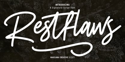 Restflaws is a casual script font. With medium mono-line stroke, fun character with a bit of ligatures and alternate characters. To give you an extra creative work. Restflaws font support multilingual more than 100+ language. This font is good for logo design, Social media, Movie Titles, Books Titles, a short text even a long text letter and good for your secondary text font with sans or serif. Make a stunning work with Restflaws font. Cheers, MaulanaCreative
 - Clockerts by Maulana Creative,
$13.00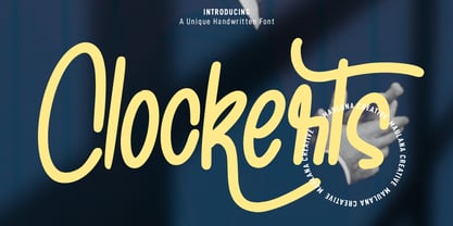 Clockerts is a fancy casual modern script font. With clean mono-line stroke, fun character with a bit of ligatures and alternates. To give you an extra creative work. Clockerts font support multilingual more than 100+ language. This font is good for logo design, Social media, Movie Titles, Books Titles, a short text even a long text letter and good for your secondary text font with sans or serif. Make a stunning work with Clockerts font. Cheers, MaulanaCreative
 - Luxury Modish by Ergibi Studio,
$20.00 Luxury Modish is Modern Calligraphy font presentation from Ergibi Studio. Inspired by beautiful writing that has a luxurious feel with additional swash lines This font includes uppercase, lowercase letters, numbers, punctuation, symbols, swash and multilingual support. Luxury Modish is perfect for branding, photography, invitations, quotes, watermarks, advertisements, product designs, social media posts, stationery, labels, and more! I hope you enjoy this font. If you have any questions please don't hesitate to drop me a message :) Thank You, Ergibi Studio
 - Milea lover by Mega Type,
$12.00 Milea Lover is a beautiful script font with an irregular baseline. Milea Lover comes with a feminine and trendy style that gives a touch of love to your design projects. Milea Lover looks very beautiful for branding, logo, wedding invitations, greeting cards, fashion, book covers, posters, labels, quotes and other romantic projects. Have fun using Milea Lover!!! I really hope you enjoy it! Feel free to follow, like and share. Thank you so much for checking out my shop!
 - Southavely Signature by Maulana Creative,
$14.00 Southavely is a casual signature font. With regular mono-line stroke, slanted and fun character with a bit of ligatures. To give you an extra creative work. Southavely font support multilingual more than 100+ language. This font is good for logo design, Social media, Movie Titles, Books Titles, a short text even a long text letter and good for your secondary text font with sans or serif. Make a stunning work with Southavely font. Cheers, MaulanaCreative
 - Sahitya by Sulthan Studio,
$19.00 Sahitya Script is a stylish calligraphy font that features a varying baseline, smooth line, classic and elegant touch. It can be used for various purposes such as headings, signature, logos, wedding invitation, t-shirt, letterhead, signage, labels, news, posters, badges etc. Sahitya Script is built with OpenType features and includes start and end. It comes with OpenType Stylistice set, Initial, swashes, ligatures and everything to add a touch to your design and also supports other languages :)
 - Wilke by Linotype,
$29.99This font is a late work of the famous Berlin font artist Martin Wilke. Presented by Linotype AG in 1988, Wilke is a lively font with eccentric, playful forms. Wilke was influenced in part by the letters of the Irish handwriting in the Book of Kells, written in the late 8th century, while the pronounced contrast in strokes goes back to the styles of the 18th century. the font’s uniqueness is particularly emphasized when used in larger point sizes. - Fusaka by Adobe,
$29.00Fusaka was created by graphic designer Michael Want, a highly original and specialized display typeface which bridges Kanji and Roman letterform styles. As in Kanji, each character fits into a square. The shape and the placement of letter and decorative strokes can make Fusaka look like Asian writing at first glance and allow it to be set either horizontally or vertically. Use Fusaka for a unique look on CD covers, magazine headlines, book titles and Web sites. - Fragille by Silverdav,
$18.00 Fragille – Modern serif typeface This font is great for designing elegant logos, quotes, magazine covers, wedding cards, invitations, and brands. Its highly contrasting lines are best used in headlines and projects of a large type. Fragille adds timeless beauty, heavenly curves, and a classic look to any project. It is recommended to use Adobe Illustrator or Adobe Photoshop. Hope you enjoy our fonts and if you have any questions feel free to send a message & I’m happy to help
 - Lemonade Peach by Letterhend,
$19.00 Introducing, Lemonade and Peach, a fresh display typeface. As you can see, this typeface has playful and fun look which is perfectly made to be applied especially in storybook cover, comics, cartoon characters, kids theme design, etc. Features : uppercase & lowercase numbers and punctuation multilingual alternates PUA encoded We highly recommend using a program that supports OpenType features and Glyphs panels like many of Adobe apps and Corel Draw, so you can see and access all Glyph variations.

