10,000 search results
(0.043 seconds)
- Melt by Flavortype,
$24.00 Introducing "Melt," a captivating and versatile font that seamlessly blends boldness with soft, rounded curves, exuding an irresistible charm. This font is a harmonious fusion of cursive elegance, bold confidence, and modern trends, making it perfect for eye-catching headlines that demand attention. The Melt font family is thoughtfully crafted with three distinct selection font files, ensuring a range of creative possibilities: Melt Italic (Full Features): The italic variation of Melt boasts full features, providing a dynamic and playful touch to your designs. With its stylish slant and graceful curves, Melt Italic is ideal for adding a touch of sophistication to headlines, posters, and other creative projects. Melt Swashes: Elevate your designs with the Melt Swashes font file, where uppercase letters are replaced with delightful swashes. These swashes add a whimsical and artistic flair to your text, creating a unique and expressive visual impact. Perfect for adding a touch of creativity to logos, branding, and more. Melt Swashes Alt: For those seeking alternative swashes for uppercase letters, Melt Swashes Alt offers a distinct set of alternative swash designs. This variation provides even more versatility and customization options, allowing you to tailor your typography to suit the specific aesthetic of your project. Whether you're designing for a trendy website, playful branding, or vibrant marketing materials, Melt's bold, cursive, and rounded style, coupled with its three font file options, ensures that you have the perfect tool to make a lasting impression. Embrace the charm of Melt and let your headlines stand out with a delightful blend of modernity and cuteness.
 - Slenderz by CozyFonts,
$25.00 Slenderz is a handwritten font designed by Tom Nikosey, an American Graphic Designer specializing in Typographic Design and Illustration. Slenderz is available in Light, Medium & Bold weights. CozyFonts Foundry is Tom's intro into the world of font design. Slenderz is a casual, handwritten font that gives a reserved yet firm and legible personality to any headline or copy. Each of the 3 weights has it’s own personality yet like 3 brothers they represent the and belong to the same family. Intermixing Light & Bold or Medium & Bold won’t ruin the flow but will enhance it. Slenderz is the 9th font family from CozyFonts Foundry.
 - Lapoya by Cuchi, qué tipo,
$9.95 “LAPOYA” (meaning in english “the coolest”) is a large slab serif typeface family, with a certain Italian inverted contrast touch. Specially designed for advertising big shows and commerces, Lapoya has 36 variables and four axes, including a text and decorative versions, where the drawing and width of its counterforms vary. It also has icons that remember the old aesthetics of wood types from the early 20th century, and more than 400 characters with a multitude of signs and ligatures, that make Lapoya ideal for up to 89 languages. It is clearly inspired by the large wood types designed for posters, advertisements and newspapers. Since they were introduced in the 19th century, slab serifs have become extremely popular. In fact, serifs are often enlarged, not so much to look like beautiful or balanced letters, but to be more graphic and visual powerful than others. Furthermore, in the case of this typeface, this idea has been applied not only to capital letters, but also to the lowercase, numbers and signs of all kinds. “That’s why this typeface is LAPOYA!” Designed by Carlos Campos in 2023. cuchi@cuchiquetipo.com OPENTYPE FONT 426 GLYPHS 388 CHARACTERS 4 AXES 36 INSTANCES 9 LAYOUT FEATURES 89 LANGUAGES
 - Skinni by Joachim Frank,
$19.00 A handcrafted font with extremely narrow letters, suitable for headings, logos, brands, menus, invitations, but can also be used with lowercase letters. Designed 2022 by Joachim Frank Germany.
 - Monzo by Panatype Studio,
$5.00 MONZO is Contemporary Fat Font comes with 2 styles ( Regular & Outline ) with corresponding italics. Perfect for Logotype, Head text, Displayed text, and many more). Support for 75+ Language.
 - Gundrada ML by HiH,
$12.00 Gundrada ML was inspired by the lettering on the tomb of Gundrada de Warenne. She was buried at Southover Church at Lewes, Sussex, in the south of England in 1085. The Latin inscription on her tomb, STIRPS GUNDRADA DUCUM, meaning “Gundrada, descendant of the Duke” may have led to the speculation that she was the daughter of William, Duke of Normandy and bastard son of Robert the Devil of Normandy and Arletta, daughter of a tanner in Falaise. In 1066 William defeated Harold at the Battle of Hastings and was crowned William I of England. More commonly known as William the Conquerer, he commissioned a string of forts around the kingdom and charged trusted Norman Barons to control the contentious Anglo-Saxon population. William de Warenne, husband of Gundrada, was one of these Barons. There has also been the suggestion that Gundrada may have been the daughter of William’s wife, Matilda of Flanders, by a previous marriage. According to the Dictionary of National Biography (Oxford University Press, Oxford, England 1921-22), both of these contentions are in dispute. Searching the past of a thousand years ago is like wandering in a heavy fog: facts are only dimly in view. Regardless, I know that I found these letterforms immediately engaging in their simplicity. Unadorned and unsophisticated, they have a direct honesty that rests well in the company of humanistic sans serifs like Franklin Gothic or Gill Sans, appealing to a contemporary sensibility. The lettering on the tomb is in upper case only. Although Gundrada does not sound Norman French to me, her husband certainly and her father probably were Norman French. Nonetheless, the man that carved her tombstone was probably Anglo-Saxon, like most of the people. For that reason, we are quite comfortable with a fairly generic lower case from an Anglo-Saxon document of the time. The time was a time of transition, of contending language influences. This font reflects some of that tension. Features 1. Multi-Lingual Font with 389 glyphs and 698 Kerning Pairs. 2. OpenType GSUB layout features: onum, dlig, liga, salt & hist. 3. Tabular Figures and Alternate Old-Style Figures. 4. Alternate Ruled Caps (line above and below, matching to brackets). 5. Central Europe, Western Europe, Turkish and Baltic Code Pages. 6. Additional accents for Cornish and Old Gaelic. 7. Stylistic alternates A, E, y and #. 8. Ligatures ST, Th, fi and fl. 9. Historic alternate longs. The zip package includes two versions of the font at no extra charge. There is an OTF version which is in Open PS (Post Script Type 1) format and a TTF version which is in Open TT (True Type)format. Use whichever works best for your applications.
 - Display Hatched by Greater Albion Typefounders,
$16.50 Display Hatched is ideal for posters with an industrial theme and is designed as a complement to Greater Albion’s “Singwriter Standard” typeface. All glyphs are diagonally shaded giving just a delicate touch of ‘industrial edge’ which is so ‘on trend’ at the moment. Display Hatched includes small capitals and title forms, as well as three forms of numerals. Bring a little industrial grit to your next project!
 - Futura Next by Neufville Digital,
$45.25 Our most up-to-date Futura adapted to the new times. Its peculiarity lies in the curved endings of three of its letters (“j”, “l” and “t”), which gives the typeface a more dynamic and modern look, making it easier to visualize on small and low-resolution screens. The original designs of these characters are also included. Futura is a Trademark of BauerTypes SL
 - Bold Pressing Pack by Fontscafe,
$39.00 Fonts Café is offering a brand new pack of fonts and elements; The Bold Pressing Pack, full of bold, strong, powerful, vintage fonts which really stand out to make a strong impact. These fonts bring us back to a time when ink was placed onto wooden blocks, which were then pressed down onto the paper, creating big, bold letters, with the beautiful flaws of a time when things of import were given the due attention they deserved. This pack is designed to quickly capture the attention of anyone who sees it, while making a statement that says you mean business. It includes five different font styles, as well as two different element styles. There's everything from a standard letterpress font, to a font which truly emulates the imperfections of those days, as well as one that stands out above the rest to make a truly bold statement, and more. Check below these powerful fonts in more detail.
 - Raqilla Kids by Zamjump,
$15.00 Introducing Raqilla Kids - Playful Display Font Raqilla Kids is a display font with a cute character. This is a kids themed font look, inspired by children's writing in general, with a shape that looks irregular but is very distinctive, these characters will add a warm touch to any look. Add this beautiful display font to your every creative idea and see how it makes them stand out! FEATURES - Uppercase - Lowercase - Numbering - Punctuations - Ligature - Alternate - Swash - Multilingual Support - Works on PC or Mac - Simple Installation - Support Adobe Illustrator, Adobe Photoshop, Corel Draw, also works on Microsoft Word Thanks
 - Paragraph Stretch by Paragraph,
$15.00 When merely “extended” just would not do, here is Paragraph Stretch™: a super extended or elongated geometric display typeface. It is a typeface with an unicase effect: the capitals and lower case fit the same height and a similar width, so they are interchangeable: fancy a round “W” in all caps? Use the lower case. Want a straight “x” in lower case? Use the cap. And so on. Designed for use at larger sizes for logotypes, short titles or headings. It supports Western plus Nordic, Eastern European and Turkish languages.
 - Salt & Spices Pro by Fontforecast,
$29.00 Salt&Spices Pro is a welcome addition to the ever popular modern calligraphy genre. Digitizing the many handwritten samples into a fully functional connected script was done with great precision, carefully guarding the authentic look and feel of vintage dip pen calligraphy. Salt&Spices Pro is a very versatile 9 font family, consisting of 3 casual styles: Regular, Bold and Shadow. With 587 glyphs each, they offer great flexibility in customizing words and phrases to suit your personal taste. For instance: the appearance of initial and terminal letters can be customized using the glyph pallet. Contextual alternates, Swashes and Stylistic sets give you the ability to replace spaces by 3 alternate connecting spaces or add swashes to initial/terminal letters. Double letter ligatures help sustain the natural flow of handwriting. In addition to the 3 calligraphic family members 3 SmallCaps Sans styles and 3 SmallCaps Serif styles were added. They all have 435 glyphs and match very well because they were designed using the same vintage nib. Each of the styles can add great variation to your designs and they supplement and support each other perfectly. Add exceptional language support to all that and you have the perfect ingredient to spice up even the most demanding design project.
 - Risotto Script by Estudio Calderon,
$69.00 Risotto Script is a sexy font designed by Felipe Calderón, it represents the texture, sound, smell and flavor of food that come in those interesting packages with different concepts. This font makes you want to eat it because it is designed with a unique texture like a lot of vegetables, it has flourishes that suggest herbs and country roots. Calligraphy with folded pen and food packaging were two of the inspirations to develop this project that will work well wherever it is applied. Risotto Script Pro has 672 glyphs that have the purpose of covering a lot of writing options with different results, by applying OpenType programming as: - Standard ligatures - Stylistics alternatives - Contextual alternates - Discretionary ligatures - Swashes - Terminal forms - Stylistic Set 1, 2, 3 and 4 - Initials (it includes leaves in some endings) NOTE: The X height is generous, in order to design signs to 8 and low size. You`d better get the “extras” for a more complete experience. Most of the Standard ligatures include Stylistics alternatives with detailed endings Multiple language options.
 - Organetto by Latinotype,
$25.00 Organetto is a typeface, inspired by the lettering found on Art Deco posters, whose design embraces latest digital font technology. This versatile font contains multiple widths which make it an ideal solution to fit every design need. In addition to its functional geometric style and different widths, Organetto also includes alternate characters that provide even more design options. All these features make the font a great choice for graphic designers and art directors, logos, wordmarks, short text, etc. Organetto is a sans-serif typeface with modern proportions and straight-edge terminals. It comes in 7 weights, ranging from Hair to Ultrabold, and 7 widths (from Ultra Condensed to Expanded) and contains a set of 397 characters that support 180 different languages. Organetto also includes OpenType features- 3 sets of alternates, catchwords and titling.
 - Ioana by Octopi,
$20.00 Ioana is an inoffensive, slightly quirky, slightly fattened sans serif font. It has a full character set as well as ligatures, small caps, superiors, inferiors, numerators, denominators and auto-fractions. Ioana came about as a direct result of 3 previous, private commissions that were all based on an artists hand-writing. For Ioana, I wanted a more regimented (but not boring) sans serif that could be used for headlines, posters and flyers with larger body text. Ioana Lighter is an inoffensive, slightly quirky, slightly lighter sans serif font. It is the lighter weight of Ioana and has a full character set as well as ligatures, small caps, superiors, inferiors, numerators, denominators, old style figures and auto-fractions. These OpenType fonts have support for CE languages and I hope you like it.
 - Slow Tempo by Dharma Type,
$19.99 Slow Tempo is a relaxed, loose-fit font that you can easily enjoy. Slow Tempo has basic, natural and neutral letterforms and skeletons for a wide range of usage. Though, there are some distinctive features. As you can see, Slow Tempo has low curvature of the intersections between stem & shoulder or bowl and also has large and open apertures. This makes this font relaxed. The letterform has low contrast and geometric shape to be neutral design, large x-height and humanistic terminal to be legible and distinguishable. Slow Tempo consists of 8 weights and their matching Italics for a wide range of usages. Further, Slow Tempo is supporting international Latin languages and basic Cyrillic languages including Basic Latin, Western Europe, Central and South-Eastern Europe. Also CSS covers Mac Roman, Windows1252, Adobe1 to 3. This wide range of international characters expands the capability of your works.
 - Milio by Tipo Pèpel,
$22.00 Any typeface has two intrinsic elements that does´t work at the same levels, form and appearance. These peculiar visual behavior generate a wide range of graphics games. At reading level, we observe a uniform gray spot, but large bodies allows us to appreciate their shapes and counterforms. Milio takes this duality to offer unparalleled service in newsprint and magazine publishing, specially in small bodies but hard and formal cogency in titling. Its wide variety of weights, 10 in total, together with a slight condensation allows us to save space without losing legibility, even under poor printing conditions. Its basic quasi humanistic forms include support for a wide range of details that give great originality and strength. A friendly appearance, but a strong, all-road typeface with internal forms that reinforced visibility in small sizes thanks to its high average eye and the contrast that generates its soft curved external and internal squared angles. The nuances here are fundamental and explain its powerful large sizes, where you can see these contrasts between the curved, organic, humanistic, and straight, angled, almost mechanical shapes. Milio has the bonus of a large multilingual support for all alphabets based on the Latin and Cyrillic, as well as large Opentype features for expert users, among which we have true small caps, ligatures and automatic contextual alternates. Several sets of numerals for use on tables and other “delicatessen” as fractions are also included. Having in mind the daily struggle in newspaper and magazines´ edition, Milio has been designed with the idea of being Cinta´s perfect couple, a similar contrast and proportion typographic san serif family produced by the same Foundry as Milio, to cover almost all the graphic needs in actual DTP.
 - Alt Gotisch by HiH,
$12.00 Alt-Gotisch Verzierte is a typeface of decorative initials that is Victorian in style and bears a close family resemblance to the many ornamental tuscans cut throughout the nineteenth century by British foundries. Instead of the bifurcated terminals of the archetypical tuscan (see Figgins Tuscan by HiH or Stereopticon by Dan X. Solo), these letters display what Nicolete Gray might call a “wedge and bite” design -- as if they started with the wedge serif of a latin form and someone came along and took a perfectly round bite out of the wedge. We need not dwell on the lack of teeth marks. The calligraphic curls and flourishes are often graceful, sometimes a bit contrived, but always complex. There is a busyness that marks the style of the period. If you ever see an old photograph of a well-appointed Victorian parlor, you will recognize that same quality of busyness. Overdone is a word that frequently comes to mind. Alt-Gotisch Verzierte means “adorned or decorated old gothic.” The typeface is attributed by Alexander Nesbitt to an unidentified German foundry of the nineteenth century (Decorative Alphabets and Initials, Dover, New York 1987, plate 92). The designer is unknown. Our font is supplied with a lower case that is similar to the upper case, but is 15% shorter and is simplified by the omission of the decorative vines. For the lower case, alternate letters A, E, & T; and ligatures LE, OT & LY have been supplied. In addition, a few small decorative vines were planted here and there for optional use. An accented upper case is not part of the original design and is not here supplied. This design is also seen under the name “Sentinel” -- as always, it is worthwhile to compare the completeness of the character set and the faithfulness of the rendering. We believe you will agree that we provide a balance of quality and value that is unmatched in the contemporary marketplace. Alt-Gotisch Einfach is a simplified version of Alt-Gotisch Verzierte. The vine-less lower case of the Verzierte font is the upper case in Einfach. For a lower case for Einfach, the letters were further simplified by stripping away the three-dimensional outline, down to the bare bones and bites, as it were. Einfach, in fact, means “simple” or “plain.” It is interesting to note that this bare bones & bite lower case bears (I have a special license to use two homonyms in the same sentence) a striking resemblance to the 15th & 16th century ornamental letters from Westminster Abbey shown in Plate 47 of Alexander Nesbitt’s Decorative Alphabets and Initials (Dover, New York 1987).
 - Benida by Craft Supply Co,
$20.00 Introduction to Benida Serif Font Benida, an elegant serif font, offers a high-contrast serif design. Its unique style is perfect for various applications. The font’s design is both bold and refined, making it versatile. Ideal for those seeking a mix of elegance and assertiveness, Benida is a great choice. Design Features Benida features high-contrast serifs, adding sophistication to its look. The wedges in the serif are carefully crafted. These elements combine to create a distinct, impactful appearance. The font’s structure balances strength with grace, making it stand out. This balance ensures that Benida is suitable for both formal and creative uses. Usability and Applications Benida’s design makes it highly readable. It’s perfect for headings, logos, and editorial work. The font’s elegant nature suits wedding invitations and upscale branding. Its assertive qualities make it ideal for professional presentations. Benida truly shines in both digital and print formats, demonstrating versatility.
 - Gistela by Solidtype,
$15.00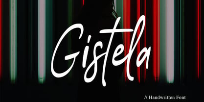 Gistela is a handwritten script font. Contemporary and fashionable. with Ligatures and Multilingual Support. This font is perfect for modern projects, headings, blogs, logos, branding, business cards, websites, invitations, shirts, mugs, and more!
 - Trostie Love by Lemonthe,
$9.00 Trostie Love is a handwritten font, cute and fun. This font is perfect for quotes, headings, blogs, logos, invitations, wedding, watermark, social media posts, product packaging, product designs, label, special events and more!
 - Gustatory Delight by Ali Hamidi,
$12.00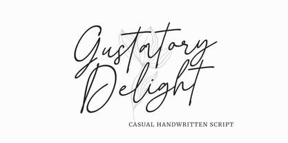 Gustatory Delight is a perfect handwritten script font that has a modern and authentic look, this font has a simple and unique character in both lowercase and uppercase, this font is perfect for branding, signature, logo, packaging, presentations, planners, resumes, business card, brochures, fashion, t-shirt, wedding invitations, yard signs and more.
 - MGT Fugiat by Magetype,
$15.00 MGT Fugiat is a Neo-grotesque font inspired by the 1900s.Apart from that, there is also monospaced.This super clean sans serif is perfect for bodytext, in magazines, websites, and books.Also suitable for book titles and posters. MGT Fugiat Neo-grotesque, there are 20 styles, hairline to heavy.Uprights and Italics.Meanwhile, MGT Fugiat Mono has 18 styles, hairline to black.Uprights and Italic too.Both fonts are also included in Variable Fonts.
 - Milko by Jesse Tilley,
$12.00 670 Characters in this tiny font. It's small, it's clean and there are no gimmicks. This is as simple as a bitmap font gets.
 - DARK PLACE_DEMO - Personal use only

- Himalaya by Arendxstudio,
$18.00 Introducing Himalaya Typeface a rounded vintage monoline. Himalaya is clean modern-vintage display font which inspired from old school letterpress 1.Uppercase,lowercase, numeral,punctuation & Symbol 2.Regular 3.Multilanguage 4.Alternate
 - Hermanz Titling by California Type Foundry,
$47.00 Hermanz™ Titling is inspired by the most majestic caps that Hermann Zapf ever drew. They are inscriptional caps, square caps, or “capitalis monumentalis”. These caps are some of the most beautiful letters made by one of the greatest talents of our time; so beautiful they deserve to be seen and appreciated by everyone. If you do any work for churches, wedding, funeral, anniversary, or other ceremonies, for the fine arts, exclusive clubs, or higher education—you will love how these letters make your brochures, pamphlets and announcements look. Hermanz Titling works for anything labeled "fine": fine dining, fine music, fine art (pamphlets, books, posters, cookbooks). It also fits well for religious topics: posters, events, websites, hymnals, for biblical; and ceremonies, religious or otherwise. Emotions It Can Communicate: • Importance • Timelessness • Special Event • Tradition • Reverence • Artistry • Beauty Released June 2021 on the Memorial of Hermann Zapf, as part of the California Type Foundry Memorial Series: Honoring the life and work of the great font designers. FONT STORY The Majestic Caps When I was on one of my visits to rare books rooms I found some large caps of Hermann Zapf, and I knew that I had to make a font inspired by these. I was surprised that no one had ever made them into a font. They were some of the most beautiful caps I had ever seen. These caps were surprisingly difficult to make. I thought it would take me a week or two; to get the detail and spirit right took significantly longer– but it was well worth the effort! When you print Hermanz Titling on a page, you will see what I mean. Even when printed digitally, it’s the closest thing to letterpress. You might even have some people thing it was printed by a traditional method with ink! (Note: Unless printed at very large sizes, this font is not recommended for actual letterpress, because the serifs are too thin.) If you do any work for churches, wedding, funeral, anniversary, or other ceremonies, for the fine arts, exclusive clubs, or higher education—you will love how these letters make your brochures, pamphlets and announcements look. Enjoy this breathtaking font, and may it help inspire people with your messages! –Dave Lawrence & the California Type Foundry
 - Bernhard Condensed No2 by SoftMaker,
$9.99 Bernhard Condensed No2 a freely drawn heading typeface published by SoftMaker.
 - Ongunkan Old Turkic Yenisei by Runic World Tamgacı,
$50.00 The Yenisei Inscriptions consist of a total of 158 Turkish inscriptions, kurgans (graves) and rock stones that have been found along the Yenisei River, which passes through the Khakasya, Tuva and Altai Autonomous Republics in Russia. The inscriptions were written with Turkish Stamps, which we know as the Orkhon Alphabet. In addition, there are dozens of versions of the Turkish Runic script, apart from the Yenisei inscriptions and the Orkhon inscriptions. I will present the other versions here as soon as possible.
 - Seddon Penmans Paradise Capitals by Intellecta Design,
$29.50 John Seddon (1644-1700), was a famous English writing master, the leading calligrapher of his time, and master of Sir John Johnson’s Free Writing School in Priest’s Court, Foster Lane. His portrait was drawn by William Faithorne and was engraved by John Sturt as the frontispiece for his copy-books, such as ‘The Ingenious youth’s companion’ of c.1690 and 'The pen-man’s paradise' of c.1695. These were engraved after his work by others. Your extra-rare book - "The Pen-mans Paradise Both pleasent & Profitable OR Examples of all ye usuall hands of this Kingdome. Adorn'd with variety of ffigures an Flourishes done by Command of hand. Each ffigure being one continued & entire Track of the pen most where of may be struck as well Reverse (or to answer bothwayes) as Forward", London (1965). - (YES, that is the title of the book!) was the starting point to these new extra accurated works of Iza W, a series of revivals of the penmanship Seddon’s artworks, like this highly ornamented animal kingdom inspired capitals and alphabets: the Seddon Penmans Paradise Capitals typeface. And, on the other hand, you can get the animal and human kingdon inspired penmanship forms in the Bestiario font. The “SeddonsFleurons” will complete the collection. Fantastic choice to elaborated barocque/renaissance inspired and historical accurated layouts.
 - Alfiyah by Ergibi Studio,
$20.00 Intrducing Alfiyah is a calligraphy script font that comes with a very beautiful change, a kind of classic decorative copper script with a modern touch, made with great detail to present a stylish appearance and of course very easy to read. The classic style is equipped with an alternative stylistic which is very suitable to be applied in various formal forms, especially wedding invitations, labels, restaurant menus, logos, fashion, make up, stationery, novels, magazines, books, greeting/wedding cards, packaging, labels or all kinds of advertisements. Features Regular Version Uppercase & Lowercase Number & Symbol Ligatures Stylistic Alternates Multilingual and PUA Encoded If there is a problem, question, or anything about my fonts, don't hesitate to ask! Big Thanks ~ Ergibi Studio
 - North Star by Fontop,
$10.00 Aaaaand here it comes! New sans serif typeface NORTH STAR. Pure geometric forms – this is what makes these fonts look so special. Ad materials, logos, posters and so on so on. The font comes in Regular and Bold, both are Latin multilingual and have uppercase letters, lowercase letters, numbers and basic punctuations. Thanks to its geometric shape you can also make an additional effect with combining different colors in the one letter and adding shades. Its easily done in AI after you convert your text to outlines.
 - Rummage Sale by Ingrimayne Type,
$11.95 Several years ago I was asked to do a sign for a rummage sale. To print the words RUMMAGE SALE, I took letters from some of the ornate fonts I was working on at the time. I liked the results, so made them into a font. Fonts from which the letters come include HippityDippity, Tuskcandy, Letunical, OakPark, WyomingStrudel, NeuAltisch, WyomingMacroni, WyomingPastad, and Rundigsburg. The original typeface had two variants of each letter, one on the upper-case keys and the other on the lower-case keys. The name of the original font, RummageSaleOne, acknowledged that a greater selection of letters was desirable but it was only with the upgrade of 2020 that the greater selection was added. The additional variants were added in two ways: as a separate typeface (RummageSale-Two) and also as OpenType stylistic alternatives.
 - Brother Bear - 100% free

- Nefertiti by JAB,
$12.00As you can see, Nefertiti is a font based on ancient Egyptian hieroglyphs and could be classified as a fun-font. I've always been really interested in Egyptology and a couple of years ago I thought it would be great to be able to write in hieroglyphs. I started to study them but soon realized it would take me a long time to be able to do this. Still, I was determined to find a way around this problem. At some point I came up with the idea of rearranging and reforming the hieroglyphs so as to resemble the English alphabet. During this process I tried as much as possible to preserve their ethos and appearance. However, since they are designed to write in English with, it's obvious that they are not always going to look like the real thing. Despite this, I'm really happy with the final result and I think many Pharaohphiles who just want to have some fun will be also. The only difference in this font between lower and upper case characters, is that the latter are set between two parallel, horizontal lines. These are for use with brackets (motif ends) to form cartouches - elongated ovals for names and/or titles. Try typing the following using the upper case in the sample text box. e.g. (JOHN} The zigzagged vertical lines at each end, separate the motifs from the hieroglyphs. Note the three types of ends/brackets. These lines are also used to separated words from one another and to give a more authentic appearance. So pressing the space bar gives a zigzagged line - not a space. They can also be used at any point within a cartouche to separate first and last names or titles. e.g. ; (JOHN;BROWN} walked straight home after work. Notice the eye glyph (period/full stop) at the end of the sentence. This is the only punctuation mark which can be used within a cartouche, e.g. after Mr. or to add a more Egyptian appearance to a name or title. e.g. (MR>;JOHN;BROWN} Parallel lines dividing hieroglyphical inscriptions and writing into rows or columns are very common. To incorporate these in a body of text, simple use the underline U. e.g. (OSIRUS) and {ISIS} were important gods of the ancient Egyptians. (HORUS) {HATHOR} and [RA],the sun god, were also highly revered deities. The punctuation marks available are shown below. . , " " ' ! ? "where is the king?" The font also includes the numbers 0-9, the following mathematical symbols and the hash sign(Scarab beetle). Once again, I've tried to make them look as Egyptian as possible; whether I've succeeded or not is open to debate. e.g. + - x / = # This font is named after Akhenaten's beautiful wife, Nefertiti, who's image can be seen in the graphic on this page. - Amanda Manopo by IRF Lab Studio,
$15.00 Amanda Manopo is a calligraphy script font that comes with very beautiful changing characters, a kind of classic decorative copper script with a modern touch, designed with high detail to bring stylish elegance. Amanda Manopo Script is attractive as a typeface that is smooth, clean, feminine, sensual, glamorous, simple and very easy to read, because there are many fancy letter connections. I also offer a number of viable style alternatives for many letters. The classic style is perfect to be applied in various formal forms such as invitations, labels, restaurant menus, logos, fashion, make up, stationery, novels, magazines, books, greeting / wedding cards, packaging, labels or any type of advertising purpose.
 - Khalifah Script by Solidtype,
$15.00 Khalifah Script is a calligraphy script font that comes with very beautiful changing characters, a kind of classic decorative copper script with a modern touch, designed with high detail to bring stylish elegance. Khalifah Script is attractive as a typeface that is smooth, clean, feminine, sensual, glamorous, simple and very easy to read, because there are many fancy letter connections. I also offer a number of viable style alternatives for many letters. The classic style is perfect to be applied in various formal forms such as invitations, labels, restaurant menus, logos, fashion, make up, stationery, novels, magazines, books, greeting / wedding cards, packaging, labels or any type of advertising purpose.
 - Antura Script by Solidtype,
$18.00 Antura Script is a calligraphic script font that comes with very beautiful changing characters, a kind of classic decorative copper script with a modern touch, designed with high detail to bring stylish elegance. Antura Script is an attractive typeface that is smooth, clean, feminine, sensual, glamorous, simple and very easy to read because there are many fancy letter connections. I also offer a number of viable style alternatives for many letters. The classic style is perfect to be applied in various formal forms such as invitations, labels, restaurant menus, logos, fashion, make up, stationery, novels, magazines, books, greeting/wedding cards, packaging, labels or any type of advertising purpose.
 - Soliloquous by Comicraft,
$49.00 Talking to yourself out loud? Jabbering? Muttering? Wittering away on some flight of fancy? Why not? Why wait to get compliments from someone else? If you deserve them, pat yourself on the back, give yourself a good pep talk! Create a dialogue with yourself so that you can hear what you're thinking! Whether you’re living on your own or living with others, you’re always living with yourself and you can always be there FOR yourself with a cheerful word of wisdom or two hundred. So, help yourself yourself with Soliloquous! You won't feel alone without it. But please, remember to be respectful and try not to hurt your own feelings. And shut up when you hear yourself tell yourself that’s enough. See the families related to Soliloquous: Monologous .
 - Dip Pen JNL by Jeff Levine,
$29.00 Answer Songs have been around for [probably] just as long as there have been songs. 1917's "If I Catch the Guy Who Wrote Poor Butterfly" was the answer to the 1916 hit "Poor Butterfly" [by Raymond Hubbell and John Golden], which in turn was inspired by the Puccini opera "Madame Butterfly". "Poor Butterfly" was so popular that this "answer" tune had as part of its lyrics "That melody haunts me in my sleep; it seems to creep." Nonetheless, the sheet music for William Jerome and Arthur Green's comic lament had the title hand lettered with an oval nib lettering pen and is now availably as a digital type face called Dip Pen JNL.

