10,000 search results
(0.087 seconds)
- Magneta Condensed by Positype,
$25.00 To describe what inspired Magneta would be to add a little Dwiggins, throw in some Benton with a hint of Austin, wrap it up in a crisp, contemporary package and serve. The skeleton of the family is a Garalde (like my earlier Epic) but with a desire to produce something much more transitional and contemporary, I sought to simplify, simplify, simplify. Cap and ascenders share the same height, the x-height is slightly larger than expected which should make a functional typeface for editorial, headlines or where more visually complex systems are needed. The modulation is much more intentional than historical and creates some interesting interactions between the various weights. There are both Normal and Condensed widths available with 6 different weights and matching italics, small caps, oldstyle figures, swashes, stylistic and discretionary ligatures (that includes some fun majuscule ligatures in the roman styles), there is no lack of typographic goodness for the designer. To add some spice, a set of Decorative Ornaments have been created that include geometric, floral, curvilinear patterns and much more.
 - Kuma Square by L'île Foundry,
$35.00 In Ancient Greek, Kuma means wave. This wavy, dynamic and poetic all-caps display typeface is useful for headlines or short texts. Kuma is the result of a graphic and perceptual game that, using experimentation as a working method, explores the possibilities of writing as an image. This grid-based typeface creates different shapes and directions, never predictable. There are different types of waves created by the wind. That's why there are three different versions of Kuma: Kuma, Kuma Rounded and Kuma Square. Each version is available in seven weights which can be combined together. In their black and white rhythm, they guarantee global readability and balance. Kuma Square was designed by Jérémy Ruiz. Supported languages: Afrikaans, Albanian, Basque, Bosnian, Breton, Catalan, Croatian, Czech, Danish, Dutch, English, Esperanto, Estonian, Faroese, Fijian, Finnish, Flemish, French, Frisian, German, Greenlandic, Hawaiian, Hungarian, Icelandic, Indonesian, Irish, Italian, Latin, Latvian, Lithuanian, Malay, Maltese, Maori, Moldavian, Norwegian, Polish, Portuguese, Provençal, Romanian, Romany, Sámi (Inari), Sámi (Luli), Sámi (Northern), Sámi (Southern), Samoan, Scottish Gaelic, Slovak, Slovenian, Sorbian, Spanish, Swahili, Swedish, Tagalog, Turkish, Welsh.
 - Kuma Rounded by L'île Foundry,
$35.00 In Ancient Greek, Kuma means wave. This wavy, dynamic and poetic all-caps display typeface is useful for headlines or short texts. Kuma is the result of a graphic and perceptual game that, using experimentation as a working method, explores the possibilities of writing as an image. This grid-based typeface creates different shapes and directions, never predictable. There are different types of waves created by the wind. That's why there are three different versions of Kuma: Kuma, Kuma Rounded and Kuma Square. Each version is available in seven weights which can be combined together. In their black and white rhythm, they guarantee global readability and balance. Kuma Rounded was designed by Jérémy Ruiz. Supported languages: Afrikaans, Albanian, Basque, Bosnian, Breton, Catalan, Croatian, Czech, Danish, Dutch, English, Esperanto, Estonian, Faroese, Fijian, Finnish, Flemish, French, Frisian, German, Greenlandic, Hawaiian, Hungarian, Icelandic, Indonesian, Irish, Italian, Latin, Latvian, Lithuanian, Malay, Maltese, Maori, Moldavian, Norwegian, Polish, Portuguese, Provençal, Romanian, Romany, Sámi (Inari), Sámi (Luli), Sámi (Northern), Sámi (Southern), Samoan, Scottish Gaelic, Slovak, Slovenian, Sorbian, Spanish, Swahili, Swedish, Tagalog, Turkish, Welsh.
 - Helenium by Greater Albion Typefounders,
$14.95 Informal does not have to mean aggressively modern or casual. Helenium is inspired by some hand drawn capitals that I found added to a 19th century map. It's a great font for informal titles and headings that still keep an air or regularity and ever so slightly period elegance. It manages to be formal and casual all at once, as well as classical and modern. Helenium's range of different weights and drop shadow effects make it useful for hierarchical titles and headings. Helenium miniscule adds greater flexibility by extending the family with a fun range of rounded lower case forms.
 - Jukebox Hero by Grype,
$19.00 As one of the most popular rock bands of the world, Foreigner has rocked the charts with 10 multi-platinum albums and sixteen top 30 hits in the last 40 years. But one might ask what a band this successful has been missing all these years? No head games here...a consistent typeface based on their logo is the answer. As fans of Foreigner, we've taken the essence of their iconic logotype and expanded it out into a full typeface in regular and bold weights to celebrate their 40th anniversary tour. The Jukebox Hero Family celebrates the typographic stylings of Foreigner, with the soft rounded terminals and an open geometric feel, including the unique stencil flavor of the original logo. It inherited the friendly stylings of the all Capitals logo that inspired it, and goes on to include a full standard character set with expansive international support of latin based languages, and two weights jumping from regular to a beefy bold. This family is ready to rock the charts for your designs towards that of a modern, comfortable appeal. Here's what's included with Jukebox Hero Family bundle: 413 glyphs - including Capitals, Lowercase, Numerals, Punctuation and an extensive character set that covers multilingual support of latin based languages. (see the 3rd graphic for a preview of the characters included) 2 weights: Regular & Bold. Fonts are provided in TTF & OTF formats. The TTF format is the standard go to for most users, although the OTF and TTF function exactly the same. Here's why Jukebox Hero Family bundle is for you: You're a die-hard Foreigner fan, and have a case of "Double Vision" and need both font weights. You're looking for a stylish and sophisticated soft sans-serif stencil typeface family. You've been waiting for fonts like these. You're looking for a Sci-fi vibe typeface that has a look that feels familiar. You just like to collect quality fonts to add to your design arsenal
 - Christmas Cove by Factory738,
$15.00 When the air becomes crisply chilly and we start thinking of festive projects in time for Christmas, it's time to celebrate. Christmas Cove, A classic Christmas typeface for sleigh rides and carol singing. Included are all of the necessary elements, such as numbers, punctuation, and multilingual letters. These ligatures will come in useful no matter what your imagination conjures up. 10 Styles Basic Latin A-Z and a-z Numerals & Punctuation Stylistic Ligatures Multilingual Support for ä ö ü Ä Ö Ü ... Free updates and feature additions Thanks for looking, and I hope you enjoy it.
 - Holly by Factory738,
$15.00 It's time to celebrate when the air turns crisply chilly and we start planning festive projects for Christmas. Holly, a modern and fun Christmas typeface perfect for sleigh rides and carol singing. All of the necessary elements, such as numbers, punctuation, and multilingual letters, are included. Whatever your imagination conjures up, these ligatures will come in handy. 5 Styles (Dancer, Comet, Cupid, Donner, Rudolph) Basic Latin A-Z and a-z Numerals & Punctuation Stylistic Ligatures Multilingual Support for ä ö ü Ä Ö Ü ... Free updates and feature additions Thanks for looking, and I hope you enjoy it.
 - Madriz by SilverStag,
$14.00 Introducing Madriz, a slab serif font with a retro feel that's perfect for any project that needs a touch of old-school charm. With over 32 fonts in one font family, Madriz offers a wide range of styles to suit any need. You can choose from Thin to Black weights and Regular to Extra Expanded widths to create your perfect look. Madriz is inspired by the old-school signage of Madrid, Spain. The name "Madriz" is actually the affectionate nickname that Madrileños, the people of Madrid, gave to their city. The font's bold, blocky letters capture the essence of Madrid's vibrant and historic streets. Madriz's versatile nature makes it a great choice for a wide range of projects. Its bold, retro style is perfect for showcasing heritage brands or giving a modern touch to classic designs. Madriz can also be used to create a sense of nostalgia, making it ideal for retro-themed projects or campaigns. Here are some of the ways you can use Madriz: Titles and headings: Madriz's bold, eye-catching style is perfect for titles and headings. Text blocks: Madriz's wide range of weights and widths makes it suitable for text blocks, from body copy to large paragraphs. Logos and branding: Madriz's retro charm makes it a great choice for logos and branding. With its 32 font styles and support for over 90 languages, Madriz is an incredibly powerful tool for any designer. It can be used to create a variety of looks, from classic and elegant to modern and edgy. Whether you're working on a print project, a web design, or an app, Madriz has the potential to make a lasting impression. Madriz is the perfect font for anyone who wants to add a touch of old-school charm to their designs. With its wide range of styles and features, Madriz is sure to make a statement in any project. Would you like to get 5 completely free fonts worth over $75? No tricks, no hidden words, terms or anything. Just subscribe to my newsletter, make sure to check your email to approve the subscription, add me to your contacts so that the emails don't end up in spam folder and you will get 5 fonts for free. The fonts are packed with alternates, ligatures and some even come with extra goodies. Happy creating everyone!
 - Aegion by DRM Works,
$19.99 Aegion is a display typeface inspired by blackletter style. Aegion is perfect choice for people who looking for unique and powerful display heading.
 - Moyshire by Rillatype,
$13.00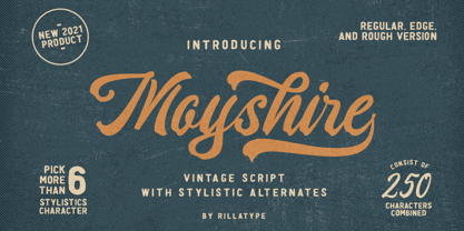 Moyshire is a vintage script font with a little touch of brush to make this font more bold and eye catching. this font is perfect for branding logo, illustration, or apparel design. This font also support multilingual, number and symbol. This font comes with 3 version, Regular, Rough, and Edge. Features : uppercase & lowercase numbers and punctuation multilingual alternates / swashes and ligatures PUA encoded
 - Aront by BaronWNM,
$14.00 Aront is a font with a modern and simple style. Having round and triangular geometric shapes adds a simple and stable impression to this font, plus a slight curve at each corner so that this font doesn't look stiff. The Aront font is perfect for logos, branding, film titles, games, and other techno-themed projects. Not only limited to techno themes, this font is also suitable for use in other themes that seem clean and simple. Aront font has multilingual support, alternate, and several ligatures as a plus.
 - FF Attribute Text by FontFont,
$72.99 FF Attribute™ Text is a proportional design with a faux monospace appearance. It has an industrial strength, minimalist vibe, making it perfect for attention getting, theme-based headlines, posters, banners and navigational links. And, because it is such a robust family, FF Attribute can also be used for branding of blogs, games, web sites and tech products. FF Attribute comes in two families; Mono and Text. The Mono is a fixed width (monospace) design, while the Text is a proportional design. FF Attribute was, in fact, initially designed for the use in code editor software. Its seven roman and italic monospaced weights and extended character set supporting a many languages, also make it a powerful communications tool. But this is only the tip of the iceberg. In addition to the monospaced version, where all characters share a fixed width, there is also a proportional, “faux monospaced” version: FF Attribute Text. The Text family keeps the visual character of a monospaced typeface, but wide letters are given more space while narrow characters have been drawn with correct proportions and spacing. FF Attribute Text looks monospaced – but it’s not. Drawn by Viktor Nübel, FF Attribute Text’s 14 designs, huge character set, including box-drawing characters and user interface-icons, make it the Swiss Army Knife® of monospaced fonts.
 - Waverley - Unknown license

- Anna - Unknown license

- Billy Serif by SparkyType,
$19.00The serifed companion to the popular Billy family comes in 3 very different but complimentary weights that when combined create a very strong, playful and persuasive style. - Getboreg Slab - Personal use only

- Secret Ring by Ditatype,
$29.00 Secret Ring is a captivating display font that will unravel the mysteries of the unknown in your designs. Designed in uppercase and bold, this typeface commands attention and exudes an aura of secrecy and horror. Each letter is meticulously crafted with details resembling plant roots with sharp edges, adding an eerie and enigmatic touch to the font. With its bold weight and uppercase design, Secret Ring creates a powerful and impactful presence. The root-like details in each letter of this font bring an organic and otherworldly appearance, as if the font draws its power from ancient and malevolent roots. These haunting details add an element of supernatural energy and create an atmosphere of foreboding and suspense. The combination of bold weight and sharp-edged root details gives this font a sinister and enigmatic look, evoking images of hidden rituals and occult symbols. For the best legibility you can use this font in the bigger text sizes. Enjoy the available features here. Features: Alternates Multilingual Supports PUA Encoded Numerals and Punctuations Secret Ring fits in headlines, logos, movie posters, flyers, invitations, branding materials, print media, editorial layouts, headers, and any horror-themed project. Find out more ways to use this font by taking a look at the font preview. Thanks for purchasing our fonts. Hopefully, you have a great time using our font. Feel free to contact us anytime for further information or when you have trouble with the font. Thanks a lot and happy designing.
 - Display Carlos by Gerald Gallo,
$20.00 Display Carlos is a display font not intended for text use. It was designed specifically for display, headline, logotype, branding, and similar applications. There are numbers and punctuation located under their respective keys.
 - Market JNL by Jeff Levine,
$29.00Market JNL is based on lettering found on a circa 1940s office supply product. There is a distinct Art Deco feel to this font, and it lends itself perfectly to all retro projects. - Bacon Buffet by PizzaDude.dk,
$20.00 Is there anything more satisfying, alluring or mouth-watering than bacon? Comes with contextual alternates, which means that the font has got 8 different versions of each letter - this cycles as you type!
 - Display Plump by Gerald Gallo,
$20.00 Display Plump is a display font not intended for text use. It was designed specifically for display, headline, logotype, branding, and similar applications. There are numbers and punctuation located under their respective keys.
 - Double Fresh by Rochart,
$15.00 These letters were created directly by my wife's hand, then I processed it into a vector and turned it into an aesthetic font, i.e. Double Fresh handwritten font. Handwritten like a note, this font features all caps, with three variations of each letter, and lots of ligatures for a natural imperfect look. It's perfect for that hand-lettered social media quote, logos, or adding a handwritten touch to any project. Mix & match the stylistic alternate or ligature, so that you’ll have lots of different letters for that unique look & feel! What’s included: ALL CAPS LIGATURES STYLISTIC ALTERNATE MULTILINGUAL SUPPORT NUMBER & PUNCTUATION Have fun creating with this brush font and let me know if you’ve any wish, suggestion or feedback 🙂
 - Algeon by Product Type,
$17.00 Algeon Handdrawn Display Font: An Artistic Touch in Every Letter, where uniqueness and artistic touch meet in every character. This hand-drawn display font brings warmth and intelligence to your projects. Each letter in Algeon is designed with an artistic hand, giving it a unique and authentic feel. Algeon brings elements of hand-drawn beauty into every design, creating a relaxed and memorable look. Algeon is the perfect choice for projects that want a hand feels full of character. Whether you are designing posters, greeting cards, or other creative elements, these fonts add a special touch to any work of art. Do not miss this opportunity! Get the Handrawn Algeon Display Font now and bring artistic uniqueness to every letter.
 - Olivetta by Los Andes,
$29.00 Olivetta—an ironic sans. Its name is inspired by Antique Olive typeface. These two fonts share a few common design features but Olivetta is more in tune with the spontaneous, ironic style of today's typefaces. Olivetta illustrates the power of words as images. The high contrast between thick and thin strokes of the lowercase letterforms gives visual strength to the font. The stroke contrast increases as the weights get heavier. Olivetta comes in 10 weights with matching italics and each style contains more than 400 glyphs which include alternates. The lightest weights work well in subtle headlines while the heaviest ones are perfect for posters, short texts, branding and editorial design. The intermediate weights are ideal for continuous reading.
 - GR Altosa by Garisman Studio,
$35.00 GR Altosa is a very cool typeface for headline designs with a bold and bold theme. With a strong display and clean nodes make text in the design become more character and great. Inspired by headline trends in a poster or magazine today. So that with a firm and a very modern style makes your design better! This font is formed from the headline display font of a very careful title. Suitable for all graphic design projects, prints, logos, posters, t-shirts, packaging, website, ticket and applies to several types of graphic design. Especially for the use of a title! Very suitable! GR Read is compatible with any software without pain, especially in headlines with GR Altosa pairing
 - Xova Layered by Cerri Antonio,
$30.00 XOVA Base, Color One, Color Two, Color Three and Color Four, is a 5 font system that can be layered in different ways to create infinite title effects used commonly in poster and 3D logo design. XOVA’s layer combinations give you complete control in producing styles like, modern, 3D, beveled. It can be used alone and/or in layered and allows you adjust leading and kerning. Each font contains the similar metrics, so when your title is set, copy and paste-in-place to create layers of different weights/styles to build out your desired effect. XOVA works great in any graphics application that allows you to utilize layers or 3D effects.
 - Shelby by Laura Worthington,
$25.00 Shelby is friendly and casual; a monoline, semi-connected script typeface based on hand lettering. It has the natural appearance of handwriting, yet can be used to create appealing headlines, logos and eye catching call-outs. Shelby features ligatures, stylistic and contextual alternates, and 20 ornaments designed to complement its handwritten look. See what’s included! http://bit.ly/2bGS9S1 *NOTE* Basic versions DO NOT include swashes, alternates or ornaments These fonts have been specially coded for access of all the swashes, alternates and ornaments without the need for professional design software! Info and instructions here: http://lauraworthingtontype.com/faqs/
 - Number Five by Laura Worthington,
$29.00 Number Five is pure Americana, suitable for titling, display, logo, signage, and editorial work. Its bold and casual down-to-earth lettering evokes the spirit of the 1940s and 1950s in America. Number Five has 433 alternates, including a set of unconnected letters (the default set is all a connected script), and 10 ornaments. See what’s included! Rough • Smooth *NOTE* Basic versions DO NOT include swashes, alternates or ornaments These fonts have been specially coded for access of all the swashes, alternates and ornaments without the need for professional design software! Info and instructions here: http://lauraworthingtontype.com/faqs/
 - MY WAY by Posterizer KG,
$18.00 MY WAY belongs to a genre of fonts which contain the “aesthetic of ugly”. This is a font with a good balance of rhythm and contrast. Its aim is casual, wild and anarchic. Because of the spontaneity this font contains, there are plenty of Standard and Discretionary Ligatures to avoid frequent repetition of letters. If you find single repeating glyphs, you can change that by toggling between Stylistic Alternates. There are ligatures created for Cyrillic too. MY WAY is the perfect choice for all dirty, natural and wild, yet authentically beautiful things such as Blues, Jazz, Punk...
 - Adegoke by Wildan Type,
$15.00 Introducing new font_ "Adegoke". This is a sans serif font, designed with contrasting countur differences. Gives a simple impression with a thick serif flavor. Some alternative characters are available to give each user freedom in creating headings such as magazines, posters or brands. While the basic character can be used as body text. This font family is also available in oblique style to add variety of users.
 - Arlington Script by KA Designs,
$12.00 Arlington is a modern script font that boasts an effortless and carefree look! This font is versatile and looks wonderful in many different projects. Use Arlington for logos, branding, wedding decor, cards, signatures, farmhouse decor, advertisements, product packaging and more! This font is sure to turn heads due to it's authentic handwritten style!
 - Tinkuy Patterns by Sudtipos,
$29.00 Meaning of Tinkuy. Tinkuy is a Quechua word that means a meeting of opposing forces that complement each other. A meeting of opposites and differences. A meeting point where different thoughts, interests, feelings and aspirations confront and converge, providing the resurgence of new ways of thinking and that are embodied in confrontational actions, in mobilizations that seek change. Tinkuy patterns is born from the analysis of different archaeological pieces of native cultures of the Andes, where the visual signs that are recorded on them are related to the concept of encounter. It is part of the research project Crónicas Visuales del Abya Yala by designer Vanessa A. Zúñiga Tinizaray. — The Tinkuy Patterns. The Tinkuy Patterns system is divided into six files containing a total of more than 2650 modules that can be combined together creating an infinite range of possibilities. The digitization of the typeface family has been carried out by Ale Paul, through the Sudtipos foundry. An infinite number of possible combinations can be accessed by using the letters on the keyboard. Although a certain shape predominates in each set, they can be combined with each other.
 - Wakefield by Galapagos,
$39.00A gentle breeze caressed his face as his body took on the easy posture of a dancer on break. Flickering sparklets of light sprinkled the glass-smooth surface of the aqua liquid on which he floated. His mind wandered; he was only days away from his scheduled departure date. This day was no different from a hundred other days he had spent melded to his windsurfer, skittering along the breadth of the modest lake, soaking up the sun's rays and forgetting about the entire rest of the world. Lake Quannapowitt, and the town of Wakefield, Massachusetts, were familiar to Steve, a long-time resident of the picturesque New England town. This is where he grew up; this is where he married and lived for many years; and this is the place he was preparing to leave, not one week hence. Not generally prone to nostalgia, it was in just such a state he nonetheless found himself once Zephyrus retreated, as was his custom, periodically, while patrolling the resplendent lake. Steve was going to miss the lake, and he was going to miss the town. How many hours of how many days had he spent exactly like this, standing on his motionless board, waiting for his sail to fill, and staring at the lake's shores, its tiny beach, the town Common with its carefully maintained greenery, and equally well-tended gazebo, the Center church - its spire shadow piercing the water's edge, like a scissor-cut the better to begin a full-fabric tear? Yes, he was going to miss this place - this town which all of a sudden had become a place out of time, just as he was about to become a person out of place. Once this idea struck him, he couldn't shake it. He was transported back in time four score years, now watching his ancestors walk along the shore. Nothing in view belied this belief - not the church's century old architecture, not the gazebo frozen in time, nor the timeless sands of the beach, nor the unchanging Common. Everything belonged exactly where it was, and where it always would be. This, he decided, was how he would remember his hometown. And this is when it occurred to Steve to design a typeface that would evoke these images and musings - a typeface with an old-fashioned look, reflected in high crossbars, an x-height small in size relative to its uppercase, and an intangible quality reminiscent of small-town quaintness. Wakefield, the typeface, was born on Lake Quannapowitt in the town for which it was named, shortly before Steve moved away. It is at once a tribute to his birthplace and a keepsake. - Farmhouse by Victory Type,
$20.00Farmhouse is a rustic serif typeface that was inspired by the woodcarved store signs on Main Street in a quaint little village nearby. Farmhouse is based upon the shapes of Baskerville but has a unique rustic character all its own. - Machineat by Wacaksara co,
$18.00 Machineat is truly inspired by traditional hand painted sign style, with the natural flow and handmade taste this typeface is ready to use for your projects such as Logotype, Letterhead, Poster, Apparel Design, Label, Advertisements, Product designs, Mural, and etc.
 - Hoxie JNL by Jeff Levine,
$29.00Hoxie JNL is based on an example found in an old sign painter's design book from the early 1900s and has been translated to digital form by Jeff Levine. All of the quirks and charm of hand lettering have remained. - Extreme Junction by Elemeno,
$10.00Extreme Junction was created for use in designing logos, signs and letterheads and has a limited character set. The uppercase letters are outline versions of the plain lowercase letters. Characters can be overlapped or merged to indicate movement or direction. - Gummed Alphabet JNL by Jeff Levine,
$29.00 Gummed Alphabet JNL was modeled from a 1960s-era package of foil embossed gummed letters. This type of lettering device was sold through stationery, variety stores and similar merchants, and could be used for personalizing items or making small signs.
 - Skammefy by Andreas Søren Johansen,
$69.00 Skammefy holds a detailed set of letters, that are intended to be both readable when small - and charismatic when large. Strong details of letters like e, a, g, f, y draws attention to headlines, signs or wherever it might be used.
 - Sycaba by Vernacular,
$9.99In a large neighborhood that crosses two cities in the metropolitan region of Belo Horizonte, Brazil, all streets are still in Tupi-Guarani language. The shop signs are hand painted. And people, every day, come and go along Sycaba Avenue.


