10,000 search results
(0.038 seconds)
- Anker by Supremat,
$39.00 Anker is a super-wide and heavy typeface. At the same time, it has a very large contrast between vertical and horizontal stems. This gives it a certain defiant and aggressive character. The name Anker means anchor in German. That is something very heavy in weight and at the same time has sharp and thin elements in the design. This is reflected in the Anker. Suitable for super large titles, short words, logos or typographic compositions.
 - Floriste by Eurotypo,
$48.00 Floriste is an elegant, stylized and expressive script font inspired by those beautiful calligraphies of yesteryear, but with a modern point of view. Its informal and friendly appearance refers to traditional flowing writing. Floriste includes many stylistic variations, swashes, stylistics sets, ligatures, contextual and stylistic alternates to create more authentic and varied connections between letters and to assure almost infinite combination possibilities. In addition, the font includes a set of very useful ornaments to combine and give an ornamental aspect to the calligraphic text. It has Central European language support to suit your design. Floriste works perfectly on greeting cards, invitations, weddings, posters, magazines, fashion world, brands, logos, packaging, etc. Floriste is friendly, cool and fun to use in your works. Enjoy it!
 - Diesel Rudolf by Ingo,
$82.00 Write like the inventor of the diesel engine — it’s possible with the Diesel Rudolf Script (patterned after the original handwriting of Rudolf Diesel)... In 2008 the city of Augsburg and the MAN Group celebrated the 150th birthday of Rudolf Diesel, inventor of the diesel engine which was named after him. With the help of a few preserved original letters, it was possible to create a convincing digital version of Rudolf Diesel’s personal handwriting. The engineer and inventor Rudolf Diesel was born in Paris in 1858 and also went to school there. In1870 his family moved to England and Rudolf was sent to relatives in Augsburg where he continued going to school. Later, after completing his studies in Munich, he began working as an engineer in the machine factory Linde. Alone this part of his life makes clear why Rudolf Diesel’s handwriting was so ”jerky,“ hesitant and inconsistent. He learned to write according to the French style, that is, Latin cursive — completely different from the very correct and neat German handwriting taught at that time which he had to learn at 13 years of age. These circumstances explain why his handwriting is ”messy“ (especially for those days) with its mixtures of letter forms within a text, even within individual words. Plus, he obviously did not attach much importance to ”pretty writing.“ Sometimes the characters are wide, then narrow, sometimes large and clear and then again crammed and primitive. The individuality is emphasized with characteristics derived from quill and ink. The diversified images of the font Diesel Rudolf Script make more than 80 ligatures and stylistic alternates possible which can be selected with help from the OpenType functions Ligatures and Discretional Ligatures.
 - Dimensions by Dharma Type,
$19.99 Dimensions is redesigned font family based on Blackout font released as free font in 2005. The original blackout has been used especially for company or brand logo of fashion and music label in the world. In 2011, Blackout had evolved into this Dimensions font family of seven weights with roman and italics. They are one of the most condensed, black and skinny font in the world. All weights and italics have upper and lower cases, accented characters and small capital glyphs that can be used with OpenType smcp feature. There is high contrast version called Speedometer.
 - Wagner Silhouette NF by Nick's Fonts,
$10.00This roly-poly, rollicking display font is based on a design from the 1946 book Blue print text book of sign and show card lettering by Charles Louis Henry Wagner, who seems to have had an aversion to combination words (like blueprint, textbook and showcard). - Bratt Graner by Balpirick,
$15.00 Bratt Graner is a modern brush font that is perfect for any title, shop name and logo. and also very suitable for product packaging, branding projects, magazine, social media, or just used to express words over the background. This font includes OTF and multilingual support.
 - Campaign by ITC,
$29.99Campaign was designed by Alan Meeks, a bold sans serif font with details typical of a stencilled alphabet. When using this font, letters and words should be set close together for the best effect. Campaign is perfect for large displays like posters or billboard advertisements. - Childish by Balpirick,
$15.00 Proudly Present, Childish Font. Childish is a Sweet Handwritten Font. This sweet font has nice smooth lines. Childish is perfect for product packaging, branding project, magazine, social media, wedding, or just used to express words above the background. Enjoy the font, feel free to comment or feedback, send me PM or email. Thank you!
 - Legquinne by Jolicia Type,
$19.00 We introduce our product called Legquinne. We designed this serif type font to reflect elegance and modernity to create an aesthetic feeling in every word issued by Legquinne. With 8 weights and variables it is possible to present the flavors of our font. The total number of glyphs is 429 support for 93 Languages
 - Pantano Pro by Latinotype,
$39.00 Pantano is a handmade grunge typeface inspired by the rustic style of Amazonia. This update adds more diacritics, alternate characters and more ligatures give a sensual and naturalistic touch to the written word. Designed by Luciano Vergara and LCF. Languages include: Basic Latin, Western European, Euro, Catalan, Baltic, Turkish, Central European, Romania, Pan African Latin.
 - Pantano by Los Andes,
$29.00 Pantano is a handmade grunge typeface inspired by the rustic style of Amazonia. Alternate characters and ligatures give a sensual and naturalistic touch to the written word. Photography by Damien Vignaux (www.elroy.fr)
 - Sassoon Primary Cond by Sassoon-Williams,
$48.00 Those who design books for young children should consider the different needs of their readers. When laying out pages for young readers, particular care should be taken over word spacing. Don't forget that justifying short lines disrupts spacing. Justification should be used only when absolutely necessary. In the research undertaken with young readers the importance of consistent spacing was clear. It also appeared that the poorer readers profited from wider word spacing, while spacing that suited the poorest readers, positively annoyed the better readers. These typefaces have built-in letter spacing because of their exit strokes, as well as extra clarity designed into them. Sassoon Primary Medium Condensed is a compact style for headlines combining the right amount of weight, yet in a friendly style. When used at large sizes the friendliness of Sassoon types really shines. Why not use it for headings throughout a book. You can find many other new ways to use this typeface. Ideal perhaps for the masthead or a magazine? Free to download resources: How to access Stylistic Sets of alternative letters in these fonts
 - Sociato by insigne,
$35.00 Introducing Sociato: a typographic trendsetter. It's a quirky font that perfectly blends modernity and antiquity. The French Revolution was a period of uncompromising innovation in art and fashion, with celebrity artists, notably Jacques Louis David, creating propaganda for the new regime. This regime failed, but we have rare historical artifacts related to this historical upheaval. The typeface was inspired by a declaration published during the French Revolution that extolled the development of a new religion, the cult of the Supreme Being. It's a stunning piece of work, with a wild, baroque layout and hand drawn typography. Words leap off the page in a cascade of sounds and shapes, and quirky letterforms give it a lively, almost mischievous character. It's a veritable goldmine of typographic ideas. This typeface is based on the hand lettering in the original manuscript, but it has been enhanced by adding a full variety of characters. The typeface comes with a comprehensive range of diacritics, including old-style figures. The typeface is suitable for a wide range of uses, including titles and headers, and it should look beautiful in any typographic setting. Use Sociato to create a revolutionary identity, as bold and audacious as the French Revolution!
 - Kuniku by ArimaType,
$18.00 Kuniku is an unconventional sans serif font that sticks to the rules. These can easily fit into a very large set of projects, so add them to your creative ideas and see how they make them stand out. Each character is uniquely crafted and would be amazing to complement any project you're working on. Use it to create beautiful titles, beautiful invitations, stunning logos and more!! Perfect for displays, headers, invitations, save the date, weddings and more! This font is PUA encoded which means you can access all the glyphs and sweeps easily!
 - Pristine Light by Gerald Gallo,
$20.00 Some words from the foundry: The Pristine Light fonts are clean and crisp, sans serif, uppercase only. They were designed specifically for those applications where uppercase text is appropriate, such as display, headline, logotype, branding, and similar applications. There are numbers, punctuation, accented characters, symbols, and miscellaneous characters. For convenience the uppercase alphabet is repeated under their respective lowercase keys.
 - Printers Impressions JNL by Jeff Levine,
$29.00 Printers Impressions JNL is an assortment of various letterpress ornaments, corner pieces, catch words and other designs, along with some shipping labels with perforated edges; all re-drawn from vintage source material. For the shipping labels, print them in red and you will recreate the standard form of gummed label so popular for years before self-adhesives took over the market.
 - Comic Toon 3 D by Adita Fonts,
$20.00 Comic Toon 3D is a cool and fun Color font 3D Style. It is the perfect font for titles or words needing a more dramatic emphasis. Whatever the topic, this font will be a wonderful asset to your font library, as it has the potential to enhance any creation. COMPATIBILITY Windows Apple/Mac Linux Easily convert to webfont Silhouette Other cutting machines
 - Bit Part JNL by Jeff Levine,
$29.00 Bit Part JNL is an extra condensed monoline sans serif typeface that's well suited for movie credits, disclaimers and other forms of tight-fit word copy. Inspired by just the numbers "65" on the cover of a 1965 high school yearbook, this retro font will fit a lot of copy into a small area. The typeface is available in regular and oblique versions.
 - MardiParty AOE by Astigmatic,
$19.95 MardiParty is a totally wild latin typestyle with inlines that grow out of it. Inspired by hand-lettering from a 1950's Haiti travel brochure, where the original lettering was just the word "Haiti", this font proved a fun challenge to flesh out. The end result, a funktastical tribute to its origins, perfect for any celebration themed invitations, logotypes, or outlandish branding.
 - P22 Acropolis by P22 Type Foundry,
$24.95 P22 Acropolis is P22's tribute to the enduring contribution of Classical Greece to world culture. This set features two typefaces in the style of ancient Greek stone carvings (one modern: Now, and one of authentic ancient Greek characters: Then) and 52 graphic extras drawn from coinage and vase paintings.
 - Magniton by MJB Letters,
$14.00 Magniton is a bold retro font that has a very strong vintage character that adds a classic impression to every design, this font also has many OpenType features that provide many choices in design. Magniton is perfect for branding designs, packaging designs, poster designs, logotypes, social media posts, labels, watermarks, fashion design, photography, and more. Magniton Features: Uppercase and Lowercase Numerical and Punctuation Ligature, Swashes & Alternate PUA Encoded Multilingual Language Files Included: Works on PC & Mac Simple installations Accessible in Adobe Illustrator, Adobe Photoshop, Adobe InDesign, and even work on Microsoft Word. PUA Encoded Characters – Fully accessible without additional design software. Fonts include multilingual support for; Afrikaans, Albanian, Czech, Danish, Dutch, English, Estonian, Finnish, French, German, Hungarian, Italian, Latvian, Lithuanian, Norwegian, Polish, Portuguese, Slovak, Slovenian, Spanish, Swedish.
 - Ongunkan Greek Script by Runic World Tamgacı,
$50.00 This beautiful writing, which belongs to the Greek culture, is in a good place among the world writing cultures. I wouldn't have done it if I didn't make the font in this article. Dozens of beautiful fonts all have the same elegant lines.
 - Trollslayer by Hanoded,
$20.00 Picture this: you are in the woods, hunting for Elk, when all of a sudden you hear the sound of battle horns coming from the village. Troll attack! Thank Wodan you are armed with this brand new font: Trollslayer. Let the fight begin!!
 - Salsiccia by Bech Type,
$19.00 Inspired by bold and rounded typefaces on signs from the 1970s, Salsiccia can promote both your hot dog stand and your international toy store enterprise. Its boldness and roundness is combined with classical proportions, with wide letters — like the O — next to little nubby ones — like the T. This not only looks nice, but helps us even out the white spaces across words and sentences.
 - ParaCaps by Paragraph,
$12.00 This decorative, headline or logotype geometric font consists entirely of uppercase letters. The glyphs of uppercase are rounder than their lowercase counterparts, allowing playful interaction within words, contrasting round and square shapes. The font is an extension of the Paragraph fonts family, however the capitals of ParaCap and lower case glyphs of Paragraph are not designed to be used together. That said, you are welcome to try :)
 - Busy Day by PizzaDude.dk,
$16.00 Today has been a busy day. I managed to take the dog for a walk, go for a run, empty the dishwasher, clean the car, vacuum the entire apartment AND make this font! :) The Busy Day font is all about fun and games: it’s playful, whimsical and legible at the same time. I’ve added an Outline version, Inside and the Regular version. They all work well together or as individual fonts - and they all have multilingual support!
 - Locked Puzzle by Linecreative,
$16.00 Introducing "Locked Puzzle," a captivating and bold font designed to elevate your creative endeavors with a playful twist. This unique typeface defies the conventional sharp angles, opting instead for a smooth and curvaceous form that seamlessly interlocks, embodying the essence of a puzzle waiting to be solved. Locked Puzzle's characters are imbued with a sense of whimsy and charm, making it a perfect choice for titles, posters, murals, and various works of art that demand attention. The absence of corners in this font contributes to its fluidity and friendly demeanor, creating a visual experience that is both engaging and approachable. What sets Locked Puzzle apart is its ingenious interlocking ligatures. These ligatures provide a dynamic and cohesive flow between letters, adding an element of surprise and coherence to your text. Whether used in digital or print media, PuzzleLock transforms ordinary words into visual puzzles, sparking curiosity and leaving a lasting impression on your audience. **Uppercase
 - Schneidler by Bitstream,
$29.99Working for Bauer in the thirties, F.H.E. Schneidler followed Weiss’ lead to provide an alternative. In 1956 he added the companion italic under the name Amalthea. - Qalloky by Ardyanatypes,
$10.00 Qalloky is a stunning representation of modern style in the serif font category. Carefully designed, this font exudes a clean and elegant impression, suitable for various graphic design projects. With rich OpenType features, Qalloky showcases versatility in its usage. The sharpness and smoothness of its letterforms give a futuristic impression while maintaining exceptional readability. Each character is crafted with precision, making every word written with Qalloky a work of art in itself. The advantages of OpenType allow limitless variations and creativity in using this font. From elegant ligatures to intriguing alternate characters, every detail is meticulously considered to provide maximum visual beauty. Not only that, the multilingual capability of this font enables its extensive use in various languages, expanding its coverage and flexibility in diverse design projects worldwide. With Qalloky, your designs will be enhanced to become more dynamic, modern, and impressive. A guide to accessing all alternatives can be read at http://adobe.ly/1m1fn4Y Adobe Photoshop go to Window - glyphs Adobe Illustrator go to Type - glyphs Features: A – Z Character Set a – z Characters set Numerals & Punctuations Ligatures & Alternates Multilingual
 - Ongunkan Latin Space by Runic World Tamgacı,
$50.00 The product of 3 weeks of work. It was a very nice style, it became a font that plays with the perception of the brain. Use it in beautiful works.
 - FHA Eccentric French by The Fontry,
$25.00 The curves are vintage and the serifs are big. They're so big that for years I never had the courage to tackle this intimidating font. But when fellow signmaker Frank Smith laid the groundwork for this intriguing typeface by Frank H. Atkinson, I couldn't pass on the opportunity to take it from paper to keyboard. After all, at over 100 years old, I felt this alphabet had never been given a proper, digital treatment. So how did this face survive the last century? Well, for those who don't know the history, it survived in Atkinson's ubiquitous book, Sign Painting, published first in 1908, the generational standard for anyone interested in sign-related type design. The layouts and lettering treatments in this book have influenced countless designers for more than a hundred years, but most haunting to me was this strange face with the big serifs. Well, I'm haunted no more. The work is done, the kerning is complete, and nothing but a mouse-click separates a very old idea from the modern world. It's wide, it's big, and with those crazy serifs, it is definitely eccentric-!!!
 - Auberge Script by Sudtipos,
$79.00 It took me a long time, but I think I now understand why people of my generation and older feel the need to frame current events in an historical context or precedents, while most of the young couldn't care less about what happened ten years ago, let alone centuries back. After living for a few decades, you get to a point when time seems to be moving quite fast, and it’s humbling to see that your entire existence so far can be summed up in a paragraph or two which may or may not be useful to whoever ends up reading the stuff anyhow. I suppose one way to cope with the serenity of aging is trying to convince yourself that your life and work are really an extension of millenia of a species striving to accept, adapt to, and improve the human condition through advancing the many facets of civilization -- basically making things more understandable and comfortable for ourselves and each other while we go about doing whatever it is we are trying to do. And when you do finally convince yourself of that, history becomes a source of much solace and even a little premonition, so you end up spending more time there. Going far back into the history of what I do, one can easily see that for the most part it was ruled by the quill. Western civilization’s writing was done with quill pens for more than thirteen centuries and with newer instruments for about two. By the mid-18th century, the height of the quill experience, various calligraphy techniques could be discerned and writing styles were arranged in distinct categories. There are many old books that showcase the history of it all. I recommend looking at some whenever the urge comes calling and you have to get away from backlit worlds. Multiple sources usually help me get a better perspective on the range of a specific script genre, so many books served as reference to this quill font of mine. Late 17th century French and Spanish professional calligraphy guides were great aides in understanding the ornamental scope of what the scribes were doing back then. The French books, with their showings of the Ronde, Bâtarde and Coulée alphabets, were the ones I referenced the most. So I decided to name the font Auberge, a French word for hotel or inn, because I really felt like a guest in different French locales (and times) when I going through all that stuff. Because it is multi-sourced, Auberge does not strictly fit in a distinct quill pen category. Instead, it shows strong hints of both Bâtarde and Coulée alphabets. And like most of my fonts, it is an exercise in going overboard with alternates, swashes, and ornamental devices. Having worked with it for a while, I find it most suitable for display calligraphic setting in general, but it works especially well for things like wine labels and event invitations. It also shines in the original quill pen application purpose, which of course was stationery. Also, as it just occurred to me, if you find yourself in a situation where you have to describe your entire life in 50 words or less, you may as well make it look good and swashy, so Auberge would probably be a good fit there as well. This is one quill script that no large bird had to die for. A few technical notes The Auberge Script Pro version includes 1800 glyphs, everything is included there. Also latin language support. We recommend you to use the latest design application to have full access to alternates, swashes, small caps, ornaments, etc. The images from the gallery uses this version. For better results use the fonts with “liga” feature on. Awards During 2014 the early develop of Auberge Script was chosen to be part of Tipos Latinos, the most important type exhibition in South America.
 - Somehand by PintassilgoPrints,
$24.00 Handsome in its own way, More versatile than one could say. Four alternates to each letter, Because in this family Spontaneity do matter. (And just in case someone wonders, Yes, there are alternates for numbers!) Seven cuts the family holds. Six of them Are for saying with words. And the very last, (Before someone asks) Holds some very cool dingbats. Books, apps, mags, To just name a few, Now go with Somehand And try something new :)
 - LiebeMenuLettering by LiebeFonts,
$19.90 LiebeMenuLettering is a collection of commonly used words and phrases found in restaurant signage and menus. Every phrase has been hand-lettered to give your menus or dinner invitations the handmade but professional look they deserve. The most frequently used restaurant terms from four different languages (English, Italian, French, and German) are included in this single font and can be used in any text or graphics application. Combine LiebeMenuLettering with our popular LiebeMenu and LiebeCook fonts.
 - Beijing by Solotype,
$19.95One of the many Solotype experiments in developing fonts with an ethnic flavor, this one is a bit less obvious than most. The lowercase seems to work well. - Tall Skinny Condensed by Outside the Line,
$19.00 This is the tallest, skinniest, most condensed, non serif font I know of. I designed this because I felt a serious need for that one big, thin word to fit in a narrow space. It is great for ‘SALE!’ in a one column ad. Also is a life saver for several long words in a narrow space like Merry Christmas... If you need a full character set take a look at the new Ultra Condensed 3 font family. Ultra Condensed was based on Tall Skinny Condensed with some changes and a full character set. Ultra Condensed Lettered is a hand lettered version and Ultra Condensed Line is a lighter hand drawn version
 - Stampoo by Typodermic,
$11.95 Welcome to the world of Stampoo, where creativity meets typography. This isn’t your run-of-the-mill typeface—this is a joyful, wild, and curvaceous font that is guaranteed to make your words pop. When you use Stampoo, your message will be transformed from a mundane statement to a laid-back expression of kindness. It’s like giving your words a warm hug, but without the awkwardness of physical contact. The rubber stamp letterforms are as natural as the grass under your feet, and the bespoke pairs will make your text flow like a mountain stream. But Stampoo isn’t just a pretty face. Oh no! This font is a true workhorse, designed to make your life easier. With OpenType ligatures, those tricky letter combinations are replaced by bespoke pairs, making your text look more natural and realistic. It’s like having a personal typographer at your fingertips, without the exorbitant hourly rate. So why settle for boring, run-of-the-mill typography when you can have the natural, creative, and joyful letterforms of Stampoo? Add a touch of whimsy to your next project, and let Stampoo do the heavy lifting. Your audience will thank you for it. Some Latin-based European writing systems are supported, including the following languages. Afaan Oromo, Afar, Afrikaans, Albanian, Alsatian, Aymara, Basque, Bemba, Bikol, Breton, Cape Verdean, Creole, Catalan, Cebuano, Chamorro, Chavacano, Danish, Dawan, Dholuo, Dutch, English, Estonian, Faroese, Fijian, Filipino, Finnish, French, Frisian, Friulian, Galician, Genoese, German, Guadeloupean Creole, Haitian Creole, Hiligaynon, Icelandic, Ilocano, Indonesian, Irish, Italian, Jamaican, Kaqchikel, Kikongo, Kinyarwanda, Kirundi, Lombard, Low Saxon, Luxembourgish, Makhuwa, Malay, Ndebele, Neapolitan, Norwegian, Novial, Occitan, Papiamento, Piedmontese, Portuguese, Quechua, Rarotongan, Romansh, Sango, Saramaccan, Sardinian, Scottish Gaelic, Shona, Sicilian, Silesian, Slovak, Slovenian, Somali, Sotho, Spanish, Swahili, Swazi, Swedish, Tagalog, Tetum, Tshiluba, Tsonga, Tswana, Tumbuka, Uzbek (Latin), Venetian, Võro, Walloon, Waray-Waray, Wayuu, Xhosa, Yapese, Zapotec Zulu and Zuni.
 - Perrywood by Monotype,
$29.99Loosely based on Bembo and Plantin, the Perrywood font family retains some old style characteristics which give the face a familiar feel, however much attention has been paid to optimizing the design to give good quality output at small point sizes and from low resolution output devices. The consistency of character shapes allows close letter spacing to give compact word shapes, excellent word recognition and an overall economy in text. Perrywood offers good legibility and, coupled with an even text color will be very useful for text setting, in correspondence, for faxes and reports. - Krifon Regular by Tebaltipis Studio,
$15.00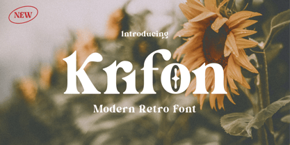 Krifon - Modern Bold Serif Font is a stylish font It has both modern and retro look. Comes with alternatives and ligatures, helps to create stunning logos, quotes, posts, blog posts. branding projects, magazine imagery, wedding invitations, and much more. WHAT'S YOU GET ? Unique Letterforms Works on PC & Mac Simple Installations Accessible in the Adobe Illustrator, Adobe Photoshop, Microsoft Word Fully accessible without additional design software. I really hope you'll get pleasure using Krifon Font and it will be perfect addition to your font collection! Contact me with an inbox message If you have any question. Thank you! Happy Creating.
 - Mountriel by Typetemp Studio,
$18.00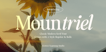 Mountriel - Classic Modern Serif Font is a stylish font It has both Classic modern and 80s 90s look. Comes with alternatives and ligatures, helps to create stunning logos, quotes, posts, blog posts. branding projects, magazine imagery, wedding invitations, and much more. WHAT'S YOU GET ? Unique Letterforms Works on PC & Mac Simple Installations Accessible in the Adobe Illustrator, Adobe Photoshop, Microsoft Word Fully accessible without additional design software. I really hope you'll get pleasure using Allenoire font and it will be perfect addition to your font collection! Contact me with an inbox message If you have any question. Thank you! Happy Creating.