10,000 search results
(0.124 seconds)
- Dekon - Unknown license

- Exit by FSD,
$50.00Exit is my first typeface (designed in 1988). The relationship to Neville Brody's work is evident but with personal touch - Sales Book JNL by Jeff Levine,
$29.00 Sales Book JNL was recreated from sample letters found in the wood type section of an old printer's supply catalog.
 - Caramel Pro-ROB by TypeSETit,
$29.95 Caramel Pro combines the entire Caramel Family into one OpenType font. Use alternates and style sets to customize your work.
 - Notification JNL by Jeff Levine,
$29.00 Notification JNL is another condensed sanserif design loosely based on one of the many variations of wood type headline fonts.
 - Mantika Informal Paneuropean by Linotype,
$67.99Jürgen Weltin's Mantika Informal is pretty difficult to categorize, but very easy to like. This particularly reader-friendly typeface in regular and bold weights, brings to the table the informal fluidity of a script, the consistency of an inclined italic, and the open and airy forms and contrast of a humanist sans. The result is a warm, approachable, and very legible typeface that is never static and staid, but rather invites an attentive, reading eye. The original idea behind Mantika Informal lay in the challenge to create a typeface for setting children's books. German designer Jürgen Weltin aimed to create a reading typeface for those just starting to learn how to read. On the one hand, it should help create clear word-images; on the other, its letterforms should remain uncomplicated but resist mechanical and industrial sterility. Mantika?s subtle cursive lines stress the printed word's connection with handwriting, in addition to making the transition from school writing exercises to printed texts seamless and effortless. The resulting slightly organic and cursive forms that developed during the design process are so captivating that Mantika Informal may be used for a multitude of unintended applications - anywhere a friendly and informal yet sophisticated character could lend a helping hand, Mantika is there, giving a fresh accent to anything from packaging design to food products. With a broad character set encompassing support for Cyrillic and Green, Mantika Informal's two fonts make for a versatile and dynamic typeface that surely will find its place in a broad range of applications. - Mantika Informal by Linotype,
$50.99 Jürgen Weltin's Mantika Informal is pretty difficult to categorize, but very easy to like. This particularly reader-friendly typeface in regular and bold weights, brings to the table the informal fluidity of a script, the consistency of an inclined italic, and the open and airy forms and contrast of a humanist sans. The result is a warm, approachable, and very legible typeface that is never static and staid, but rather invites an attentive, reading eye. The original idea behind Mantika Informal lay in the challenge to create a typeface for setting children's books. German designer Jürgen Weltin aimed to create a reading typeface for those just starting to learn how to read. On the one hand, it should help create clear word-images; on the other, its letterforms should remain uncomplicated but resist mechanical and industrial sterility. Mantika?s subtle cursive lines stress the printed word's connection with handwriting, in addition to making the transition from school writing exercises to printed texts seamless and effortless. The resulting slightly organic and cursive forms that developed during the design process are so captivating that Mantika Informal may be used for a multitude of unintended applications - anywhere a friendly and informal yet sophisticated character could lend a helping hand, Mantika is there, giving a fresh accent to anything from packaging design to food products. With a broad character set encompassing support for Cyrillic and Green, Mantika Informal's two fonts make for a versatile and dynamic typeface that surely will find its place in a broad range of applications.
 - Dopelton by Variatype,
$22.00 Introducing Dopelton, a signature font that transcends the ordinary, embodying the essence of personal style and sophistication. Crafted with meticulous attention to detail, Dopelton is more than a font; it’s a stroke of individuality, a visual symphony that transforms signatures into works of art. Each letter in Dopelton carries a distinctive flair, reminiscent of a signature penned by a hand writer. The fluid strokes seamlessly merge, creating a harmonious rhythm that captures the art of the handwritten with a contemporary twist. The balance between elegance and readability is finely tuned, making Dopelton versatile for various design purposes. Dopelton is not confined to the limits of static characters; it adapts to the natural flow of the hand, ensuring a unique signature experience every time. The font’s dynamic nature brings authenticity to digital signatures, providing a touch of human warmth in the digital realm. The details of Dopelton are a testament to its craftsmanship. Subtle curves, refined loops, and a tasteful interplay of thick and thin lines give each letter a signature-worthy personality. Whether used for branding, invitations, or personalized stationery, Dopelton adds a touch of refined charm to any project. This signature font is designed to make a statement—bold yet graceful, modern yet timeless. Dopelton is more than a font; it’s an extension of your identity, a signature that leaves a lasting impression. Elevate your designs with Dopelton and let your words carry the unmistakable touch of personalized elegance. FONT FEATURES Additional Accents 68 Languages Kerning Alternates Ligatures Swashes
 - Beat by MADType,
$21.00 Beat is a quirky OCR-inspired face with a rounded, retro-electronic feel. All of the stem weights were drawn at random, but the ensuing chaos works amazingly well.
 - Bechamel Roman by Andinistas,
$39.00 BECHAMEL ROMAN was born interpreting unicase letterings of the movie "Willy Wonka and the chocolate factory". Later these ideas matured with flexible tip nib and paper mixing their naive proportions with some classic ingredients of Baskerville, Bodoni, Didot, Round Hand Script, Graffiti and labels found in Venezuela and Colombia. BECHAMEL ROMAN designed to be combined with Bechamel. BECHAMEL Script, Vein, Words & Ornaments were hand drawn to design words and phrases in logos, packaging, posters, envelopes and greeting cards. BECHAMEL ROMAN 1,2,3 & 4 is an experimental font family designed by #carlosfabiancg. It includes an irregular look to communicate craftsmanship. Its multiple upper cases with condensed width and naive lines are notable for their expressive drawing with a high amount of contrast between thick and thin strokes.
 - Exo Slab Pro by Polimateria,
$35.00 Exo Slab Pro is a slab serif with a technological and futuristic tone. Even though it has a very peculiar look and many distinct shapes that pop out in an headline, it also works well as whole creating a nice shade of text. Large x-height, ink-traps and a modest contrast ensures that this font will work well even on small font sizes. Loaded with opentype features Exo Slab provides a huge versatility. You can use it on rigorous work as well as on more funny projects. From Branding to Editorial, from Paper to Screen, from Today to the Future. Please see our promotional video.
 - Forrest by Fenotype,
$20.00 Typographers — and clients alike — are often obsessed with novelty. Be it self-consciously peculiar details with made-you-look appeal — or just austere, detached minimalism, constant seek for novelty in typography often becomes an end in itself. A lot of times, an old trick is better than a bagful of new ones — all you might actually need would be a good, reliable font family with soul, providing that comforting, familiar feel. This is where Forrest comes in: a type family born out of a lifelong passion for digging into old archives of fonts, in search for that good ol’ type — simple, honest, made with love. But make no mistake, Forrest is as savvy as fonts come, packed with smart features. Handsome swashes, cute small capitals and old style figures all add a bit of flair and enable a highly sophisticated and contemporary approach to typography.
 - Alea by astype,
$28.00 Alea is based on the drawings of Maria Balle. The floral, organic look of these bastard script initials will play well together with nearly all Didone designs and will give them a special note. Alea works perfectly with the Adana fonts also available from astype. The Opentype features Superior, Inferior & Numerator will activate the filling objects. Use these features on a new layer and choose your color to get up to three color layers.
 - Twista by Viktor Nübel Type Design,
$25.00 Twista is a typeface from the realm of impossible constructions, from letters of illusions, the world of M.C. Escher. It takes its place in the tradition of typefaces playing with 3-dimensional drawings on a 2-dimensional surface. iÍt tricks the eye and attracts our gaze. Carefully choose which messages you set in Twista, they might be read with an invisible question mark added at the end. All letters and characters come in two versions.
 - Woodgrit by Baseline Fonts,
$39.00The Woodgrit family could originally be found on broadsides (posters, playbills) throughout the midwest on any public announcements. All original letterforms available were incorporated into the set with little modification. Typographic convention was limited to creating three weight to serve the needs of the design community. Woodgrit Heavy is a perfect headline weight; Woodgrit Medium fits nicely in subheads, and Woodgrit Thin enables this chunky font to even work well as body copy. - Angleface by ArtyType,
$29.00 With initial thoughts of creating something tubular, I had in the back of my mind the kind of contemporary chrome furniture that became ubiquitous throughout the 60s and that concept remained with me throughout the development process. The font-styling idea worked out very well in this case, resulting in plenty of optional character variations for my chosen theme, most of which are included in both styles of light and bold character sets.
 - Minik by Ahmet Altun,
$16.00 Minik Font Family comes in 2 weights; Regular and Bold. It is completely hand-drawn. While the capital letters have normal sizes, the lowercase letters are smaller than the common form in the vertical axis to have a cute view. The Minik Font Family has a few ornaments and stylistic alternates. With this font family, you can create eye-pleasing and nice works such as posters, printings, t-shirts, adds, magazines etc.
 - Astoria Classic by Alan Meeks,
$45.00 The latest addition to the Astoria Range, Astoria Classic has the same basic characteristics as Astoria but with vertical stress. The characteristic subtle top left serif which makes it not quite a Roman and not quite a sans has been retained. Unlike Astoria, the Italics in form are old style yet have a modern look. This is designed specifically as a text face, however it still works very well as a headline font.
 - Mechanikschrift by Victory Type,
$12.00Mechanikschrift, roughly German for “mechanical writing”, is a typeface from Noah Rothschild and Victory Type. The aesthetic of this font is just what its name points towards: machine-like structure with a German flare. Minimalism is often associated with German design, and Mechanikschrift is a minimalist typeface. Furthermore, the designs of the characters, outside of the general theme of squared-off corners and angular appearance, are related to Herbert Bayer’s work at the Bauhaus. - My Darling by Type Innovations,
$39.00 ‘My Darling’ is a stunning new typeface by Alex Kaczun. Inspired by the Didone shapes, ‘My Darling’ incorporates some Didot, a little Caslon, a splash of Scotch and a pinch of old Times. This unique display, with its high-contrast strokes is playful, formal and just a bit ‘sexy’. The swash capital terminals and lively curves, give this design a unique and distinctive look. It works well as a headline font, and because it was designed with generous counters, proportions and spacing—works equally well over a large range of text point sizes. My Darlings' character set supports most Central European and many Eastern European languages. Alex hopes to add many style variations, along with alternate glyph sets and weights to further enhance this offering. Stay tuned!
 - Black Brody by Sipanji21,
$12.00 Black Brody Is Black Letter Font, this Font creating manually, by drawing until getting vector with Ai. Black Brody was inspired by the Sword, all about the sword was inspired at every Uppercase. beside that, Black Brody also inspired by historical film, game, mythology, and other. Black Brody Black Letter expected you will find fantastic gaming experience and past stories by this font and with two style font, regular and italic font. Black Brody is very suitable for anything your design product, like as Logos, Trade Mark, Poster, Business Cards, Game Magazine, Gift Cards, Cloth, T-Shirt, Tattoo Brands, Coffee, Restaurant, Food Car, CD and DVD Cover, Wall, Frame, and typing in your PC. This Font you can use and Apply for anything you want.
 - Mikea by Craft Supply Co,
$20.00 Introducing Mikea – Elegant Luxury Font Elegance Personified Mikea – Elegant Luxury Font is, without a doubt, the epitome of sophistication and class. It has been meticulously crafted to infuse a touch of opulence into your designs. Luxury Redefined Furthermore, this sans serif font exudes luxury in every letterform, making it an ideal choice for projects that require a sense of opulence and refinement. It takes the concept of luxury to a whole new level. Timeless Elegance Mikea encapsulates timeless elegance. It ensures that your designs maintain a sense of prestige and grandeur that stands the test of time. With Mikea, your work exudes a classic charm. Perfect for Prestigious Projects Whether it’s high-end branding, premium packaging, or upscale invitations, Mikea’s elegant luxury font elevates the perception of your projects to new heights. It is the ultimate choice for conveying prestige. In Conclusion In conclusion, Mikea – Elegant Luxury Font is your gateway to a world of sophistication and grandeur. With its timeless elegance and unparalleled refinement, it effortlessly adds a touch of luxury to your designs. When you choose Mikea, you choose the finest in typographic elegance, setting a standard of opulence and prestige that leaves a lasting impression.
 - Bona Nova by Borutta Group,
$- ☞ Bona Nova is a collective revival project of Bona typeface designed in 1971 by the author of polish banknotes Andrzej Heidrich. Besides giving the project a digital font form the aim was to expand the base character set: preparation of small caps, designing the alternative glyphs and multiple opentype features. Working together with the author we designed two new text versions: regular and bold – to give the family a form of a classic script triad. ☞ It is accompanied by three title versions and three contour styles under the name of Bona Sforza. All styles contains over 1200 glyphs. ☞ Bona Nova is an unprecedented typographic adventure for our team. We hope that our work will allow the cultural heritage of Bona and the work of Andrzeja Heidricha to gain new followers and fans. This project connected three generations of graphic designers who graduated the same school – the Academy of Fine Arts in Warsaw. ☞ Bona Nova isn’t only a typeface. We have also prepared a book about the project (including an interview with Andrzej Heidrich, my text about the digitalisation and a font specimen). The Bona Nova release party was a big exhibition (over 1000 guests). I’ve invited 26 graphic designers to prepare their own initials of Bona Nova – they were presented as posters on exhibition too. LINKS Bona Nova WEB Bona Nova FP Bona-Nova-(FREE-FONT) Bona Nova Book BONA NOVA IN THE MEDIA Typeroom Typography Guru Slanted Designalley Stgu Typografie Info Wikipedia Bona Nova is a non-profit project, all founds that we raise we reinvest to develop the Bona Nova project (new styles, Cyrillic & Greek, extend character set).
 - Range Sans by Eclectotype,
$36.00 This is Range Sans, the sans-serif counterpart to Range Serif . It can be categorized as a grotesque, with the idiosyncratic angular details from the serif family making themselves known in the arches and bowls of the lower case. The range of weights is larger than Range Serif, with two more weights at the lighter end of the spectrum. The weights from light to black correspond to their seriffed sisters, so can be interchanged with them freely while maintaining a similar text color and vertical metrics. This is useful for adding emphasis; Range Sans is deliberately lacking an italic, but the italics from Range Serif work better than you might expect in running text, particularly for the light and regular weights. Range Sans has a contemporary, somewhat geometric look that lends itself to uses such as corporate identities, minimalist graphic design, and logos. The middle weights do work well in running text, however, with the angled details being less noticeable at small sizes. Designed for demanding typography, supporting most Latin-based languages, Range Sans is equipped with true small caps for all weights, an array of numeral styles (proportional- and tabular- lining and oldstyle figures, small cap figures, numerators, denominators, superscripts and subscripts/scientific inferiors), automatic fractions, a set of useful arrows, case-sensitive forms, and a range of currency symbols including recent additions: Turkish Lira, Indian Rupee and Russian Ruble.
 - New Lincoln Gothic BT by Bitstream,
$50.99New Lincoln Gothic is an elegant sanserif, generous in width and x-height. There are twelve weights ranging from Hairline to UltraBold and an italic for each weight. At the stroke ends are gentle flares, and some of the round characters possess an interesting and distinctive asymmetry. The character set supports Central Europe, and there are three figure sets, extended fractions, superior and inferior numbers, and a few alternates, all accessible via OpenType features. Back in 1965, Thomas Lincoln had an idea for a new sanserif typeface, a homage of sorts, to ancient Roman artisans. The Trajan Column in Rome, erected in 113 AD, has an inscription that is considered to be the basis for western European lettering. Lincoln admired these beautiful letterforms and so, being inspired, he set out to design a new sanserif typeface based on the proportions and subtleties of the letters found in the Trajan Inscription. Lincoln accomplished what he set out to do by creating Lincoln Gothic. The typeface consisted only of capital letters. Lincoln intentionally omitted a lowercase to keep true his reference to the Trajan Inscription, which contains only magiscule specimens. The design won him the first Visual Graphics Corporation (VGC) National Typeface Competition in 1965. The legendary Herb Lubalin even used it to design a promotional poster! All this was back in the day when typositor film strips and photo type were all the rage in setting headlines. Fast forward now to the next millennium. Thomas Lincoln has had a long, illustrious career as a graphic designer. Still, he has one project that feels incomplete; Lincoln Gothic does not have a lowercase. It is the need to finish the design that drives Lincoln to resurrect his prize winning design and create its digital incarnation. Thus, New Lincoln Gothic was born. Lacking the original drawings, Lincoln had to locate some old typositor strips in order to get started. He had them scanned and imported the data into Freehand where he refined the shapes and sketched out a lowercase. He then imported that data into Fontographer, where he worked the glyphs again and refined the spacing, and started generating additional weights and italics. His enthusiasm went unchecked and he created 14 weights! It was about that time that Lincoln contacted Bitstream about publishing the family. Lincoln worked with Bitstream to narrow down the family (only to twelve weights), interpolate the various weights using three masters, and extend the character set to support CE and some alternate figure sets. Bitstream handled the hinting and all production details and built the final CFF OpenType fonts using FontLab Studio 5. - Q-bo - Personal use only

- Gramorel by Gatype,
$12.00 Best collection of display fonts, don't miss it: The Gramorel font is vintage elegant, these typefaces are truly made for one another. They work very well to give you the perfect design label you have designed. It's perfect for Logo, Advertising, Apparel Design, Label, Signage, Etc. Don't hesitate to contact me if you need anything. Enjoy!
 - Abel Pro by MADType,
$39.00 Abel is a modern interpretation of the condensed flat-sided sans serif. Originally used for newspaper headlines and posters, this style can also be used for text on the web. Its angled terminals and spiked stems give it enough style to be unique at display sizes, while its mono-weight still works well at smaller text sizes.
 - Figural by ITC,
$29.99Figural is the work of Michael Gills, developed under the direction of Colin Brignall. It is based on an original 1940 design of Czechoslovakian designer Oldrich Menhart. All original characteristics were carefully retained in this distinguished typeface family. Figural is highly legible, making it perfect for both short pieces in advertising text or larger applications in magazines or books. - Satreva Neue by Balevgraph Studio,
$14.00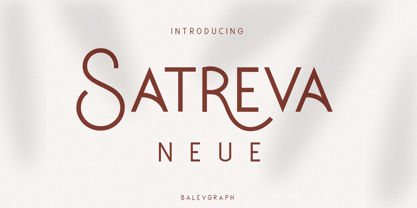 Satreva Neue is a stylish, elegant and distinct sans serif font. Suitable for a wide variety of designs because of its neat and simple style, this font has the potential to become your favorite font, whatever the occasion! What's Included : Uppercase, Lowercase, Numerals & Punctuations Alternate & Ligature Works on PC & Mac Simple installations Multilingual support PUA Encoded
 - Tectura by Greater Albion Typefounders,
$11.95 Tectura is hand drawn letters that come to you from the typefounders. It's all about those slight-but-telling imperfections that separate hand lettering—which this really is—from machine drawn imperfections. Use it for any work that needs an authentic touch of the human hand, it's genuinely hand drawn, yet clear and legible at all sizes.
 - Merry Deer by Yoga Letter,
$15.00 "Merry Deer" is a unique display typeface with a deer horn embellishment added to the font. This will add a unique and funny feel to any writing or work you make. "Merry Deer" is PUA coded which means you can access all the glyphs and sweeps easily! FEATURES: Uppercase Lowercase Swash Numbers & Punctuation Multilingual Support PUA coding open type
 - Rastogas by Gatype,
$14.00 Rastogas Brush, is tightly spaced, and retains all brush imperfections. It has a nice contrast with the opaque and transparent parts. This will give your work an authentic and realistic brush look! It's the ultimate font for a fresh new branding look and create eye-catching designs for ads, social media posts, product packaging, fashion apparel, posters & more.
 - Fauna by Del Alma,
$14.99 Fauna is the set of cute animals you were looking for! We know these animals will give their best in order to give a lovely touch to your work. With a total of 108 characters; the font family is divided into two styles of 54 each: Fauna Blanca and Fauna Negra. Choose one of them... or better, choose both!
 - Skid Row by ITC,
$29.00Skid Row is the work of Japanese designer Akira Kobayashi and named after a song from his favorite film, Little Shop of Horrors. It is an informal script typeface whose unique, streaky appearance was first drawn with a brush and then refined to give the typeface an even texture. Skid Row is particularly effective in large display applications. - Riga Screen by Ludwig Type,
$45.00 Riga Screen is designed to work particularly well on screen. Especially responsive websites or office applications will appreciate its economic proportions. Riga has been specially engineered and optimized for exceptional readability in small sizes on all current computer monitors, including tablets and smartphones. This small family of four weights is the perfect companion for the Riga type family.
 - WOODTYPE Collection by Borutta Group,
$19.00 WOOD TYPE COLLECTION from Mateusz Machalski is a set of wonderful, warm, and weathered hand made typefaces designed by Mateusz Machalski. The Inspiration for this collection comes from a wooden letter blocks and other old technologies used for printing. WTC supports 40 different languages and contains over 300 glyphs per style. The Family consists of 20 typefaces. ENJOY!
 - Weltschmerz by Hanoded,
$15.00 Weltschmerz, world-weariness… I love the sound of it, so I chose this name for my new font. Weltschmerz font is a hand made Jugendstil typeface which was modeled on a 1910 poster from Austria. Weltschmerz is a classy typeface, a little melancholic, but with a positive uplift in the end. Weltschmerz comes with extensive language support.
 - Twelkmeyer by Popkern,
$18.00 The multilingual accidental typeface was inspired by the pathos of the late revolutionary asceticism and architectural projects of V.F. Twelkmeyer. All story on twelkmeyer.com This typeface is a spring swallow. This typeface is a dawn and optimism of alumnus of Higher Art and Technical Institute in Leningrad. This typeface is a mirror of the Soviet architecture 30’s. It reflects the impressions from Vesnin brothers and Ginzburg’s works, a curiosity to Bauhaus, and the first test of the waters of socialist reconstructions. This wide, dynamic, angular, drawing typeface will be perfect for serious branding and architectural projects. So, give it a try! From innovative ideas of the 30s to innovative projects of the XXI century.
 - Kit Cloudkicker by Anastasia Kuznetsova,
$19.00 I present to you the universal everyday font 'Kit Cloudkicker'!! This font is very versatile and can be used in various styles of projects where a fast relaxed handwritten font is required. Filled with fun and energetic brush strokes, this font will undoubtedly add a touch of playfulness to your text - perfect for greeting cards, branding, merchandise, invitations and handmade quotes! The 'Kit Cloudkicker' font is so easy to use and create completely unique, hand-made words every time. It looks so great!! Font Features A-Z; a-z character set; 1 language (English); numbers and punctuation marks, symbols. A font containing uppercase and lowercase letters, numbers, and a wide range of punctuation marks. Fonts can be opened and used in any software that can read standard fonts, even in MS Word. No special software is required, and to get started. It is recommended to use it in Adobe Illustrator or Adobe Photoshop Made with love and magic ♡ Thanks for checking it out, and feel free to drop me a message if you had any queries! ~ Anastasia

