10,000 search results
(0.054 seconds)
- Onlychalk by Allouse Studio,
$16.00 Proudly Presenting, Onlychalk A Handmade Chalk Font Onlychalk is perfect for any titles, logo, product packaging, branding project, megazine, social media, wedding, or just used to express words above the background. Onlychalk also come with Multi-Lingual Support. Enjoy the font, feel free to comment or feedback, send me PM or email. Thank You!
 - Gabyrose by Allouse Studio,
$16.00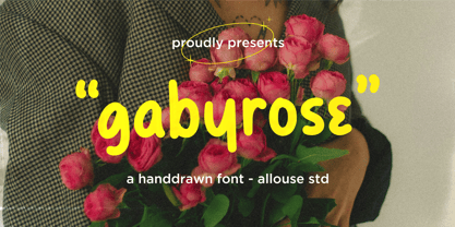 Proudly Presenting, Gabyrose A Monoline Hand drawn Font. Gabyrose is perfect for any titles, logo, product packaging, branding project, megazine, social media, wedding, or just used to express words above the background. Gabyrose also come with Multi-Lingual Support. Enjoy the font, feel free to comment or feedback, send me PM or email. Thank You!
 - Heartcraft by Allouse Studio,
$16.00 Proudly Present, Heartcraft a Handwritten Signature Font. Heartcraft is perfect for any titles, logo, product packaging, branding project, megazine, social media, wedding, or just used to express words above the background. Heartcraft also come with Multi-Lingual Support. Enjoy the font, feel free to comment or feedback, send me PM or email. Thank You!
 - Shinymotion by Allouse Studio,
$16.00 Proudly Presenting, Shinymotion A Monoline Script Font. Shinymotion is perfect for any titles, logo, product packaging, branding project, megazine, social media, wedding, or just used to express words above the background. Shinymotion also come with Multi-Lingual Support. Enjoy the font, feel free to comment or feedback, send me PM or email. Thank You!
 - Lemonmint by Allouse Studio,
$16.00 Proudly Presenting, Lemonmint A Cute Handwriten Script Font. Lemonmint is perfect for any titles, logo, product packaging, branding project, megazine, social media, wedding, or just used to express words above the background. Lemonmint also come with Multi-Lingual Support. Enjoy the font, feel free to comment or feedback, send me PM or email. Thank You!
 - Montageway by Allouse Studio,
$16.00 Proudly Presenting, Montageway A Bold Brush Script Font. Montageway is perfect for any titles, logo, product packaging, branding project, megazine, social media, wedding, or just used to express words above the background. Montageway also come with Multi-Lingual Support. Enjoy the font, feel free to comment or feedback, send me PM or email. Thank You!
 - Ninetys Starfox by Allouse Studio,
$16.00 Proudly Presenting, Ninety Starfox A Playful DIsplay Font. Ninety Starfox is perfect for any titles, logo, product packaging, branding project, megazine, social media, wedding, or just used to express words above the background. Ninety Starfox also come with Multi-Lingual Support. Enjoy the font, feel free to comment or feedback, send me PM or email.
 - Franksthone by Allouse Studio,
$16.00 Proudly Presenting, Franksthone A Handwritten Brush Font Franksthone is perfect for any titles, logo, product packaging, branding project, megazine, social media, wedding, or just used to express words above the background. Franksthone also come with Multi-Lingual Support. Enjoy the font, feel free to comment or feedback, send me PM or email. Thank You!
 - Headhunter Two by Barlov,
$25.00 The original Headhunter shareware font was created in ©1992 by the famous D. Rakowski. It consisted of 63 unique skeletal Glyphs, including Capital A-Z, and a few bone symbols, but lacked lowercase and numerals. He has since abandoned his fonts to pursue other things. (You can download it from FontSquirrel for free.) I've always enjoyed this limited Halloween font, but its incompleteness had to be rectified; thus I took it upon myself to delve slightly into the world of typography, resulting in the birth of HeadhunterTwo. I've slightly reworked his original contribution and "fleshed out" more of the font than necessary. As of this writing, it consists of 777+ Glyphs and passes Underware's compatibility test for Latin Plus (Supporting 219 Latin based languages, which are spoken in 212 countries.)
 - Kirani by Nirmalagraphics,
$14.00 Kirani is a beautiful fonts that I made with the aim to meet the needs of the industry in the creative world for those who are bored with ordinary script fonts. You can also use Kirani for your promotional needs, whether it's for logos, flyers, magazines, brochures or even for advertising. Oh yes, and this font also has multilingual support.
 - Longing by Font-o-Rama,
$25.00Longing is a modern, sans-serif typeface with floral ornaments. It was supposed to have a smart and elegant style and to have a good readability. In addition to the long stems, ascenders and descenders, the oval form is the prime characteristic feature of this beautiful ornamental font. The typeface was designed to work for headlines as well as for short copy. - Numis by Tyler Jamieson Moulton,
$11.00 Numis was born out of a coin collecting hobby. A quick survey of coins from the late medieval to modern periods to today led to this unicase design. The rounded corners and smoothed edges are meant to evoke a the slightly worn letterfaces found on old coins; a process that tends to bolden the text before being rubbed away completely.
 - Town And Country JNL by Jeff Levine,
$29.00 Town and Country JNL features a mix of block-style characters along with rounded ones found so often in the Art Deco fonts of the 1940s. Modeled from the hand-lettered title on a piece of sheet music from that era, this unusual coupling of two distinct design styles works despite it breaking all of the obvious rules of typography.
 - Labyrinthus Pro by Cerri Antonio,
$40.00 LABYRINTHUS PRO is a multiline decorative font, works very well as a type of identity logo, poster and 3d works. It continues the tradition of precedent LABYRINTHUS but with a hard linear impact. Its interesting to note that with it its possible to play with the multiline concept to create endless overlapping geometric creations.
 - Aint Nothing Fancy by Hanoded,
$15.00 A nice, ‘normal’ script font without the frills and thrills of my other work. It’s a handwritten typeface with a schoolboy kind of feel to it. Use it for your websites, your letters and product descriptions! Because of its unobtrusive nature, the font won't attract too much attention, so your work will stand out better.
 - Andis by JAM Type Design,
$- Andis’ rough cut makes it an interesting display typeface, but thanks to its generous x-height and firm serifs, Andis works equally well in text sizes. The typeface’s idiosyncratic italic builds a strong contrast with the roman. Andis is both functional and expressive; using it lends a humanistic touch to editorial or advertising work.
 - Kraftwied by Alexey Makarov,
$16.00 An original flat font, light and clean. Works best for accents and any small blocks of text. There are over 1000 kerning pairs to ensure that the flow of the font is natural and easy to work with. Language support: Contains full set of Latin alphabet, including diacritical marks for European languages and Cyrillic alphabets.
 - Goudy National by Matteson Typographics,
$19.95 Frederic Goudy designed National Old Style Roman in 1916. It is loosely based on a logo he lettered for the National Biscuit Company in 1901. Steve Matteson expanded on Goudy’s original by designing a bold, semibold and matching italics. While much of Goudy’s work is strongly influenced by Venetian types of the 15th and 16th centuries - this design has a truly American quality about it. The design is useful for text or headlines that captures a sense of Americana.
 - Dunhill Script by Lipton Letter Design,
$29.00 A bit of happenstance and accident are always full of possibility — Richard Lipton’s Dunhill Script is based on observations of the work of his left-handed calligraphy students and then from a small detail generated by his own freehand sketching. Like his other script typefaces, Dunhill was born from the desire to achieve a certain visual drama. Many details show the pen at work, like the terminal shapes and the caps and ascenders. Dunhill also has a range of alternate stylistic glyphs and contextual features that can transform it into a connected script. It’s a great choice for editorial display or advertising and branding settings on its own or paired with a Roman sans or serif.
 - Ford's Folly by Ascender,
$50.99Ford's Folly is a lively yet sophisticated handwriting font designed by Ascender's Jim Ford. It captures the look and spirit of the designer's handwriting using a using a Sharpie™ Extra Fine felt pen. This casual script font evokes an energetic feeling, and has very legible letterforms without quirky distractions. Jim Ford took his hand global by creating a massive multilingual character set. The font features the WGL Pan-European character set (Eastern Europe, Cyrillic, Greek and Turkish) and advanced typographic features for use with OpenType-savvy applications. The font is a fun and attractive handwriting font that is great for greeting cards, menus, advertisements, scrapbooking and many other projects that can benefit a personal appearance. - P22 Tai Chi by IHOF,
$24.95 Experimental lettering Stephen Rapp created in 1999 became the spark that Stephen's imagination transformed into the Tai Chi design. Tai Chi is a display face but it could also be used as a textured calligraphic script. Its delightful sense of movement distinguishes it from other scripts. Individual characters stand poised in a vertical Zen-like balance while at the same time displaying an inner rhythm that makes them appear to dance along the line. Rich in texture and variation, Tai Chi works very well at medium and large point sizes. The font contains several alternate letters that help maintain a hand-lettered look. Tai Chi includes both upper and lowercase letters but works well in all uppercase settings.
 - Biblia by Hackberry Font Foundry,
$24.95 This all started with a love for Minister. This is a font designed by Carl Albert Fahrenwaldt in 1929. In the specimen booklet there’s a scan from Linotype’s page many years ago. They no longer carry the font. I’ve gone quite a ways from the original. It was dark and a bit heavy. But I loved the look and the readability. This came to a head when I started my first book on all-digital printing written from 1994-1995, and published early in 1996. I needed fonts to show the typography I was talking about. At that point oldstyle figures, true small caps, and discretionary ligatures were rare. More than that text fonts for book design had lining OR oldstyle figures, lowercase OR small caps—never both. So, I designed the Diaconia family (using the Greek word for minister). It was fairly rough. I knew very little. I later redesigned and updated Diaconia into Bergsland Pro —released in 2004. It was still rough (though I impressed myself). In 2006, I found myself needing a readable sans serif. So I went to Bergsland Pro, and eliminated the serifs. I named the font Brinar. I kept a flare in place for the serifs and cupped the ends. I was stunned. People loved it. It’s remained my bestseller until very recently. So, at the end of 2016 I decided that Brinar really needed some help. The flares were basically random. The stem width and modulation variances all needed to be fixed. My old OpenType feature code was quite limited and clumsy. So, I created the 6-font Biblia family. I cleaned up or redesigned all the glyphs. I updated the fonts to the 2017 set of features: small caps, small cap figures, oldstyle figures, fractions, lining figures, ligatures and discretionary ligatures. These are fonts designed for book production and work well for text or heads.
 - Compatil Fact by Linotype,
$50.99Compatil is the first comprehensive type system which enables all typographical elements to be used to full effect in order to reproduce the message conveyed by text information. Four different type styles with a total of 16 weights including italics have been merged into a unique typographical network. There are now no limits to the font user's creativity. The system is a product of technical innovation and constitutes a new design approach which meets the highest aesthetic standards. For almost two years, a team of experts from Linotype has been working with initiator Professor Olaf Leu under the direction of Silja Bilz, Erik Faulhaber and Reinhard Haus to create the Compatil type system. Despite the Internet and TV, it is essential today to be able to absorb information quickly by being able to read it with ease. A fact that is becoming increasingly important both on-screen and on paper. It is the role of the font to increase legibility and to ensure typographically perfect results for text design work. The new Compatil type system meets all these needs. The Compatil is a part of the Platinum Collection. The following four different styles are available: Compatil Exquisit, Compatil Fact, Compatil Letter and Compatil Text. Compatil is available in various font formats: 16 separate OT Pro fonts including the small caps and Adobe Central European character set for OpenType-supporting applications like Adobe InDesign, or as 32 separate OpenType Com fonts for office communication, with the following special features: 1. Optimized display capabilities for computer screens eXcellent Screen Fonts (XSF-quality). 2. An extended, international character set, which supports 48 different languages for Microsoft Office applications like MS Word or as 64 PostScript fonts, which can be used in non-OpenType-supporting applications like Quark XPress. - Compatil Fact Paneuropean by Linotype,
$103.99Compatil is the first comprehensive type system which enables all typographical elements to be used to full effect in order to reproduce the message conveyed by text information. Four different type styles with a total of 16 weights including italics have been merged into a unique typographical network. There are now no limits to the font user's creativity. The system is a product of technical innovation and constitutes a new design approach which meets the highest aesthetic standards. For almost two years, a team of experts from Linotype has been working with initiator Professor Olaf Leu under the direction of Silja Bilz, Erik Faulhaber and Reinhard Haus to create the Compatil type system. Despite the Internet and TV, it is essential today to be able to absorb information quickly by being able to read it with ease. A fact that is becoming increasingly important both on-screen and on paper. It is the role of the font to increase legibility and to ensure typographically perfect results for text design work. The new Compatil type system meets all these needs. The Compatil is a part of the Platinum Collection. The following four different styles are available: Compatil Exquisit, Compatil Fact, Compatil Letter and Compatil Text. Compatil is available in various font formats: 16 separate OT Pro fonts including the small caps and Adobe Central European character set for OpenType-supporting applications like Adobe InDesign, or as 32 separate OpenType Com fonts for office communication, with the following special features: 1. Optimized display capabilities for computer screens eXcellent Screen Fonts (XSF-quality). 2. An extended, international character set, which supports 48 different languages for Microsoft Office applications like MS Word or as 64 PostScript fonts, which can be used in non-OpenType-supporting applications like Quark XPress. - Compatil Letter by Linotype,
$50.99Compatil is the first comprehensive type system which enables all typographical elements to be used to full effect in order to reproduce the message conveyed by text information. Four different type styles with a total of 16 weights including italics have been merged into a unique typographical network. There are now no limits to the font user's creativity. The system is a product of technical innovation and constitutes a new design approach which meets the highest aesthetic standards. For almost two years, a team of experts from Linotype has been working with initiator Professor Olaf Leu under the direction of Silja Bilz, Erik Faulhaber and Reinhard Haus to create the Compatil type system. Despite the Internet and TV, it is essential today to be able to absorb information quickly by being able to read it with ease. A fact that is becoming increasingly important both on-screen and on paper. It is the role of the font to increase legibility and to ensure typographically perfect results for text design work. The new Compatil type system meets all these needs. The Compatil is a part of the Platinum Collection. The following four different styles are available: Compatil Exquisit, Compatil Fact, Compatil Letter and Compatil Text. Compatil is available in various font formats: 16 separate OT Pro fonts including the small caps and Adobe Central European character set for OpenType-supporting applications like Adobe InDesign, or as 32 separate OpenType Com fonts for office communication, with the following special features: 1. Optimized display capabilities for computer screens eXcellent Screen Fonts (XSF-quality). 2. An extended, international character set, which supports 48 different languages for Microsoft Office applications like MS Word or as 64 PostScript fonts, which can be used in non-OpenType-supporting applications like Quark XPress. - Compatil Text by Linotype,
$50.99Compatil is the first comprehensive type system which enables all typographical elements to be used to full effect in order to reproduce the message conveyed by text information. Four different type styles with a total of 16 weights including italics have been merged into a unique typographical network. There are now no limits to the font user's creativity. The system is a product of technical innovation and constitutes a new design approach which meets the highest aesthetic standards. For almost two years, a team of experts from Linotype has been working with initiator Professor Olaf Leu under the direction of Silja Bilz, Erik Faulhaber and Reinhard Haus to create the Compatil type system. Despite the Internet and TV, it is essential today to be able to absorb information quickly by being able to read it with ease. A fact that is becoming increasingly important both on-screen and on paper. It is the role of the font to increase legibility and to ensure typographically perfect results for text design work. The new Compatil type system meets all these needs. The Compatil is a part of the Platinum Collection. The following four different styles are available: Compatil Exquisit, Compatil Fact, Compatil Letter and Compatil Text. Compatil is available in various font formats: 16 separate OT Pro fonts including the small caps and Adobe Central European character set for OpenType-supporting applications like Adobe InDesign, or as 32 separate OpenType Com fonts for office communication, with the following special features: 1. Optimized display capabilities for computer screens eXcellent Screen Fonts (XSF-quality). 2. An extended, international character set, which supports 48 different languages for Microsoft Office applications like MS Word or as 64 PostScript fonts, which can be used in non-OpenType-supporting applications like Quark XPress. - Bensonhurst JNL by Jeff Levine,
$29.00 The model for Bensonhurst JNL was a 1930s-era hand-lettered WPA (Works Project Administration) poster for the play "Hell Bent For Heaven". Although the basic style is a classic Art Deco "thick and thin" format, the design (in certain characters) starts to take on the feel of a 1970s revival style. With this in mind, Bensonhurst JNL is a bit of a hybrid between the 1930s and the 1970s.
 - Perfect Dream by Sealoung,
$17.00 Introducing Perfect Dream – a new serif with all the nostalgic vibes! A classy eighties magazine-inspired serif - with a complementary italic version :) Comes in two normal and condensed versions, mix them together to create an interesting effect. Perfect Dream is a beautiful nostalgic upper and lower case typography that looks amazing in both large and small settings as display and body text. I love combining regular and italics, either all in one word (as in the Missfits sample) or in body text! Don't forget to use all caps as well in your blending and matching - this adds contrast and impact to your type design.
 - ITC Tyfa by ITC,
$29.99 Some words from the designer, Frantisek Storm... Designed by Josef Tyfa in 1959, digitalized by F. Storm in 1996. This Roman and Italic are well-known perhaps to all Czech graphic artists and typographers ever since their release. Although this type face in some details is under the sway of the period of its rise, its importance is timeless, in contradistinction to other famous types dating from the turn of the sixties which were found, after some time, to be trite. The italics live their own life, only their upper-case letters have the same expression as the basic design. Thin and fragile, they work excellently, emphasizing certain parts in the text by their perfect contrast of expression. When seen from a distance they are a little bit darker than the Roman face. Tyfa Roman was released in 1960 by Grafotechna in Prague for hot setting. Later on, Berthold produced letter matrices - "rulers" for Staromat devices, used for manual photosetting of display alphabets. In the eighties it was available on dry transfers of Transotype and today it is offered also by ITC. The meticulously executed designs of the individual letters in the 288 point size are arranged into a set of signs on a cardboard of about B2 in size. The yellowed paper reveals retouches by white paint on the ink. Blue lines mark the baseline, the capital line, the ascender and descender lines and the central verticals of the letters. With regard to the format of the flat scanner, the designs had to be reduced, with the use of a camera, to the format A4, i.e. to the upper-case letter height of about 30 mm. These were then scanned in 600 dpi resolution and read as a bitmap template to the FontStudio programme. The newly created bold type faces derive from Tyfa's designs of the letters "a", "n", "p", the darkness of which was increased further, approximately by 3%, to enhance their emphasizing function. The text designs have hairstrokes thickened by one third; the contrast between thin and thick strokes has been modified, in order to improve legibility, in sizes under 12 points. We have used electronic interpolation to produce the semi-bold designs. Josef Tyfa himself recommends to choose a somewhat darker design than the basic one for printing of books.
 - Garamond Premier by Adobe,
$35.00Claude Garamond (ca. 1480-1561) cut types for the Parisian scholar-printer Robert Estienne in the first part of the sixteenth century, basing his romans on the types cut by Francesco Griffo for Venetian printer Aldus Manutius in 1495. Garamond refined his romans in later versions, adding his own concepts as he developed his skills as a punchcutter. After his death in 1561, the Garamond punches made their way to the printing office of Christoph Plantin in Antwerp, where they were used by Plantin for many decades, and still exist in the Plantin-Moretus museum. Other Garamond punches went to the Frankfurt foundry of Egenolff-Berner, who issued a specimen in 1592 that became an important source of information about the Garamond types for later scholars and designers. In 1621, sixty years after Garamond's death, the French printer Jean Jannon (1580-1635) issued a specimen of typefaces that had some characteristics similar to the Garamond designs, though his letters were more asymmetrical and irregular in slope and axis. Jannon's types disappeared from use for about two hundred years, but were re-discovered in the French national printing office in 1825, when they were wrongly attributed to Claude Garamond. Their true origin was not to be revealed until the 1927 research of Beatrice Warde. In the early 1900s, Jannon's types were used to print a history of printing in France, which brought new attention to French typography and the Garamond" types. This sparked the beginning of modern revivals; some based on the mistaken model from Jannon's types, and others on the original Garamond types. Italics for Garamond fonts have sometimes been based on those cut by Robert Granjon (1513-1589), who worked for Plantin and whose types are also on the Egenolff-Berner specimen. Linotype has several versions of the Garamond typefaces. Though they vary in design and model of origin, they are all considered to be distinctive representations of French Renaissance style; easily recognizable by their elegance and readability. Garamond Pemiere Pro was designed by Robert Slimbach, and released in 2005." - Confitería by Sudtipos,
$39.00 Confitería is the Spanish word for a shop where sweets and chocolates are made and sold, which sometimes has a tea room. And now Confitería is also a font that brings to mind lettering piped on delicate cakes ... sweet but never sickly. This font captures something of that simple and innocent beauty of traditional confiterías, where good manners will never go out of fashion, menus are elegant and time comes to a standstill to make way for life’s little pleasures. A confitería is a perfect place to share sweet tidbits with a friend or date, eavesdrop on the conversation at the next table, read a book, or just people-watch from the window. I celebrated my last birthday at one. There is one iconic confitería in Buenos Aires that I love more than the rest because, some 60 years ago, it put up its marvellous sign and never took it down. Walking by it is sure to bring a smile to your face. It’s big. Very big. And the lettering in its name is written in a timelessly beautiful vertical script – the most attractive I have ever seen. I joined forces with Sol Matas – who worked with me to update the Montserrat font –to design this geometrical connected font with pleasant, even strokes. It is elegant and saccharine-free. And to top it off, it comes in several flavors. Welcome! What can we get you?
 - Chinese Rocks by Typodermic,
$11.95 In the bustling world of rough, grungy typography, there’s one typeface that stands out among the rest—Chinese Rocks. This iconic typeface draws inspiration from the hand-cut rubber-stamp writing found on Chinese export crates from the twentieth century. It’s a typeface that captures the raw, unpolished energy of the streets and infuses it into your messaging. What sets Chinese Rocks apart is its artisanal, handcrafted quality. Each letter is carefully carved to give your words a unique, personal touch that cannot be replicated by any other font. With Chinese Rocks, your text takes on a casual, laid-back vibe that speaks to the rawness and authenticity of modern culture. This versatile font comes in sixteen different styles, including Fat, Condensed, and Shaded. Each variation offers a different take on the classic Chinese Rocks style, allowing you to tailor your messaging to fit any occasion or application. Whether you’re looking to make a bold statement or add a touch of personality to your branding, Chinese Rocks has you covered. So why settle for a generic font that doesn’t capture your essence? Chinese Rocks is the typeface that captures your personality and turns your words into art. Try it out today and discover the power of authentic, handcrafted typography. Most Latin-based European writing systems are supported, including the following languages. Afaan Oromo, Afar, Afrikaans, Albanian, Alsatian, Aromanian, Aymara, Bashkir (Latin), Basque, Belarusian (Latin), Bemba, Bikol, Bosnian, Breton, Cape Verdean, Creole, Catalan, Cebuano, Chamorro, Chavacano, Chichewa, Crimean Tatar (Latin), Croatian, Czech, Danish, Dawan, Dholuo, Dutch, English, Estonian, Faroese, Fijian, Filipino, Finnish, French, Frisian, Friulian, Gagauz (Latin), Galician, Ganda, Genoese, German, Greenlandic, Guadeloupean Creole, Haitian Creole, Hawaiian, Hiligaynon, Hungarian, Icelandic, Ilocano, Indonesian, Irish, Italian, Jamaican, Kaqchikel, Karakalpak (Latin), Kashubian, Kikongo, Kinyarwanda, Kirundi, Kurdish (Latin), Latvian, Lithuanian, Lombard, Low Saxon, Luxembourgish, Maasai, Makhuwa, Malay, Maltese, Māori, Moldovan, Montenegrin, Ndebele, Neapolitan, Norwegian, Novial, Occitan, Ossetian (Latin), Papiamento, Piedmontese, Polish, Portuguese, Quechua, Rarotongan, Romanian, Romansh, Sami, Sango, Saramaccan, Sardinian, Scottish Gaelic, Serbian (Latin), Shona, Sicilian, Silesian, Slovak, Slovenian, Somali, Sorbian, Sotho, Spanish, Swahili, Swazi, Swedish, Tagalog, Tahitian, Tetum, Tongan, Tshiluba, Tsonga, Tswana, Tumbuka, Turkish, Turkmen (Latin), Tuvaluan, Uzbek (Latin), Venetian, Vepsian, Võro, Walloon, Waray-Waray, Wayuu, Welsh, Wolof, Xhosa, Yapese, Zapotec Zulu and Zuni.
 - Down Home JNL by Jeff Levine,
$29.00 In the October 31, 1920 edition of Wid's Daily (the predecessor to The Film Daily), a block of ad copy from a 1920 film called "Down Home" had the text printed in such a fluent pen-lettered style that a bit of a shortcut was used at the beginning of the design process for this typeface. Normally, font inspirations are redrawn [and not by simply using auto-trace] except under specialized circumstances like this one where that feature is a help, rather than a replacement for the creative process. The entire block of text copy was auto-traced, then the necessary letters were selected from the available wording and cleaned up to remove any sharp points and irregular curves in an effort to make the end results as close to the original and unusual hand-drawn text. From there the missing characters needed to produce a finished type font were created utilizing the standard methods of drawing and font construction. The end results turned out very well. Using the film's title as its namesake, this design is now available digitally as Down Home JNL in both regular and oblique versions.
 - Yin Yang Messages by Ingrimayne Type,
$9.00 YinYangMessages contains two sets of letters, those on the upper-case keys that fit on the left side of a yin-yang symbol and those on the lower-case keys that fit on the left side of a yin-yang symbol. One can alternate the two sets manually but the OpenType contextual alternatives feature does this automatically in any program that supports this feature. The family contains two fonts. In one the filled half is on the left and in the other the filled half is on the right. The slash and backspace keys contain blank halves of the symbol, which are useful for completing words with an odd number of letters. The two styles can be used in layers. YinYangMessages is a fun and playful family that every once in a while may be the ideal typeface for some unusual situation.
 - Wilberty by Timurtype,
$14.00 Introduced by Timurtype Studio! Wilberty is a Handbrushed Signature Script Font This font embrace the artistry of handwritten elegance with our handbrushed signature script font, where every stroke tells a story of timeless sophistication and personal style. Redefine your brand with a touch of bespoke authenticity Wilberty font is perfect for product packaging, branding project, megazine, social media, wedding, or just used to express words above the background. Wilberty Font also supports multilingualism. Enhance your designs with our original fonts, feel free to comment or provide feedback, Enjoy the fonts 😊 Thank You
 - Marketing Strategy JNL by Jeff Levine,
$29.00 Marketing Strategy JNL was inspired by some display signage used in an episode of the classic "Alfred Hitchcock Hour". Evoking the early-60s feel of kitchy advertising, this display font has a limited character set and is specifically designed for creating retro ad banners and point-of-sale attention getters as well as period piece signage. For those preferring a blank hexagon for spaces between words, one is located on the equal key. Marketing Strategy JNL is available in both regular (outline) and solid (white letters on black) versions.
 - Emerat by Dirtyline Studio,
$21.00 Emerat is sharp script style, So beautiful on logo, invitation like greeting cards, branding materials, business cards, quotes, posters, and more! The alternative characters were divided into several features such as Stylistic Sets, Stylistic Alternates, Contextual Alternate, SWASH and Ligature. The Open Type features can be accessed by using Open Type savvy programs such as Adobe Illustrator, Adobe InDesign, Adobe Photoshop Corel Draw X version, And Microsoft Word. And this Font has given PUA unicode (specially coded fonts). so that all the alternate characters can easily be accessed in full.
 - Adelaila by Sikifonts,
$10.00 Adelaila is a simple handwritten script font that comes in two styles, brush and monoline. With the Contextual Alternate (OpenType) feature, if you type a word with double letters, as in 'sweet' 'mono' or 'creative', the next duplicate lowercase character will be automatically replaced by an alternate character. This will make the handwritten font appear more natural. Other features: Standard Ligatures Stylistic Set - Ending (ss01) Tabular Figure Discretionary Ligatures to access swash glyphs with combination symbols You will need OpenType-savvy programs such as Illustrator, InDesign, Publisher, Designer, CorelDraw etc. to access OpenType features.
 - Minthas Script by Amarlettering,
$15.00 Minthas Script comes with 280+ glyphs. The alternative characters were divided into several Open Type features such as Swash, Stylistic Sets, Stylistic Alternates, Contextual Alternates. The Open Type features can be accessed by using Open Type savvy programs such as Adobe Illustrator, Adobe InDesign, Adobe Photoshop Corel Draw X version, And Microsoft Word. And this Font has given PUA unicode (specially coded fonts) so that all the alternate characters can easily be accessed in full by a craftsman or designer. Note : Tail is available only for lowercase letters. Happy Designing!
 - Lila Pro Heavy by Eurotypo,
$27.00 The Lilac (or Syringa vulgaris), a slightly vigorous plant, gives a nice colour to the place where its located, well maintained from one season to another and even when not in flower, the colour of its foliage and compact form makes it attractive enough. Lila Pro was created on the coast of Andalucía, inspired by its vibrant colour’s contrasts, and lush climate. This new script has all the advantages of OpenType technology that allows a variety of combinations: standard ligatures, contextual alternates, discretional ligatures, word ending and tails. Specially designed for creating logos for products and packaging, this font can also be used as body text for its good legibility and accurate kerning.