10,000 search results
(0.022 seconds)
- Bagel Boy by Blythe Green,
$17.00 Meet Bagel Boy: the funky sans serif display typeface perfect for headlines, logos, names, and quotes. Buy now and tag me (@blythegreen) in your designs to be featured on IG! Includes: Bagel Boy font Uppercase + lowercase Numbers + punctuation Special characters Language support
 - Pumpkin Boy by PizzaDude.dk,
$14.00 October is the season for pumpkins - some of them are meant for soups, salad or other kinds of food. Others are cut into creepy looking pumpkinheads...and then there are the ones that are used for fun and games only! And that is exactly what this font is about! Pumpkin Boy is my laid back comic font with a jumpy x-height and crunchy lines. If you choose to write in uppercase only, the letters are a bit less funky, but still crunchy and great for headlines. I've added ligatures for double letters substitution for the most common letter combinations.
 - Material Boy by PizzaDude.dk,
$15.00 Yes, it is a clear reference to one of my all-time favourite movies: “The Wedding Singer”, but it is also a handmade, rough, organic looking ALL CAPS font. The letters are simple and legible, but vary in roughness and because of the Contextual Alternates, you get 5 different versions of each letter - leaving the text more lively and organic!
 - Ordinary Boys by Putracetol,
$26.00 Ordinary Boys - Elegant Font Duo is a delightful and versatile font combination that consists of a modern sans-serif font and a playful handwriting font. With a perfect blend of modern elegance and fun, this font duo offers creative possibilities for various design themes. The sans-serif font exudes sophistication and is ideal for modern and elegant projects, while the handwriting font adds a playful and enjoyable touch, perfect for fun and lighthearted designs. Whether you're creating logos, headlines, titles, invitations, greeting cards, printing materials, or designs for children, Ordinary Boys will bring charm and character to your projects. The modern and playful style of Ordinary Boys is what sets it apart. The sans-serif font showcases clean lines and a sleek design, conveying a sense of elegance and professionalism. On the other hand, the handwriting font injects a fun and whimsical vibe, adding a touch of enjoyment and personality to your text. The versatility of this font duo allows you to seamlessly switch between elegant and playful designs, making it suitable for a wide range of projects. Ordinary Boys - Elegant Font Duo brings the best of both worlds to your design projects. Its unique combination of modern elegance and playful fun allows you to create a diverse range of designs, catering to different themes and styles. Whether you're designing for sophisticated brands or playful children's themes, Ordinary Boys will elevate your designs with its charming and delightful touch, making your projects truly stand out with its versatility and character.
 - Bad Boy by BA Graphics,
$45.00If you are looking for some wild extreme grunge this is it. No holds barred this is some bad stuff. Let your imagination go there is no stopping here. - Giant Boys by Sipanji21,
$13.00 "Giant Boys" is a cute display font characterized by thick and rounded letterforms, making it a great choice for design projects aimed at children, such as children's games, book covers, and any projects related to schools. With its playful and friendly appearance, this font adds a touch of whimsy and charm to your designs, making them more engaging and enjoyable for young audiences. The simplicity and clarity of "Giant Boys" make it easy to read and understand, making it an excellent choice for educational materials and other projects aimed at young learners.
 - Nature Boy by Adorae Types,
$20.00 Nature Boy was born in a fantasy world of old, where you can find magic, elegance, dreams and fun all together... just like nature in its purest form with its leafy curves and shapes that make it peacefully enjoyable. Soft and simple yet fairly ornamental, attributes that create an enchanting atmosphere but keep the texts legible at the same time when combined. Nature Boy can bring life and magic to every design, from editorial to posters, brands and packagings. Just picture this font on any product intended to move your soul and take you on a journey into a different and most beautiful place and time and let the adventure begin. This font family is made up of optically corrected regular, italic and bold types. All of them contain functional ligatures with alternative glyphs for texts and words to be dynamical and fluently graphed.
 - Lucky Boy by Sipanji21,
$13.00 lucky boy is a display font that has a cute character, whether it is used for various themes of children, love, or others. This font is good for crafting, packaging, apparel, comics, book titles, t shirts. and others.
 - Comic Boys by Stringlabs Creative Studio,
$25.00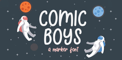 Comic Boys embodies fun, quirkiness and authenticity. This enchanting display font will turn any creative idea into a true standout.
 - Pretty Boy by Creativemedialab,
$24.00 Introducing Pretty Boy a decorative serif family. This font consists of five weights and an ornament and has many alternative options to arrange to get a very beautiful and charming typography art. Pretty Boy Ornament works great to pair with any fonts too! This decorative serif family is perfect for all sorts of designs like movie, poster, wedding invitations, and also work great for logo, branding, headers or labels. how to access alternate? Adobe Photoshop go to Window - glyphs Adobe Illustrator go to Type - glyphs Others ( Canva, Cricut Design Space, etc ) , open font book (mac) / Character map (PC) - Set to view all Glyphs, copy the glyph that you want from Pretty Boy font and paste. Check out Losta Frida which is a great pair for Pretty Boy.
 - Idiot Boy by The Type Fetish,
$60.00 Idiot Boy was inspired and named after a design by Huw Morgan from the book Typographics 1. Idiot Boy is built from The Type Fetish’s distressed collection of fonts, including a few that have never been released. The OpenType version contains eight alternative glyphs for each character within the single font file. The TrueType version offers nine different fonts, each with a unique variation of the character in its character set.
 - Happy Boy by Niznaztype,
$15.00 Happy Boy is a handwritten sans typeface that has a rounded corner in each glyph. Inspired from speech bubble for comics, illustrations and kid writing. Happy Boy is perfect for comics, illustrations, cartoons and very suitable for speech bubble text. It is fun, easy communication and an eye catching style. You can use it for cover book, tagline, poster, branding, advertising, wallpainting letter, graphic design, and more. Happy Boy comes in 4 styles, regular, italic, bold and bold italic.
 - Big Boy by Type Innovations,
$39.00I have always wanted to create the world's biggest and heaviest font. I admit that I was visually inspired by contenders like Akimoto, Champ Ultra, Blackoak and Bloque. However, I not only wanted a real heavyweight, but a really good looking and readable font as well. Look out—Big Boy is here. This powerhouse can get the job done. Try it out and get the attention you deserve. - City Boys by Dharma Type,
$19.99 City Boys is a fashionable contrasted sans-serif that can be used in almost any situation. City Boys has basic, natural and neutral letterforms and skeletons for a wide range of usage. The glyphs are somewhat humanist yet they have vertical stress for modern and sophisticated impression. The ratio of the contrast was carefully designed for modern usage –websites, digital, printings and merchandises–. City Boys consists of 7 weights and their matching Italics for a wide range of usages. Farther, City Boys is supporting international Latin languages and basic Cyrillic languages including Basic Latin, Western Europe, Central and South-Eastern Europe. Also CSS covers Mac Roman, Windows1252, Adobe1 to 3. This wide range of international characters expands the capability of your works. City Boys Soft is a softly rounded version of this City Boys.
 - Tomket Boys by Dumadi,
$20.00 Tomket Boys is a fun and relaxing typeface ready to perfect your designs. This font lends itself to full color in a design so that the design feels alive. with support Uppercase, Lowercase, Numbers, Symbol, Ligature, Multilingual. Tomket Boys is perfect for product names, advertising designs, children's game titles, event titles, t-shirt designs, posters, web, banners, book covers, social media, and other designs. Compatible with design studios such as Photoshop, Affinity Design, Adobe Illustrator or Silhouette. That makes it great for creative projects. Thank you, Toni Dzulham - Dumadistyle
 - Little Boy by Gassstype,
$23.00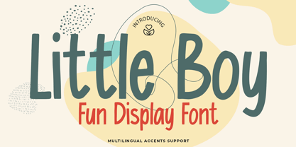 Here comes a New font, Introducing Little Boy It's Fun Display Font is a Cute Craft style and Textured Natural Style , this font is great for your creative projects such as watermark on photography, and perfect for logos & branding, invitation,advertisements,product designs, stationery, wedding designs,label ,product packaging, special events or anything that need handwritting taste. Little Boy a natural display Hand Drawn feel. It is perfect for any design project as Invitation,logo, book cover, craft or any design purposes,photos, photography overlays, signs, window art, scrapbooking, tags and so much more!
 - Phat Boi by Comicraft,
$19.00 Word up! DJ Dongboi and triple threat "JG" Roshell has been bustin' out for all the young font gunnahs out there. He bein' crazy, givin' out the love and non-stop dope moves... You feel it? Be showin' ya respect and holla at the Phat Boi an' y'all be cool. Aiiiigggghhht?! Phatboi is Da Next Big Thang! Stay bent.
 - Growing Boy by Brenners Template,
$19.00 Growing Boy Display Font Family is designed with a rather high x-height and consists of cute and creative glyphs. Nine weights include regular and rounded styles, the rounded styles are designed for soft edge. The really uniquely drawn glyphs can work well with any composition to create the layout you want. In addition, rounded styles increase readability and simplicity, so they can be applied in a variety of ways, including editorial publishing, logo design, brand identity, and on-screen channels.
 - Shuriken Boy by Adobe,
$29.00 - Bloc Boy by Mans Greback,
$59.00 Bloc Boy is a handwritten typeface by Måns Grebäck. Its 150+ alternates and swashes gives it great variety, and the contextual alternates ensures the font a genuinely handwritten look.
 - Just Boys by j.dsky,
$19.00 Silhouette font designed to be used as a decorative element within layouts and illustrations. Featuring boys and toys in everyday life situations. Inspired by my kids and their friends playing, running, fighting and expressing different emotions. To create this set of 81 glyphs I used photographs that I hand-traced. Picture font recommended for a variety of illustrative purposes.
 - Sammy Boy by Hanoded,
$20.00 Sammy Boy is sweet and cuddly when he wants to, but also loud and boisterous. Sammy Boy keeps you awake at night, but smiles at you in the morning. Sammy Boy can speak most languages. Sammy Boy is amazing.
 - Anderson Torchy The Battery Boy - Unknown license

- Bogie Bogie by Dumadi,
$20.00 Bogie Bogie – Logo Typeface A special font for the company logo and the logo of the project you are working on will certainly make it easier to create a logo. so for those of you who are still starting a business, this font will be very suitable for your identity and you will not bother anymore to create a logo. Bogie Bogie is perfect for logo designs, electronic logos, drone logos, smartphone logos, computer brand logos, camera logos, and other logo logos. What’s Included : + Standard glyphs + Multilingual Accent + Works on PC & Mac, Simple installations Accessible in Adobe Illustrator, Adobe Photoshop, Adobe InDesign, even work on Microsoft Word. PUA Encoded Characters – Fully accessible without additional design software. Fonts include multilingual support + Image used: All photographs/pictures/vectors used in the preview are not included, they are intended for illustration purposes only. Thanks
 - Lost in space by Gleb Guralnyk,
$13.00 This futuristic typeface "Lost in space" is a geometric vintage font with multi-lingual support.
 - Lost and Foundry by Fontsmith,
$15.00 Breaking the cycle of homelessness We are partnered with The House of St. Barnabas, a private members club in Soho Square, whose work as a not for profit charity aims to break the cycle of homelessness in London. Each purchase (of the family pack) comes with a one month membership to The House and 100% of the proceeds from sales of fonts go directly to the charity to help their essential work. This unique collection of 7 typefaces is based on the disappearing signs of Soho, at risk of being lost forever due to the ever changing landscape of the area. By re-imaging the signage as complete fonts, we have rescued this rich visual history from the streets and present the typefaces into a contemporary context for a bright optimistic future. FS Berwick Thanks to its humble tiled origins, this Egyptian serif type maintains a uniform character width, creating the irregular letter proportions found in the final alphabet. Broad-shouldered, the bracketed serifs firmly ground the font, whilst its extreme hairlines become a necessity due to the uniform width. Of note is the upside down ‘S’, to be found on the original sign on Berwick Street. Perhaps due to its ceramic origins, there is a surprising ‘slippiness’ to its final appearance. FS Cattle Cattle & Son is best described as a wide, but not overly extended, grotesque-style sans serif, showing a uniform width and carrying a robust strength to its form. Whilst lightly functional overall, the purposeful diagonal legs of the ‘K’, ‘R’ and the tail of the ‘Q’ add an urgency to its appearance. The reduced size of the ampersand gives away Cattle & Son’s hand-painted origins, and the oblique compacted ‘LTD’ found on the original sign is also included in the final set. This beautiful sign is tucked away under an arch in Portland Mews, sheltering from the weather. Perhaps this is why it has lasted so long. FS Century This somewhat elongated set of Roman capitals was originally rendered in paint circa 1940, but its roots trace back to the Trajan Column in Rome. Witness the slightly unbalanced ‘W’ and the painter’s hand is revealed. Century’s flared serif style is extremely short, sharp and bracketed. The ‘M’ is splayed and has no top serifs. Century has a uniform appearance of width, probably due to its sign-written origins. Yet is elegant, classic and exudes sophistication. FS Charity A true Tuscan letterform, the original is located on The House of St. Barnabas in ceramic tiles and was revealed in all its broken glory in 2014. FS Charity retains the option of using these incorrect characters (try typing lowercase in the test drive above and compare with the more uniform uppercase characters). FS Charity features fishtailed terminals on its strokes, a curious branched ‘T’ and the ‘S’ displays tear-drop ends to its serifs. Almost uniform in width, the ‘A’, ‘M’ and ‘W’ are the widest characters in this set. FS Marlborough The elongated Marlborough features diagonal terminals to some characters and numerals. Also retained is the space-saving contracted ‘T’ glyph from the original sign, while the ‘R’ features a distinctive wedge-shaped leg. Highly individual in this form, similar signage appears around Soho, but featuring a variety of widths in their design. FS Portland The sister type to Cattle & Son, Portland is oblique rather than italic. The serifs are not overly long, yet still enhance its rather rigid cap height and baseline appearance. Its ‘A’ has a top serif, the ‘M’ is square and the ‘G’ foregoes any spur. Particularly delightful is the open ampersand. Numerals align to encourage the horizontal flavour of the oblique style. Overall, Portland is both confident and graceful. FS St James A lineal Continental style, St James also displays a true sense of ‘Londoness’ in its titling form, perhaps influenced by early Underground signage. Irregular letterforms display a continental flavour, particularly evident in its Deco style ‘W’, ampersand and numerals. The rather high cross bar in the ‘A’ is also reflected in the raised middle strokes of the ‘M’. Noteworthy are the distinctive unions found on all of the characters and the additional small caps. The original lettering is still located on Greek St.
 - Lost Hills JNL by Jeff Levine,
$29.00Lost Hills JNL is a split-serif Western font based on Jeff Levine's Brogado JNL. Named for an actual location in California, this font has all the basic characteristics of a traditional Old West design. - Words You Lost by PizzaDude.dk,
$20.00
- Lost In South by Gassstype,
$27.00 Introducing Lost in South – Natural Brush Font is a Signature Style and classy style, this font is great for your creative projects such as watermark on photography, and perfect for logos & branding. Lost in South a natural handwritten feel. This handmade font will make your design has a beautiful natural touch for each details.
 - KG The Last Time Bubble - Personal use only

- Pete-Boy <> Hand of Pete-Boy - Unknown license

- Bboy - Unknown license

- Box by Superfried,
$32.50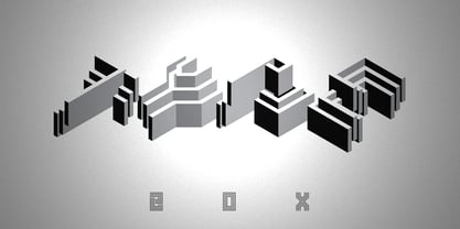
- Bohy by wkklee,
$25.00Bohy was a candidate when it was felt there was a need for a "house font" to start a design service. Its readability can be relied on to clearly display the most creative or obscured names, yet the adherence to a chosen system of construction to achieve this consistency also make the Bohy characters stubbornly distinguishable from most other font sets if you were to group it under geometric, or technical typeface, or some other categories it should belong (it is considered more constructivist, not humanist, etc...). - Bosis by Monotype,
$29.99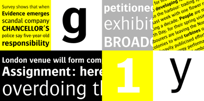
- Boxy by Hackberry Font Foundry,
$24.95 In my on-going quest for display fonts to be used with my books and on my book covers, I decided I need a squared sans serif. I started the build off of Fiscal, a font I designed back in 2006. I never liked the font, plus my tastes have changed. So, I opened it, made it narrower, increased the x-height, and various stuff like that. I made it much heavier—an ended up with Boxy. Then my brain slapped me and said, "Why don't you make a sorta modern version?" So, I did and decided to call that style Chic. But then I wanted a thin version also. Fiscal was always too heavy and ponderous for me. So, I made the Thin style. Finally, I felt I needed an italic of Chic. OpenType features didn't seem to work well with the family, so all I added was oldstyle figures. So, I ended up with another of my unique families—with two unmodulated fonts: Thin and Medium, and two modulated fonts: Chic and Chic Italic. But, I'm pleased with it. My hope is that you will like it also.
 - Boxed by Tipo Pèpel,
$18.00 Boxed typography is a new and extensive 18 weight typeface, brightly conceived and designed to look good on small screen devices, but offering also enlightened looks on paper. The semi-modular geometric font shapes seek to be fully responsive to the grid of screen«s pixels to deliver a crisp, fluid reading rate. Due to its extensive range of weights and subtle difference in thickness, compensating for the stain of characters between different CSS styles is really easy. It offers an extensive set of Latin characters, even the Cyrillic.
 - Joy by Yasmina Creates,
$33.00 Joy is sure to spice up your text life! She overflows with style and personality. She loves to be center stage on headlines, flirting with her readers eyes. There are over 100 ligatures, creating words with some letters connecting and others standing on their own. This creates a modern, fresh, handwritten look.
 - Boos by Fontex,
$29.00 A lot of time and effort has been put into the process of creation the Boos Font. A careful analysis of the current font market and overly increasing customer needs have shaped Boos' final appearance and content. We don't have a precise target audience for Boos, since the amazing amount and structure of the chosen characters enables a very wide utilization. It will be best suited for headlines for classy magazines. It's look and feel came from a different designing approach, so that it can successfully satisfy the needs of even the neediest. Shining with calm and dignity, while in the roots being aggressive, it has successfully connected classic and modern styles - representing it's largest value. Medium, bold, black and light versions are included in the complete package, at a discounted price!
 - BOT by fontkingz,
$19.00The BOT font package includes two character sets, BOT-Regular and -Stencil. The futuristic looking characters are designed to work in both large scale and small sizes; it works very well as a comfortable, readable lettering on machines of any kind as much as in print and screen publications. In addition, the BOT-Stencil letters can easily be cut out and work as a template for painting type on any surface.


