10,000 search results
(0.033 seconds)
- Sabio by Greater Albion Typefounders,
$11.95 I regard Sabio as an evolutionary face. By this I mean that it merges elements of script and Roman design into one elegant whole. The design was 'evolved' somewhere between these two classic approaches. The resulting family of faces makes an excellent display family, but is also clear and legible at small sizes and can be used as a text face with a distinctive flair. Sabio is a wonderfully flexible face that can sit happily alongside artwork that owes its inspiration to any era from the Art Deco onwards. The regular form is gently and subtly oblique, and the glyphs have a slight hint of swash about them. Alternate and perpendicular forms are also offered. The regular, alternate and perpendicular forms are all in turn offered in regular, and bold weights as well as in a condensed form. All in all Sabio is a humanist face with which almost anything can be done offering flair and elegance for almost any project. Whether it's a distinctive way of setting paragraph text, or poster work that's eye catching yet flowing and clearly legible, Sabio offers the answer.
 - Festival by Monotype,
$29.99 The Festival Titling font was cut by Monotype in 1950 as the official display face for the Festival of Britain which was staged in 1951. Used for all official Festival announcements, Festival Titling was made available for general use in 1952. The festive feel of this design together with the clean glitter and novelty make it a useful face for display and advertising use.
 - Barcis by insigne,
$24.75 Take your reader far away to a tropical morning, where the inviting aroma of a fresh roast introduces them to a gentle breeze and the first, warm light of day. Take them there with Barcis. This organic face with its tall x-height and neo-humanist attributes shows its free spirit through unique terminals, calligraphy-inspired strokes, and a rich variety of OpenType alternates All insigne fonts are loaded with OpenType options. Barcis is geared up for pro typography. The font features many numeral sets, with fractions, old-style figures, superiors and inferiors. OpenType-capable programs like Quark or the Adobe suite allow you to quickly change ligatures and alternates. You can see these options shown in the .pdf brochure. Barcis also features the glyphs to aid a variety of languages, together with Central, Eastern and Western European languages. In all, Barcis supports around forty languages that utilize the Latin script, earning Barcis the pick for for multi-lingual publications and packaging. Barcis features three different widths and seven weights from exceptional Light-weight to dense Black. Each of these individual fonts offers its own authentic italics and alternate glyphs as well. With its high versatility, Barcis is without a doubt an amazing titling font, a great choice for journals, a solid option for web use, or even for clearly defining your mark in logotype. Bring Barcis into your library, and use it to carry your audience away.
 - Hyper Super by Bisou,
$15.00 Made in La Chaux-de-Fonds Switzerland, Hyper Super is born while the hyperdesigner Bisou watches "Blow up", a french film-lover show. This episode about Paul Newman quotes the 1969 movie "Winning". The Italian poster with the title "Indianapolis pista infernale" uses a striking handmade font that inspire Hyper Super, a very fast font. Hyper super is thought from ground up to give a strong impact and an impression of speed. Its retro 70’s car racing movies style makes it best suitable a dog race stadium. It works perfectly with short texts for advertisement like a tuning garage sign or delivery pizza menu. Just use it for your pizza restaurant and see Paul Newman in person apply for a delivery boy job.
 - Metropole by Greater Albion Typefounders,
$12.00 Metropole is an exercise in combing the curvaceous lines of the Art Nouveau with the solid character and simplicity of Art Deco. The resulting three display faces combine the spirit of the 20s and of the thirties, creating lively fun display faces for headings, signage and banners. These characterful faces with clear simple outlines are also ideal to lend a distinctive air to your web pages, or to create a distinctive 'house-style' for lettering.
 - KING HOSHUN by Twinletter,
$17.00 Welcome King Hoshun, a display font with a superhero style ready to take your projects to a higher level. If you need a strong, bold, and action-packed theme like those in movies, games, or bold designs, King Hoshun is the right choice. With King Hoshun in attendance, your designs will be in the spotlight. Each letter is filled with strength and heroism that will make an unforgettable impact on the audience. The impressive and bold look of this font will make your message feel even more powerful and compelling. Not only does it look impressive, but King Hoshun also offers special features that enrich your creativity. With the available ligatures and alternative characters, you can explore unique and interesting typography combinations. Plus, this font supports multiple languages, so you can present a strong and inspiring message to a global audience. Join the power of King Hoshun and let your projects light up the world. With its bold superhero style and superior features, this font will give your designs an unforgettable impression. Don’t miss the chance to own King Hoshun and create amazing works that amaze and inspire. What’s Included : File font All glyphs Iso Latin 1 Alternate, Ligature Simple installations We highly recommend using a program that supports OpenType features and Glyphs panels like many Adobe apps and Corel Draw so that you can see and access all Glyph variations. PUA Encoded Characters – Fully accessible without additional design software. Fonts include Multilingual support
 - Emoji Emotions by Pixel Colours,
$16.00 Emoji Emotions Font is a hand drawn dingbats font inspired in human emotions and feelings. Includes the complete emojis and the individual faces. Create beautiful quotes, social media posts, posters, cards, ads, packaging or any design with character! Includes 9 original emojis that you will love :) Includes: Emoji Emotions: includes the complete emojis Emoji Emotions Faces: includes just the faces so you can make color emojis
 - Vertrina by Greater Albion Typefounders,
$8.95 Vertrina marries four virtues: elegance, simplicity, character and usefulness. It started as an idea to combine two things: the elegance of classical Roman typefaces and of classical Roman architecture. The result is that rarest of all things - a truly new face that is elegant yet characterful but not so obtrusive as to be restricted to display work. All the faces' uprights mirror the elegant taper of Roman columns, as used in the most simple and elegant form of Roman architecture. The serifs are a subtle shape that mirrors the pediments and corbels of that same order of architecture. Vertrina is a family of eight faces, four upper and lower case faces, suitable for the elegant setting out of text, and four small capitals faces ideal for headings and titles. You'll find regular and bold weights and normal and condensed width, as well as a range of Opentype ligatures. All faces are offered individually and in family groups. Bring some simple elegance to your work.
 - Courier 10 Pitch WGL by Bitstream,
$49.00Another in the series of competent IBM serifed typewriter faces, this one from Howard Kettler in Lexington in 1956. - Courier 10 Pitch by Bitstream,
$29.99Another in the series of competent IBM serifed typewriter faces, this one from Howard Kettler in Lexington in 1956. - Artlessness by sugargliderz,
$18.00 I used a technical pen to the trace the letters in an alphabet learning book for this font. Of course, I drew several letters by freehand as if I were practicing, and included all of them together as a Stylistic Set.
 - Haweni by Twinletter,
$15.00 Halloween has never been so much fun. You don’t need to go near a spooky house in the dead of night or deal with creepy creatures while you wait for trick-or-treaters to pass out candy. With this Halloween font and our new Halloween-themed templates, it will be easy to get your Halloween party started without all that hard work! Of course with this font your various design projects will be perfect and amazing, get a beautiful title and start using our font for your special project.
 - Meuthia Beauty by Awan Senja,
$14.00 Meuthia is a beautiful and classy signature font. This is a beautiful combination of timeless elegance and authentic calligraphy. It features an incredibly classic style, while still keeping a friendly feel. Fall in love with its authentic feel and use it to create gorgeous wedding invitations, beautiful stationary art, eye-catching social media posts, and cute greeting cards. This font is PUA encoded which means you can access all of the amazing glyphs and swashes with ease! It also features a wealth of special features including alternate glyphs and ligatures.
 - Bhoory by Twinletter,
$15.00 Bhoory Halloween Font is a bold font that will help you create powerful text or logos and designs for your Halloween-themed projects. Use it to create invitations, flyers, and posters, or use the font as a headline or just a decoration. You can use this font to depict Halloween in an artistic or spooky way while showing your creative talents. Of course with this font your various design projects will be perfect and amazing, get a beautiful title and start using our font for your special project.
 - Morover by Greater Albion Typefounders,
$14.00 Morover is a lively display Fraktur, which manages to combine legibility with hand-drawn charm. All letterforms are carefully hand constructed to bring great legibility and clarity to the family of two faces-ideal for seasonal or festive work, or anywhere that vintage charm is required. The regular face offers an elaboately incised decorative design; the plain face offers solid black letterforms.
 - Spike by Quadrat,
$25.00 Spike was designed as a Latin type family, with the characteristic triangular serifs, but with more character and range of weights than the more common latin faces available. Designed as a display face, it could be used as a flavorful text face in special situations. The complete family consists of four fonts: light, regular, bold and an all-caps incised version.
 - Othersight Script by FallenGraphic,
$20.00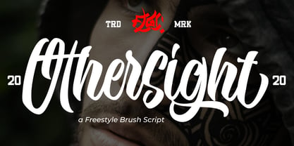 Othersight Script is an amazing handwritten font. Made in natural handwriting, this font will make your design more beautiful and powerful. Othersight Script is suitable for any design like branding, quotes and more. Othersight Script contains: -Accents (Multilingual Characters) -PUA encoded -Numerals and Punctuations (OpenType Standard) -Many alternates I hope you enjoy it . Thanks for visiting and downloading my font.
 - Comilfo by Larin Type Co,
$15.00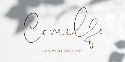 Comilfo is an amazing handwritten font that is delicate and elegant. It will emphasize your personality in any project and will charm you with its signature. Comilfo looks stunning on wedding invitations, thank you cards, quotes, greeting cards, logos, business cards and every other design which needs a handwritten touch. This font includes alternates, ligatures, and swashes. Comilfo has OpenType features.
 - Mallaba by FallenGraphic,
$15.00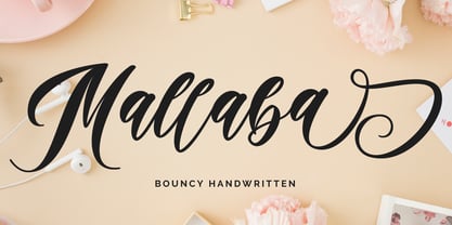 Mallaba is an amazing bouncy handwritten brush font. Made in naturally handwriting, this font will make your design more beautiful and powerful. Mallaba is suitable for any design like branding, quotes and more. I hope you enjoy it !! Thanks for visiting and downloading my font! Mallaba offers you: Accents (Multilingual Characters) PUA encoded Numerals and Punctuations (OpenType Standard) Many of alternates
 - LTC Kaatskill by Lanston Type Co.,
$24.95LTC Kaatskill was made specifically for use in an edition of Rip Van Winkle for the Limited Editions Club. "I feel that Kaatskill owes nothing in its design to any existing face, and the type therefore is as truly an American type as anything so hidebound by tradition as type can be."- F. Goudy This face was one of the first digital typefaces released by the Lanston Type Co. Ltd. Jim Rimmer took painstaking measures in his faithful revival. Goudy had never designed a specific Italic to accompany this face. The Italic completed by Rimmer is a variation on Deepdene Italic. The font set was re-mastered in 2006 by Colin Kahn. - Puanto by Larin Type Co,
$15.00 Puanto is a elegant serif font that includes two styles: regular and true Italic. This font has a lightweight and looks amazing in logos, branding, arranging wedding invitations, business cards, packaging, titles and much more, it is very readable and recognizable. This font includes alternates and ligatures for Uppercase and Lowercase, with them you can make your project more elegant and unique and italic style will add dynamics to your design, it also includes alternates and ligatures This font is easy to use has OpenType features.
 - Jet Jane by Ingrimayne Type,
$7.00 JetJane is a geometric sans-serif family. The family has two widths and each width has nine weights. Each of these 18 fonts comes with an accompanying italics version, giving the family a total of 36 members. JetJane, like other geometric sans faces, is plain, unadorned, and highly legible. It is derived from JetJaneMono, a monospaced sans-serif face. This development is unusual because one expects the monospaced variants to be created after the proportional variant, if a monospaced variant is even produced. This development history results in some distinctive differences between JetJane and two other geometric sans faces from IngrimayneType, AndrewAndreas and Yassitf.
 - Berolina by Solotype,
$19.95A circa 1900 type from the foundry of W. Grauneau, Berlin. A great utility face as it works well as the "plain" face with other decorative type of the same era. Reads well in paragraphs of copy. - TiredOfCourier by Ingrimayne Type,
$14.95 Courier is the king of typewriter faces. But if you want an alternative, something with a look reminiscent of the older, manual typewriters, consider TiredOfCourier. The family includes true italics, something very unusual in a typewriter face.
 - Boot Hill NF by Nick's Fonts,
$10.00 Here's an unusual take on the classic Tuscan face of the 1880s. The unusual finials lend a slightly spooky feel to the face, hence its current name. Both versions support the Latin 1252, Central European 1250, Turkish 1254 and Baltic 1257 codepages.
 - Fairway by Alan Meeks,
$45.00 The thinking behind Fairway was to create a relatively conventional soft sans with a certain amount of movement at the top of the x-height line. The face is casual and quirky but can still be used as a text face.
 - Cynapse OT by Positype,
$29.00 Several years ago I was faced with a project that required very small type to be used in a directory. In general, there was a need for a lot of 'fine print'. Faced with this, all of the tests I was making with existing faces were producing too much bleed of the individual glyphs...Cynapse was born. It evolved into this pseduo-techy looking type that standardized and glorified the ink trap (the small, tiny allowances of white space that reduces the amount of ink hitting the page, and in effect, reducing the appearance of bleed). The results was promising. The new OT version contains additional OpenType features that include expanded ligature sets, fractions, 5 sets of numerals as well as small caps and Central European diacritics.
 - Antique by Storm Type Foundry,
$26.00The concept of the Baroque Roman type face is something which is remote from us. Ungrateful theorists gave Baroque type faces the ill-sounding attribute "Transitional", as if the Baroque Roman type face wilfully diverted from the tradition and at the same time did not manage to mature. This "transition" was originally meant as an intermediate stage between the Aldine/Garamond Roman face of the Renaissance, and its modern counterpart, as represented by Bodoni or Didot. Otherwise there was also a "transition" from a slanted axis of the shadow to a perpendicular one. What a petty detail led to the pejorative designation of Baroque type faces! If a bookseller were to tell his customers that they are about to choose a book which is set in some sort of transitional type face, he would probably go bust. After all, a reader, for his money, would not put up with some typographical experimentation. He wants to read a book without losing his eyesight while doing so. Nevertheless, it was Baroque typography which gave the world the most legible type faces. In those days the craft of punch-cutting was gradually separating itself from that of book-printing, but also from publishing and bookselling. Previously all these activities could be performed by a single person. The punch-cutter, who at that time was already fully occupied with the production of letters, achieved better results than he would have achieved if his creative talents were to be diffused in a printing office or a bookseller's shop. Thus it was possible that for example the printer John Baskerville did not cut a single letter in his entire lifetime, for he used the services of the accomplished punch-cutter John Handy. It became the custom that one type founder supplied type to multiple printing offices, so that the same type faces appeared in various parts of the world. The type face was losing its national character. In the Renaissance period it is still quite easy to distinguish for example a French Roman type face from a Venetian one; in the Baroque period this could be achieved only with great difficulties. Imagination and variety of shapes, which so far have been reserved only to the fine arts, now come into play. Thanks to technological progress, book printers are now able to reproduce hairstrokes and imitate calligraphic type faces. Scripts and elaborate ornaments are no longer the privilege of copper-engravers. Also the appearance of the basic, body design is slowly undergoing a change. The Renaissance canonical stiffness is now replaced with colour and contrast. The page of the book is suddenly darker, its lay-out more varied and its lines more compact. For Baroque type designers made a simple, yet ingenious discovery - they enlarged the x-height and reduced the ascenders to the cap-height. The type face thus became seemingly larger, and hence more legible, but at the same time more economical in composition; the type area was increasing to the detriment of the margins. Paper was expensive, and the aim of all the publishers was, therefore, to sell as many ideas in as small a book block as possible. A narrowed, bold majuscule, designed for use on the title page, appeared for the first time in the Late Baroque period. Also the title page was laid out with the highest possible economy. It comprised as a rule the brief contents of the book and the address of the bookseller, i.e. roughly that which is now placed on the flaps and in the imprint lines. Bold upper-case letters in the first line dramatically give way to the more subtle italics, the third line is highlighted with vermilion; a few words set in lower-case letters are scattered in-between, and then vermilion appears again. Somewhere in the middle there is an ornament, a monogram or an engraving as a kind of climax of the drama, while at the foot of the title-page all this din is quietened by a line with the name of the printer and the year expressed in Roman numerals, set in 8-point body size. Every Baroque title-page could well pass muster as a striking poster. The pride of every book printer was the publication of a type specimen book - a typographical manual. Among these manuals the one published by Fournier stands out - also as regards the selection of the texts for the specimen type matter. It reveals the scope of knowledge and education of the master typographers of that period. The same Fournier established a system of typographical measurement which, revised by Didot, is still used today. Baskerville introduced the smoothing of paper by a hot steel roller, in order that he could print astonishingly sharp letters, etc. ... In other words - Baroque typography deserves anything else but the attribute "transitional". In the first half of the 18th century, besides persons whose names are prominent and well-known up to the present, as was Caslon, there were many type founders who did not manage to publish their manuals or forgot to become famous in some other way. They often imitated the type faces of their more experienced contemporaries, but many of them arrived at a quite strange, even weird originality, which ran completely outside the mainstream of typographical art. The prints from which we have drawn inspiration for these six digital designs come from Paris, Vienna and Prague, from the period around 1750. The transcription of letters in their intact form is our firm principle. Does it mean, therefore, that the task of the digital restorer is to copy meticulously the outline of the letter with all inadequacies of the particular imprint? No. The type face should not to evoke the rustic atmosphere of letterpress after printing, but to analyze the appearance of the punches before they are imprinted. It is also necessary to take account of the size of the type face and to avoid excessive enlargement or reduction. Let us keep in mind that every size requires its own design. The longer we work on the computer where a change in size is child's play, the more we are convinced that the appearance of a letter is tied to its proportions, and therefore, to a fixed size. We are also aware of the fact that the computer is a straightjacket of the type face and that the dictate of mathematical vectors effectively kills any hint of naturalness. That is why we strive to preserve in these six alphabets the numerous anomalies to which later no type designer ever returned due to their obvious eccentricity. Please accept this PostScript study as an attempt (possibly futile, possibly inspirational) to brush up the warm magic of Baroque prints. Hopefully it will give pleasure in today's modern type designer's nihilism. - ITC Luna by ITC,
$40.99 ITC Luna is the work of Japanese designer Akira Kobayashi. He turned to the designs of the 1930s for his inspiration for both ITC Luna and ITC Silvermoon. Luna is designed to fill the gap between a pure Art Deco display face and an ordinary text face," says Kobayashi. "It has an Art Deco style but is still fairly easy to read. It can be used in short passages of text. As for individual characters, I especially liked the distinctive O, shaded only on one side. Lowercase a and g are also unusual, but they are somehow legible enough in text matter." And for a finishing touch on his Luna, Kobayashi added the charming moon face as an extra character.
 - P22 Founders by IHOF,
$24.95 Based on turn-of-the-century advertising type. A condensed, fat-faced display font with a touch of the medieval. The influence of art nouveau is also present in the high-waisted caps and flowing lines, putting the face into the early 20th century.
 - Camaro by Flawlessandco,
$9.00 Introducing "Camaro" - a dynamic and high-octane racing display font that embodies speed, excitement, and adrenaline. Camaro showcases a strong and sleek design that mimics the aerodynamic lines of racing cars. There's some connected letters and some alternates that suitable for any graphic designs such as branding materials, t-shirt, print, business cards, logo, poster, t-shirt, photography, quotes .etc This font support for some multilingual. Also contains uppercase A-Z and lowercase a-z, alternate character, numbers 0-9, and some punctuation. If you need help, just write me! Thanks so much for checking out my shop!
 - Gumball Machine by Rachel McBride Creative,
$9.00 Gumball Machine Typeface is everything you ever wanted in retro type design. With eight font styles, its disconnected and eccentric nature is enough to give any project some funk. Amazing for the spring and summertime! Use for website and brand design, product labeling, album/movie/project graphics, t-shirts and clothing, and anything else that needs a spark! Gumball Machine has 440 glyphs and supports most western languages.
 - Princess Signature by Lucky Type,
$18.00 Princess signature is the newest signature font with a truly amazing combination of old style and modern style. Perfectly designed from beautiful natural handwriting for any design project you can think of. Perfect for branding, business cards, quotes, posters, stickers, blogs, logos, weddings, birth announcements, photo overlays, printed items, bags, t-shirts and more. Thank you so much for looking and let me know if you have any questions.
 - Vainest by Gatype,
$12.00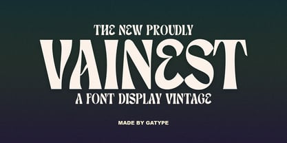 Vainest Serif vintage style font It has a modern and retro look. Comes with different styles, really helps to create amazing logos, quotes, posts, blog posts. branding projects, magazine imagery, book and billboard displays, and more. hope you will enjoy using the Vainest font and it will make a perfect addition to your font collection! Contact me with an inbox message If you have any questions. Thank you
 - Luxgard by Tadiar,
$25.00 Luxgard is an authentic vintage font of 8 design styles (done as separate fonts) created for such areas as Media & Entertainment, Food & Drinks, Clothes, Music, Games & Applications, etc. with Multilingual support (Latin Extended). Well use in vintage labels, headers & titles, Posters, Street Signs and other Outdoor, Package Design. Please see the preview image with three letters S: You can make different combinations of these styles to get amazing looks of designs.
 - Marco by TypeTogether,
$49.00 Marco is a lively text face, with an informal touch, inspired by 15th century Italian letter-forms with strong calligraphic traces and intended to be used primarily in continuous and intensive reading conditions. Marco is full of features required for high-quality book typography, including: strong language-support in extended Latin, Cyrillic and polytonic Greek, a multitude of swashes in the italic styles of Latin and Cyrillic, stylistic alternates to obtain the best possible solutions and other typographic niceties. Inspiration for Marco goes back to Italian humanist typography such as those of Nicholas Jenson or Aldus Manutius, and general influences from calligraphy. As a result, Marco has matured into a personal and unique text face where its lively and somewhat informal style is an ideal counterpart to its careful and ingenious crafting. Toshi Omagari’s Marco features a huge set of over 1900 characters per style —and almost 2600 in the italics— and is available in Regular, SemiBold, Bold with matching Italics.
 - Jatayu by Khurasan,
$10.00 Jatayu is a fun bold script font, with a fresh and modern style. Jatayu has two different styles, regular and extrude. You can combine regular and extrude to get amazing results. Jatayu is suitable for logos, branding, greeting cards, posters and any design that you create.
 - Altra Two by Hackberry Font Foundry,
$24.95AltraTwo is a complete redraw of a family based on a tracing of a clip art font from an old printed book. The AltraTwo family adds italic, black, and black italic. I liked the gentle calligraphic look. Consider it a sans serif with style. This is a typical NuevoDeco OpenType pro font with caps, lowercase, small caps, lining, oldstyle, and small cap figures, numerators, denominators, fractions, swashes, and so on. There aren't many unusal ligatures for this one, though. It does have the Latin 2 character set or what Adobe calls CE, Central European characters. Altra has been my preferred header face for sevral years. it also works very well for body copy. I usually use it for my contrasting tip and quote paragraphs with Bergsland Pro as my normal body copy. - Pergamon by URW Type Foundry,
$39.99 The Pergamon series is a creation of Alfons Schneider (1890–1946) and was issued by the foundry of Ludwig Wagner in Leipzig in 1937/1940, though the website of the Klingspor-Museum says that several of the faces were probably produced after the death of Schneider. This digital version is extended with the necessary OT characters and signs, while also the “символы кириллицы” are added. Also, in addition to the members of the family designed by Schneider, regular, italic, bold and bold italic extended versions were produced. The specimens of Ludwig Wagner stated emphatically: “In allen Graden werden beide K K geliefert”, so these two forms are in all the faces, while the two condensed members also have k k, as the specimens said that this alternative character was also in these two faces.
 - RM Imber by Ray Meadows,
$19.00 A great new display face. The slight serif gives extra character to this solid looking design, whilst the outline version has an open, clean look.